NYSE 52Wk Highs And Lows Nets


The Dow Jones continues advancing into market history. So far in February it has made five new BEV Zeros (new all-time highs), its 12th to 16th since its low of March 23rd 2020. That was almost a year ago. In these eleven months the Dow Jones has advanced over 13,000 points, or 70% as of this Wednesday’s all-time high, with no signs of this historic advance slowing down.
Like a speeding locomotive, obviously this advance isn’t going to continue forever, but you don’t want to get in front of it until it does slow down. So should someone who was sitting on the sidelines come into the market now? I don’t think so, just on the basis of one should be selling into market strength, not buying.
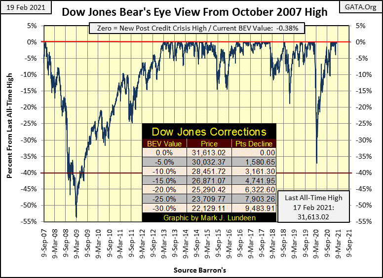
The time to have come into the market would have been last March, when everyone was selling in a panic as the Dow Jones deflated 37% in only twenty-eight NYSE trading sessions. Did I recommend buying last March? Hell no!
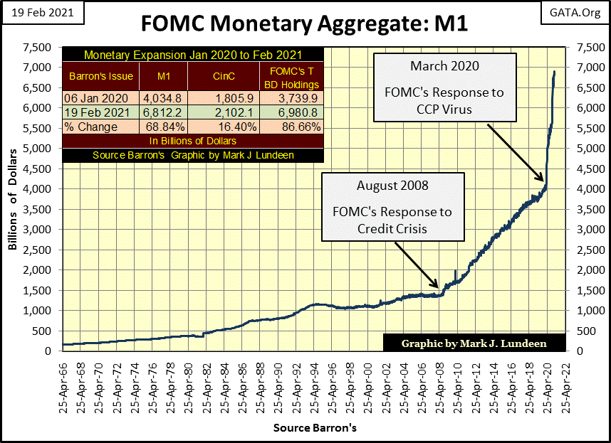
The only people buying stocks last march was the FOMC and their Wall Street minions (you know; all the usual suspects), as Fed Chairman Powell’s Not QE#4 began “injecting” over a trillion dollars into the financial system in a month (see chart below).
Where do you think the Dow Jones would be at this week’s close, had the FOMC not “injected” all that “liquidity” into the market in the past year? I’ll give you a clue; it wouldn’t now be up 70% from the lows of last March. Looking at the weekly “injections of liquidity” seen below since February of 2020, I’d say the Dow Jones and the rest of the stock market would now be in a historic, and profound bear market.
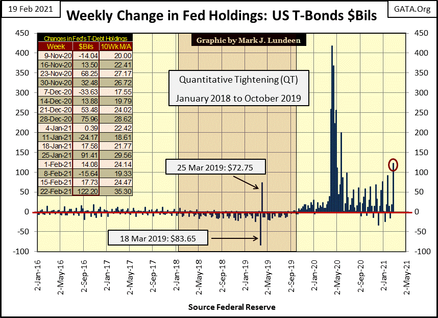
The games on Wall Street continue this week with the FOMC “injecting” an additional $122.2 billion into the financial system. We’ve not seen a weekly triple-digit billion dollar “injection of liquidity” into the market since the end of May last year, when the FOMC “injected” $199 billion into the market. My guess is in the coming year, the FOMC will be forced to increase their “injections of liquidly” to the point where they may take out that weekly “injection” of over $400 billion seen last April.
So what is actually going on here? I think the Lady from Niger seen below has a superior understanding of the present economic dilemma, with its pathetic low interest rates and bond yields and exploding asset valuations, than all the idiot savants at the FOMC; that when one rides on the back of a tiger,
there’s no safe way off.

So, should you buy into this market? Not on my recommendation. Mind you, it’s not I’m afraid of tigers as much as I’m afraid of bears. It’s bears, cuddly as they may appear, that give me the heebie jeebies.

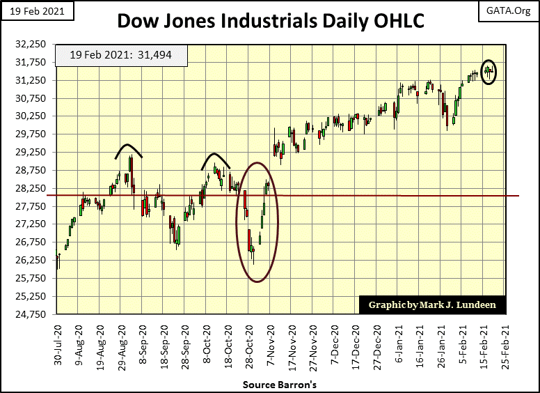
But at this week’s close, there was no sign of bears lounging around lower Manhattan. Look at the Dow Jones below in daily bars; this week it made two new all-time highs as it took baby steps, like a good bull market should do.
So what’s all this talk about tigers and bears giving anyone the heebie jeebies? The banking system in this hot market would be happy to give you a second, maybe even a third mortgage on your house. Take the proceeds to your broker and open a margin account to invest in out-of-money calls in one of today’s hot glamor stocks; lots of people are doing it why not you?
What – the banks and brokerages wouldn’t let anyone do this? Maybe not last week, but maybe next week they will, as insanely leveraged positions are what drive historic bull market advances (like ours) up to their last all-time high, just before the bust.
Let’s look at NYSE 52Wk High and Low Nets in the chart below where I used a +/- 300 threshold to filter out market noise. Visually, this chart can be divided into two eras; before and after the October 2002 NASDAQ Dot.Com bear market bottom.
Before October 2002, NYSE’s 52Wk High and Low Nets did break above their +/-300 thresholds, but not as frequently as they did after, where post October 2002 they now occur in clusters instead of as singular market events. It’s only natural wondering why this change in the NYSE 52Wk Highs and Lows happened. I’m inclined to peg this change in the market with the FOMC efforts to reflate the stock market after the 2000-02 high-tech bear market bottom, and again after the 2007-09 sub-prime mortgage bear market bottom. And now one more time after last March’s flash crash’s bottom.
Another feature seen in this chart that supports my hypothesis is the extremes these 52Wk High and Low Nets have declined to the downside. Before October 2002 the nets broke below -1000 only for three daily closes in these twenty-two years. Then beginning in 2007, NYSE 52Wk High and Low Nets broke below -1000 nine times as seen in the chart, and many more times had I counted the total days the High and Low Nets closed below -1000.
Also notable are the extremes where 52Wk Lows overwhelmed 52Wk Highs during the October 2008 market panic, from which the FOMC began their quantitative easing programs QE #1-3. Then again with last March’s spikes in NYSE 52Wk Lows, Fed Chairman Powell chose this market event to begin “injecting” over a trillion dollars of “liquidity” into the financial system in a matter of weeks.
Without a doubt, seeing over 2000 listings on the NYSE close at a 52Wk Low on the same day will trigger the FOMC to respond with a massive “injection” of “liquidity.”
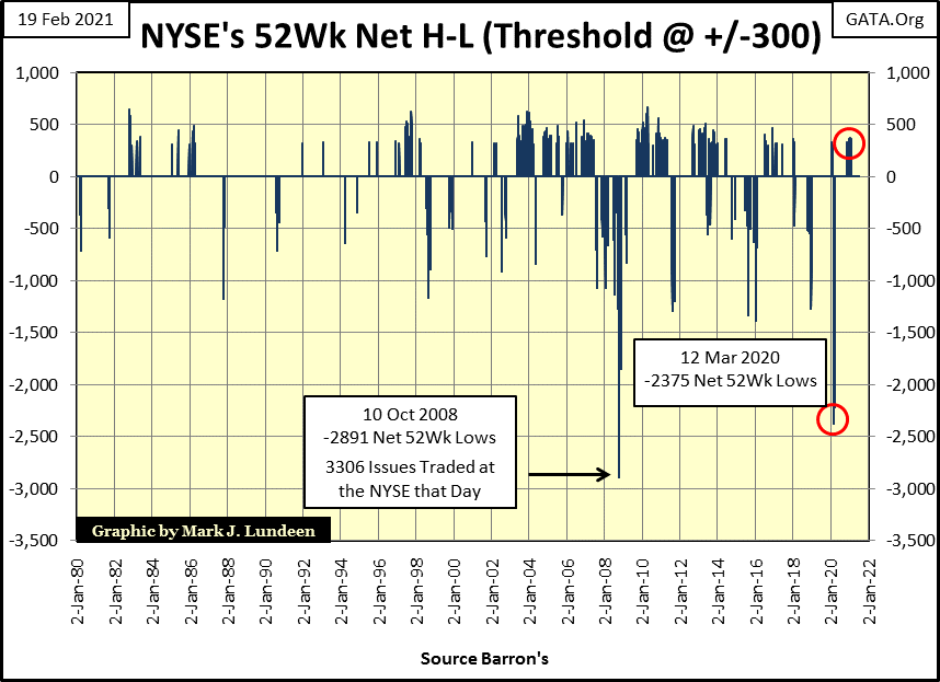
In January, 52Wk High Low daily Nets (H-L Nets) at the NYSE are once again exceeding +300, as seen in the table below. It’s an indication a market advance is maturing, but not necessarily a market crash is imminent. Think of these NYSE 52Wk H-L Nets of over 300 as an important milestone we’ve passed on our way to the ultimate top in this market advance.
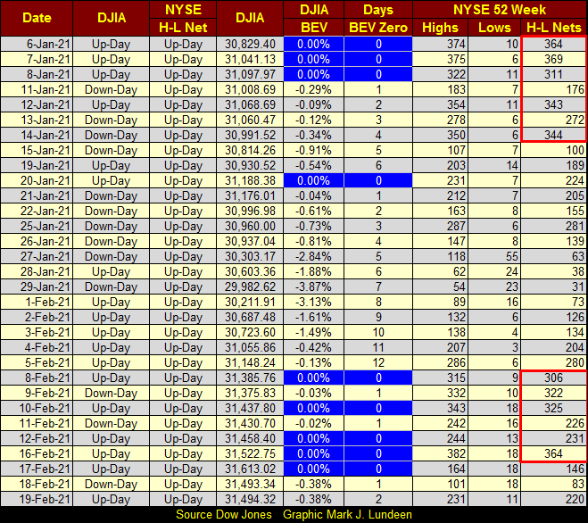
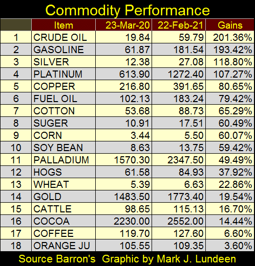
Another thing to be aware of is with so many NYSE listings making new 52Wk highs, the big money to be made in the post March 2020 stock-market advance has already been made. Look at all the BEV Zeros for the major market indexes I follow made last week; this has been going on since last November.
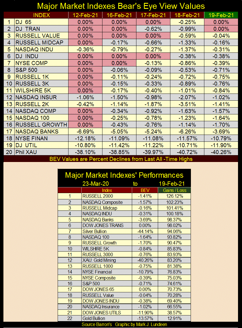
Every week I look at the gains seen in these major market indexes off their March 23rd 2020 lows, and they never fail to amaze me. Don’t expect the next eleven months to resemble the last eleven seen in the table above!
Barron’s used to publish NYSE Market Capitalization, but the NYSE stopped publishing that data in the public domain decades ago.
Now that would be a data set I’d like to have; market cap for the NYSE and NASDAQ. With an occasional 50% collapse in valuation since 2000, I suppose they’d look similar to the chart of M1 below, as that’s what is driving this advance in the stock market; monetary inflation flowing from the FOMC.
Not being a current fan of the financial markets, what do I like? Precious metal assets like gold bullion. Maybe not this week, but the day is coming when all this monetary inflation seen above is going to flee – run for its life – from deflation in the stock and bond market, and head straight towards gold and silver bullion as well as the companies that mine them.
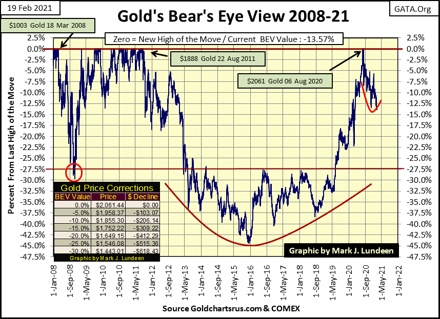
Still, this week in gold’s BEV chart below it broke below its November -13.44% low, closing the week with a BEV of -13.57% ($1781.65). So, they bushed whacked the gold market to a new post August 2020 low, but can they now take gold below its BEV -15% level ($1752.22)? I’m sure they will try next week, but I’m not going to lose any sleep should they succeed, because of the massive influx of monetary inflation flowing into the economy seen above.
Anyway, gold and silver prices the media provide to the public (as charted by yours truly) aren’t based on reality, but on worthless promises to deliver bullion that doesn’t, and will never exist sometime in the future in the paper gold and silver COMEX markets.
With CPI inflation once again ignited in the commodities markets, as seen below, it’s surprising seeing gold down at #14 closing the week only 19.54% above its lows of last March. Silver at #3 (up 118.80%) is more like it, but its gains of the past year have also taken place as the “policy makers” suppressed its price in the COMEX futures market.
When one goes to a dealer who sells actual ounces of gold and silver, prices seen on Kitco or from the COMEX are proven fictions. Friday night when I was writing this, one ounce silver rounds couldn’t be purchased for less than $32 and 1oz gold bars for $1890 – but only if you purchase ten more rounds or bars.
Silver eagles minted by the US Mint since 1986 are available, but only in some years. Sets of silver eagles (34 coins / 1986 to 2020) are going for $2,392 or $70.35 a coin. Why so much? People who have them are holding on to them, and that isn’t going to change until silver prices are much higher than they are now.
Current low prices are making inventory management for gold and silver coin dealers difficult as there are more buyers than sellers. The prices these dealers would like to see are ones that not only induce people to buy coins from them, but are also high enough to motivate current owners of precious metal coins to sell them. This allows the coin dealers to function as a clearing house for coins coming into and out of their inventories, which is difficult with current, and artificial prices now set at the COMEX paper markets.
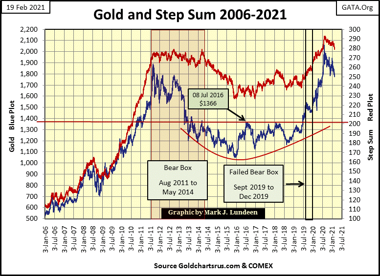
Looking at gold and its step sum below shows the current correction continues. How will we know when this correction is completed? That’s simple; we’ll see both plots turn up, and my guess is that when they do they will do it in a dramatic fashion as was the case from 2009 to 2011.
Until that happens, we wait knowing the underlying pressure beneath the gold and silver markets is rising. The table showing the gains in basic commodity prices, and the chart for M1 above tells us that, and that our patience will be profitably rewarded.
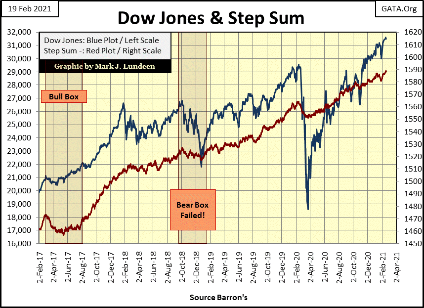
Here’s the chart for the Dow Jones and its step sum. Everything looks good, and that’s how it’s going to be for as long as the NYSE continues seeing days with 52Wk High and Low nets of +300.
Next are the step sum tables for gold and the Dow Jones. The relentless selling pressure gold has been under is on full display below. Since mid-January gold’s step sum has lost six steps on Friday’s close; that’s a lot. Also in the past twenty-five trading days, we don’t see many positive 15 counts either.
Still, after all that the bears could force the price of gold down by only 3.54%. Do I dare think this is the sort of market that isn’t making anyone, either bull or bear happy?
The story for the Dow Jones step sum table is completely different. The Dow Jones at Friday’s close with its 15 count in an overbought condition at a +7. No surprise there with all those daily advances for the Dow Jones. But for all that the Dow Jones had advanced only 1.62% in the past twenty-five days.
I know bull markets for the Dow Jones are low volatility markets. But for all the “liquidity” the FOMC has “injected” into the financial system, producing six new all-time highs in the table below, seeing the Dow Jones advance by only 1.62% since January 14th seems a bit miserly.
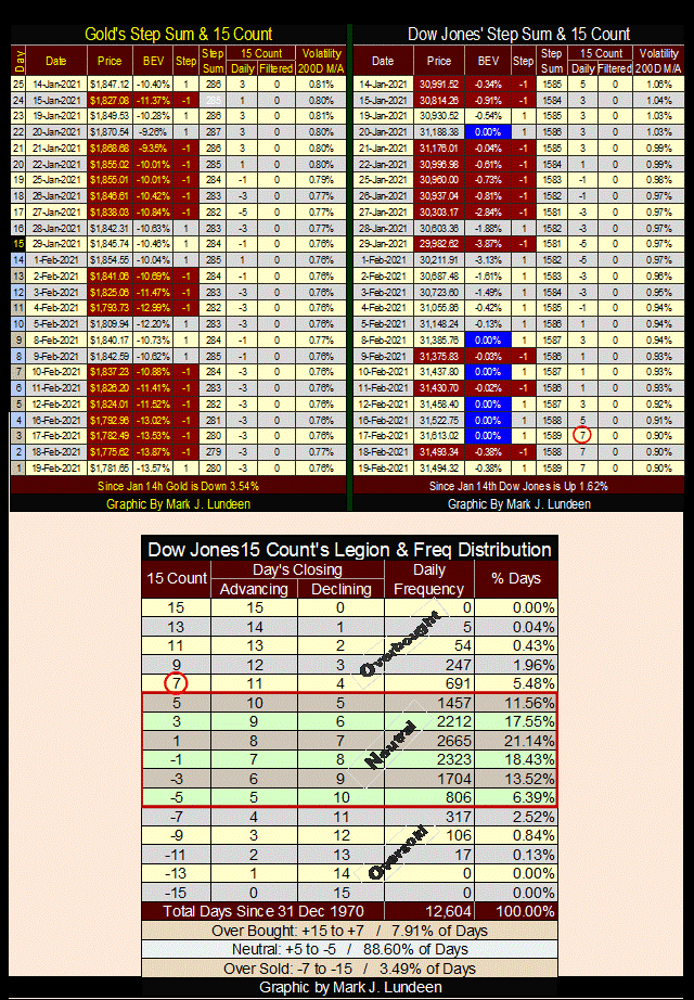
Let’s take a look at the Dow Jones’ overbought condition that developed this week, a 15 count of +7 in the table above and red plot in the chart below. What’s a 15 count of +7? In a running sample of 15 trading days; eleven of those days the Dow Jones closed up, with the other four days closing down. Since December 1970, the Dow Jones’ 15 count had increased to a +7 for only 691 daily closes, or 5.48% of the 12,604 NYSE trading sessions since December 1970. What that means can be best described in the chart below.
The table in the chart below lays out the 15 count’s range of market conditions;
- Overbought (+15 to +7)
- Neutral (+5 to -5)
- Oversold (-7 to -15)
Being overbought doesn’t mean the Dow Jones (or any market series) is going up; it can go down resulting in a step sum bear box. But typically seeing the Dow Jones in an overbought condition indicates it has been advancing; but due for a short term correction.
Being neutral, the Dow Jones can be trending either up or down. However, in an advancing market the count usually remains positive (+1 to +5), while in a declining market the count usually remains negative (-1 to -5).
Being oversold doesn’t mean the Dow Jones is going down; it can go up resulting in a step sum bull box. But typically seeing the Dow Jones in an oversold condition indicates it has been declining, but due for a market bounce.
Take a moment to study the Dow Jones (Red Plot below) since March 28th of last year, an eleven month period where the Dow Jones has advanced 70% at the close of this week.
Since last March the Dow Jones’ 15 count remained above the Zero line (Black Line) except for a few short periods of -1, and twice down to a -5 in late October and again in January. The Dow Jones’ 15 count also reached an overbought +7 three times since October, so a count of +7 isn’t necessarily bearish, but an indication the advance is in need of a rest.
That is exactly what happened last October and again in early January, the Dow Jones’ 15 count soon came down to a -5 both times, but soon the bulls got their second wind and took the Dow Jones’s 15 count back up to positive territory as the Dow Jones itself began making new all-time highs.
This week the Dow Jones’ 15 count closed at +7. It could increase to a +9 sometime next week. But if you look at the table above, a count of +9 is a very rare market condition. So looking at the data, I’d say the Dow Jones is going to cool down sometime in the next few weeks before it resumes its advance. But the day is coming when the count for the Dow Jones will have been in the main negative values for weeks and months. What will the bulls on Wall Street do then?
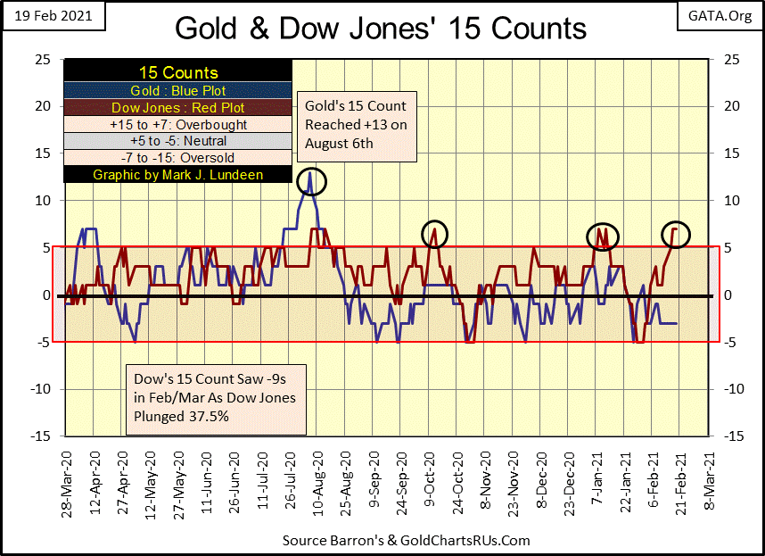
Looking at gold’s 15 count (Blue Plot above), from last March to early August gold’s 15 count, with few exceptions, remained positive as gold advanced into record territory. It did see a -5 in early May, but that low count followed gold’s 15 count of +7 in early April. From early May until August the count remained positive until it soared up to a historic first of +13 on August 6th as gold closed at $2061.
A count of +13 is truly an overbought market, a historic first for the gold market. Since this market extreme, gold has been correcting for the past half year, with gold’s 15 count typically in the -1 to -5 range ever since. We’ll see exactly when this correction is over; when gold’s 15 count once again sees positive values for weeks and months.
Mark J. Lundeen
*********


