One Hundred Years Of The Barron’s Gold Mining Index


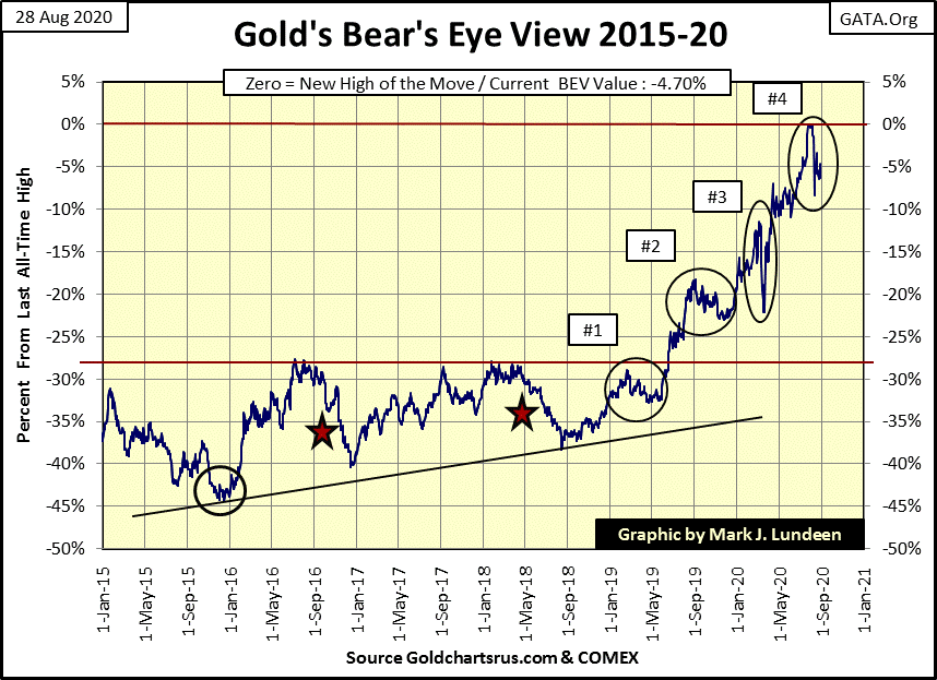
The Dow Jones Index closed the week in scoring position; that is within 5% of its last all-time high in its BEV chart below. Closing this gap, and once again making new BEV Zeros in the BEV chart below is almost a guarantee in the weeks to come, maybe by next Friday.
In weeks past I’ve frequently complained how slow the Dow Jones was progressing back to new all-time highs. Well, this isn’t the first time I’ve missed an important point on the market. Here’s a fact we market commentators have all seem to have missed; since 12 February 2020 (the Dow Jones last all-time high, or BEV Zero), the Dow Jones has moved with an intensity from an all-time high, to a 37% market decline (let’s call it a BEV -40% Bear Market), and recovered from that 40% decline as never seen before.
Let’s compare our current decline and recovery with that of the 2007-09 market crash and its recovery in 2013 in the BEV chart below.
From the Dow Jones’ last BEV Zero (February 12th) down to its March 23rd -37.05% bottom (Red Line) took only 27 NYSE trading sessions. For the Dow Jones to make this same percentage decline during the sub-prime mortgage bear market (2007-09), the Dow Jones took 253 NYSE trading sessions – a full year.
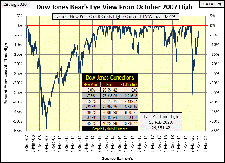
Our recovery from the March 23rd -37.05% market bottom has taken less than six months in the BEV chart above. From the red line marking a 37% market decline, when the Dow Jones passed above this level in July 2009, it took four years (March 2013) before it saw a new BEV Zero in the chart above.
The Dow Jones’ March to August 2020 recovery isn’t a record. That honor belongs to the July 1932 to July 1933 advance, where the Dow Jones gained 163% in only twelve months. But comparing the decline and recovery from 2007 to 2013 with our decline and recovery, it’s apparent our decline and recovery has been greatly compressed in time.
Let’s look at my comparison between our Dow Jones bear market with the Great Depression’s below. The September to November 1929 market crash (Blue Plot) was breadth taking. In fifty-one NYSE trading sessions, the Dow broke below its BEV -37% level, but our market decline (Red Plot) took only twenty-seven NYSE trading sessions to break below its -37% level.
At today’s close, the Dow Jones is now on day #138 after its February top, and is only 3.04% from making a new all-time high after a 37% market decline – simply amazing!
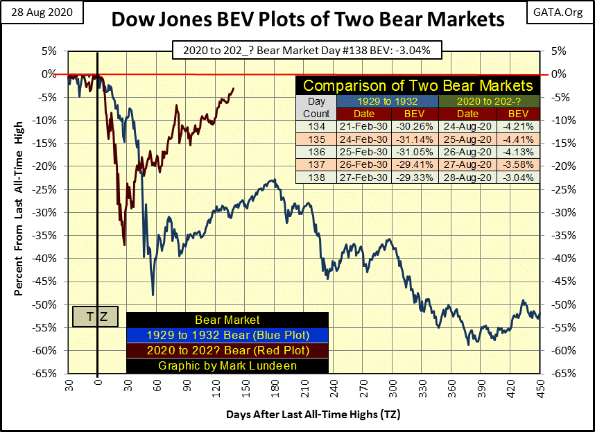
So, what’s the point to all this? I’d say we’re looking at a tug-of-war between the FOMC and Mr Bear in these Dow Jones BEV charts. Last February the stock market was so overvalued it took only twenty-seven days for the Dow Jones to collapse 37%.
That’s a frightening thought.
Since the March 23rd bottom the FOMC has “injected” $2.44 trillion into the market to “stabilize market valuations”, with $166 bil of that in just the past six weeks. In other words, the stock market today is more overvalued than it was last February. How could it not be when we see the flood of “liquidity” the FOMC has “injected” into the financial system since February in the chart below?
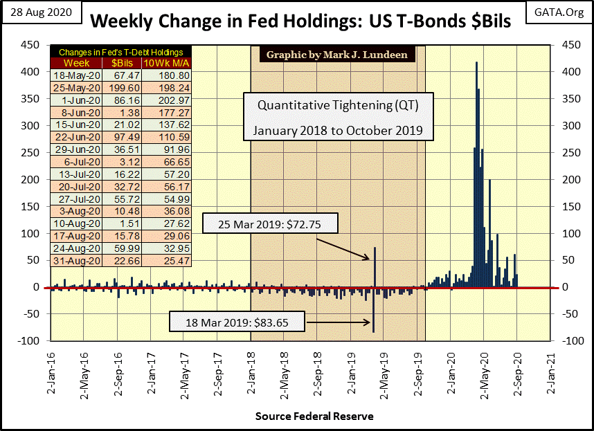
How is all this going to end? Ultimately it won’t be good for retail investors when all that “liquidity” comes flooding out of market valuations. Maybe not next week, but in a yet to be known week to come all hell is going to break lose in the stock and bond markets. But who knows exactly when the reality of bloated, unstainable valuations once again re-exerts itself on the public in a market collapse?
As it is, the major market indexes I follow are finally making new all-time highs (BEV Zeros) in the table below, so maybe not anytime soon. Again, look at the chart above at the weekly FOMC “injections” of “liquidity” into the financial system. How much time has this monetary inflation from our central bank purchased for the bulls?
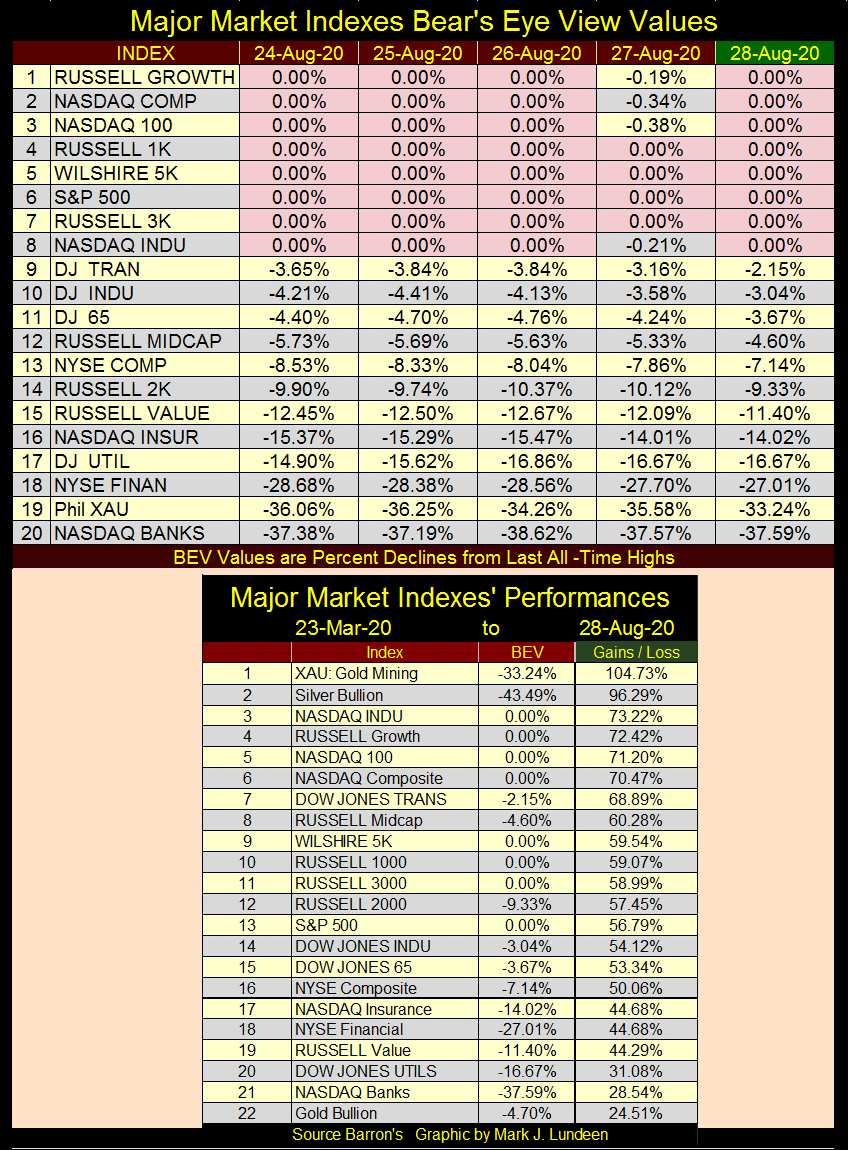
Keep in mind that in the Bear’s Eye View format (BEV), every new all-time high is worth only a 0.00% to Mr Bear, as they are all Big-Fat Zeros to him. All Mr Bear cares about BEV Zeros is how large a percentage claw back he can take from them.
This past week I see the S&P-500 (#6) made five new all-time highs in the table above, but the NYSE’s daily new 52Wk highs typically are under 100, and have been for months. How can an index constructed with 500 companies see five new all-time highs with so few NYSE 52Wk Highs?
Decades ago, market watchers complained the Dow Jones, a mathematical average of market valuations for thirty huge, dividend paying blue chip stocks, wasn’t an accurate measure of the broad market. At the time IBM’s huge valuation distorted the impact of the other twenty-nine stocks in the average. This was when the S&P 500, an index of the 500 largest stocks’ market capitalization became popular.
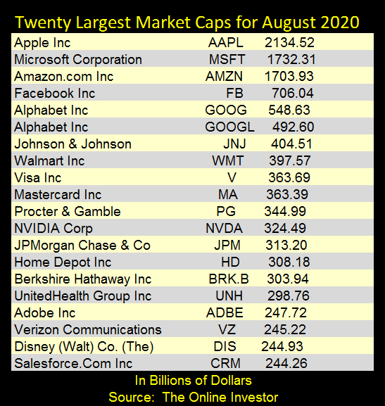
Today it’s the S&P 500 that is being distorted by a few companies’ market capitalization;
- Apple: $2.13 trillion
- Microsoft: $1.73 trillion
- Amazon: $1.70 trillion
Trillion dollar market caps are a post Quantitative Easing phenomenon. Here’s a table listing the top 20 market caps for August 2020. Number 20 is only $244 billion, so you can imagine #300 in the S&P 500 is much less than that, and has little impact on the index.
In the summer of 2020, where the top three tech giants go, there goes the S&P 500. I also suspect these top three companies are also ground zero for “liquidity injections” for the FOMC, while companies farther down in the S&P 500 have to manage their market caps as best they can on their own.
With or without FOMC market manipulation, this is how big market advances evolve; from a big-bear market bottom almost everything takes off. But as the advance matures weaker companies begin falling behind. As the advance comes to its end point, most of the companies in the market have already begun their bear market as just a few companies continue advancing, until the day comes when Mr Bear comes for them too; that’s what’s called the market top.
Looking at market advances (two tables above), the XAU gold mining index remains the top performer since the Dow Jones’ March 23rd bottom, with silver bullion coming in at #2.
The XAU began in 1983, but I have Barron’s Gold Mining Index (BGMI) data going back to 1920. Barron’s began publishing this data in 1938, but a good friend of mine, Goeff, made the effort to obtain Homestake Mining data going back to January 1920, so I could push my BGMI data back to that date.
Thanks Geoff!
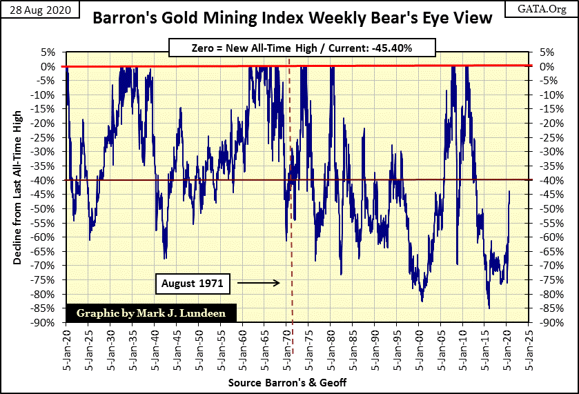
BGMI consists of weekly closing prices, calculated on Thursday’s closing. It’s a real antique from the Depression era, but thanks to Goeff it goes way back to before the Great Crash. So let’s take a look at it to see what it says about the gold miners in good and bad times. First a Bear’s Eye View of the BGMI going back to 1920.
Gold mining is a volatile market sector, but after August 1971 the volatility had become insane. Its deepest bear market bottom happened in January 2016, an 85% market decline from its April 2011 BEV Zero. The market remembers things like this. The residual pain from a five year, 85% market crash is good for people like us as it provides a low risk and very profitable entry point into the gold mining sector. And we are still very early into this move.
Note the BGMI’s impressive advance off its January 2016 bottom. Most market commentators and investors now currently focusing on the social media and high tech stocks could not care less. This too shall pass.
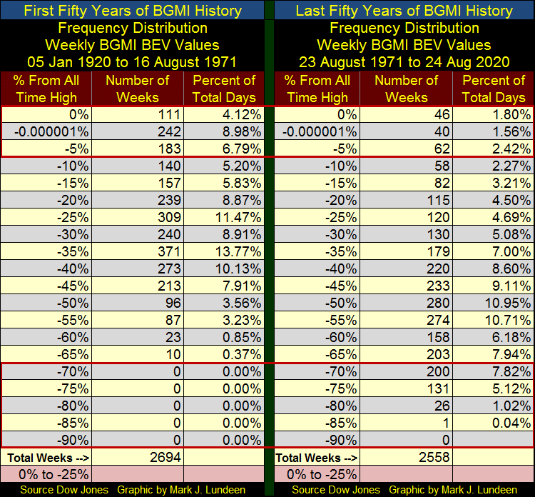
Here’s a frequency table for the BGMI BEV data plotted above, which is weekly data. In the past 100 years, the BGMI has only made 157 new weekly all-time highs, or 5.92% of its 5252 weekly data points. That’s not much. This strongly suggests that post August 1971, when investors saw the BGMI at a new all-time high, the best thing they could do was to sell. This was especially true after 2000 with the start of our current bull market in gold and silver.
But those were the bad old days. This time should be different as there are trillions of dollars of flight capital coming towards precious metals assets when Mr Bear begins deflating the financial markets. Try as they might, at some point in their tug-of-war with Mr Bear, the FOMC will be forced to surrender and watch helplessly from the sideline as Mr Bear deflates their market bubble. It’s going to happen!
My next chart contains the indexed plots of the BGMI (Blue Plot), Dow Jones (Red Plot) and Currency in Circulation (Green Plot / CinC) with January 1920 = 1.00.
Looking at the Dow Jones and CinC; the only time the Dow Jones exceeded the rate of inflation (as measured by the expansion of CinC) was during the Roaring 1920s bull market. The Dow Jones came close to exceeding CinC in 1966, but couldn’t do it. Since then the Dow Jones has failed to exceed the expansion in CinC. So, investor capital gains may have also been inflation adjusted losses from which the IRS expects them to pay capital gains taxes on. That sounds about right.
The BGMI’s first post 1920 bull market happened during the depressing 1930s. This bull market in gold mining actually exceeded the gains the Dow Jones saw in the 1920s and lasted longer as seen in the insert in the chart below.
The BGMI exceeded CinC once again in the 1960s, and would remain above the rate of monetary inflation until the 1990s, though the gold miners were a volatile market sector that most investors found difficult profit from. Still, in the chart below you can see the BGMI remained above the rate of inflation from 1965 to the 1990s, a time the Dow Jones remained far below the green CinC plot. Still after 1980, gold mining was in a bear market, but a bear market whose valuation didn’t decline below the rate of CinC inflation until 1991; strange but true.
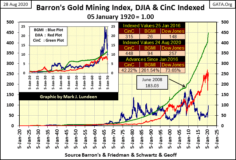
The Dow Jones almost exceeded CinC’s rate of inflation in January 2000, but then began a bear market as the NASDAQ High Tech bull market turned into a bust. It again attempted to rise up to the CinC rate of inflation in 2007 during the sub-prime mortgage bull market, but failed to come as close to the rising CinC plot as it did in 2000.
The Dow Jones latest attempt to exceed CinC inflation was early this year, but CinC expansion was far above the advancing Dow Jones. Should the Dow Jones see new all-time highs in the weeks and months to come, it will be yet one more attempt for it to rise up to the rate of CinC inflation seen in the chart above.
As the last time advances in the Dow Jones exceeded CinC inflation was in the 1920s, a hundred years ago, I don’t see this happening again anytime soon. In terms of CinC inflation, the stock market isn’t compensating investors for the risks they take on, such as the loss of purchasing power in the dollars their capital gains and losses are denominated in.
Now look at the BGMI (Blue Plot); twice since 2000 the gold miners have made a good effort to exceed the rate of inflation, as seen in the ever rising green CinC plot; once in 2008 and again in 2011. And now it appears the BGMI is making its third post 2000 attempt on CinC. For the BGMI to catch up to CinC in the chart above, it would have to increase to 4,200 from last week’s 876, an increase of 379%. Is the BGMI capable of this? I think it is and much more.
I inserted a table of Indexed Values from the data plotted in the chart above. The first data set is from Barron’s 25 January 2016 issue when the BGMI saw its post 2011 bottom, the next is from Barron’s 24 August 2020 issue (last week’s data). Since January 2016 the BGMI has advanced 262% as CinC inflation has expanded by only 42%. Since January 2016, the BGMI has increased at a rate that is considerable higher than the rate of CinC inflation, with no fanfare from the financial media.
I’ve studied this data set for a long time, and as I read it I’m of the mind that once again the BGMI is making a run on the green CinC plot. The gold miners have done it before and they’ll do it again! The big question is whether the BGMI exceeds the CinC’s plot before or after Apple, Microsoft and Amazon deflate below a $1 trillion dollar market cap.
Can you imagine what gold, silver and their miners will do with a few trillion dollars of flight capital fleeing deflation from just these three companies’ market caps? What flight capital searches for is inflation, aka another bull market far away from the deflating bear market it’s fleeing from. The current bull market in precious metals is going to be historic!
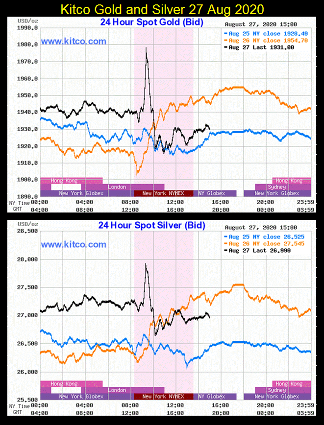
Gold did well this week, closing within scoring position in its BEV chart below. One thing we should all note is the failure of the bears to force gold to correct by double digits. They came close on August 11th when gold closed down 8.37% from its last all-time high on August 6th. See gold’s step sum table below for specifics.
The following charts, courtesy of Kitco.com, illustrate the problem the gold & silver bears are now having. Look at gold and silver market action on Thursday (Black Plot). Gold advanced just short of $1980 and silver to $28 in early trading, and as expected they then got whacked as the day went on. Gold declined below $1920 ($60 or a 3% decline). From just short of $28, silver almost broke below $26.6 ($1.4 or a 5% decline).
But that was Thursday. By Friday’s close gold and silver made up most of these losses;
- Gold: $1964.58;
- Silver: $27.52.
This is a huge difference in the trading patterns of these markets; where once gold and silver got whacked, they stayed whacked for weeks, months and maybe years. Seeing them recover as they did last week, in just a single day is a big change that promises better things to come for us bulls.
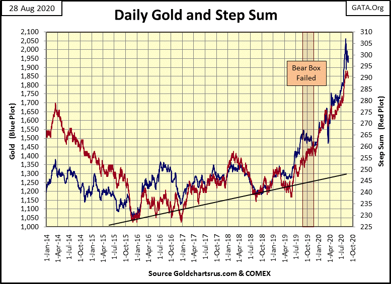
Gold’s step sum chart below remains very positive. And why not? Look at market reality (Blue Plot / the price of gold) and market sentiment (Red Plot / step sum) collapse from April 2014 down to a very hard bottom twenty months later in December 2015. This hard bottom flushed out any remaining weak hands in the market from gold’s August 2011 top. From such bottoms, big bull markets spring from.
From this point on (December 2015) gold and its step sum began their recovery, which really took off in June 2019 as gold for the first time in six years broke above, and stayed above its $1360 line, and hasn’t looked back since. The remaining months of 2020 should be good for the gold bulls.
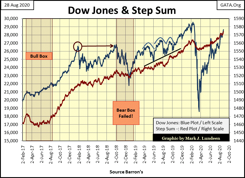
I’m going to skip the commentary on the step sum chart for the Dow Jones as nothing seems to change in it. Yes I’ve just pointed out how quickly the Dow Jones has declined and recovered in 2020. This market action is historic. But I can’t help it as this chart and the stock market in general just bores me to no end. Still, it remains a bullish chart for the bulls running wild and free on Wall Street.
Looking at gold’s step sum table below, I note gold’s deepest correction from its August 6th high was only three trading sessions later when it closed at $1888.82. FYI: the previous all-time high from August 2011 was $1888, so gold bounced off of its last all-time high of August 2011, which I take as significant.
Gold also saw a 15 count of -3 on Thursday this week, which is a far cry from the +13 it saw on August 3rd. The 15 count is a measurement of a market’s state of being overbought or oversold. On August 6th with its 15 count of +13, gold has never been so overbought, so the multitude of down days since then was something to be expected. And seeing gold’s 15 count going negative this week is a welcomed development, as the gold market is no longer overbought and ready to once again advance into new all-time highs.
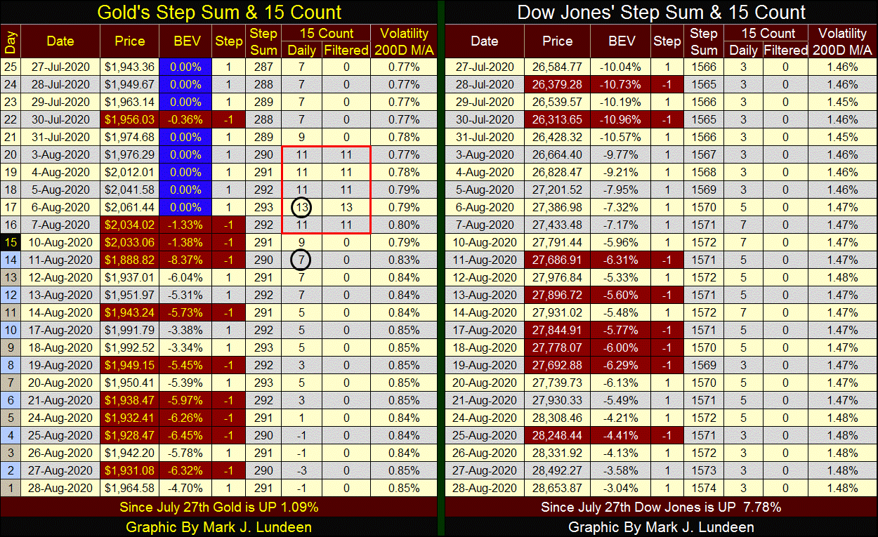
You think not? Look at this; after all this selling from gold’s August 6th top, gold at Friday’s close is still up by 1.09% from its July 27th close, which at the time was a new all-time high, and only 4.70% from its August 6th bull market top. After all those post August 6th daily declines, the bears didn’t get much done for all their efforts.
What happens when the bulls begin pushing back? I expect by the end of September we’ll see something exciting happening with gold, silver and the mining shares.
Mark J. Lundeen
********


