Part IV: When Inflation And Deflation Clash
 share
share
 share
share
 share
share
 share
share
 share
share
Before we move on to the HUI Fractal work, I thought we’d dedicate some time to considering how the investment climate might look from different perspectives in hopes of getting an idea of what investors might be thinking. Just how are investors viewing the discussion of inflation versus deflation? In Part I we discussed some of the fundamentals driving the Historical Precious Metals Bull. In Part II we introduced our Silver Momentum Fractal Chart that shows the upside potential into May or June of this year. In Part III we reintroduced our long-term Gold Fractal work and introduced the concept of what fractals are.
PART I- REVIEW
www.gold-eagle.com/editorials_08/goldrunner021008.html
PART II- SILVER MOMENTUM
www.gold-eagle.com/editorials_08/goldrunner021608.html
PART III- LONG-TERM FRACTAL GOLD
https://www.gold-eagle.com/editorials_08/goldrunner022308.html
A Few Loose Ends
In the first three Parts we discussed the massive deflationary backdrop resulting from the massive debt buildup at all levels of society that creates this K-Winter economic climate. Such an environment resulted in the Deflationary Depression in 1929, but the Fed has elected to try something different this time- to inflate the US Dollar by printing large numbers of dollar bills. The increased supply of Dollars forces a drop in the value of the Dollar as each dollar is worth less. This US Dollar printing comes under the heading of Monetary Policy along with the setting of interest rates. The idea is to try to neutralize the deflation with inflation, and the most likely result will be Stagflation; where the economy remains weak, but inflation increases to some higher level. As inflation rises, your US Dollar buys less so investors move investment money into Gold and Silver to protect their savings. Since Gold rises as investors seek Gold as a safe haven to protect the value of their savings, Gold takes on the role of money- what we might call Real Money since Gold has been seen as the ultimate form of money in times of paper crisis for thousands of years.
Since Gold and Silver as Real Money are the only true alternatives to paper currency and paper investments, and since Gold rises in times of inflation, the Fed and Friends might prefer to see Gold rise slowly in this environment. Too rapid of a rise for the Precious Metals might start a momentum move that would grow on itself as more liquidity would be attracted to Gold and suck a lot of liquidity out of the general markets and the Bond markets. We have touched on some of the ways that the Fed might use to manage the markets. For instance, it appears to me that the Friends of the Fed have been shorting Gold into natural resistance areas on the chart to help prevent Gold from rising too high too fast, and as a mechanism to flush liquidity back into the general markets and into Bonds. The Fed can print Dollars and provide liquidity to the markets, but the Fed cannot control where the liquidity goes. Thus they might be motivated to attempt to manage the movement of liquidity.
I prefer to call these attempts “market management” because I think it is healthier for investors to realize that they must deal with the condition of the market. There are groups who prefer to call the above “market manipulation” because they feel that the management is too heavy handed, and that a market should be completely free. One such group is the GATA organization. GATA has done some wonderful work in exposing how the Gold Market is not free to act as the Real Money alternative to paper currency. If you would like to read about their work, you can go to the following link. Some of my favorite market contributors are members of GATA.
In reality a managed market can only be managed to a certain point. The clear trend of a market like the Bullish Trend of Gold cannot be reversed, it can only be suppressed in price or delayed in time, and then only in the direction that the fundamentals support the price movement. Also, if suppression of price is administered, the result will usually be a larger resultant move in the direction of trend than would have happened without the suppression.
Reality, or Smoke And Mirrors
The effect of the falling value of the US Dollar affects the value of an investor’s savings in the US. If an investor looks at the bottom line of his portfolio he might see that the total is higher than in 2000, but he must realize that each dollar is worth less since the US Dollar has dropped in value, thus each Dollar will buy less. Still, the average US investor looks at his stock value as represented by the Dow and sees the below chart.

http://aycu28.webshots.com/image/45507/2004501381623677571_rs.jpg
Jim, pls do same with all succeeding charts
To the average investor this chart that represents the value of his savings as invested in Dow stocks might look pretty good, but is it truly representative of the performance of his savings? It shows that his investment is now 6 times higher than the low in 1990, and is still above the 2000 top. He might be wondering what all this hubbub is about in terms of deflation and inflation. His investment numbers are up, right?. But what if he was willing to go a step further to try to find out how his Dow investments have faired after inflation is taken into account. Well, he might look at the Dow as displayed in the two charts, below. The first is the Dow divided by Real Money Gold, instead of the Dow divided by the dwindling Dollar as in the chart, above.
http://aycu29.webshots.com/image/44588/2005110868144057763_rs.jpg
Yikes, suddenly the Dow investor might start to get a bit of a queasy feeling in his gut. When priced in Real Money Gold his portfolio has DROPPED about 72.3% from the 2000 high. How about the Dow compared to an index of inflation as seen in the old CRB index, the CCI?
http://aycu02.webshots.com/image/45561/2005878195785836352_rs.jpg
Well, more queasiness as the Dow has lost about 63% from the 2000 top against this indicator of inflation. Well, how has the Dow done against a widely viewed index of the Gold stocks, the HUI?
http://aycu10.webshots.com/image/44569/2002798983766796218_rs.jpg
Better call “Code Blue”, for the Dow has fallen against the HUI by 91.4%, but that is not a real loss, is it? Well, it depends on how you look at it. The HUI is up from its bottom at 35 in 2000. So, the HUI has risen 1,326% while the Dow has risen about 5% above its 2000 highs. Yet, since the value of the US Dollar has dropped precipitously, the Dow will not buy as much, today, as it did in 2000. The real truth is that anybody invested in the general stock markets as represented by the Dow, has been losing the value of his savings to inflation.
The Fed and Friends might be managing the price of Gold and the price of the Gold stocks, but the PM sector has seemingly outperformed the Dow by a wide margin. The average investor looks at the chart of the Dow and sees strength, but he does not see the value of his portfolio crashing against inflation- yet it has. The buying power of his savings is running down the inflation drain. Thus, there is another aspect to market management. Almost all forms of market management are really directed at the psychology of investors. Many aspects of managed markets are aimed at the investor’s perception of the markets.
An investor makes his investing decisions based on how he perceives the investment. If he only looks at a chart of the Dow in isolation, he might be missing the big picture. Would investors be sitting in Dow stocks if they saw the Dow to Gold chart? I don’t think so, thus our investment view needs to constantly be compared to other reference points to gain a proper perspective of the markets. To that end, the Fed and Friends do not make it easy. They use substitution and hedonic adjustments to make the major inflation indicator, the CPI, look much tamer than it really is. They inflate the US Dollar and provide liquidity to the markets, but the US Dollar inflation destruction is not visible in the Dow chart.
Thus, the true extent of the effects of Dollar inflation will not easily be seen by investors. US Dollar inflation will eventually be seen in terms of price inflation, but there is a lag. The inflation indicators like the CPI have been altered as suggested, above, and the M3 numbers are rocketing up the chart, but they have been removed from view. So, investors watch television, read the newspaper, or listen to the radio; and mostly what they see is the massive amount of deflationary news coming out. They do not easily get a proper feel for the inflation that is eating away at their life’s savings, and worse yet, they might become scared that PM Stocks will fall along with general stocks due to deflationary forces. But is that a realistic expectation? I do not think so. To have a truly deflationary landscape we should be seeing prices falling all around us. Yet, we look on the grocery shelves and see price rising. We look at the price of gasoline, and we see prices rising. We look at the charts of Wheat, or Beans, or Corn, and we see prices rising.
The Two Inflations
In Part III on Long-term Fractal Gold, we developed our case for US Dollar inflation as the real driving force behind today’s market movements in the PM Sector. US Dollar inflation simply means that many US Dollars are being printed in paper or electric form so the US Dollar supply is increasing, or being “inflated.” Let’s take a look at a chart of the US Dollar to see how it is dropping in value. This chart was originally done in early 2007, and it suggests that the US Dollar might be headed to around 63, next. We certainly see a clear downtrend that has no suggestion of ending anytime, soon.
http://aycu36.webshots.com/image/44835/2003315831764103551_rs.jpg
Gold is considered an inflation indicator because it smells out inflation as measured by US Dollar inflation at its inception. So, we would expect Gold to start to bottom at the same time that the USD inflation starts. Below we have a chart of the Grains Index with smaller charts of the USD, Gold, and the HUI at the bottom.
http://aycu10.webshots.com/image/46369/2000883277177160098_rs.jpg
As noted on the chart, we see Gold and the HUI bottomed around the time that the US Dollar topped in late 2000/ early 2001. This began the “Phase I” rise in Gold and the HUI that would be equivalent to Wave I in Elliot Wave terms. Even before the second top in the USD in late 2006, the HUI and Gold began a more vertical rise into Phase II, the equivalent of Wave III in Elliot Wave terms- just before the Grains began to bottom and rise aggressively. This Phase II ushered in the early commodity wave of price inflation as a result of US Dollar Inflation- the expanse of Dollars chasing something real. The final Phase III rise of Gold that will be the Wave V more aggressive parabolic rise will start later as many more investors become aware of price inflation. That will occur when the commodity inflation rolls through the system to cause more rapid price inflation of finished goods. Over the coming months, the price rises in oil, base metals, and grains will move through the pricing system to reach the price of finished goods. That will cause investors to rush to the Precious Metals in a real panic. Do you remember the chart of the Dow crashing against inflation and the chart of the Dow crashing against Gold? That is just the beginning of US Dollar inflation eating up the savings of the uninformed. Better get your Precious Metals while you can because, “You Ain’t Seen Nothing, Yet.”
The Precious Metals Investor And Inflation
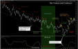
Let’s return to the Silver Momentum Fractal Chart I showed in Part II. At the time the price of Silver was butting its head up against the angled blue line. Above that blue line things get pretty vertical for Silver. Today, Silver busted through the blue line rather aggressively. We might see some consolidation above that line like we did in the last momentum run in Silver, but Silver is headed much higher. I’ll need to move to the long-term charts to see if I think that the $26 to $27 level will hold the price advance over the coming months. Crossing the blue angled line is a warning of the Silver verticality to come.
http://aycu11.webshots.com/image/45930/2004274805958085779_rs.jpg
Below, is the chart of Gold I showed in Part III. As I am completing this editorial around 3 AM on early Wednesday morning, $Gold is breaking out over $960 on its way to (in my opinion) $1130, then on to around $1250. I’ll have to go to longer-term charts to see what the possibility of Gold spiking higher might be, but I believe there is a Gann number around 1437, also. In the chart, below, I have included smaller charts of Silver and the HUI at the bottom. The chart of the HUI shows many of the same price movement characteristics as the charts of $Plat, $Gold, and $Silver. Thus, I expect the HUI to bust upward very, very soon. I’d expect the above resistance zones to come in around 550, then from 600 to 640, with an ultimate target in this run to between 735 and 780. If things get wild enough, and the HUI moves above 780, then the top of the channel would come into play. That would be something.
http://aycu17.webshots.com/image/43616/2005592637273866956_rs.jpg
So, what about the PM stocks? Why are they trailing the price rises in Gold and in Silver? Well, if you look at the conversations on all of the sites where PM investors congregate most of the talk has been about the deflationary news coming out over the airwaves regarding the general markets. PM investors are very concerned about deflation causing a crash in the general markets and taking the PM stocks with them. If the PM investors are concerned, you know that “normal” investors would be afraid of moving investment money to the PM stocks. Yet, I think investors are missing the general stock market crashing right in front of their eyes. The crash will not be a deflationary design because of the massive US Dollar inflation that is expanding out into price inflation as described, above. The real stock market crash is ongoing in terms of general stocks and investment paper, all crashing against inflation. I think investors will hit a “recognition point” very soon that will send the PM stocks into orbit as they realize just how far the fundamentals have run ahead of the PM stocks.
I hope to return this weekend to discuss charts of the HUI Index, along with the fractal relationship of the HUI movement compared to that of the Dow. I will be moving my work to a subscription site in about a month. Rather than write a newsletter on a weekly basis, I will be able to add information to the site as I wish, and the information will be available within minutes of when I produce it. The time saved in the process should allow us to consider more aspects of investing including a lot more charts of individual PM companies. I’d like to thank the many readers who have written to me with comments. We are compiling an e-mail list of those who have written to request that we contact them when the site is ready. We can be reached at [email protected].
For the moment…………..Goldrunner.
Below, is the link to the Gold-Eagle Forum where many of us discuss the various topics of the Precious Metals sector………..
https://www.gold-eagle.com/cgi-bin/gn/get/forum.html.
Again, I’d like to thank all of the posters at the Gold-Eagle Forum for their daily input. This thank you is especially extended to TQ and to Grininbarrett who have positively affected my growth over the years. Special thanks go to Dr. Vronsky and Westerman for creating the Gold-Eagle site and for editing my work. A very special “Congratulations” go out to Dr. Vronsky and Westerman after Gold-Eagle saw its hit counter ring up to 281 million this last week.
Thanks also go out to CaptainHook and David Petch of TreasureChests since I have learned so much from them. They offer a wide diversity of fundamental and technical information and can be found at
http://treasurechestsinfo.com/Nuke/
There are many great editorials that can be found on the Gold-Eagle site at the following link. Master David Petch from TreasureChests is one contributor…….
https://www.gold-eagle.com/research/petchndx.html
Here is the link to a site I use to research the warrants of Precious Metals stocks. I will be discussing some aspects of the leveraged use of warrants later in this editorial series.
http://preciousmetalswarrants.com/
E-mail contact:
share
share
share
share
share