Same Old, Same Old Crummy Market
Last week was a frustrating one for me. I had to reconstruct, from scratch, an important and frequently used file in Excel. I like what Excel does for me, but it has some really annoying quirks in it that somehow never get corrected with every new upgrade of Windows.
Also, midweek the Upper Midwest had a huge electrical storm that knocked power out of large areas of the state, including my home for over a day. So, due to circumstances beyond my control; acts of God and crappy software from Microsoft, this week’s article will be an abbreviated one.
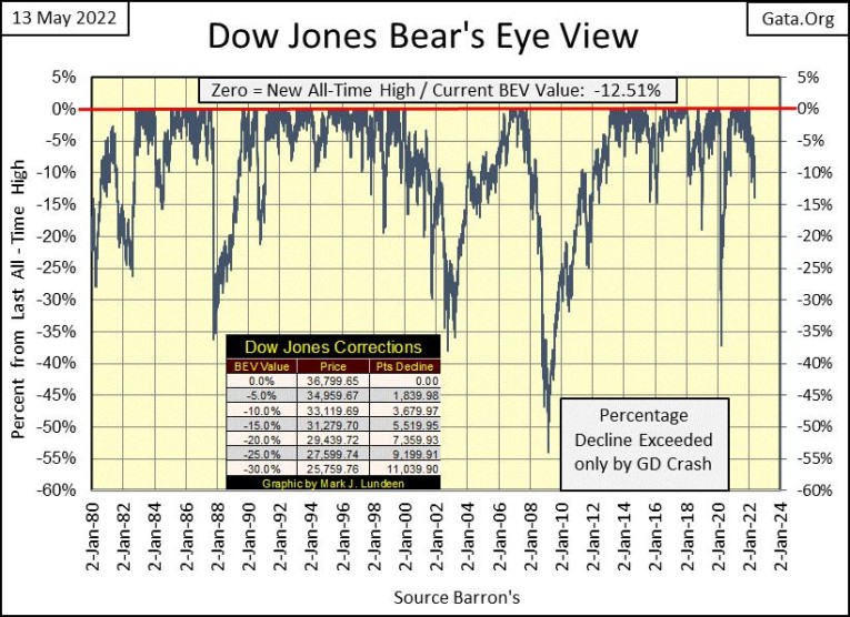
The Dow Jones’ BEV chart below came from my newly reconstructed file on Dow Jones volatility, and it looks pretty good. The chart that is. As for what it tells us about the Dow Jones, we’ll have to wait to see. Ignoring the March 2020 -37% Flash Crash, in December 2018 the Dow Jones made an attempt for its BEV -20% line, deflating to -18.77% at the decline’s bottom. The Dow Jones then reversed directions, and went on to making new all-time highs. Could this happen again? Anything can happen in the market.
I’m a bear, and the market doesn’t care much, if anything of what I think is going to happen to the Dow Jones, my proxy for the broad stock market. So, with these Bear’s Eye View (BEV) charts, I like to think in terms of this or that.
Should the Dow Jones next go up, and cross its BEV -10% line, I won’t become a bull, but how committed should I be to Mr Bear’s beardom? However, should the next BEV line the Dow Jones crosses, its BEV -15% line, I’m thinking us bears are pretty smart fellas, and begin looking really hard at the Dow Jones’ BEV -20% line.
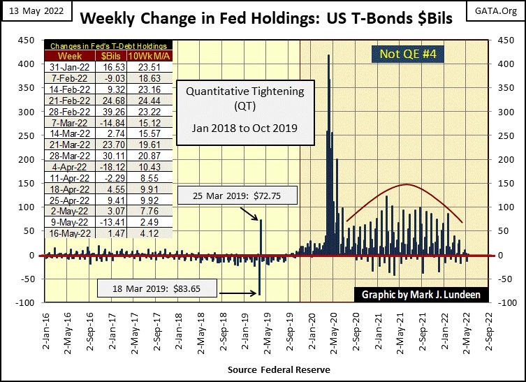
One factor we bears have going for us is “monetary policy.” So far, the idiot savants at the FOMC appear to be sincere; that they are going to sell off a large portion of their holdings of T-debt, and mortgages, beginning in June, a few weeks from now.
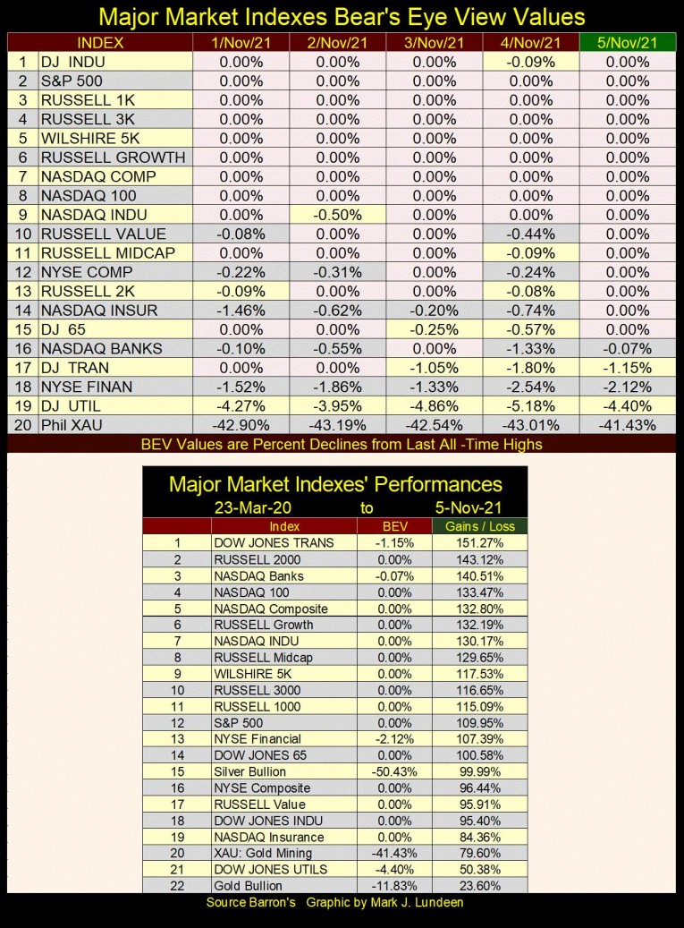
They made their intensions public a few months ago; I think in March. Looking at the data in the table from last November below, as well as the BEV chart above, March was when the they began reducing their maintenance “injections” of “liquidity” to Wall Street’s credit junkies.
This March was also when the major indexes I follow, began to seriously deflate from their last all-time highs seen earlier this year. Not long ago, in the first week of November, all of the big market indexes were either at new all-time highs, or in scoring position, or a few percent away from making a new all-time high. In the table below from last November, note all those BEV Zeros, new all-time highs, and indexes in scoring position (BEVs of 0.01% to 4.99%) during the first week of November 2021 below.
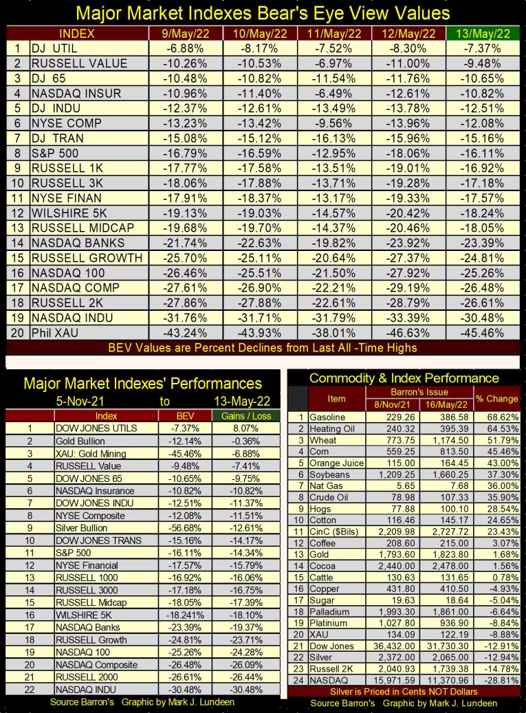
The advances off the lows of March 2020, seen in the table above are now a thing from the past. In this weeks’ table of Major Market Indexes BEV values, below, the thing to now note are the market’s declines from November 2021.
What the market will look like when the idiots do begin selling their holdings of debt; T-debt, mortgages and most likely corporate bonds too by the tens-of-billions each month into the open market? One can only guess. But based on the market’s reaction to the reduction of maintenance “injections” since March (chart and table below), I’m anticipating some big moves to the downside before we see the first of September.
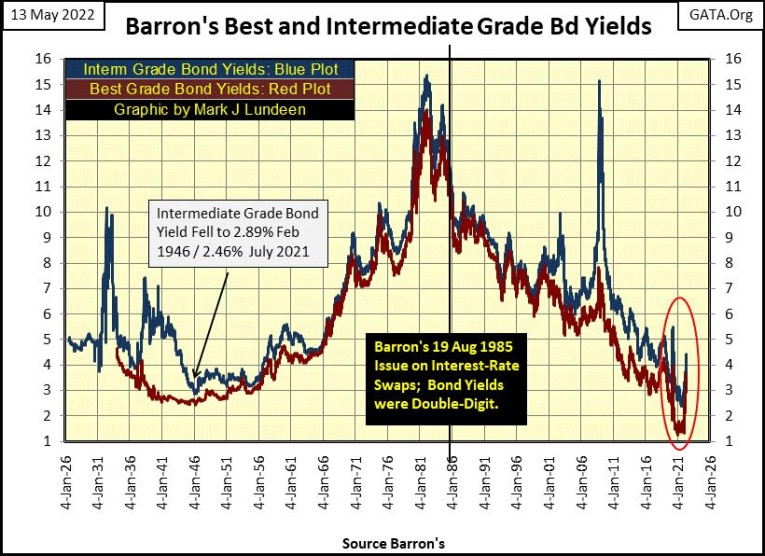
This week, I reviewed some of my recent articles. I do that now and then to see if I caught the trends in the markets. I’ve covered the bond market’s problem with rising yields (deflating valuation) in some detail. I don’t own any bonds, but they are important. The massive bull market seen at the New York Stock Exchange and the NASDAQ, didn’t happen in a vacuum, but in an environment of declining bond yields since 1981.
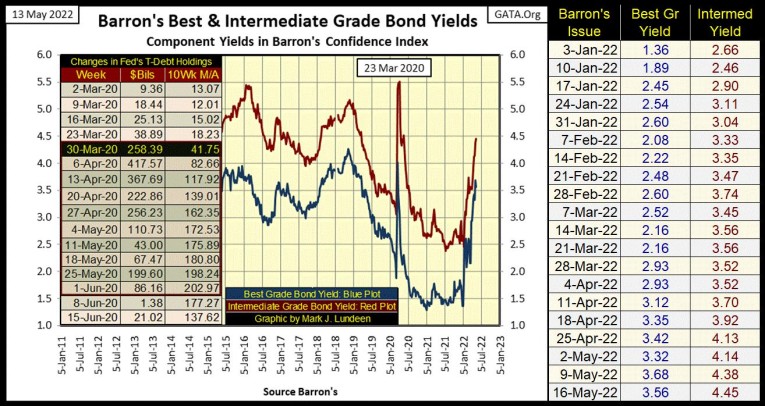
Looking at my bond yield data, (below), the bottom in the bond yields happened sometime between August 2020 (T-Debt) to late 2021 (Corp Bonds), depending on the market. Due to the difficulties the markets are having dealing with rising consumer prices, forward thinking people must anticipate rising bond yields (deflating bond valuations) as the debt market’s response to the FOMC’s monetary inflation now flowing into consumer prices.
Historically speaking, eras of rising bond yields and CPI inflation are not eras where bulls in Wall Street have prospered. Due to rising consumer prices, how much longer before we see bond yields in the double-digits, back where they were in the late 1970s and early 1980s? I had to buy a battery for a car this week; $200! I went somewhere else to compare prices; $200 there too! Batteries, I remembered used to go for about $50; apparently not anymore.
Before the stock market sees a bottom, there will be plenty more sticker shocks we consumers will have to deal with.
Below, let’s look at a shorter-term chart of these two plots above.
Since the first of the year, these yields have done only one thing; rise. It’s in the nature of markets to see relief rallies, short term counter-trends in both bull and bear markets. So, should these yields see a decline in the not-too-distant future, that would only be expected. But that wouldn’t change my bearish, long-term opinion on the bond, and stock markets. The lows in bond yields are in. The path of least resistance for bond yields in the coming years is up.
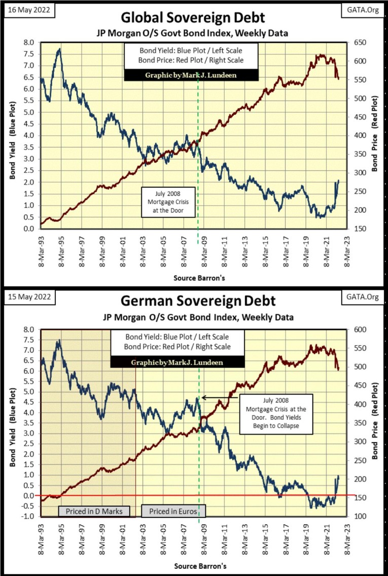
The bond-bear market is global, as seen in the rising yields and deflating valuations below. Yep, starting in late 2021, Mr Bear has been doing his thing worldwide in the debt markets.
Here’s this week’s table listing BEV values to the major stock indexes I follow, some six months after the one I posted above for November 2021. Look at the NASDAQ INDU index (#19). On November 4th of 2021, six months ago it closed at a BEV Zero, a new all-time high. At the close of Thursday this week it had deflated by 33%. That is a big move in only six months.
I’m expecting much more of the same for these indexes in the coming months, as the idiots no longer “inject liquidity”, but begin draining tens-of-billions of dollars of “liquidity”, from the market, month after month with their promised QT.
In the tables above, I have some technical problems with the stock indexes in the right table I have to work out (Russell 2K). The values from one table to the next are different, as the data in the left table is Friday’s close, the right table is Thursday’s close.
But these are little issues compared to the performance difference between the stock market and commodities seen since November 2021. Has a major stock market index ever advanced 50%, or more in only six months as energy and food prices have since last November? The Dow Jones did in January 1933, advancing 56% six months following its Great Depression Crash bottom of July 1932. But it hasn’t done so before, or after January 1933. I doubt any other index has either.
It's going to get worse. Since his first day in office, the usurper Biden has been shutting down oil drilling on Federal Land and off shore leases. Just like his boss, Obama declared war on coal in 2008, these Democrats have declared war on America’s middleclass. Soon, it will be $400 car batteries as far as the eye can see, in a world where people living on fixed income will never see a comparable increase in their monthly income.
Watch them, and you will all know Who They Are; the destroyers of peaceful societies attempting to incite another covid-panic sometime this summer, to once again justify massive mail-in ballots for this ELECTION YEAR. Can the Democrats maneuver the public for a repeat of 2020 election, as seen in Dinesh D’Souza 2000 Mules?
https://finance.yahoo.com/news/2000-mules-becomes-most-successful-160000389.html
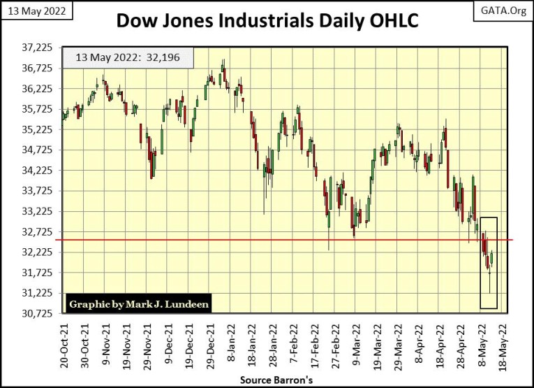
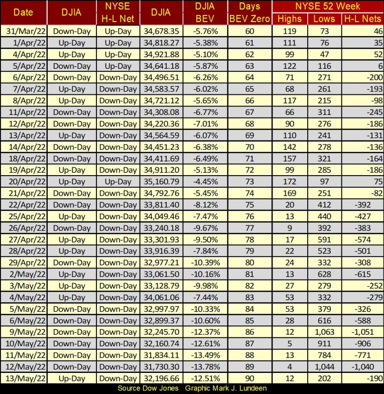
Below is the Dow Jones in daily bars. The line-of-support at 32,600 gave way this week. On its daily low for Thursday, the Dow Jones saw 31,228, making 31,225 our next line-of-support in the chart below. I wish it well, but doubt it will do much against Mr Bear’s relentless deflation of market valuations on full view in this week’s article.
At the NYSE, 52Wk Lows continue dominating 52Wk Highs. On Monday, and again Thursday, the 52Wk H-L Nets netted over 1,000. Normally, I’d say such large negative 52Wk H-L Nets were a sign of a bottom forming, a strong indication that a bounce in the market was due.
But with the idiots’ pending QT coming online in a few weeks, I believe expecting a return to a bull market any time soon would be a big mistake.
Let’s move on to something rare and precious, something like the Silver to Gold Ratio, or how many ounces of silver one ounce of gold could be exchanged for. This week the SGR, below, closed at 85.85 ounces of silver for one ounce of gold. That is historically high, meaning a historically excellent opportunity to favor silver over gold.
But that supposes the SGR is one day destined to decline down to, and then far below its red-40 line. Something the SGR really hasn’t done since the early 1980s.
This week I did a frequency distribution table (freq table) for the SGR going back to 1969. Keep in mind, since 1969 the gold and silver markets have been manipulated by the “policy makers.” Why would a bunch of idiots do such a thing?
Because gold and silver were once money. Paper money way back then was only a debt payable in real money: gold and silver. At a bank, Americans before 1934 could take a paper $20 bill and demand one double-eagle $20 gold coin, or twenty silver dollars. Not anymore. Today, one would have to have over $2000 in paper money to exchange for that same double-eagle $20 gold coin – at a coin shop, not a bank.
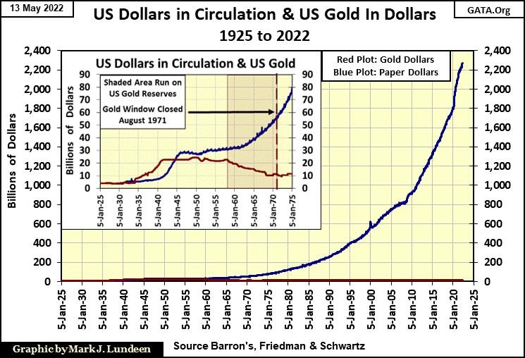
The “policy makers” always understood rising precious metals prices were a failing grade on their management of the supply-of-money in the economy. So, they do all they can to suppress the natural reaction of gold and silver to rise in dollar terms, as the volume of paper dollars circulating in the economy increases. The expansion of paper dollars in circulation (CinC) since 1971, seen below, is obscene, and will one day be reflected in the price of gold and silver.
Anyway, this week’s SGR found itself in the freq table’s 90 row, which contains all the daily SGRs from 90 ounces of silver, down to 80.01 ounces of silver to one ounce of gold. Making silver today a very attractive purchase for those who believe the SGR will once again fall below its 40 line once again. After seeing the vast increase in CinC above, you should too.
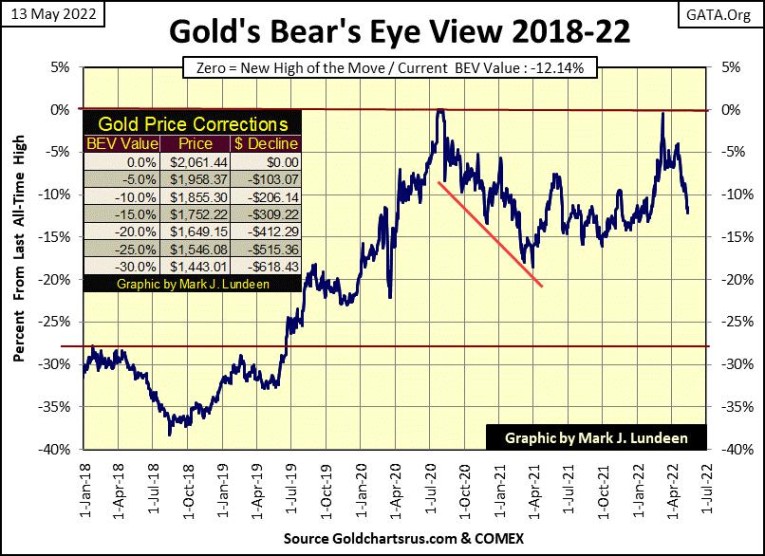
Here’s gold’s BEV chart. Just last March 8th, gold came just a few dollars short of making a new all-time high (BEV Zero) in gold’s BEV chart. Since then, gold, and silver began selling off. How much more can gold go down?
I don’t know that. But I’m not going to sell just because the goons running amuck on the COMEX gold futures floor are allowed by their government regulators to run the longs’ stops in the futures market.
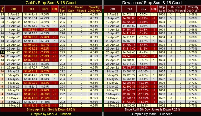
I’m going to end this week’s market comments, except to note how daily volatility for the Dow Jones (below) continues rising, closing the week at 0.75%, on the way to somewhere above the dreaded 1.00% line.
That’s it for this abbreviated week. I’ll be back a week from now.
Mark J. Lundeen
********


