(Some) Commodity Charts Are Breaking Out
 share
share
 share
share
 share
share
 share
share
 share
share
I would like to update some charts for the commodities complex as we are starting to see some action in this sector. Back in the summer months when we first started to get long some of the different commodities sectors, we got many breakouts from some very nice H&S bases. After the initial move up came the first consolidation phase that has been going on for nearly four months or so. We are now starting to see some of these consolidation patterns breaking out which should lead to the next impulse move higher in most cases.
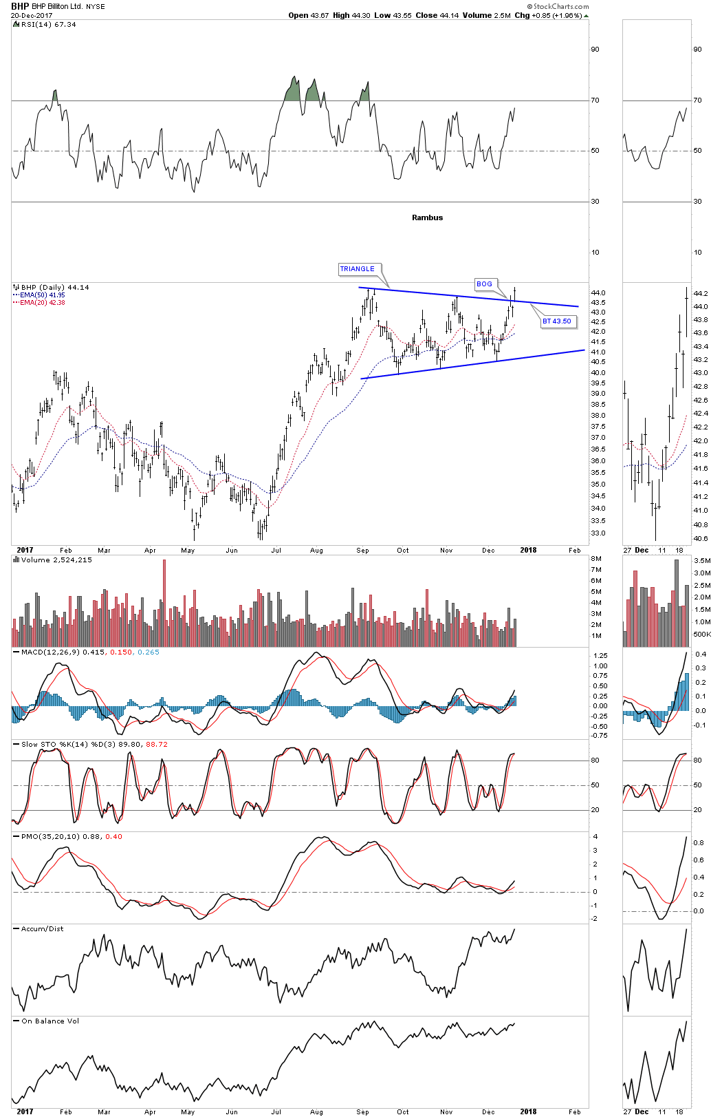
Let’s start with BHP, one of the biggest miners on the planet that shows a good example of where we are at in the bull market. Today the price action broke out with a gap above the top rail of an almost 5 month triangle consolidation pattern. A backtest to the top rail would come in around the 43.50 area.
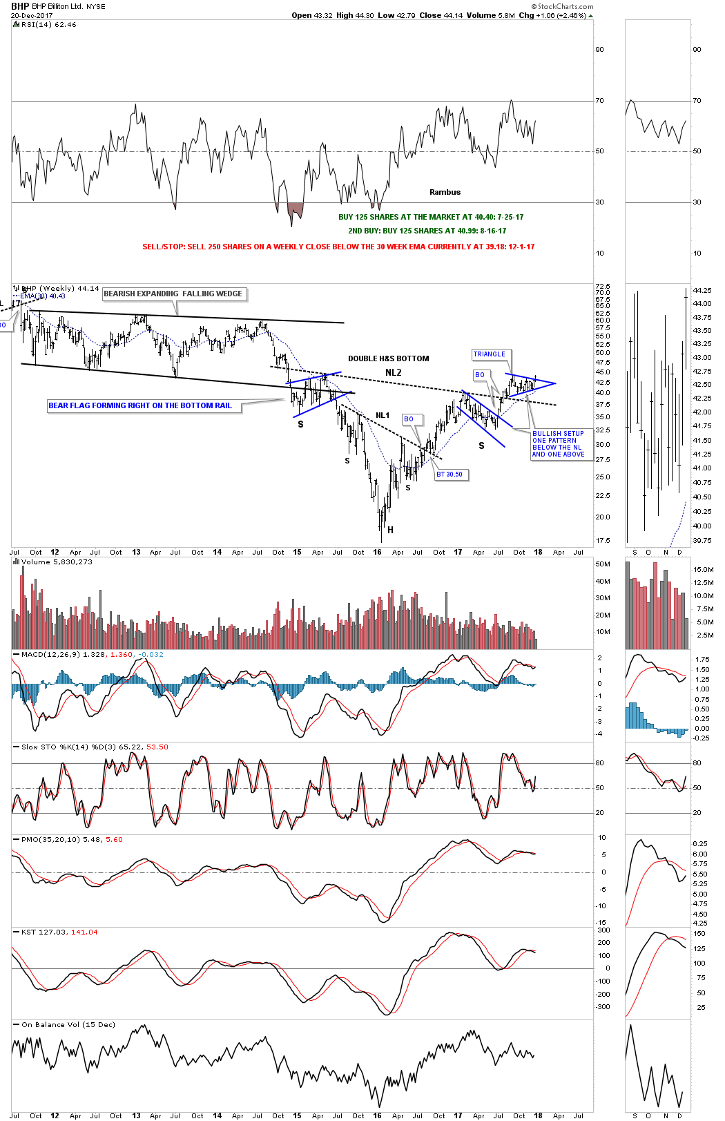
Now let’s look at a long term weekly chart which shows some classic Chartology. We have discussed many times in the past when you see a small consolidation pattern form just below an important trendline, in this case the neckline, and one above, that is usually a very bullish setup which BHP is now showing.
Also keep in mind the size of that double H&S bottom that took three years to buildout. Big patterns lead to big moves. The minimum price objective of that double H&S bottom is measured from the head straight up to the neckline # two. Add that distance to the breakout point to get your minimum price objective.
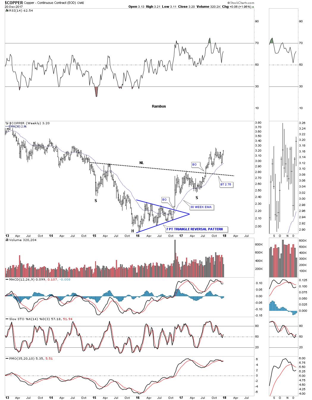
Copper is an important commodity as it can show the strength or weakness of the economy which is why it’s called Dr. Copper. This weekly chart shows copper’s big H&S bottom with the breakout in the summer. The head formed a 7 point triangle reversal pattern which actually reversed the bear market. Here is a case where we didn’t see a backtest to the neckline when the breakout took place. The 30 week ema has done a good job of holding support so far during Coppers new bull market.
This 20 year monthly chart shows how the H&S fits into the very big picture.
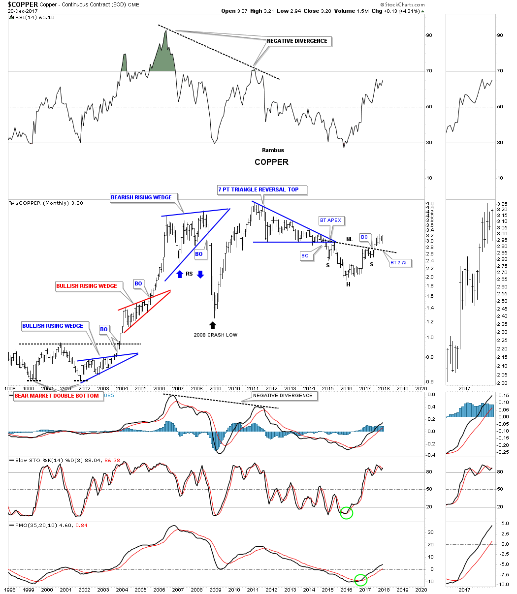
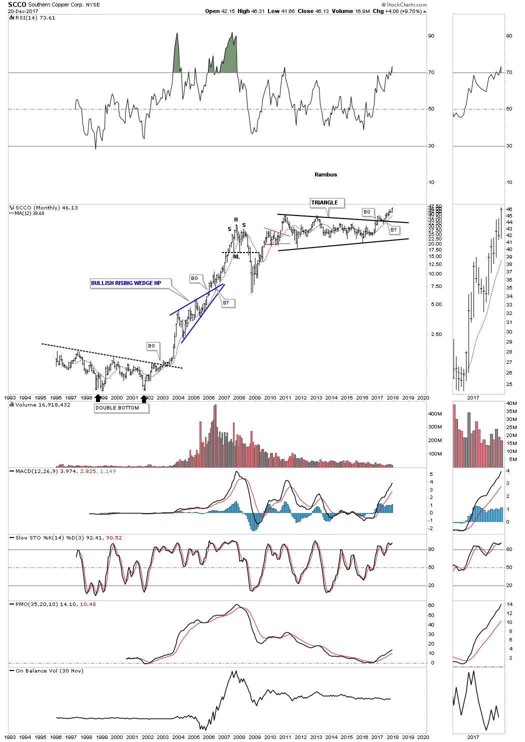
This 25 YEAR monthly chart below shows the breakout taking place above the six year triangle consolidation pattern which is now making new all-time highs. Note the blue bullish rising wedge that formed as a halfway pattern back in the early 2000’s.
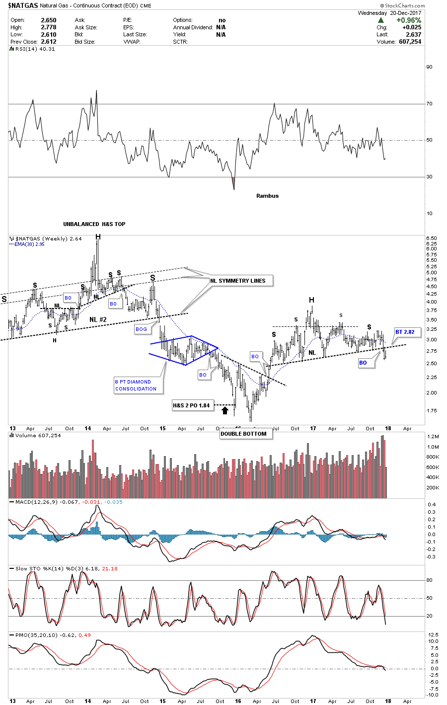
Before I run out of time I would like to show you one of the weakest areas in the commodities complex which is $NATGAS. Last week it finally broke down from a year and a half H&S top. We now have a clean line in the sand, above the neckline is bullish and below is bearish.
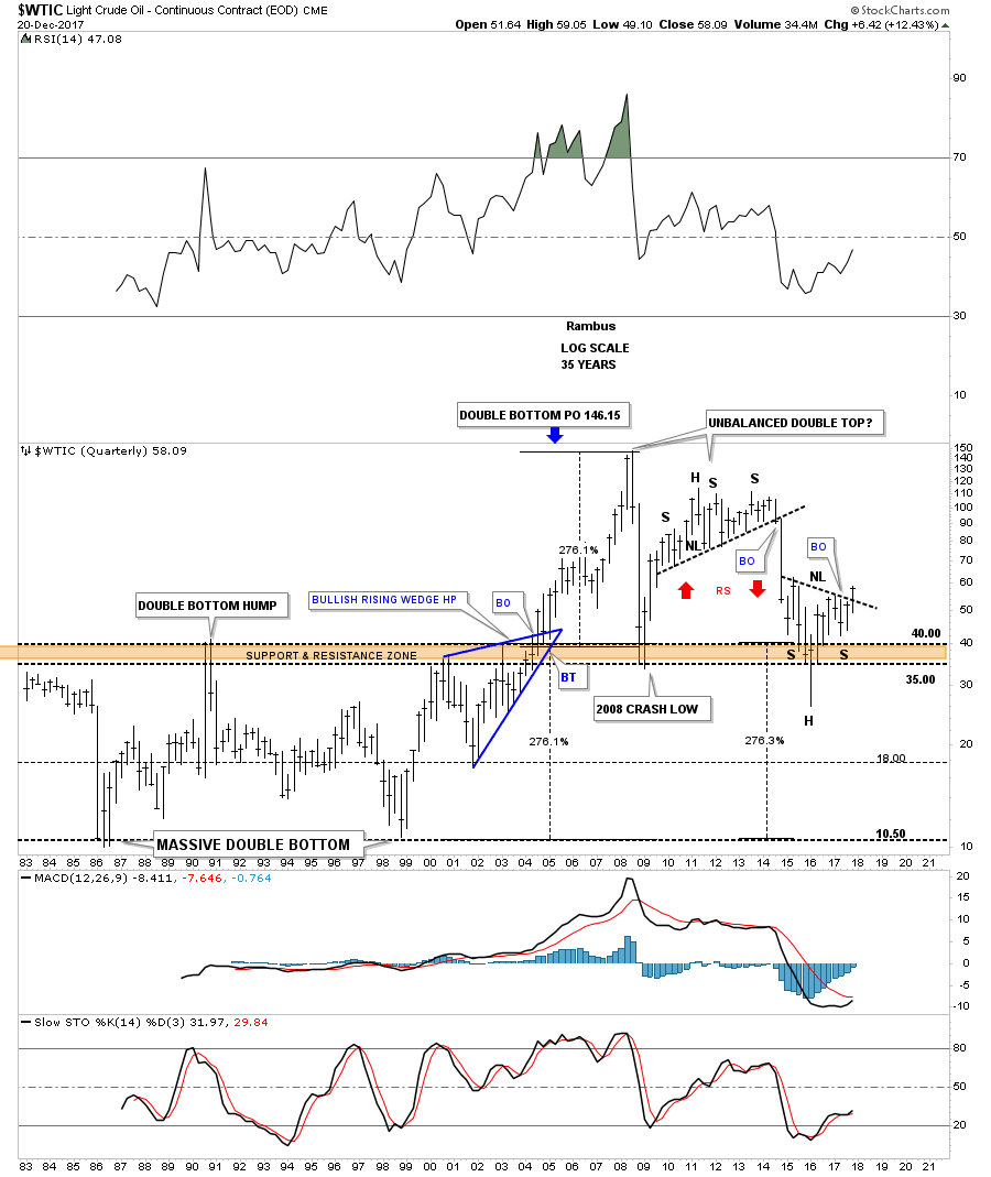
This last chart for tonight is a 35 year quarterly chart which puts everything in perspective. Keep in mind the measured move for a H&S pattern when you look at this chart. Time to get this posted.
*********
share
share
share
share
share
 Meet Rambus, a seasoned trader and technical analyst renowned for his unbiased and insightful chart work. Through his website, Rambus Chartology, and Substack newsletter, Rambus shares his expertise with a global community of subscribers, providing daily updates, commentaries, and hands-on training in the art and science of chartology. With his calm, humble, and down-to-earth approach, Rambus demystifies complex market trends, helping his followers navigate the challenges of today's volatile markets. Join the Rambus Chartology community today and discover a unique blend of technical analysis, trading expertise, and time-tested protocols. Subscribe now at www.rambus1.com or https://rambuschartology.substack.com/
More from Gold-Eagle