The Stock Market And Precious Metals On Hold


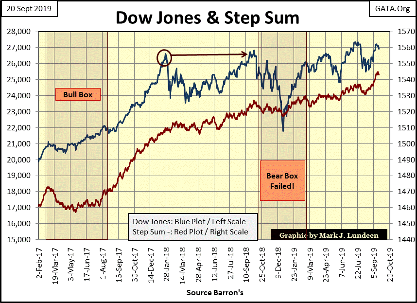
At week’s end we find the Dow Jones Index with a bearish, picture-perfect head and shoulders technical formation. The left shoulder goes back to last April, the head in early July and the right shoulder at the close of the week. So, is the market a sell as September 2019 comes to a close? It could be, but as I read the landscape the Federal Reserve is holding up this market. The Dow Jones won’t go down until the FOMC says it does.
But that doesn’t mean the Federal Reserve intends to shower the bulls with capital gains; look at how this crazy market has traded in the past year.
A year ago the Dow Jones made four (4) new BEV Zeros (new all-time highs), after which it corrected 18%. It then recovered from this price correction where it made four (4) new BEV Zeros in early July last summer before correcting seven percent in August. The Dow Jones now stands once again at the threshold of market history, just short of making a new all-time high. But with only eight (8) new all-time highs made in the past year, are the “policy makers” inclined to give more to the market’s bulls as we head into October?
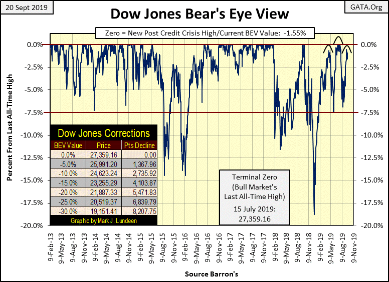
Call me a big chicken, but I don’t care to speculate on what the Dow Jones (my proxy for the broad stock market) is going to do as 2019 approaches its terminal end point. Today’s big bulls are members of the global central banking cartel, who by definition can never run out of money, and aren’t primarily motivated by profits in their dealings with the financial markets. So, what are they after? What they seek is called “market stability.” That isn’t the description of what we seek from the market; as we need profits to just stay in place in our inflationary economy, market losses can result in bankruptcy for us.
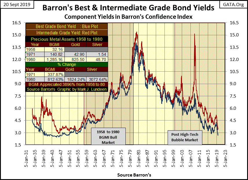
Take a look at how things used to be, a time when “monetary policy” didn’t define how markets traded, as with US T-bond yields (Red Plot) and the price of gold (Blue Plot) in the chart below. I placed some light vertical dashed lines on turns in the gold market, look how T-bond yields reacted to these changes in the price of gold from 1971 to August 1987.
This relationship between the price of gold and bond yields make perfect sense, as rising gold prices (rising CPI inflation) promised T- bonds would become big losers on a total return basis. So bond buyers demand higher yields (lower bond prices) as an inflation premium. Lower gold prices resulted in the exact opposite reaction; lower yields and higher prices in the bond market.
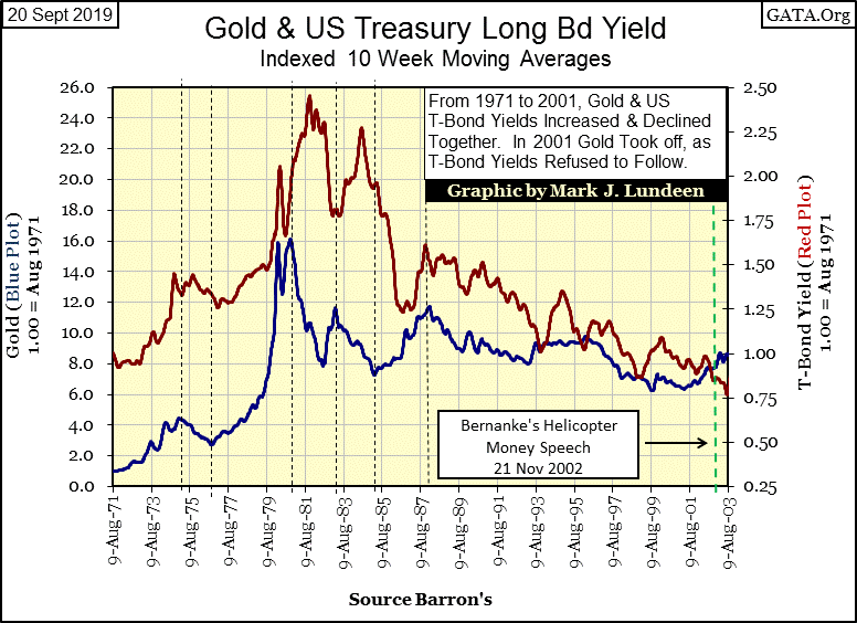
Then in August 1987 Alan Greenspan – the Maestro – became chairman at the Federal Reserve and this connection between bond yields and the price of gold was severed. Gold in February 2001 began a bull market that continues to this day, which unlike the 1969 to 1980 gold bull market, has had zero impact on bond yields as “monetary policy” has compromised any and all connections between trends in the gold and debt markets.
Former Federal Reserve Governor Kevin Warsh put it this way in January 2012:
"Now that I am out of government, I can tell you what I really believe. ---
“Central banks are now so heavily influencing asset prices that investors are unable to ascertain market values. This influence is especially evident, with the Fed's purchase of government bonds, which has made it impossible for investors to use bond prices to learn anything about markets.”
- Kevin M. Warsh: Former Federal Reserve Governor. Comments made to the Stanford University Institute for Economic Policy Research, 25 Jan 2012.
It’s not just the Dow Jones that is at the threshold of making market history. In the table below the Dow Jones Utility Average closed the week at a new all-time high (0.00%), while #2-15 are within 5% of doing so, or as I like to say, in scoring position for making a new all-time high.
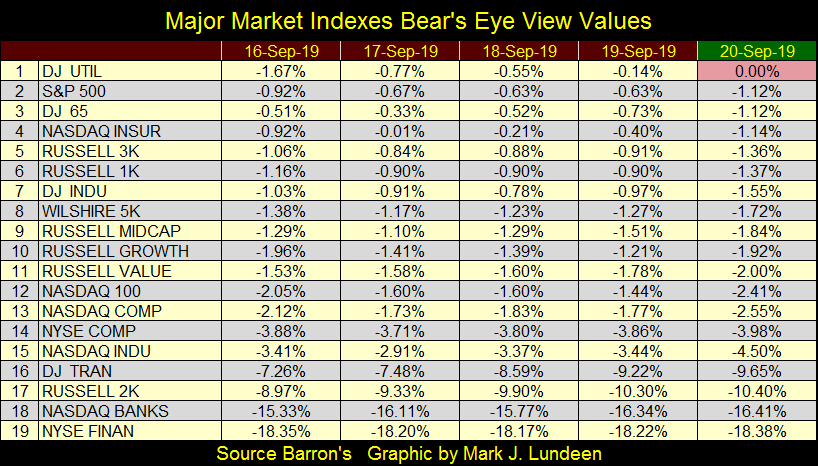
This is how it’s been for several weeks now; what’s everyone waiting for? Personally I think the market is waiting for another “injection of liquidity” to drive these indexes into record territory, but for reasons the “policy makers” at the FOMC have kept from the public, they have decided to hold back on “injecting” their Go-Juice into the markets for the time being.
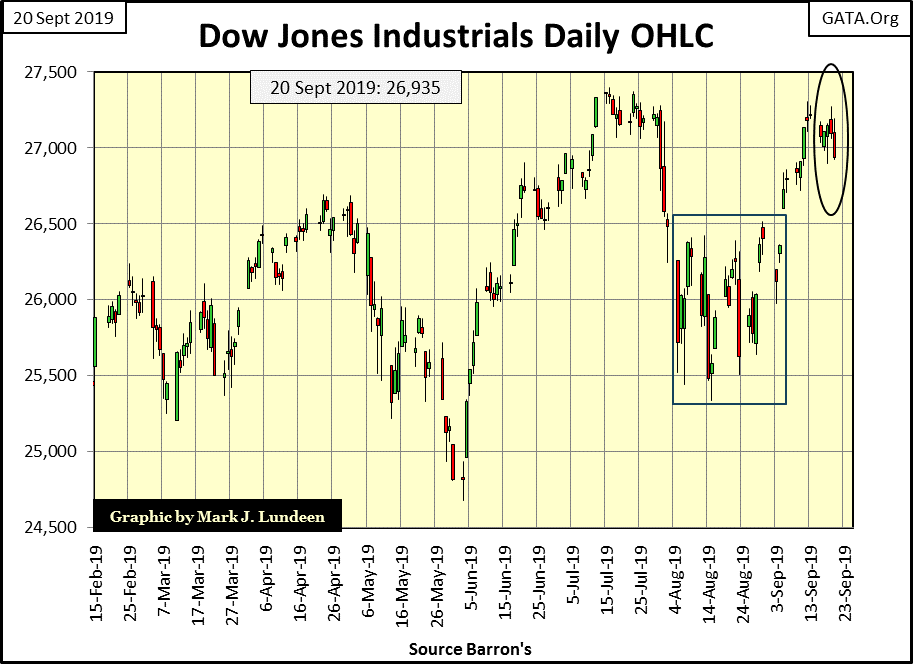
Here’s the Dow Jones in daily bars. From early August to early September the Dow Jones remained range bound within the box, but then broke out in September’s second week. It appeared to be headed into market history, until this week (Black Circle) when the Dow Jones once again came up short.
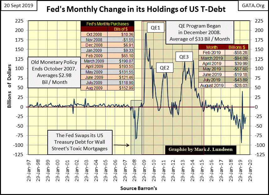
The Federal Reserve continues their Quantitative Tightening (QT), the reduction of their balance sheet which they began in late 2017. With the exception of last April where they increased their balance sheet by $39.99 billion, they’ve reduced their holdings of US T-bonds every month since January 2018.
Just as the Federal Reserve’s three QEs provided the monetary inflation needed to inflate the financial markets out of its sub-prime mortgage funk in March 2009, the Fed’s current QT is an enormous factor for calling for a deflation of market values in the future. Or one would think it to be. However, so far this QT’s effect on market valuations has been minimal.
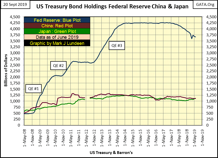
Next to the Federal Reserve, China and Japan currently hold the largest positions in US T-bonds, but as of June 2019 the Federal Reserve holds more T-debt than the two combined. However in 2008 the Federal Reserve’s holding of T-debt was smaller than either China or Japan. Doctor Bernanke’s three QEs had a HUGE impact on the Fed’s balance sheet.
In the table below we see T-debt held by the Federal Reserve (#2), Japan (#3) and China (#4) down by 13.9%, 9.55% and 15.51% respectably as of June of this year. That’s a reduction of $914 billion dollars from their max holdings. With the Grand Total (#1) currently at a new all-time high, I wonder who is buying all these bonds, along with all the new bonds being issued by the US Treasury.
There are eight countries who in June saw their portfolios of T-bond at new all-time highs, but I don’t see these countries being able to soak up all this supply coming into the market. But I don’t know exactly what these numbers represent. Are they official holdings of these nation’s central banks, or bonds held by private corporations, insurance companies and pension funds, or both?
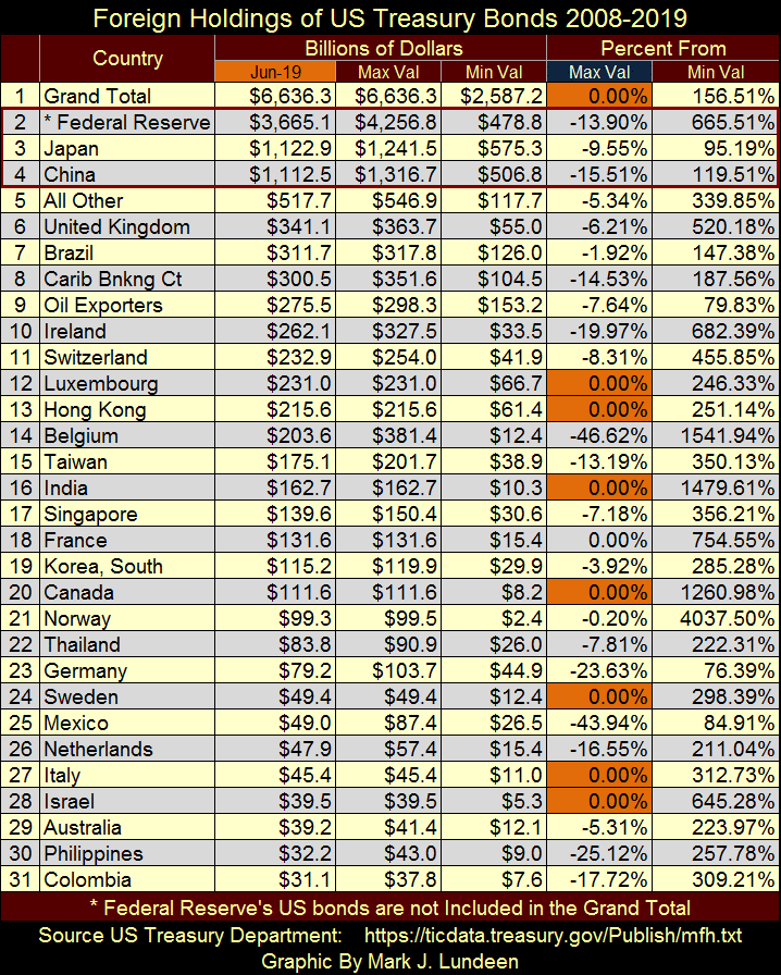
But anyway one looks at it, there is a tremendous flow of T-bonds coming into the market, which makes me wonder why bond yields in the debt markets today are so low. Maybe it’s best to just accept that it’s a “policy thing” and just leave it at that until the walls come tumbling down. And “come tumbling down” is the correct technical term to use in a market where best grade corporate bond yields (Blue Plot below) are lower today than they were in 1955.
Here’s a chart for the Federal Reserve, China and Japan’s T-bond holdings, which like all countries included in this data, greatly increased their holdings of T-bond as a reaction to the 2007-09 sub-prime mortgage fiasco. I wonder if they are now having buyers regret?
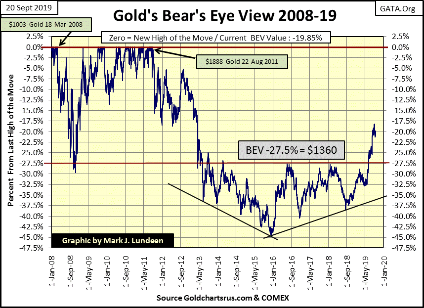
Here’s gold’s BEV chart, which is holding up pretty darn well. Gold broke above its BEV -27.5% line ($1360) on June 19th and hasn’t looked back. This is good market action, which is another way of saying I wish the price of gold would stop playing around its BEV -20% level and go on to new all-time highs. But the market doesn’t care about what you or I think, so gold will do what it’s doing until it decides to break about the $1888 it saw on 22 Aug 2011.
I don’t like it, but it is what it is. Which could mean still one more downward stab at the BEV -27.5% line before gold finally breaks into market history.
The silver to gold ratio (SGR) has declined from 93.36 down below 80 on the first two trading days of September, and has since walked back to the 85 level. When you realize that a 93.36 SGR is something not seen since the early 1990s, well it’s one of those market extremes I like seeing, a market event that will prove to be hard to repeat in the months and years to come.
Being a market prognosticator is a hazardous occupation, or in my case a personal hobby I enjoy sharing with my readers. I have to warn you that my crystal ball’s calibration sticker has long ago expired, and the visions seen within it are all too frequently foggy. What isn’t foggy is seeing the SGR below reversing an eight year trend that began in March 2011, and that is darn bullish for gold, silver and the precious metal miners.
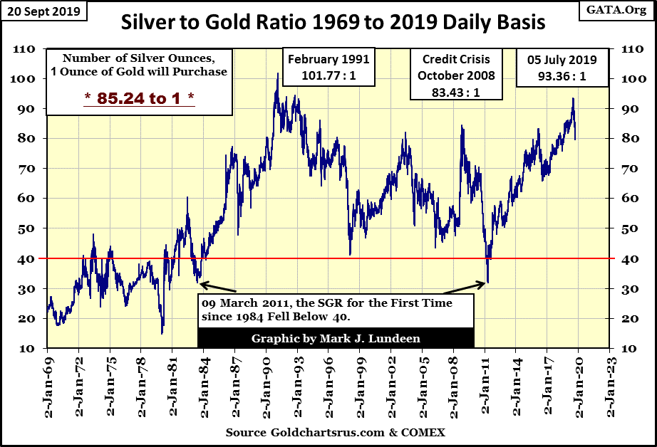
When it’s time to buy or sell they never ring a bell, and history shows the best time to buy is when doing so people think you’re a bit unhinged. I expect when September 2019 is seen in the market’s rear view mirror in the months and years to come, taking a position in gold and silver assets now will gain one bragging rights for making an astute move in the markets. However the markets are never easy; we may once again test the 90s with the SGR. Even so, buying gold and especially silver at these prices seems a good thing to do.
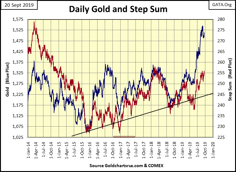
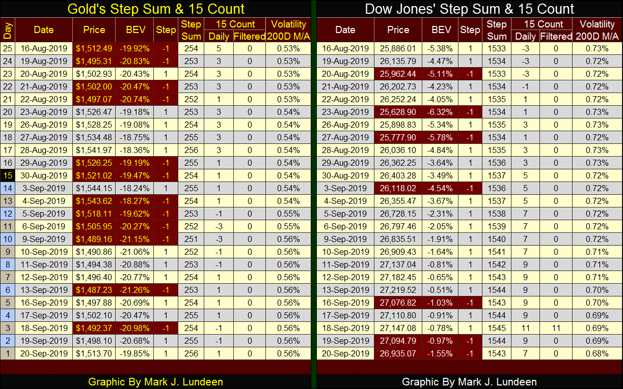
Gold (Blue Plot) and its step sum (Red Plot) below are looking good. It’s obvious gold on its advancing days is advancing, while the declining days’ effects on the price of gold has been minimal.
The Dow Jones and its step sum look good too. BUT as the step sum is a sentiment indicator, seeing it rise up as it has without seeing the Dow Jones making a new all-time high makes me suspicious that market sentiment is getting ahead of market reality. Of course seeing the venerable Dow Jones breaking into record territory would make this point moot.
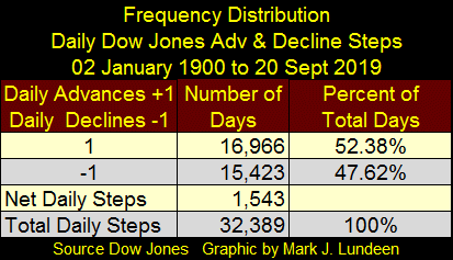
So, what is a step sum? A step sum is a single item Advance – Decline Line using the daily advances and declines of a market series, like the price of gold or the Dow Jones as its inputs. What does it mean that at week’s close the Dow Jones’ step sum stood at 1543, as seen in the step sum tables below?
I made a frequency table for the Dow Jones step sum below going back to 02 January 1900, just a few months short of 120 years of market history.
Every day the Dow Jones advanced its step sum gains a +1, every day the Dow Jones declined it gains a -1 with no regard to how much the Dow Jones advanced or declined. So the step sum is only the sum total of all the daily +1 & -1 since January 1900, and since 02 January 1900, the Dow Jones has seen 1543 more daily advances than daily declines, hence its step sum at week’s close is 1543.
Moving on to gold’s step sum table below; in the past twenty-five trading sessions its step sum has advanced by two steps, which advanced the price of gold $1.21. It could be better, but it could be worse too; best to think of the gold market in a holding pattern waiting for higher prices.
During these past twenty-five trading sessions gold’s 15 count has in the main registered between +3 and -3, which is normal.
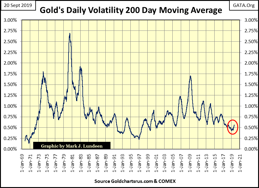
It’s good seeing gold’s daily volatility increase to 0.56%, but as seen in the chart below, in January volatility for gold declined below 0.50%; something not seen since January 2001. But January 2001 was a good time to buy gold, and I expect last January’s low volatility will also prove to be a good time to buy gold. When gold begins advancing to within 10% of its last all-time high, I expect its daily volatility will break above 1.0% as excitement in the precious metals build.
Since August 16th the Dow Jones has had a lot going for it. Look at all the daily advances; on September 18th its 15 count registered a rare +11! Also its daily volatility has been declining; and bull markets at the NYSE are low daily volatility market events. The only bearish thing to comment about the Dow Jones is its inability to break above to new all-time highs with all this going for it.
What’s the Dow Jones going to do when the market once again enters a cycle of more daily declines than advances, similar to or worse than what gold has seen since August 16th?
Gold also saw its 15 count increase to +11 from 19 to 24 June of this year as the price of gold was at or below $1419. On the decline of gold’s 15 count (an increasing frequency of declining days) the price of gold actually increased as seen in the table above. Could the Dow Jones see something similar to what gold did last summer when its 15 count began its decline from an 11? Maybe, but I doubt it.
An important point I’ve made in the past is that monetary inflation inflates market valuations in the financial markets and real estate – NOT valuations in gold and silver. What inflates the valuations in the old monetary metals is DEFLATION in the financial markets and real estate, which results in capital flight from those markets into gold and silver.
As the “policy makers” are having success in their imposition of “stability” in the stock, debt and mortgage markets, I’m not really surprised that market action in gold and silver are currently sluggish.
I hope my readers are aware of the authoritarian behavior of the big social media tech companies in their censoring of conservative opinion on their platforms. In fact this is the Left’s attack on the Bill of Rights and it needs to be opposed by good people who love their liberty.
Here is a video from INFOWARS on the Bill of Rights. INFOWARS is an independent media outlet that is currently under attack by the Deep State.
https://www.infowars.com/watch/?video=5d76dc71ab93ea00132ffd11
I like INFOWARS. Years ago I listened to Alex Jones rant about the FBI or CIA doing this, that or some other evil thing. I thought Alex was a bit of a crank, but an entertaining one. But thinking back on what he has said years ago, and comparing that with what is happening today, his INFOWARS has proven to be one, if not the most accurate, and entertaining sources of actual news available. INFOWARS covers topics the MSM refuse to, that by itself is reason enough to watch it.
Mark J. Lundeen
*********


