The Stock Market Was Over Valued When The Dow Was At 19K…And The Dow Over 20K Doesn’t Fix That!


Just when you think you understand the rules of the game, someone changes them. I’m talking about the relationship between the Dow Jones Index and its trading volume. Last week I noted how since January 2000, the Dow Jones and its volume had turned the law of supply and demand upside down; where the Dow goes up on declining volume, and down on rising volume. But that changed this week; with the Dow Jones closing every day at a new all-time high with trading volume increasing in a big way. Look at the chart below.
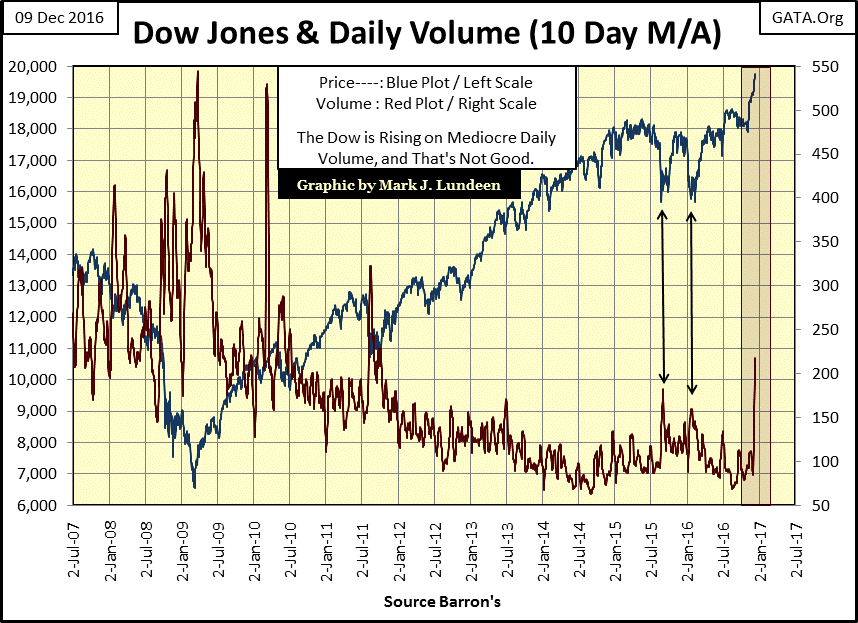
What does this mean? I think it’s a strong indication the public is returning to the stock market. Whether or not they will continue sending their dollars towards Wall Street in the coming weeks and months is something we’ll have to wait to see. In any event, this advance in the stock market began in March 2009. After eight years it’s getting very stale. My readers are most likely sick of hearing me say gold and silver is the place to be. I know I’m sick of saying it. Be that as it may, I still believe it to be true.
For one thing, the old monetary metals have seen plenty of bad times since 2011. There’s no froth in the current prices for gold and silver, or the mining shares. This means precious metal assets are cheap, and cheap is good when one is buying.
On the other hand, valuations in the stock market are priced for perfection, with little allowance for disappointments, like the Federal Reserve increasing its Fed Funds rate by a pathetic twenty-five basis points. Remember how the FOMC did exactly that last December; by January last year Wall Street was running for the tall grass.
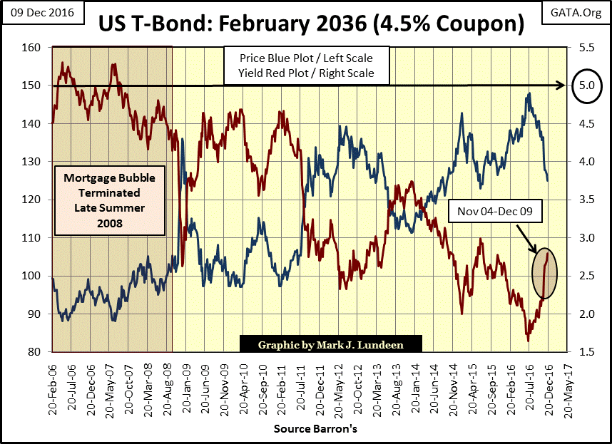
What could spoil the party on Wall Street are rising interest rates and bond yields. US Treasury long bond yields are up by a full percentage point since last summer, mortgage rates are up eighty-four basis points. If these trends continue in the debt markets, the stock market is ripe for a major correction, something that hasn’t happened in years; something that’s overdue.
Look at the T-bond chart below. If bond yields continue rising, at some point they’ll force President Trump to scale back his aggressive plans to revitalize the economy. The national debt is $20 trillion, most of which will be rolled over in the next five years. Bond yields increasing to, and then exceeding 5% would quickly consume the Federal government’s tax receipts to service its debts. The same goes for corporate America with their earnings and dividend payouts. In such a world, gold and silver, assets with no counterparty risks, are very attractive at today’s prices.
Current “monetary policy” has severed stock-market valuations from all historical benchmarks of value. It’s December 2016, and I wouldn’t be surprised if the Dow Jones found itself above 20,000 before the arrival of 2017, maybe before the close of next week. But what does the Dow Jones at 20,000 really mean? That the economy is anticipating a strong recovery now that Donald Trump will occupy the oval office next month?
Maybe, but when I think of the many tens of trillions of dollars in government, corporate, and personal debt that must be serviced by this same economy, I just have my doubts that President Trump can pull that rabbit out of his hat.
Does 20,000 in the Dow Jones indicate the stock market is expensive or cheap? Other than signaling that a handful of people at the FOMC have had great success in funneling their “liquidity” into Wall Street since March 2009, maybe the Dow Jones at 20,000 doesn’t really mean much of anything at all.
I’m an old fashion guy, apparently someone who in today’s market may be bit over his head when it comes to the financial markets. I’m not saying I don’t understand how the Dow Jones got up to $20k; the FOMC has for years been pumping it up with “liquidity.” I just don’t see how the “policy makers” can continue inflating financial market valuations for much longer. When Mr Bear terminates the FOMC’s operation Bull Market, there is going to be hell to pay.
When I think of the stock market, I keep coming back to dividends. Why? Because dividends are a true indication of the profitability of the companies trading on the NYSE. At least they were when dividend payouts were based on corporate operations, not cash flow from selling bonds in the debt market as some dividend payouts are today.
Below is a chart of Dow Jones dividend yields going back to 1925. From 1925 until Alan Greenspan became Fed Chairman in August 1987, one could time excellent exit and entry points using the Dow Jones’ dividend yield;
- Dividend yield around 3%: sell as the lion’s share of the bull market is over
- Dividend yield above 6%: buy as the worst of the bear market has passed.
It’s remarkable; how until Alan Greenspan became Fed Chairman in 1987, investors could have timed profitable entry and exit points for every bull and bear market since 1925 by simply using the Dow Jones’ 3% & 6% dividend rule.
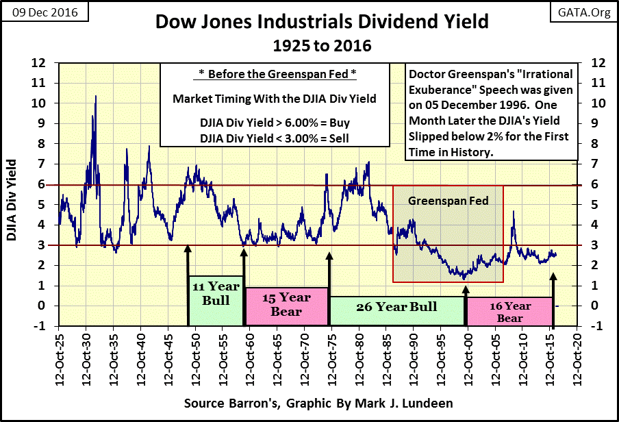
This rule worked wonderfully from 1925 to the early 1960s, where from the first 3% sell signal of the 1960s, it took over a decade (November 1974) before the Dow Jones sent another 6% buy signal (chart above). That’s a long time for staying out of the stock market. But if you saw what the Dow Jones, and most of the stocks trading at the NYSE did during this time, you would understand the stock market did little to reward investors during the 1960s and early 70s.
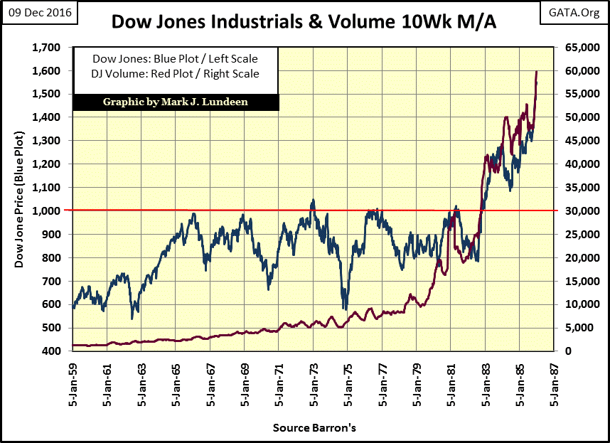
From 1966 to 1981, the Dow Jones (Blue Plot below) attempted, but failed to break above, and stay above 1,000 five times. It was only on the sixth attempt in 1982 that the stock market finally took out the Dow Jones 1,000 resistance level for good, and it did so on rising trading volume (Red Plot), as one would expect.
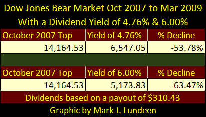
Dividend yields still matter. Look at the Dow’s dividend yield for 09 March 2009 in the table below. As it was, on a payout of $310.43, the Dow Jones bottomed at 6,547.05 (a 54% bear market bottom) as its yield increased to 4.76%.
But as it was before Alan Greenspan became chairman of the Federal Reserve, bear markets didn’t end until the Dow Jones yielded 6% or more. As shown in the table below, a bear market bottom that would have taken the Dow’s dividend yield up to 6% would have taken the Dow Jones itself down to 5,173; a 64% bear market bottom.
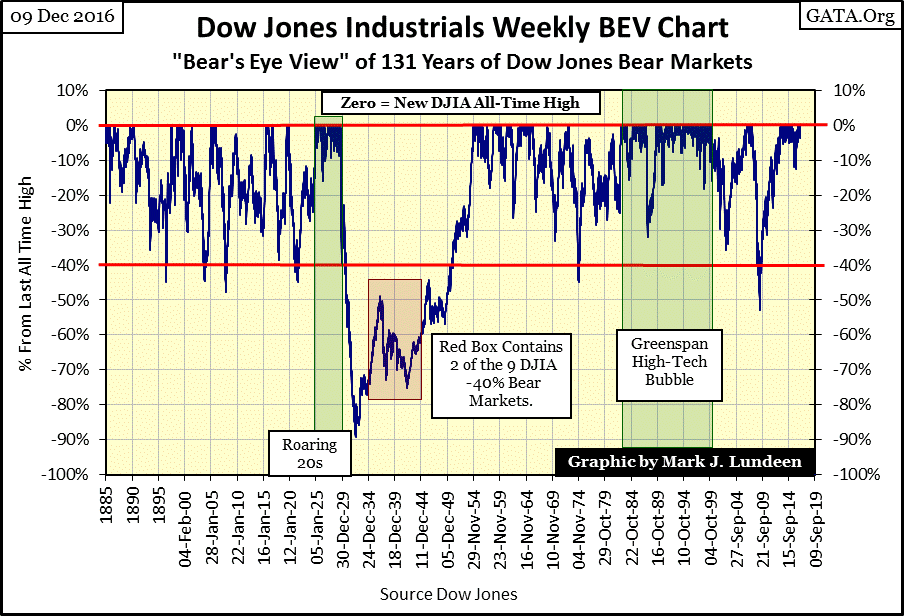
Next is a Bear’s Eye View (BEV) chart showing every bear market since 1885. In this chart it’s obvious the March 2009 bear market bottom was the seconded deepest bear market since 1885. I don’t have Dow Jones dividend yield data previous to 1925, but assuming the Dow Jones dividend rule of 3% sell & 6% buy would be applicable to the 19th century stock market seems reasonable.
So why for the pre-Greenspan Fed bear markets, a 6% dividend yields would see the Dow Jones decline by 40%, while the credit crisis bear market saw the Dow Jones decline 54% on a dividend yield of only 4.76%? Go back to the Dow Jones dividend yield chart above. During the high-tech bubble of the late 1990s, the Greenspan Fed inflated the valuation of the Dow Jones until it yielded only 1.30%, an overvaluation that to this day the Dow Jones has yet to work off because “policy” refuses to allow that to happen.
Except during the credit-crisis bear market (2008-09), the Dow Jones has yielded something less than 3% since the early 1990s. These depressed dividend yields is probably the strongest prima facie evidence that valuations in the stock market have been manipulated far above free market levels for decades. Though for the past three decades market commentators and regulators are blissfully unaware of this.
I don’t believe Mr Bear will allow the “policy makers” to continue keeping market valuations at their current inflated levels forever. There’s a bear market coming our way that will take the Dow Jones down to levels where it will once again see it yield over 6%; something not seen for over thirty years. In a bear market like that, don’t expect interest rates and bond yields to remain at their current low levels.
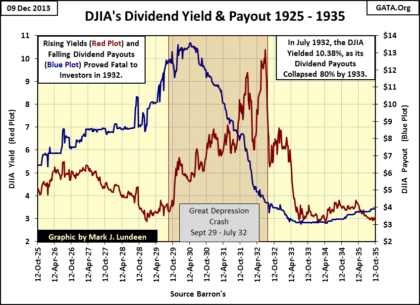
How would the Dow Jones work off its current overvaluation? Let’s see how Mr Bear worked off the Dow’s overvaluation of the 1920s in the chart below. Note the blue plot is for Dow Jones’ dividend payout, the red plot for dividend yield, and the Dow Jones valuation isn’t plotted at all. The highlighted area covers the Great Depression Crash. During this crash the Dow Jones declined by 89%. Take another look at the Dow Jones BEV chart above to see what that looked like. During this crash the Dow’s dividend yield soared to over 10%, as its dividend payout was slashed by 80%. This is good data too. I personally compiled the numbers from contemporary issues of Barron’s of the 1920s & 30s.
This is what a massive deflationary bear market looks like, and I fear we are going to see another before Mr Bear is through with us. Here are the dividend payouts for the Dow Jones since 1925. Since October 2009 the Dow’s payout has increased by 73%. I question how secure these payouts are.
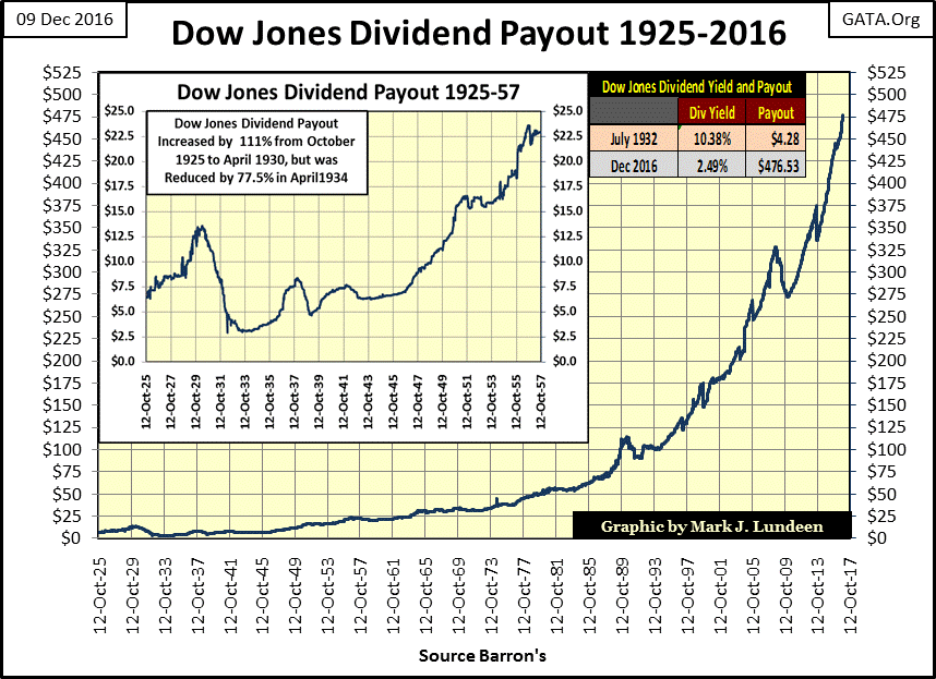
Just as an exercise, let’s see where the current Dow Jones would be if, as happened during the Great Depression, the Dow’s yield increased to 10% with a dividend payout reduction of 80%. That would have the payout reduced to $95. Divide $95 dollars by 0.10 (the yield) and the Dow Jones would find itself at 950; below 1000 for the first time since 1982, a 95% market decline from Friday’s close.
Is this possible? Damn right it is, but hopefully we never see the day where the Dow Jones finds itself at 950! But keep this in mind; the same university system that has devised the social engineering that has ravaged America’s inner-cities since World War Two, has also trained the people who make “monetary policy” at the FOMC. Ditto for corporate management. You can’t have decades of economic-central planning by blockheads like Greenspan, Bernanke and now Yellen, and have an economic future free of negative consequences.
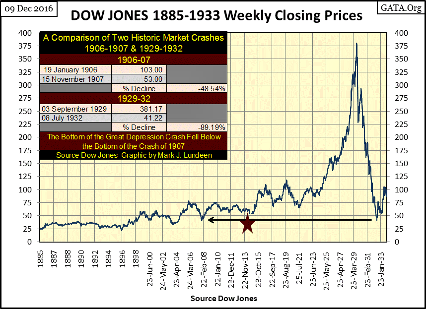
Here’s a chart of the Dow Jones from 1885 to 1933. The Red Star marks the creation of the Federal Reserve in 1913. Our world was never the same after America’s politicians, academics and bankers got their central bank.
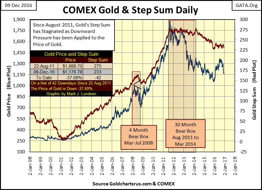
Let’s move on to gold and silver. Here’s a long term step sum chart for gold I haven’t looked at since last summer. Unlike the shorter term step sum chart I’ve been publishing these last few months, I see the makings of a bear box that began forming late last summer. I haven’t drawn a box over the plots just yet, but the price of gold is going down as the step sum plot refuses to follow.
If the box proves true to form; the price of gold won’t rebound until we see its step sum plot collapse, signaling the bulls in the gold market have surrendered to bearish price trend.
Uggh! Since August 2011 the price of gold is down over $700 on a net of 42 lower daily closings in the step sum. When the gold bull resumes, we’ll see gold’s price and step sum plots once again rising with the same enthusiasm they had from 2001 to 2011. But when? I don’t know. But if it’s any comfort to you, I’m sure we are closer to the end of this correction than to the beginning.
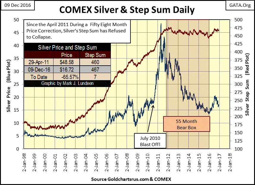
Here’s silver’s step sum chart. I don’t even know why I keep a step sum chart for silver. Since April 2011, the price of silver is down 65% as silver saw a net of seven higher daily closings in its step sum. Silver was also like this during its 1980 to 2002 bear market; it’s step sum just trended sideways for years at a time no matter how low the price of silver went. Still I continue the chart, if for no other reason than just to see silver’s step sum turn up with the price plot, a good way to confirm the resumption of the bull market.
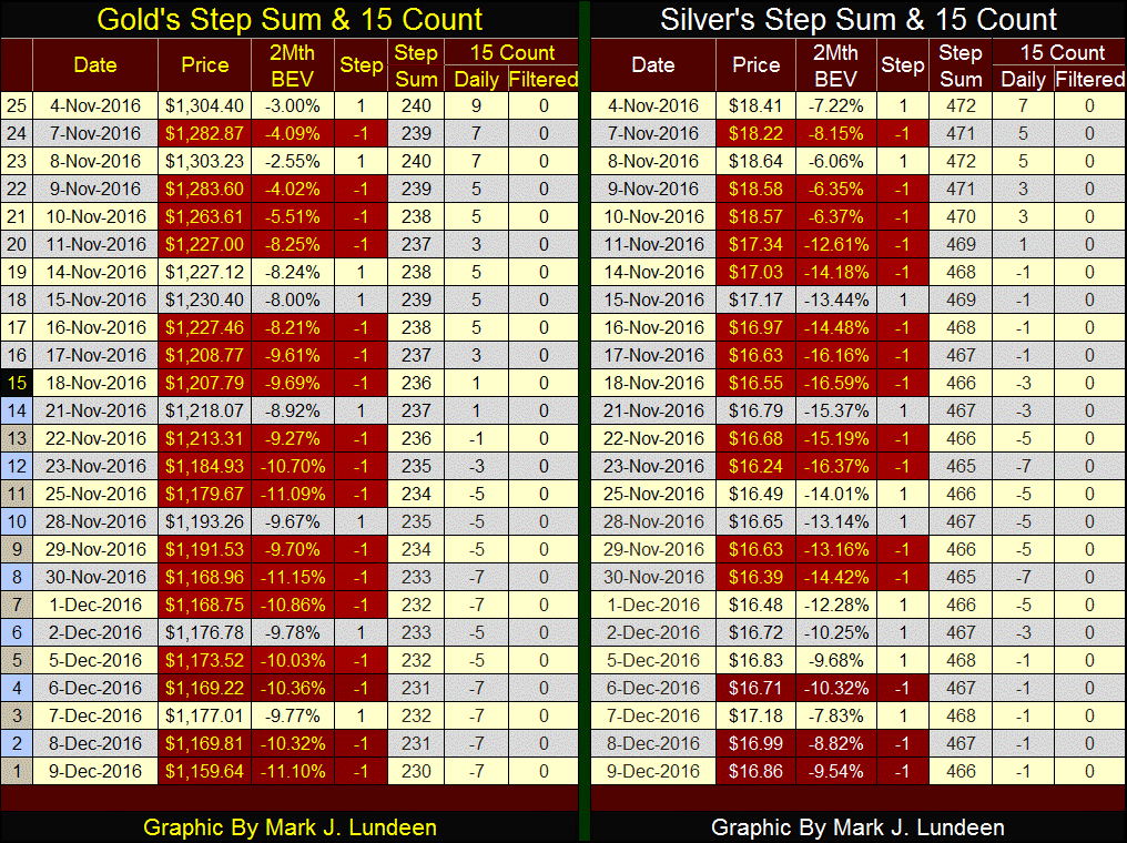
Here’s gold and silver’s step sum and 15 count table. In gold’s long-term step sum chart above it appears that the step sum plot is trending sideways, but look at the actual numbers in the table below. Since the November 8th election, gold is down about $150 as its step sum declined by 10. Look at all those down days!
With gold’s 15 count at -7 a month after the election, I pretty sure investment sentiment in the gold market is pretty grim for the bulls. This is what bottoms look and feel like. We may see more declines in the price of gold and its step sum. Maybe even a double-digit negative number for the 15 count, a rare occurrence of extreme market sentiment. But the next few months may make holding on to gold and silver during these difficult times all worthwhile.
I was always told that you can tell a lot about someone by how they treat people beneath their station in life. People who in no way can assist them. Here’s a clip from INFOWARS on a woman who was assisted by Donald Trump. It touches my heart what he did for her, and note this came out after the election.
Mr. Trump, like all of us is not perfect. Still I think Donald Trump is a very good man, an honest man. I also know that he is very aware that he is going to have to battle against the scum of the Earth currently sitting in Congress to get anything done in the next few years.
God Bless you Donald Trump. And God Bless America for still being a nation where someone like Donald Trump can still become president.
Mark J. Lundeen