Technical Analysis Of The Markets
 share
share
 share
share
 share
share
 share
share
 share
share
Current Position of the Market
SPX: Long-term trend – Final long-term phase on the way? How much longer is the question.
Intermediate trend – We have started a correction of intermediate nature.
Analysis of the short-term trend is done on a daily basis with the help of hourly charts. It is an important adjunct to the analysis of daily and weekly charts which discusses the course of longer market trends.
Correction Continues
Market Overview
Market Analysis (The following charts are courtesy of QChart)
Last week’s 800-point drop in the Dow Jones Industrials made it clear that we are in an extended, ongoing correction. Despite a strong rally at the end of the week which is most likely a counter-trend rally, we should not see the end of the corrective process until the middle of next month. The fact that relatively minor cycles have had a big impact on prices probably means that they are getting some added strength from larger cycles whose lows are still ahead. In fact, the current cyclic alignment is roughly similar to the one which was behind the correction of October-December 2018. That does not mean that we should necessarily expect the same kind of weakness to recur. Nevertheless, we should be aware that the current cyclical phase will not come to an end until about the middle of September, with the same 40-wk cycle putting an end to it.
And then what? A rally, for sure, but will it be a resumption of the long-term uptrend? Probably not if the current talk of inverted yield curve, and the manufacturing sector already being in recession weights enough on investor psychology to spook buyers and encourage sellers over the next few months. We’ll just have to see how the economy and the market perform after mid-September.
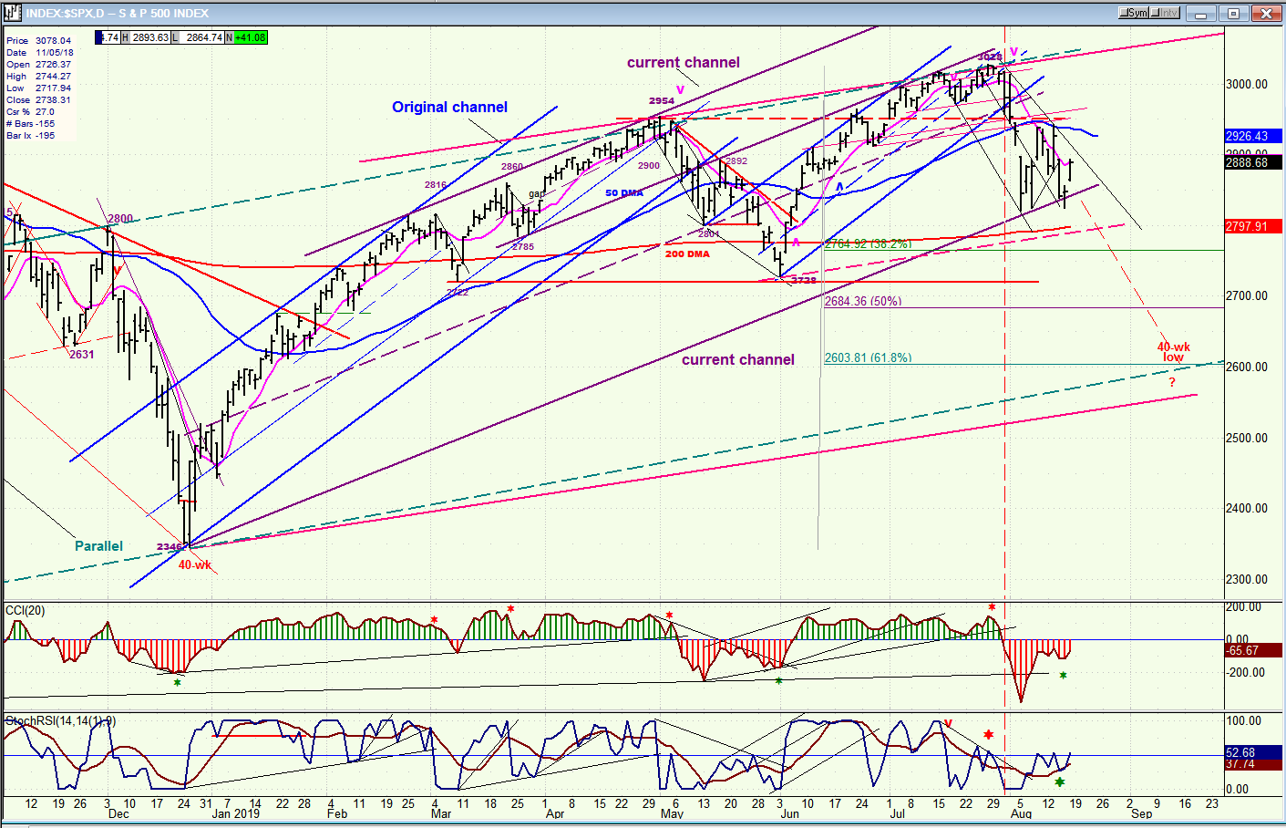
SPX daily chart
I have already discussed the original blue trend channel which has morphed into the purple (current) channel whose lower boundary is already being challenged. If (when) we break through the lower purple channel line we may form an even broader channel. By connecting the two tops with a red trend line and running its parallel at the 2346 low, I can create another even larger channel which could define the trend of future prices. The price action from 2346 appears to be decelerating and forming a large rounding top formation, suggesting that there could be major cycles in play. (We’ll discuss that later)
You will notice that there are two dashed parallel green lines. The top one is the three-year trend line from 1810. If I extend that trend line, it creates the resistance which stopped the rallies to 2954 and to 3028. By drawing a parallel to that trend line at the 2346 low, I get a line which almost matches the bottom trend line of the red channel. So, either one of these may turn out to be the approximate target for the low of the 40-wk cycle which is due about 9/15. That would correspond to about a .618 retracement of the uptrend from 2346 and essentially match the P&F count across the 2950 top. Incidentally, 2346 was the price reached the last time the 40-wk cycle made its low!
The sell signal in the price chart was matched by the oscillators going negative. This is similar to what happened after the October ’18 high. Note that we did not get our next buy signal until we developed some positive divergence in the top oscillator. I would expect a near replica of this pattern to occur in about a month when the current 40-wk cycle makes its low. Although we are getting some divergence right now, it may have been caused by the bottoming of the 80-day cycle which also produced divergence in the hourly indicators.
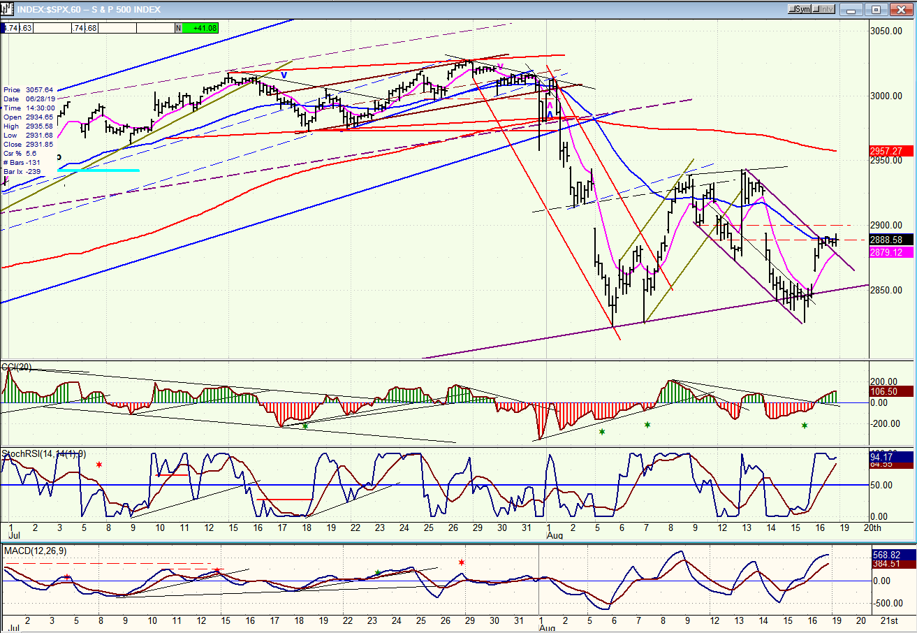
SPX hourly chart
Divergence on the CCI has a very high reliability potential! This time again, it signaled a turn at the hourly level after a sharp decline which decelerated for several hours before making that last little climactic thrust to a new low which created the positive divergence in that oscillator.
The reversal was quick, consistent with the high volatility period in which we find ourselves since the correction from 3058 started. Friday’s action brought us close to the anticipated target of 2900-2910. It is not yet clear if we will resume the correction from that level or if, after a little consolidation, the rally will extend to about 2950, first. In any case, it is likely that we will see some negative divergence before we reverse the trend.
The trend line that you see at the bottom of the chart is the lower line of the purple channel. It has held prices on three separate occasions, with the last attempt at going through breaching it slightly before reversing. It’s a good bet that the next time, it will keep on going.
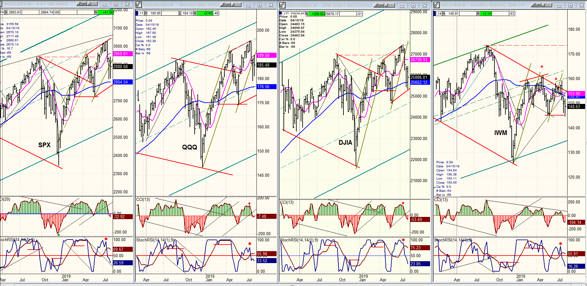
QQQ, SPX, DJIA, IWM (weekly)
Last week’s weakness has taken both oscillators of the four indexes below the zero line -- although only slightly on the CCI.IWM is obviously still the weakest index whichever way you compare it to the others, and that means that the market trend should still be down.I keep a Point & Figure chart of IWM.As you can see on the chart below, since February of this year, it has created a secondary band of distribution between 146 and 161 which measures 71 points across.Looking at this objectively, it means that the index has the potential to decline 71 points from its current level if the low is violated.Even if we were to start our measurement from 161 (which would be the most conservative count possible), it would suggest a downtrend ahead, if the index begins to trade significantly below146, that could reach 90 before it is complete.Last week, IWM traded as low as 144.79 before it rallied.If it resumes its current downtrend on the next market sell-off, it could mean that it has started the downtrend suggested by the P&F chart.Perhaps talks of a weakening world economy which could worsen over the next few months is not so far-fetched after all.
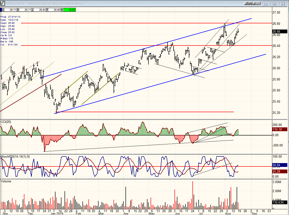
UUP (dollar ETF) daily
UUP did hold the 26.40 level and rallied. It looks like it’s either ready for a slightly new high or a retest of the high. That could end the move from 25.20 and be followed by a correction which could extend below the lower blue trend line.
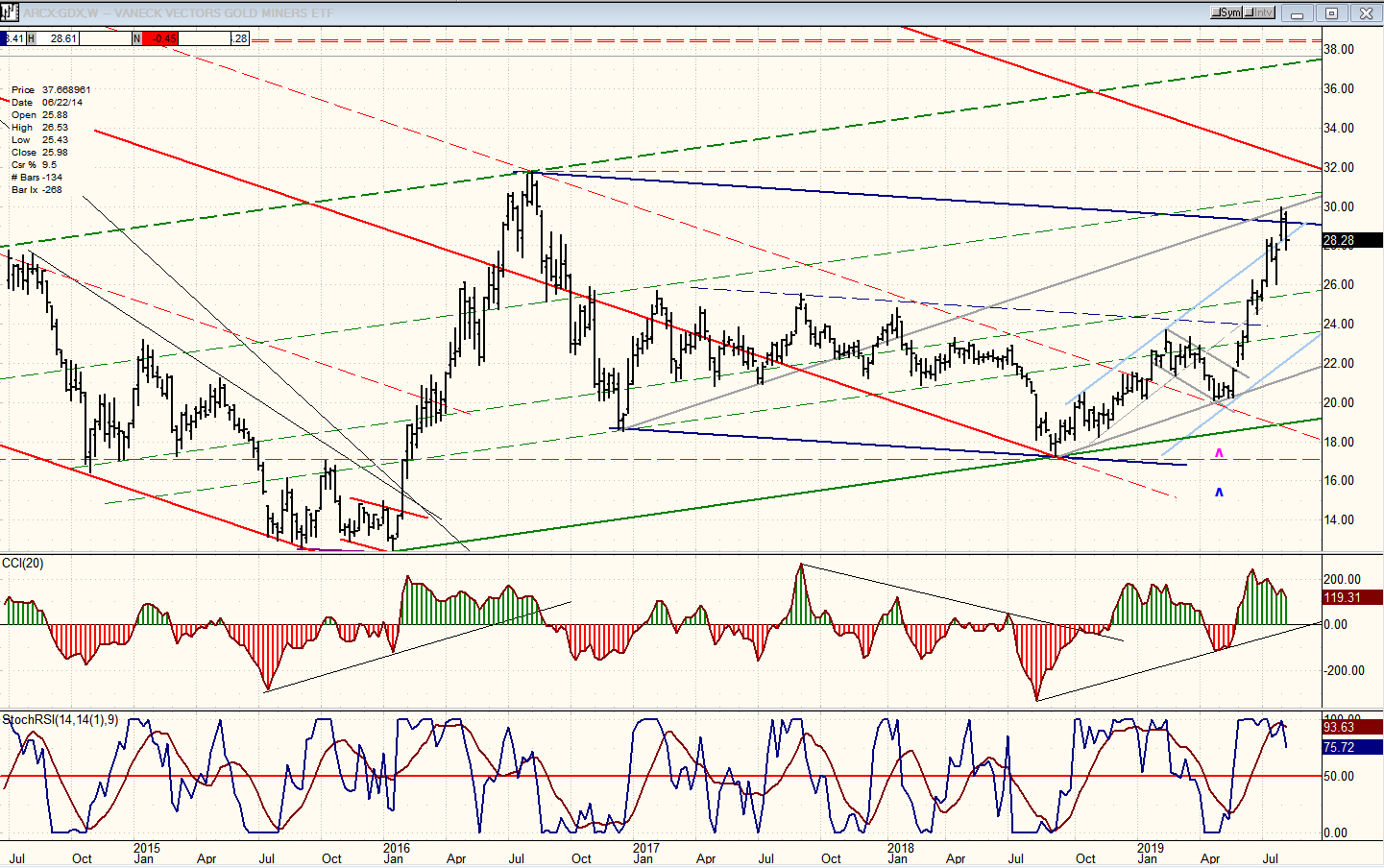
GDX (Gold miners ETF) weekly
The weekly chart shows clearly why GDX is pausing here. It has reached a couple of resistance lines including the top of a channel, which could put a halt to its progress if it cannot get above it over the next week or so. A retracement in UUP such as the one described above would keep the advance going to the red downtrend line above, or beyond. That line represents the top of the correction channel from the 2011 top and it could initiate a consolidation/correction of several weeks and perhaps months (see second chart below) if it is not overcome on the next move. Reaching that channel line would also complete a .382 retracement of the correction. It would take a very strong move to go through that level without adequate preparation.
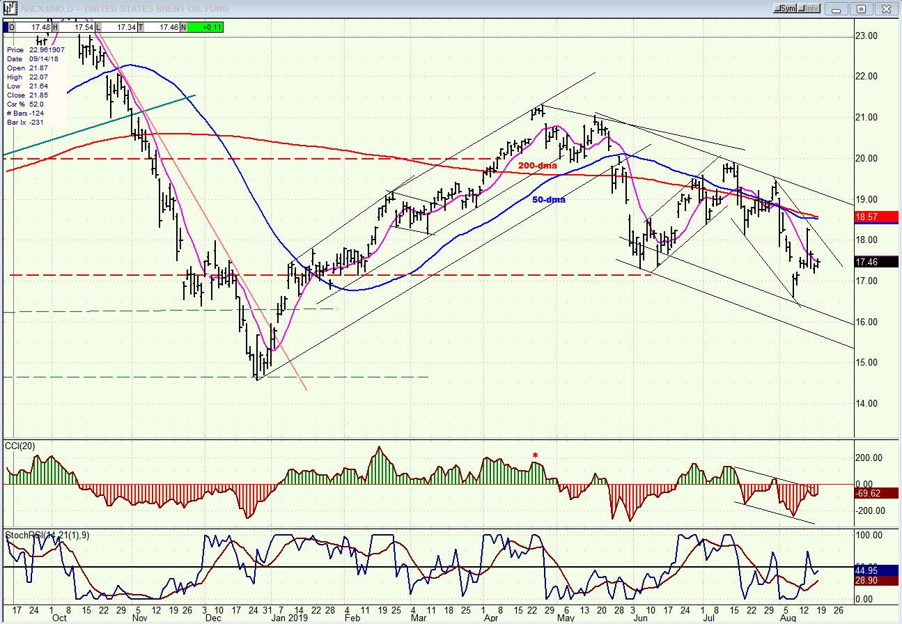
BNO (U.S. Brent oil fund) daily
Small bearish channel within larger bearish channel: the correction continues.
Summary
The correction is progressing normally, marked by high volatility. There is no sign that it is ready to come to an end, and if IWM is meant to fulfill its projection to 90 over the next several months, it does not take too much imagination to visualize what this would do to SPX and other principal market indexes.
FREE TRIAL SUBSCRIPTON
With a trial subscription, you will have access to the same information that is given to paid subscribers, but for a limited time period. I think you will find that knowing how far a move can carry is one of the most useful benefits of this service, whether you are a trader or an investor -- especially when this price target is confirmed by reliable indicators which give advance warning of a market top or bottom. Furthermore, cycle analysis adds the all- important time element to the above price projections. For a FREE 4-week trial, further subscription options, payment plans, and for general information, I encourage you to visit my website at www.marketurningpoints.com.
The above comments about the financial markets are based purely on what I consider to be sound technical analysis principles. They represent my own opinion and are not meant to be construed as trading or investment advice, but are offered as an analytical point of view which might be of interest to those who follow stock market cycles and technical analysis.
********
share
share
share
share
share

When Andre Gratian was a stock broker years ago, a friend introduced him to technical analysis of the market. Consequently, it is not an exaggeration to say that Andre fell in love with this approach! Ever since then, it has become an increasingly important part of his professional life. Gratian has studied the works of Wyckoff, Edwards & Magee, Edward J. Dewey (cycles) and many others. However, one of my most profitable undertaking has probably been to study Point & Figure charting, which he finds invaluable in analyzing stocks and indices. If he were restricted to one methodology, this is the one that he would choose. This well-rounded background has given him what he feels to be a special insight into the stock market, facilitating the recognition of meaningful patterns and the ‘turning points’ in all trends, whether they be short or long term. Andre feels very comfortable discussing the stock market and passing on meaningful information to others. His subscribers include individuals and money managers throughout the world. Moreover, his Newsletters are currently published on several financial sites, here and abroad.