Unprecedented Bull Market in Precious Metals Complex: What’s Next?


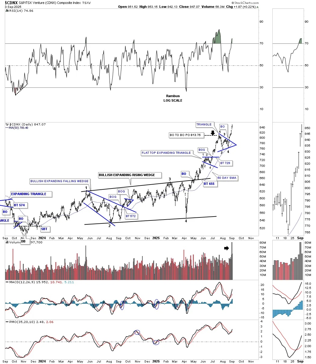
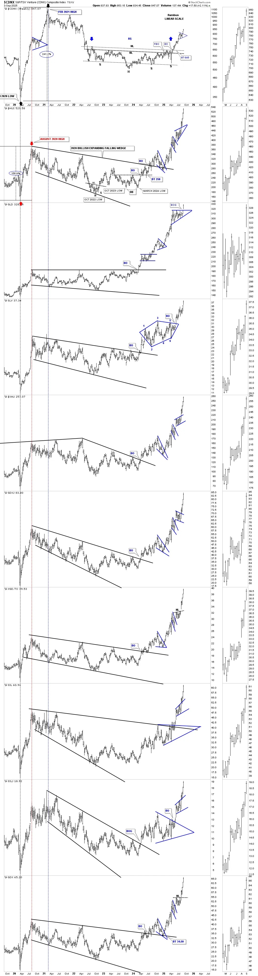
If you’ve been wondering why many of the junior and micro-cap PM stocks are beginning to show some life, the CDNX is a good index to look at. One of the most beaten-down areas within the PM complex have been the junior and micro-cap stocks, which have gotten no love until April of this year, 2025. At the April low on the CDNX, Canadian Venture Composite, where many of the junior and micro-caps reside, this beaten sector put in the 4th reversal point in its one-year bullish expanding rising wedge consolidation pattern, which is a pattern few chartists recognize, but is a very bullish pattern.
Since that April low, the CDNX has been on fire and just completed the second consolidation pattern since the breakout above the top trend line of the bullish expanding rising wedge. What makes this particular bullish expanding rising wedge so bullish is that it’s just the right shoulder of a much larger H&S bottom. Note how the volume has increased since the breakout of the most recent triangle consolidation pattern.
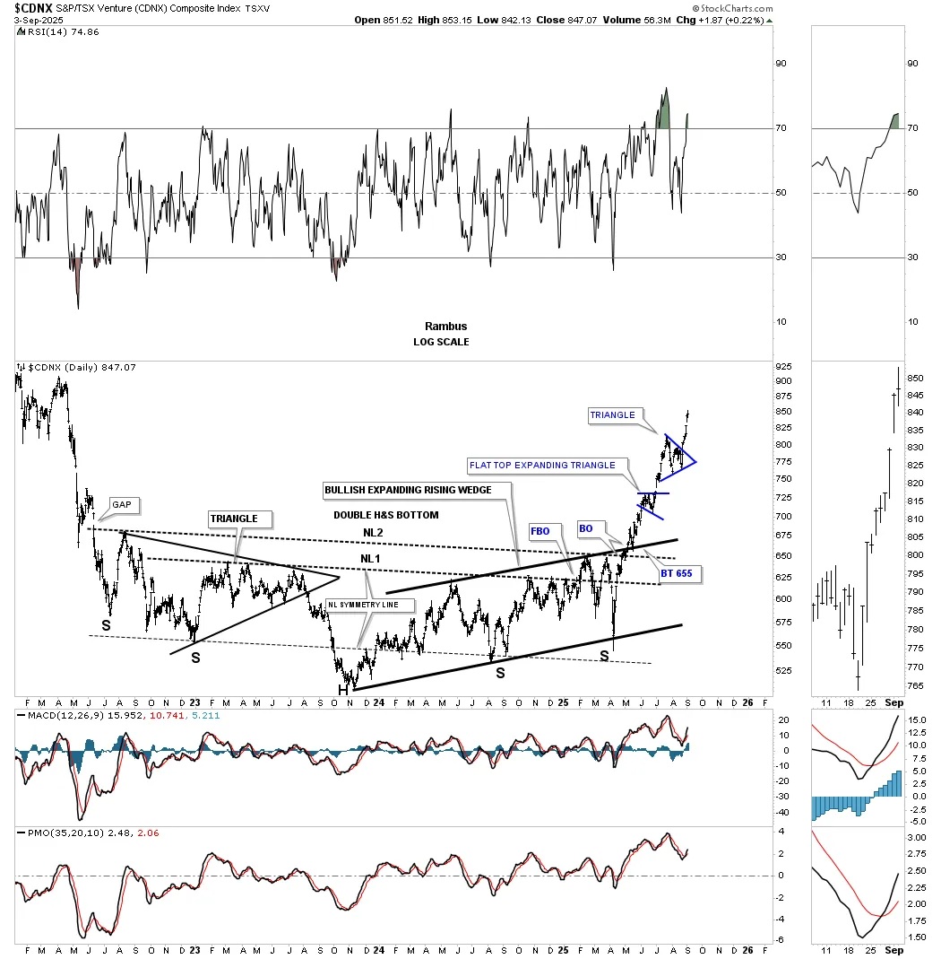
To show you how the bullish expanding rising wedge on the daily chart above fits into the bigger picture, below is a longer-term daily chart, which shows the bullish expanding rising wedge forming the right shoulder of the much larger three-year double H&S bottom. Note how well the neckline symmetry line showed us where to look for the possible right shoulder low for both necklines #1 and #2. As you can see, the left shoulder formed a symmetrical triangle.
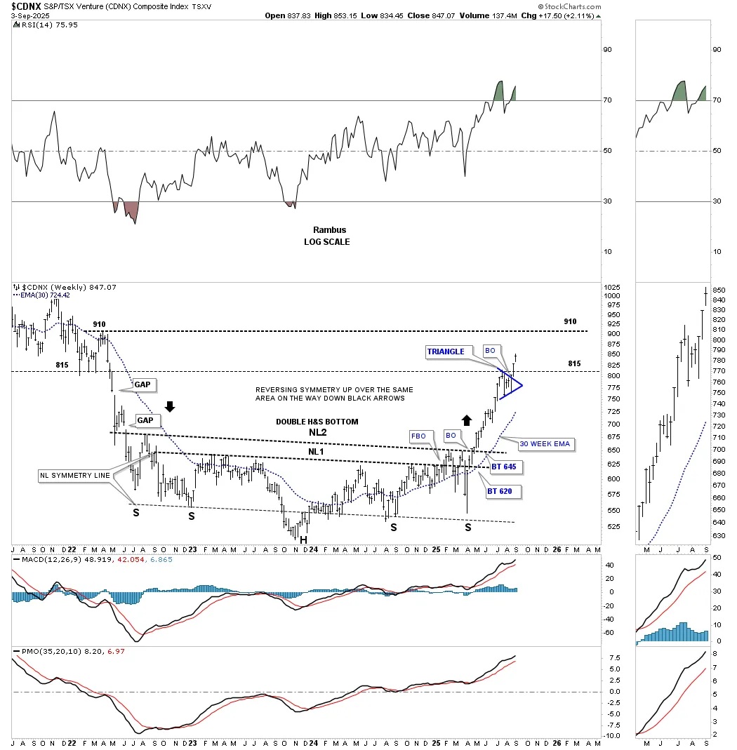
I call this weekly chart for the CDNX the “clean version” as it just focuses mostly on the double H&S bottom. When we got the breakout above NL2, I suggested we could see reverse symmetry up to the 815 area, black arrow, where the three lows formed on the left side of the chart. Since that decline was so steep, there weren’t any important consolidation patterns that formed, so when the price action broke out above NL2 earlier this year, there was nothing to stop the rally until the support and resistance line at 815 was hit. The small blue triangle that formed just below the 815 S&R line is exactly what you would want to see; resistance will now turn into support on any backtest from above. The 910 area, where the previous highs were made on the left side of the chart, now becomes the next target for the CDNX, where we could see another consolidation pattern form as the reverse symmetry continues to play out.
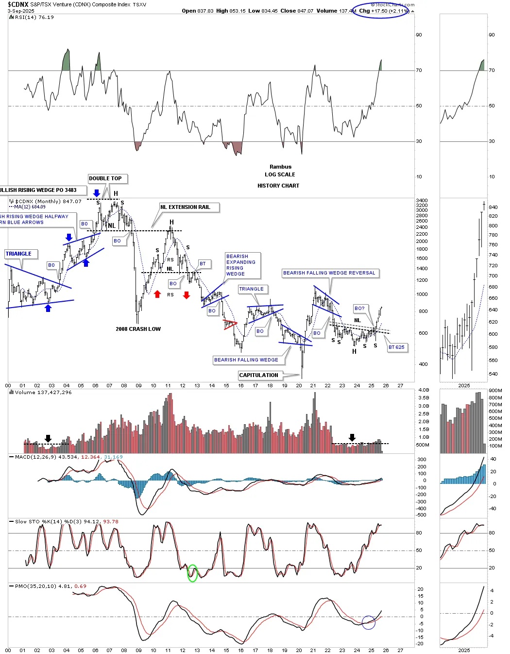
To really put the double H&S bottom into perspective, below is the long-term monthly history chart for the CDNX, which shows how the new bull market in the junior and micro-cap PM stocks is just really getting started. Note the low volume bar during the triangle formation in the early 2000’s which led the CDNX to its bull market high. We have a similar volume setup with the current H&S bottom. As the rally progresses we should see the volume bars start to get larger as interest in this group begins to get noticed.
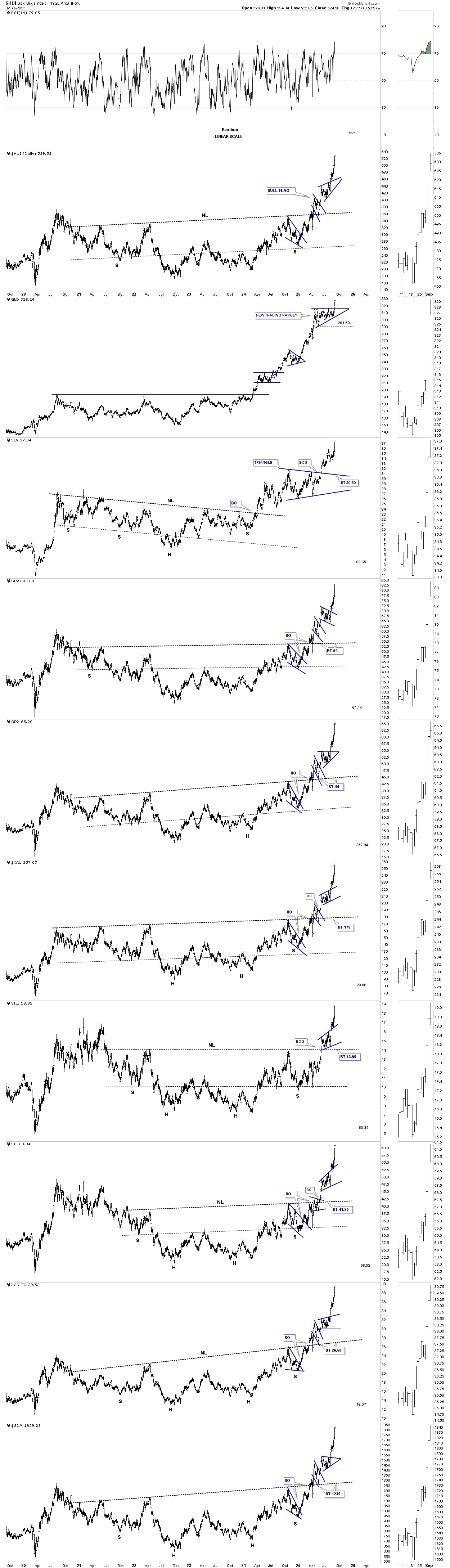
On this short term daily chart for the HUI we’ve been following the smaller April bullish rising wedge for much of its existence, which finally got the breakout last week and has been impulsing higher. You can see that the April bullish rising wedge was made up of three smaller consolidation patterns. Also note the negative divergence on the RSI above, which is the hallmark of a bullish rising wedge.
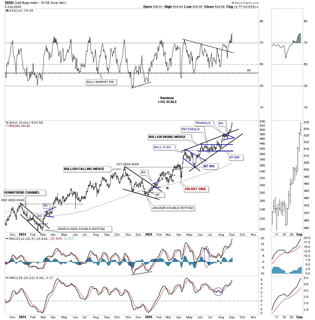
Next up is the daily bar combo chart for the PM complex, which shows the October 2024 bullish rising wedge in most cases. The last small blue consolidation pattern either formed just below or just above the top rail of the October rising wedge before the current impulse move got underway.
You can see GLD finally broke out from its April triangle and SLV broke out above its second diamond, as those two had been lagging on a short-term relative basis as the PM stock indexes were rallying strongly to the upside. Both SIL and SILJ formed a bullish rising flag with a smaller blue consolidation pattern as the backtest. This is about as bullish as it gets.
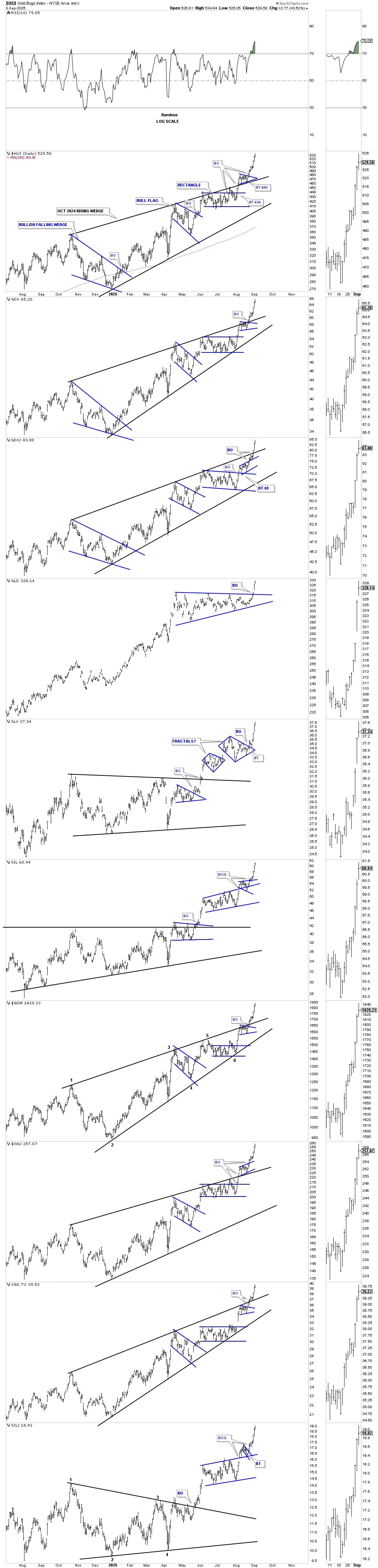
Next is the companion daily line chart to the daily bar chart above for a slightly different perspective. When we saw the breakout of the top trend line, we were looking for the possible backtest, which is usually the case but not 100% of the time, to confirm the breakout. When the backtest held support, it was game on for the PM complex.
Again, you can see GLD, which had been trading sideways forming the symmetrical triangle while the rest of the PM stocks were breaking out, finally had its breakout last Friday, joining the party. On this daily line chart, I combined the two fractal diamonds on the daily bar chart above into one larger diamond, which also has broken out.
Next is the short-term daily combo chart, which just focuses on the smaller April bullish rising wedges in most cases. Note how the internal structure of most of the bullish rising wedges and flags formed multiple smaller consolidation patterns, which is how most larger consolidation patterns are formed. Note SLV’s fractal diamond, which we’ll look at in more detail in just a bit.
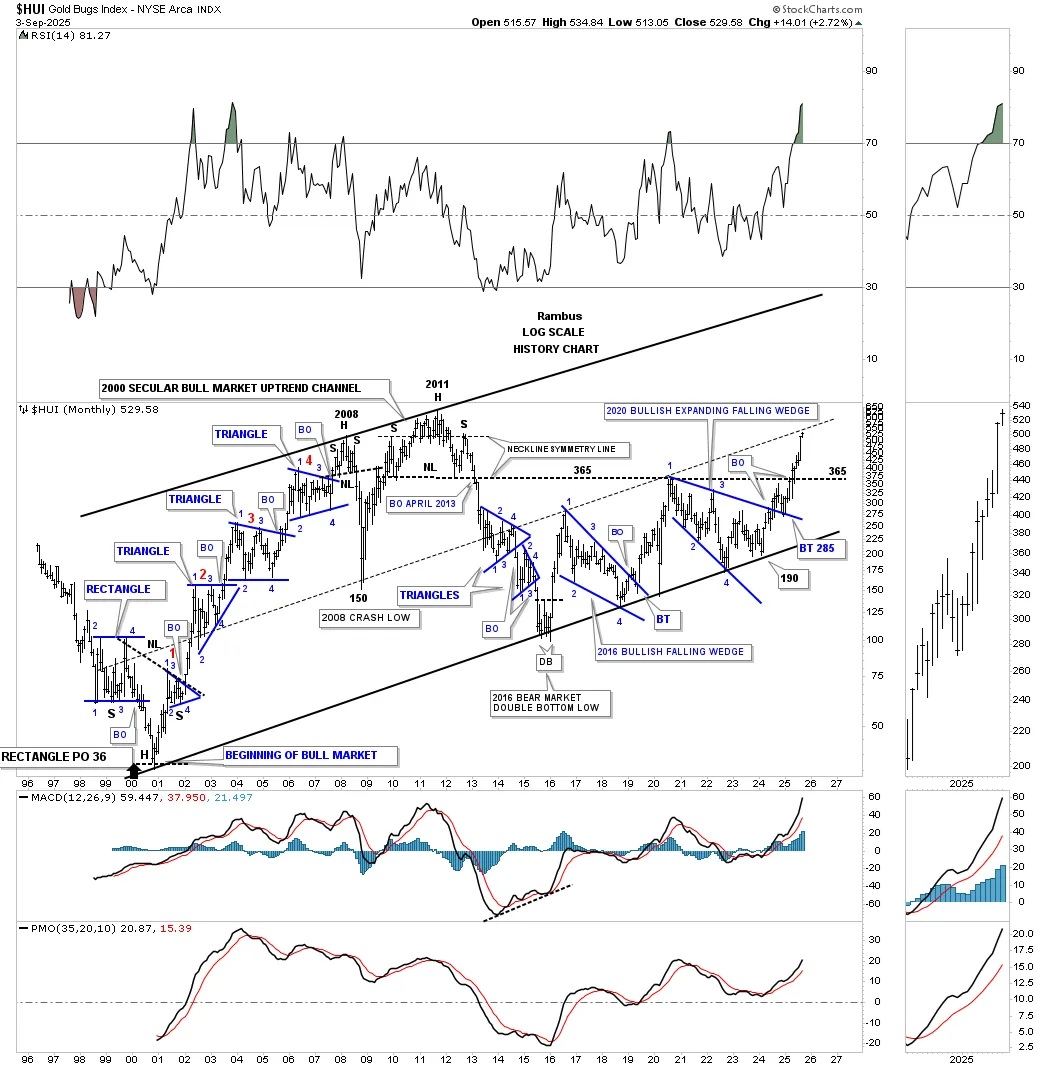
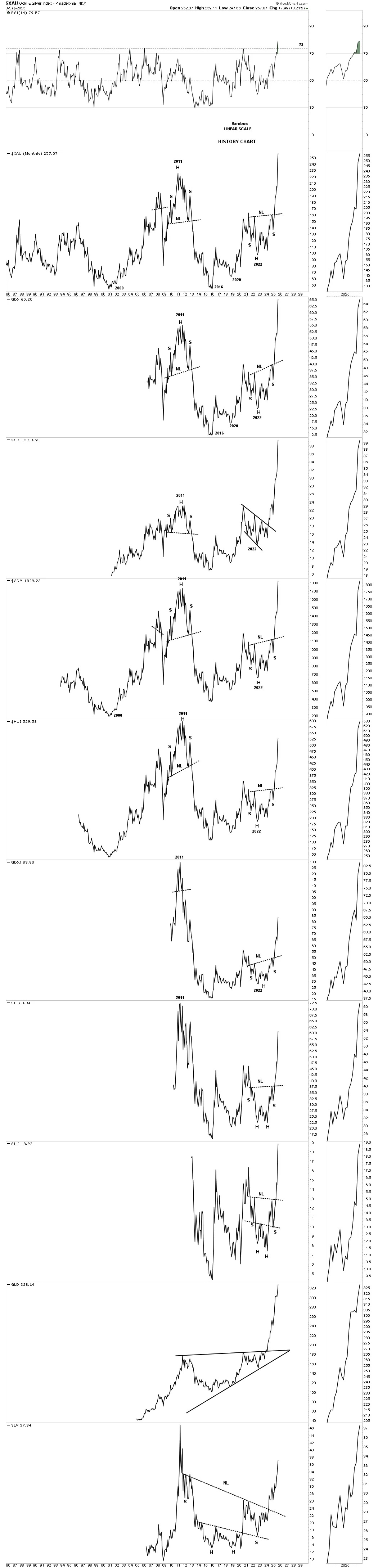
The bear market in the precious metals complex officially ended in 2016 after the first leg up of the secular bull market, which ran for eleven years from 2000 to 2011, came to an end with a multi-year H&S top in most of the PM stock indexes.
The new second half of the secular bull market that began at the 2016 low had been a slow and laborious grind higher, with two very large consolidation patterns – the 2016 bullish falling wedge and then the 2020 bullish expanding falling wedge – forming the 2016 uptrend channel, which is just part of the 2000 secular bull market parallel uptrend channel.
Those two very large consolidation patterns took the wind out of the sails for most of the investors in the PM complex, which is the job of consolidation patterns. The most recent 2020 bullish expanding falling wedge is the largest consolidation pattern that the HUI has ever built in its entire history, so if you survived that one, you can congratulate yourself.
As the 2020 bullish expanding falling wedge is the largest consolidation pattern the HUI has ever built, then we can assume the impulse move will also be the largest in history. As you can see, when the top rail was backtested in January of this year at 285, it hasn’t looked back. The neckline extension line taken from the 2011 H&S top was resistance when the 2020 rally came to an end and the 2020 bullish expanding falling wedge began to form. This most recent rally took out the 2020 high after a short pause and has now reached the center dashed midline of the 2000 parallel secular bull market uptrend channel.
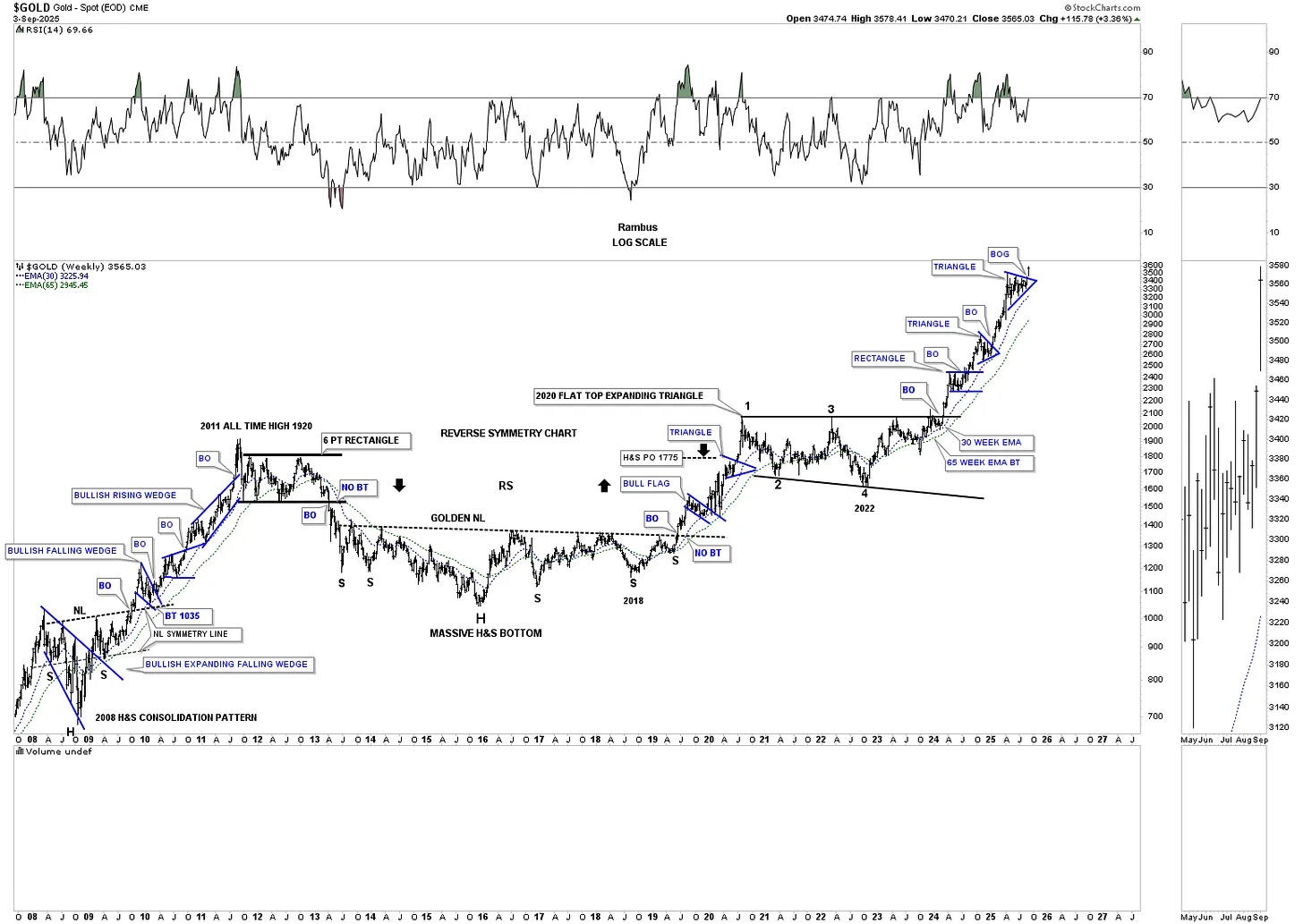
On the left side of the chart, you can see how the first leg of the secular bull market that ran from the 2000 low to the 2011 all-time high formed one consolidation pattern on top of the previous one, which is classic bull market price action. There was a small H&S top in 2008, which led to the 2008 crash, which found support on the center dashed midline. That correction formed a V-bottom, which led to the last leg into the 2011 high. Again, note how the neckline symmetry line showed the high for the left and right shoulders during the formation of that very symmetrical 2011 H&S top.
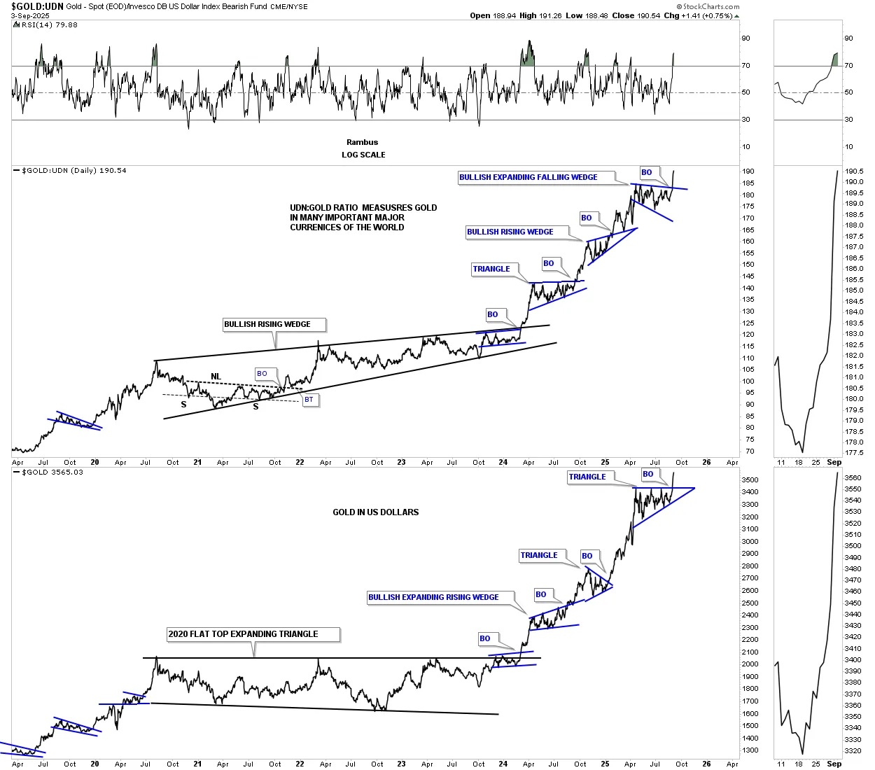
We’ve been following this triangle for gold beginning around the 4th reversal point, looking for what possible consolidation pattern may form. We didn’t know if the April trading range was going to be a rectangle or a triangle, but we were expecting some type of consolidation pattern. There was a false breakout below the original bottom trend line at reversal point #6, which turned out to be just a false breakout/bear trap. Last Friday, we finally got the breakout.
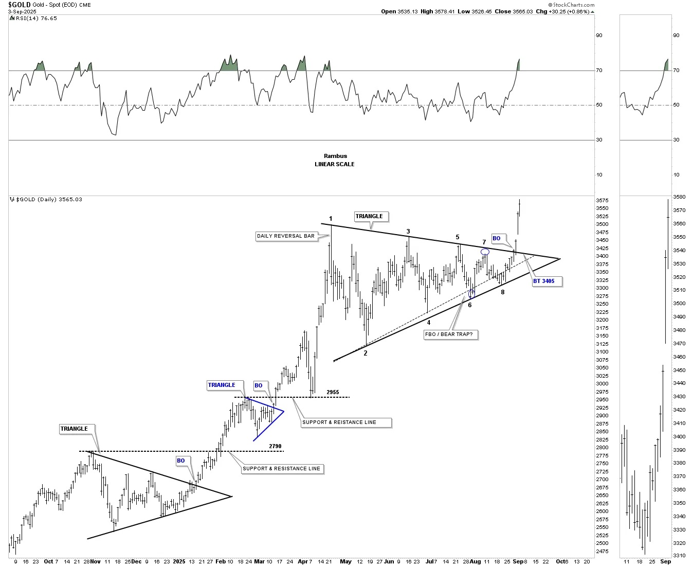
To put the April triangle on the daily chart above into perspective, below is a longer-term weekly chart, which shows the massive rally after the breakout from the 2020 bullish flat-top expanding triangle, with the recent blue consolidation pattern completing and in breakout mode. This chart shows what a classic bull market should look like, with one consolidation pattern forming on top of the previous one, until it’s time for a much larger consolidation pattern to start forming – think 2020 flat-top expanding triangle.
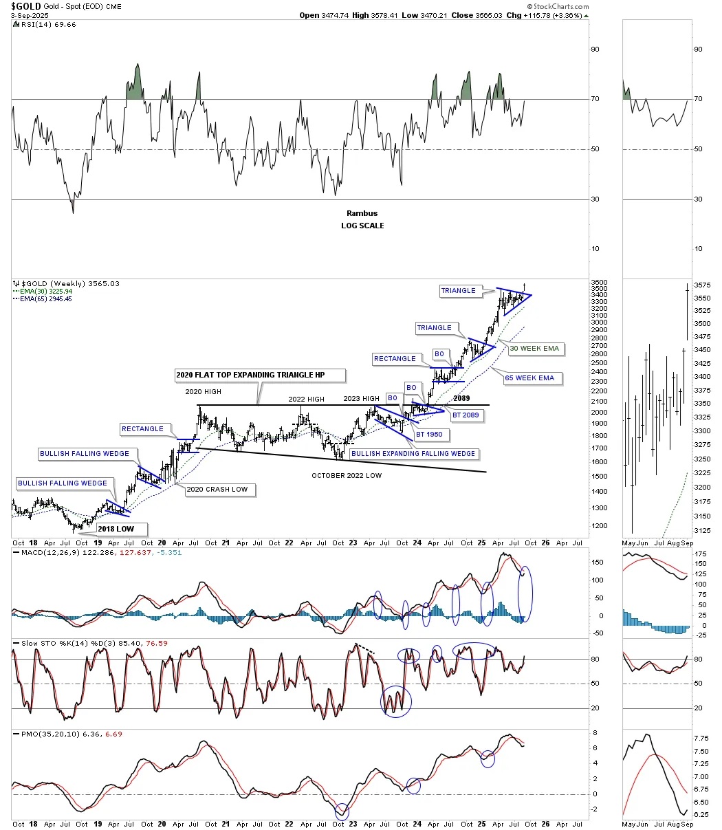
This much longer weekly chart shows the last rally phase after the very bullish expanding falling wedge/H&S consolidation pattern formed at the 2008 crash low. You can see the small blue consolidation patterns that formed one on top of the previous one into the 2011 high.
The bear market low in 2016 was the head of the very large H&S consolidation pattern, which reversed the 2011 bear market. Eventually, gold is going to form a larger consolidation pattern, but until it does, we’ll just follow the price action and see where it takes us.
Next is a ratio combo chart, which adds more confirmation that this new impulse move up in gold has legs.
Below is a daily ratio combo chart, which has the Gold:UDN ratio on top, showing gold in many of the important currencies in the world, with Gold in US dollars on the bottom. These two generally move together, but sometimes the ratio on top will lead, and other times gold in US dollars will lead. As you can see, last week they both broke out of their respective April consolidation patterns.
During the 2020 consolidation phase in the PM complex, the Gold:UDN ratio formed a bullish rising wedge, while gold in US dollars formed a flat-top expanding triangle, both of which are very bullish patterns.
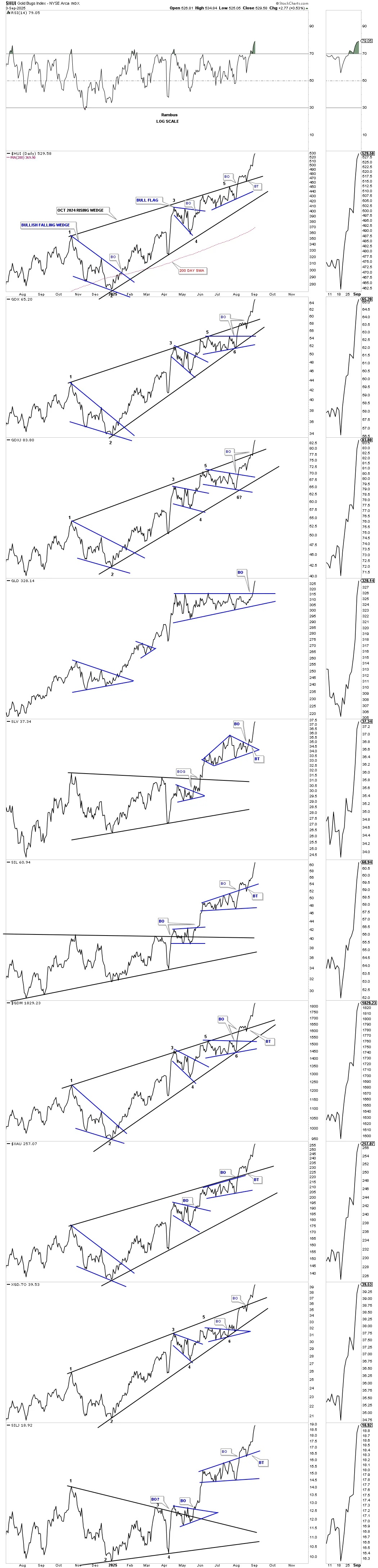
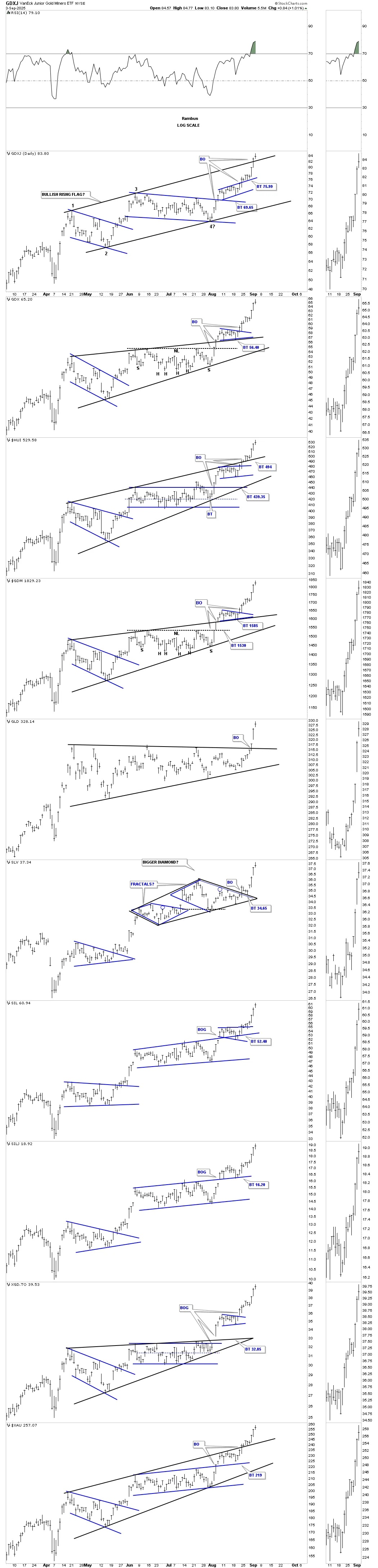
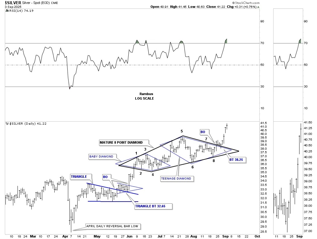
Let’s move on to silver, which is finally coming to life, and how we’ve been following the price action since the breakout from the October 2024 rectangle consolidation pattern. After the initial breakout, silver formed the small, what I called at the time, baby blue 6-point diamond consolidation pattern. After the breakout and backtest, the rally phase began, but was very weak and not what should have happened. When that takes place, I will look for a larger consolidation pattern to start forming, which will then encompass the smaller pattern. As you can see, silver formed a second 6-point diamond on top of the smaller baby diamond, which I called the teenage diamond, as it was slightly larger in time and price. Last week, we got the backtest to the top rail of the teenage diamond at $38.35, and the rest, they say, is history.
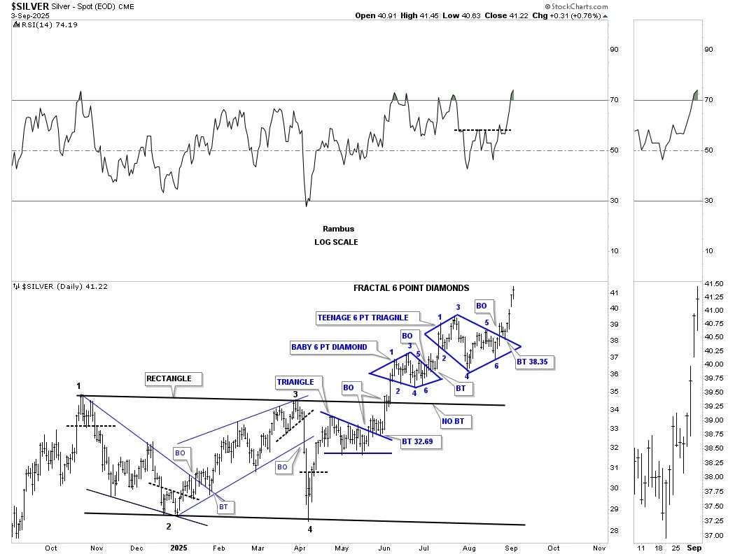
Since the two 6-point fractal diamonds were so small, I combined them into one larger diamond, which I described above is how a larger consolidation pattern can form. The larger black diamond has 8 reversal points. I called this larger black diamond the mature diamond, as it’s bigger than the 2 smaller fractal diamonds. Again, you can see the perfect backtest to the top trend line and the impulse move that has begun, with silver now making new higher highs.
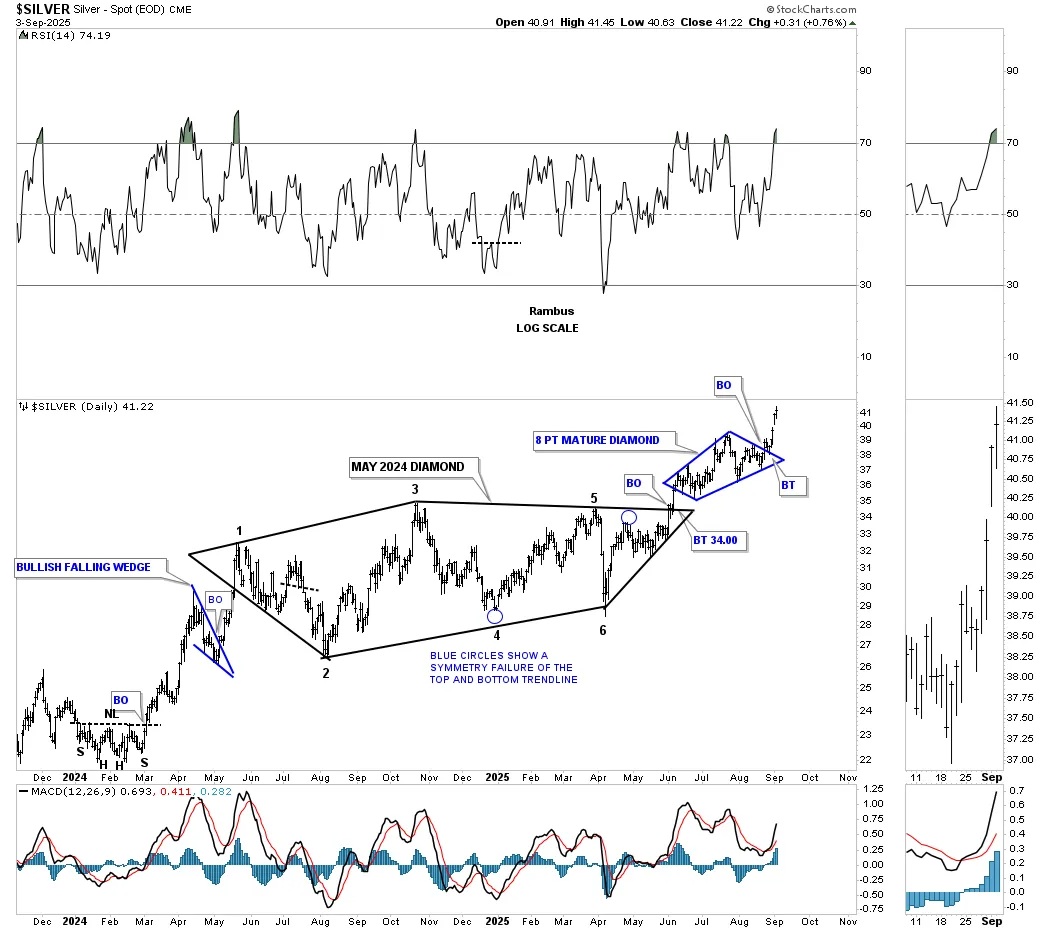
To put the 8-point diamond on the chart above into perspective, you can see on this longer-term daily chart below how it formed the backtest to the much larger May 2024 six-point diamond consolidation pattern.
Let’s wrap it up by looking at some very bullish long-term charts, which show how this unprecedented bull market is evolving. This next chart shows the 2020 bottom, which led to that near-vertical rally into the 2020 high, which began the formation of the 2020 bullish expanding falling wedge in the PM stock indexes.
Note how the PM complex rallied into the 2020 high, with the HUI gaining 156% before it began to correct. Now look at the CDNX on the very top; it rallied for another six months, finally topping out in February 2021, gaining 241%. Once the junior and micro caps start to rally, they can go up faster and further than most think is possible – speculative fever. As you can see, currently the rest of the PM complex has been stronger than the CDNX, but the time has come for the CDNX to start flexing its muscles.
Keep the 2020 bullish expanding falling wedge in the back of your mind as we look at this next combo chart, which shows the four-year H&S consolidation patterns that formed on most of the PM stock indexes. I’ve run out of annotations, but you can see the necklines and the breakout and backtesting that took place before the current rally phase took off. Again, classic Chartology.
Now I’m going to try to tie all the pieces of the puzzle together, so you can see what the very big picture looks like and how young this bull market really is yet.
Remember the combo chart just above, which was showing the 2020 bullish expanding falling wedge and the chart just above, which is showing the four-year H&S consolidation pattern? When you combine these two patterns into one, you get the very bullish combo consolidation pattern, which has formed in the apex of these very large 2011 triangle consolidation patterns.
Note the breakout point of the 2020 bullish expanding falling wedge and the top rail of the 2011 black triangle and the small rally that ensued. During the backtest, the right shoulder of the four-year H&S consolidation pattern was formed. After the backtest was completed and the right shoulder low was in place, the current impulse move began, which looks classic in every sense.
How do we know that the 2020 bullish expanding falling wedge in combination with the H&S consolidation pattern is a very bullish pattern? Just go back up to the weekly chart for gold, that shows the 2008 crash low, which was the exact same setup we see now. That rally led to the 2011 high with several small blue consolidation patterns forming along the way.
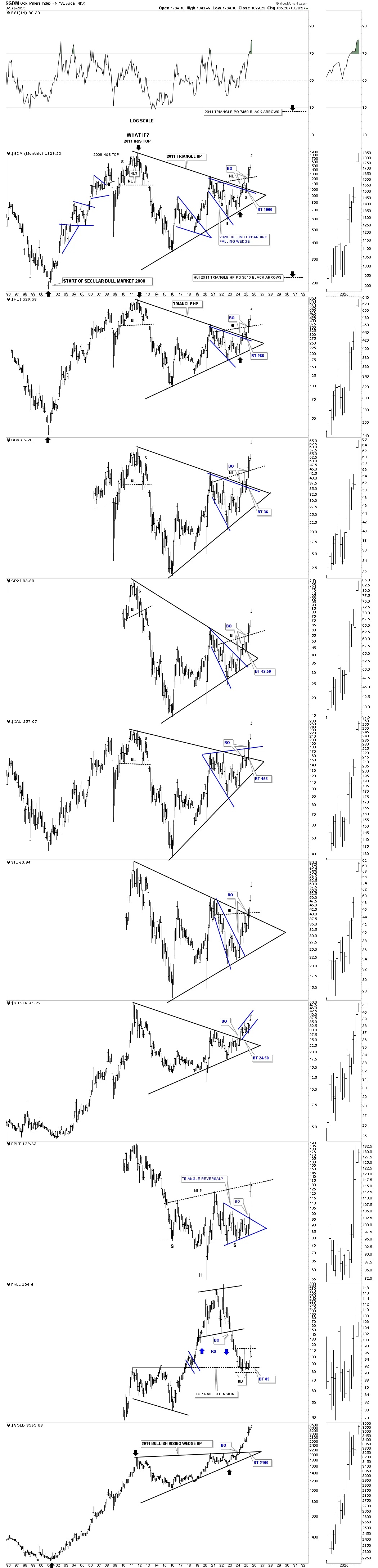
I’d like to finish up by looking at this one last long-term monthly line chart in linear scale for the PM complex. I’ve been calling the current second leg of the secular bull market, which began at the 2016 low, unprecedented. Since the right shoulder low in January of this year, the PM complex has been in one massive impulse move higher, barely stopping to catch its breath yet. Also, note how many of the indexes are now trading at new all-time highs on a monthly closing basis. Up until this year, gold had been the leader in the PM complex, but now the PM stock indexes are getting their turn to show what they can do, which so far is pretty amazing.
I have many more long-term charts we could look at for more confirmation that the secular bull market has much further to run, but these will have to do for tonight. All the best…Rambus.
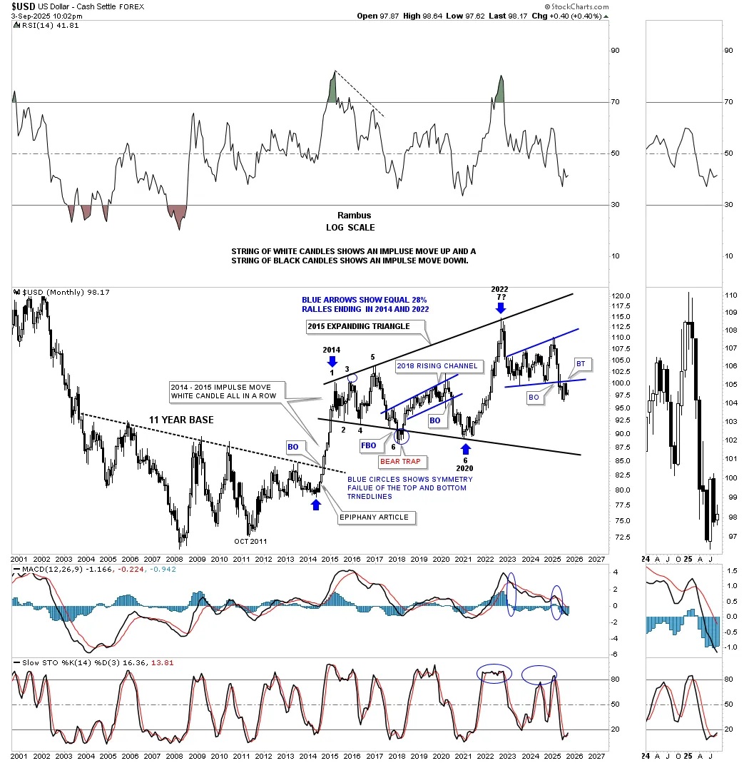
PS: I almost forgot. If the PM complex is going to have an unprecedented bull market then the US dollar will have to have an unprecedented bear market which so far has been the case since the 2022 high. The US dollar formed the 2022 bearish expanding rising wedge which experienced the breakout and backtest to the 101.50 area. Now we just need to see a new lower low put in place to confirm the next leg down is underway which should be very bullish for the PM complex.
*********
 Meet Rambus, a seasoned trader and technical analyst renowned for his unbiased and insightful chart work. Through his website, Rambus Chartology, and Substack newsletter, Rambus shares his expertise with a global community of subscribers, providing daily updates, commentaries, and hands-on training in the art and science of chartology. With his calm, humble, and down-to-earth approach, Rambus demystifies complex market trends, helping his followers navigate the challenges of today's volatile markets. Join the Rambus Chartology community today and discover a unique blend of technical analysis, trading expertise, and time-tested protocols. Subscribe now at www.rambus1.com or https://rambuschartology.substack.com/


