The US Dollar and Oil…The Inflation/Deflation Battle Rages On


There were some interesting developments this week that I would like to focus on in the Weekend Report. The most important thing to happen was the rebound in the US dollar that was very impressive. Is the bottom in or is this just a short covering rally that will peter out when it’s finished? Oil continues to fall at a rapid rate which could be signaling another deflationary event maybe on the horizon. There are still a lot of crosscurrents out there but if we can get a good read on the US dollar and Oil that should help us understand what is likely to take place over the intermediate term.
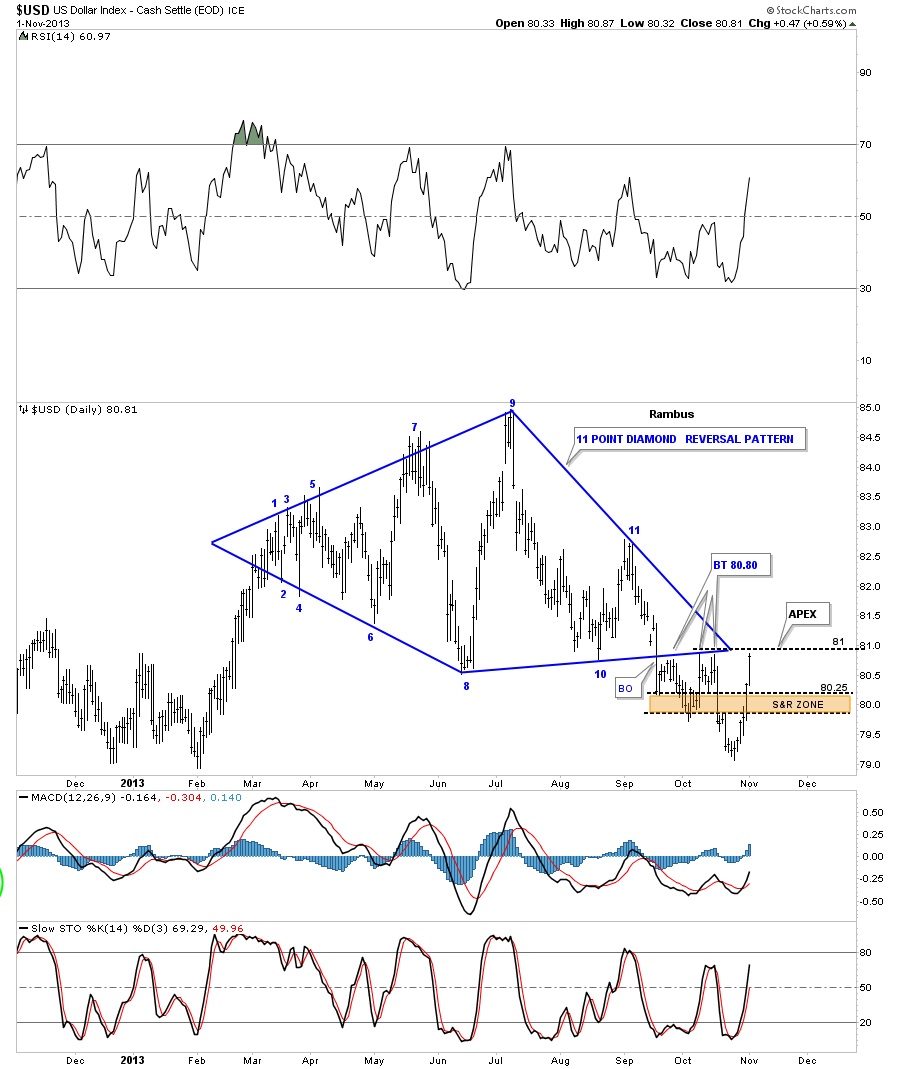
I have a ton of US dollar charts I would like to show you so lets look at some of them and what they’re showing. First, lets start with the eleven point Diamond that broke down in September of this year and had several backtests to the underside of the bottom rail before it moved lower. The US dollar had a strong counter trend rally this week which is now trading right back up to the backtest area at the apex of the Diamond. This is a critical area where the confluence of the support and resistance rails are focused like a laser beam at one point, the apex. If the US dollar can trade above this critically important area that would be one for the dollar bulls.
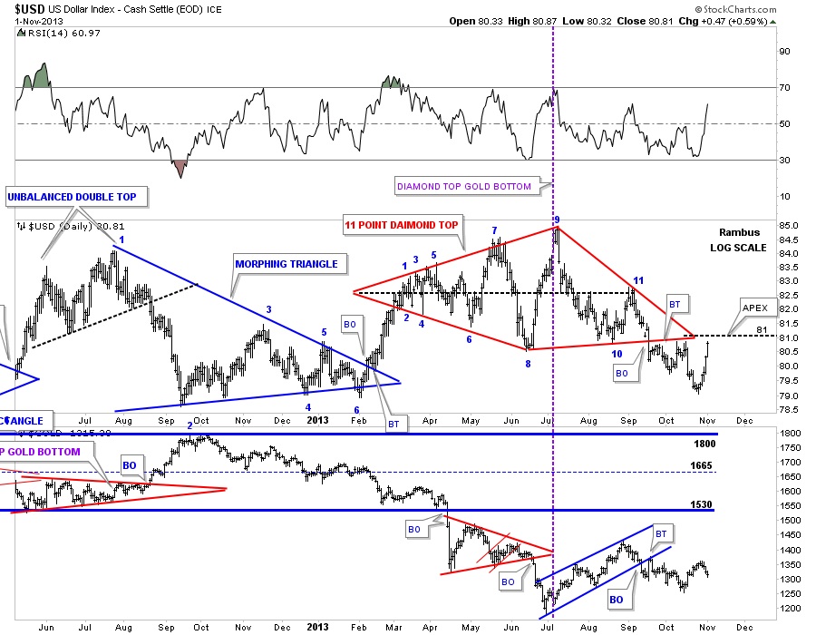
This next chart shows when the US dollar put in its top at reversal point #9 gold was putting in a nice bottom that led to a 250 dollar rally that shows the inverse relationship is still working. As you can see last weeks rally in the US dollar put gold on the defensive.
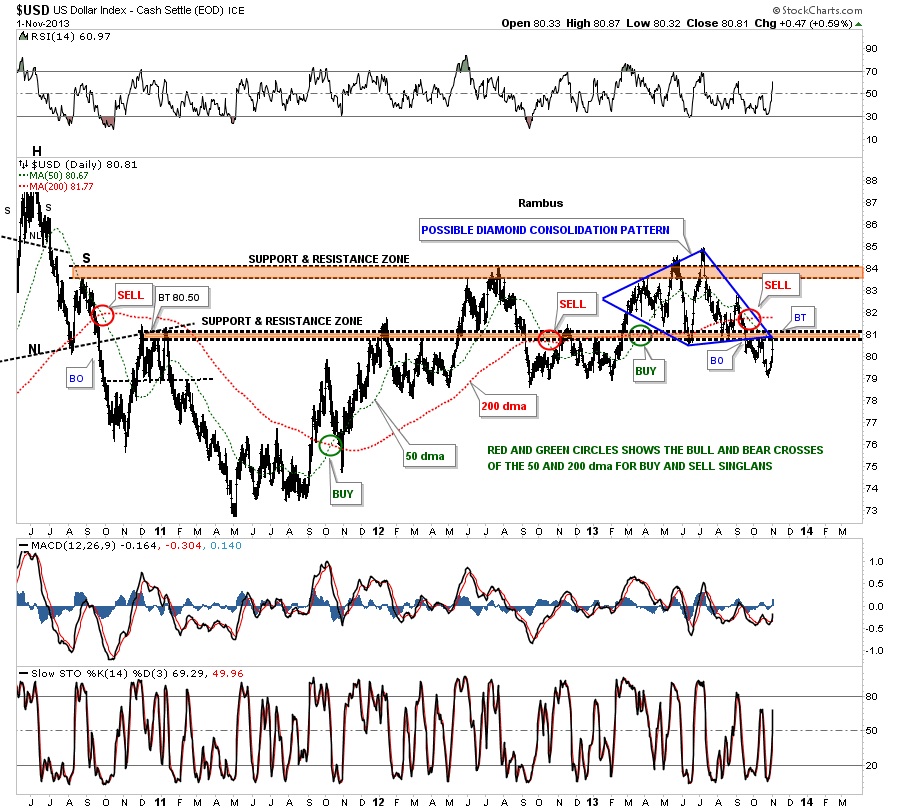
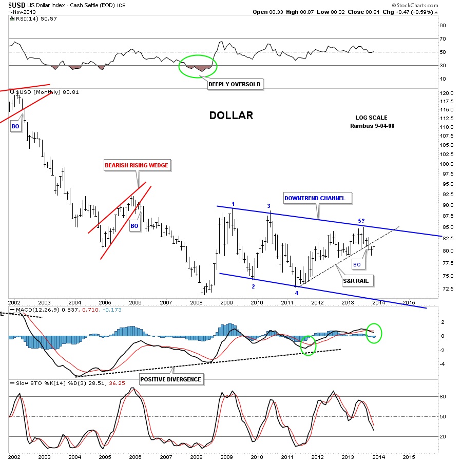
This next chart is a longer term look that shows the Diamond and our rally from last week as a backtest so far. The red and green circles shows where the 50 dma and the 200 dma have crossed over giving buy and sell signals. As you can see the dollar is still on a bearish crossover at the moment.
Next lets look at the old original expanding triangle which led to the Diamond pattern. As you can see the bottom rail is still HOT after all this time as this is where the dollar is getting its bounce. This recent low at reversal point #10 completed the ninth reversal point which is telling us it’s a reversal pattern to the downside. In order to get the 10th reversal point completed the dollar would have to rally all the way up to the top rail to compete the 10th reversal point putting the expanding triangle back into a consolidation pattern to the upside if it breaks through the top rail. Expanding triangles like this tells you the volatility is getting to extreme levels as each swing is getting bigger and bigger suggesting the dollar is getting out of control. Right now the dollar is testing the brown shaded support and resistance zone from below which is its first real obstacle to moving higher.
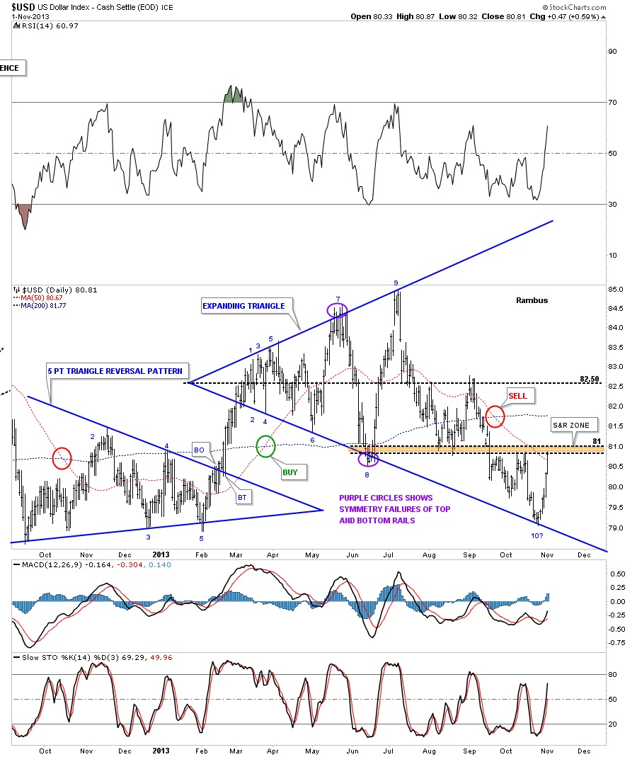
I have to give this next chart to the bulls as they have managed to trade above the support and resistance rail that I have to label as a false breakout for the time being. If the dollar bulls can get the price action above the brown shaded support and resistance zone, directly overhead, that would be another positive development for the bulls.
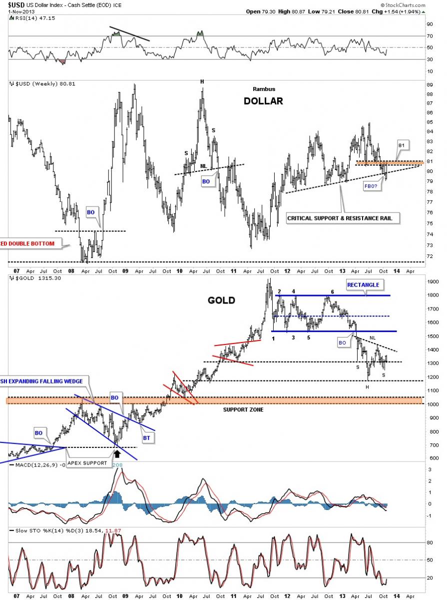
The reason the dollar chart above is so important, especially with the support and resistance rail, is because of what the implications are if the S&R rail can hold support. I’ve shown you this next chart many times in the past that shows the big picture for the dollar. Notice the thin black dashed line on the far right side of the chart that is the support and resistance line from the chart above. If this critically important line holds it will put the bigger picture of a strong US dollar back into play. The dollar would need to take out the thicker S&R rail to really create a strong move to the upside. So far the thick down sloping S&R rail has held resistance on several attempts by the dollar to breakout.
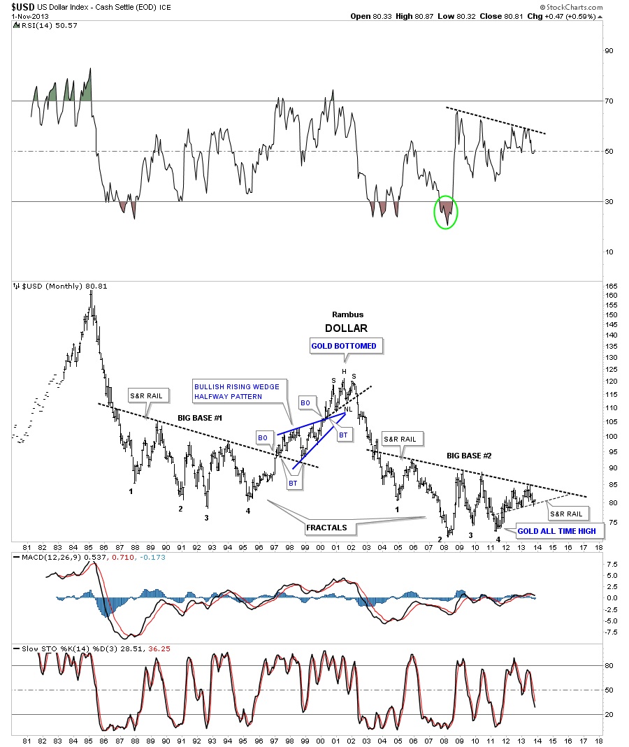
This next long term monthly chart shows the US dollar breaking below a 2 plus year uptrend, black dashed line, that has formed within the completed downtrend channel at reversal point #5. Is this just a backtest move to the thin dashed line or something bigger?
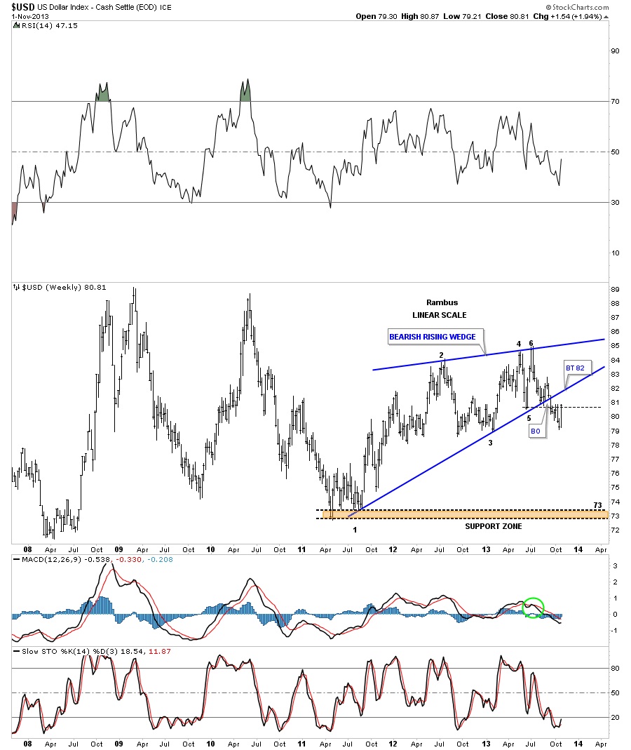
Lets look at weekly chart for the US dollar that shows a bearish rising wedge that has broken down. A complete backtest would come in around the 82 area.
Lets look at one last chart for the US dollar that shows the very long term look that shows a potential very large H&S top pattern. I really don’t expect this chart to play out but in a worst case scenario, if inflation was ever to go hyper, then this chart would probably play out and gold would go to the moon. You can see why our latest support and resistance rail, that had the false breakout to the downside and has reverse back up above that important rail, is so critical to the big picture. We are at junction city USA.
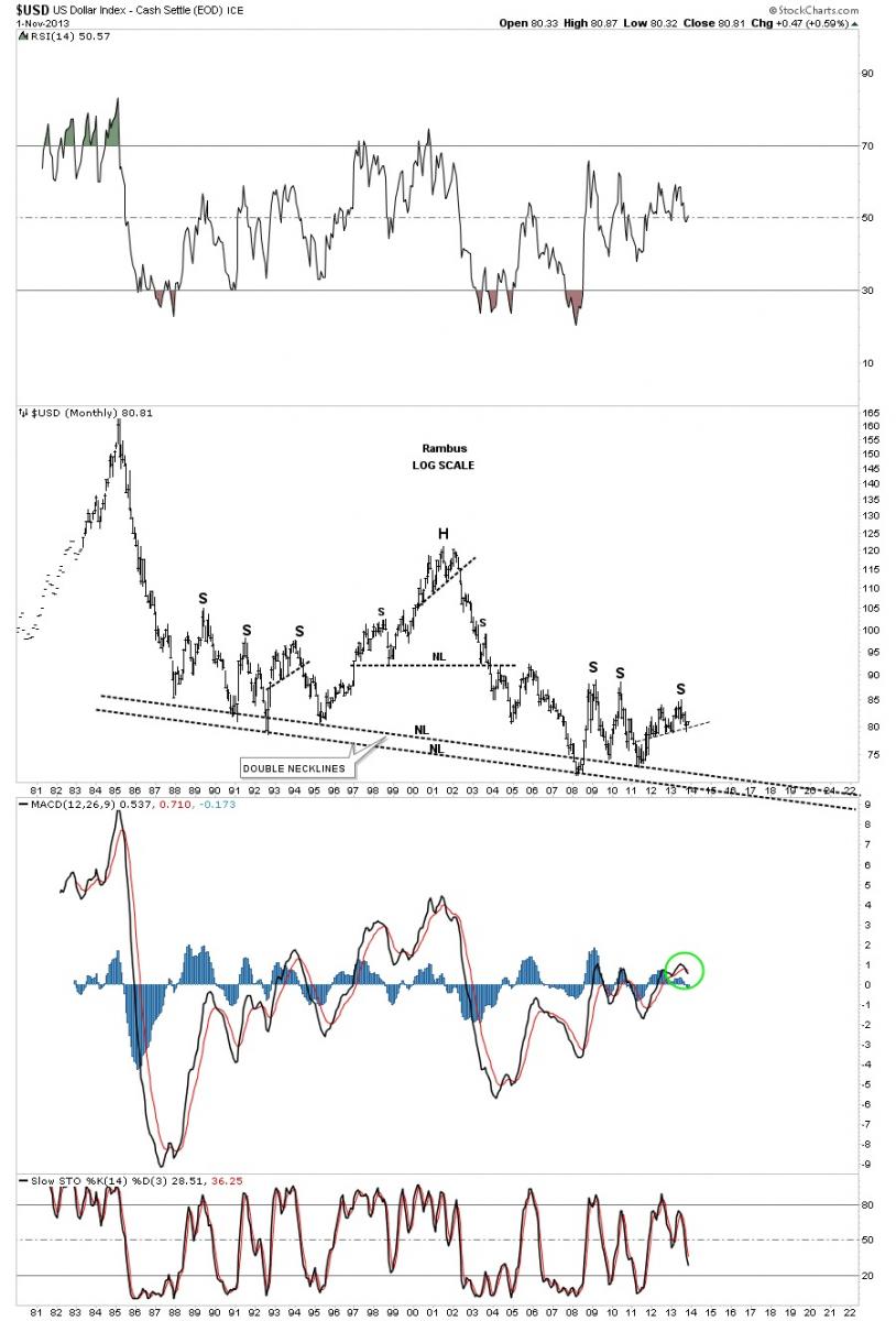
So far what the US dollar charts are showing us is that it’s time for the bulls to step up to the plate and break through all the overhead resistance rails to turn the dollar back up into an uptrend. The ball is in their court right now.
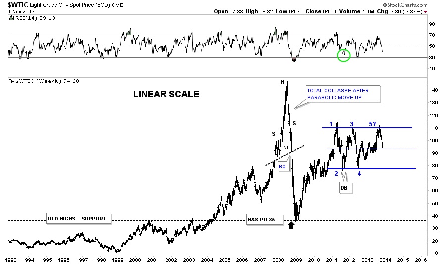
Now lets look at the most important commodity on the planet which of course is Oil. We shorted oil when it broke down from the support and resistance rail as that showed me a creditable top was in place. So far the price action is moving down in reverse symmetry to how it went up this past summer on the daily line chart.
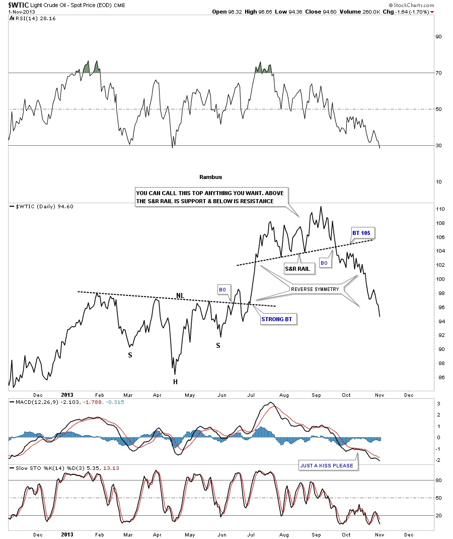
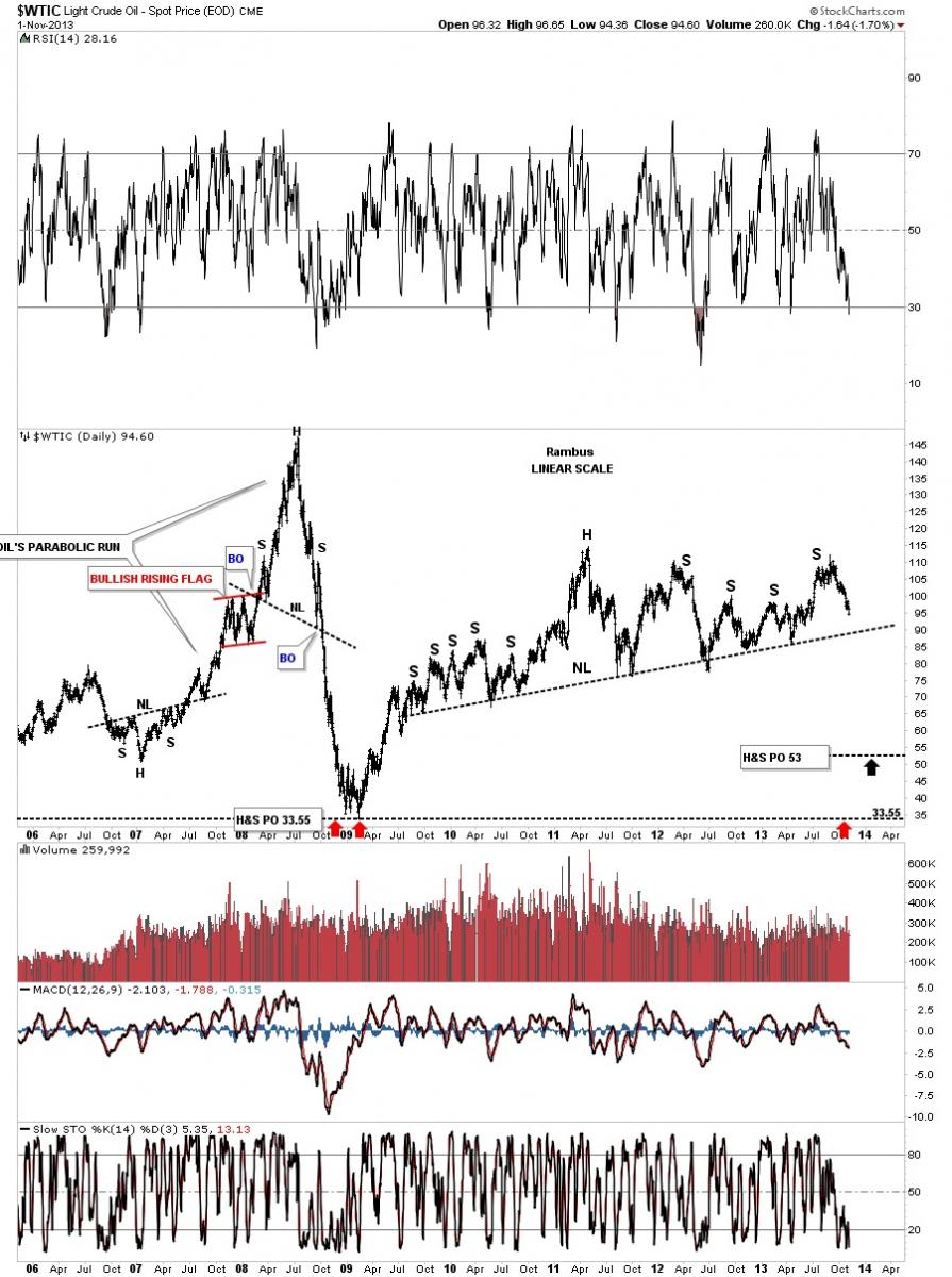
Lets look at the same top using a bar chart that shows us Oil created a red bearish falling wedge that is approaching a short term price objective down to the 92.71 area. This would be a good place if one wanted to take some profits.
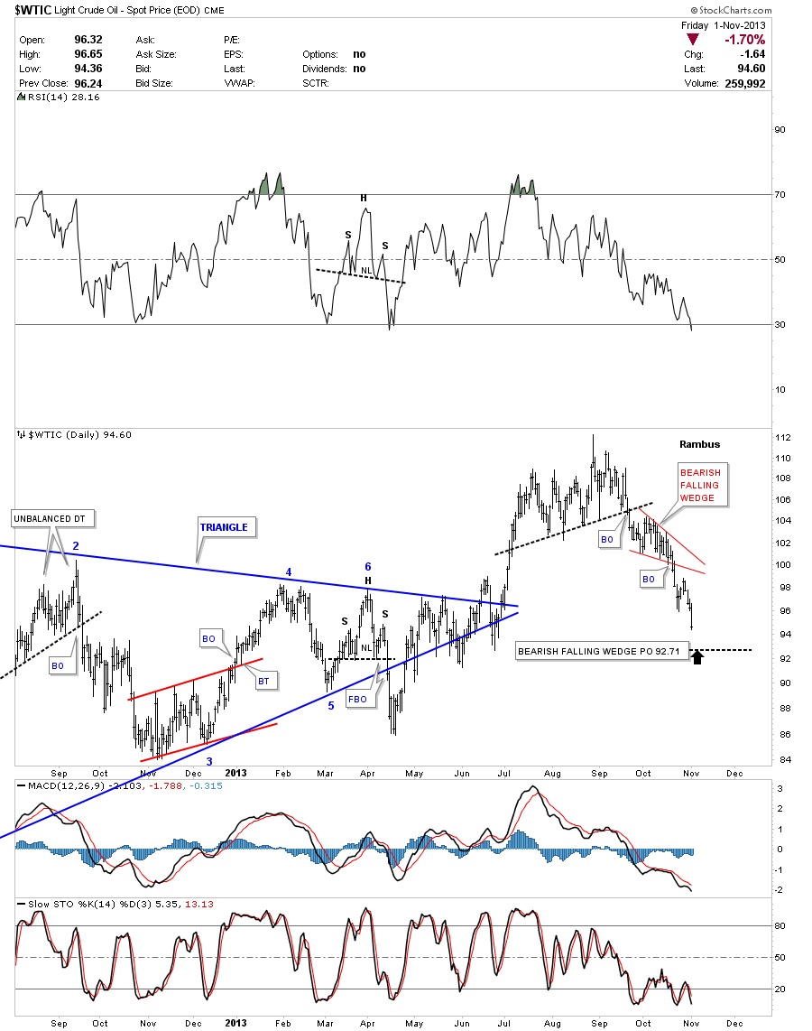
Before we move on I want to show you how the false breakout, that I attributed to the Syrian crises, looked like the real thing at the time as the price action broke above the 2 1/2 year top rail of the blue triangle. Everybody and their brother saw that breakout but when I looked at it from a different perspective I seen something totally different. First the blue triangle with the false breakout.
Below is the weekly chart I showed you where I used horizontal trendlines for the top and bottom of the big trading range. Doing this gave me a much clearer picture of what was really taking place. Many times horizontal support and resistance zones gives one a clearer picture even though the tops and bottoms are not specific points but more of a zone, thus the brown shaded support and resistance zones I often show. As you can see Oil is now working on a possible 5th reversal point in a rectangle which would put this rectangle into a reversal pattern if the price action eventually breaks through the bottom brown shaded support and resistance zone.
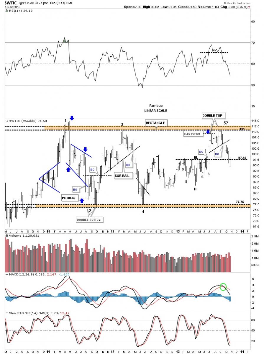
This is what the rectangle would look like on a very long term chart of oil. If this rectangle turns out to be a 5 point reversal pattern and breaks out to the downside I think the deflationary scenario I’ve been looking for would come to fruition.
I want to show you one more long term look at oil, that I’ve been showing for a long time now, that has yet to materialize but with the recent weakness its starting to get interesting again. This chart shows a massive H&S top pattern that has teased me several times in the past when it would approach the neckline. Note how many times this neckline has been tested over the last 5 years or so. I look at this very long neckline as the line in the sand between deflation or inflation. If the neckline can hold then the inflation scenario will have merit and the inflationists will have a shot at being correct. On the other hand if the neckline gives way to the downside then the deflationary hole will open up like a black hole that will suck in everything that isn’t nailed down.
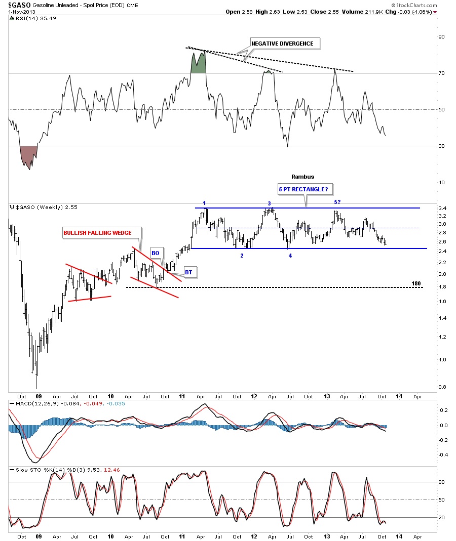
The GASO chart shows it’s approaching the bottom rail of a 5 point rectangle.
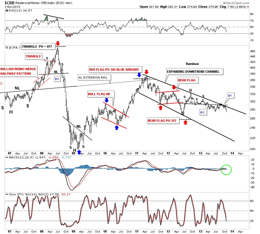
Lets turn attention to the old CRB commodities index that shows us, after trading sideways since July of 2012, it’s now starting to show some weakness as it’s getting close to making a new lower low.
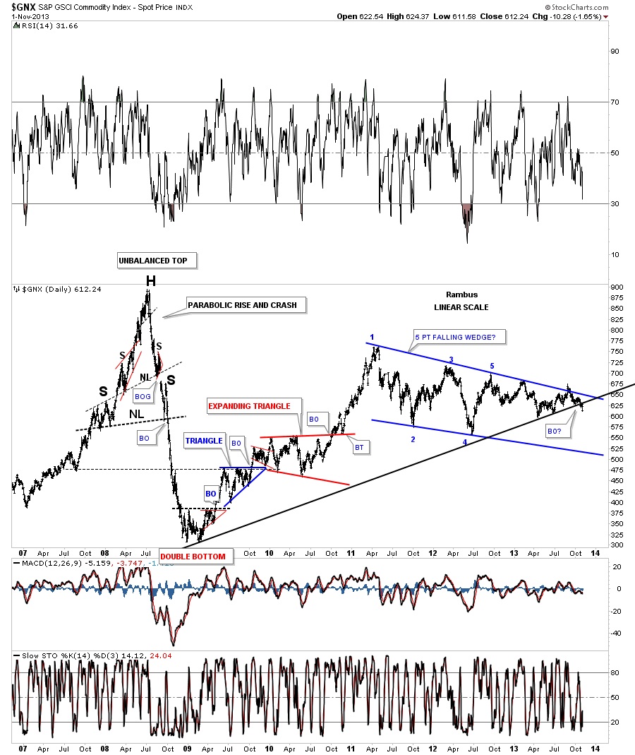
The GNX commodities index.
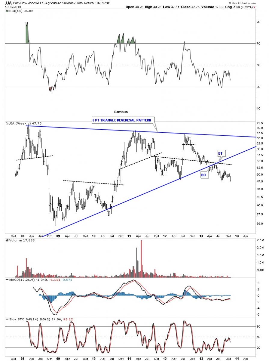
JJA agricultural index.
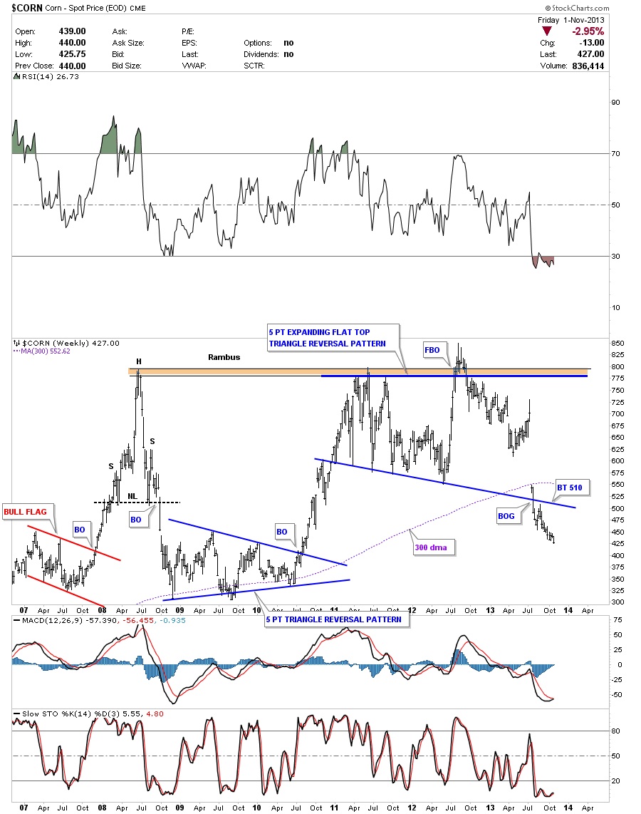
You can use your imagination on what this next chart tells you about the battle between inflation or deflation.
The battle still rages on between the inflation camp and the deflation camp. This has been going on ever since the bull market started for the precious metals complex. If we’re going to see deflation come to the forefront then the US dollar bulls will need to step up to the plate and rally the dollar above some of those close by resistance rails just overhead. Buy the looks of most of the charts above deflation still seems to be in the big picture going forward. How long it takes to really get the ball rolling is anyone’s guess but we seem to inching closer to the inevitable tipping point. How the precious metals complex does is still unclear yet as that sector is still in a trading range which could breakout either topside or through the bottom. I suspect the PM sector will initially fall in the first round of deflation but then turnaround before everything else like it did in 2008. The US dollar will be our biggest clue going forward so that’s where I’ll be keeping a close eye. All the best…Rambus
 Meet Rambus, a seasoned trader and technical analyst renowned for his unbiased and insightful chart work. Through his website, Rambus Chartology, and Substack newsletter, Rambus shares his expertise with a global community of subscribers, providing daily updates, commentaries, and hands-on training in the art and science of chartology. With his calm, humble, and down-to-earth approach, Rambus demystifies complex market trends, helping his followers navigate the challenges of today's volatile markets. Join the Rambus Chartology community today and discover a unique blend of technical analysis, trading expertise, and time-tested protocols. Subscribe now at www.rambus1.com or https://rambuschartology.substack.com/
More from Gold-Eagle


