Valuing The Stock Market With Dividends


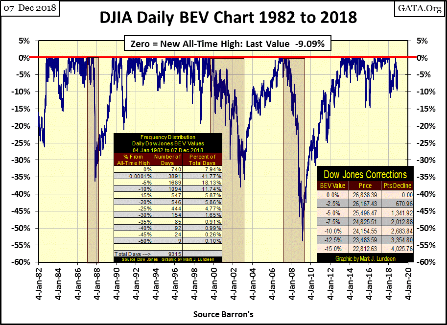
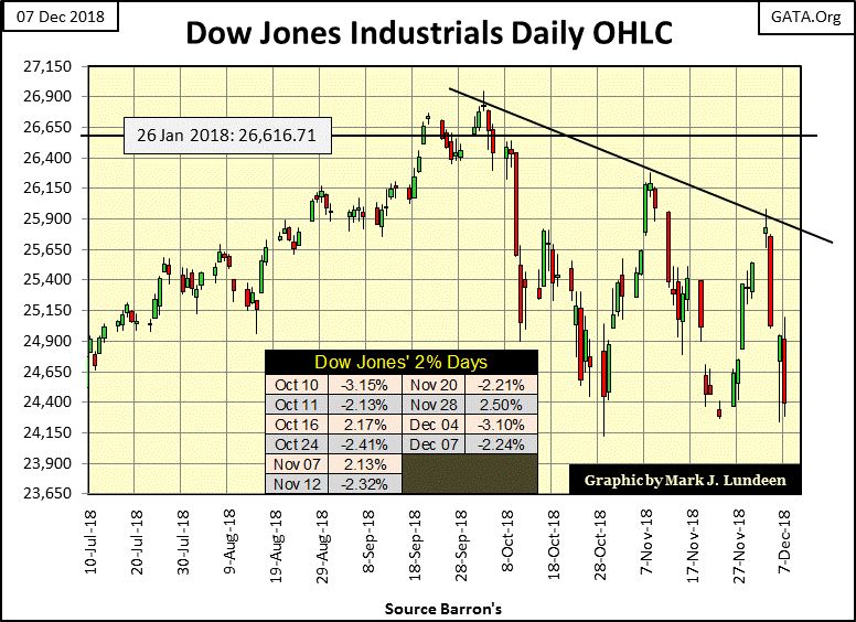
What a week for Mr Bear! Oh, the Dow Jones Index closed 9.09% from its last all-time high of October 3rd. That by itself isn’t a concern of mine. As seen below, since last January the Dow Jones Index has seen lower levels in the BEV chart.
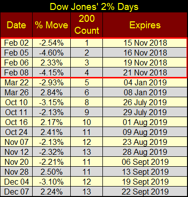
It’s the market’s internals that has me concerned; look at all the days of extreme volatility (Dow Jones 2% days) in the table below. Last January when the Dow Jones came just short of breaking below its BEV -15% line above, it did so on six of these extreme days. These days of extreme volatility stopped after March 26th; the market then recovered and went on to four new all-time highs for the Dow Jones in late September and early October.
This time seems to be different; we’ve seen ten Dow Jones 2% days since October 10th, with the last two just this week. During prolonged market advances, we can go for years without seeing a single one of these. However in the last year we’ve seen sixteen of them, closing this week with a Dow Jones 200 count of 13.
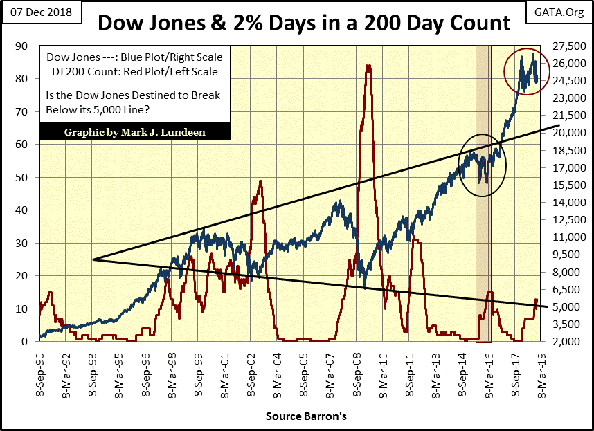
Here’s a chart for the Dow Jones (Blue Plot) and its 200 count (Red Plot: the number of Dow Jones 2% days in a running 200 day sample). We’re only looking at the high-tech, sub-prime mortgage, and our current market bubbles. But the following has been true for all the 20th century bear and bull markets:
-
Bear markets begin on increases in the Dow Jones 200 count
-
Recoveries from bear market bottoms begin on decreases in the Dow Jones 200 count.
Currently the count is at 13 as the Dow Jones has declined by 9% from its last all-time high of October 3rd (26,838), which on the face of it is no reason to panic. What leads me to want to panic before everybody else is looking at the rise in the Dow Jones from its March 2009 bottom.
During a nine and a half year period, the monetary maniacs at the FOMC inflated the valuation of the Dow Jones from 6,547 to 26,828. That’s an advance of 20,828 points in the Dow Jones or 310%. As this bubble inflated, everyone loved the Federal Reserve and its “monetary policy.” But inflationary bubbles in the market have never been a source of permanent prosperity; the post March 2009 bubble seen below won’t be an exception.
NYSE 52Wk Lows have dominated the market since September 14th. On Thursday this week the NYSE 52Wk H-L Net was -613, the deepest decline seen by this indicator since the Dow Jones peaked on October 3rd. The NYSE can’t have a bull market if a rising number of its issues continue deflating to their 52Wk lows, which seems to be the case in early December 2018.
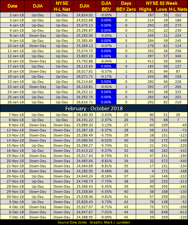
Here’s the Dow Jones in daily bars. What’s there to say except volatility just keeps rolling in? Since October 3rd it’s like the surf crashing on a sunny beach when a big storm is raging somewhere over the horizon.
Since October 10th there have been ten NYSE trading sessions where the Dow Jones has moved >+/-2% from a previous day’s closing price, or ten Dow Jones 2% days. And Post October 3rd, even the days that didn’t move 2%, most saw oversized daily volatility when compared to the market pre-October 3rd. Something has changed since early October, and I believe that change is Mr Bear has returned to see what mischief he can do to investors’ portfolios.
Last week I noted:
“I last wrote an article on Friday November 9th as the Dow Jones closed with a value of -3.13% in the BEV chart below. Three Fridays later and the Dow Jones closed today with a value of -4.81%. Not much of a difference, until we note between these two Fridays the Dow Jones almost broke below its BEV -10% line only six NYSE trading sessions ago; last Friday November 23rd. Then, beginning Monday this week the Dow Jones recovered 1252 points, a full five BEV points in only * FIVE trading sessions *: very impressive.”
Not to be outdone, Mr Bear this week from Monday’s to Friday’s close (Market was closed Wednesday for George HW Bush’s memorial) declined by 1437 points in only * FOUR trading sessions *: even more impressive!
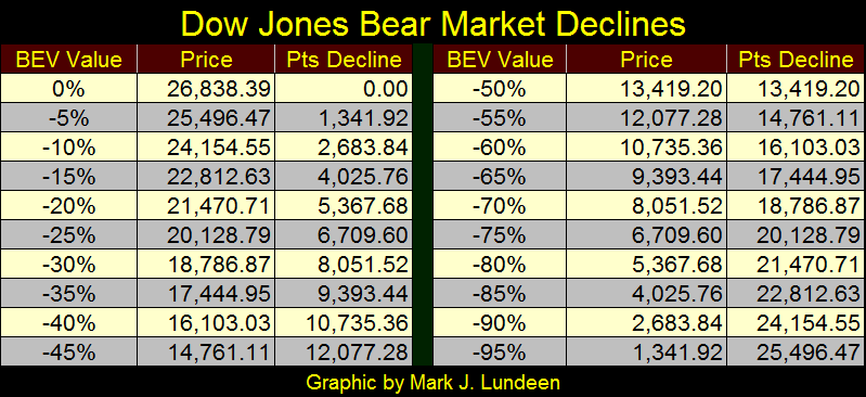
These are huge daily movements in the stock market, and when the market is moving like this, it’s best to limit, or completely eliminate one’s exposure to the stock market. So how bad could it get?
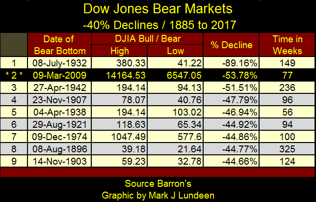
Next is a table of possible declines in the Dow Jones from its last all-time high of October 3rd. This table is just an exercise in mathematical possibility; it has no predictive quality. But if you were wondering if the coming bear market bottom would be as bad as the bottom of the sub-prime mortgage bear market bottom (-53.78%), you could go to the -55% row and see the Dow Jones would have to deflate to 12,077 to accomplish that.
What does have predictive qualities is examining the stock market with the dividend yields for the Dow Jones. Below we see from 1925 to August 1987 (When Alan Greenspan became Fed Chairman), one could time the stock market by simply tracking the dividend yield of the Dow Jones.
-
Rising dividend yields indicated a bear market was in progress. With the exception of the Great Depression bear market, when the yield increased to something above 6% the bottom was at hand.
-
Declining dividend yields indicated a bull market was in progress. When the Dow Jones dividend yield declined to 3%, it was time to exit the stock market.
Alan Greenspan’s “monetary policy” changed all that. He arrived at the Fed with the Dow Jones yielding something less than 3%. A bear market was at hand! But that didn’t happen, as he “injected” the financial system with so much “liquidity” that thirteen years later (January 2000) the Dow Jones yielded a minuscule 1.30%.
His “liquidity”, like a cheap bottle of booze intoxicated everyone from my mother whose memory of the 1930s kept her out of the market for seven decades, to Members of Congress. In the late 1990s Senator John McCain called Greenspan a national treasure for the bubble he inflated into the stock market. I wish I could link to videos of CNBC from the time, a time when finance became a three-ring circus.
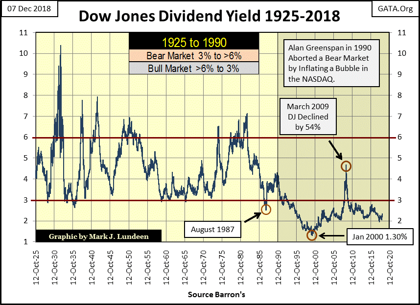
This chart of dividend yields for the Dow Jones illustrates the problem current FOMC “Policy Makers” continue struggling with, a financial system chronically overvalued. In March 2009, at the bottom of the sub-prime mortgage bear market (the second largest bear market percentage decline since 1885) the Dow Jones yielded only 4.74%, not even 5%.
Had the Dow Jones succeeded in seeing a 6% yield in March 2009, its valuation would have had to decline to 5173, or a 63.47% market decline, instead of the 53.78% it actually saw. If you don’t know the difference that additional 10% decline would have been, you have forgotten the pale faces seen on CNBC in March 2009 as market valuations at the NYSE were upchucking dollars on live TV.
Since March 2009 “monetary policy” has continued over inflating the Dow Jones as seen in its dividend yield of less than 3% for almost a decade. Actually, with the exception of the 2007-2009 bear market, the Dow Jones hasn’t seen a 3% yield since May 1993 (twenty-five years), and in my opinion that’s a huge problem for the stock market that Mr Bear is going to correct.
So, since Alan Greenspan became Fed Chairman in August 1987, we see the full extent of the “policy makers’” market machinations by looking at the dividend yield for the Dow Jones. My assumption is when the current market rig comes undone, once again we’ll see a bear market where the dividend yield for the Dow Jones rises up to and above 6%, yields not seen since 1982.
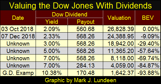
In the table below I used the Dow Jones’ dividend yield and payout to calculate potential future valuations for the Dow Jones. The Valuations are computed by dividing the payout by the yield. If I’m correct, the implications for what is coming are horrendous, yet the percentage reductions in payout and increases in yields used are all within historical parameters.
I did cut the payout by 50% in the second 7% yield example. But during the Great Depression crash dividend payouts for the Dow Jones were reduced by 70% as it yielded 10.38%. Using the Great Depression as a guide in my G.D. example below, that would take the Dow Jones down to 1,642, or a 93.88% bear market claw back by Mr Bear.
If so, that would make the pending bear market the greatest market decline of all time. After a hundred years of the Federal Reserve setting its meat hooks in the market, I don’t rule out any possibility when it comes to pending bear-market consequences.
Next is my Bear’s Eye View (BEV) chart, plotting daily BEV values since February 1885.
What’s a BEV Chart? Its plots the market as Mr Bear sees it. Each new all-time high (BEV Zero) registers as a 0%; because as far as Mr Bear is concerned, each new all-time high is only another big fat zero. All the big furry fellow cares about is how many percentage points can he claw back from the gains the bulls have made from each BEV Zero seen below.
BEV charts are useful when analyzing data series denominated in dollars, data spanning many decades as the Federal Reserve has inflated away most of the dollar’s purchasing power since its inception in December 1913.
I love this chart, and to the best of my knowledge I’m the only market commentator who offers this to the public. There’s a lot of information to be gleamed from this data, the most notable being how many bear markets the Dow Jones has seen since 1885, and how large each was in terms of percentage declines.
I have a Red Line placed at the BEV -40% line. Seeing the Dow Jones deflate by 40% is a huge market decline, after which the bear market was pretty much completed, until we come to the 1929-32 Great Depression crash.
This BEV chart of the Dow Jones illustrates the absolute horror of the Great Depression Crash when compared to every other bear market since 1885, an 89% market decline from a BEV Zero (an all-time high in the Dow Jones). The next deepest bear market was the -53.78% market decline seen on 09 March 2009 at the bottom of the sub-prime mortgage bear market.
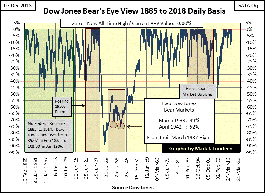
The sub-prime mortgage bear market would have been much deeper had it been allowed to follow its natural course. But Doctor Bernanke implemented three bouts of Quantitative Easings that “injected” many trillions of dollars into the financial markets as he lowered his Fed Funds interest rate to an effective Zero% for seven years.
The net effect of Doc Bernanke’s “policy” was the creation of many trillions in new mortgages, corporate and government bonds, all at unnaturally low yields as well as inflating the Dow Jones with 20,281 points from March 2009 to October 2018. The Main Stream Financial Media hailed Doctor Bernanke a genius at the time.
Though I’m proud to say I denounced him an idiot savant because I knew ultimately all he was accomplishing was increasing counterparty risk in the debt markets as he inflated valuations in the stock market. And Doctor Bernanke is smart enough to have known that too.
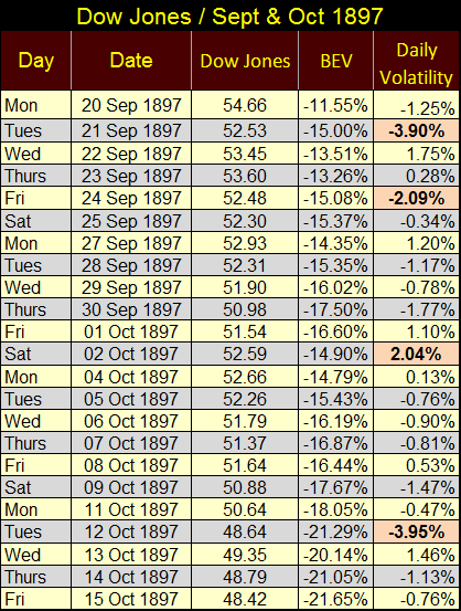
To illustrate the effectiveness of examining historical Dow Jones data via a BEV chart and daily volatility, here’s a table (below) listing Dow Jones data for September/October 1897.
The Federal Reserve wasn’t to be created by Congress for another sixteen years, and the dollar was fixed at $20.67 / ounce of gold. So, seeing the Dow Jones in the 50s meant that it was trading for over two ounces of gold. At the close of this week the Dow Jones was trading at 19.53 ounces of gold, which to my reckoning tells me how over valued is the Dow Jones, and undervalued is gold.
Back to the table below; looking at the BEV values we see the Dow Jones deflated 10.10% from Sept 20th to Oct 15th as it sheds 6.24 dollars. Today, with the Dow Jones valuation at over 24,000 a $6.24 loss in the Dow Jones seems like a rounding error. But no matter what the valuation for the Dow Jones, in 1897 or 2018, a 10% decline over the course of twenty-three NYSE trading sessions is the same.
Note to the days of extreme volatility for the Dow Jones occurring during this decline. The table shows four of them as the Dow Jones declines by 10.10% from Sept 20th to Oct 15th 1897. Many things have changed at the NYSE since 1897, but seeing days of extreme market volatility during a market decline isn’t one of them.
So, looking at the Dow Jones 1885 to 2018 BEV chart above is without a doubt the most effective way of understanding the 133 year history of the Dow Jones: as all-time highs and percent declines from those all-time highs.
Here is something I think my readers will find interesting. Look at the big down days in the table above. Both Sept 21st and Oct 12th saw the Dow Jones deflate by 3.90% from one day to the next. On what news of the day did the financial media of the 1890s blame for these big down days? I haven’t a clue, but like today I’m sure it wasn’t the market was overvalued.
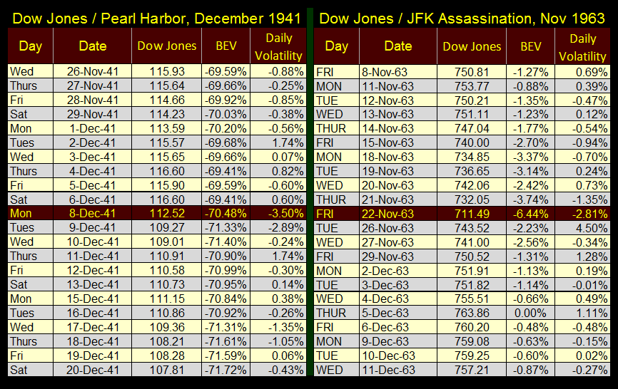
But on really big historical news like Pearl Harbor and the assassination of President Kennedy, how did the Dow Jones respond to that news? I have it recorded in the tables below.
Pearl Harbor happened on Sunday December 7th 1941. As FDR declared war the following day (Monday Dec 8th), the Dow Jones was down 3.50%, less than the two big down days in the table above.
President Kennedy was murdered as the NYSE was trading on November 22nd 1963; the Dow Jones was down 2.81% for the day. The following day it was up by 4.50%.
Without a doubt the news impacts the financial markets, but sometimes in surprising ways.
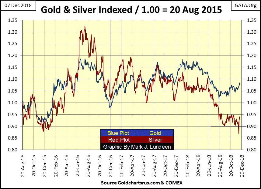
Let’s move on to gold and silver. Both of the old monetary metals broke out to the upside this week. They’ve both have done so before, only to break down later. But this time maybe different, as the financial markets are now under increasing pressure.
Look at silver, it gapped down to 0.87 on Monday this week, only to close at 0.94 on Friday. Hi Ho Silver – Away!
Here’s gold and its step sum below, and what you’re looking at is market reality in the price of gold (Blue Plot), and market sentiment in the red step sum plot.
From January 2006 to August 2011 market reality and market sentiment were in agreement, even during the decline of the price of gold from March – October 2008. That was to change after August 2011, where market sentiment (Red Step Sum Plot) refused to follow market reality down (Blue Price of Gold Plot).
For the next three years these two plots decoupled, creating a bear box. The price of gold maybe going down, but the bulls in the gold market refused to believe it.
It wasn’t until May 2014 that market sentiment became bearish, seen in the collapsing red step sum plot; but note how the price of gold had already seen most of its decline. This happens frequently in bear boxes.
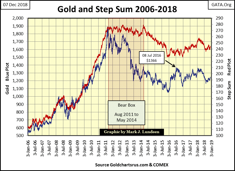
After the step sum plot reversed to the down side, signaling the start of the terminal phase in this decline in the price of gold, both gold and its step sum hit a hard bottom in December 2015. It was a hard bottom, mail from my readers were warning me never to say anything good about gold ever again just as it rebounded off its December 2015 bottom and began a very nice advance in 2016.
So what’s gold’s step sum telling us about the gold market right now? Actually not much except market reality and sentiment in the gold market has been in agreement for many years. If I’m optimistic about gold’s future prospects it’s because the stock and debt markets are beginning to deflate.
What gold, silver and their miners need right now are flows of flight capital exiting deflating financial asset valuations, and establish flows of refugee dollars into precious metals assets. Currently that has yet to happen, but we’ll know when it does by seeing gold’s volatility’s 200 day M/A below begin to rise up to, and then exceed 1.00%. Unlike the stock market, bull markets in gold and silver see lots of extreme volatility.
Mark J. Lundeen


