Volatility in the Gold Market


Oh oh; the Dow Jones may have closed last week at a BEV Zero, but then broke below its BEV -3% level this week, closing the week with a BEV of -2.27%. Is the rally over? It may be, but until the Dow Jones actually breaks below its BEV -5% line, falling below scoring position (BEV -0.01% to -4.99%), I’m going to assume this advance in the Dow Jones will continue.
Should the Dow Jones close below a BEV of -5.00%, it can still rally to new all-time highs (BEV Zeros). But should the Dow Jones fall below its BEV -5% line, maybe someone with exposure to the market needs to sell a good portion of their positions in the market, as you won’t go broke taking profits. As it is, at this week’s close, I’m not going to get too bearish on the stock market, until the Dow Jones breaks below its BEV -10% line in the BEV chart below.
In this BEV chart, we have two examples for a Dow Jones market advance, the Trump, and Not QE #4 rallies to study. Both advances remained in scoring position for a year or more. There is something to learn there, including when the Dow Jones crashed in early 2020, when FOMC flooded the financial market with their massive Not QE#4, to “stabilize market valuations.”
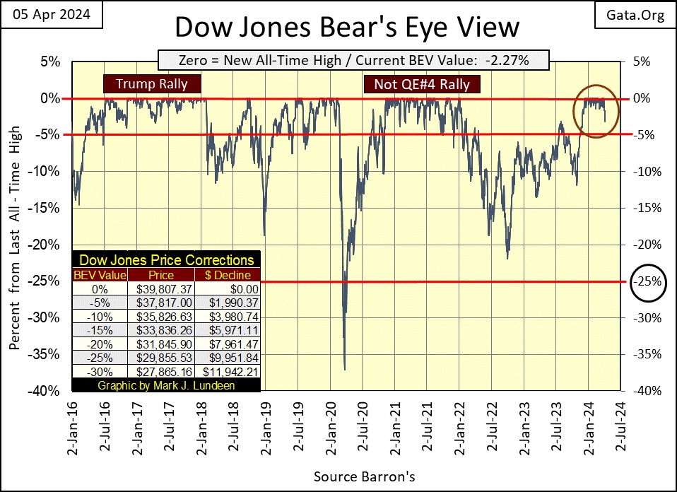
Will that happen again, a QE#5 on the next big down turn in the Dow Jones? I think it will, but who knows for sure? They may do nothing until the Dow Jones is well below 50% from its last all-time high, before attempting to “stabilize” the market. Today however, on a short-term basis, seeing the Dow Jones close 10% from its last all-time high, seems a darn good reason to get the hell out of the stock market, and not come back until it rises once again above its -5% BEV line.
But at this stage of any bull market on Wall Street, when it’s approaching a market top, there isn’t much left for the bulls should the Dow Jones continue rising. This is the part of the bull market cycle where it’s mostly risk, with little reward for assuming that risk. I’m not the least interested in the stock market, and won’t be for a long time to come.
What would make me interested in the stock market once again? Seeing the Dow Jones dividend yielding something well over 6%, something not seen for over forty years.
For the first time in a few months, the table below listing this week’s BEV values for the major market indexes I follow, have no BEV Zeros (new all-time highs) in it. A sign of things to come? Maybe. But until the Dow Jones (#12) sees a BEV of something less than -5.0%, I’m going to assume this stock market’s rally still has some more in it to the upside.
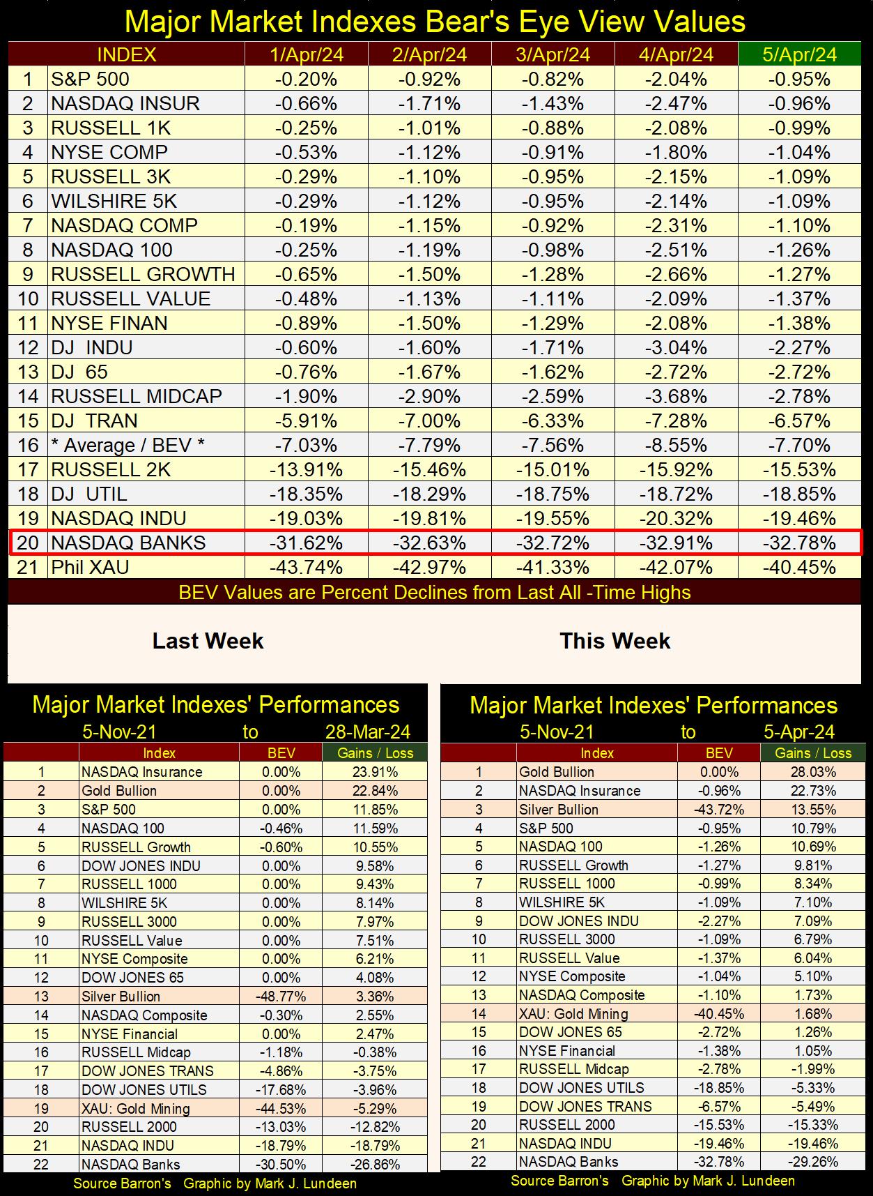
Geeze Louise! Look at what precious metals assets did this week in the performance tables above. Gold took the #1 spot for the week, up 4.2% as the stock indexes were mostly down for the week. That is except for the XAU, advancing from #19 to #14 this week, gaining of over 7%.
But the star of the week is silver, advancing from #13 to #3, from last to this week, gaining 9.86%, almost a 10% move from last week! Below is an actual photograph of the market action in silver this week, which somehow was not published in the mainstream financial media. But I got it, and am passing it along to my readers.

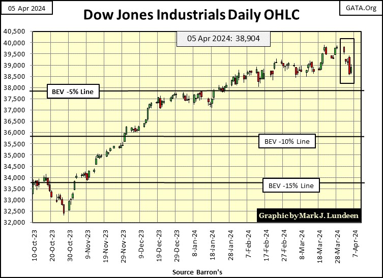
The Dow Jones in daily bars below is a better display of how the week went for the stock market, than its BEV chart above.
What to think of this week? Well, the Dow Jones hasn’t seen a bad week like this since last October. That’s a long time. So, maybe a bad week, this week, was something the market was due for. Until the Dow Jones closes below its BEV -5% line, a line clearly marked in the chart below, I’m staying positive on the stock market, expecting to see the Dow Jones rising above 40,000 in the weeks to come.
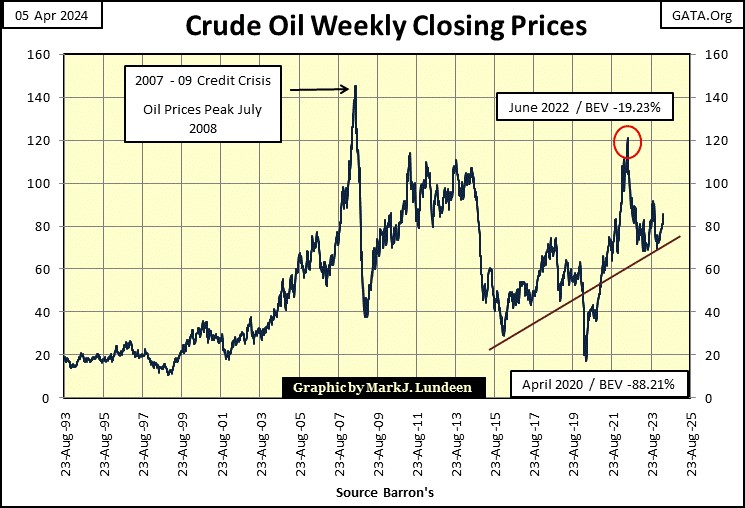
Of course, there are things in the real world that can affect the stock market, things like the price of oil. Looking at this chart, it seems to me oil prices have been rising since they bottomed in April 2020, during the Dow Jones Flash Crash.
No doubt some of the “liquidity” from Powell’s Not QE#4 went into the short side of the oil market, spiking oil prices down by 88% from their all-time highs of July 2008. They have been rising since, peaking in June 2022, and correcting since. But since mid-March, oil once again broke above $80 a barrel, closing this week at $86.91.
You tell me; is the price of oil going up or going down? Me, I think oil is going up. I also think oil is only one cruise missile away from exploding to much higher levels, thanks to the current mess in the Middle East.
Looking at this chart, it’s obvious when oil begins moving – it does so with authority. As a market enthusiast, I wouldn’t be surprised seeing oil above its highs of June 2022, as Mr Bear’s Christmas present to the market. But like me, you’ll just have to wait to see if that happens.
The chart below plots the monthly changes in the FOMC’s holdings of US Treasury debt. “Monetizing” Treasury debt, and “injecting” the resulting effluent into the financial system, is how the FOMC inflated the NASDAQ High Tech bubble of the 1990s, and the real estate bubble in the early 2000s.
But before the 2007 top in the sub-prime mortgage bubble, look at how small the volume of T-debt was required to inflate these huge bubbles in the financial markets.
Something changed with the aftermath of the sub-prime mortgage bust. For the idiots at the FOMC to continue “stabilizing market valuations” they had to greatly increase the volume of “liquidity” required to maintain acceptable market valuations. So came the Quantitative Easings (QE 1-3) during the Bernanke Fed, and the massive Not QE #4 from FOMC Primate Idiot Powell in 2020.
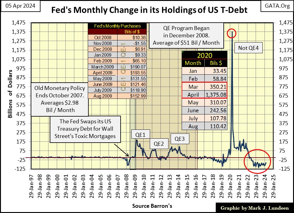
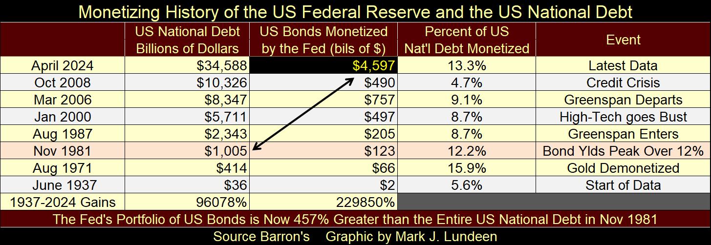
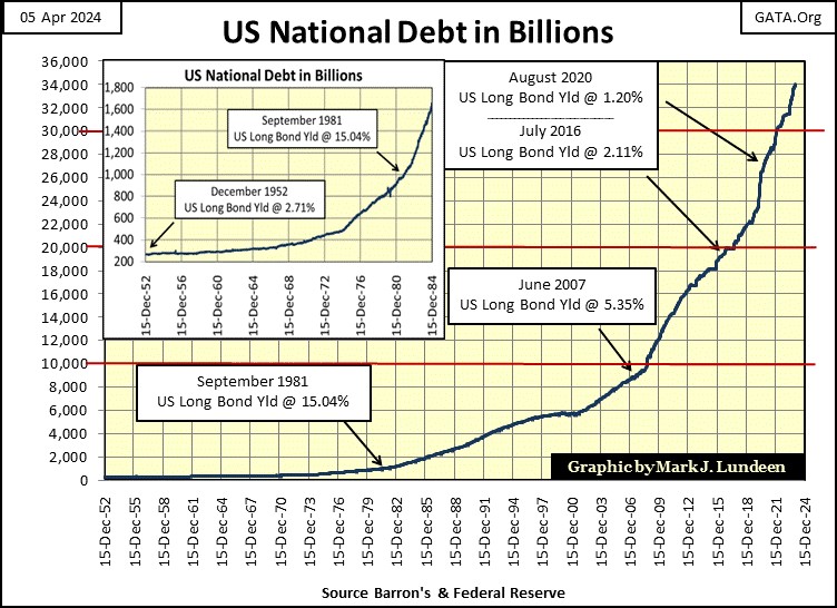
Look how much T-debt was “monetized” in April 2020 (chart above) to “stabilize market valuations;” $1,375 billion, over a trillion dollars in a single month. There wasn’t a trillion dollars of national debt to be monetized before November 1981 (table below).
Look at our current QT in the red circle, chart above. Since May of 2022, week after week the FOMC has been draining “liquidity” from the financial system, as they’ve increased interest rates and bond yields. Yet the stock market has been advancing? Something is very wrong here.
The following is from a few weeks ago, but still relevant to what our “monetary policy makers” are doing today, something far from what they were doing decades ago.
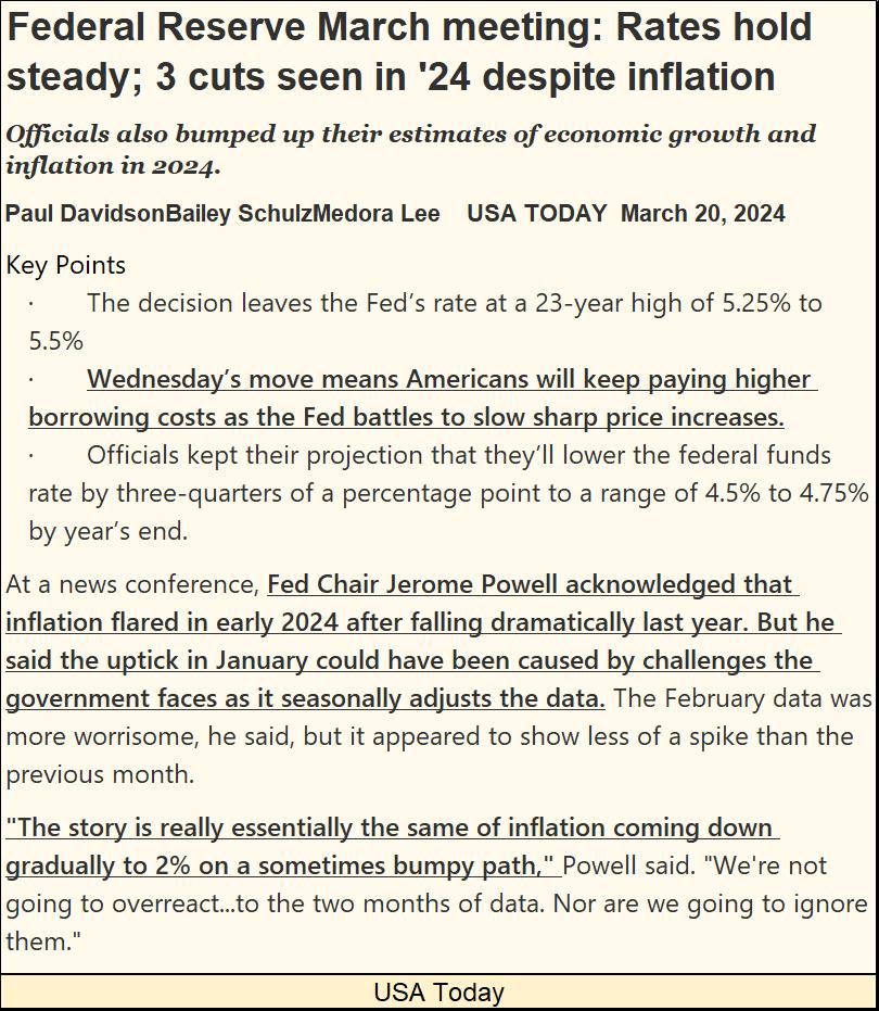
I highlighted some of this PR’s text, the first in the second bullet point, about how Americans will continue paying higher interest costs as the Feds continue “battling higher price costs.” About the Fed “battling inflation,” that is complete nonsense. The Federal Reserve is the great engine of price inflation, everything they do is inflationary.
Pre-1971, the American banking system didn’t provide credit to American consumers, though Americans could obtain credit from merchants the banking system did provide credit to. I’m referring to credit cards provided by companies like Sears & Roebucks, J.C. Pennys, or General Motors for car loans, companies that would cut credit off to any of their customers that had the slightest whiff of being overextended in their financial affairs. When people went shopping long ago, they paid cash by no choice of theirs.
Pre-1971, American consumers didn’t think of banks as places to get home equinity loans, or home equinity lines of credit from, because banks back then didn’t do that! Banks back then were places people deposited their savings into, money the banks would then loan out to local merchants to finance their inventories via lines-of-credit. From the banks themselves, there were no;
- Mortgages (Savings & Loans did mortgages),
- Home equity loans, (what in the hell is that?),
- School loans (say what?),
- Visa or Mastercards.
The world was a much better place for the lack of all the above. Whenever the gods would have something’s price structure bloated beyond recognition, like a college education, or housing, to become a heavy burden for humanity to carry, the Federal Reserve first “injects” its “liquidly” into.
Way back then, pre-1971, most people had money in the bank, money that paid interest income to the American middle-class. When interest rates peaked in the early 1980s – deep into the double-digits, most people, and many businesses thought that was great, as they received more, much more in interest payments * From * their bank, than they paid * To * their bank. When interest rates again exceed 10%, and they will, that will not be so on that future dark day in the economy.
In the second highlighted portion of the above PR, FOMC Primate Idiot Powell admitted inflation flared a bit in January. Powell blamed this inflationary flair up on problems the government’s statisticians had in making their “seasonal adjustments.” Or as I understand this situation; inflation in early 2024 was so bad, government statisticians found it impossible to make it look good. These days in Washington DC, there is a lot of that going on.
The third portion of the highlighted text in the above PR, essentially states that the Idiots at the FOMC will eventually manhandle “inflation” down to 2% once again.
I wish them luck with that, but for what I see in the chart below, I have my doubts. Following Dr. Bernanke’s three QEs, and Powell’s one Not QE#4, the ground work required for the destruction of the American dollar as global reserve currency has been laid.
Prices in any doomed currency never go down, only up until that currency becomes totally worthless, to the point its issuing government ultimately refuses to accept their own currency for payment in its taxes. A common occurrence in monetary history.
Rising CPI Inflation? You just wait until the many trillions of dollars now circulating outside the United States, come back flooding back home, as they are no longer wanted by foreigners across the sea. Consumer price increases? You just wait! This may not happen in 2024, but someday it will happen, thanks to these idiots, who have done what you see below.
How long before they begin a QE#5? You do know that one day they will, no doubt to “stabilize valuations” in the financial markets, exactly as Bernanke did with his three QEs and Powell did with his Not QE#4.
Why do I call Powell’s QE#4 a Not QE#4? Because when he began it in October 2019, that is what he said when he terminated the first QT. He said, he was beginning to once again “monetizing” the national debt, but it wasn’t going to be anything like the first three QEs, a Not QE as I understood his meaning. If you look below, you can see he wasn’t lying about that.
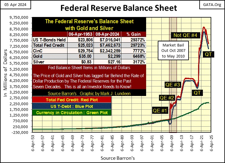
This chart of the Fed’s balance sheet (above) is beginning to not make any sense; look at our current QT. Since May 2022 (two years ago) the Idiots at the FOMC have drained about $1.5 trillion from their balance sheet. The Idiots have also increased their Fed Funds Rate from 0.33% in May 2022, to 5.33% at this week’s close, inverting the yield curve since November 2022 (Box #5, chart below).
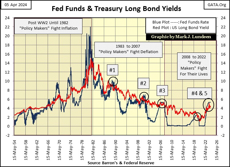
The Idiots announced they were going to do this in early 2022, when I began predicting the Idiots were promising to crash the stock market. I said this because when the “monetary authorities” drain “liquidity” from the financial system with a big QT, and raise short-term rates above long-term bond yields; that is what happens – the stock market crashes. Or, so it used to be, as in boxes #1-4 above.
That for the fifth time since 1982 the yield curve has inverted, box #5 above, yet this inversion in the yield curve hasn’t yet crashed the stock market, which is very odd. What is also odd, is how little this is noted by the financial media, how the yield curve has been inverted for a full year and a half, as the Dow Jones is making new all-time highs.
How can I explain this? I can’t, so I’ll just post a quote from Robert Bleiberg from June 1979 below.
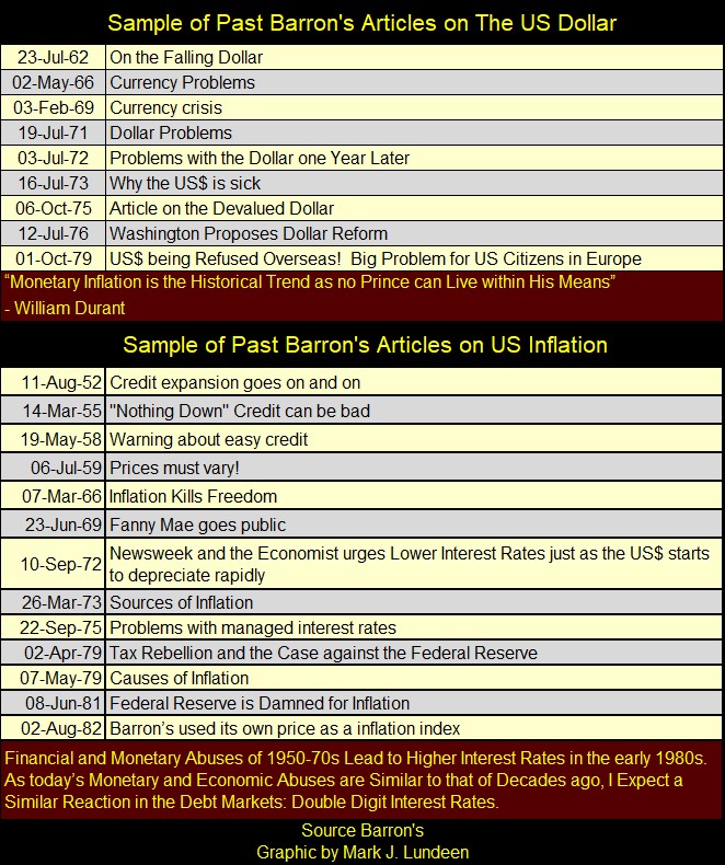
Barron’s decades ago, was a hard money (gold standard supporting) publication, as seen in the below list of past articles they published long ago. But this is no longer so, as Barron’s editorial staff, as everybody else from corporate board rooms, to my college educated family members have attended colleges that are left-leaning.
Karl Marx, in his Communist Manifesto, wanted to eliminate the gold standard, and introducing a central bank to manage credit. Amazingly, that is what is taught in today’s college economics; that a precious metals monetary system has no place in our modern economy, one efficiently managed by the Federal Reserve. Today’s institutions of “higher education,” are dismissive of the 19th century monetary standards that built America. An America Marxists hated in 1848, as they still do today.
What a bunch of commies. Using Marxist economic principles to destroy the Western World’s economy, watch these same people blame capitalism when this stinking heap of debt comes tumbling down. Of course, with so many people today having a college education, they’ll believe it.
Do “educated people” today hate America? I’m sure most don’t, but they go along to get along. And that goes for all the deficit spending Washington’s political class has been doing since Roosevelt’s New Deal went into effect in the 1930s.
When the US National Debt first increased to over $1 trillion dollars, it was shocking, sending the Treasury’s Long Bond yields into double-digits. Decades later, long T-Bond Yields bottomed in August 2020 at 1.20%, as the national debt approached $28 trillion dollars.
How was such a thing possible? It’s possible because there is no free market in the financial markets. Prices in the financial markets are what the idiots at the FOMC say they are, and for now, most people are fine with that; of having “experts” manage the markets and economy.
This chart of the US National Debt is so sad. There will be consequences for what they have done in the name of the American people. What is seen below is an obscenity.
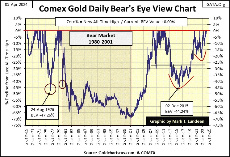
Let’s next look at gold’s BEV chart. Gold closed the week with a BEV Zero, its 15th of this rally. It may be a while before we see gold approaching its BEV -5% line.
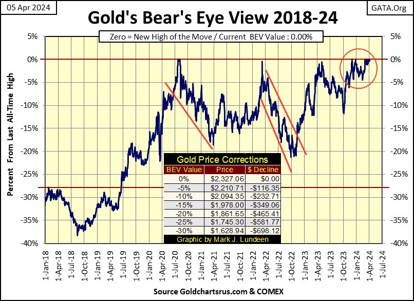
A better chart to look at this week for gold and silver, are their indexed values in the chart below. Since gold broke out of its Bowl & Breakout (B&B #2) formation a few weeks ago, it’s been advancing relentlessly. A few weeks ago, I reluctantly predicted gold would close above its 55.0 level ($2400) by the end of August. This week, I have gold closing at $2327, only $73 from the 55.0 level in the chart below, and we’re not even out of April.
There is real power behind this advance, making this much fun to watch.
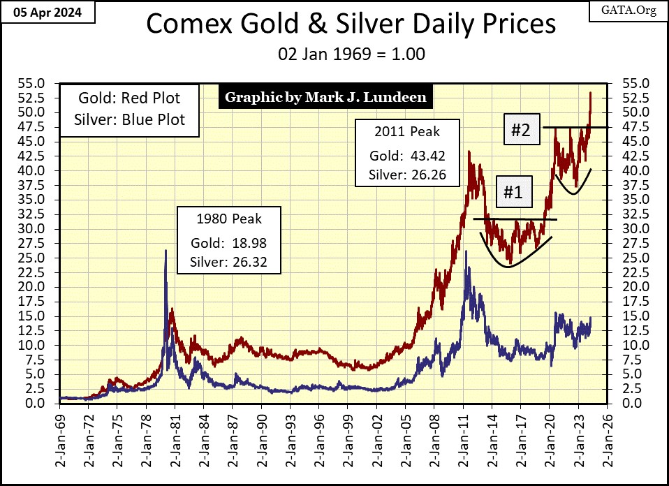
Silver was the star for this week, but looking at the chart above (Blue Plot), one would wonder why that was. Don’t worry, it’s still early in silver’s advance, it hasn’t broken above its 15 line yet ($27.75). Things should get exciting when silver breaks above its 17.5 line ($32.4) in the chart above.
Looking at gold’s step sum table below, it’s so very nice seeing all of those BEV Zeros; thirteen since March 1st.
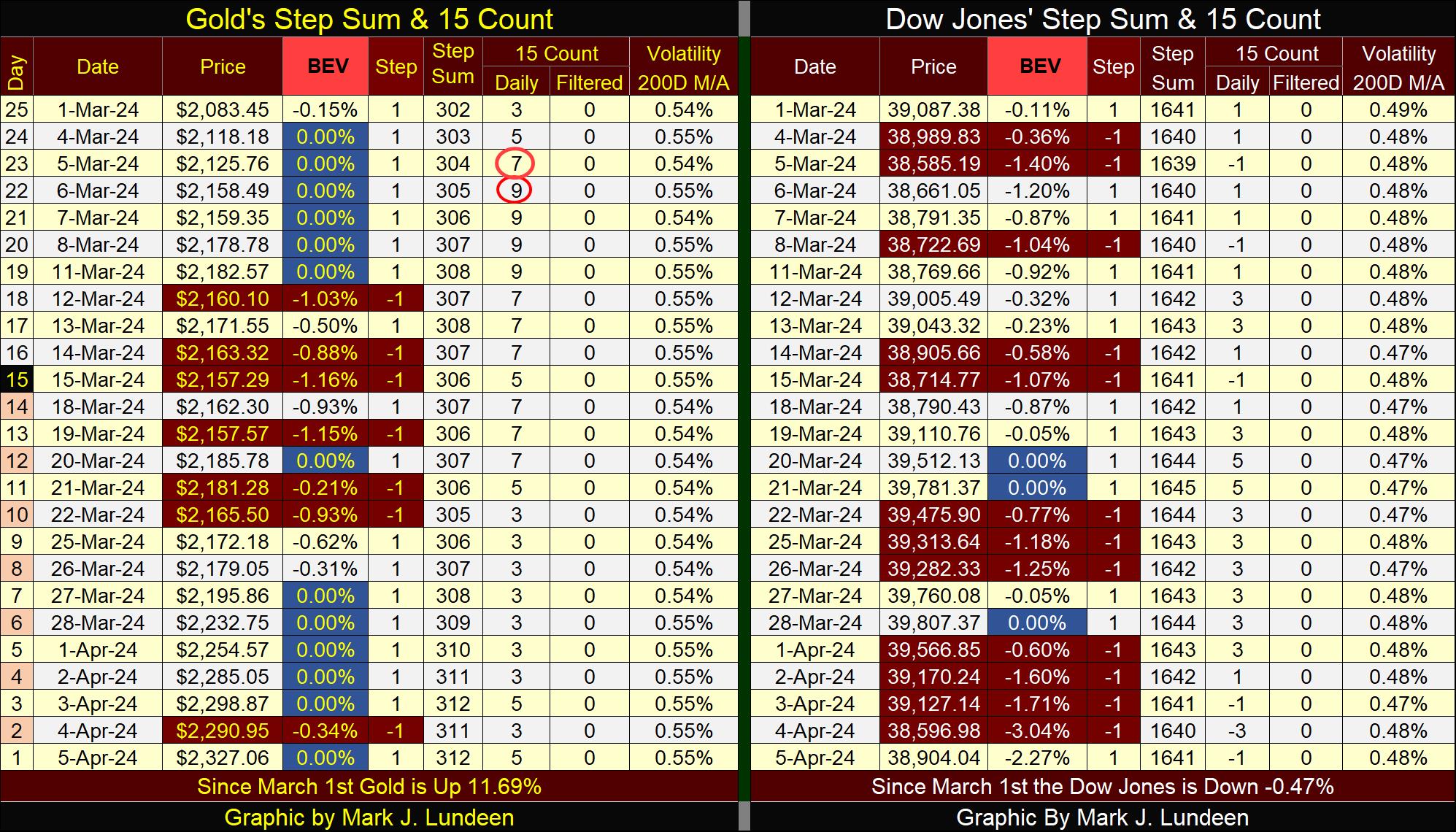
I’m going to skip discussing the Dow Jones step sum table above, and instead focus on gold’s daily volatility for this week.
So far, gold’s daily volatility’s 200D M/A hasn’t increased in this advance. But if this advance is real, that will change. Volatility in the gold and silver markets work differently than it does for the Dow Jones. For the Dow Jones; big increases in daily volatility are always bearish, big decreases in daily volatility are always bullish. Of course I’m not talking about from day to day, but from month to month, and from year to year.
But for gold and silver, its different. For gold and silver, volatility increases whenever the market is making a big move – be it up or down.
Below is a chart plotting total days-of-extreme volatility for gold since 1970. How many 3%-days, days gold has moved up or down by 3% ,or more, from its previous day’s close, gold has seen for each year. The year with the most 3% days was 1980, which in January, saw gold’s ultimate all-time high of the 1969 – 1980 bull market. So, most of those 3% day in gold in 1980, occurred during the first year of a twenty-year bear market.
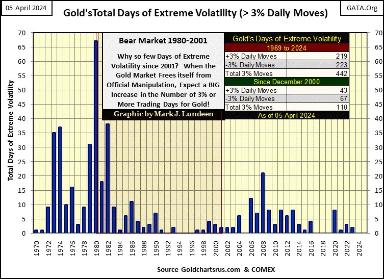
I’m not going to do a year-by-year analysis of the data above, but there are some items worth noting. First a comparison of daily volatility of the two bull markets gold has seen since 1970. The 1970 to 1980 bull market in gold saw lots of excitement, both to the upside and downside for these ten years, as gold increased from $35.40 to $825.50 ten years later, a ten-year gain of 2331%.
The first few years of the 1980 to 2001 bear market saw lots of volatility, as the bulls refused to believe gold was in a bear market. They kept buying on market pull backs, only to see the gold market pullback even deeper.
By 1987, the bulls finally got the message; all the action was now happening at the NYSE and NASDAQ stock exchanges. Daily volatility for gold became greatly subdued for the remainder of the 1980 to 2001 bear market.
The next item is a bit curious, our current bull market in gold. Looking at the chart above, comparing daily volatility of the 1970 -1980 bull market, with daily volatility for our bull market (2001 to today), our gold bull market has so far been remarkably more subdued.
Gold bottomed in February 2001, deflating by 70% from its January 1980 Terminal Zero (TZ), in the BEV chart below. Gold has been advancing since then, except for the nine-year, 45% correction from August 2011 to August 2020.
This week closed with gold at a new all-time high (BEV Zero / 0.00%) in the BEV chart below. So, since February 2001 ($255) to the close of today ($2327), gold has advanced by 912% during these past twenty-three years.
That really isn’t a big bull market that will attract much public attention. Maybe, that is why daily volatility for our current bull market (2001 to 2024) has been so much lower than the daily volatility for the first bull market (1970 – 1980), in the annual volatility chart posted above.
I’m thinking the bull market in gold, silver and the precious-metal mining shares will begin attract more attention, and inflows of money from the public and managed money, as precious metals continue rising in the years to come. I also expect we’ll know when that happens; when gold’s 3% days begin stacking up in the chart above for, hopefully beginning in 2024, and beyond.
Mac Balkam, CEO of Eskay Mining is attempting to catch the attention of the Canadian Mining Industry about the problems of naked-short selling of Canadian mining and exploration shares in the Canadian stock market. I suspect the same is happening in the American stock market.
This is a very illegal, but apparently a common practice in the market that has greatly impacted share prices for the gold and silver mining industry.
Mac sent me the link below. I watched it, it’s only a 45-minute video, and I think you should watch it too. If you want fair value for your mining companies when selling them, then do something about it. Send this video to the public-affairs office of your mining company. Like 100% of all publicly traded companies, they all have a website to find where to send an e-mail too, or a phone number to call. Ask them if they are aware of this practice, and what are they doing about it? Be nice, but let them know what a shareholder of their company’s concerns are about naked-short selling in the market.
It’s amazing what a few dozen e-mail, or better yet phone calls can do with a publicly traded company. Take the time to do something for yourself.
https://www.youtube.com/watch?v=AvI1H0IsHnM&list=PPSV
Mark J. Lundeen
********


