Wednesday Report…You are Experiencing an Impulse Move…How does it Feel ?


I hope everyone is enjoying the volatility because that is the name of the game we are playing. There is no such thing as a safe investing environment. As with nature you always have two opposing forces, the ying and the yang, the good and the bad, the democrats and republicans and the bulls and the bears. This creates tension between the two sides which leads to movement in one direction or the other. Nature demands change because without it everything would become stagnant and die. Just when you think you have the markets figured out something will change and leave you wondering why this is happening when that should be happening. I’ve stated several times in the past, “the only rule in the market is there are no rules.” This means markets are always changing and what may have worked before may not work this time. So we are always trying to hit a moving target with our Chartology, Elliot Wave or time cycles, whichever method you use, to gain an edge. This is just the nature of the beast pure and simple. If it was easy there would be no markets to trade because everyone would be right and nobody would be wrong. Like I said you have to have the ying and the yang, the good and the bad, the democrats and republicans and the bulls and the bears.
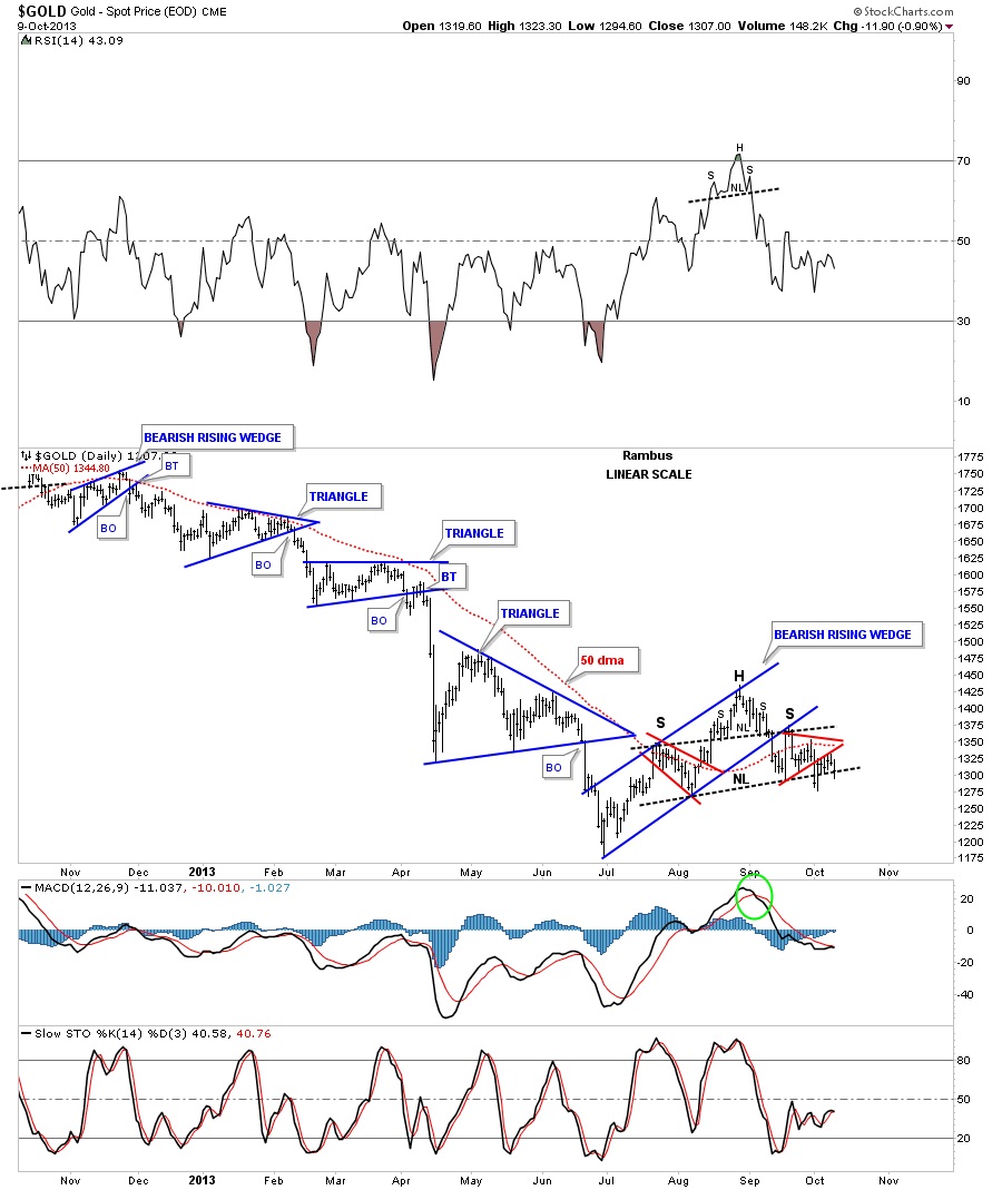
Tonight I want to show you some weekly line charts for some of the big cap precious metals stocks but before we do I would like to update you on a couple charts first. Below is a daily bar chart for gold that shows the double H&S top with the lower neckline coming in right at 1300. Even though there was a small false breakout the pattern still remains intact. We’re close but just not quite there yet.
(Editor’s Note : This Post was made Wednesday Night….. As You probably Know…as of Friday…we are Now “There” )
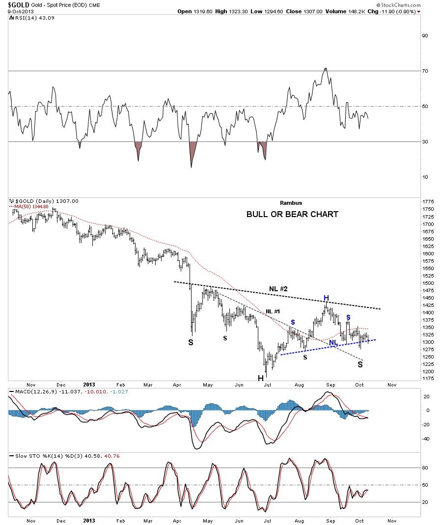
This next chart is what I call my bull and bear chart. The bulls are looking at this chart and are seeing an H&S bottom that is going to lead to a brand new bull market. The bears look this same chart and see a bearish H&S top. One side is going to be right and the other side is going to be wrong. We’ve placed our bets and now we wait for confirmation.

This next chart is a combo chart that I’ve been showing that shows gold breaking down from its small red bear flag five weeks ago already and the HUI has been in breakout mode for the last two weeks. Let me repeat this again. Gold has broken down out of its bear flag five weeks ago and the HUI two weeks ago. Folks we are and have been in an impulse leg lower. What you are experiencing right now is just normal market movement, nothing more or nothing less. In the case of the bear, the markets go down more than they go up but there is always the steady chopping action that frustrates both the bulls and the bears alike. It’s the trend of lower lows and lower highs that you have to observe, over time, to see who is in control. Note the heavy purple dashed line that shows the bull market tops in gold and the HUI. Look at the price action on the left side of the purple dashed line and you see higher highs and higher lows all the way up. Now look to the right side of the purple dashed line and you see just the opposite, lower highs and lower lows which is a downtrend. This is basic Chartology 101.
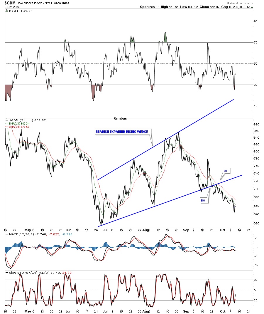
The two hour line chart for the GDM shows the breakout and backtest, that we observed in real time, when it happened. I don’t know how to make it any planer that the precious metals stocks have been in an impulse move lower since the breakout from the bottom blue rail of the bearish expanding rising wedge. There is nothing weird or strange about this downtrend. It actually looks pretty normal. Two steps down and one step up, backing and filling which is creating lower lows and lower highs. This is a downtrend you are experiencing.
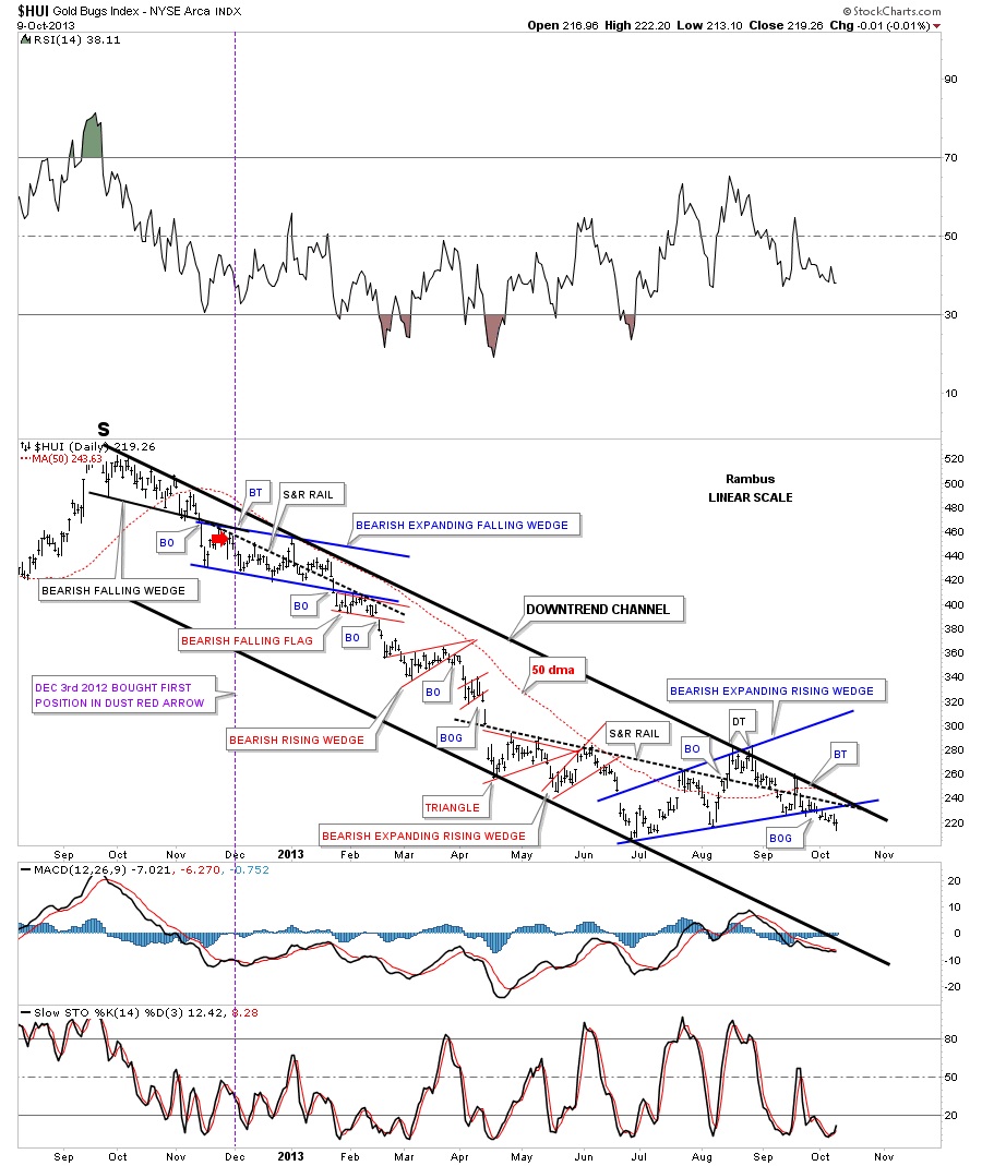
This next long term daily chart for the HUI puts our bearish expanding rising wedge into perspective within the confines of the downtrend channel that started one year ago already. As you can see its been a steady grind lower until the blue bearish expanding rising wedge developed. The market need a timeout and this is the consolidation pattern it chose to form. Note the breakout and backtest when the HUI broke through the bottom blue rail of the expanding rising wedge. It just doesn’t get any pretty than this. As long as the price action stays below the bottom blue rail of the bearish expanding rising wedge we have to play the odds that the move lower will continue.
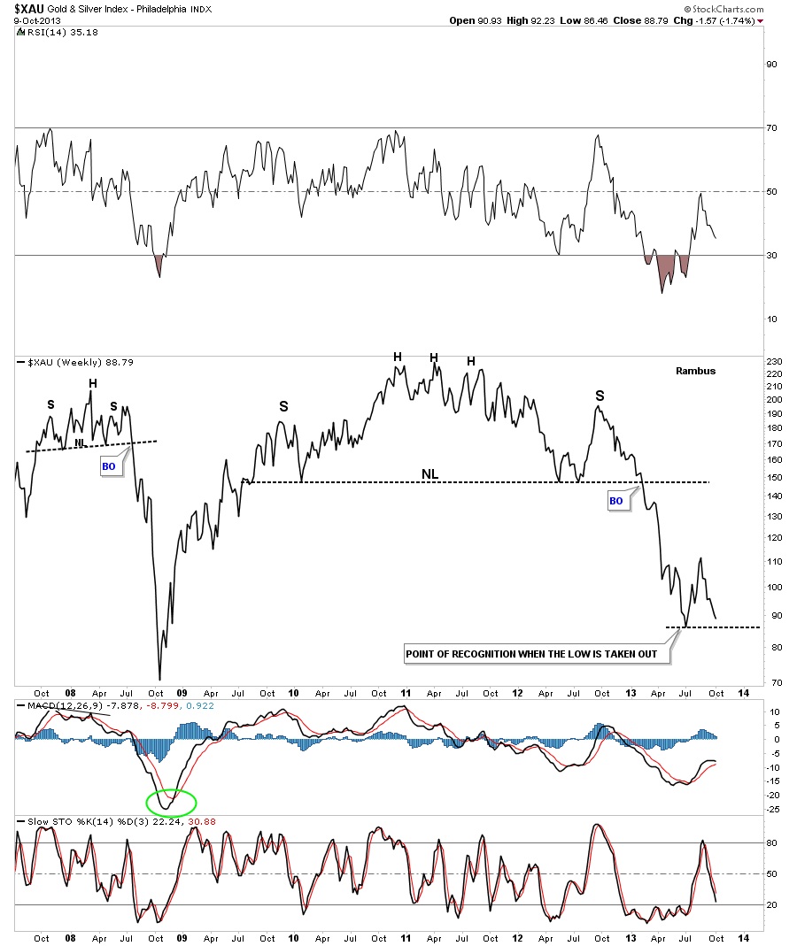
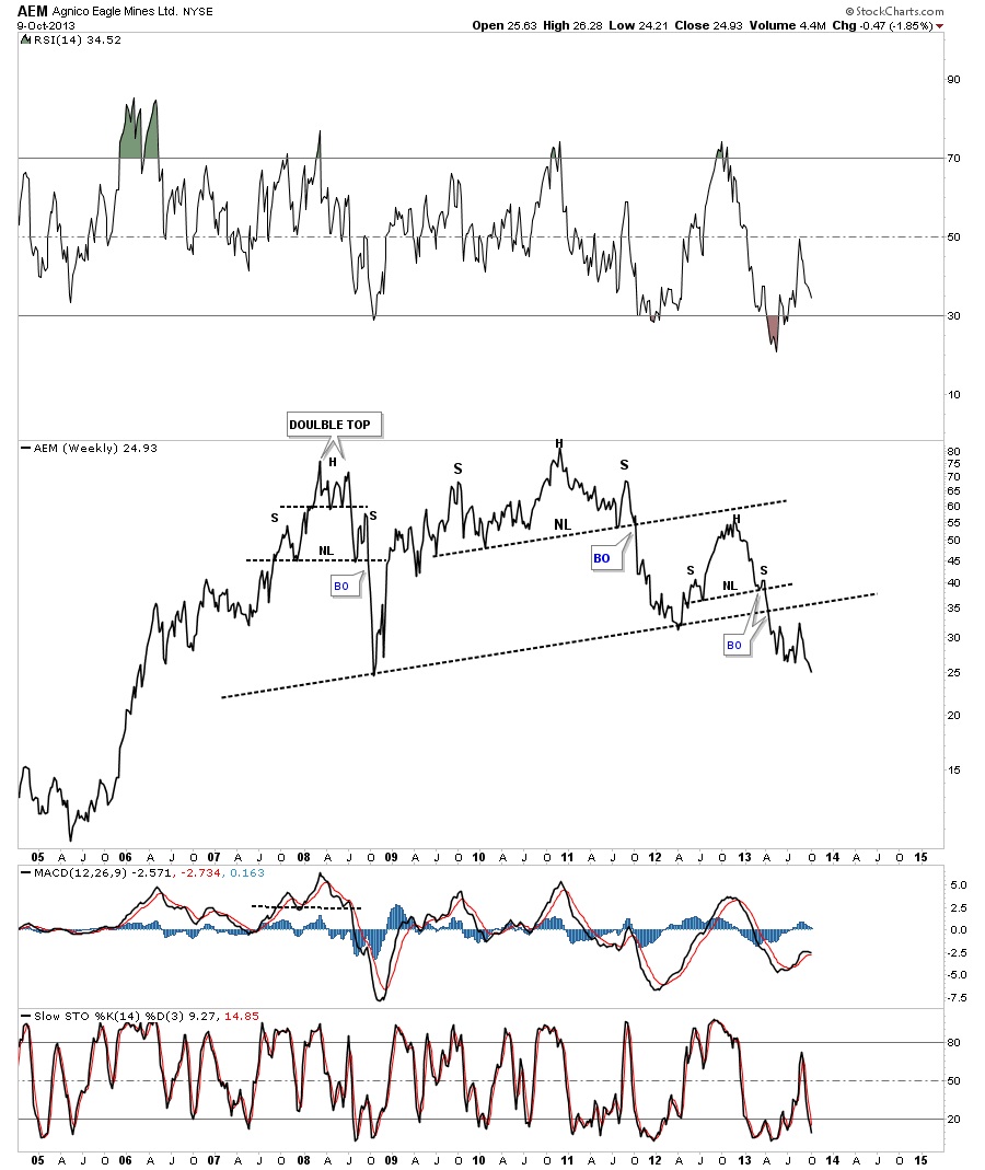
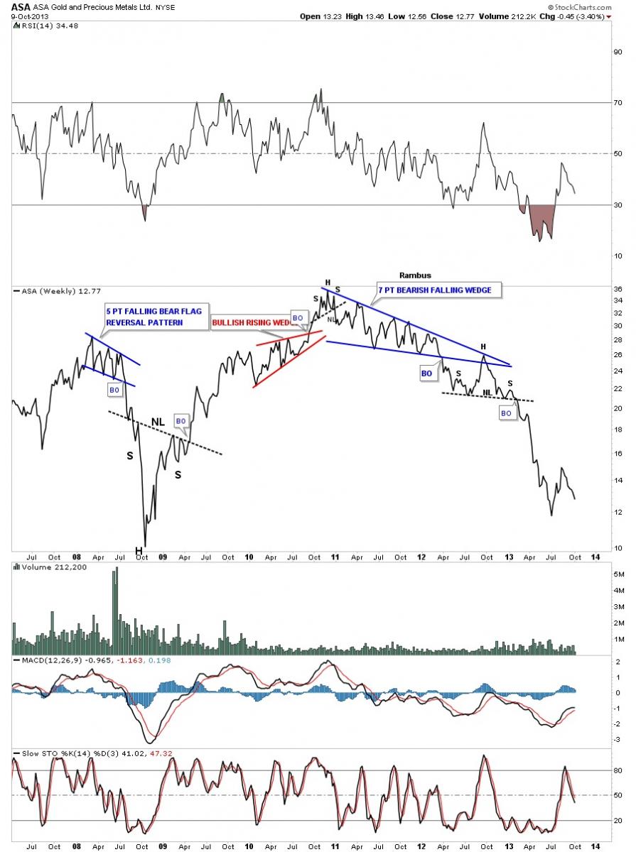
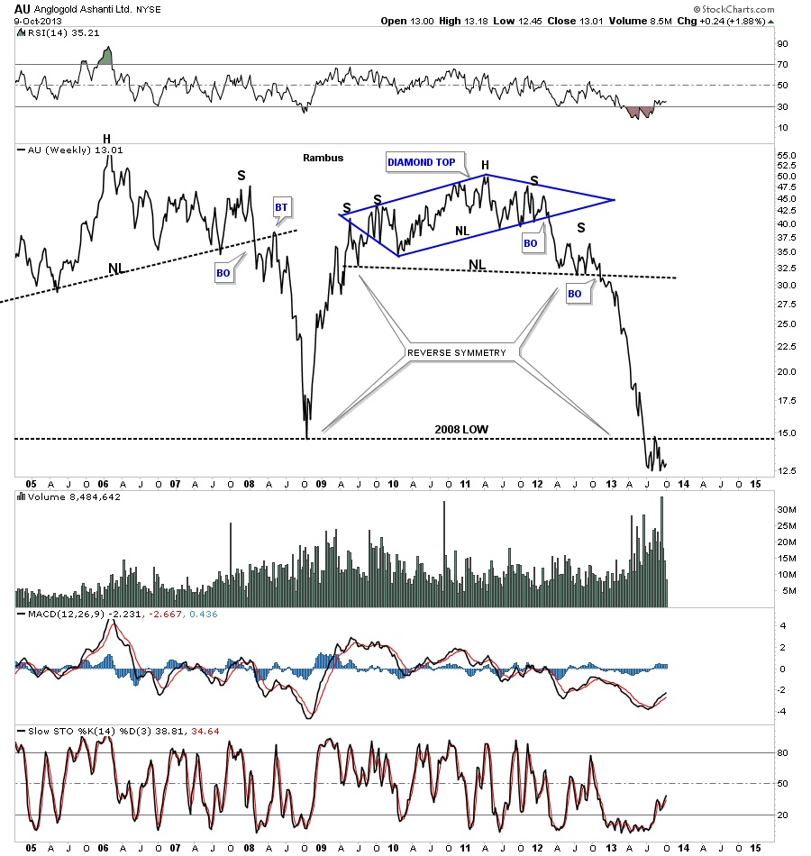
Earlier in this post I showed you my bull and bear chart and said I believe the bears were going to win the battle. These weekly line charts shows why I still remain bearish and why the bulls will have to start proving their theory before the precious metals stocks go much lower. As sir Plunger so aptly put it, the point of recognition is close at hand for the third phase of this bear market. I believe when the bulls can no longer make a case for their inverse H&S bottom they will start to capitulate and run for the hills. That has yet to happen but it’s getting closer by the day.
The first weekly line chart I would like to show you is the XAU that is just a simple chart that says alot. Sometimes you don’t need alot of lines on a chart to make your point. You can see the two H&S top patterns that most missed that stand out like a sore thumb now that they can be seen in hindsight. I believe the point of recognition for the bulls will be when the previous low is broken to the downside.
ABX is currently trading below the 2008 bottom.

AEM is currently trading at multi year lows on the weekly line chart.
ASA is showing some nice reverse symmetry down but is still trading several points above its 2008 low.
AU has been trading below its 2008 low for sometime now. Note the breakout and backtest to the 2008 trendline.
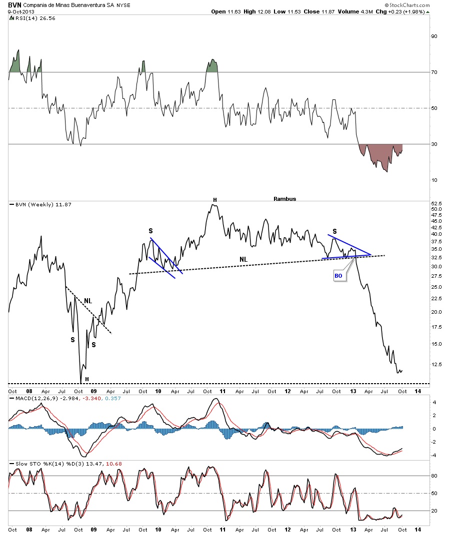
BVN is just a point or so away from its 2008 low.
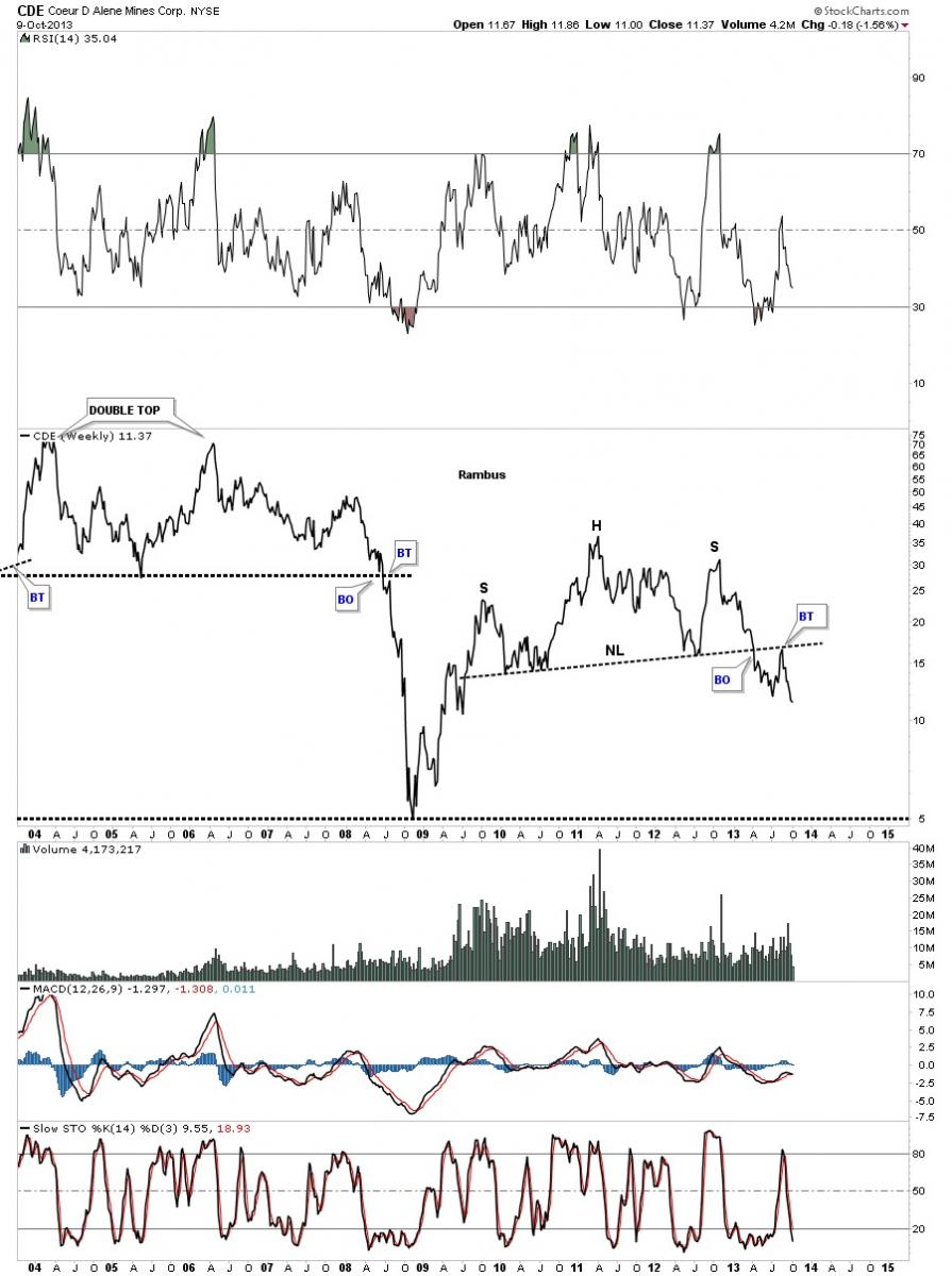
CDE shows a beautiful H&S top that just completed the backtest and now has plenty of room to run to the downside.
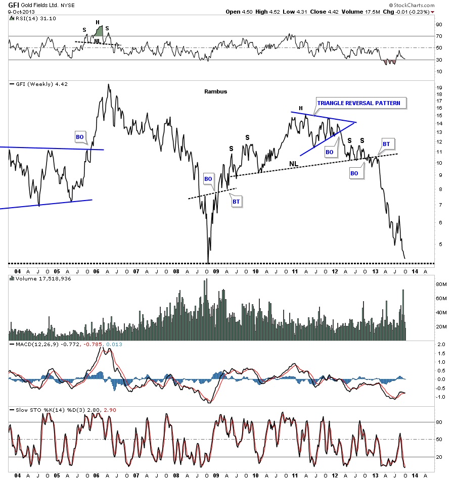
GFI is trading at multi year lows and is approaching the 2008 bottom.
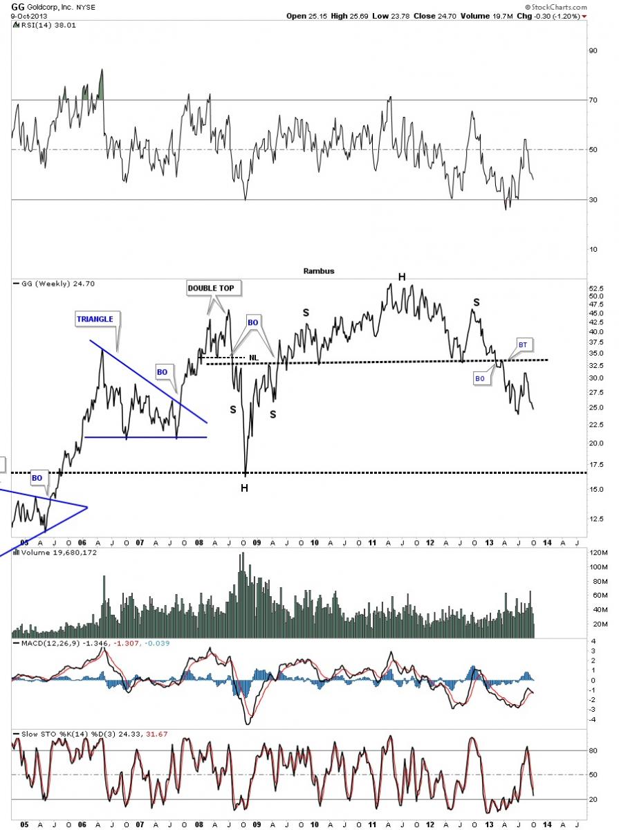
GG still has a lot of room to move lower.
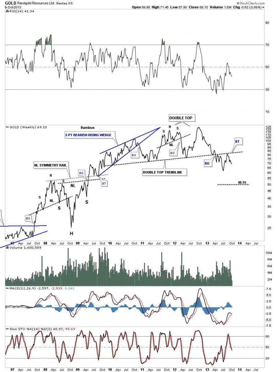
Randgold just completed a backtest to its double top trendline and has a lot of room to move lower now.
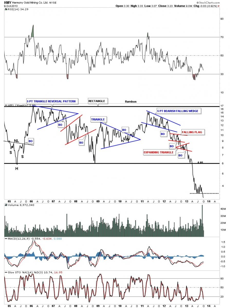
HMY is trading way below the 2008 bottom is now approaching new all time lows.
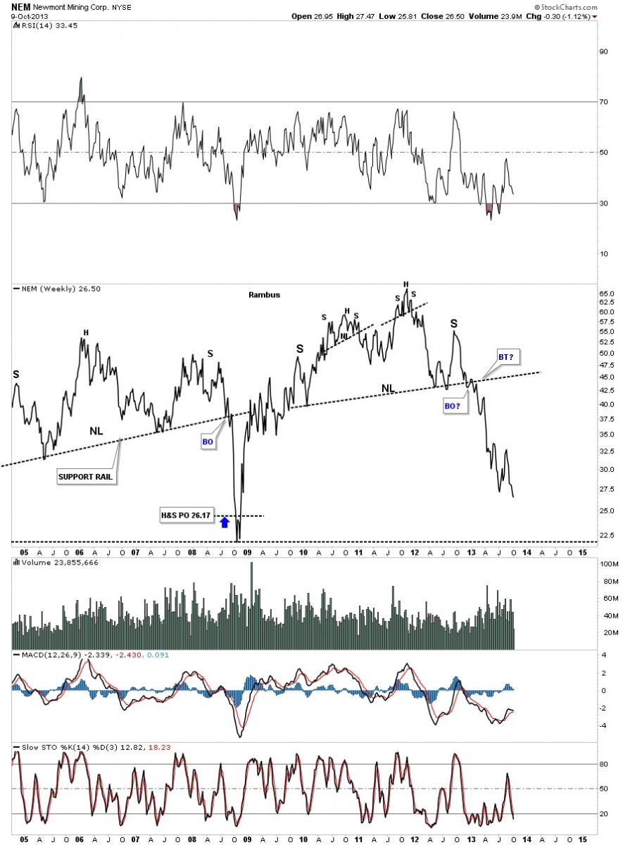
One last chart and then I need to get this posted. NEM is now trading at multi year lows. There are still two days left of trading for this week but if NEM closes below the previous low that will not be a good omen if your a bull.
All these charts above shows you why I’m still bearish on the PM sector and until something changes these charts for the better it is what it is regardless of what the fundamentals may say. There are going to be good days and bad days coming up. The volatility will probability increase as we move lower with the bottom pickers looking for a bottom and the lonely bulls selling at all cost to save whatever capital they can. Stay calm and strong. All the best…Rambus
 Meet Rambus, a seasoned trader and technical analyst renowned for his unbiased and insightful chart work. Through his website, Rambus Chartology, and Substack newsletter, Rambus shares his expertise with a global community of subscribers, providing daily updates, commentaries, and hands-on training in the art and science of chartology. With his calm, humble, and down-to-earth approach, Rambus demystifies complex market trends, helping his followers navigate the challenges of today's volatile markets. Join the Rambus Chartology community today and discover a unique blend of technical analysis, trading expertise, and time-tested protocols. Subscribe now at www.rambus1.com or https://rambuschartology.substack.com/


