A Week With Nothing Positive To Report On


This week the Dow Jones gave up all of last week’s gains. Moving from last Friday’s BEV -12.63% to below its BEV -15% line at the close of this week.
Before we go deeper into this week’s market action, let’s take a moment and study this Bear’s Eye View (BEV) chart that goes back to the latter part of the 2002-2007 Sub-Prime Mortgage Bubble. We see two significant market declines:
- The Sub-Prime Mortgage Bear Market, the Dow Jones’ second deepest percentage decline from an all-time high since February 1885.
- The March 2020 Flash Crash, the most violent twenty-eight days in Dow Jones History.
Looking at these market declines from their Terminal Zeros (TZ; last all-time high of the previous market advance), for the Sub-Prime Mortgage Bear Market, the market decline was an orderly one, until it broke decisively below its BEV -20% line. That done, the market’s decline gained momentum to the downside, until it broke below its BEV -40% line in October 2008. This decline took a year, and not a pleasant year for investors. The ultimate bottom to this bear market was a 53.78% decline five months later in March 2009.
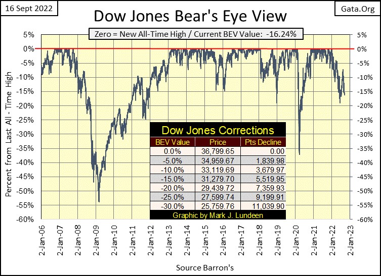
With the March 2020 Flash Crash, many “market experts” blame the covid pandemic. But I don’t believe that for a second, not with the Dow Jones deflating from a BEV Zero (all-time high) on February 11th down to a BEV of -37.09% in only twenty-eight NYSE trading sessions. Shock and Awe from Mr Bear; a month of Pain and Horror for the bulls!
And of those twenty-eight NYSE trading sessions, seventeen of them were Dow Jones 2% days; days of extreme market volatility, days where the Dow Jones moved (+/-) 2% or more from the Dow Jones previous day’s close.
As with all Dow Jones 2% days, the 2% is only a threshold value. For eight of those twenty-eight days of extreme market volatility in February / March 2020, the daily moves for the Dow Jones were (+/-) 5% to 13% from one day’s close to the next; Geeze Louise, that got everyone’s attention, as seen below from my 27 March 2020 article.
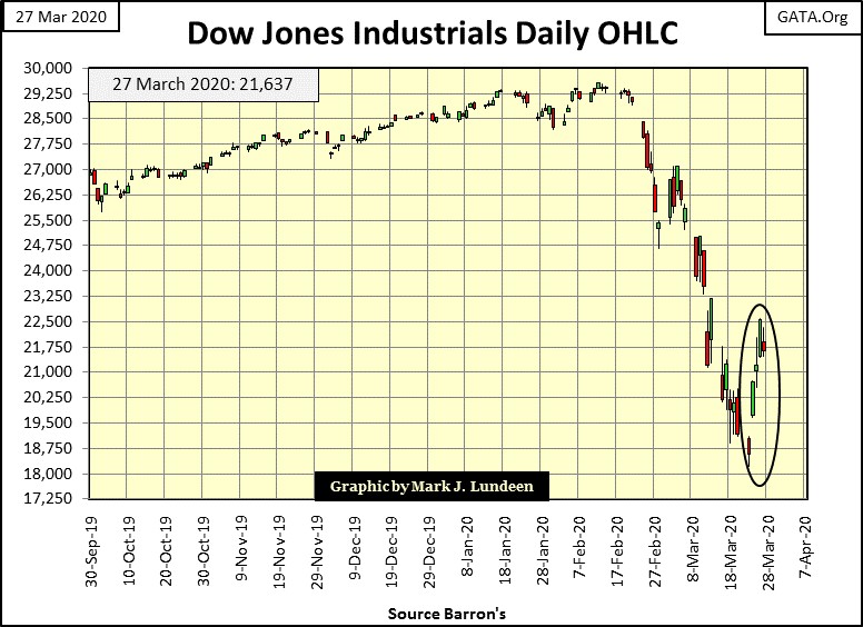
The March 2020 Flash Crash may have only lasted twenty-eight NYSE trading sessions, but they were the most violent twenty-eight trading days the Dow Jones had seen since February 1885.
What was the problem with the Sub-Prime Mortgage Bear Market and the March 2020 Flash Crash? Thanks to the idiot savants at the FOMC, their “monetary policy” had drastically overvalued market valuations, which subjected market valuations to something bad happening to the downside.
Looking at the chart below, plotting the 10Wk M/A for the weekly changes in the Federal Reserve’s balance sheet, the inflationary set up for the Sub-Prime Mortgage Bear Market is not obvious, but the market crash of October 2007 to March 2009 was the result of an inflationary bubble being deflated. And the Sub-Prime Mortgage Bear Market’s Bottom of 09 March 2009, a 53.78% market decline, would have been much deeper had then Fed Chairman; Doctor Bernanke not instituted his three QEs seen below.
These three QEs placed a bottom to the Sub-Prime Mortgage Bear Market, and reinflated the bubble Mr Bear was attempting to deflate. These three QEs were also the inflationary setup for the March 2020 Flash Crash, a flash crash which required Fed Chairman Powell to implement his massive Not QE#4 to place a floor under.
Why a “Not” QE#4? Because in October 2019, when he began it, he said this QE wasn’t going to be anything like the three previous QE. As seen in the chart below, he was right to say that!
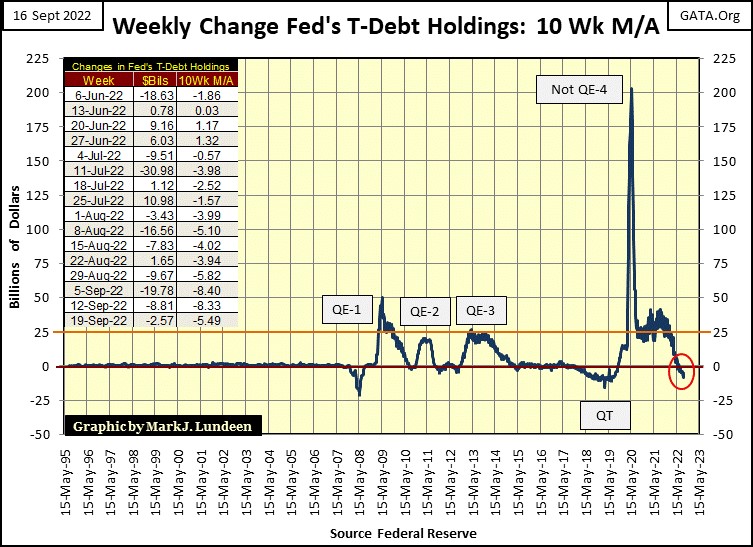
To best understand the market, I believe it’s necessary to have an underlying theory for the market as it stands. Looking at the charts above for the Dow Jones and the FOMC’s QEs, my theory is that today, in September 2022, all the financial markets; stocks, bonds and real estate are historically overvalued, and so due for a historic crash. Fed Chairman Powell’s Not QE#4 resulted in a historic market boom that peaked on January 4th of 2022, now in the months and possibly years to come, comes a historic market bust.
That’s how I see things. And as I’ve said before, until the Dow Jones Dividend is yielding something over 6%, maybe something like an 8% yield, I’m sitting in the market’s peanut gallery enjoying the show below. Today, with the Dow Jones dividend yielding a mere 2.31%, the stock market holds no attraction to me in the least, with the precious metal miners being the exception to that rule.
Let’s move on to the Dow Jones in daily bars in my next chart. The week started off bullishly, with the Dow Jones up nicely by the close of Monday’s trading; then came Tuesday.
What happened on Tuesday? Joe Biden; the current resident at the White House, was having a party with the leading congressional Democrats over his signing of their trillion dollar “inflation fighting legislation.” The Dow Jones was down 4% for the day as the bears joined in the celebration. For the bulls, the rest of the week wasn’t so good either.
At week’s end, I’m now looking at the lows of last June. Should the Dow Jones break decisively below 29,500 in the coming weeks, as market volatility increases, as seen in multiple Dow Jones 2% days; that would not be good for the bulls. This may not happen. But as I’m a bear, this is what I’m watching for, as I know bad things in the market frequently happen in October.
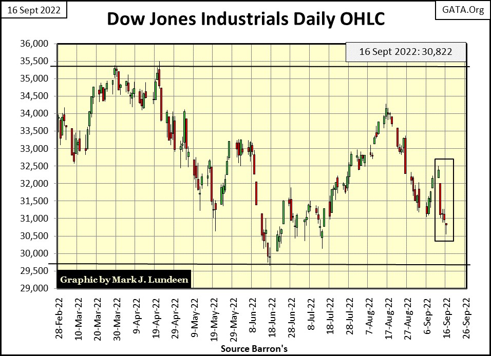
It wasn’t just the Dow Jones having problems this week, as seen below in my table for BEV values for the major market indexes I follow. From Monday’s BEV values, come Friday, many of these indexes were down 4% or more. That’s a bad week.
Then looking at the Dow Jones Transports Average (#14), it was down 4% from Thursday to Friday’s close, down 8.38% for the week.
The railroad unions threatened going on strike / Fed Ex warned of growing economic contraction. That’s reason enough why the Dow Jones Transports were down 4% on Friday when nothing else was.
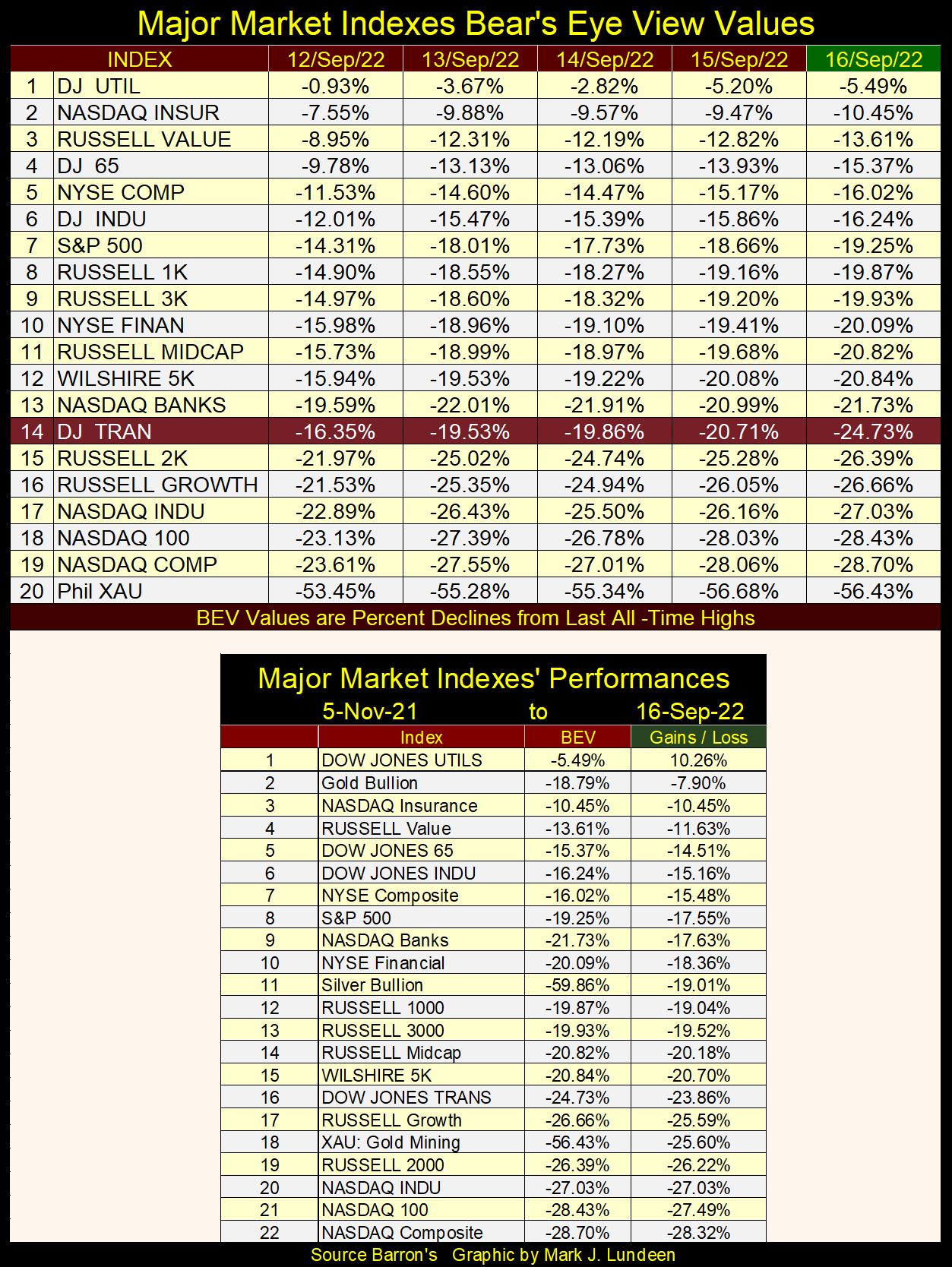
All the indexes in the table above are drifting down to their lows of last June, not good. But I note how since early last November, gold remains #2 in the table. Silver is #11, while all the hot indexes of the Post March 2020 advance are now drifting down to their BEV -30% levels.
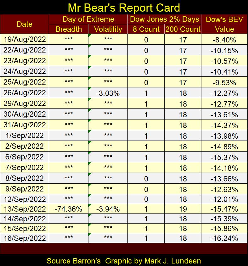
As seen in Mr Bear’s report card below, Tuesday was a bad day, a day where the market saw two market extremes. There was a Dow Jones 2% day, plus a day of extreme market breadth; a NYSE 70% A-D day.
During market advances, these extreme days are rare market events. Many months, even years can pass between them. So far this year, since the Dow Jones last all-time high of January 4th, there have been eighteen days of extreme market volatility for the Dow Jones, and the NYSE has seen six days of extreme market breadth. For 2022, that’s a lot of extreme days in the stock market, something that just doesn’t happen during market advances.
From day to day, one may be excused for believing the market is currently seeing a correction from its last all-time high of January 4th. One simply can’t be a bull and not believe that sometime in the coming year, the market will once again be making new all-time highs.
But deep beneath the surface of this market, there are indications present that there are big problems brewing below. For myself, I’m staying in the market’s peanut gallery, with no exposure to this market.
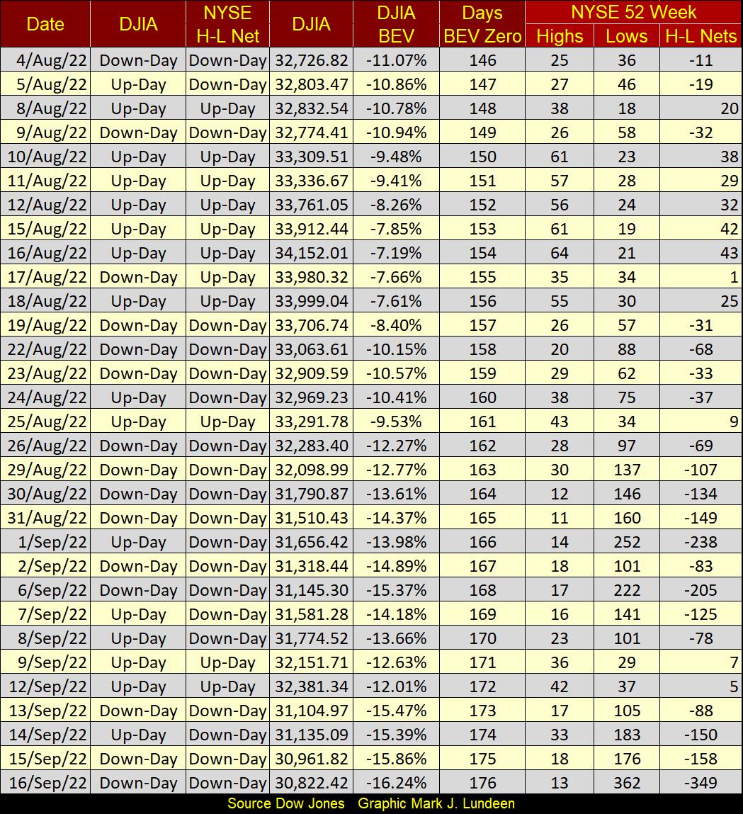
One more item I need to cover; NYSE 52Wk H-L Nets are once again being dominated by 52Wk Lows. Not a good development for the bulls.
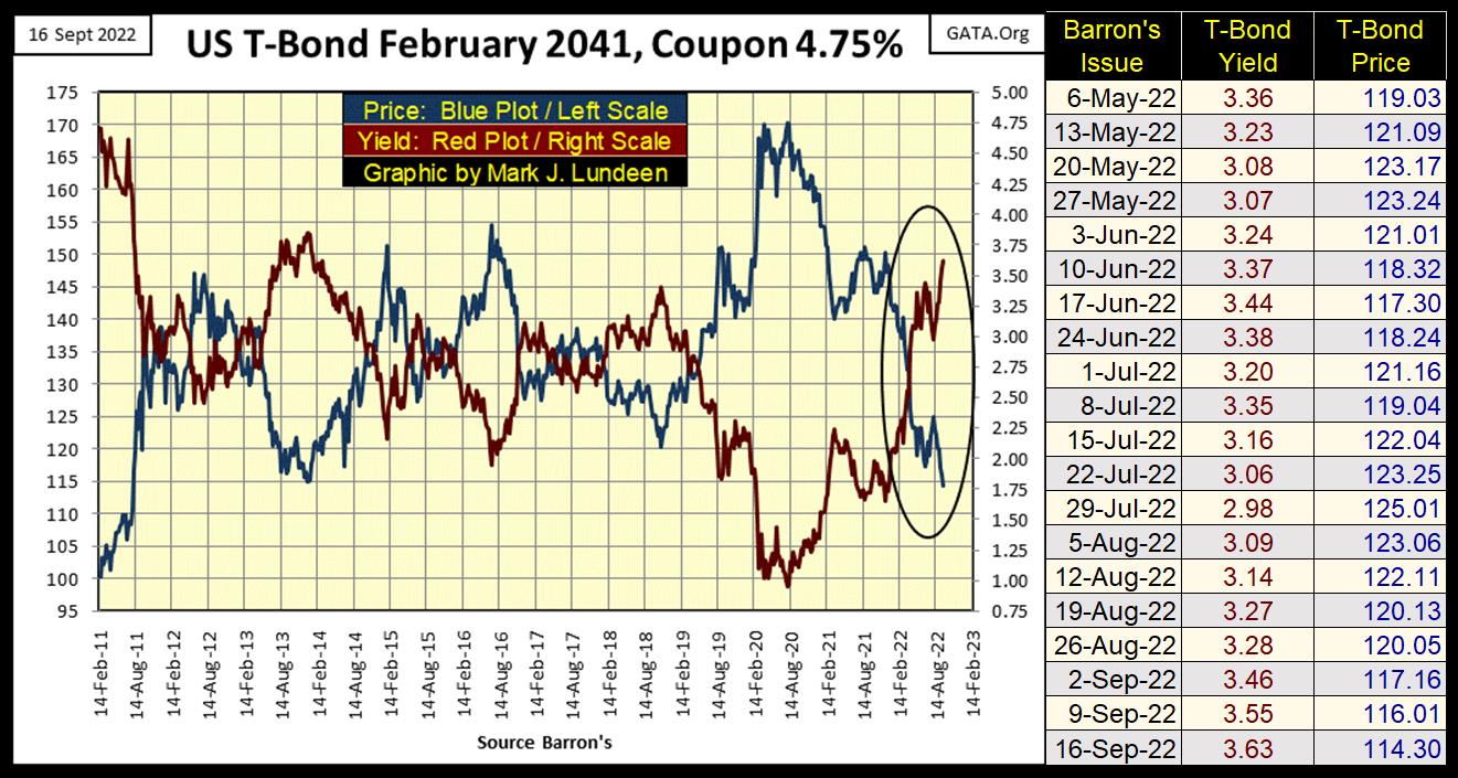
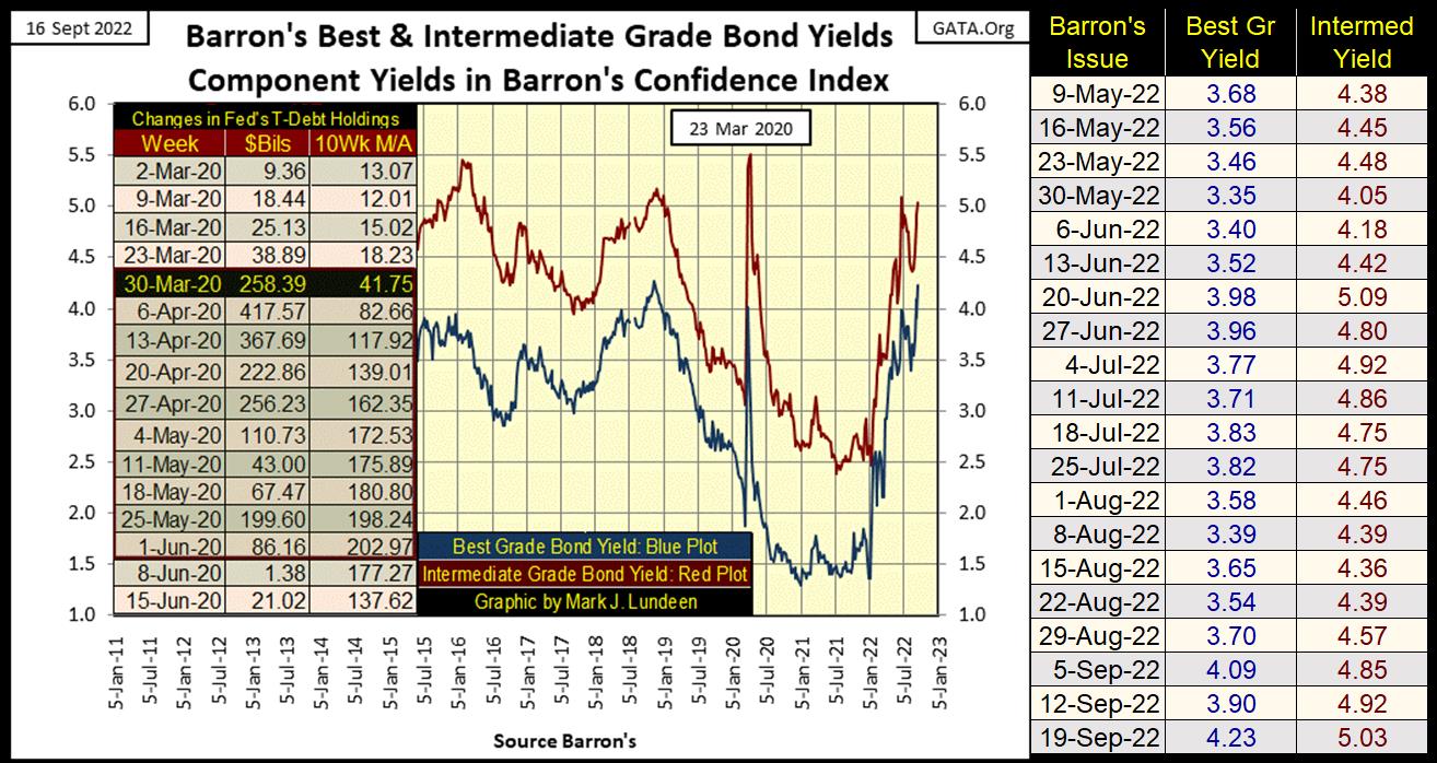
Mr Bear is still having his way with the bond markets; having bond yields rise as prices deflate. Looking at the below T-bond’s weekly data, the last time it saw its yield decrease from one week to the next was in Barron’s July 29th issue. In the subsequent seven weeks; bond yields have only increased as bond prices declined.
At the close of this week, this bond’s price (Blue Plot) fell below 115, a loss of 32.76% from its high of 170 two years ago.
I don’t follow the mainstream financial media much anymore. For the most part, their market commentary seems directed towards keeping the general public’s retirement funds within the confines of the financial markets, come hell or high water.
That’s not good, as there are times when the correct investment position should be to be out of the market, and staying out until Mr Bear has finished with deflating over inflated market valuations, and forcing the system to write off nonperforming investments from everyone balance sheets. This process is a brutal one, something smart investors want no part of.
Looking at the T-bond chart above, it’s undeniable the bond market following its top in August 2020, over two years ago, began a historic bear market. One may argue how much more this bear market in the bond market has to go, in terms of time and valuation, but one can’t argue the bond market isn’t in a bear market.
I wonder when the mainstream financial media will report this fact; the two-year old bear market in bonds to their viewing public. Probably not until the yield for this T-bond is something over 6%.
Corporate bonds, such as Barron’s Best and Intermediate Grade Bonds are also seeing their yields rising. Since the first of January, they’ve more than doubled in the last nine months.
Currently, rising yields in the debt markets are off most investors’ radar screens. But there is a threshold in the bond market, a point where rising yields in this bear market in debt will have to be recognized by all. When this threshold is crossed, it won’t a good day for the bulls in the stock market.
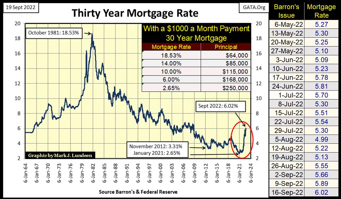
Mortgage rates are rising too. As with all debt markets, when yields are rising there is a bear market somewhere, in this case in real estate.
I have a table in the chart below, which gives the mortgage rates from October 1981 (18.53%), when the bull market in real estate began, to January 2021 (2.65%), when it can be argued the bull market in real estate topped.
This table is simple to understand. For someone who could afford a $1000 a month payment, how large of a mortgage would the banking system write for a perspective “home buyer” at different mortgage rates.
I placed the home buyer in quotation marks, as it’s ridiculous believing anyone servicing a mortgage legally owns the collateral underlying their mortgage, when legally speaking the bank does, until the “homeowner” pays off their mortgage.
But I digress from the topic at hand; how during the forty years of declining mortgage rates seen below, from 1981 to 2021, a “bull market” in single family homes came about. It’s as simple as looking at the table; as mortgage rates declined, the size of the mortgage a $1000 monthly payment could service increased.
It didn’t have to, but it was good business for the mortgage industry and local real estate agents to leverage home valuations to as much as the “home buyers” could bear.
In the table below are two examples, one of what did happen, and then an example of maybe what should have happened. The top example, of what happened shows what a monthly payment of $1000 could get a home owner from a bank’s mortgage department. From October 1981, to January 2021, it’s quite possible we’re looking at two different mortgages written for the same house.
People tend to focus on home prices, but the mortgage industry looks at mortgage rates and monthly payments. As the monthly payments for both these mortgages are $1000, for 360 months, the final costs for the “home owners” for each mortgage, the one for $64,500, and the other at $250,000 are the same; about $360,000.
The big difference between the two mortgages, is with mortgage rates now rising, the owner of the 30Yr mortgage with a rate of 2.65% will find it very difficult finding a buyer for their house, should the need arise. As current mortgage rates at 6.02%, will only afford potential buyers a mortgage of $168,000, for a $1000 a month payment.
This is called having one’s mortgage turned upside down in the market, something that was much talked about in the financial media in the wake of the 2002-07 sub-prime mortgage bubble. Now in 2022, we’ve come to that point again in the real estate market.
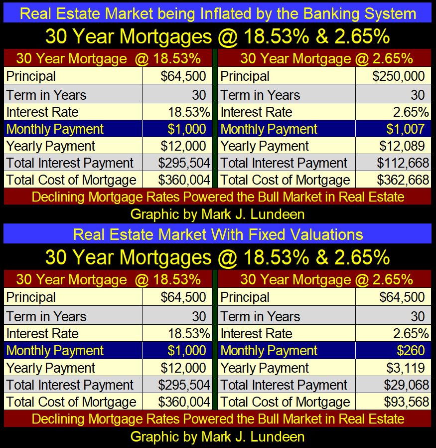
The bottom table is an example of what could have happened in the real estate market, where affordable housing was actually a goal of “monetary policy.” In case one didn’t know, banks just write checks with numbers on them. That was the whole point of the US Treasury abandoning the Bretton Woods $35 gold peg. With no real money involved (gold at a fixed exchange rate), banks can do what they damn well please with credit creation.
But what if the banking system did the right thing, and just implemented a policy of fixed mortgage principle; for example, the $64,500 seen above for the past forty years, from New York to California?
First of all, the extremes in housing valuation inflation seen before 2008, and now again in 2022 could not have happened. Monthly payments over time as mortgage rates came down would have become very affordable, and I believe the world would now be a better place.
But people are predators. And yes, I’m talking about you and me too, looking to get the maximum out of any deal we enter. That doesn’t make us bad, it’s just how things are. The above fixed-mortgage principal example would never be tolerated by either the banking system, local real estate companies in every country in the world, or the home buyers themselves, who like to see their home’s valuation rise over time.
But with mortgage rates now rising, and home values deflating because the banks must now reduce their mortgage loans in response to rising mortgage rates, maybe things will change as rates approach double digits. One thing for sure, there are going to be a lot of hurting homeowners as this bear market in real estate continues for the foreseeable future.
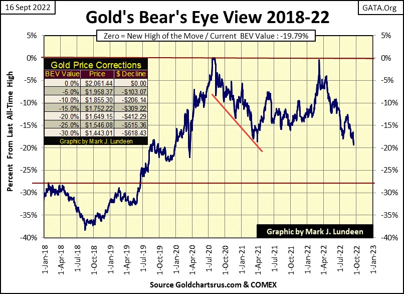
Let’s look at gold’s BEV chart. This week gold almost broke below its BEV -20% line, far from where it was last March when it almost made a new BEV Zero.
I’m not pessimistic on the precious metals, just frustrated at how the “policy makers” are allowed to suppress gold and silver as valuations in their prime markets (stocks and bonds) continue deflating. Should gold and silver once again be allowed to be countercyclical to the financial market, as they were before 1980, it would be a disaster for the powers that be as money managers and investors chose inflating precious metal investments over deflating stocks and bonds.
What price would gold and silver be should a few trillion dollars of flight capital head their way? I don’t know. Nor do the idiots at the FOMC, and they intend on keeping it that way for as long as they can.
But this shift in focus for investment funds, from stocks and bonds, to gold and silver, IS Going to Happen Anyway, whether the “policy makers” approve of it or not.
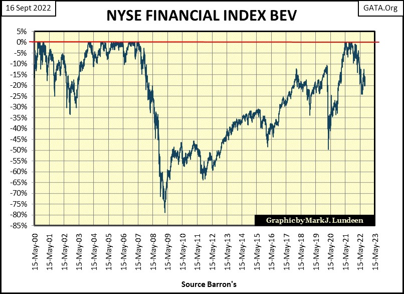
Like the bond market, the NYSE Financial Index is having a hard time of it as bond yields and interest rates continue advancing. But nothing like the problems they had in 2007-09, where at their bear-market bottom this index of financial companies had fallen 78%. This was even with direct support of many hundreds of billions of dollars from the Federal Reserve and US Treasury, and actual changes in their accounting standards to keep these companies from having to declare bankruptcy. Had Mr Bear had his way, I believe the NYSE Financial Index over a decades ago would have seen a BEV of -100%; a total wipeout in market valuation.
During the 2007-09 bear market in financial stocks, there was also a bull market in gold and silver, though it took until October 2008 before the precious metals began their advance.
So? Well, I’m inclined to believe the current market decline in the NYSE Financial Index is only going to go deeper, possibly taking out its lows of March 2009. At some point in this decline, as was the case in October 2008, the bull market in gold and silver will once again resume. Am I right? Time will tell.
In gold’s step sum chart below, I don’t know what it is, but sometimes I see a bear box in it, and other times I don’t. This week? Oh, I see one now, and I finally placed a red box around it. The bear box began when gold failed to make a new all-time high last March, until this week’s close, gold’s blue valuation plot (market reality) has been going down. This as gold’s red step sum plot (market expectations) has refused to follow market reality down for the past six months.
Bear boxes are where bulls go to be punished for being wrong on the market, and no one can deny that hasn’t been so for the bulls in the gold market since last March.
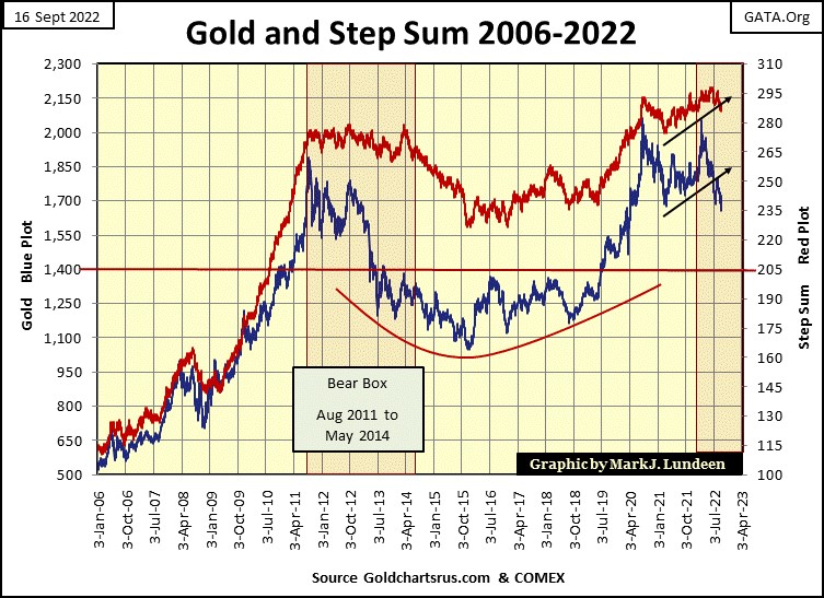
Next thing to watch in the step sum chart above, is if, or when gold’s step sum plot begins collapsing downward towards gold’s price plot. That would only happen if in the gold market, down days began to overwhelm advancing days. Such a collapse would result in the final downward surge, and find the bottom in gold’s current, six-month decline.
But that doesn’t have to happen. The bear box could fail, by having the price of gold reverse upwards towards its step sum plot. That could happen, but chances are the current downtrend in gold has further to go before it finds a bottom.
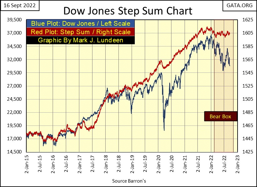
The Dow Jones in its step sum chart below is a very similar situation as is gold in its step sum chart above. So far, the bulls remain optimistic the Dow Jones will turn around, as see in the sideway trending step sum plot. But the Dow Jones itself has been going down since it made its last all-time high on January 4th.
I’m feeling bearish, so I believe it’s only a question of time before the Dow Jones breaks below its lows of last June, and continues going down.
That won’t be a morale booster for the bulls. Resulting in the bulls exiting their losing bullish positions by selling into market strength. We then begin seeing more down than advancing days in the market, causing the Dow Jones’ step sum plot to recouple, downward to its declining price plot.
Or so bear-box theory goes, which is going to be tested in the weeks to come with the Dow Jones.
In the step sum tables below for gold and the Dow Jones, we can see the dynamics at play in the step sum charts above. On gold’s side, look at all those down days since August 12th, dragging down its step sum from 295 to 287 at the close of the week. That plus gold’s 15 count has been a negative value since August 18th, as the bulls failed to move the price of gold higher for the past month.
On August 30th, gold’s 15-count declined to a -7, which is an oversold market. Typically, following a 15-count of -7 one can expect a bottom in a decline. But that didn’t happen. Well, if one can’t beat them, maybe one should join them.
I remain a long-term bull on the precious metals, but it’s pretty clear that right now the bears (COMEX goons) are dominating the gold market. I may remain bearish on gold until its step sum plot recouples, to the downside with gold’s price plot in the step sum chart above. Until they both bottom, and once again begin trending upwards, hoping gold will begin advancing will only result in frustration.
But if someone is buying, times like this are excellent opportunities for do so. Much better than buying at a market top.
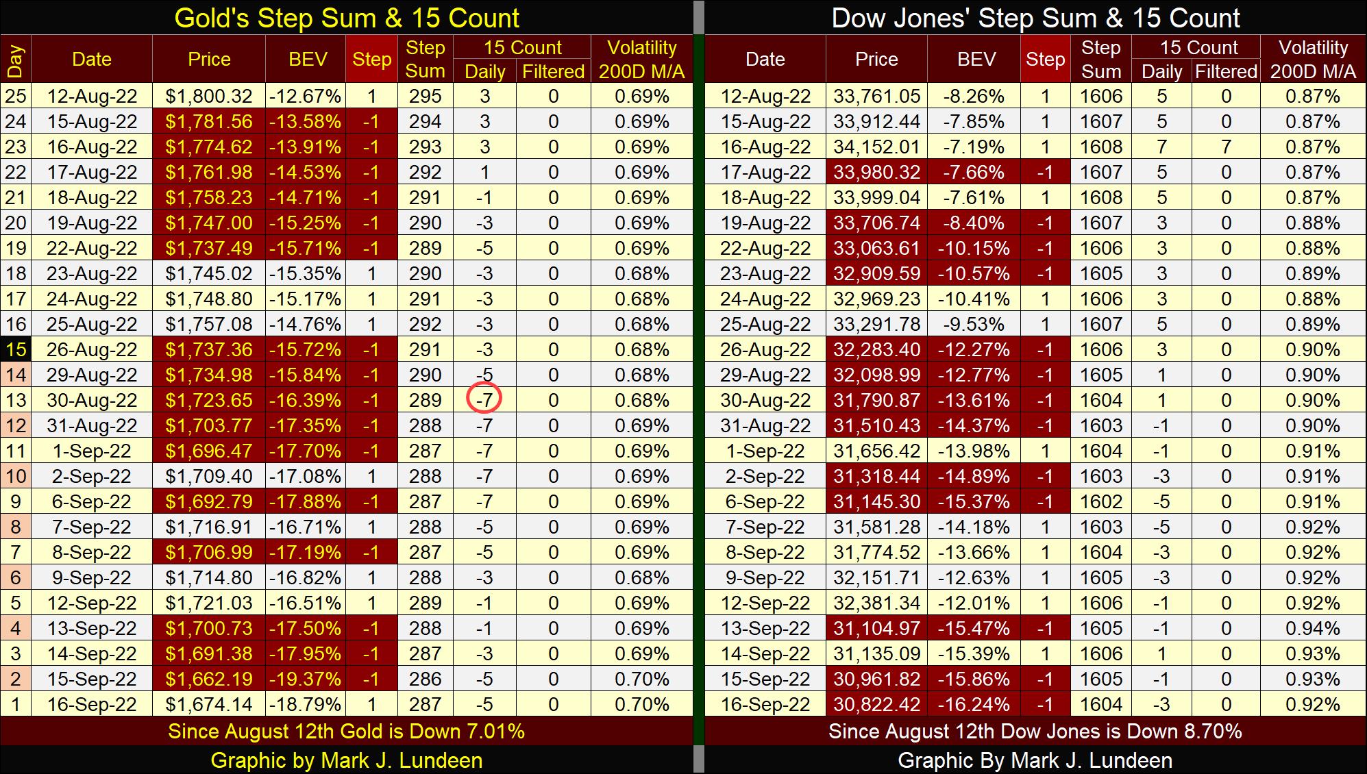
For the Dow Jones, its step sum on August 12th was at 1606, and closed the week at 1604, almost unchanged, indicating the market has seen about as many advancing days as decliners since August 12th. Still, the Dow Jones has lost about 3000 points in its valuation during this time. Sounds like the Dow Jones is in a bear box. Let’s see how much more punishment the bulls can take before they give up and sell.
Mark J. Lundeen
********


