Weekend Report… Longer Term Look at Gold
 share
share
 share
share
 share
share
 share
share
 share
share
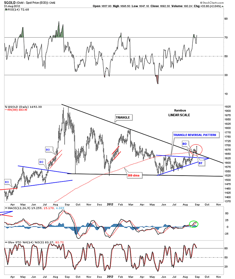
In this weekend report I would like to focus in on some of the longer term weekly and monthly charts for gold but would like to start off with just one daily chart. Last week was probably the most important week for gold in quite sometime as it finally took out the top black rail of the possible triangle consolidation pattern. There is alot going on where I’ve added a red circle to show you how critical that area is going forward. The first thing to note is the breakout from the blue triangle that has given gold the energy to finally break through the top black rail of the much bigger triangle consolidation pattern plus the 300 day moving average. You can see how once the top black rail was broken to the upside it reversed it’s role and held support last week. This was a very encouraging event IMHO. Most important is Friday’s price action that produced a nice long bar. So now gold has experienced a breakout and a backtest this week. It would be nice to now see some decent follow through to the upside and leave the breakout area behind.
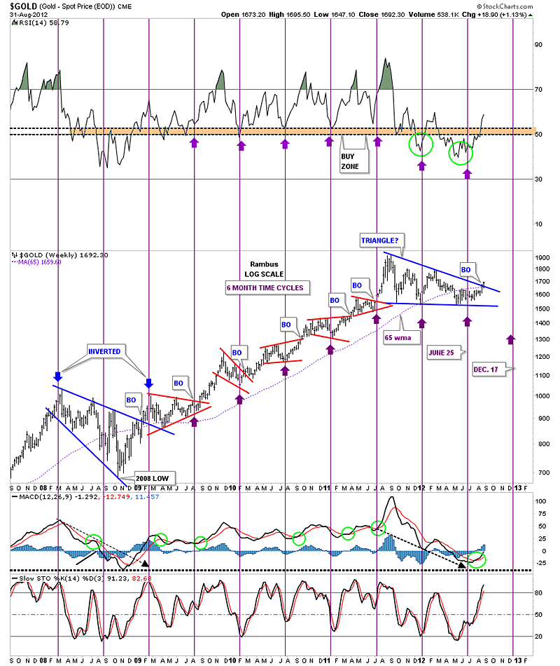
The next chart is a six month time cycle chart that has been very effective over the last several years, especially since the big rally out of the 2008 crash low. The latest six month time cycle came in just a tad earlier than what has been the case lately but its still looking good in here. When I experiment with a time cycle chart I not only look at the price but also the indicators that can give one a good confirmation that the cycle is indeed relevant. For instance notice the RSI indicator at the top of the chart and the slo stoch at the bottom of the chart. They usually turn on a dime when the six month time cycle hits. The MACD is alittle different in that it’s the last indicator to confirm the six month cycle as it usually crosses over several weeks later. One last note on time cycles. Sometimes they will invert meaning, in our current case where the six month time cycle is bottoming, sometimes they will invert and instead of making a bottom they will make a top. Note the two inverted 6 month time cycles that hit back in 2008 and 2009 that showed highs instead of bottoms.
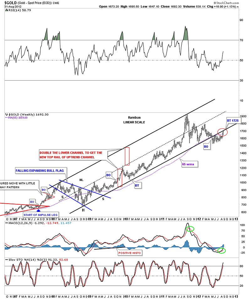
This next weekly chart shows the most critical test for gold right now. I’ve shown you this chart in the past where the price of gold broke below the bottom black rail of the uptrend channel made off the 2008 low. As you can see that bottom black trendline has been acting as resistance since it was broken. Gold is now testing it from below so we should know very shortly how much energy that bottom rail has left. Also note gold is now trading above the 65 week moving average which is a healthy sign.
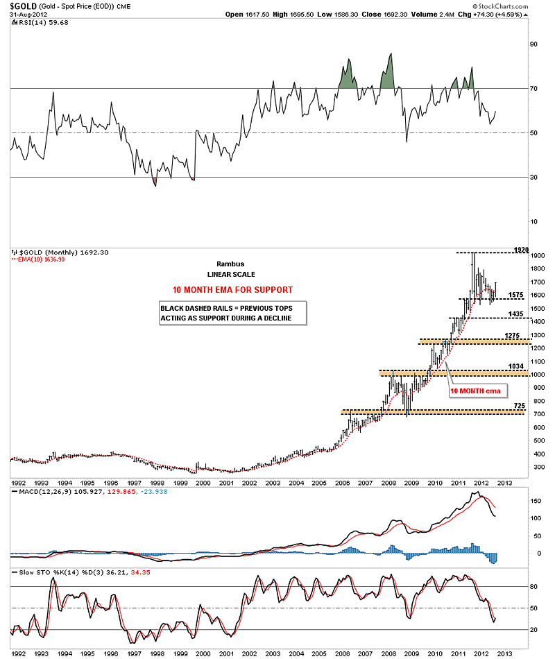
This next chart for gold is a long term monthly chart with a 10 month moving average that has done a very good job of holding the major uptrend intact. The only two times it has failed to do so was the 2008 crash and our most recent correction. On the monthly chart below I just want to show you how support and resistance really works even on large time scales. Again, the main psychology on why support and resistance works is very easy to understand. I’ve labeled the tops that were made on the way up with a horizontal black dashed rail or brown area if the tops were just a little ragged. The reasoning behind how this monthly gold chart is showing support on declines is because the investors who bought at these previous tops, black dashed rails, are still ahead of the game even though prices have fallen. So the psychology is “I’m still ahead and and can stand the pain, so they don’t sell. The buyers come back in and up prices go. Now if the price of gold were to penetrate any of the previous tops by a fair margin the psychology would be, ” if I can only get out even I will sell on any strength.” Then everything changes as what was support now turns into resistance as investors want to limit their loses and pain.
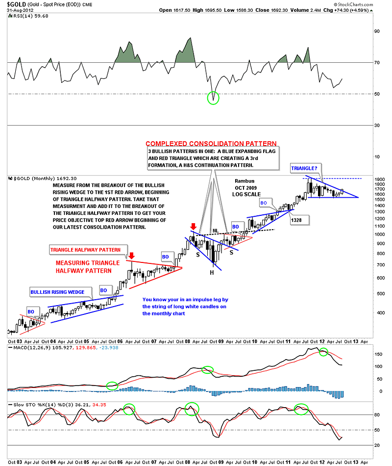
The next chart I would like to show you is another monthly look that is a candlestick chart. The reason I’m showing you this chart is so you can get a good feel for when an impulse leg up is in full swing. When a good bull move is underway you will start to see alot of white candles in a row. Then when you see one or two black candles in a row, within the impulse leg up, it usually suggests a small correction is taking place and you will be able to see it on a daily chart. This technique also works very well on weekly charts. Note the last three candlesticks are white while gold is trying to breakout from the blue triangle.
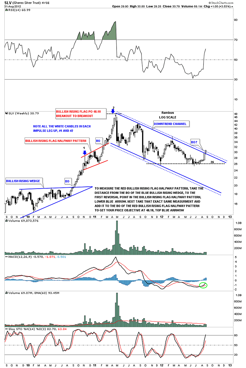
Let me just throw in this weekly chart for SLV that shows a better example of how a really good impulse leg up shows a string of white candles that lets you know you are in a strong bull move.
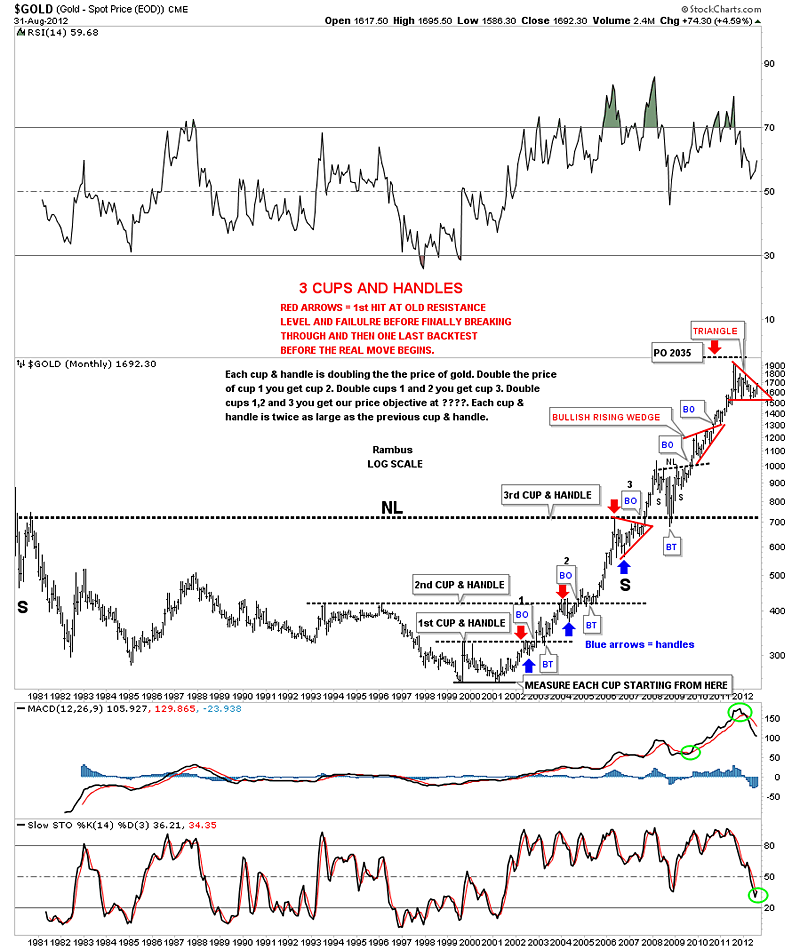
Finally, the long term look at gold wouldn’t be complete without looking at my favorite chart of the yellow metal going all the way back to the 1980 high. There is a massive 25 year inverse H&S base that finally broke out in September of 2007. When everything crashed in 2008 gold found support just where one would expect, at the massive neckline. From that backtest to the 25 year neckline gold went on to rally nearly 1200 points before topping out last year at 1920.
From this longer term perspective gold still looks remarkable strong after being in a bull market all these many years. Finding key support and resistance zones, as the monthly chart above shows, gives one a place to look for support and a place to add to your portfolio. Gold’s most recent high at 1920 will most likely come into play as support once its taken out to the upside. From my perspective, and the last several weeks of price action, gold is in the best technical shape I’ve seen in quite sometime. We just need to see some follow through to the upside now showing us many white candles on the monthly and weekly charts. All the best…Rambus
To Subscribe to Rambus Chartology and see Rambus' 10 Favorite PM Stocks and a World of Charts and Projections including the Chartology Forum where Rambus answers your Questions and even Charts your Favorite PM Stocks by Request, go to : www.rambus1.com
share
share
share
share
share
 Meet Rambus, a seasoned trader and technical analyst renowned for his unbiased and insightful chart work. Through his website, Rambus Chartology, and Substack newsletter, Rambus shares his expertise with a global community of subscribers, providing daily updates, commentaries, and hands-on training in the art and science of chartology. With his calm, humble, and down-to-earth approach, Rambus demystifies complex market trends, helping his followers navigate the challenges of today's volatile markets. Join the Rambus Chartology community today and discover a unique blend of technical analysis, trading expertise, and time-tested protocols. Subscribe now at www.rambus1.com or https://rambuschartology.substack.com/