What’s A Bubble Among Friends!


In a conversation among people old enough to remember, the word ‘bubble’ brings back memories of 1987 and 2000 and the Nasdaq.com frenzy. The craziness of the South Sea Island bubble in the UK and John Law and his Banque Generale in France is before our time, but is still expected reading in economics. We know about bubbles – only by hindsight as Greenspan reminded us – and we know what caused them by the time we recognise that there has in fact been a bubble blown! How long still is it to be before the Wall Street bubble is generally recognised for what it truly is?
It has been a consistent theme in these reports that the introduction of the new CPI in the mid 1990s has resulted in the impoverishment of the employee middle and lower classes and also more optimistic value for the GDP. The increasing wage and wealth gaps between employee and employer households appear to present academics with a riddle for which they have no good answer. They appear not to understand the US is divided into employees and employers, which include professionals and similar other mostly self-employed people. Because of the official CPI, they inhabit different worlds.
If employees receive increases measured against the official CPI – while employers in effect set the price increases that determine their own income – the standard of living of employee households will deteriorate in real terms after each annual increase, while he people responsible for the higher prices will continue to live well. Much the same applies to the GDP. If an index of actual price increases is adjusted lower for the GDP calculation by a deflator similar to the CPI, the calculated GDP is more optimistic than the reality. Do this for 20 years and the country appears richer in material wealth than it really is.
Taken towards a ludicrous extreme: if prices in general increase by 20% each year, but because of quality and other improvements the CPI and deflator is calculated as 8%, the 12% difference with the rule of 72 means the GDP as measure of the size of the economy will double every six years. For an economy the size of the US this is obviously laughable. However if according to John Williams one can generalise true inflation to be 8% or higher while the CPI is to about 2%, the 6% difference implies the US economy ought to double in 12 years. It should now be double that of 2009.
So we have a situation where the dollar is subject to unreported inflation at a higher rate than the CPI or the deflator. Which means everything that is priced in dollars is now more expensive, because of the unjustified increase in price, including equities. Unjustified in terms of real, true value, but thoroughly justified by the profits made by corporations from price increases that substantially exceed what is being reported by the CPI or the deflator. Perhaps the US should double all prices in dollars overnight, then add 10% to each of the CPI and deflator to compensate for the higher prices – then China will never be able to catch up to the US GDP.
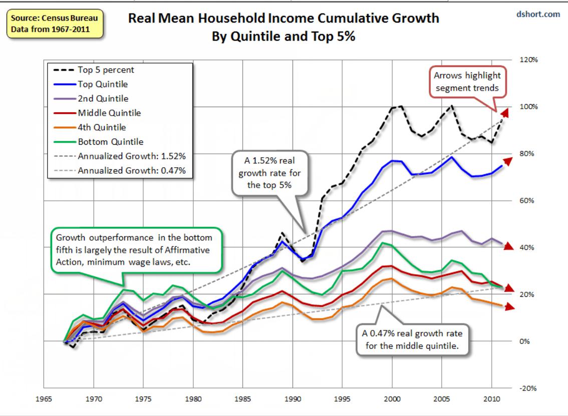
The chart above shows the cumulative growth in household income for five quintiles and also the top 5% of households. The top 20% of households show cumulative growth which, while not keeping pace with the top 5%, still outdistances the lower 80% by a substantial margin.
Perhaps not intentionally so, the chart also shows the effect on the lower 80% of all households – which mostly consists of employees earning salaries and wages – of the introduction of the new CPI in the mid 1990s. By 2000, not even a full five years later, the incomes of all 80% of households peaked and started to decline. The upper of the four quintiles, 60-80%, managed to level off and at least nominally earned incomes that did not decline by much.
The green line, representing the 40-60% of households which are the heart of middle America, saw the worst decline by comparison to the peak in 2000. Taken as a whole, the US is being impoverished, except for a consistent wealth transfer from middle and lower America to the wealthy. 80% of US households do not share in whatever real growth the economy enjoyed since 2000 – even if measured in inflated dollars, for a double whammy on their quality of life.
Which brings us to Wall Street. The equities bull market started in 2009 with the bail out of the financial system and has continued ever since on open and hidden largesse of the Fed and Congress. There are frequent reports of how recently is the date of the half-way benchmark of all dollars printed. This page has it that more than half of all dollars in circulation has been printed since 2010 and that excludes the $trillions /of dollars that were added in 2009. All that money had to find a home – and not much was spent on new goods and services as the GDP crept higher at a snail’s pace.
Despite the growth of the cryptos (which must have absorbed a fair number of dollars) Wall Street is still a favourite of rich investors and a true favourite of fund managers. As money was being printed as never before, a substantial portion of it flowed into equities. While there must have been disinvestment to some degree as COVID took its toll on households, most of these must have been lower income with little exposure to Wall Street.
The only real sell-off on Wall Street, in March last year on the COVID scare, was over almost as soon as it had started, then to begin a new leg of the bull market. When the DJIA approached and passed 34 000, profit taking increased as momentum slowed. It became evident then that there were forces at work with an objective to prevent any sell-off. Clearly, there were fears ‘upstairs’ that if a bear trend were to develop, this would be difficult to bring to a stop; better to ensure that the Bull continues before the Bear takes hold.
When a major trend approaches its end, the tug of war between the bulls and bears intensifies; daily changes tend to be smaller than before and vary in direction. As is often seen at such times, the chart develops a well-known pattern – either a rising or falling wedge, depending on the circumstances. Wedge formations typically consist of five moves from one side to the other, with the first and main wave in the direction opposite the previous main trend. The chart below shows the Dow-30 4-hourly futures as it had closed on Friday. The rising wedge with four legs completed can be seen; the attempt to complete leg and break lower were reversed before a full break happened.
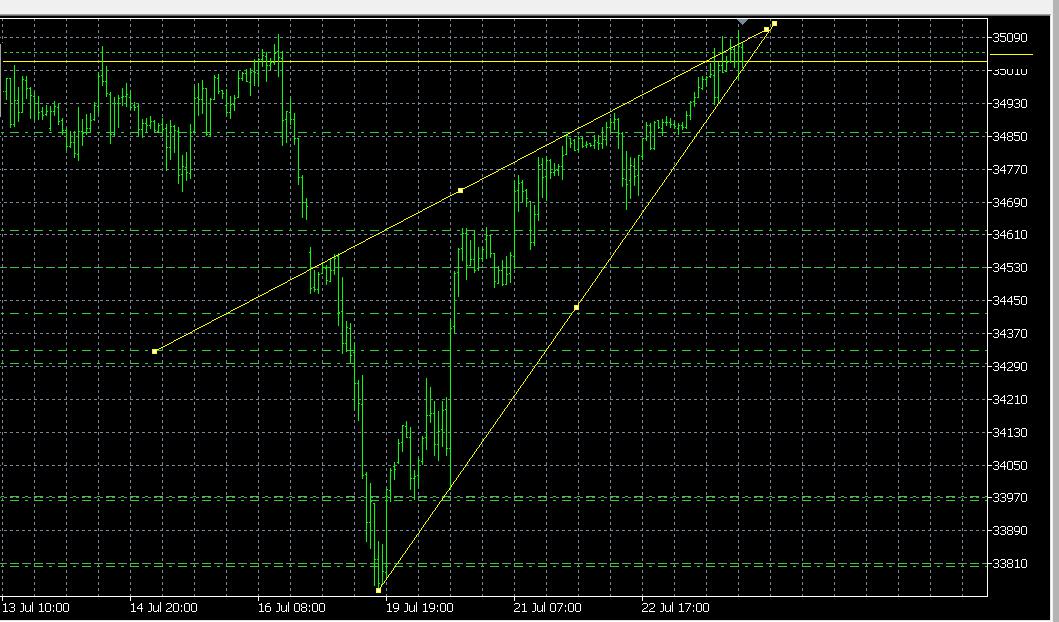
On the face of it, it looks as if Wall Street will break down on Monday. However, over many years I have seen clearly defined rising wedges break higher to extend the old bull market; quite often at a steeper and longer sustained rate. Were that to happen here, the probable reason would be the market’s expectation that even more dollars will be printed in 2H 2021 and well into 2022.
During Friday afternoon’s trading there was an ongoing battle to keep the DJIA above the rising support line against the late Friday profit taking that threatened to cause a break lower. Several breaks above the wedge and into the DJIA 35 000 level occurred and failed to extend or hold, yet the market did manage to finish the day with new all time highs for all three main indices. Monday should show whether this is a rally top to the market, or whether the rally is to resume on a promise of even more liquidity.
For gold and silver the story is little changed; gold again sitting just below $1800 and silver, having given up on the $26 handle the week before, sank lower to challenge $25 on Thursday, before a slight bounce on Friday. All of this preparation for COMEX expirations next week? When considering the degree to which Wall Street refuses to conform to the repetitive warnings of the coming Crash and Bear market, it no longer appears so out of the ordinary for the PM price suppression to last as long as it does. After all, the health of the dollar depends more on low PM prices than on a ramped up Wall Street, I think.
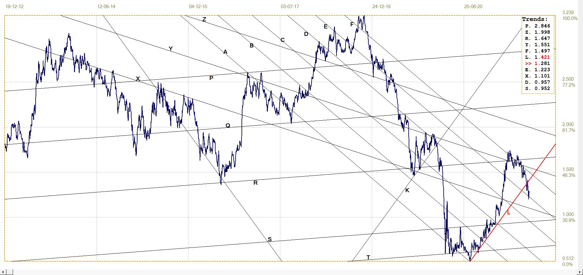
Euro–Dollar
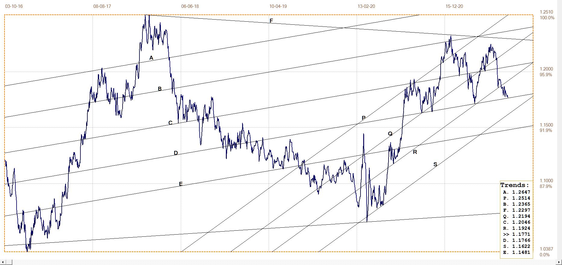
Euro–dollar, last = $1.1771 (www.investing.com)
Last week it was written here that the break below bull channel PQR should be short term bearish for the euro, provided that the support along line D continues to hold. On Friday’s close, almost exactly at line D, the euro has reached a potential turning point. This in combination with the rising wedge on the DJIA could imply that the coming week might turn out to be decisive for the near future of US markets.
DJIA daily close
The post-2008 bull market held closely in broad bull channel ABCDE, initially up to the COVID panic in March 2020 and then again after the recovery off the bottom spike. On the other hand, the post-March 2020 rally held close to the much steeper channel JK, all the way to the triple top between late April and early June this year. A triple top traditionally is viewed as the final top of a major bull market and should it be broken, the break will begin a lasting new rally.
When the DJIA completed the third top and broke below the easily visible support of line K, general opinion would have been that the bull market is over and done with. A new bear market on Wall Street did not feature on the agenda of the authorities – and still doesn’t – which meant that the break below channel JK had to be ‘corrected’ with a major push to resume and extend the bull market.
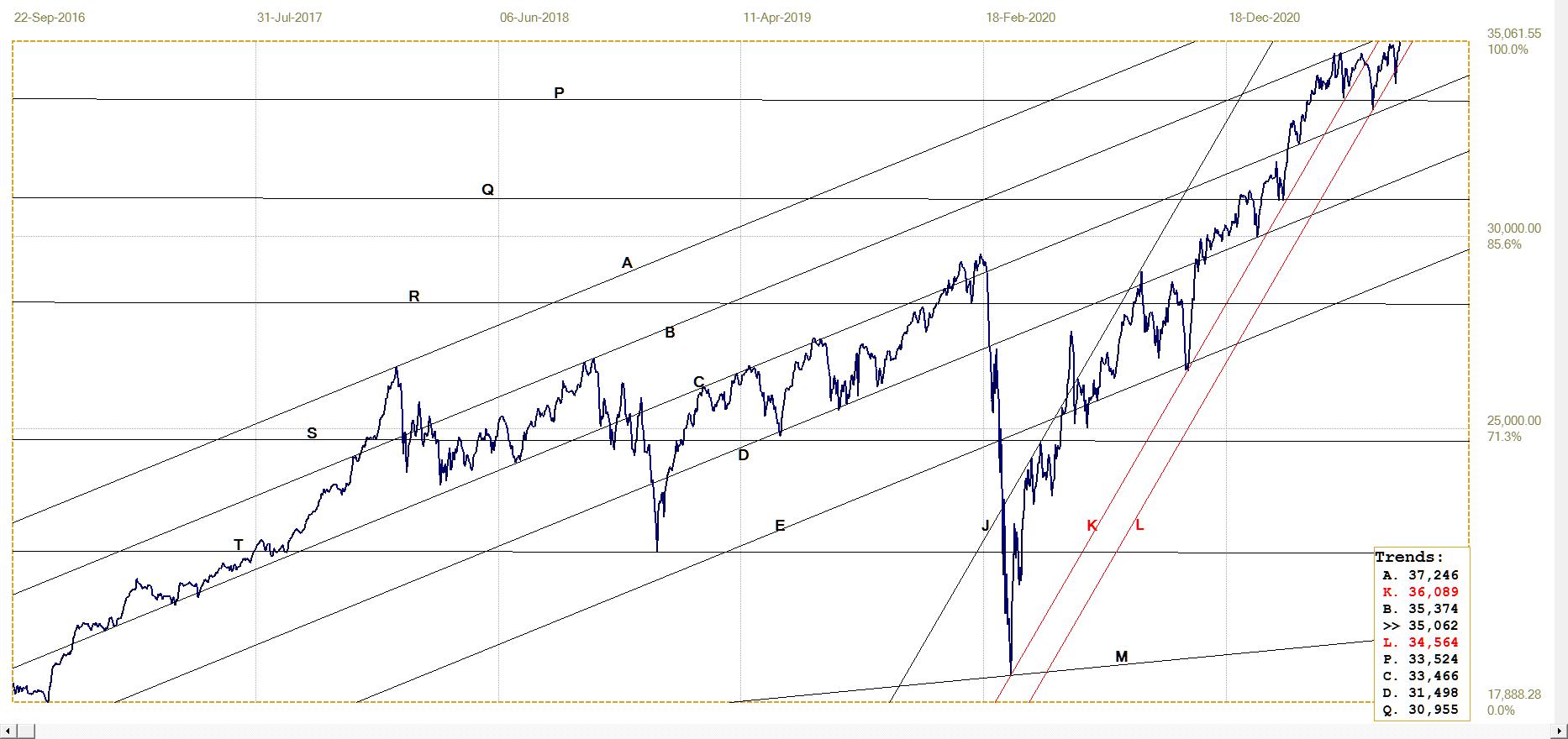
DJIA. last = 35061.55 (money.cnn.com)
Serial new all-time highs were set in the three major market indices, to reach another triple whammy last Friday with all three at new highs. Channel KL is a first possibility as an extension of channel JK and it was also briefly penetrated by a steep decline on Monday last week. Tomorrow, again after a weekend of deliberation, the market has to choose whether to complete the rising wedge with a break lower at the end of leg 5 that should also break below channel JKL, or to break higher and extend the rally.
Gold London PM fix – Dollars
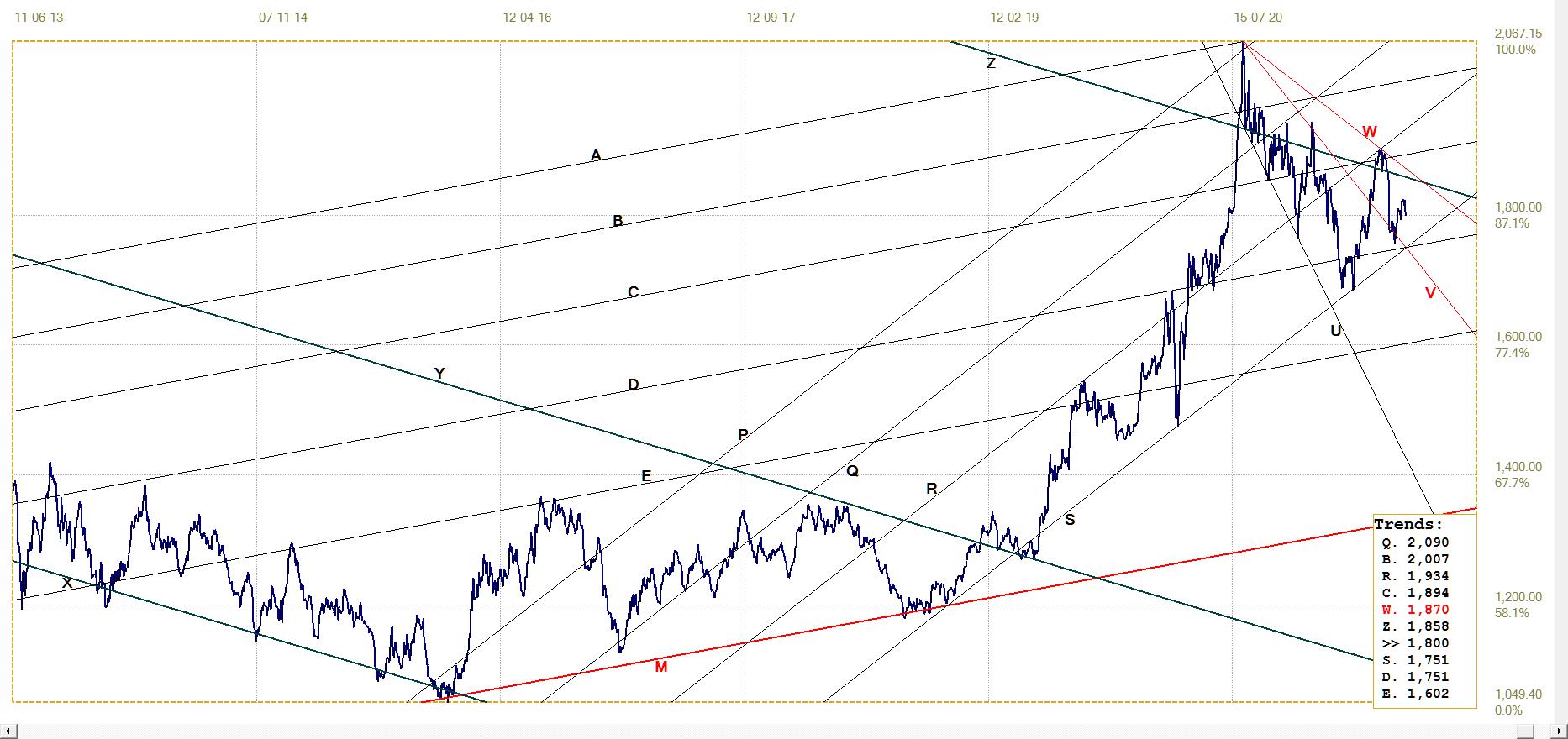
Gold price – London PM fix, last = $1799.60 (www.kitco.com)
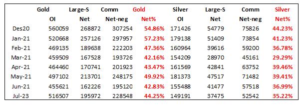
The table that essentially displays the trend in the Commercials’ net short position in gold and silver relative to the open interest in the metals (red columns) shows that the Commercials had to sell more gold contracts to keep the price of gold down (to below $1800), while they could slightly reduce their net short position relative to the OI. This was probably feasible because of lack of demand for silver contracts that enabled the Banks to get the price of silver well below $26 and close to $25.
The price of gold has again broken above the steep inverted megaphone UV, which in principle should have resulted in a steep, sustained move. The previous break above line V ended at line W to form a new megaphone pattern. (As always, lines V and M are derived from the master gradient, M). These patterns anticipate strong moves when broken to the upside, but they do not predict when this will happen.
Euro–gold PM fix
The weaker euro late last week was not able to off-set the weaker dollar price of gold to result in further gains in the euro price of gold. The euro price nevertheless was able to hold above the descending resistance of line G. The possibility exists that the mover back, close to line G, is an attempt at a ‘goodbye kiss’ on line G – a return to a trend line that had been penetrated as if to confirm its presence before resuming the original trend. This week should provide more clarity about that possibility.
Euro gold price – PM fix in Euro. Last = €1529.84 (www.kitco.com)
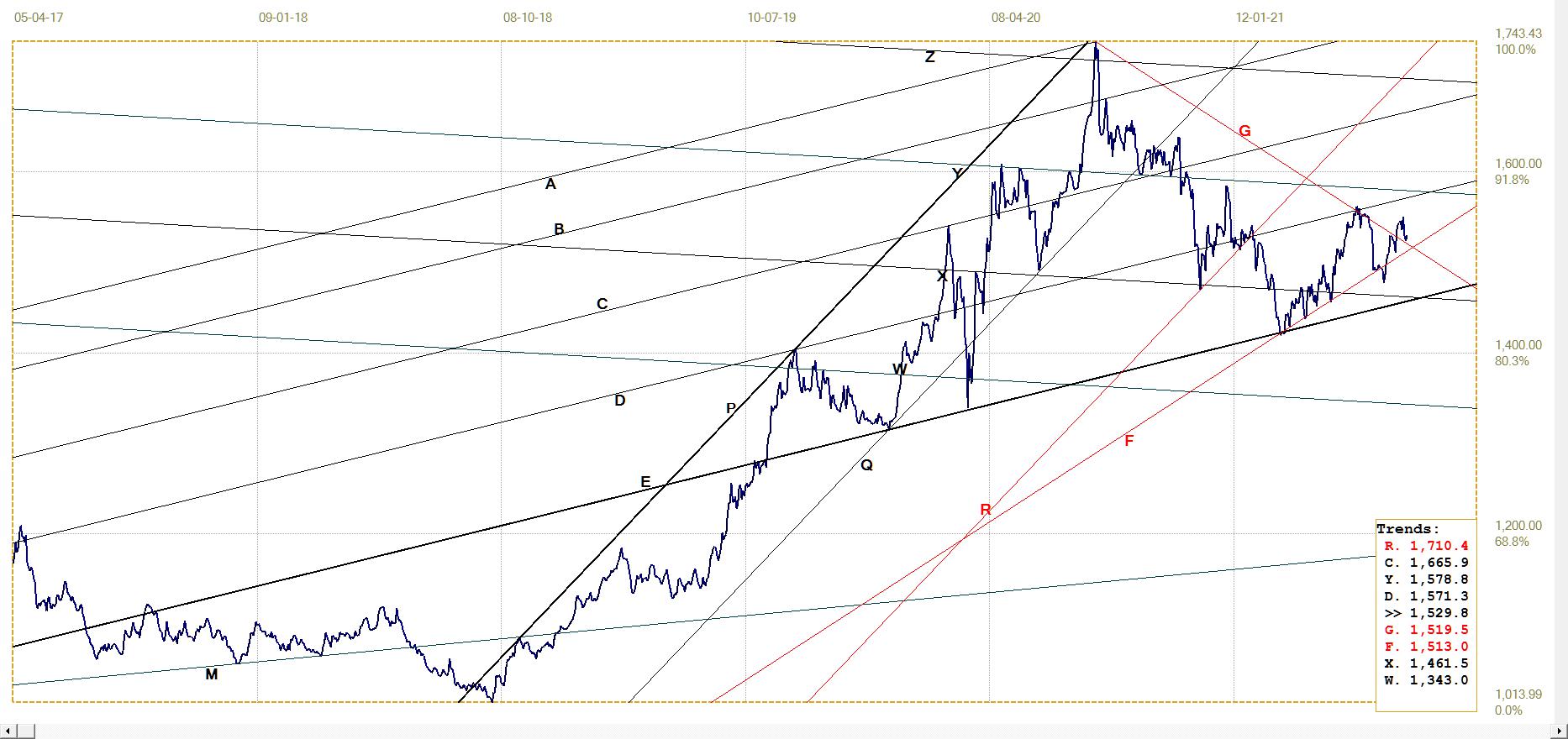
Silver Daily London Fix
The steep fall in the price of silver, to break clear below $26 and to test the $25 level has the price down to the bottom of the redefined channel KL. Line L is located in the centre of the bifurcated bottom patter, often used as an important anchor point.
This is still a tentative analysis and a rebound higher of line L this week is needed to confirm that it is valid. As discussed earlier under the chart of the dollar gold price, the percentage of the Commercial net short position in silver relative to the silver OI shows that the Banks could relax their level of price suppression a little. It is assumed that this could be done because demand for silver contracts has declined, perhaps as buyers have come to realise that it does not pay to chase the price any higher while it is being so manipulated. If so, it did take a long time to sink in.
Silver daily London fix, last = $25.165 (www.kitco.com)
U.S. 10–year Treasury Note
The break below bear channel KL, has extended lower. Presumably this confirms that the market believes inflation in fact will be transitory, as confidently stated by Yellen and Powel. The authorities still face an uphill battle to really get the economy going after the COVID slump and lower interest rates are an important factor in this effort.
What the yield will do if and when the CPI should continue higher with little or no sign of being transitory will be interesting, given the widespread fiddling with markets and the need to keep rates low – a preferred outcome despite the volume of dollar printing and issuance of new Treasuries.
U.S. 10–year Treasury note, last = 1.281% (www.investing.com )
West Texas Intermediate crude. Daily close
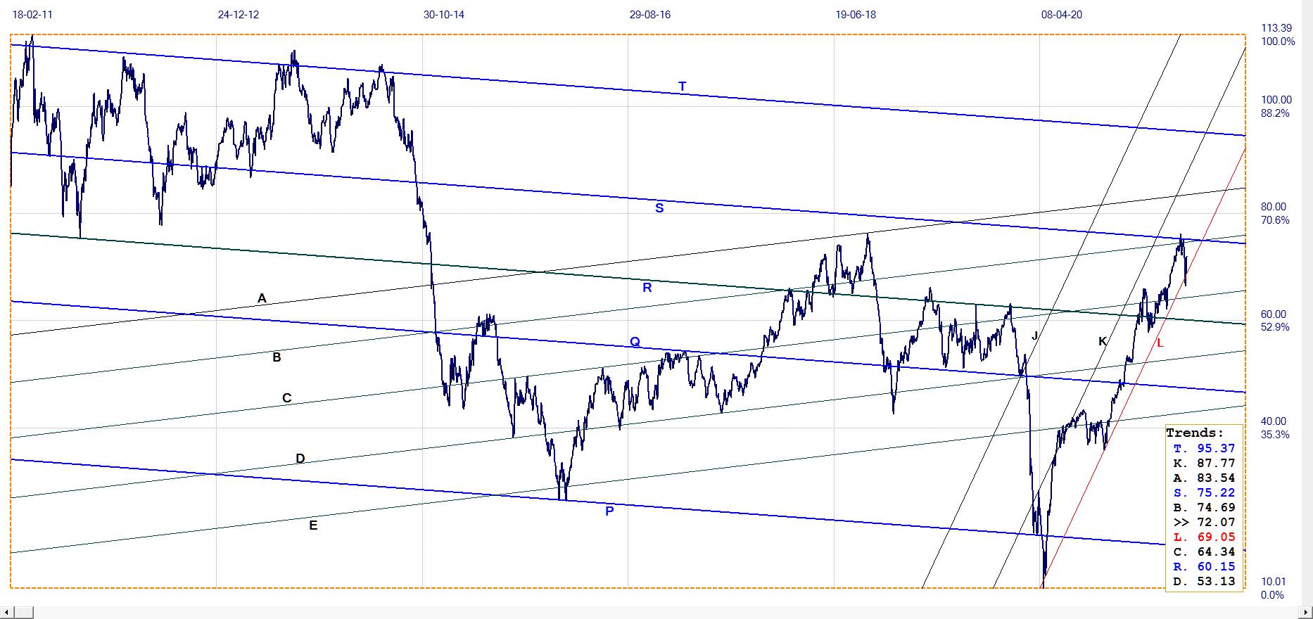
WTI crude – Daily close, last = $72.07 (www.investing.com )
The price of crude briefly broke below channel KL as if to confirm that the hiccup in the CPI will not last very long, but the price quickly reversed and spiked higher after the break. The move back into channel KL is a bullish warning, but this will only take effect on a definite break above lines B and S to continue higher in the bull channel.
********
In a conversation among people old enough to remember, the word ‘bubble’ brings back memories of 1987 and 2000 and the Nasdaq.com frenzy. The craziness of the South Sea Island bubble in the UK and John Law and his Banque Generale in France is before our time, but is still expected reading in economics. We know about bubbles – only by hindsight as Greenspan reminded us – and we know what caused them by the time we recognise that there has in fact been a bubble blown! How long still is it to be before the Wall Street bubble is generally recognised for what it truly is?
It has been a consistent theme in these reports that the introduction of the new CPI in the mid 1990s has resulted in the impoverishment of the employee middle and lower classes and also more optimistic value for the GDP. The increasing wage and wealth gaps between employee and employer households appear to present academics with a riddle for which they have no good answer. They appear not to understand the US is divided into employees and employers, which include professionals and similar other mostly self-employed people. Because of the official CPI, they inhabit different worlds.
If employees receive increases measured against the official CPI – while employers in effect set the price increases that determine their own income – the standard of living of employee households will deteriorate in real terms after each annual increase, while he people responsible for the higher prices will continue to live well. Much the same applies to the GDP. If an index of actual price increases is adjusted lower for the GDP calculation by a deflator similar to the CPI, the calculated GDP is more optimistic than the reality. Do this for 20 years and the country appears richer in material wealth than it really is.
Taken towards a ludicrous extreme: if prices in general increase by 20% each year, but because of quality and other improvements the CPI and deflator is calculated as 8%, the 12% difference with the rule of 72 means the GDP as measure of the size of the economy will double every six years. For an economy the size of the US this is obviously laughable. However if according to John Williams one can generalise true inflation to be 8% or higher while the CPI is to about 2%, the 6% difference implies the US economy ought to double in 12 years. It should now be double that of 2009.
So we have a situation where the dollar is subject to unreported inflation at a higher rate than the CPI or the deflator. Which means everything that is priced in dollars is now more expensive, because of the unjustified increase in price, including equities. Unjustified in terms of real, true value, but thoroughly justified by the profits made by corporations from price increases that substantially exceed what is being reported by the CPI or the deflator. Perhaps the US should double all prices in dollars overnight, then add 10% to each of the CPI and deflator to compensate for the higher prices – then China will never be able to catch up to the US GDP.
The chart above shows the cumulative growth in household income for five quintiles and also the top 5% of households. The top 20% of households show cumulative growth which, while not keeping pace with the top 5%, still outdistances the lower 80% by a substantial margin.
Perhaps not intentionally so, the chart also shows the effect on the lower 80% of all households – which mostly consists of employees earning salaries and wages – of the introduction of the new CPI in the mid 1990s. By 2000, not even a full five years later, the incomes of all 80% of households peaked and started to decline. The upper of the four quintiles, 60-80%, managed to level off and at least nominally earned incomes that did not decline by much.
The green line, representing the 40-60% of households which are the heart of middle America, saw the worst decline by comparison to the peak in 2000. Taken as a whole, the US is being impoverished, except for a consistent wealth transfer from middle and lower America to the wealthy. 80% of US households do not share in whatever real growth the economy enjoyed since 2000 – even if measured in inflated dollars, for a double whammy on their quality of life.
Which brings us to Wall Street. The equities bull market started in 2009 with the bail out of the financial system and has continued ever since on open and hidden largesse of the Fed and Congress. There are frequent reports of how recently is the date of the half-way benchmark of all dollars printed. This page has it that more than half of all dollars in circulation has been printed since 2010 and that excludes the $trillions /of dollars that were added in 2009. All that money had to find a home – and not much was spent on new goods and services as the GDP crept higher at a snail’s pace.
Despite the growth of the cryptos (which must have absorbed a fair number of dollars) Wall Street is still a favourite of rich investors and a true favourite of fund managers. As money was being printed as never before, a substantial portion of it flowed into equities. While there must have been disinvestment to some degree as COVID took its toll on households, most of these must have been lower income with little exposure to Wall Street.
The only real sell-off on Wall Street, in March last year on the COVID scare, was over almost as soon as it had started, then to begin a new leg of the bull market. When the DJIA approached and passed 34 000, profit taking increased as momentum slowed. It became evident then that there were forces at work with an objective to prevent any sell-off. Clearly, there were fears ‘upstairs’ that if a bear trend were to develop, this would be difficult to bring to a stop; better to ensure that the Bull continues before the Bear takes hold.
When a major trend approaches its end, the tug of war between the bulls and bears intensifies; daily changes tend to be smaller than before and vary in direction. As is often seen at such times, the chart develops a well-known pattern – either a rising or falling wedge, depending on the circumstances. Wedge formations typically consist of five moves from one side to the other, with the first and main wave in the direction opposite the previous main trend. The chart below shows the Dow-30 4-hourly futures as it had closed on Friday. The rising wedge with four legs completed can be seen; the attempt to complete leg and break lower were reversed before a full break happened.
On the face of it, it looks as if Wall Street will break down on Monday. However, over many years I have seen clearly defined rising wedges break higher to extend the old bull market; quite often at a steeper and longer sustained rate. Were that to happen here, the probable reason would be the market’s expectation that even more dollars will be printed in 2H 2021 and well into 2022.
During Friday afternoon’s trading there was an ongoing battle to keep the DJIA above the rising support line against the late Friday profit taking that threatened to cause a break lower. Several breaks above the wedge and into the DJIA 35 000 level occurred and failed to extend or hold, yet the market did manage to finish the day with new all time highs for all three main indices. Monday should show whether this is a rally top to the market, or whether the rally is to resume on a promise of even more liquidity.
For gold and silver the story is little changed; gold again sitting just below $1800 and silver, having given up on the $26 handle the week before, sank lower to challenge $25 on Thursday, before a slight bounce on Friday. All of this preparation for COMEX expirations next week? When considering the degree to which Wall Street refuses to conform to the repetitive warnings of the coming Crash and Bear market, it no longer appears so out of the ordinary for the PM price suppression to last as long as it does. After all, the health of the dollar depends more on low PM prices than on a ramped up Wall Street, I think.
Euro–Dollar
Euro–dollar, last = $1.1771 (www.investing.com)
Last week it was written here that the break below bull channel PQR should be short term bearish for the euro, provided that the support along line D continues to hold. On Friday’s close, almost exactly at line D, the euro has reached a potential turning point. This in combination with the rising wedge on the DJIA could imply that the coming week might turn out to be decisive for the near future of US markets.
DJIA daily close
The post-2008 bull market held closely in broad bull channel ABCDE, initially up to the COVID panic in March 2020 and then again after the recovery off the bottom spike. On the other hand, the post-March 2020 rally held close to the much steeper channel JK, all the way to the triple top between late April and early June this year. A triple top traditionally is viewed as the final top of a major bull market and should it be broken, the break will begin a lasting new rally.
When the DJIA completed the third top and broke below the easily visible support of line K, general opinion would have been that the bull market is over and done with. A new bear market on Wall Street did not feature on the agenda of the authorities – and still doesn’t – which meant that the break below channel JK had to be ‘corrected’ with a major push to resume and extend the bull market.
DJIA. last = 35061.55 (money.cnn.com)
Serial new all-time highs were set in the three major market indices, to reach another triple whammy last Friday with all three at new highs. Channel KL is a first possibility as an extension of channel JK and it was also briefly penetrated by a steep decline on Monday last week. Tomorrow, again after a weekend of deliberation, the market has to choose whether to complete the rising wedge with a break lower at the end of leg 5 that should also break below channel JKL, or to break higher and extend the rally.
Gold London PM fix – Dollars
Gold price – London PM fix, last = $1799.60 (www.kitco.com)
The table that essentially displays the trend in the Commercials’ net short position in gold and silver relative to the open interest in the metals (red columns) shows that the Commercials had to sell more gold contracts to keep the price of gold down (to below $1800), while they could slightly reduce their net short position relative to the OI. This was probably feasible because of lack of demand for silver contracts that enabled the Banks to get the price of silver well below $26 and close to $25.
The price of gold has again broken above the steep inverted megaphone UV, which in principle should have resulted in a steep, sustained move. The previous break above line V ended at line W to form a new megaphone pattern. (As always, lines V and M are derived from the master gradient, M). These patterns anticipate strong moves when broken to the upside, but they do not predict when this will happen.
Euro–gold PM fix
The weaker euro late last week was not able to off-set the weaker dollar price of gold to result in further gains in the euro price of gold. The euro price nevertheless was able to hold above the descending resistance of line G. The possibility exists that the mover back, close to line G, is an attempt at a ‘goodbye kiss’ on line G – a return to a trend line that had been penetrated as if to confirm its presence before resuming the original trend. This week should provide more clarity about that possibility.
Euro gold price – PM fix in Euro. Last = €1529.84 (www.kitco.com)
Silver Daily London Fix
The steep fall in the price of silver, to break clear below $26 and to test the $25 level has the price down to the bottom of the redefined channel KL. Line L is located in the centre of the bifurcated bottom patter, often used as an important anchor point.
This is still a tentative analysis and a rebound higher of line L this week is needed to confirm that it is valid. As discussed earlier under the chart of the dollar gold price, the percentage of the Commercial net short position in silver relative to the silver OI shows that the Banks could relax their level of price suppression a little. It is assumed that this could be done because demand for silver contracts has declined, perhaps as buyers have come to realise that it does not pay to chase the price any higher while it is being so manipulated. If so, it did take a long time to sink in.
Silver daily London fix, last = $25.165 (www.kitco.com)
U.S. 10–year Treasury Note
The break below bear channel KL, has extended lower. Presumably this confirms that the market believes inflation in fact will be transitory, as confidently stated by Yellen and Powel. The authorities still face an uphill battle to really get the economy going after the COVID slump and lower interest rates are an important factor in this effort.
What the yield will do if and when the CPI should continue higher with little or no sign of being transitory will be interesting, given the widespread fiddling with markets and the need to keep rates low – a preferred outcome despite the volume of dollar printing and issuance of new Treasuries.
U.S. 10–year Treasury note, last = 1.281% (www.investing.com )
West Texas Intermediate crude. Daily close
WTI crude – Daily close, last = $72.07 (www.investing.com )
The price of crude briefly broke below channel KL as if to confirm that the hiccup in the CPI will not last very long, but the price quickly reversed and spiked higher after the break. The move back into channel KL is a bullish warning, but this will only take effect on a definite break above lines B and S to continue higher in the bull channel.


