Where Is The Stock Market? The DJTMG Tells All!


Markets are human creations; they enable the specialization of labor that’s so essential in creating, and sustaining civilization. Who today grows most of their own food? Very few people, and those that do typically provide the food for the rest of us. They can do so because with economies of scale they can purchase the necessary equipment to cultivate many hundreds or even thousands of acres of crops. But 21st century farmers don’t know how to make and shape the steel to manufacture tractors, how to get crude oil from the ground, or refine the petroleum products needed to run the equipment to grow food for billions of people.
The simple fact is that with the specialization of labor, there’s no need for farmers to know about smelting iron or refining petroleum, or for the rest of us who work in trade unions or in offices to know anything about agriculture. What makes this all work is our medium of exchange: money, the one thing we all want and need.
Today’s media are apparently clueless of the fact that one day our debt backed money supply, the life blood of the economy will become as toxic as the central bank reserves our money is based upon. So, tonight as you watch vampires and the living dead roam the streets on television, keep in mind that today the truly ghoulish activities are happening on Wall Street, in Brussels and in Washington.
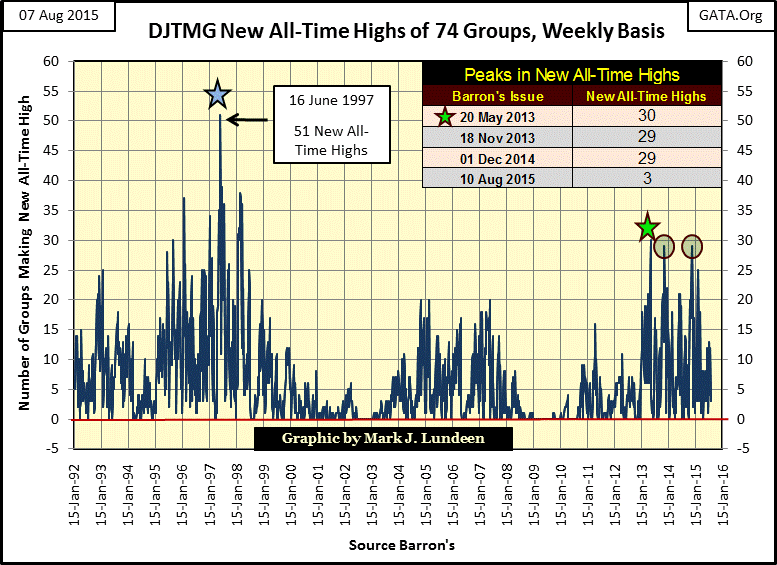
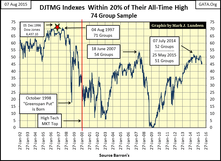
Okay, but how are these ghoulish activities currently impacting the stock market? To tell the truth for all the massive inflation the “policy makers” have been “injecting” into financial markets, the results could be better. Then again they could also be worse. During Greenspan’s market bubble of the 1990s a little “injection of liquidity” went a long way as shown by the multitudes of new all-time highs in the Dow Jones Total Market Groups (DJTMG) in the chart below. Since 1992 it’s never been so easy to pick stock market winners as it was in the 1990s. However this inflationary wave peaked in Barron’s 16 June 1997 issue as 51 of 74 DJTMG indexes made new all-time highs. Afterwards something remarkable happened; many of the DJTMG’s actually began their bear market a full two and a half years before the Dow Jones and Nasdaq Composite peaked in the first quarter of 2000.
After June 1997, the bull market increasingly became limited to high-tech shares as investors soon abandoned everything but semiconductors, DOT.Com, wireless telecom and software. But then in the first weeks of the 21st century, little AOL whose sole asset (as I recall) was 8 million monthly internet subscribers purchased media giant Time Warner in a leveraged buyout (LBO). The deal cost $164 billion, $164 billion AOL didn’t have. But financing a few measly tens of billions of dollars for an LBO on Wall Street was never a problem when Alan Greenspan was FOMC chairman. The January 2000 merger of AOL and Time Warner marked the top of the high-tech bubble.
The link in the text above provides an insight into the confused reasoning driving corporations and media at the time. After twelve years of Greenspan continually medicating the markets with “liquidity injections” nothing seemed out of the ordinary when AOL, whose main asset in January 2000 was its 8 million monthly subscribers had a market cap of $226 billion, larger than media giant Time Warner who owned Time Magazine, Warner Brothers movie studios, cable TV networks and professional sports teams. When AOL’s inflated market cap earned it 55% of the newly announced AOL Time Warner company in January 2000, who even questioned the wisdom of the division? At the time everyone believed this to be a brilliant merger of the coming high-tech future with an old-line media company, until – as reported by Wikipedia:
Unfortunately, the growth and profitability of the AOL division stalled due to advertising and subscriber slowdowns in part caused by the burst of the dot-com bubble and the economic recession after September 2001. The value of the America Online division dropped significantly, not unlike the market valuation of similar independent internet companies that drastically fell, and forced a goodwill write-off, causing AOL Time Warner to report a loss of $99 billion in 2002 — at the time, the largest loss ever reported by a company. The total value of AOL stock subsequently went from $226 billion to about $20 billion.
So Mr Bear clawed away the inflated market valuation the Fed created, leaving the Time Warner divisions of the new AOL Time Warner company to pay off AOL’s debts incurred in the LBO – ouch!
However the high-tech bubble wasn’t the only time during the past fifteen years people came to rue the day they’d taken advantage of borrowed money at attractive rates. Just a few years later the DJTMG indexes were again inflated during Alan Greenspan’s second, and more disastrous market bubble in the single-family housing market.
At the time few in the media questioned the wisdom of writing thirty-year $250,000 mortgages to America’s chronically unemployed. In fact many “market experts” such as Alan Greenspan lauded the new era’s financial engineering that used derivatives to contain “risks” in the mortgage market making low interest rates available for sub-prime mortgages. If expanding the mortgage market to the known credit deadbeats was fine with Alan Greenspan and Doctor Bernanke, apparently it was fine with Time Magazine too, as seen on Time Magazine’s 13 June 2005 cover.

Returning to the first chart above, we see the that largest number of DJTMG indexes reaching a new all-time high in any issue of Barron’s during the housing bubble was only 20. However, inflationary finance in the early years of the 21st century was mostly geared to blowing bubbles in the mortgage market. The DJTMG groups reaching new all-time highs were primarily financial, construction and home furnishings, but consumer stocks also did well as the bubble inflated.
However by the early months of 2007 cracks in the subprime-mortgage bubble became evident. By May Doctor Bernanke felt the need to assure the markets that he and his fellow morons managing “monetary policy” had everything under control.
“We do not expect significant spillovers from the subprime market to the rest of the economy or to the financial system.”
- Fed Chairman Ben Bernanke, May 17, 2007
Sadly the market events following October 2007, including a market meltdown and banking crisis from October 2008 to March 2009 did not change the public esteem for the FOMC, or lessen American consumers’ desire to take advantage of unlimited credit at attractive rates. As seen in the chart above, the DJTMG once again began seeing new all-time highs within two years following the market bottom in March 2009. By 2013 monetary inflation was once again creating new all-time highs in the DJTMG on a scale not seen since the 1990s.
So what exactly are we looking at in the chart plotting DJTMG’s new all-time highs? The DJTMG has two types of indexes in it: broad categories, such as Basic Materials, Technology or Energy, and the individual indexes that fall within those broad categories. Using my Bear’s Eye View (BEV) data for the DJTMG, every week I look at the frequency distribution of the 74 individual indexes contained within the 10 broad categories to see how many groups reached new all-time highs, or how far they are from making one in 5% increments.
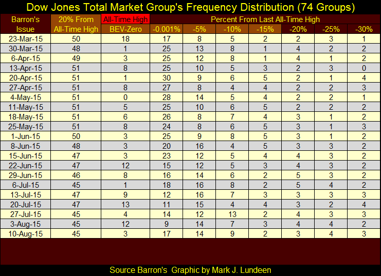
Note: each 5% category contains the groups within a 5% range; for example the 5% category contains all groups between -5% to -9.999% from their last all-time high. The only exception is the BEV-Zero column which contains only new all-time highs, and is the data used in the new all-time highs chart above. Note also the 20% From All-Time High column highlighted in light brown. This column contains the sum of the groups of the columns from BEV-Zero to -15% (also highlighted in light brown). I’ll cover this information later in the article.
The table below shows the weekly frequency breakdown since last March, but displays the data only down to the -30% increment (-30% to -34.999%). It would clutter the table to include all the data down to -95%.
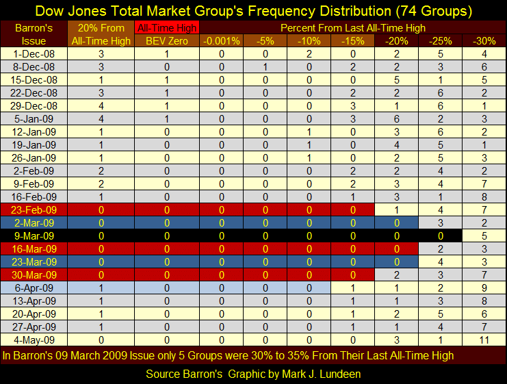
Below is the frequency breakdown from the credit crisis. In Barron’s 09 March 2009 issue only 5 groups were within -30% to -34.999% from their last all-time high, meaning 69 of 74 groups had declined 35% or more.
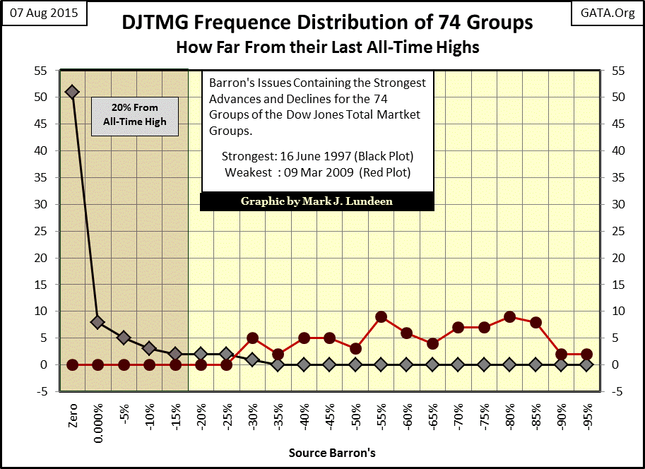
How far these 69 groups had fallen from their last all-time highs can be seen in the chart below. I plotted the frequency distribution from Barron’s 16 June 1997 issue (Black Plot – the stand out week for new all-time highs in this article’s first chart), and also for 09 March 2009 (Red Plot) the bottom of the credit crisis. Keep in mind that these plots contain the same 74 groups, the only difference being their percentage declines from their last all-time highs.
On 16 June 1997, 51 of the 74 groups (69%) were at new all-time highs with the worst performing group of the 74 in the -30% column. However by Barron’s 09 March 2009 issue all groups had declined 30% or more from their last all-time high, with 35 groups (46% of the DJTMG) suffering declines of 70% or more. Auto Manufacturing actually declined 95.41% and the Full-Line Insurance by 99.25% from their last all-time highs!
Note the Red Box; the “20% from all-time high.” In Barron’s 16 June 1997 issue there were 69 groups in the box, let’s call it the top 20%. But in Barron’s 09 March 2009 issue there were no groups in the top 20%.
Six years have passed and most investors have long forgotten the bad old days when 46% of the DJTMG had declined 70% or more from their last all-time highs. How far out of mind the bad old day are can be seen by plotting the “20% From All-Time High” column (top 20%) from the frequency distribution tables I had you note earlier. This column includes all DJTMG groups found in the first five columns – BEV Zero to -15%: the top 20%.
What we are looking at in the plot below are the 74 DJTMG indexes migrating towards the top 20% during bull markets and away from the top 20% during bear markets. How extreme the March 2009 bottom was is made evident when for the first time since 1992 there were no groups in the top 20% (also see Credit Crisis frequency distribution table above).
But we’ve experienced a nice recovery since then, the DJTMG saw 52 groups in the top 20% in July 2014. Still we should notice that groups have once again begun migrating out of the top 20%. May of this year saw 51 DJTMG groups in the top 20%. Currently the DJTMG has 45 groups in the top 20%; certainly no reason for panic. However should the top 20 continue to decline, it will be proof positive that valuations in the stock market are deflating in a wholesale manner even if the major stock indexes somehow manage to remain high.
To see the DJTMG from Mr Bear’s perspective, let’s now have a look at the bottom 50% (chart below). During most of the 1990s none of the DJTMG indexes dropped 50% or more from their last all-time high. Mr Bear began doing something about that in the late 1990s. By October 2002 twenty-nine of the seventy four groups had declined by 50% or more from their last all-time high. The sub-prime bull market never saw fewer than eight groups in the bottom 50%, mostly the same high-tech groups from the glory days of the 1990s. Then came the credit-crisis crash, which as you can see from the top 20% data above and the bottom 50% data below was a profoundly deeper bear market than the high-tech bear market bottom. Keep in mind that in Barron’s 09 March 2009 issue 35 of the 74 Dow Jones Total Market Groups (almost half) had declined by 70% or more.
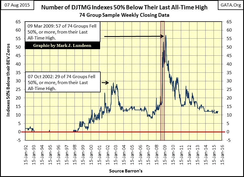
Currently there are twelve groups down 50% or more from their last all-time high. When Mr Bear once again comes to pay the stock market a visit, we’ll again see numerous Dow Jones market groups migrate from the top 20% to the bottom 50%. The only question is will the DJTMG see a deeper bear market than it saw during the credit crisis of 2008-09. My expectation is that we will see more of these groups deflate to even deeper declines than we saw during the credit crisis. My reasoning to this is the credit-withdrawal symptoms from all of the QE injected into the financial system since March 2009 will be extreme.
Look at the thin Red Box in the chart above; in October 2008 (one month) the bottom 50% spiked from 20 to 45. No doubt many people in late September 2008 believed they were nimble enough to get out of the market should things become ugly. A month later they discovered that big bears can move with surprising speed.
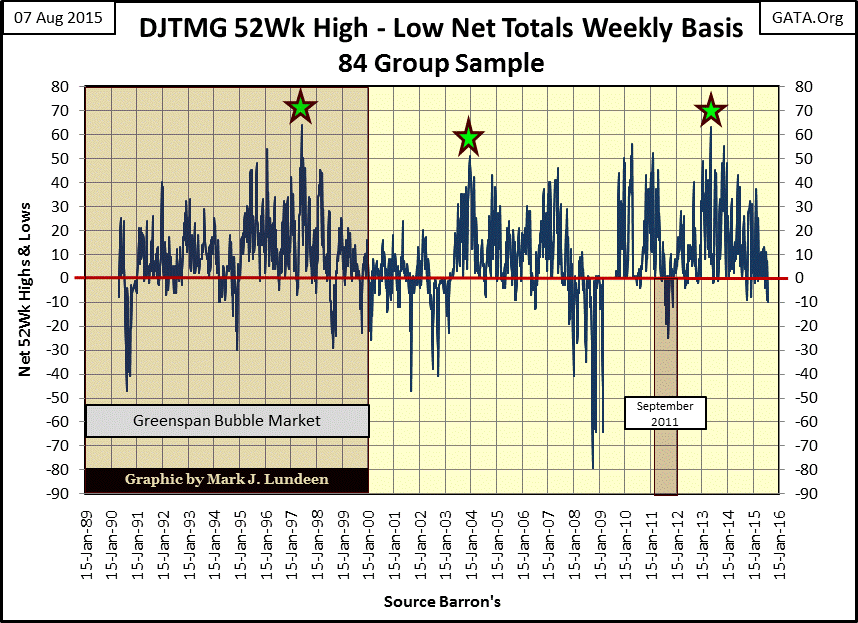
In the next chart we see the DJTMG 52Wk Highs – Lows. Again we see the current bull market has produced more 52Wk highs than during the housing bubble market. The current peak in 52Wk highs was seen in Barron’s 20 May 2013 issue. As was the case with the Greenspan bubble market of the 1990s, making money in the market became more difficult afterward as investors needed to be in the right groups. We can see that in the past few weeks the net DJTMG 52Wk H-L data has now turned negative. The Basic Material and Energy groups have been under a lot of selling pressure this summer. If a bear market is around the corner, we’ll soon see other groups making new 52Wk Lows as well. In any event, I doubt we’ll be seeing the DJTMG net 52Wk H-L again rise above 60 as it did in May 2013, which is another way of saying that the best of the current bull market passed us by two years ago.
It takes a lot for a group to move from one 52Wk extreme to another, and a lot more for it to do so from a three year perspective. Comparing the 52Wk data above with the 3Yr data below proves that since 1992 there haven’t been a lot of 3Yr lows except when the market is under a lot of stress.
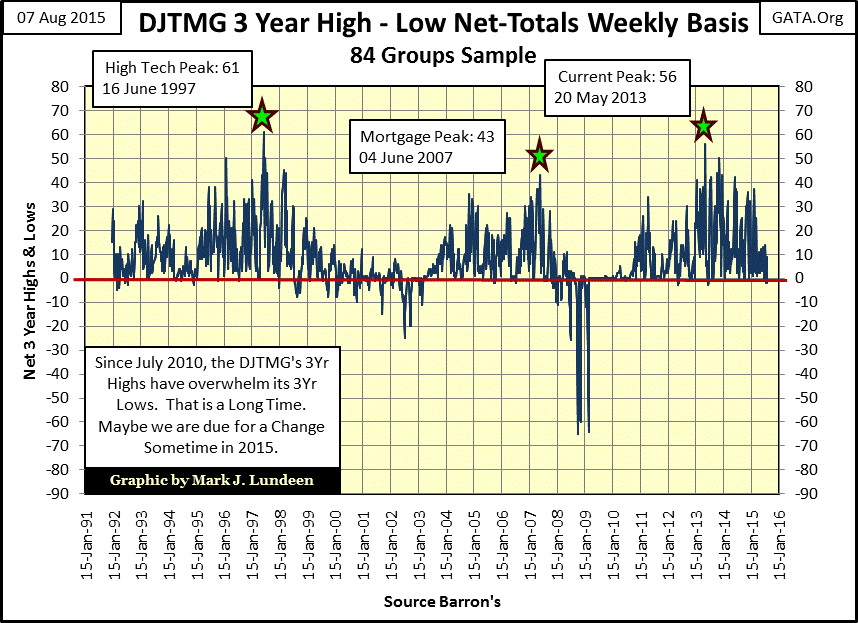
For this week (Barron’s 10 Aug 2015 issue) the DJTMG’s net 3Yr H-L is at -2. To put this -2 in perspective, this week also saw three new 3Yr Highs in Toys, Home Furnishings and Tobacco, but five groups in Basic Materials and Energy saw 3Yr Lows. As I noted a few weeks ago consumer stocks, like the ones making new 3Yr Highs this week, are doing pretty well now. But if the economy and market take a spill in the months to come, consumer stocks will be just another snack on Mr Bear’s menu.
So is the stock market on the verge of a down turn? One reason it should be is that the Dow Jones hasn’t seen a double-digit correction since the August-October 2011. After four years of dragging the market higher the market bulls must be getting tired, and undoubtedly need a break. Looking at the Dow Jones and it step sum below shows this is exactly what is happening now. The Dow broke above 18,000 for the first time on 23 December 2014, but hasn’t shown much enthusiasm since then, choosing instead to form a bearish inverted bowl formation in the chart below. And then Dow Jones for the past seven days closed down, as is evident below in its red step sum plot.
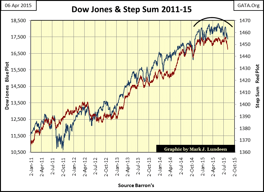
Although everything may change next week; looking at the Dow Jones and its step sum it’s evident that at the end of this week the Dow Jones is heading southward and the bulls up to now haven’t tried very hard to stop it. All in all, the stock market is acting very heavy. But after a hard time this week, next week may be kind to the bulls.
But even if next week is a good week for the stock market, after four years without a 10% correction the Dow Jones apparently wants to go down. The question is when the Dow Jones does finally see a 10% to 15% correction what will happen then? If this really is a bull market, the bulls rested and refreshed after the correction will once again advance the Dow Jones on to new all-time highs. If this is the case we’d also see increasing levels of BEV Zeros and 52Wk Highs in the DJTMG and at the NYSE. If it’s not a bull market then the Dow Jones will continue its decline below 20%, and even below 30% as 52Wk lows overwhelm 52Wk highs in the DJTMG and at the NYSE.
As for myself, I’m in Mr Bear’s camp. It’s not that his company is particularly enjoyable; it’s not. It’s just that there are some serious issues on market valuations that Mr Bear has to settle with the “policy makers.” I expect one day in the not to distance future the big furry fella will serve up some rough-justice to the politicians, academics and bankers who for decades have trashed the US dollar as they manhandled market valuations in stocks, bonds and real estate ever higher as a matter of “economic policy.” I want no part of that. Go Gold, Go GATA!


