Who’s In Charge Of This Mess? It Isn’t Mr. Wizard!


The Dow Jones Index and the general stock market look weaker by the day. Today, for the first time since October 2008 a Dow Jones’ 52Wk High expired after its 52 weeks passed it by.
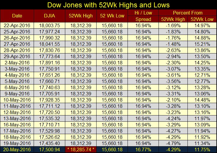
This is something that isn’t supposed to happen in bull markets. Obviously since the termination of QE3, the bulls just don’t have what it takes to make this market move higher (i.e. “injections” of “liquidity” from the Federal Reserve into the financial system.)
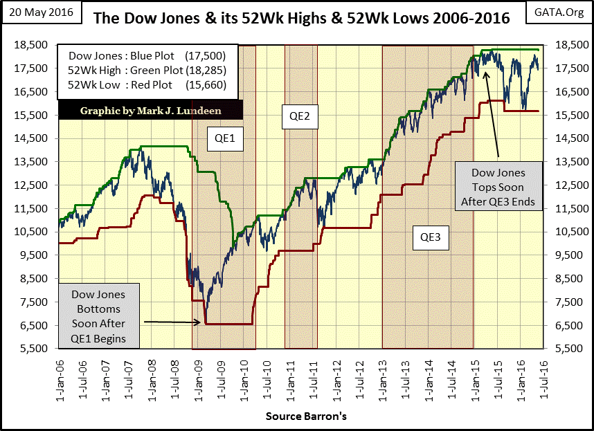
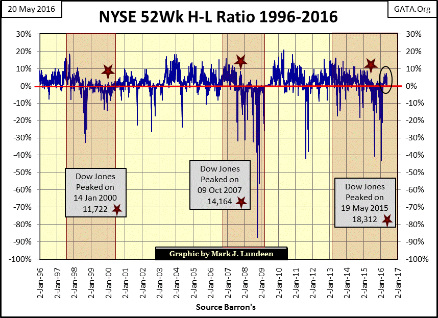
In the chart above, the Dow Jones made its most recent 52Wk Low in early February. Shortly thereafter new 52Wk Highs came to dominate the NYSE. That’s good, but as seen in the circle in the chart below, there were never enough 52Wk Highs to drive the NYSE 52Wk H-L Ratio above +10%. After the NYSE saw not one, but two -40% declines in the ratio since last summer, we should have seen a stronger rebound in the ratio. It’s too early to begin writing an obituary on the post credit crisis market advance, but if this ratio can’t clear +10% as it frequently did since 1996 after a good market correction, it’s yet another indication of market weakness. Except for the precious metal miners, this is a stock market I want nothing to do with.
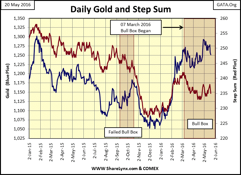
Gold has been under pressure since the end of April, but after its advances from the lows of last December I’m not surprised. Looking at its bull box below, as long as the price of gold doesn’t fall below its lows of early April ($1215) I’m going to keep it open. Today, gold closed at $1251.90. If the bears think that they can drive the price of gold back into the $1100s, the burden of proof is on them.
Moving on to gold and silver’s step sum and 15 count table below, we see gold’s 15 count closed the week at -3; meaning that in the past 15 trading days, gold closed down nine days and up only six. Looking at silver’s 15 count and step sum, it’s been remarkably stronger than gold’s (more advancing days), but silver’s price trend is not what I’d like to see.
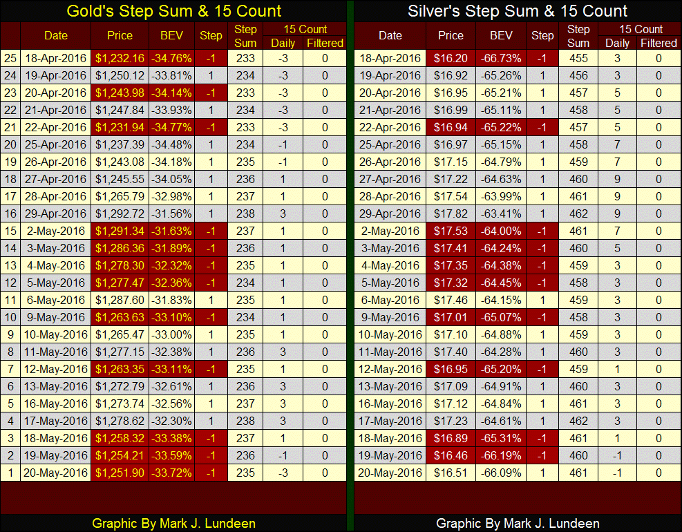
It’s not how many days a market goes up or down that drives a market’s price trend, but what the market does on its up and down days. Look at gold’s bull box in the chart above. Since early March, gold has closed down for the day more frequently than up; that’s why its step sum (Red Plot) looks bearish. Still gold’s price trend (Blue Plot) is bullish, rising on a pattern of higher highs and higher lows.
This’s why gold is now in a bull box; the bears are driving the step sum down with more down days than up, but the bulls are getting more out of their up days than the bears are with their down days. The bulls and bears can’t both be right, and as is usually the case in a bull box the bulls should prove to be victorious. We’ll know when the bears finally surrender to gold’s bullish primary trend; when the step sum rises above 240, and keeps advancing with the price of gold breaking above $1300 with authority.
Is it only me, or do others also find the monthly Fed Minutes Release a charade? CNBC starts an actual countdown to the release the day before, as NASA does with a rocket launch; down to the second. Then just seconds after the release CNBC has their usual suspects provide detailed opinions on specific items in the minutes. These “market experts” are either clairvoyants or were provided with the minutes…just hours, possibly days before the official release. To believe the big houses on Wall Street, and politically-powerful individuals aren’t privilege with inside information from government sources is naive.
The FOMC has yet to find their entire collective backbone, but on Wednesday of this week, they must have scrounged up a few dusty vertebra somewhere and found the courage to promise an increase in the Fed Funds Rate next month, if (and this is a BIG IF), if the economy continues to improve. Don’t fool yourself; the “economy” referenced to was the stock and bond markets. What the FOMC actually meant was that they would raise interest rates if they could do so without initiating a catastrophic deflation in market values. If you recall what happened after they increased the Fed Funds Rate twenty-five basis points last December, the stock market had its worst January in decades as gold, silver and their miners began their current advance. Janet and the guys don’t want to do that again!
On the news the Dow Jones and S&P immediately went from positive to negative territory. The selloff continued the next day though the Dow Jones finished off its lows. Some may say the selloff was due to news of an Egypt Air flight from Paris to Cairo crashing over the Mediterranean Sea. Maybe, but yet another terror attack on the airline industry isn’t the problem the FOMC now struggles with. The demons our central bankers battle daily are of their own making, problems that have been understood for centuries.
Historians, if not Keynesian economists, have long known the rise and fall of empires have much to do with the quality of the coins of their realms. At their peaks, Rome, Byzantium, Spain, Great Brittan and yes the United States all had sound currencies, and a political class that for the most part refused to resort to monetary inflation to fund government operations. But for all of the above that was to change; and with the change began their declines. William Durant in 1935 addressed China’s 11th century experiment with paper money, and its impact on global history.
"Such were the sources of that flood of paper money which, ever since, has alternatively accelerated and threatened the economic life of the world."
- William Durant: Our Oriental Heritage, (1935) pg 780
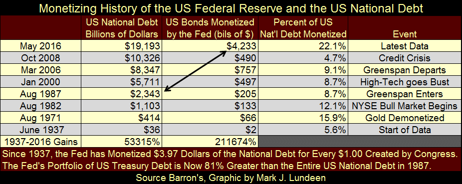
So how goes the Federal Reserve’s program of monetary inflation for the dollar? Since 1937, Barron’s has weekly published the Fed’s balance sheet. In the past eight decades, the Fed has increased their portfolio of US Treasury bonds from $2 billion to $4.23 trillion. That’s an increase of three orders of magnitude and a double, and from a “policy perspective”, it gets even better. Since October 2008 the national debt has increased by 86%, however the Federal Reserve’s holdings of T-debt increased by 763%! To place the Fed’s current portfolio of Treasury bonds into perspective (table below), it’s now about twice as large as the entire US national debt of August 1987 when Alan Greenspan became Chairman of the Federal Reserve. This is serious “policy making!”
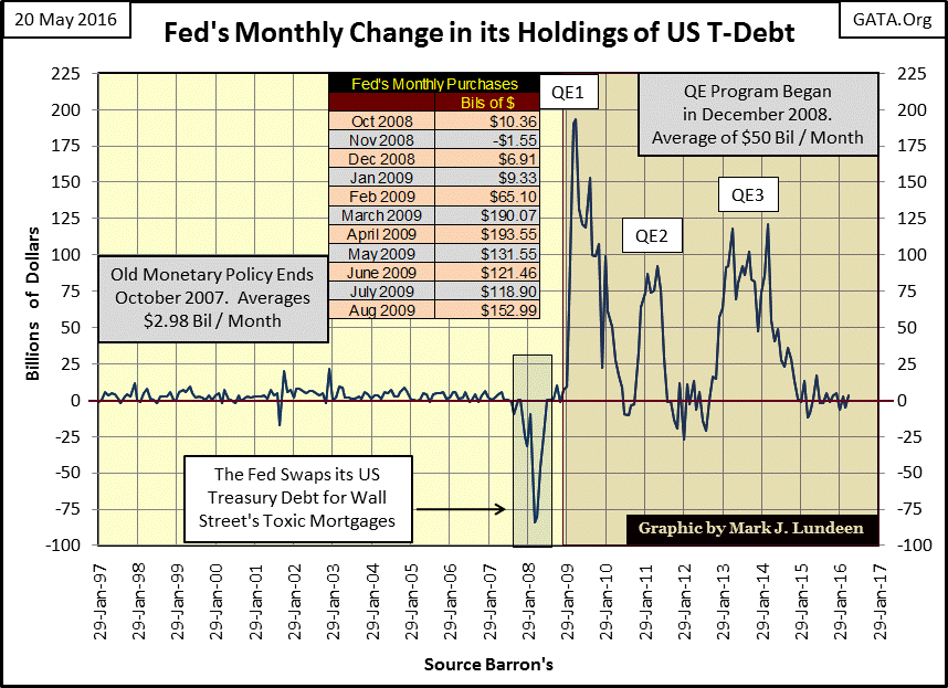
The chart below plots monthly changes in the Fed’s holdings of US Treasury Debt. Before October 2007, at the start of the sub-prime mortgage crisis, the Fed on average increased their portfolio of T-debt by $2.98 billion dollars a month, a sum larger than their entire portfolio in June 1937, month after month. But since December 2008 they have on average purchased $50 billion a month, though since December 2014 when they terminated their QE3 program they’ve greatly curtailed their purchases of Treasury debt.
The table in the chart below displays an interesting market milestone; the credit-crisis bear market bottomed on 09 March 2008, at the absolute peak in QE1. Had the Federal Reserve not interfered in the bear market with their QE program I’m sure the Dow Jones would have seen a 70% decline at a minimum.
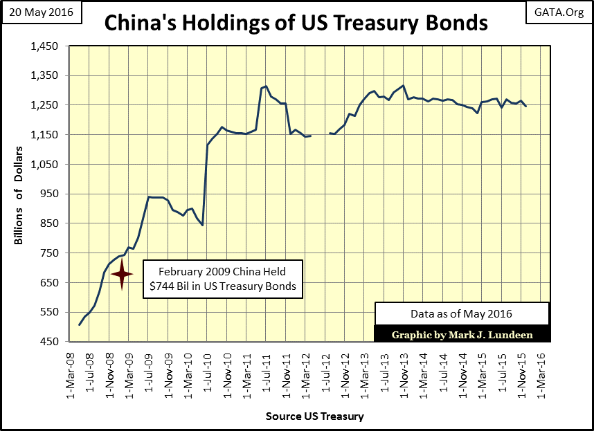
The Federal Reserve wasn’t the only purchaser of Treasury debt during the credit crisis. The Chinese too were massive purchasers of Uncle Sam’s IOUs from 2008 to 2011. But if you can believe Mr. Luo at the China Banking Regulatory Commission, and I do, it wasn’t because the Chinese loved the dollar or saw the wisdom of the Federal Reserve’s QE-1 program.
“We hate you guys. Once you start issuing $1 trillion-$2 trillion [$1,000bn-$2,000bn] . . .we know the dollar is going to depreciate, so we hate you guys but there is nothing much we can do.”
- Luo Ping, a director-general at the China Banking Regulatory Commission, 11 February 2009
How anyone can doubt the Chinese have been purchasing gold by the many thousands of tons since February 2009, even if to just hedge their US T-Bond position below is beyond me.
My next chart plots the grand total of foreign holdings of T-debt along with the Federal Reserve’s portfolio of Treasury debt. I highlighted the three episodes of QE. In May of 2008 foreigners held five dollars of Treasury debt for every one dollar the Fed held. In March 2016 (latest data) the ratio contracted to $1.48 for every dollar the Federal Reserve held.
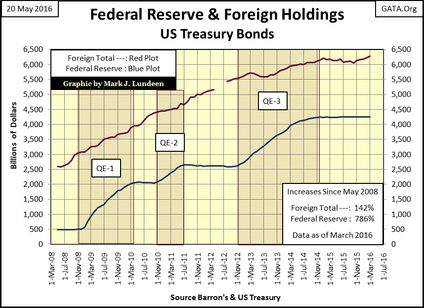
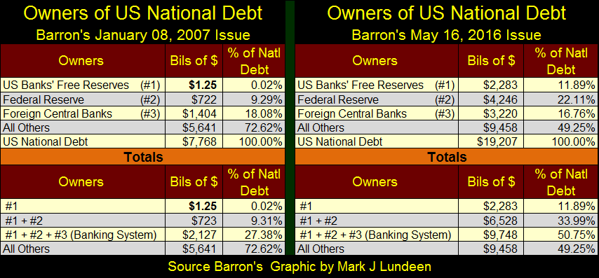
The Fed’s T-bond purchasing frenzy has subsided since December 2014, and so far no high government official or a Wall Street economist has suggested the need to initiate a fourth round of QE. Obviously with the stock market near its all-time high and T-bond yields in the low single digits there’s no need to “stabilize the economy” with another dose of QE. But as seen in the table below, the past eight years of “stabilizing the economy” has changed structure of the Treasury debt market.
In January 2007, banks held 27% of the Treasury market, while all others held 73%. In May of 2016 the banks increased their foot print in the T-debt market to 51%, while all others contracted to just 49%. How healthy is the financial system when banks hold a larger share of the Treasury bond market than do fiduciaries for insurance companies, pension funds and individuals? In case no one has told you, your insurance company and pension fund are selling their Treasury obligations that yield only a bit more than nothing to purchase junk-grade debt that now yields what T-debt did before the credit crisis. The clock is ticking on this bomb.
Also in 2016, the banking system now holds two trillion dollars more in Treasury debt than the total national debt of January 2007. That plus the national debt in the past eight years has increased by over eleven-trillion dollars. Who’s in charge of this mess? It isn’t Mr. Wizard, but you can be sure they have a Ph.D. from a prestigious university!
Note on the table below and chart above: data for foreign-central banks below is from the Federal Reserve. The foreign holders of T-debt data plotted in the chart above (Red Plot) is from the US Treasury. Don’t confuse one data series with the other.
The chart below plots the totals data in the table above for Barron’s 16 May 2016 issue. It’s obvious the global banking system’s response to the sub-prime mortgage crisis has been to “monetize” all of America’s national debt as it stood in September 2008. The question begging to be asked is if there is to be a QE4; how much of the remaining Treasury market can the banking system “monetize?”
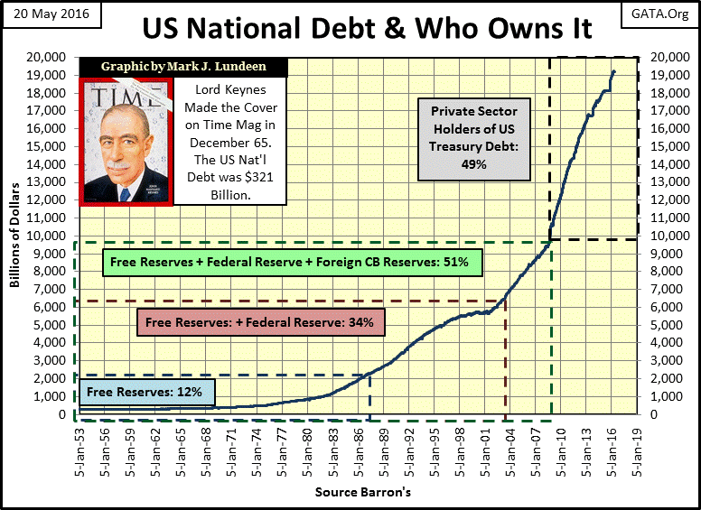
A lot more than its current 51%! But in the pending market decline that may not be sufficient fuel for the FOMC’s engine of inflation to “stabilize the economy.” During the summer of 2008 the Federal Reserve found it necessary to monetize abandoned sub-prime mortgages to keep too big to fail banks from going under. Eight years later they may have to do the same with the shale-oil industry’s bonds and bank loans (chart below).
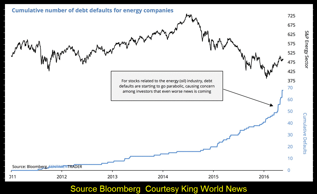
The above chart from King World News is shocking, and no doubt will have an impact in the derivatives market. One has to wonder why it hasn’t already. Or has it, but the “policy makers” are stalling for time by making promises or threats to the banking system’s counterparties not to demand specific performance on derivatives contracts now in the money.
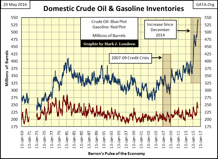
That’s not a long term solution to the problem. The price of oil may have risen 60% from its lows of three months ago, but with domestic crude oil inventories now at all-time highs, one has to wonder how that could happen.
It’s not just domestic crude oil inventories that are overflowing. In Zerohedge’s “Something Stunning Taking Place off the Coast of Singapore” an oil trader who frequently visits the city state was a bit shocked to see so many idle oil tankers at anchor off the coast of Singapore.
http://www.zerohedge.com/news/2016-05-20/something-stunning-taking-place-coast-singapore
With a world awash in crude, prices should be declining to draw down existing inventories. But are oil prices going up for the same reason gold and silver prices have been under pressure for the past five years; to safeguard the “policy makers” precious banking system? A banking system that now finds itself on the wrong side of an insanely leveraged trade that when nature finally takes its course, will take down the financial system for a second time in a decade.
In the coming crisis everyone is going to get hurt. To believe otherwise is just foolish. So do something smart like reducing your exposure to ground zero in the financial markets and buying gold, silver and their miners. And if you’re not right with God, this is the time to amend your evil ways and show some appreciation for all the good things he provides in our lives. It goes without saying that had the “policy makers” honored the Commandments not to lie, cheat or steal, the world would be in a different situation than it now finds itself in.


