Why are there Bull & Bear Markets?


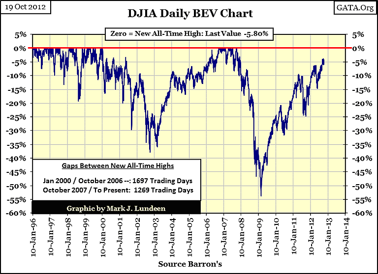
The Dow Jones saw some excitement this week, or did it? Can you see this week's movement in the BEV chart below? I can't. During 2011 & 12, I waited for the Dow Jones to get above its BEV-10 line; and stay there. It was like watching paint dry. If the stock market was in a primary-bull market, after waiting over 900 days since its last all-time high, breaking above the BEV -10% line, and making a new BEV Zero should have been easy for the Dow. We've seen 1269 NYSE trading sessions since the October 2007, and still there is no new all-time high, instead the Dow Jones is now struggling with its BEV -5% line. On September 20th, the Dow Jones saw a BEV of -4.01%. Back in 1999 or 2006-07, the Dow Jones could have moved 4% in a couple of trading session. Instead, in the past month it has hung back from making a new all-time. Bull Market? More like a B.S. Market!
But the Dow Jones can't seem to go down either. Where are the days of Extreme Volatility and Market Breadth? The Dow was down 1.52% today. A down day of 1.52% is no big deal in a bear market. We've only seen two days of extreme market breadth since the year began. This is a market that runs neither hot nor cold - a big waste of time for both bulls and bears. No doubt about it, 2012 is an election year.
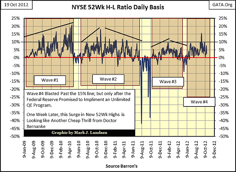
Let's look at the NYSE 52Wk H-L Ratio, but not for long. It's been eighty-two trading sessions (June 25th) since this ratio saw a down day. There are about 3100 stocks trading on the NYSE each day, but since October of 2011, on a good day, only a handful of stocks (between 200-300) bother to make the effort to rise up to a new 52Wk High, and since 2010 good days have been hard to come by. Someone really needs to put this "bull market" out of its misery!
Obama and his economic-henchmen have the stock market in lock-down, and I don't expect this to change until he loses (I hope). However, it doesn't matter who wins in November; because our current, contrived market valuations are going to break loose from their shackles. But the question I have is if Obama is willing to pull plug on the market rig to punish the voters for throwing him out of the White House. Wall Street's former "Masters-of-the-Universe" must realize how bad things really are. They can do the math to calculate the chasm between their potential liabilities from their 700 trillion dollar derivatives fraud, and the ability of their bank's reserves, and the entire US Treasury to make good on their obligations to their counterparties when interest rates begin backing up to where they were in October 2007. When all hell breaks loose in the markets, the peasants will be surrounding their castles with torch and pitchforks in hand. It would be nice to get a presidential pardon while they are still available, and for a select few, they will be for sale.
Do you remember the rogue's gallery president Clinton pardoned minutes before he left the White House? There were members of a Marxists revolutionary group, who Hillary favored, that bombed Federal property, blinding an FBI agent in the process. Clinton even pardoned Mark Rich who traded unspecified contraband between countries that gave sanctuary to terrorists. Mr. Rich was very rich, and had a beautiful wife to personally press his case with President Clinton. I don't remember all the details, but this pardon was an embarrassment to the media who had to report it, and then dutifully moved on.
I have always believed Obama was the greatest mistake ever to occupy the White House. His political coming out party was held at William Ayres' home (a former Marxist terrorist from the 1960s) in Chicago. The list of people who will receive pardons from Obama should prove to be very entertaining, and yes the president can pardon someone before they are arrested or tried. I expect to see John Corzine and a few other Wall Street billionaires on the list. But don't hold your breath waiting for the main-stream media to report how much they paid Obama for them.
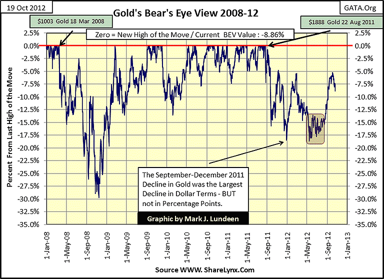
Now on to gold. I guess I'm just out of whack with everyone else. The "policy makers" enforcers in the past six or seven trading day have really made a huge effort to crash gold and silver. But I see the damage they did to the price of gold below, and the first thing that comes to my mind is; is a 2.75% decline in the price of gold all they could do? I understand the frustration everyone has with the "policy antics" at the COMEX and with the Federal Market Regulators ignoring the abuses we suffer almost daily. But I have no control over any of that. So, all I can do is look at Gold's BEV chart below and note the total failure of the rats to drive gold down below its BEV -10% line, at least so far.
It seems to me that it's only a matter of time before they have about as much control over the price of gold, as we've had with them for the past decade or more. Well done Bill Murphy and Chris Powell, GATA's Dynamic Duo.
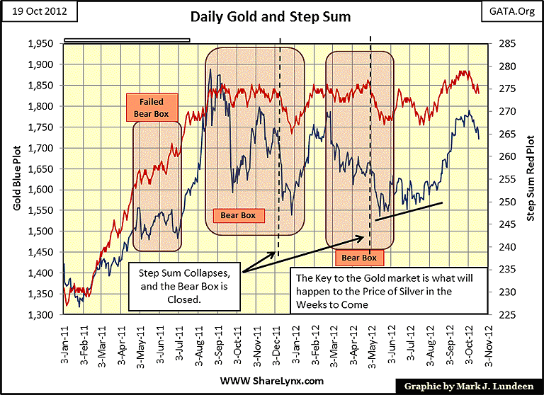
Same story this week for gold's step sum chart as it was for last week. Gold's price and step sum are going down. The only question is how far will they go down until they begin to go up?
Silver's story this week is a change from last; the big silver shorts made my bull box fail. But like for gold, they really had to work hard for the price decline they got in the market. As noted in the chart below, since October 04, they only managed an 8.40% decline in silver; that isn't much of a correction for silver. Believe me, if a week from now I see silver closing at the COMEX at $2 an ounce, my next article will not be as casual as this one. But I'm looking at my charts, and all in all, I believe in this war between the bulls and the bears in both the gold and silver markets, the bears are actually losing and becoming exhausted in the process.
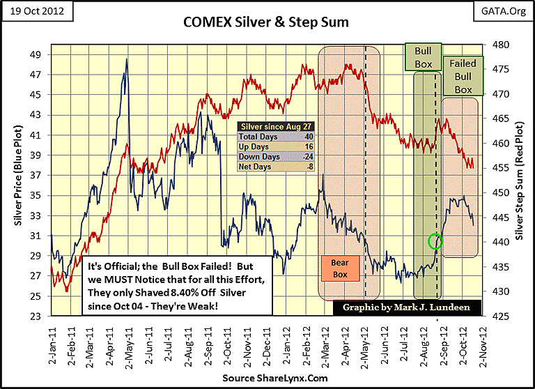
Take a good look at silver's BEV chart for 2001-12. Since last July, silver was up over 15 BEV points. To move 15 BEV points from the -45% line, takes an actual price move of 30%.
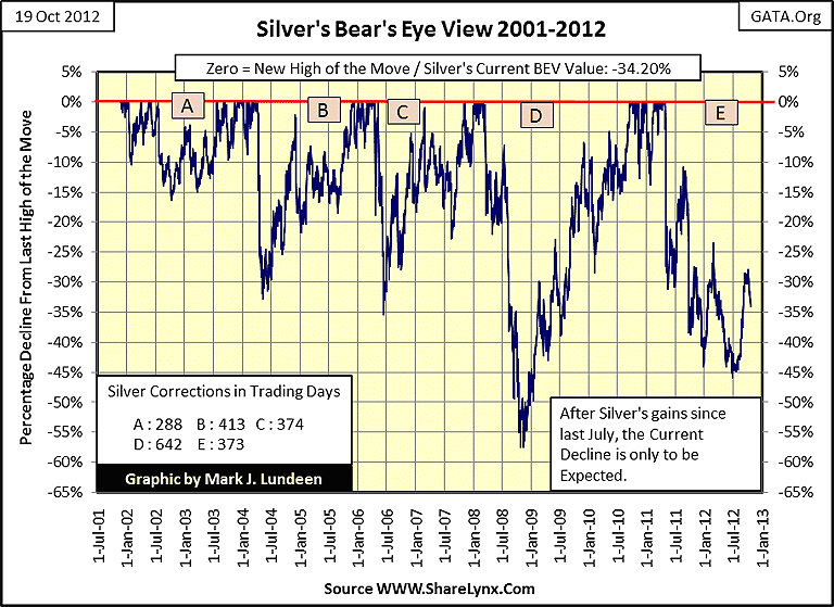
Bear's Eye View charts convert prices into a range of percentages that span from 0% to -100%. A 0% (BEV Zero) is a new high of the move, while a -100% is a total wipe out in valuation. The Dow Jones in July 1932 saw a BEV -89% at its bottom. So looking at a market as Mr Bear does, a 30% decline, for instance, from $10 is no different than a 30% decline from $1000; both are a 30% decline from the last high of the move. This allows us to compare every decline in the price of silver from 2001 to today in equal terms. Nowhere in the chart above do we see silver moving from its BEV -45%, or even -30% line without a correction or two, or three before it makes a new BEV Zero. The truth is after a three month, 30% increase in price, a correction in the price of silver here is actually constructive, even if I don't like it.
Why are there Bull and Bear Markets?
Why are there bull and bear markets? Why do some assets go up as others go down? On a short term basis, it's difficult to say. But looking at financial assets (stocks and bonds), and hard assets (precious metals and mining shares) over the long term of decades, the answer to that question is simple: monetary inflation flowing from the Federal Reserve is responsible for bull markets in financial assets; deflating financial assets provides the rocket fuel needed for bull markets in precious metals and PM mining shares. Coming off a hard bottom, like April 1942 or August 1982, the stock market is like a sponge wrung dry by its previous bear market, and will readily accept monetary inflation from the Federal Reserve.
Here's a chart for the Federal Reserve's M1 monetary aggregate and the Dow Jones from 1980 to 85. After Fed Chairman Paul Volcker wrung out the stock and bond markets with a 22% Fed Funds Rate, and double-digit bond yields, financial assets beginning in August 1982, were more than ready to suck up every dollar of inflation flowing from the Fed. Note the huge increase in M1 in January 1982; a one week jump of 24%! This is even something Doctor Bernanke hasn't done yet - but give him time! Seven months later, the Dow Jones began its historic 1982-2000 bull market that took the Dow Jones from 776 in August 1982 to 11,722 in January 2000; a fifteen fold increase in the Dow Jones in nominal dollar terms.

Note that from 1980-82, gold and silver had already begun their two-decade bear market. The Fed had just fired up their engine-of-inflation that would take stocks up to record levels in the next eighteen years. But it's a historical fact that the rising money supply and lower interest rates from 1980-2001 had no beneficial effect on gold and silver until the high-tech bubble, inflated beyond reason, burst in 2000. One year later in 2001, gold, silver and the Barron's Gold Mining Index began their current bull market as the Dow Jones began deflating, which as we'll see, both trends still have years to go.
So there's a pattern here; the Fed inflates the valuation of financial assets to the point of saturation. When financial assets can no longer soak up the "liquidity" flowing from the Fed, a deflationary crisis finally arrives, at which point wealth begins exiting the financial markets, and begins flowing into hard assets like the BGMI.
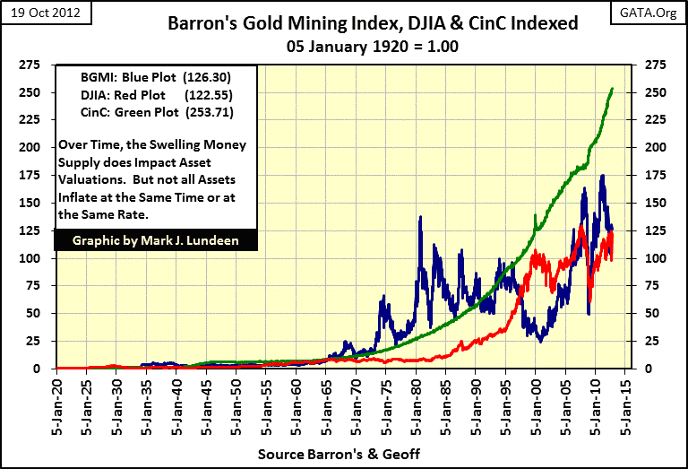
Since Congress created the Federal Reserve, this exact process has occurred several times. Let's look at a chart of CinC from 1920, plotted with the Dow Jones and Barron's Gold Mining Index (BGMI).
If one understands inflation to be a government program of increasing the money supply circulating in an economy (which it is), we see in the green chart below that the US has had a relentless inflationary problem since 1920. From one year to the next, the number of paper dollars circulating in the economy never go down, only up. This has been true both in times of "inflation" (rising consumer prices) and in times of "growth" (rising stock and bond prices).
In the chart below, it's obvious that the ever increasing supply of paper dollars in circulation (CinC), the Dow Jones and the BGMI have a relationship with the Fed's Open Market operations. Also note the counter cyclical correlation of the Dow Jones and the BGMI. At times their prices may trend together, but more often than not, one is inflating as the other deflates in price. Since 2003, the Dow Jones and the BGMI have trended together, with the BGMI usually outperforming the Dow Jones. But history tells us that this will one day stop. Then the BGMI once again will close the gap between it and the ever rising CinC green plot, until it rises far above it. This will be bad news for the Dow Jones, as it once again deflates its inflationary excesses of the past three decades.
How far could the Dow Jones fall? More than most people think possible! There are two main methods for valuing the stock market.
- Inflationary Expectations (Bull Markets)
- Dividend Yields (Bear Markets)
During bull markets, bulls come to expect a certain percentage increase over time. As the bull market progresses towards its point of termination, bullish investors' expectations of capital gains become completely disconnected from the reality of dividend cash payments. Who cares about a 3% dividend yield when the Dow Jones has increased by 5% to 10% for many years? In truth, they shouldn't; as long as they realize the party isn't going to go on forever.
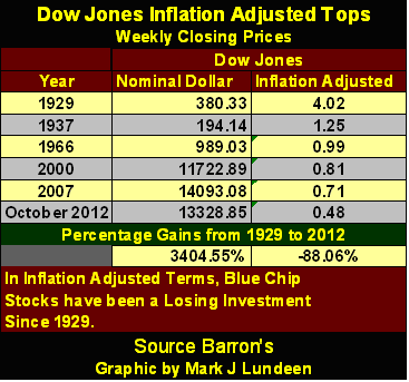
But during bear markets, when juicy capital gains become distance memories, and capital losses are a daily reality, dividends matter greatly. Stock Prices and their relationship to their dividends are set in hard mathematics, during both bull and bear markets. However, bulls are not very good at math; while Mr Bear excels in it! Here is how the big-furry fella looks at the Dow Jones; currently the Dow Jones is paying out $339 in dividends, at a yield of 2.54%, which fixes the value of the Dow Jones 13,343.
$339 (Cash Payout) / 2.54% (Dividend Yield) = 13,343 on the Dow Jones (I used rounded values, but this is close enough)
This is bear market thinking, fixing the value of the Dow Jones according to payouts and yields. Historically, bear markets end with the Dow Jones seeing a dividend yield north of 6%. Assuming a constant dividend payout of $339, should the market demand a yield of 6% for the Dow Jones, which someday it will when bond yield begin their rise toward double digits, here is the bear market mathematics to value the Dow Jones:
$339/6.00% = 5650 on the Dow Jones, for a -60.1% decline from October 2007!
A Dow Jones yield of just 6% would result in a -60.1% decline in the Dow Jones from its October 2007 top! You may believe this is impossible, but the history of Dow Jones dividend yields is one of changes in percentages, and since 1925 (when my data begins) all Dow Jones bear markets continue until the Dow's dividend yields 6%, or better. In July 1932, the Dow Jones bottomed with a yield over 10%.
By the way, the reason the stock market is in such deep problems now is because Alan Greenspan inflated the stock market until the Dow Jones yielded a minuscule 1.30% in January 2000. All hell is going to break loose when Mr Bear takes the Dow Jones' dividend yield back up over 6%. Do you see the spike in the Dow Jones' dividend yield in March 2009? That's right. The Credit crisis low point for the Dow Jones only saw a yield of 4.68%. Mr Bear will not be happy until he gets the Dow Jones' yield well over 6%, as Mr Bear never is until he gets what he wants!
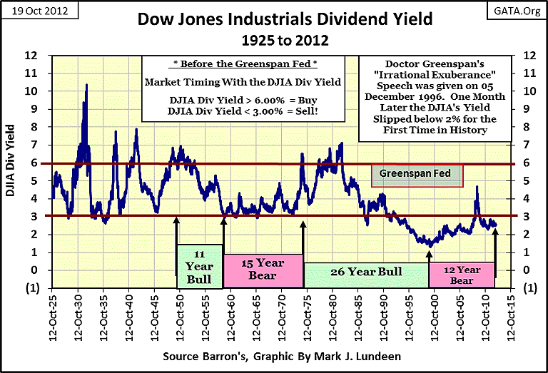
What would a Great Depression 10% yield for the Dow Jones do to us?
$339/10% = 3390 on the Dow Jones, for a -76% decline from October 2007!
And most Dow Jones -40% bear markets see declines in their dividend payouts. Should the Dow's cash payment be cut in half (it declined by 78% during the Great Crash of 1929-32), the effects of Mr Bear's math would be devastating!
$169/10% = 1690 on the Dow Jones, for a -88.06% decline from October 2007; such a decline is on the scale of the July 1932 bottom!
Looking at the stock market like Mr Bear (mathematically), the Dow Jones is wildly overvalued and due for a huge decline when interest rates begin to climb. Since 1920, it's at times like this when the smart money exits deflating stocks, and enters the inflating BGMI.
My next chart uses the same indexed data seen in the above chart, but plots both the Dow Jones and the BGMI as ratios to CinC:
- Blue Plot: BGMI / CinC
- Red Plot: Dow Jones / CinC
The 1.0 green line marks the level of CinC in 1920; any time the Dow Jones or BGMI plots are equal to1.0, they have inflated as much as CinC has since 1920. In nominal dollar terms published in the media, these indexes may have risen greatly since 1920. However, in the inflation adjusted terms seen below, having the Dow Jones or BGMI below the green line, indicates their real gains have been below the rate of inflation. Actual inflation adjusted profits are seen when the red plot (Dow Jones) or blue plot (BGMI) increase from below, and then rise above the CinC 1.0 line.
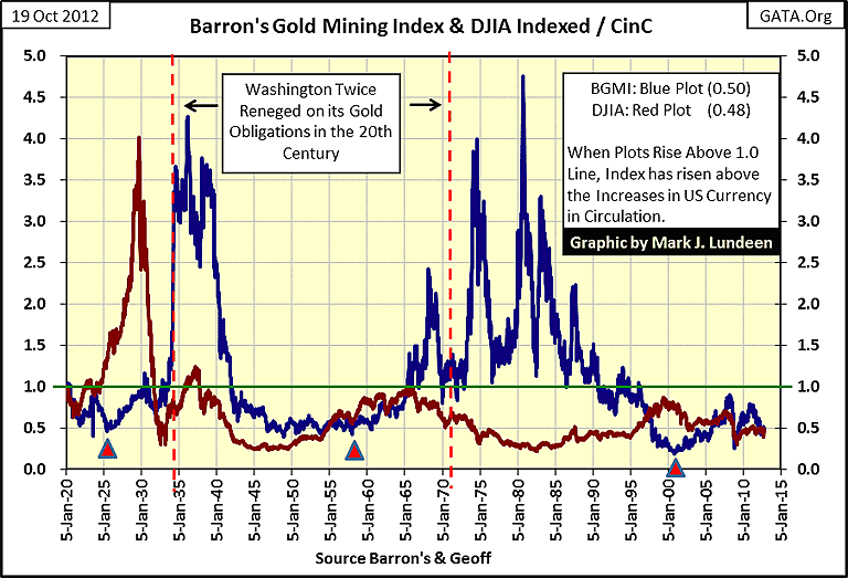
The first thing that stands out in this chart, is that since 1920 (93 years), the only Dow Jones bull market (Red Plot) that ever inflated in value more than the Federal Reserve inflated Currency in Circulation (CinC), occurred during the Roaring 20s. In fact, the bull market tops of 1966, 2000, and 2007 actually failed to compensate blue-chip stock investors for inflationary losses in the purchasing power of the dollar. The stock market has been a mug's game for decades, thanks to the Federal Reserve and its inflationary "monetary policy."
The table below lists the tops in these Dow Jones bull markets in nominal and CinC corrected terms as seen in the chart above. You may disagree that since the 1929 top, holders of the Dow Jones stocks have lost 88% of their capital due to inflation, maybe so. But for most people who invested in the stock market since the start of the 1982 bull market, they are no better off now for doing so.
Let's look at the blue BGMI plot above. Since 1920, there have been three bull markets in the gold and silver mining shares, including our current BGMI bull market. Never commented on is how the BGMI's 1925-37 bull market's top was actually higher than the Roaring 1920s Dow Jones bull market. This was true of the BGMI's 1980 top when compared to the Dow Jones' 1966 market top. There's a pattern here; the Federal Reserve inflates the Dow Jones, which eventually deflates into the BGMI, with the BGMI ultimately seeing a larger bull market than the Dow Jones bull enjoyed. Take another look at the chart above; the 1937 BGMI top was larger than the 1929 Dow Jones top.
There is another important point this chart makes; Look at the Red Triangles located at 1925, 1958, and 2001, all key years for "policy decisions" by the US Treasury and the Federal Reserve.
1925: Paper money inflation from World War One ravaged the British gold pound. In May of 1925, to support the UK in its efforts to return to the gold standard, the US Treasury and Federal Reserve provided hundred-million dollar lines of gold credit to their counterparties in Her Majesty's government. In 1925, these loans were monstrously sized loans, that later resulted in the inflationary excesses that created a disastrous-bubble in the 1926-29 US stock market, and made the depressing 30s, and 1930-34 monetary-crisis, and 1934 gold default by the US Treasury inevitable. I believe that it's more than coincidence that the BGMI turned up in 1925, just weeks after this "policy" was implemented, and didn't stop going up until 1937 (see chart above).
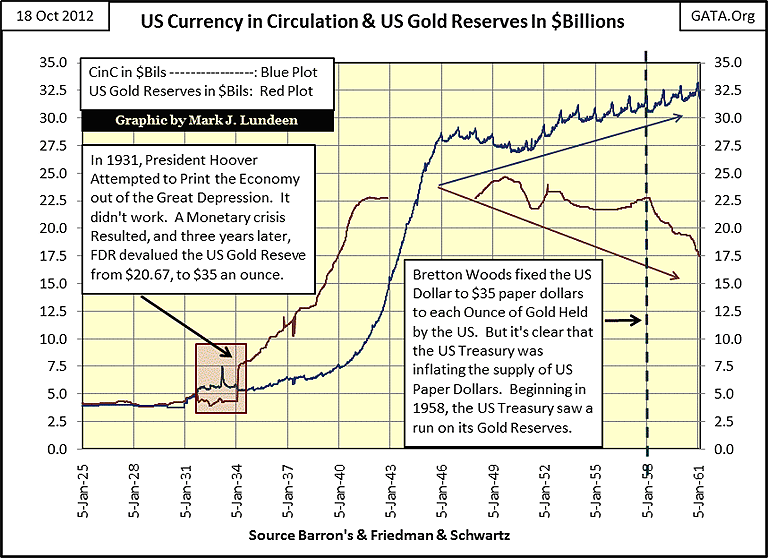
1958: The chart below plotting US CinC and US Treasury gold, illustrates both the 1931-34, and the beginnings of the 1958-71 monetary crises that correspond to the first two red triangles in the chart above. The dollar used to have immense purchasing power to what it has today. The increase in CinC (paper money) of only * $3.81 BILLION * from December 1930 to March 1933, was a major factor in deepening the Great Depression. The terrible truth is that a billion dollars doesn't buy much anymore. We now live in a world where the Federal Reserve now has to expand CinC by the trillions to create a bear market on the same scale of the Great Depression. That said, let's see why 1958 is an important date in understanding bull and bear markets.
Below, we see that beginning in 1951, the blue CinC plot began increasing, as the US Treasury's gold reserves dropped. This was because some foreign-central banks began demanding US gold in exchange for their paper dollars, at $35 an ounce. Can you blame them? This 1951-58 inflationary increase in CinC (Blue Plot) was done in a scandalous breach of international law that culminated in the US Treasury's second gold default in 1971. Is it mere coincidence that 1958, the point in time when a run on the US Treasury's gold reserves marks the point in time where the BGMI, for the second time since 1925, began a massive bull market?
Importantly, please note how the 1958-80 BGMI bull market, exactly as was the case for its 1925-37 bull market, didn't really get exciting * UNTIL AFTER * the Dow Jones began to seriously deflate following its 1929 & 1966 bull market tops.
2001: A little review: I placed a red triangle under 1925's BGMI plot because the US Treasury and Federal Reserve implemented a "policy" to bailout the UK's ailing pound, a decision that ultimately resulted in a stock market bubble from 1926-29 (and crash in 1932) as well as a US government gold default in 1934, and a huge gain in the BGMI.
I placed a triangle under the BGMI in1958 (two charts up) as the US Government had finally increased the number of paper dollars in circulation to the point where foreign central banks began withdrawing gold from the US Treasury, in exchange for their unwanted US paper dollars (chart above). As in 1925, 1958 also saw the BGMI find a hard bottom at its 0.50 level (two charts up), and began a bull market that would eventually exceed any 20th century bull market top in the Dow Jones. Both the 1925-37 and 1958-80 BGMI bull markets saw the US Treasury default on its gold obligations.
So what is so significant about 2001? Simple, it too, hit a hard bottom below the 0.50 line (two charts up), and since 1920, whenever the BGMI finds a hard bottom at its 0.50 line, a monetary crisis is looming, during which inflated-financial assets eventually deflate as the "policy makers" point their fingers at everyone but themselves, and the valuations of the BGMI eventually rise to new, inflation adjusted highs (two charts up).
But since 1971, after two gold defaults by the US Government, they can't default on gold again. There are no more gold coins in circulation to round up as in 1934, and there is no longer a convertibility issue between the US Treasury's paper dollars to its gold reserves. So, what could the next monetary crisis be? I believe the rejection of the US dollar for payment settlement in international trade; that will get everyone's attention! And if history is any guide to the future, we can anticipate Dow Jones deflating for the third time in one hundred years, as the BGMI inflates to levels that are not to be believed today.
Today, people are asking what's wrong with the gold and silver mining shares; why after so many QEs by the Fed aren't the gold and silver shares doing as well as they did from 1965 to 1980? My answer to that question is to study the history of the Dow Jones and the BGMI to CinC ratios two charts up. Every major BGMI bull market since 1925, began with BGMI/CinC ratio finding a hard bottom below its 0.50 line - with no one watching. The BGMI then rises up above the Green CinC plot, to levels that well rewards those who understood why the Dow Jones was going up, and why it's now doing down.
We are still early in the cycle (two charts up). When interest rates begin increasing without first asking permission from Doctor Bernanke, gold and silver mining shares are going to be THE HOT MARKET SECTOR! The smart money is buying now.
Mark J. Lundeen
21 October 2012


