Why Gold & Silver Could Do A "Moonshot" Soon...
 share
share
 share
share
 share
share
 share
share
 share
share
In yesterday’s article THE STATE OF THE WORLD we looked at the complex geopolitics of the world as it spirals into World War 3. This was necessary as we have to take these trends into consideration when attempting to determine the outlook for Precious Metals’ prices, as well as other commodities, in particular oil and gas. With respect to the Mid-East, the Arab (Muslim) world is boiling mad at what Israel is doing to the Palestinians and not just the Arab world. Israel’s brutal and relentless bombardent of Gaza increasingly looks like it is being done in an effort to “stir the pot” and provoke other regional powers like Iran to take drastic action, which would provide the excuse for the US to attack Iran probably involving extensive bombing and possibly even nukes which is something they have been aspiring to do for decades. This they see as a means to pave the way for the creation of a greater Israel, once the Arab world has been beaten into submission and subjugated (as they see it) and would also enable them to forcefully acquire Iran’s oil and other assets. The problem for them, although they seem blissfully unaware of it, is that the Arab world is not as weak and divided as they think it is, especially not after what they have done to the Palestinians, and furthermore they have some very powerful potential allies in the form of China, Russia and Turkey. So this is an incredibly incendiary situation that could quickly devolve into a massive regional war that would have serious global implications and if it does both gold and oil will do a moonshot and this could be a lot closer than most people think.
Now we will proceed to look at a range of most interesting gold and silver charts and by the time we are done looking at them I am confident you will understand clearly why these metals look set to go much much higher, probably in short order.
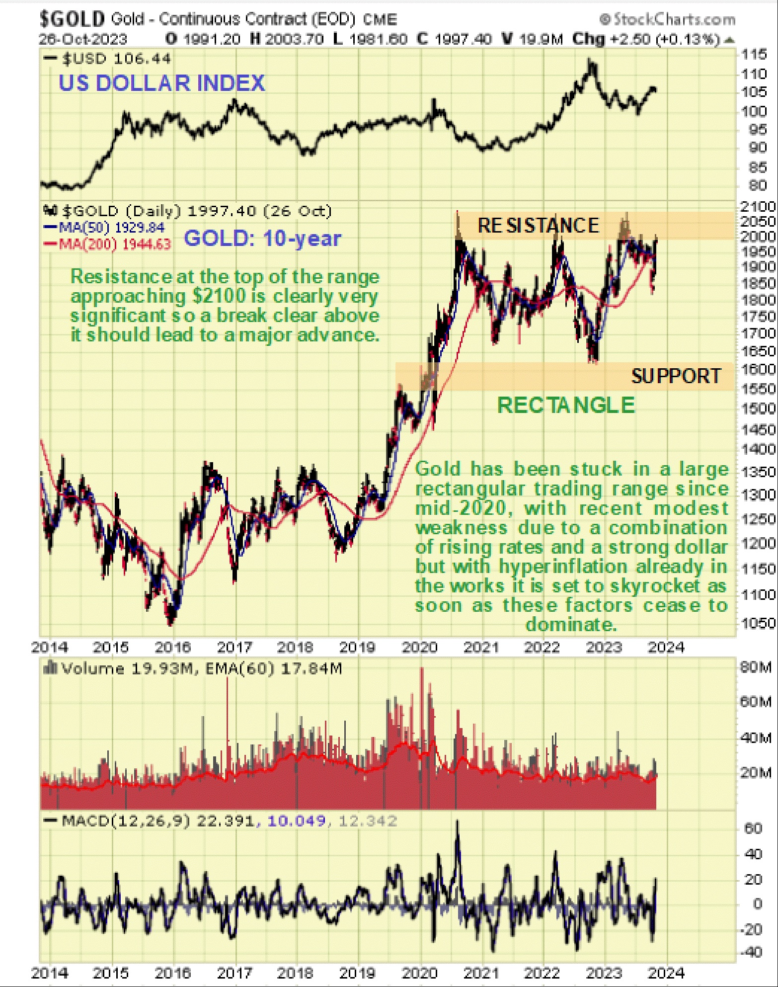
We will start with a quick look at the 10-year gold chart to remind ourselves of the importance of the clear line of strong resistance which has capped the price below about $2100 since mid-2020. Even without an awareness of what is going on in the Mid-East, and soon Taiwan, we can say with confidence that a break clear above $2100 will probably lead to a major advance, but it is also easy to comprehend that taking account of the latest developments including the threatening complete meltdown of the debt market, a break above this resistance could lead to an advance of stunning magnitude.
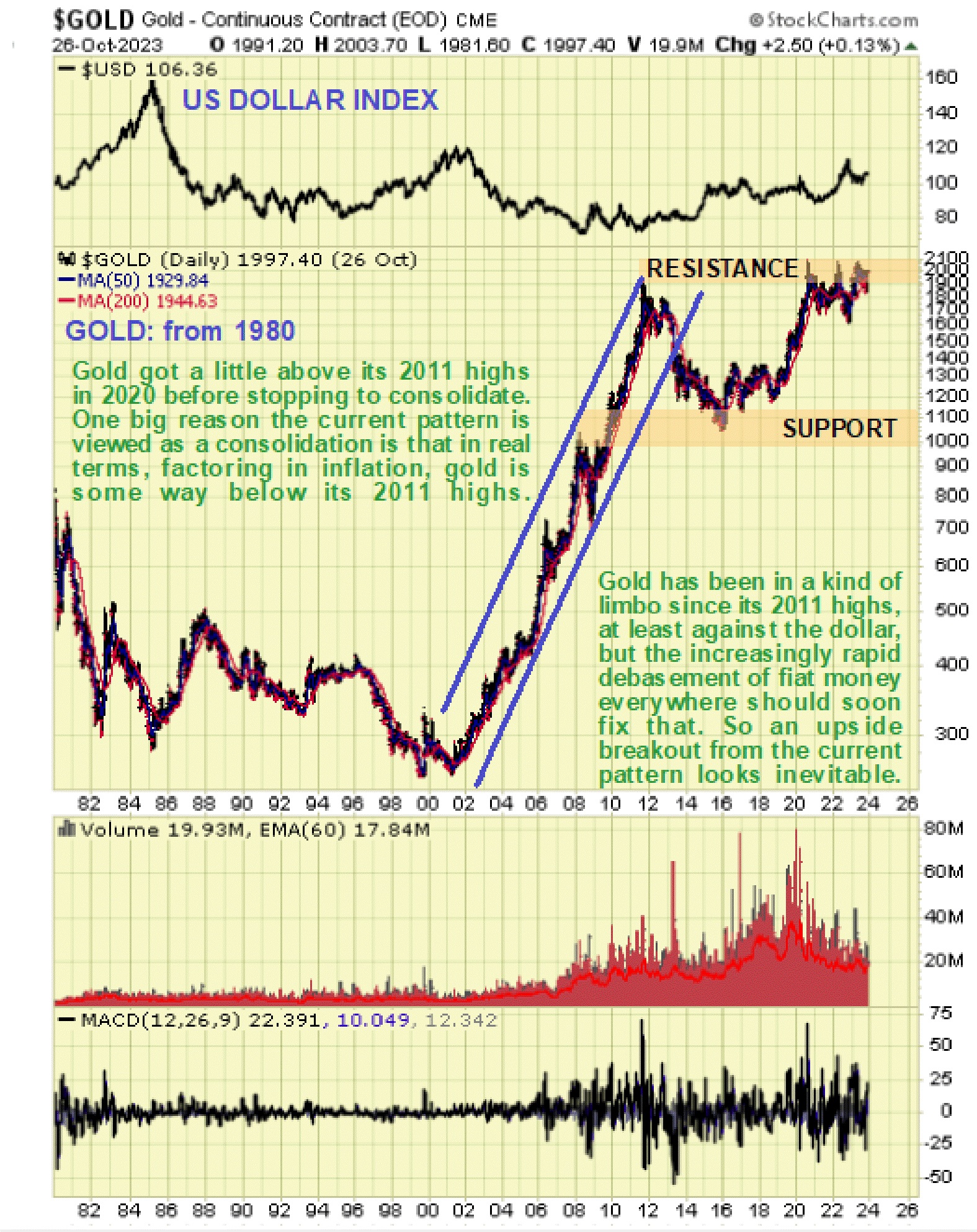
Moving on, the long-term gold chart going way back to 1980 shows us that although gold has risen above its 2011 highs that marked the end of the 2000’s bullmarket, it is not by much and if we factor in inflation during the intervening years, we appreciate that in real terms it has not yet exceeded its 2011 highs and is probably still somewhat below them. Another interesting point to observe on this chart is that the great 2000’s bullmarket took the form of an orderly steep uptrend, albeit that we saw something of a parabolic blowoff move towards the end.
Now we are going to look at a range of most interesting ratio charts for both gold and silver that turn up some highly illuminating insights.
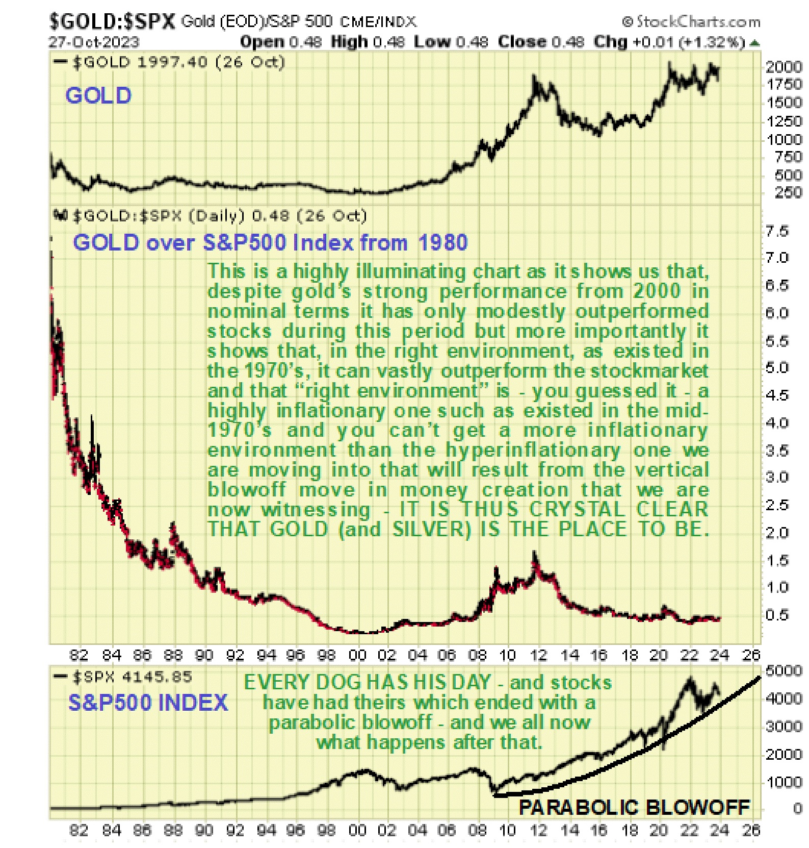
Beginning with the chart for gold relative to the S&P500 index going way back to 1980 we see that despite gold’s big 2000’s bullmarket it has only modestly outperformed stocks during the period from 2000 to the present. In contrast by the end of the 1970’s – early 1980’s at the end of the strongly inflationary 1970’s the gold to stockmarket ratio was vastly higher. So now, if we reflect on the enormous money creation that occurred in recent years that is now culminating in a vertical spike, which must lead to not just inflation that we already have but to hyperinflation, it is clear that if this ratio only moves part of the way towards the levels it attained in the late 70’s we are looking at a massive increase in the gold price (and / or a massive drop in stock prices) especially as gold and the PM sector have greatly underperformed the stockmarket since gold’s 2011 peak.
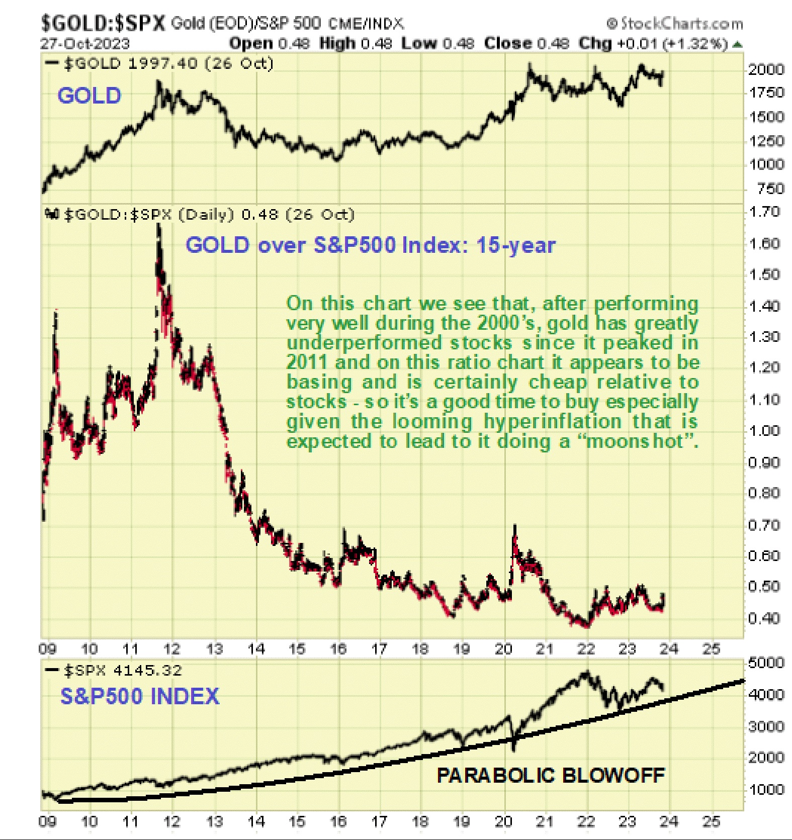
Gold’s woeful underperformance relative to stocks since 2011 is made more abundantly clear on the 15-year chart for gold relative to the S&P500 index. Yet despite the ratio making a new low at the end of 2021 it looks like it has been basing since about 2018, implying that outperformance by gold is a growing probability.
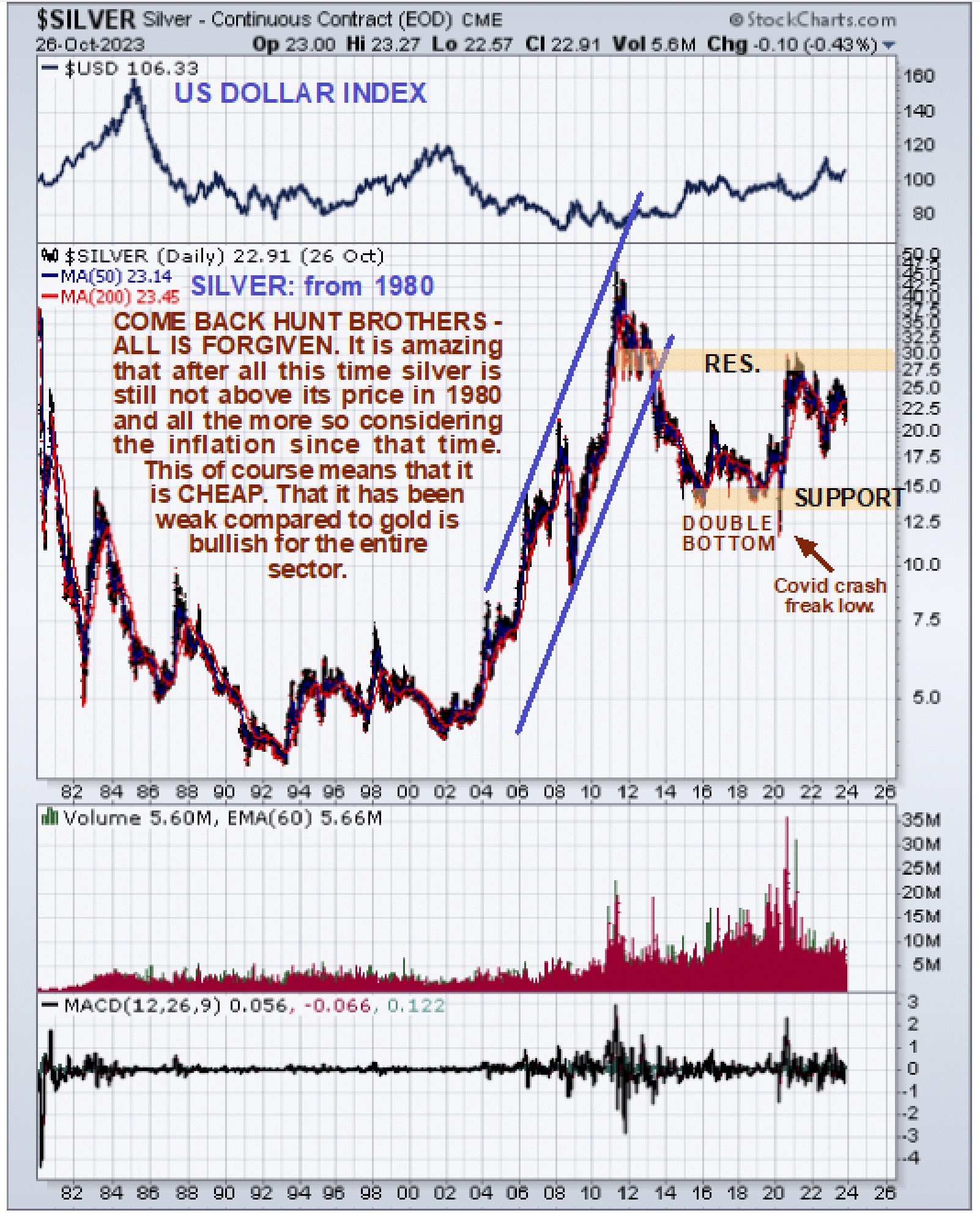
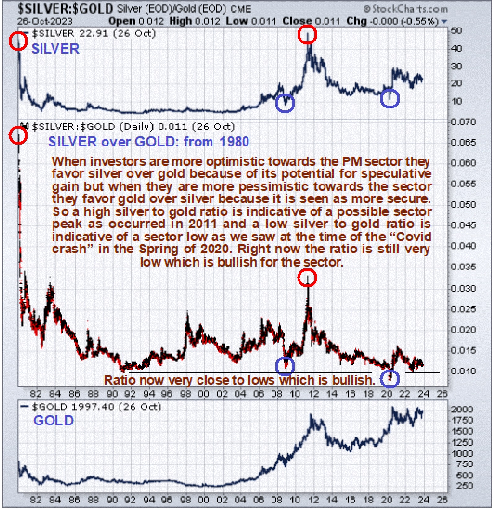
Turning now to silver, we know that it has underperformed gold significantly since 2011 which is a bullish sign because when investors favor gold over silver it means that they are more interested in safety than speculative gain so it is a sign of the sort of pessimism that classically accompanies market bottoms. Looking at the long-term chart for silver going way back to 1980 it is remarkable to observe that it is still below the level it was at in 1980 and this is in nominal terms. If we factor inflation in during all the intervening years it is obvious that silver is now very cheap in real terms. On this chart we can also define the broad uptrend of the 2000’s that paralleled gold’s uptrend and we can also see how, disregarding the “head fake” freak Covid crash drop in the Spring of 2020, it then broke out of a large Double Bottom to complete the 1st upleg of the major new bullmarket before pausing ever since to consolidate.
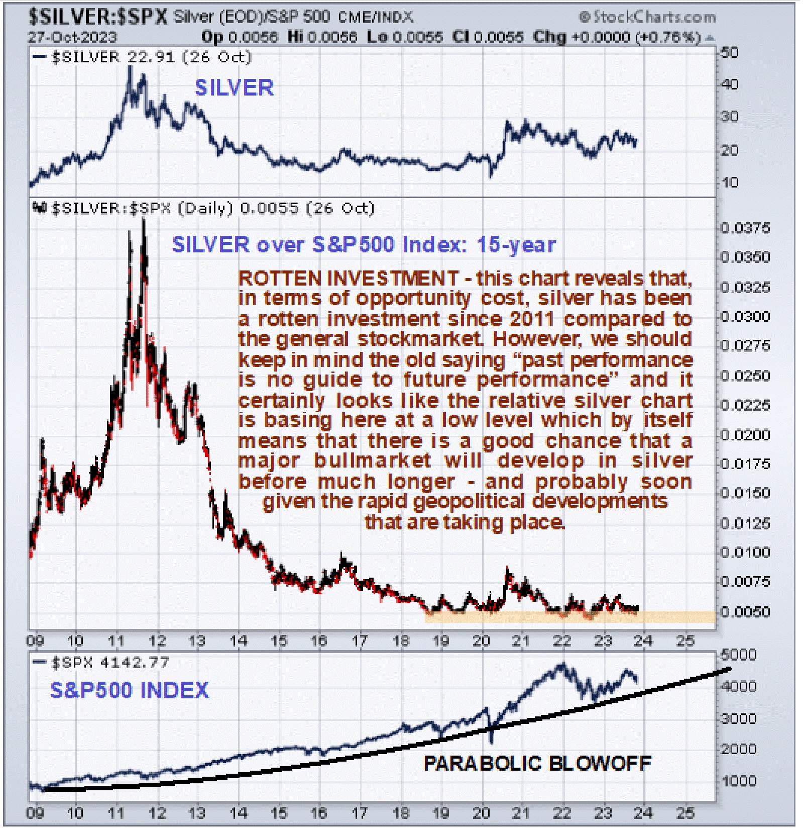
On the 15-year chart for silver relative to the stockmarket (S&P500 index) we can see that silver has been a rotten investment compared to stocks since its 2011 peak with silver having been in a bearmarket until 2020 and the ratio having stayed in a bearmarket until now. That said, however, it certainly looks like the ratio is basing at a low level here. This is the sort of chart that would impel any true contrarían investor to switch out of the stockmarket and into silver. The S&P500 index, shown at the bottom of this chart, looks like it is close to breaking down following a long parabolic blowoff move, and if it does it could crash. However, on this occasion it doesn’t now look likely that gold and silver will be taken down with it. This is because a stockmarket crash will be accompanied by, and perhaps preceded by, a meltdown in the debt market so that Treasuries offer no safe haven as in the past, which is perhaps not so surprising given that the US government is demonstrably bankrupt and running on fumes emanating from the Fed.
We will end with a ratio chart that is viewed as providing compelling evidence that the Precious Metals sector is grossly undervalued with much more upside potential than downside potential and that is the long-term silver over gold ratio chart. This chart is very easy to interpret and use. As a general rule, when the ratio is at a high level it means that there is strong speculative interest in the sector which is a sign of a top and we certainly saw that in 1980 when the ratio was at a wild extreme and again in 2011 to a lesser extent. When the ratio is at a low level it means that speculative interest is at a low level which is a sign of a bottom and this we saw in 2003 before the 2000’s sector bullmarket really got underway and again in 2008 following the steep drop induced by the broad 2008 market crash and then briefly at the time of the Covid crash in the Spring of 2020 when for a brief while you literally couldn’t give oil away. Note that, as mentioned above, a stockmarket crash is not expected to cause the Precious Metals to drop hard as in 2008 apart from perhaps a short-lived knee-jerk reaction, because this time the debt market looks set to drop hard too, and it will probably be a debt market meldown that triggers a stockmarket crash.
The conclusion therefore is that the outlook could scarcely be better for the Precious Metals sector.
*********
share
share
share
share
share

Clive P. Maund’s interest in markets started when, as an aimless youth searching for direction in his mid-20’s, he inherited some money. Unfortunately it was not enough to live a utopian lifestyle as a playboy or retire very young. Therefore on the advice of his brother, he bought a load of British Petroleum stock, which promptly went up 20% in the space of a few weeks. Clive sold them at the top…which really fired his imagination. The prospect of being able to buy securities and sell them later at a higher price, and make money for doing little or no work was most attractive – and so the quest began, especially as he had been further stoked up by watching from the sidelines with a mixture of fascination and envy as fortunes were made in the roaring gold and silver bull market of the late 70’s.
Clive furthered his education in Technical Analysis or charting by ordering various good books from the US and by applying what he learned at work on an everyday basis. He also obtained the UK Society of Technical Analysts’ Diploma.
The years following 2005 saw the boom phase of the Gold and Silver bull market, until they peaked in late 2011. While there is ongoing debate about whether that was the final high, it is not believed to be because of the continuing global debasement of fiat currency. The bear market since 2011 is viewed as being very similar to the 2-year reaction in the mid-70’s, which was preceded by a powerful advance and was followed by a gigantic parabolic price ramp. Moreover, Precious Metals should come back into their own when the various asset bubbles elsewhere burst, which looks set to happen anytime soon.
Visit Clive at his website: CliveMaund.com