Will 2019 Be The Year Of The Crunch?


At this time…along with just about everyone who comments on financial markets, I have to write on what I think 2019 will bring. Scanning with Google, it seems clear 2019 is expected to be a year of volatility and brinkmanship. The main focus is on the effect of higher interest rates that could increase further, the effect of the trade war should it turn into hard confrontation, the effects of Quantitative Tightening on liquidity and the economy and more $trillion deficits and lesser important factors. While most reports are based on deep economic analysis with many charts, this US Markets will be based on simple economics and only two charts to look at very basic trends in the economy. Unfortunately, Stein’s Law comes into play, which means the message is not a good one.
Regular readers of US Markets know Stein’s Law states that if something cannot continue indefinitely, it will stop. Very logical; at the level of, ‘If you stop breathing you will die”, but not well understood by economists who project recent trends as if they will last for many years. The charts will show two trends that have been in place since the mid-1980s and that must stop at some point in the future. This can be either because the risk they pose is recognised and action is taken to reverse them, or because they continue until circumstances force them to stop – which will be a time of much greater than expected volatility.
A frequent theme in US Markets is the impoverishment of working America through the use of the discounted CPI as a cost of living index for deciding on the size of annual increases in wages and salaries of employees. Since the new CPI is less than the annual increases in actual consumer prices, this means that household income lags the increase in price. Wage and salary increases lagged actual prices during the high inflation years before 1980, which set a trend that lasted until the new CPI in the mid-90s made it mathematically certain to continue.
Data from the Federal Reserve database at the St Louis Fed were used to generate two charts that do not require complex calculations and that make sense to me as a non-economist. The objective was to illustrate what I believe are significant trends in the relative wealth of US households as a consequence of various factors that include the change in the CPI in the mid-90s.
There are no easily accessible historical information on incomes of different levels of wealth. The charts use the mean value of household income which is available since 1984. Since some research that has been quoted here before showed that the top 20% of US households did not lose any of their wealth from 2007 to 2016, it can be assumed that the mean household income – where there are as many households that earn more than the number as those that earn less, would by strongly biased towards employee households. It is useful when looking at the charts that half of all US households are worse off than the charts indicate.
The gross national product is “. . the market value of all the goods and services produced in one year . . ., and is also referred to as gross national income.” All households except those where there is no member with a job or an own source of income contribute to the GNP in one way or another. One would expect as the GNP increases over time, as a result of improving productivity of the workers and growth in the population, that household income would tend to keep pace with the increase in the GNP.
With a substantial part of the population not being employed and with an increase in the use of automation, and other factors, the ratio of mean household income to GNP should not remain static. However should ‘the system’ ensure that there is an equitable distribution of the wealth of the nation, as reflected in the GNP, the ratio should only vary slowly over time, perhaps in step with the business cycle and with no sustained or steep trend.
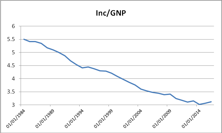
Ratio of median household income to gross national product
From the trend in the above chart, ‘the system’ clearly discriminates heavily against working households, perhaps even from before 1984 when data on mean household is available. The proportion of an improving GNP from 1984 to 2016 that percolates down to the 50% level of US households decreases by 45% during that period.
The nominal GNP used in the chart is influenced over time by two factors; changes in the volume of productive and service activity in the US and also the prices that are charged for the production and services. It seems likely that a significant part of the decline in the above chart is due to a decrease in household income relative to the level of economic activity in the US. If so, it means that many US households during the past two decades would have taken on more debt in order to sustain their standard of living or even just to survive.
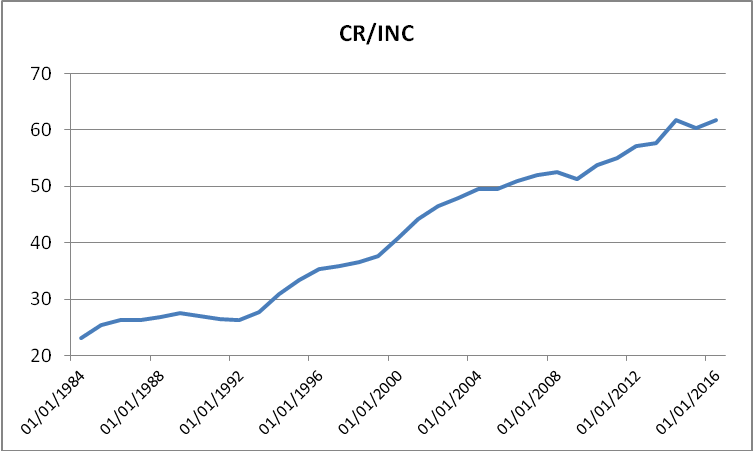
Ratio of total consumer credit to median household income.
The second chart shows total consumer credit to median household income. One could argue that the upper 20% of households would be less likely than the working households to take on expensive consumer credit when they could easily fund their larger purchases with a bank loan at a much lower rate of interest. Therefore, most consumer credit, even if only on a pro rata basis, is likely to be a financial burden on employee households, closely represented by the mean household income.
While mean household income decline by 45% relative to the growth in GNP, total consumer credit relative to mean household income increased from 1984 to 2016 by 160%. Observe that the trend in the above chart remained fairly level from 1984 to 1992. The early 1990s was the time of the brief recession that brought Clinton to the White House, which soon resulted in the new CPI that no longer reflected actual increases in consumer prices. As the difference between CPI-linked wage and salary increases increased over time, the ratio of total credit to mean household income speeded up to hold its steeper trend with only a few slight corrections, one of which has just happened, but might already be over.
Consider the implications of the two charts and the two trends on US households as these will unfold during the new year, and beyond. There can be no doubt that that Stein’s Law will take effect at some point in time; neither of the two trends shown in the charts can continue indefinitely. In combination they are more than deadly. Is 2019 to be the year when the crunch comes – not purely because of high Federal debt, or because interest rates are raised to high, or because of liquidation of their excess reserves by the Fed. But because the US economy has been hollowed out as a consequence of government policy and corporate exploitation of that policy.
There is no fun or joy in bringing such a new year’s message. Nobody who watches from a distance as a tornado approaches his house phones a friend to tell him the good news that he will be able to build a brand new house when the insurance pays up. Not then, and least of all in these circumstances where half or more of all US households are losing wealth and many becoming destitute and have to rely on assistance to survive – and there is no other insurance.
Consider; the trends shown in the two charts have been in place since at least 1984 and circumstances practically dictate that they will continue unless specific action is taken to first end the trends and then reverse them to repair the damage that was done during mostly the past two decades. To achieve these objectives will require a set of measures that will be traumatic for the economy and probably more so for the households that obtained benefit from the system during the past two decades.
It means closing the inequality gap that has developed as a result of the factors that enabled the establishment of the trends shown in the two charts. That will not be an easy task and, I think, it is unlikely that any serious effort will be undertaken in time to rectify the situation. It is politically impossible to do so, probably even if Trump can hold onto the White House for a second term. No career politician from either party would have a snowball’s hope to do so.
There are many commentators who expect bad times for the US, most of whom are focused on Wall Street and a major long term bear market – that is, if the PPT can be overcome. But should the two trends shown here continue through and beyond 2019, the end result will be even more catastrophic for the whole US economy and for many others, mainly in the west.
The major risk of a crisis exploding is implied in the second chart. If interest rates increase to where perhaps as much as half of all US households is no longer able to service their debt and go into default, it will be a much darker shade of grey than in 2007/8. If limits are imposed on consumer credit by the banks or whoever, the effect on households and the economy will be even worse as one could expect a widespread boycott of servicing bank loans.
Perhaps the trends can continue through 2019 without triggering financial chaos. If so, that will not be good news, because then the financial collapse, when it happens – not if – will be even greater; and last longer. Should this seem a too bleak view of 2019 and beyond, think what steps you would take, if given absolute power, to correct the situation by reversing the two trends shown in the charts for at least the next 20 years. If you have a solution, please write to me and let me know; after more than 14 years of observing the situation unfolding I still cannot see an easy, non-traumatic way to end and reverse these trends.
Gold and silver ended 2018 with a growth spurt, acting more like teenagers and not old and decrepit folks preparing for their final rest. One wonders to what extent the new interest in precious metals – should it last! – is a result of greater awareness, at least among wide awake investors, of growing instabilities and dangerous trends in the US economy – and in the many others that slavishly copied US policies and practices during the past two decades.
2019 perhaps could become very interesting.
Euro–Dollar
The euro had a recent second bounce off support along line L ($1.1268), bottom of bull channel JKL, which imparts a bullish bias. The new trend has to be confirmed by a definite and extended break above bear channel VW ($1.1464) and a return to the steeper bull channel FG ($1.1472). Failure to do so quite soon – while channel FG is still within reach – is likely to see a more sideways trend developing into much of 2019.
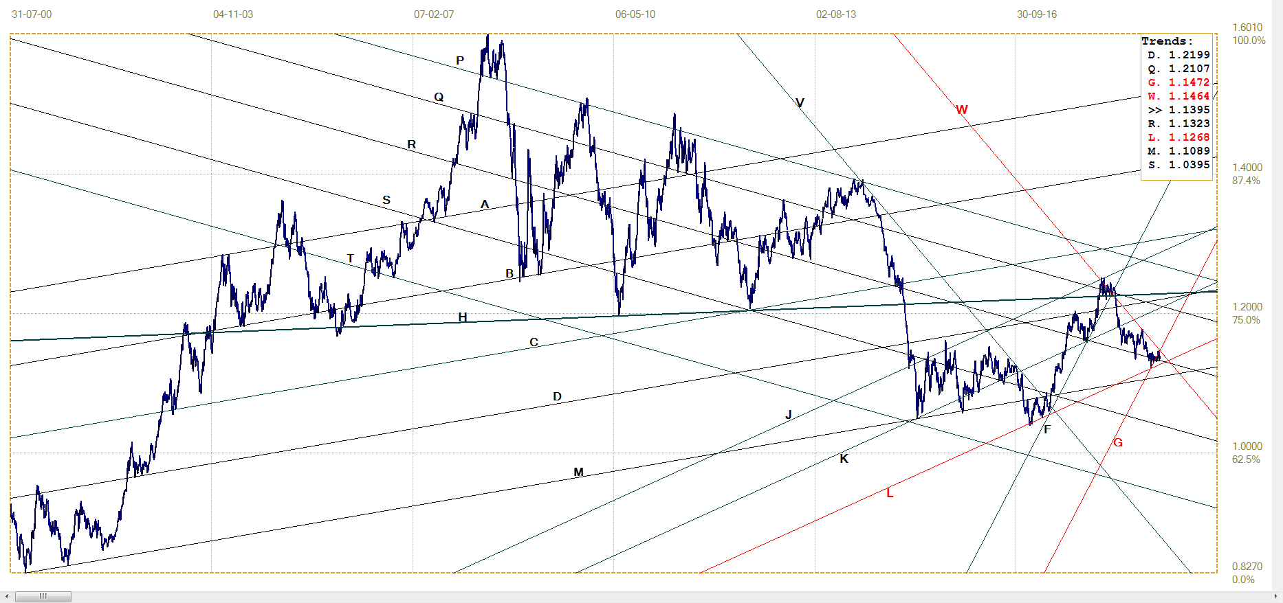
Euro–dollar, last = $1.1395(www.investing.com)
DJIA
It is not surprising that the DJIA rebounded steeply off the support along line A (21 843) it reached on the last day of 2018. The full activation of the PPT and Trump’s excitement that 2019 would begin with a bang even before the stock market opened on January 2nd, made it clear that Wall Street would not be allowed to collapse. Volatility remained high last week and Friday’s 700+ point fall shows there is great nervousness in the market – despite bouts of apparent euphoria when the market rebounds higher.
These appear to be due to covert (overt?) support for Wall Street and perceived as opportunities to sell into strength by investors too nervous to bet on a resurgence in the economy. Considering the implications of the trends in the two charts shown earlier, selling out and banking a certain profit, if any, might be a very wise move.
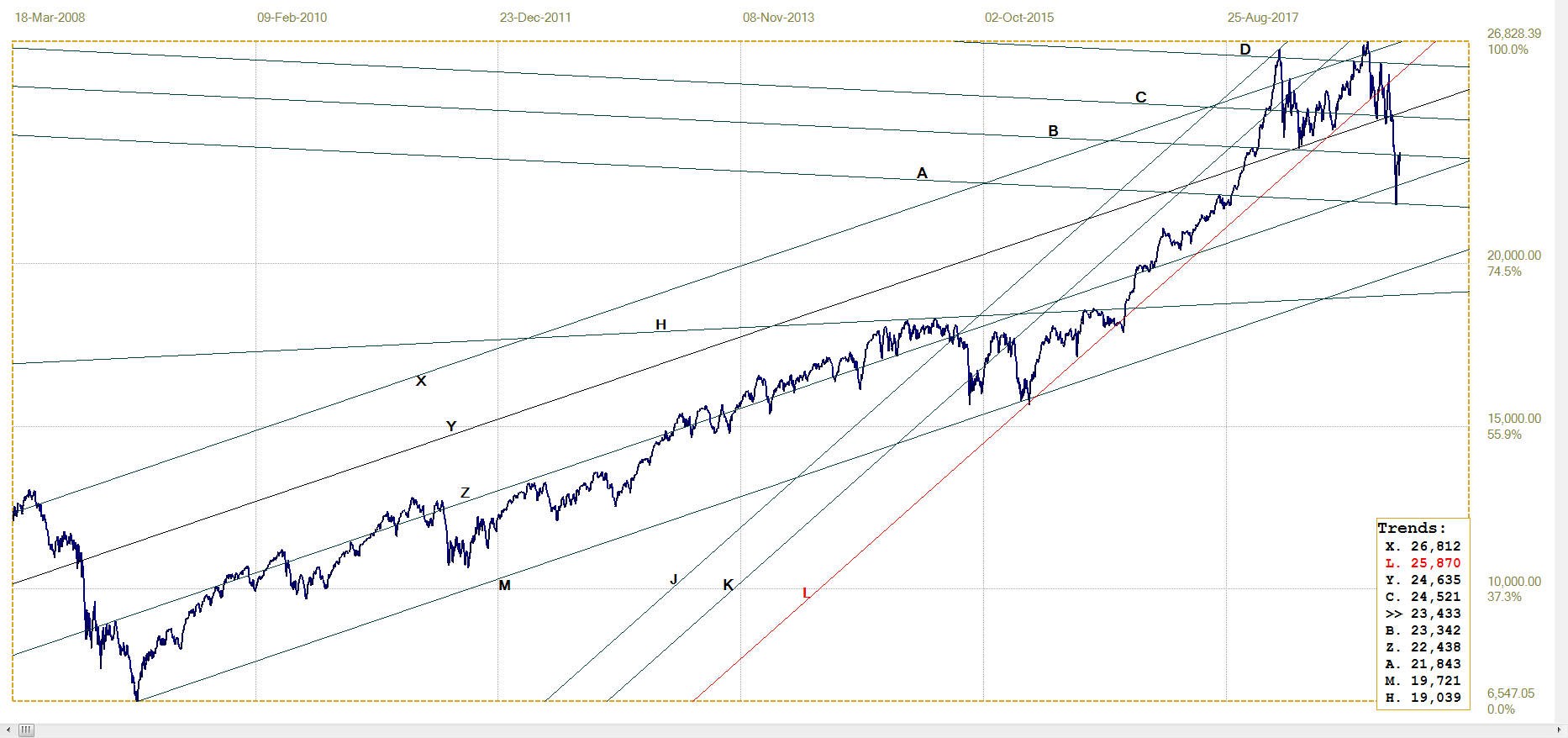
DJIA, last = 23433.16 (money.cnn.com)
Gold PM fix – Dollars
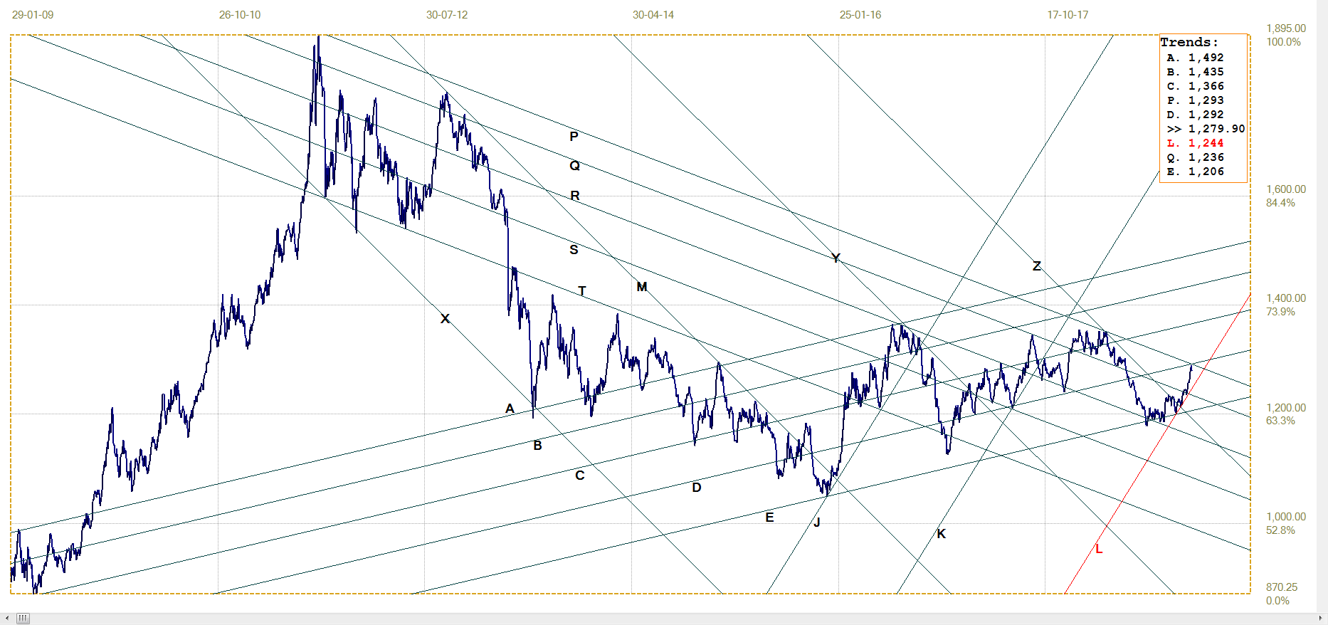
Gold price – London PM fix, last = $1279.90 (www.kitco.com )
Last week it was thought the price of gold is getting closer to a point where one may expect some fireworks. Even with the steep jump last week, that point still will be on a definite break above bear channel PT ($1293) and into shallow bull channel CD ($1292). Of course, as so often happens, the round number $1300 also present a hurdle to the rising trend in the price.
Then it will depend on how the price behaves in shallow bull channel CD and later also in the steeper bull channel KL ($1244). Much of the increase came late in 2018, with the first week of 2019 seeing the price retreat from the resistance along lines C and P. This new week should give an indication how the rest of January and perhaps all of 2019 is to proceed.
Euro–gold PM fix
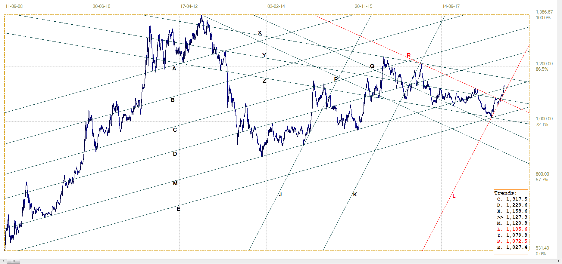
Euro gold price – PM fix in Euro, last = €1127.34 (www.kitco.com)
After clinging closely to the steep support of line L (€1106), the euro price of gold finally managed to challenge and then break above the resistance at master line M (€1121). The earlier chart of the euro-dollar exchange rate shows that the euro is challenging resistance and should be breaking higher on any new dollar weakness, to resume and extend its recovery. A stronger would hamper the advance in the euro price of gold. On the other hand, the dollar price of gold is also improving and – as shown by this chart – the gain in the dollar price of gold is sufficient to effect a break above line M. Should gold itself continue to improve at a higher rate than the euro, the euro price would extend higher.
Silver Daily London Fix
Comparison of the charts of dollar gold and silver shows that silver has suddenly woken up and achieved a better technical performance than gold. The break above the long term and broad bear channel XYZM ($15.45) is significant and signals a new bull market taking off – provided that the break above line X holds and then also holds in channel KL 14.94) to extend higher.
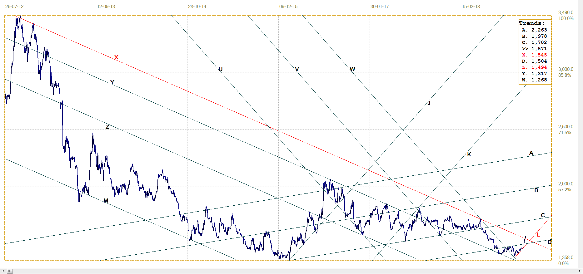
Silver daily London fix, last = $15.705 (www.kitco.com)
U.S. 10–year Treasury Note
After holding to steep bull channel VW (2.637% - 2.891%)m a sudden spike lower last week carried it below the steep channel and also below lines S (2.726%) and D (2.701%). It was a pure spike lower that did not last and the yield has returned to just within channel VW and right at line I (2.669%).
The high volatility shows turmoil in the bond market and it is difficult to anticipate the next direction. At least a break to above line I will indicate more bearishness ahead, while a reversal to below channel VW again will be more bullish.
U.S. 10–year Treasury note, last = 2.668% (www.investing.com )
West Texas Intermediate crude. Daily close
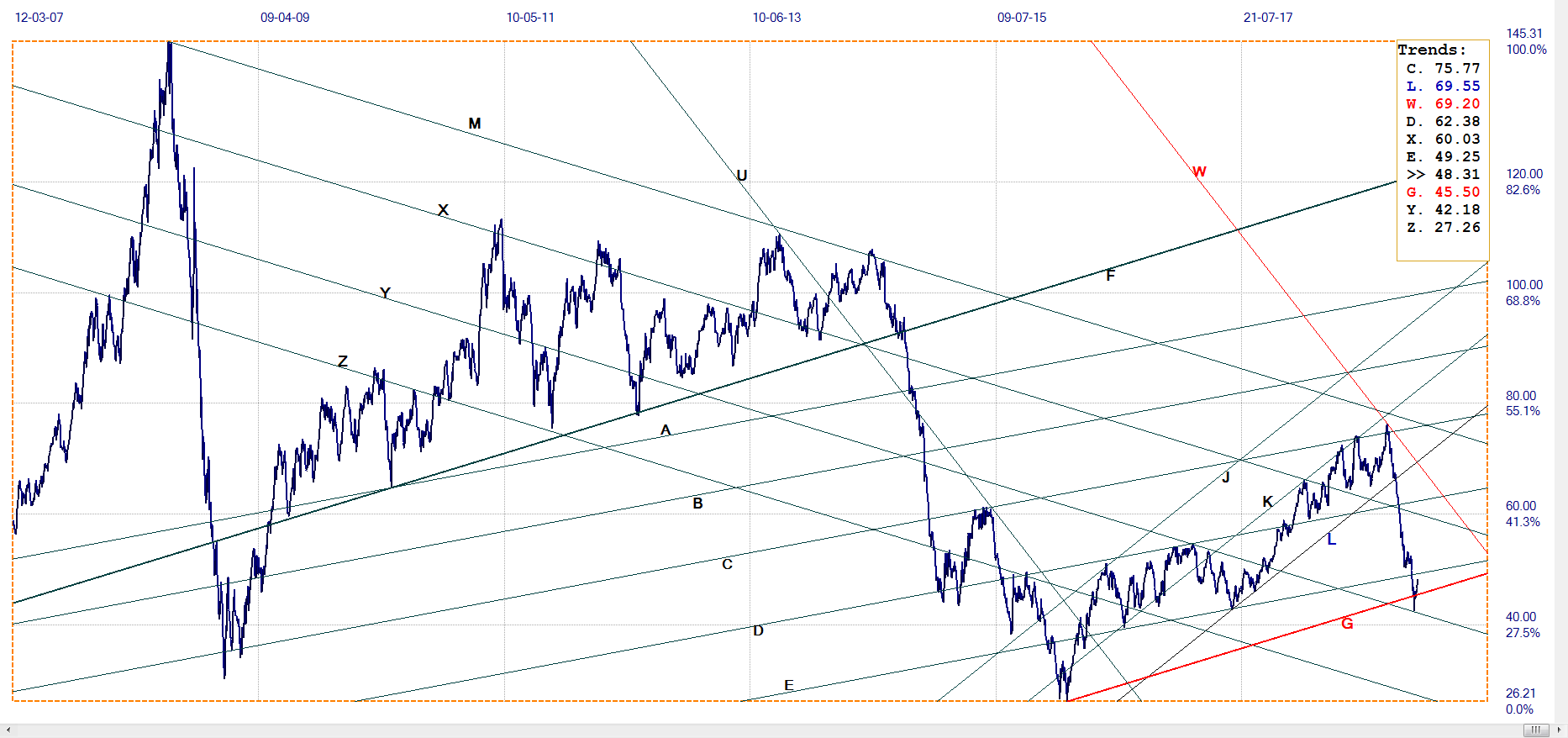
WTI crude – Daily close, last = $48.12 (www.investing.com )
The support at line Y ($42.18) has held and the price of crude has rebounded back above line G ($45.50). A break above line E ($49.25) is needed to confirm that the bear has returned, while a break below line G again is needed to provide a bullish bias.
©2018 daan joubert, Rights Reserved chartsym (at) gmail(dot)com
*********
More from Gold-Eagle


