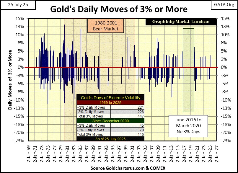
Gold’s Days of Extreme Volatility


The Dow Jones in its daily bar chart below, is having difficulty closing above its 45,000 line. For an advance that began in August 1982, when the Dow Jones for the last time closed below 800, four decades later at 45,000, maybe the Dow Jones is now at an altitude where the oxygen is getting very thin.
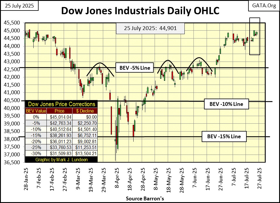
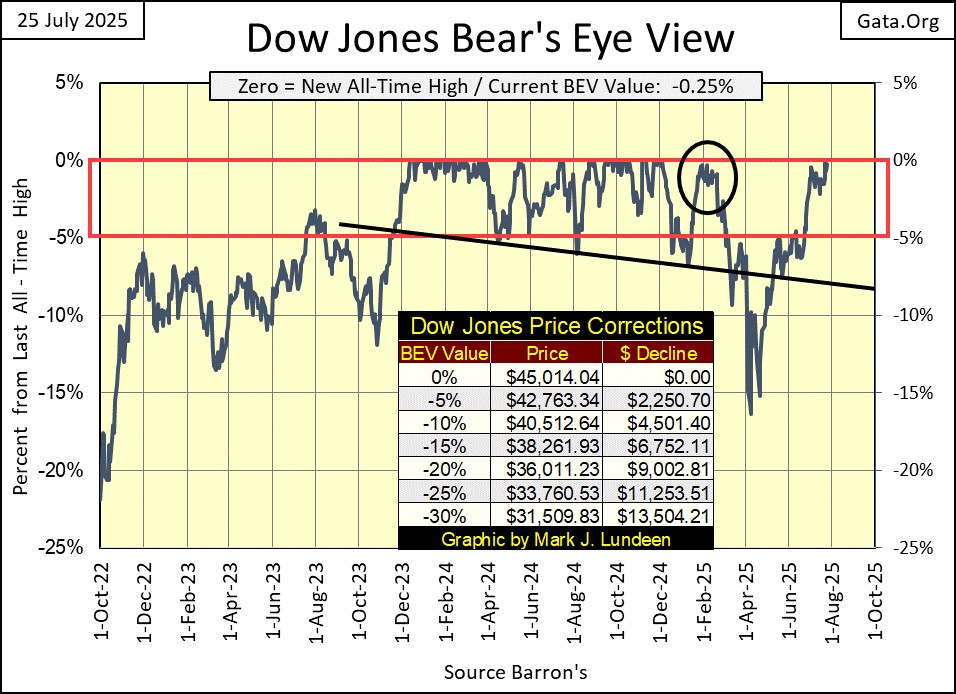
The Dow Jones closed the week with a BEV of -0.25%, a quarter of a percentage point (112.12 points) away from making a new all-time high. On Wednesday, it closed with a BEV of only -0.01%, or 3.75 points from making a new all-time high. In the past few weeks, many other major market indexes are making new all-time highs (BEVs of 0.0%), as seen in the table below. But so far, the Dow Jones has refused to join the party.
What in the heck is going on here? Most likely, nothing more than the Dow Jones is shy about coming out on the dance floor with the other dirty dancers in the market. Maybe next week, we’ll see some action with the venerable Dow Jones, with a close above its last all-time high of 45,014.04, it saw last December. I hope so, because if it should now decide to pull back below scoring position from these recent highs (the red box below), as it did last March (black circle) – at best it would be very annoying.
It's important for the current advance in the stock market, that the Dow Jones does make some new all-time highs. Since long before any of us were born, during any bull market, that is what the Dow Jones did; advance from one new all-time high, to another. Historically, when the Dow Jones stopped making new all-time highs, it wasn’t good for the bulls.
Look at my table below listing the BEV values for the major market indexes I follow. There are lots of BEV Zeros (0.00% = new all-time high) being generated in the stock market by these indexes. Yet the Dow Jones, #12 in the table, remains with its last all-time high from last December, seven months ago. If this advance has any legs to it, the Dow Jones * MUST * make a new BEV Zero in the next few weeks.
But at this week’s close, the Dow Jones did close in scoring position, within 5% of its last all-time high. And what * MUST * we assume for as long as the Dow Jones is in scoring position? That new all-time highs are pending. So, at this week’s close, I’ll leave it at that.
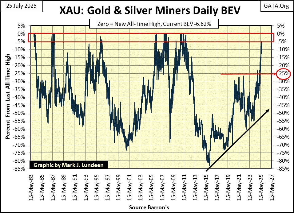
Look at the XAU, at #17 in the table below. On Tuesday it closed in scoring position, with a BEV of -4.97%. That is something it hasn’t done since 2011. With a BEV chart as seen below for the XAU, coming off an 83% market decline in 2016, it won’t be long before the gold and silver miners in the XAU will be trading at new all-time highs.
And the XAU won’t be just another dirty dancer on the dance floor, it’s a market sector with a future. Exposure to the gold and silver miners is something you’ll one day be proud to take home to mother.
Geeze Louise, look at all those new all-time highs in the table below! So, why is the Dow Jones’ (#12) last all-time high still from last December?
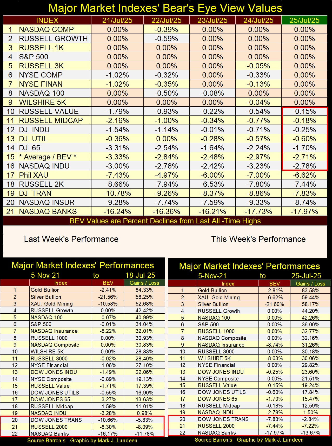
In this week’s performance table above, precious metal assets remain in the top three spots, as they have for months now. Silver is up by 58.17% since November 2021, far above any major-stock index, with the exception of the XAU.
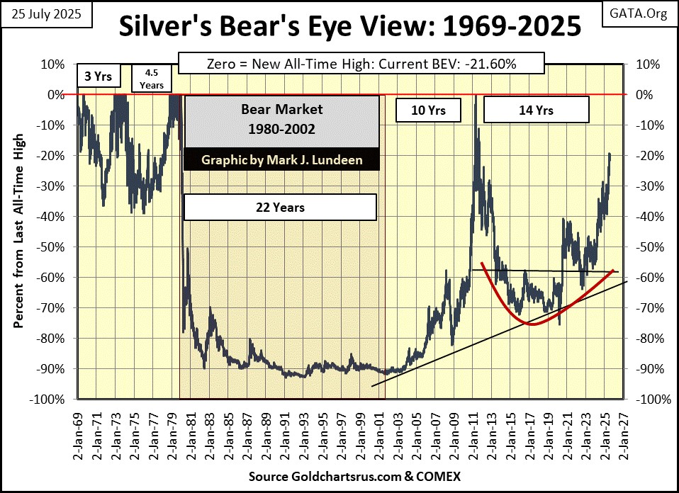
I’ve posted silver’s BEV chart below. Like the XAU, it is finally coming in strong after a very prolonged period of being a perennial loser in the market. Geeze Louise, during its 1980 to 2003 bear market, silver was down by 90% from its highs of January 1980. Then, following its 2011 failed attempt at making a new all-time high, it collapsed by 75% in 2020.
Silver was a tale of woe these last forty-five years; that is, if someone was buying at a market top. For someone who purchased silver at the bottom of one of its 21st century bottoms, they realized significant profits in silver.
But as for silver being a perennial loser; those were the bad old days, times best kept forgotten. Especially so with silver now approaching a new all-time high, maybe sometime this year, or even by October.
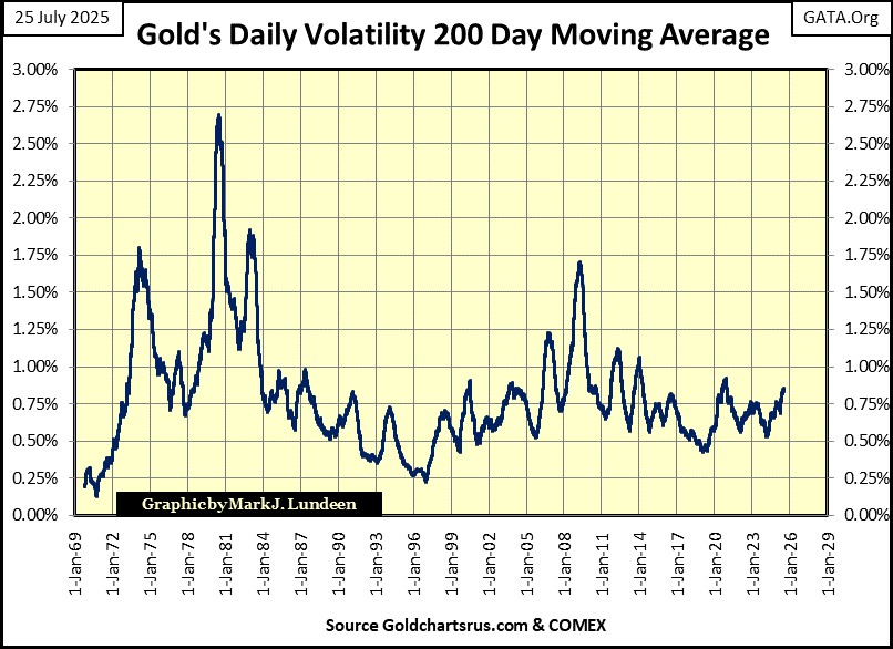
Let’s take a look at gold’s daily volatility, a metric I post every week in gold’s step sum table as Gold’s 200Day Moving Average. As seen two charts below, currently gold’s daily volatility’s 200D M/A is about 0.86%, which is near the low end of its range of values since 1969. But what does that mean?
Unlike the Dow Jones’ daily volatility, where rising volatility is ALWAYS BAD, if you’re a bull, rising volatility for gold indicates money is flowing into, or out of the gold market.
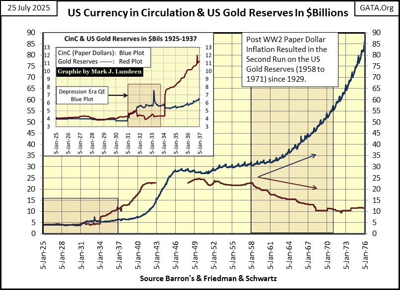
The spike in gold’s daily volatility seen in 1974, occurred when gold was, in a very alarming fashion, rising far above its discontinued Bretton Woods’ $35 gold peg. Just three years after the US Treasury decoupled the dollar from its $35 gold peg, the price of gold spiked to $179.80 in April 1974.
That wasn’t supposed to happen. Except it did, because the US Treasury continued increasing the volume of paper dollars into circulation (Blue Plot below), far above its gold reserves (Red Plot). So, gold acted accordingly by rising in price.
The price of gold soon began declining from these shocking highs of 1974, and volatility in the gold market declined accordingly. But in December 1977, daily volatility in gold once again began to rise. In July 1978, gold for the first time closed above $200 an ounce, and continued rising with its daily volatility, until January 1980, with the price of gold spiking at $840 an ounce.
But soon, only days following gold’s $840 close, the price of gold began a twenty-one-year bear market, as its daily volatility continued spiking into historic levels for the rest of 1980, as the price of gold collapsed, as money flooded out of the gold market, and into stocks and bonds.
In the first decade of the price of gold trading above $35, its daily volatility spiked in a bull market; 1974, and again during a bear market; 1980. So, spikes in gold’s daily volatility are due to money flowing into, or out of the gold market.
It takes some interpretation, some market insight to understand why volatility for gold is spiking, be it a bull or bear market. Daily volatility for gold last bottomed in 2019 at 0.44%, and has been rising, in a meandering fashion ever since, which I understand as bullish; that money is beginning to flow into the gold market. Which it has, as gold has been making new all-time highs since November 2023, sixty-six so far.
That gold has made so many new all-time highs in the past two years, as its daily volatility has remained below 1.00%, is remarkable. When gold enters its next phase in its current advance; when money begins flooding into the gold market, as the stock and bond markets begin deflating in earnest, gold’s daily volatility will spike far above its 1.00% line in the chart below.
The chart below shows all of the trading days gold has seen a day of extreme-volatility, a day gold moved +/- 3% from a previous day’s closing price. The data seen below, was used to create the data seen in the chart above.
Since 1969, gold has seen 447 days of extreme-volatility. These extreme days in the gold market were more common in the 1970s, and early 1980s. A natural question arises from studying this chart; why after 1983 has the volume of extreme days in the gold market been greatly reduced? Especially so, following the start of our current bull market in gold in February 2001.
I can’t say anything for a fact, but since 1983, the “policy makers” and their “market regulators,” have made a fetish of “market stability” in our unstable financial system. And yes, any financial system that requires regular QEs, regular “injections” of massive doses of monetary inflation to prevent a massive market collapse, is an unstable financial system.
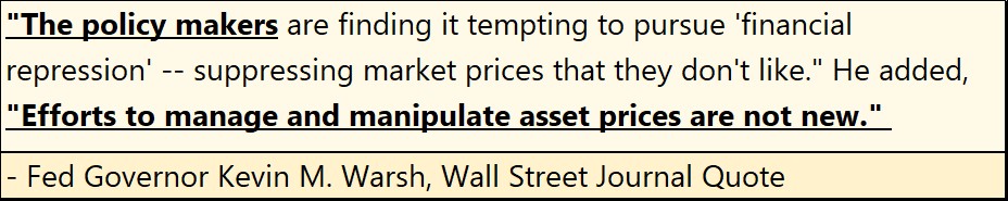
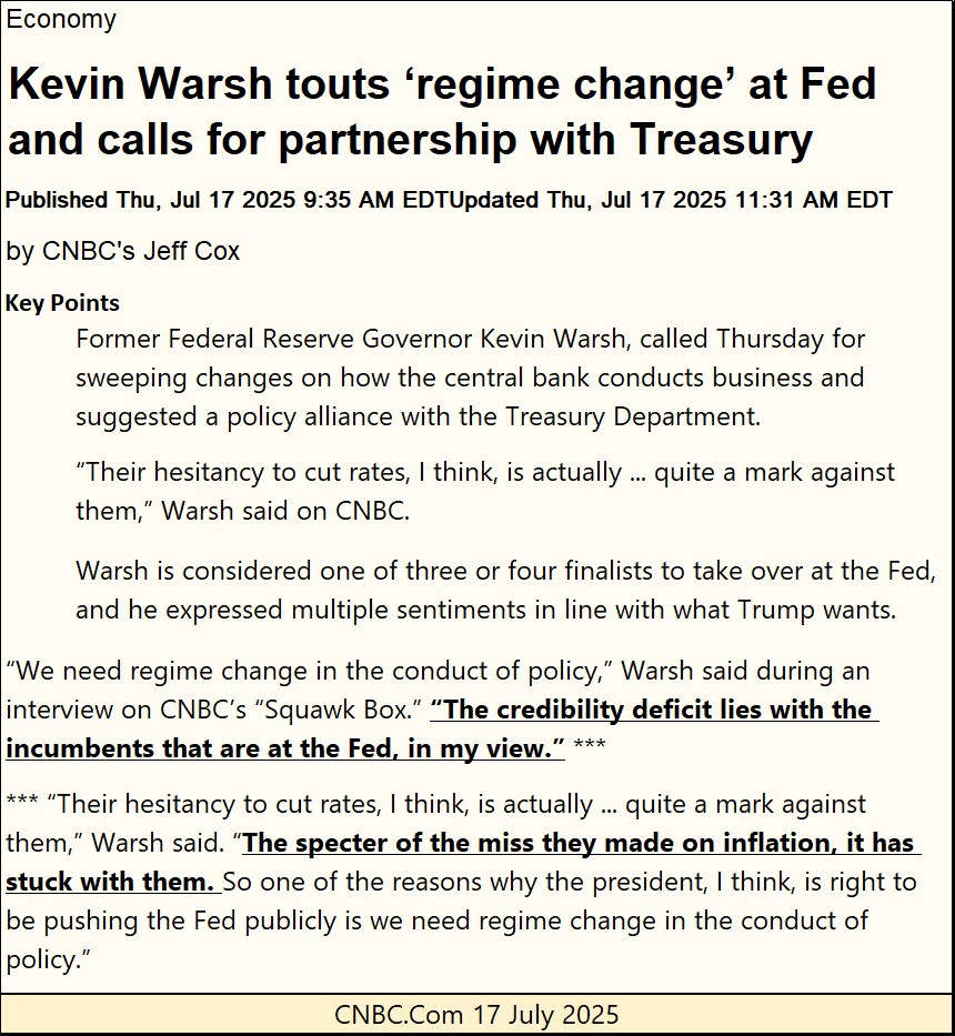
In such a system, its “policy makers” have no desire of allowing gold to do anything “stupid,” such as spiking upwards, as everything else was in a state of collapse, as per former Fed Governor Kevin Warsh.
So far, our “policy makers” have been very successful in managing the gold market, preventing gold (silver too) from becoming a logical alternative for investment funds, to the stock and debt markets.
If so, seeing the volume of gold’s days of extreme-volatility increase dramatically in the chart below, as seen during the 1970s, would suggest dire problems for our “policy makers” arising in the financial system.
Below, I’ve taken gold’s days of extreme volatility seen above, and tallied them in annual bars. This chart highlights the extremes in daily volatility seen before 1983, and how quiet the gold market has been since then. Except for the panic year of 2008, when the global-banking system almost melted down, for all of the toxic sub-prime mortgages these banks held in their reserves.
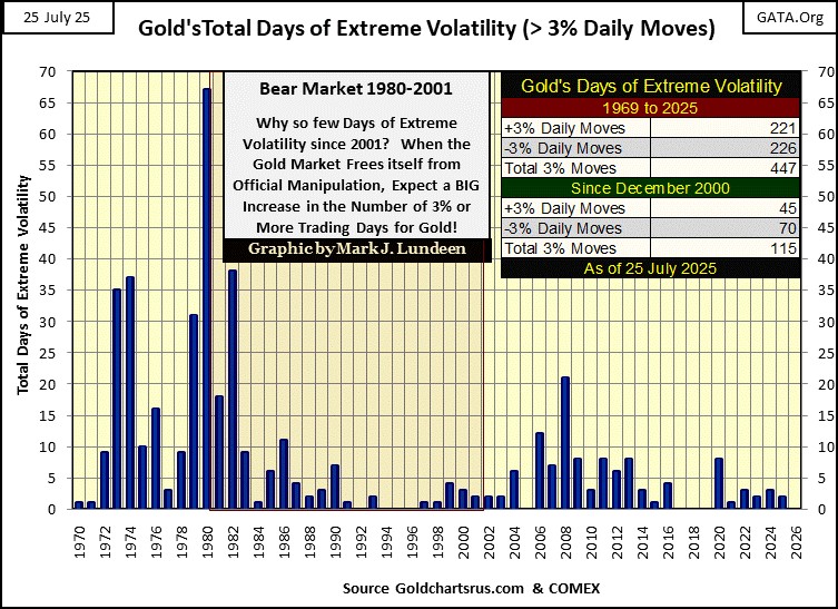
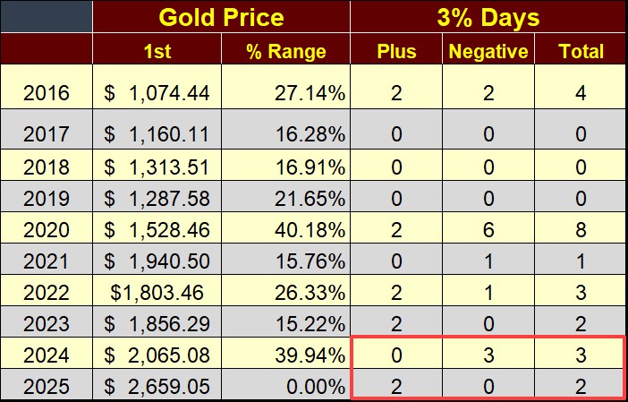
Since gold has remained within scoring position; within 5% of its last all-time high since early November 2023, it has seen sixty-six new all-time highs. However, in 2024 and so far in 2025, gold has seen only five days of extreme volatility;
- 2024: three negative extreme days,
- 2025: two positive extreme days,
as seen in the red box in the table below. That seems way low to me for all the new all-time highs gold has seen in the past three years. But since 1983, that is how things go in the gold market.
For your information; in the table below under the header of gold price, the 1st column gives the closing price of gold on the first trading day of the year. The % Range column gives the range gold has moved between its highest and lowest daily close for that year. As 2025 is still a work in progress, I haven’t yet listed its range for 2025. But using the data up to today’s close, the range for gold so far in 2025 would be 30.04%. By 2025’s close, I would not be surprised if this year’s range exceeds that of 2020; 40.18%.
It seems FOMC Idiot Primate, Powell, will soon be former FOMC Idiot Primate, Powell. A likely replacement for FOMC Idiot Primate is former Fed Governor Kevin Warsh (who I quoted earlier), as seen in the article below.
As long as the Federal Reserve is managing “monetary policy,” there are no painless cures for what ails America’s monetary system. Truth be told, should the Federal Reserve stop managing “monetary policy” tomorrow, the markets would be in a state of collapse shortly thereafter.
Though I admit, I can’t think of any way of converting America’s current monetary system of relentless inflation, to one of sustainability, without first going through a period of chaos. Maybe Kevin Warsh, as FOMC Idiot Primate could devise such a plan. But I doubt it.
I actually like Kevin Warsh. If we are going to have a FOMC, he’d make as good an Idiot Primate as anyone else, as he recognizes there are problems in the system. Though I’m sure he doesn’t agree with me; that having a gaggle of academics “managing monetary policy” is one of them. Here are some other quotes by Mr. Warsh from the past.
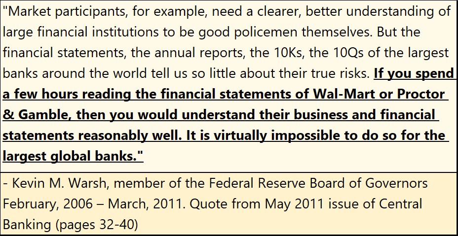
The above quote shows how corrupt accounting has become. This is a huge problem.
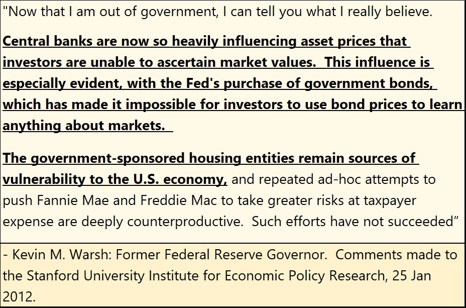
This quote is from 2012, four years after the sub-prime mortgage debacle, when Mr. Warsh recognized the government’s continual manipulation to inflate housing valuations higher was a problem. That was the boom. Now we wait for the bust.
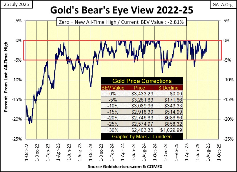
Here is gold’s BEV chart. On Tuesday, gold saw a BEV of -0.04%, just $1.50 away from making a new all-time high. I guess the “policy makers” couldn’t allow that, so they did their price suppression thing, as noted by Kevin Warsh above. Gold closed the week with a BEV of -2.81%, or $96.49 from making a new all-time high.
Don’t let this get you down. Gold has no place to go but up in the months and years to come, “policy makers” be damned!
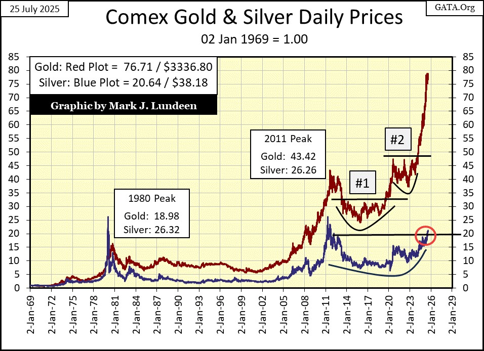
But even with the future of gold being bright, looking at the chart below, plotting the indexed values for gold and silver below, I have to wonder how long can gold’s current advance go uncorrected; not see a sharp decline from its current valuation? After all, no market goes straight up. In all bull markets, there are always pullbacks in valuations. That is just a fact of life – damn it!
Silver in the chart above closed the week above its 20 line. Nothing dramatic, but a very positive market event for silver. Maybe we are due for a period of time where silver out performs gold.
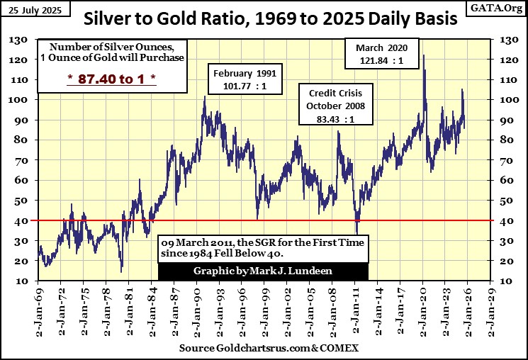
Looking at the Silver to Gold Ratio (SGR) chart below, its current ratio of 87.40 ounces of silver for one ounce of gold is historically very high. Seeing this ratio close the week below 90 is a positive development for silver.
As the bull market in precious metals develops in the months and years to come, this ratio should one day fall below its 40 line, which would mean that silver has doubled any gains seen by gold.
How does that work? Simple, trade in an ounce of gold for 87 ounces of silver today, then when the ratio goes down to 40, you take those 87 ounces of silver, and trade them for two ounces of gold, with seven ounces of silver as change. Should the ratio to be reduced to 20, as happened in 1980, you could take your 87 ounces of silver, and exchange them for 4 ounces of gold, with seven ounces of silver as change.
What that means in dollar terms, cannot be known today. But if you’re looking for a return in dollars, I’m sure your returns will be substantial.
Looking at gold’s step sum table below, I’ve been waiting for a period where advancing days will once again exceed daily declines. It looked as if that was at hand. Then came Wednesday this week, when gold’s last three trading days of the week saw big declines.
A bit suspicious that these overwhelming down days followed Tuesday’s BEV of -0.04% (highlighted in green). It is what it is, but gold this week closed in scoring position (BEV of -2.81%), so it doesn’t matter.
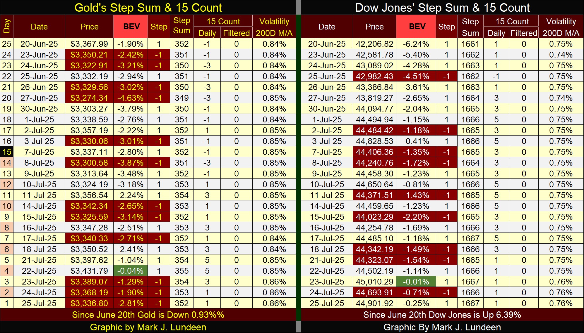
On the Dow Jones side of the step sum table above, I highlighted in green the BEV of -0.01% it saw on Wednesday’s close. Unlike gold, the Dow Jones didn’t sell off following that promising BEV, so we should expect a new all-time high for the Dow Jones, a BEV of 0.00% sometime soon.
We have better. Should the Dow Jones’ last all-time high of last December continue for the weeks and months to come, that would be a very bad omen for the current market advance.
Eskay Mining issued a press release this week.
https://eskaymining.com/news/news-releases/eskay-expands-its-high-grade-gold-vein-system-at-i-10650/
Spoiler alert on the PR above; Eskay Mining is finding excellent samples of highly enriched ore with precious metals, so far in their exploration program for 2025. They’ll take the assay results from these samples, to be used for targeting new areas to drill for core samples, hopefully they will be pulling core samples out of the ground before mid-September.
In 2025, the precious metals and their miners are advancing nicely. This is the type of market where exploration companies, like Eskay Mining can do something really nice for their shareholders, if Eskay can show some excellent results from this summer’s exploration program.
But will they? Mac Balkam, Eskay Mining’s CEO, as well as its largest shareholder (a position he purchased with his own money) is reporting excellent results so far this year. So yeah, I want to be onboard for the ride.
Mark J. Lundeen
******


