Gold Forecast: The Old Monetary Metals Took a Break This Week


The Dow Jones is doing good, meaning that like a sponge, it (the stock market) is soaking up a good amount of the monetary inflation circulating in the economy. This week, the Dow Jones closed at a new all-time high (BEV Zero = 0.0%) in its BEV chart below.
Also, on Friday’s close, it closed for the first time over 47,000. Are we on the way to 50,000 for the Dow Jones? I suspect we are; but there is something so wrong with that; 50K on a market index that started its current bull market advance in August 1982, below 800. Or 0.8K, for those who follow the market in the Metric system.
Well, I don’t think we’ll see Dow Jones at 50K until sometime next year. If then, as there are a lot of things that could stop that from happening. So, what else is there to say about its Bear’s Eye View chart below? Let’s keep it simple; as long as the Dow Jones remains in scoring position, between its BEV 0.0% & -5% lines (within the red rectangle), the Dow Jones remains in a bullish advance. That being so, we should expect additional all-time highs in the Dow Jones in the weeks to come.
As the Dow Jones is my proxy for the broad stock market, I’m actually expecting the stock market, as a whole to continue doing good, for as long as the Dow Jones below remains in scoring position.

The Bear’s Eye View of the Dow Jones above, plotting the past forty-five years in terms of new all-time highs, and percentage claw-backs from those new all-time highs, we see where this bull market began; at the star, in August 1982.
Since August 1982, we see the four major market corrections in the Dow Jones, claw-backs from a BEV Zero of greater than 35%. The 53% claw-back in March 2009, was the second deepest claw-back from an all-time high since the Dow Jones was first published in February 1885. A claw-back exceeded only by the 89% claw-back in July 1932. But for this bull market, such a decline proved to be only a bump in the road towards Dow Jones 50K.
I placed a black oval over our current advance in this massive bull market. Within this oval, since November 2023 when the Dow Jones first entered into scoring position, it has made sixty-eight new all-time highs, or BEV Zeros in the BEV chart above.
Now, slide your eyes to the left, along the red rectangle that highlights scoring position since 1980, to identify every other advance in this massive, forty-five-year bull market. Look at the cluster of BEV Zeros spanning from 1989 to 2000. Wow! What happened there? I can answer that question with one word: AlanGreenspan. Okay, Alan Greenspan is actually two words, and the name for the FOMC Idiot Primate par excellence.
No one, I mean no one could inflate market valuations like Alan Greenspan could. There were times he would testify before Congress, mumbling total nonsense for hours on end, and everyone knew it. No one cared, including the Members of Congress, who Alan bullshitted to for six hours, as stock market valuations inflated during the entire time Greenspan mumbled nonsense.

Let’s take a quick look at the past forty-five years for the Dow Jones, in terms of new all-time highs, and percentage claw-backs from those all-time highs, in the frequency table below. Since 1980, the Dow Jones has seen 891 new all-time highs, or 7.71% of the 11,549 daily closings in this sample, as seen in this table’s 0% row. Daily closings in scoring position, found in this table’s -0.001% row, were 4,755, or 41.17% of daily closings in the sample.
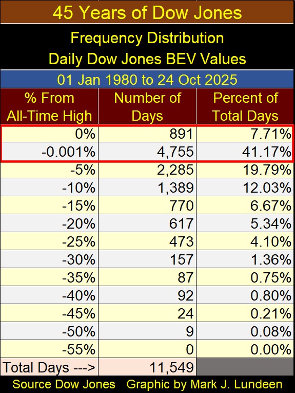
Add those two rows together, to see the Dow Jones has been advancing in a bull market for 48.88% of all daily closings since 1980. Making the past forty-five years in the stock market, a humongous inflationary bubble in the American financial system. This bubble has a rendezvous with destiny; a day it will go bust. A day when all the King’s horses, and all the King’s men, won’t be able to put it back together again.
Not that I know when this party ends, though I do know it can end only in tears. But I admit it, this was fun while it lasted.
Next is the Dow Jones in daily bars. This week, I had to increase this chart’s scaling to 47,500, to fit the Dow Jones closing over 47,000 on it. How long before I have to increase its scaling to 48,000?

Now on to my table listing the BEV values for the major market indexes I follow. The stock market closed the week with remarkable strength, with nine of the 20 indexes closing at new all-time highs, and the next seven within scoring position, less than 5% from their last all-time high.
Hey? What happened to the XAU, an index that was making new all-time highs on a regular basis very recently, closed this week way down at #20, with a BEV of -13.28%! Is there something wrong going on here with the gold and silver miners?
I don’t think so. First thing to keep in mind; gold and silver bullion, as well as the companies that mine gold and silver, have few friends in Washington or Wall Street. To make it simple, if you are investing in gold, silver, or in the gold miners in the XAU below, you are betting against the inflationary schemes of the “policy makers,” and that big bubble I noted above. There are very powerful people who don’t like investors doing that.
Unlike the stock and bond markets, markets that receive considerable support from Washington and Wall Street, the old monetary metals, being the old monetary metals, are seen as a report card on the American monetary system. When they decoupled the dollar from its $35 gold peg in August 1971, gold was officially at $35 an ounce, but traded in the gold market at $43.60.
What is gold trading for now? On Monday this week, it made its latest all-time high of $4,356, about 100X more than gold traded for in August 1971. For Washington’s report card on “Monetary Policy,” an increase in the price of gold by a factor of 100 since 1971, is a failing grade; a * Big Red F * for all the academics managing “monetary policy” for the US Dollar.
But few see that yet. But for those of us who do see it, we like gold, silver, and their miners as long-term holds in our investment portfolios. Look at the XAU below. After an advance like that since April, a correction is something only to be expected. If for the next few months, the XAU took a break from its current advance, maybe going down to 250, or lower, I’m not going to lose any sleep over that.

Since the XAU was first published in December 1983, it has been a volatile index, as seen in its BEV chart above.
I’m just a market enthusiast. I make no claims of market certainty for what is to come in the future. But, over the years I’ve done alright. After making that disclaimer, looking at the Bear’s Eye View for the XAU above, if it can keep above its BEV -25% line during this correction, or 247 in dollar terms, I’d be happy with that.

In this week’s performance table above, gold, silver and the XAU remain firmly in the top three positions, with nothing else close to taking them out. 2025 has been an outstanding year for precious metal assets. If following the gains seen so far this year, we now see a significant pullback in these markets, it might actually be a healthy market development.
As I haven’t covered the COMEX gold inventories since last May, this seems like a good time now. What catches my eyes on this chart below, is how little gold was held at the COMEX during the 1969 to 1980 gold bull market. If my memory serves me right, there wasn’t a COMEX futures gold market until sometime after gold was decoupled from its $35 gold peg. Why would there be a need to hedge future price swings in gold, if gold was pegged at $35 an ounce?
Again, trusting my memory, before August 1971, the futures markets were exclusively agricultural, as varied rainfall over farmland, made hedging price swings for grain and cattle, for farmers a necessity. Industrial commodities like copper, interest rates, and FOREX were unnecessary when the dollar was fixed to gold. After the dollar was decoupled from its $35 gold peg in 1971, everything changed.
Anyway, the gold held at the COMEX since gold’s second bull market began in 2001 below, has increased significantly. Keep in mind, that for every ounce of physical gold held by the COMEX, seen below, there are multiple ounces of gold sold in the paper futures markets.
I’ve seen credible people claim that for every ounce of gold seen below, 50 to 100 ounces are shorted (sold) into the futures markets, where today the price of gold is actually set. If it wasn’t for this tremendous supply of digital gold flowing from the COMEX into gold’s futures market, where would the price of physical gold be today?
That the price of gold is rising, as it has been since November 2023, when it entered into scoring position in its BEV chart, in spite of this avalanche of paper gold from the COMEX market, is very remarkable.

Above is the Bear’s Eye View of the gold inventories at the COMEX storage facilities. The data is the same as seen in the top chart, just looking at it in the Bear’s Eye View.
During the 1980 to 2001 bear market in gold, gold inventories declined by over 90%. Why was that? Because by 1997, with the rising stock market, no one gave a damn about gold. Truth be told, for most investors, that is still true today.
But, maybe most people are wrong about gold and the stock market. Below I’ve plotted the indexed values for gold (Red Plot) and the Dow Jones (Blue Plot), with 05 January 1980 = 1.00. Based on gold’s last all-time high on Monday this week, since 1970, gold’s advance during these fifty-five years, has been twice that of the Dow Jones. Strange, I’ve never seen this chart anywhere in the main-stream financial media. They also never publish charts going back decades, the type of charts I publish weekly.

To be honest about gold and the stock market’s relative performance, when comparing gold to the market performance of the NASDAQ Composite index, table below, the NASDAQ has outperformed gold by a factor of 10. But does that make gold look historically bad, or historically cheap, when compared to the NASDAQ? Comparing the Dow Jones to the NASDAQ Composite Index, the NASDAQ has outperformed the Dow Jones by a factor of 20.
Note on the table below. In 1970, the NASDAQ Composite didn’t exist yet. The earliest data I have for it, is for 26 December 1978. So, that is the date I used for this comparison between the price of gold and the NASDAQ. Note gold in 1978, was no longer at $35.50 an ounce.
As I was also curious how the Dow Jones would do, compared to gold and the NASDAQ since December 1978, I included it in the table below. The Dow Jones was down by $19.76 from where it was in January 1970. From 1966 to 1982, the Dow Jones, my proxy for the broad stock market, did nothing for investors.

What can we conclude from the data seen above;
- That the stock bull market of the past few decades has so far outperformed gold as an investment,
- But that doesn’t mean these trends will continue in the decades to come.
In late October 2025, I believe gold, silver, and their miners’ prospects for capital gains in the decades to come, far exceed those of the Dow Jones and NASDAQ Composite seen above.
This was an exciting week for gold, even if it was down a bit on the close of Friday’s trading. Look at the chart below, plotting gold’s days of extreme volatility (gold’s 3% days). This week gold saw two 3% days (Red Arrow below). Monday closed 3.14% above last Friday’s close, a positive 3% day. On Tuesday, gold closed 5.22% below its close on Monday, a negative 3% day for gold.

As seen in the chart above, these two 3% days for gold, doubled gold’s totals of extreme days for 2025, from only 2 last week, to 4 at this week’s close. Let’s see how high the total for extreme volatility will be for 2025. The higher the better, and negative 3% days are fine too.
As mentioned above, gold’s day of extreme volatility on Tuesday, a move of -5.22% from Mondays’ all-time high, knocked gold out of scoring position in a single day in gold’s BEV chart below. That doesn’t happen very often! But, it doesn’t make me any less bullish on the gold market.
Looking at the chart below, at the lows of November 2024, a BEV of -8% seems a good place to be watching, to see if the current breakout from scoring position exceeded those lows of a year ago. However, I would not be surprised should gold once again enter scoring position in the weeks to come.

If you found gold’s BEV chart above a little depressing, its indexed value chart below should cheer you up. If you’re a bull on gold, what isn’t there to like about this chart?
After the advance seen by gold, and silver so far in 2025, a little pullback from their last all-time highs is only to be expected. A pullback to 85 for gold, and 20 for silver, would not cancel their bullish advances seen below.

For gold in its step sum table below, last week its 15-count increased to an extremely overbought +11. Markets don’t like being extremely overbought. So, I’m not surprised seeing an increase in daily declines for this week, following gold’s last all-time high on Monday.
We should expect daily declines exceeding daily advances for the next few weeks. Should gold’s 15-count decrease down to a -7, thus making gold an oversold market sometime in November, that would be a big positive for the gold market. A point where all the weak hands in the gold market sold their positions, making the gold market ready to advance once again.
Am I making a prediction that gold is going to continue declining until its 15-count descends to a -7? Absolutely not!
Since 2024, gold, silver and their miners have been advancing like screaming banshees on the wind – why? I haven’t a clue. But looking at gold and silver in the chart above, someone out there does, and they have been buying gold and silver, as not seen since the 1970s. In my opinion, for what that’s worth; this just isn’t a good time to become bearish on the old monetary metals.
What did gold’s daily volatility’s 200D M/A close this week at? 0.91%, up from the 0.83% from a month ago. Good, very good.

For the Dow Jones in its step sum table above, its darn bullish. The Dow Jones sold off following its 15-count increasing to a +7 on October 3rd, making it an overbought market. But now, with its 15-count at a neutral -1, the Dow Jones is once again making new all-time highs.
What is the Dow Jones daily volatility’s 200D M/A? 0.72%, a very reasonable number, supporting further increases in the Dow Jones valuation.
But historically, gold and the Dow Jones are counter-cyclical to each other. Meaning when one is going up, the other is going down, as seen in the chart below, plotting the Dow Jones to Gold Ratio.
For your information, I included the base data used to create this ratio in the chart beneath the ratio. If it looks familiar, that is because I already used this chart above. But it’s good to know it also forms the basis for the Dow Jones to Gold Ratio chart below.
For the Ratio, when it rises, the Dow Jones is outperforming gold. When it declines, gold is outperforming the Dow Jones. This ratio has been contained inside the red box since 2014; eleven years, but is now breaking out to the downside, which is bullish for gold.

If one is a Jew or Christian, God holds us accountable for what we do, and sometimes don’t do.
I bring this up, as I feel obligated to point out an approaching danger to humanity, that of AI, as reported in the CNBC article below.

If someone were to do a little research into the transhumanist movement, a group of elitists academics, receiving taxpayer funding for their research, these people say the future isn’t carbon, but silicon. In other words; people will be replaced by computers. Many of the leaders of Silicon Valley are members of the transhumanist’s movement, who do their utmost to someday, enable AI to do exactly that, and they don’t keep this a secret.
Much effort has been made in past decades to create the “internet-of-things,” where everything, and everyone is connected to the internet. For example; the electrical grid. As a former electrician on US Naval Ships, I know a little something about steam-turbine electrical generation.
For the boiler tenders, to keep it simple, they are concerned about only two parameters;
- Is the boiler operating at rated pressure?
- Is the boiler’s water level within rated parameters?
- And that is it!
For the electricians, to keep it simple, they are concerned about only two parameters;
- Are the generators at rated voltage?
- Are the generators at rated frequency (60Hz)?
- And that is it!
So, what in the hell would be the advantage of having a ships boilers and electrical generators connected to the internet, other than to allow access to nefarious outsiders, to the ships vital systems? None that I can see. The same is mostly true for civilian electrical utilities.
So, why today are we concerned about China, or some other nefarious agent-of-chaos, causing electrical blackouts for the United States? Because some idiot connected our electrical utilities to the internet. They didn’t have to, but still, they did.
I suppose there were reasons for doing that with an electrical systems spanning many states, that would not be obvious to someone like me; a naval electrician. But before the internet was created, America’s power grid never had difficulties maintaining rated voltage, at rated frequency, to all users, including people’s kitchen appliances and industrial users.
So, what advantage did connecting America’s electrical utility system to the internet give us? Absolutely none that I can see, that outweigh the risks of internet hackers waging war on America’s electrical grid. Still, they did this, and I have to ask why?
Due to this deliberate effort to connect everything, and everybody to the internet, the potential for AI to inflict havoc to society is becoming unlimited, should AI ever (when) take control of the worldwide web.
Mark J. Lundeen
********


