The 1929 & 2007 Bear Market Race to The Bottom Week 102 of 149

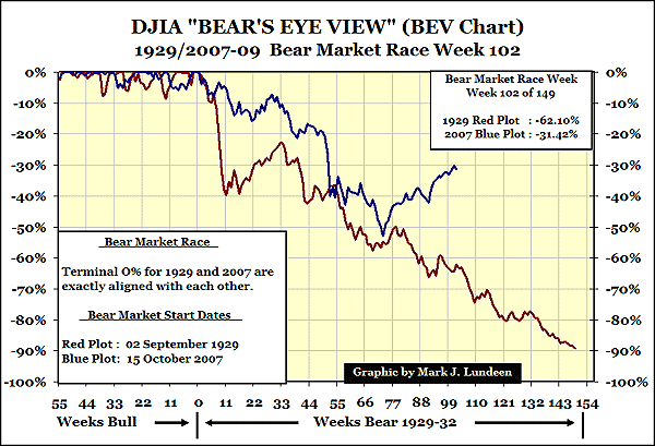
On 09 March 2009, the DJIA fell to a BEV -53.78% low. In the following six months it increased to its BEV -31.42% level. In BEV Terms, that's an increase of 22.36%. That's seems awfully small for all the nice profits people have been making.
But remember, BEV Plots are based upon their last all-time high, or Terminal Zero. So the above chart is examining the DJIA from the DJIA's last all-time highs of 02 September 1929 & 15 October 2007.
To actually see the DJIA's gains of the last six months, we need to leave the BEV Plot and compute the gains from the March lows to this Friday's close in the DJIA. On 09 March, the DJIA closed at 6547.05, and today the DJIA's close at 9665.19 for a six month increase of 47.62%.
My point is, while the BEV Plot is a useful market tool to compare one Bear Market to another, don't use it to compute your capital gains when figuring your income tax!
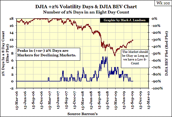
The 8-Count is boring, but then the DJIA has been going up for the last six months. No doubt about it, the Bear left town and took his volatility with him. Still the stock market seems to be getting tired, and is due for a good down-side correction. I'm not selling investment advice, and except for precious metals shares, I'm not in this market. But prudence seems to demand that anyone who has made 47.62%, or more, in only six months, should take a big chunk of their winnings off the table. A really big chunk!
I know that the DJIA may be up over 10,000 next month, but I don't care. Now is the time to take most of your winnings off the table. Don't worry about the taxes, just pay them and be proud you made money in one heck of a difficult market.
Remember, sometimes the correct market position is to do what the Bear is currently doing; he just left town and forgot about the market.
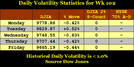
We've had 21 days of having a zero for an 8-Count. It might go on to 42 days. There is no way to see into the future, so I'm not predicting when we will see a 3 or 4 again. But when the Bear comes back from his vacation, we will know it with the 8-Count.
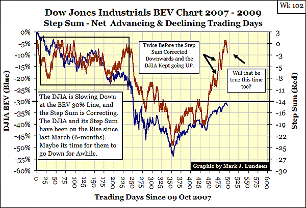
The current bullish move is getting old and tired. The Step Sum shows us that for all the net market up-days we've seen since day 438 (July 7th), each up-day seems to have a smaller effect on the DJIA. Upward momentum is failing, but market gravity is always working against us in a Bear Market.
It would be a healthy thing to see the Step Sum fall hard from here, and take the DJIA towards the BEV -40% line. Like pruning the branches of an apple tree, this would be a beneficial thing for the Bulls. Although neither Bulls, nor apple trees, appreciate a good pruning.
Anyways, that is what I'm expecting to happen from here. If I'm correct and we revisit the BEV -40% line again, at that time I'll reevaluate whether or not the Bear has came back. The key to that will be how boring or exciting the 8-Count Chart becomes between the BEV -30% and -40% lines. But this isn't science, so maybe the DJIA will continue to go up from here. I know the "Policy Makers" wants it to.
Last November, I wrote an article on the Step Sum and Lundeen Bear Box. The Step Sum and the Lundeen Box are my own creations, far off the radar screens of 99.99% of market followers. It's not necessarily bad that people in the media don't follow my indicators. In fact it's in my favor. When you know that I've back-dated my Step Sum model going back to 1900, and see that it has worked darn well for 110 years, what could be more important to you?
The link to my historical research is provided in every report. Have the creators of current popular, technical indicators done the same? If they have, I've never seen their historical charts going back decades, have you? I'm not suggesting they are unimportant; as they are. But I'm not a camp follower in the markets, depending on what experts recommend. So I spend years studying old issues of Barron's, and history in general, as well as develop my own technical indicators. I'm happy with how well my research has served me.
I'm on record for possible stock market problems, similar to the Great Depression Bear, going back to November of 2007, with the DJIA only 6.34% off the October 2007 BEV Terminal Zero (DJIA's last all-time high).
"The Dow Jones Industrials may be at historic highs, but I smell a rat. The current situation in the financial markets is one of exceptional risks. --- I would not rule out the possibility of a 1929-32 scale market event, in the not too distant future."
- Stock Market Historical Valuations (1925 to 2007) Part 2, 08 November 2007
And I made a similar call in October 2004 when I first introduced my BEV Chart. The similarities in the concentration of DJIA BEV 0% hits between the Roaring 20s and the 1990s on a BEV Chart are eerie! The plot just sticks to the top of the chart, with few, if any 10% corrections, and for years. Extreme Bull Markets need extreme Bear Markets to correct their excesses. Look at how the 1932 Bottom corrected the 1929 Top in the BEV Chart below.
In 2004, even with the DJIA well off its 2002 Bottoms, (vertical Red Line on chart below dates my article) it just jumped out from a long-term BEV Chart that a massive Bear Market, similar to 1929-32, was something to seriously consider.
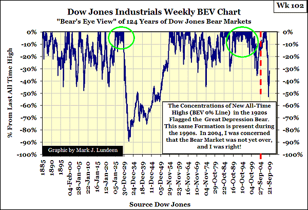
Five years later, reviewing the updated weekly DJIA BEV Chart above, I'm still Bearish. To my eyes, the DJIA -53.87% bottom in March of 2009 looks insufficient to what is needed. I'm not looking for a certain level in the DJIA as a sign of when to turn Bullish. I haven't a clue what the final low for the DJIA will be. But at a true Bear Bottom, the Bulls are overwhelmed by the Bear. The Bulls capitulate, market volume shrinks, and the field of battle is left to the Bears. Denial is no longer possible. So the final reckoning of writing off bad debt and ill-advised investments of the previous Bull Market is at last done. It's a brutal process, but perversely, it also signals the start of the new Bull Market that only a few will benefit from.
We had two opportunities in the last twelve months to get this Bear Market over, as well as a chance back in 2002. But Tammany Hall's local chapter in Washington keeps flooding the financial markets with hundreds of billions of inflationary dollars, in a vain attempt to keep their bankrupted supporters afloat. To the credit-addicted, and their pushers, these bailouts were necessary to "fix" the system. But to those with a sober, historical perspective on the market, the bailouts were no different than giving increasingly larger fixes of heroin to a drug addict in his terminal stage of addiction. The Bulls are still fighting for their lives. They fear a truthful audit of their "assets" as Dracula fears the Cross! This article from Business Week tells me the worst is far from over!
Based upon my own technical indicators, and understanding the nature of the scoundrels in charge of "Policy", I expect decades from now the long-term BEV Chart above will display two massive Great Depression Craters.
I may sound like a Perma-Bear, but I'm not marketing specific investment advice in a paid service. My focus is on long-term market trends and financial history, for my own use, that I make available to the public at no fee. And what financial history tells me is that massive, ill-advised debt issuance by a banking system creates euphoric Bull Market Tops on the upside, and Great Depression-grade Bear markets on the downside.
I don't think ill of the Bear. He's not the bad guy. He is only the janitor who cleans up after the Bull's drunken bacchanal. The Bear's is a necessary but thankless job. That there is so much for the Bear to clean up, is the fault of the "Policy Makers", and the University system that trained our "Policy Makers" for "service" in government, market regulation, law, accounting and banking. To be touched by them, is to be ruined by them.
Until the system stops creating uneconomic debt, and allows the Bear to clean up * all * the bad debt created since Greenspan was Fed Chair, I will remain a Bear. This means that the Baby-Boom Generation will pay a horrible price for its youthful dalliance with credit. But then the "Woodstock Generation" never saw a dark alley it didn't rush into. Go watch the recent documentary on the Woodstock music festival of 1968; it explains much of our current problems.
I haven't published an updated version of the chart below for almost a year, so here it is. The amazing fact this chart illustrates is the DJIA has only seen a net of 1,325 up days in the 29,869 NYSE's trading days from 02 January 1900 to 25 Sept 2009. We might say that only 4.43% of the total trading days since 1900 have brought us to our present situation.
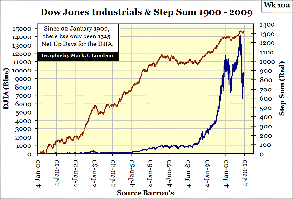
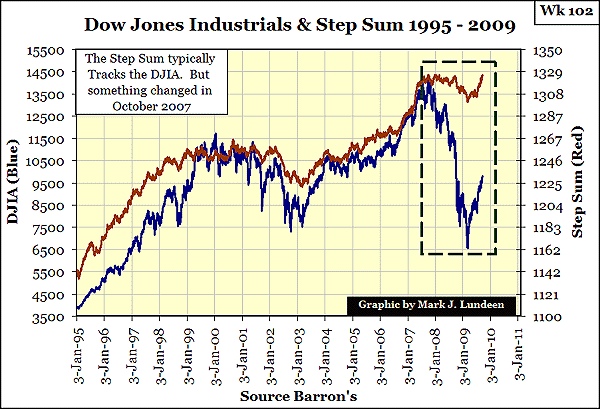
My article on the Step Sum covers all the big DJIA BEV -40% Bear Markets. It's not a long read and will do much in explaining why I had a problem with our Bear Market last November, as I still do this September. Never has such a massive Bear Market had such little impact on the DJIA's Step Sum, as is the case for the 2007-09 Bear. Look at the chart below, it really looks as if the 2007-09 DJIA Bear's Step Sum has someone propping it up with tax-payer's money.
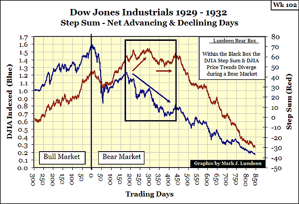
Below are the DJIA & its Step Sum during the Great Depression Bear Market. From September 1929 to February 1931, over half of the 1930's Bear Market, as the DJIA fell over 50%, the Step Sum actually went up (more up than down days). Eventually, market gravity finally pulled the Step Sum down with the DJIA. We see the DJIA's final Selling Climax as the Step Sum exits the Lundeen Box.
As we can see in the next chart, a Selling Climax in the Step Sum is something the #2 all-time DJIA Bear Market has somehow managed to avoid - at least so far.
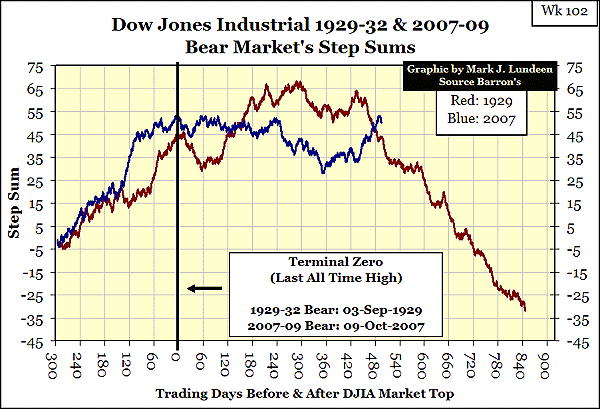
If you compare our DJIA Bear's Step Sum with the seven other massive DJIA BEV -40% Bears of the 20th Century, (read my article), reasonable people see something is currently amiss. And now we see the DJIA's Step Sum taking off into new highs. But, the same thing happened in the 1929-32 DJIA Bear before its Selling Climax. See the chart above.
I study my data, I construct my charts, and I think a lot. But looking at the past only provides us with probabilities of the future. The best anyone can do with historical data, is like betting in a casino with better than house-odds on your side. Most of the time you'll win, but the mathematics demand that sometimes you must also lose. So maybe seeing the Step Sum rising up to new all-time highs is an all-clear signal for coming back into the Stock Market.
But 110 years of market history says, for a massive Bear Market like we're in, its Step Sum is going to have a Selling Climax before the true bottom has been reached. This is because in a Bear Market, the Bear ultimately wins! Don't fool yourself; this Bear is not going away until the "reserve assets" on the Fed's balance sheet, as well as the books for the banking systems, corporate American, and the gold in Fort Knox, all examined with a fine tooth comb by America's creditors.
What would it take for me to become a Charging Bull again? Well I am a Charging Bull, for Gold and Silver! As far as the stock market is concerned, I want to see the DJIA's Dividend Yields well north of 7% to even consider buying the general stock market. But 15% Yields on the US Long Bond changes everything. Remember, US T-Bonds have been there before.
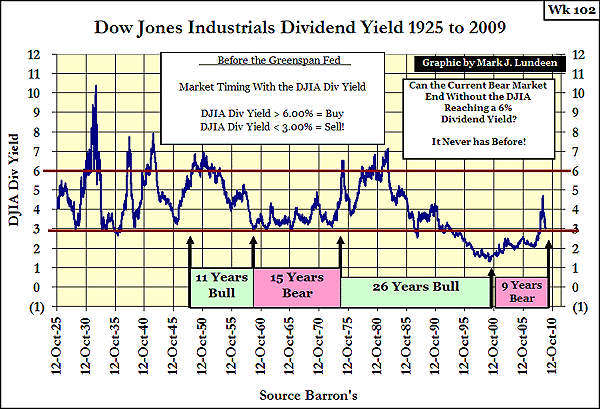
But incredibly, the DJIA fell back to its 3% yield line again; this is not a good sign! But when stock valuations are driven by inflationary flows of "Liquidity", Bulls always ignore dividend yields. The day is coming when a good dividend will become of paramount consideration.
For almost 50-years (1925-73) before the Federal Government broke the final link between the dollar and gold, a 3% Yield on the DJIA was a Strong Sell Signal. But currently, with crummy earnings, a crumbling business climate due to business fears of political bullying, pending-massive tax and regulation increases, not to mention a general fear of the future for most people, there are no shortages of Bullish "Experts" counseling people to come back into the stock market. But other than the DJIA going up because of Government manipulation, what's so Bullish about the Stock Market? Nothing. The Stock Market has become another bad habit most people should just avoid.
The Step Sum is an indicator of market sentiment. When the underlying sentiment is bullish, the Step Sum rises. When bearish, it falls.
Think of the "Step Sum" as the sum total of all the up and down price "steps" in a data series over time; an Advance - Decline Line for a data series derived from the data series itself. Logically, bull markets will have more net up days, while bear markets will have more net down days. Understanding the Step Sum is no harder than that.
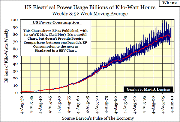
Something is happening to America's EP (Electrical Power Consumption). Or maybe I should say something is not happening. Just viewing the raw data with its 52Wk M/A, (below) we see power usage is in a serious decline. As I've asked before: what in our lives doesn't use electricity? The answer is still the same: idle assembly lines, unoccupied office space, unsold condos - stuff like that.
There are many in Washington who see EP's decline as a good thing. Nothing reduces CO2 emissions like massive unemployment. Then after a few months of these unfortunate people not paying their bills, the banking system does their part in "saving the planet" by foreclosing on the government-subsidized 30-Year Mortgages Congress provided to the working poor from 2000 to 2007. The bank will make sure the lights and appliances are turned off when they lock the door. The numbers making up EP are not sterile statistics. There is a lot of pain associated with any drop in EP.
Also the "Global Warming" issue is purely political. Its purpose is to expand government, reward progressive academics and environmental groups with taxpayers' money.
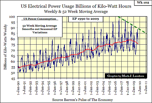
Below are the last 20 years of EP demand. Unlike Government statistics, there is no way these numbers are manipulated, yet look how neat the last four years' (summer) demand peaks line up with the dashed green line.
We can see how Global Warming started to cool down two years before the economy did. Note the maximum summer spike occurred in 2006, while EP's 52Wk M/A itself peaked in 2008. This summer, I seldom used my A/C unit, and my tomatoes never ripened.
How much farther can the economy's demand for EP fall? I don't know. But by taking EP's 52Wk M/A in the above data, and plotting it in a BEV format, we can see how far EP has fallen in the past. The current decline in EP argues poorly for an economic recovery anytime soon.
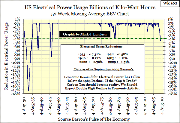
We have already exceeded the lows of 1983, the worst recession since 1938. The 1946 decline I ignore. After WW2, entire factories were shut down to retool for peace-time production. The much dreaded post World War 2 recession never happened. That makes the 1938's, -6.58% decline the next record to break. Will that happen? It will, if the Socialists controlling the White House and Congress continue to have their way with us!
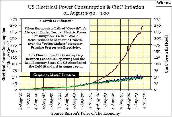
Personally, I already have my eye on the 1933 lows of -17.32%. Why? The US Government continues to print money to "stimulate" the economy. This will only make a bad situation worse. The chart below is the best data available to prove that inflation does nothing for actual productive-economic growth.
Much is made of "Green Energy Sources", and top of the list is usually Solar Power for electrical generation. Let's examine what Solar Power on an industrial scale, say an area the size of the State of Arizona, has to offer the US in reducing our foreign oil imports and lower CO2 emissions. As horsepower makes the wheels go round, basic laws of physics allows us to compute the impact Solar Power offers in available horsepower for transportation purposes.
My sources are from the internet, whose data I believe reliable. But basic inputs from different sources offer different information, such as how many square miles the State of Arizona covers. I also used my background as a Naval Electrician to fill in some of the holes. Still I can't believe the results I've found. So I sent my sources and calculations to a few internet buddies, and unfortunately, they confirmed my results. Feel free to find my mistakes, and let me know where I went astray. I'd like to get a good night's sleep whenever I hear Solar Power "Experts" discuss Solar Power as a practical replacement for coal-fired electrical generation.
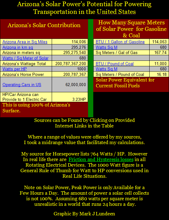
If this is all the power solar-collection cells can produce by covering 100% of the surface of Arizona, solar power is not a realistic replacement for coal-fired electrical generation.
The Sierra Club is a big supporter of Solar Power; do you think anyone in the Sierra Club has bothered to calculate the power available from Solar Power to the United States? I doubt they would support covering 100% of Arizona's surface area with solar cells! How about the Green Energy Czar? If he has, he's keeping it to himself. The same goes for Congress and the President. Unless you can find a mistake in the above calculations, you have to understand that Green Energy is only a political issue used by cynical, power-hungry people who don't care if America's working-class are hot in the summer, cold in the winter and hungry all year long.
In Wk 98, I published a chart of CinC, Barron's Gold Mining Index (BGMI) and the DJIA. The chart below shows that since 1938, CinC inflation has been a constant factor in the economy, as it flowed back and forth between financial assets and CPI Inflation. Monetary inflation flows from the Fed causes Bull and Bear Markets in Commodities and Financial Assets.
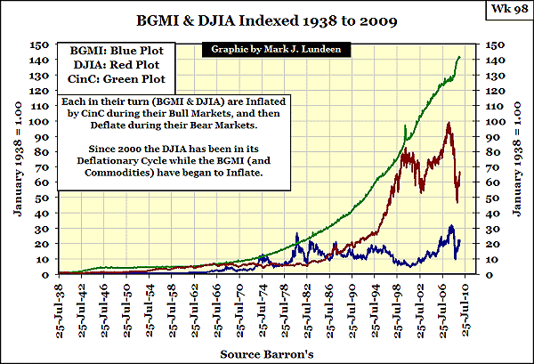
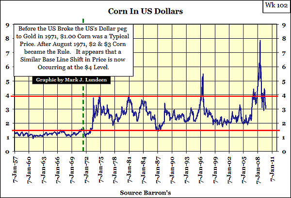
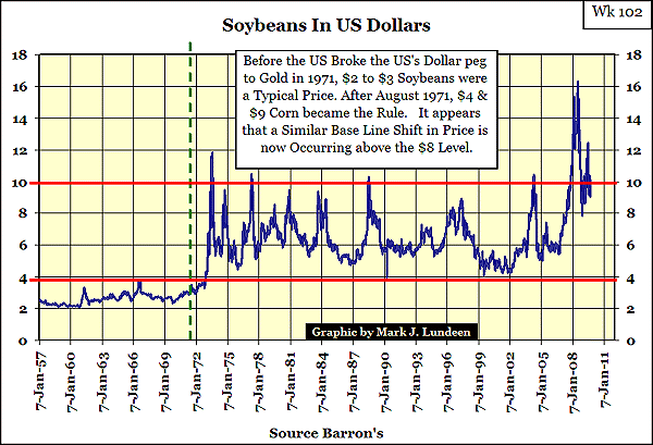
As I have weekly data for Copper, Corn, Wheat & Soybeans from 1957 to 2009, 52 Years, I thought it would be interesting to see if they also followed the BGMI as countercyclical investments to the DJIA. Well, they don't act exactly track the BGMI. But during DJIA Bear Markets, (Commodity Bull Markets) these four commodities experienced a base-line-shift in their prices where a price level stops being a ceiling, becomes a floor.
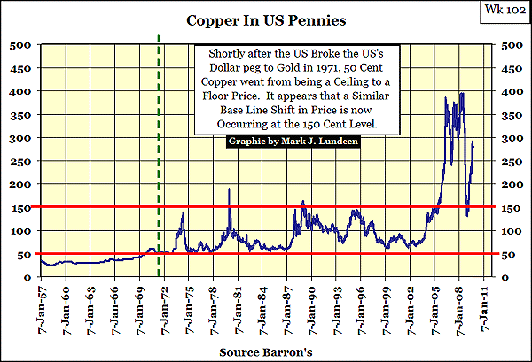
In all four examples, it's evident that after the US broke its last link between the US dollar and gold in August 1971, inflation shifted an old price ceiling into a new floor price.
Here is the chart for Corn.
Soybeans are next.
And finally, Wheat.
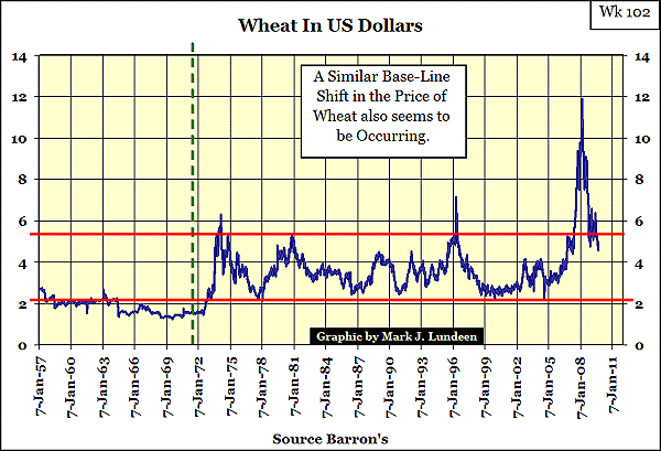
It's notable that these prices started to rise around 1972 & 2002. There is nothing special about the numbers 1972 or 2002. But reviewing history with 20/20 hindsight, in 1972, financial assets were not the place to be, as CPI Inflation was heating up, causing food & consumer prices to rise. In 1982, as inflation came to a full boil, it was time to dump inflation plays and invest in Financial Assets. The Flows of Inflation started to shift from CPI Inflation to Financial Asset Valuations. This is just history. But I'm thinking that 2002 will prove to be very similar to 1972. The inflationary flows are shifting towards CPI Inflation again. For investors of Gold and Silver, and these four commodities, it has so far.
Dow Jones Industrials Average Market Volatility is the source for my volatility studies.
The Lundeen Bear Box and Step Sum is the source for my Lundeen Bear Box and Step Sum Chart
Note For the Record: Mark Lundeen does not want a devastating bear market in the next two years. However, in full view of Congressional Market Oversight Committees and under the supervision of Government Regulatory Agencies, things were done that I believe will make a historic bear market inevitable. If you have a problem with this bear market, contact Washington, not Mark Lundeen.


