Base-Line Shifts In Commodity Prices Since 1957


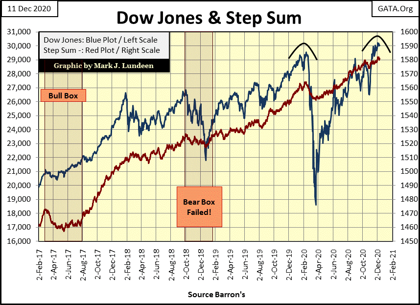
Since November 16th when the Dow Jones made its first BEV Zero since its -37.5% market bottom of last March, it has remained within 2.5% of its BEV Zero as well as making two additional new all-time highs. The current chaos resulting from the presidential election of November 3rd hasn’t bothered the bulls too much.
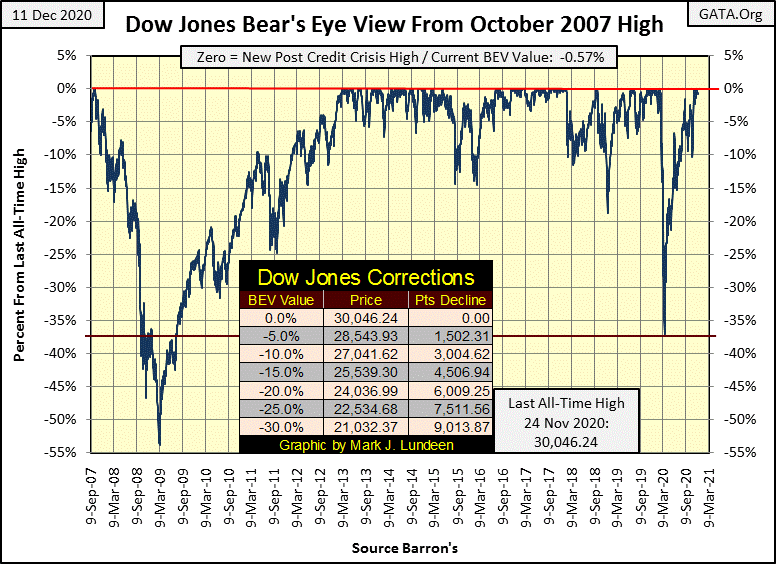
Last week we saw many BEV Zeros in the table below. The best day this week was Tuesday with ten of the major market indexes making a new all-time high in the table below, but by Friday’s close they had all cooled off a bit. My best guess is that in the weeks to come, the market will continue seeing new all-time highs in these major market indexes.
I’d expect the uncertainty of not knowing who was going to be president for the next four years many weeks after the election would have resulted in lower valuations in the stock market, but so far it hasn’t. Maybe that is the best proof that the big bulls in this market are the idiot savants managing “monetary policy” at the FOMC.
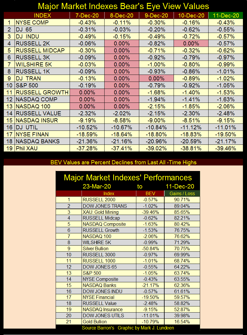
The above post March 23rd returns remain amazing, but they really haven’t done much for about two months. With #20 (DJ Utilities) coming in with a 40% advance in the past ten months, and most of the others advancing well over 60%, expecting them to do something other than correct some in the next few months seems a bit greedy to me. Typically, precious metal assets do well when the broad market comes under pressure.
I like having a theoretical basis for modeling my market expectations in the coming weeks and months. I can be wrong, but it’s what I do, so what the heck here goes; before we see April’s showers the broad market will shed a good percentage of the gains it has seen since the lows of last March as gold, silver and the XAU (gold and silver mining) above advance to higher levels.
The chart for the Dow Jones below plotting its 52Wk high and low lines supports my theoretical basis for modeling the next few months. From the summer of 2016 to the end of 2017 the Dow Jones for the most part advanced from one new all-time high to its next, then beginning in 2018 the Dow Jones began to struggle. Sure it was advancing; pushing up on its 52Wk high line, but when it did it needed a long rest before it did so again.
Then came October 2019 and the bulls began running up the hill as they did from 2016-17 – until February 2020 when the deflating Dow Jones pushed its 52Wk low line down a whopping 10,900 points in only twenty-eight trading sessions.
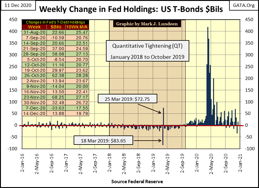
Unphased by this stunning 37.5% market decline, on March 23rd the bulls once again began taking the Dow Jones back up into record territory eight months later in November. That the FOMC had “injected” $2.74 trillion into the financial system during this time may have had something to do with this nine-month advance.
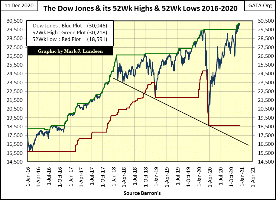
I’m looking at this chart and wondering what’s coming for us in 2021:
- a blow-off top for the Dow Jones far above today’s close;
- continued wild market oscillations as seen since January 2018.
This bull market has been going on since August 1982. A historic bull market such as this deserves a historic ending. Looking at how the FOMC has been “injecting liquidity” into the market since late 2019 below, the likelihood of this bull market ending in a whimper is very slim!
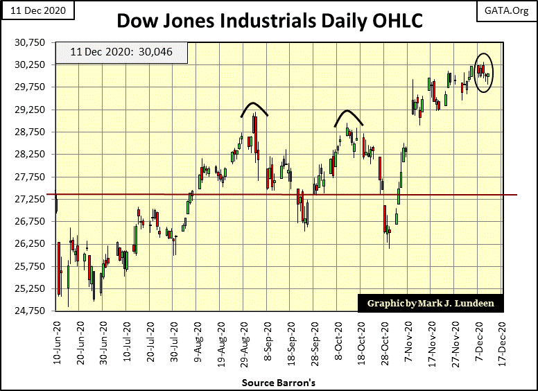
Here’s the Dow Jones in daily bars; from here we move on to gold.
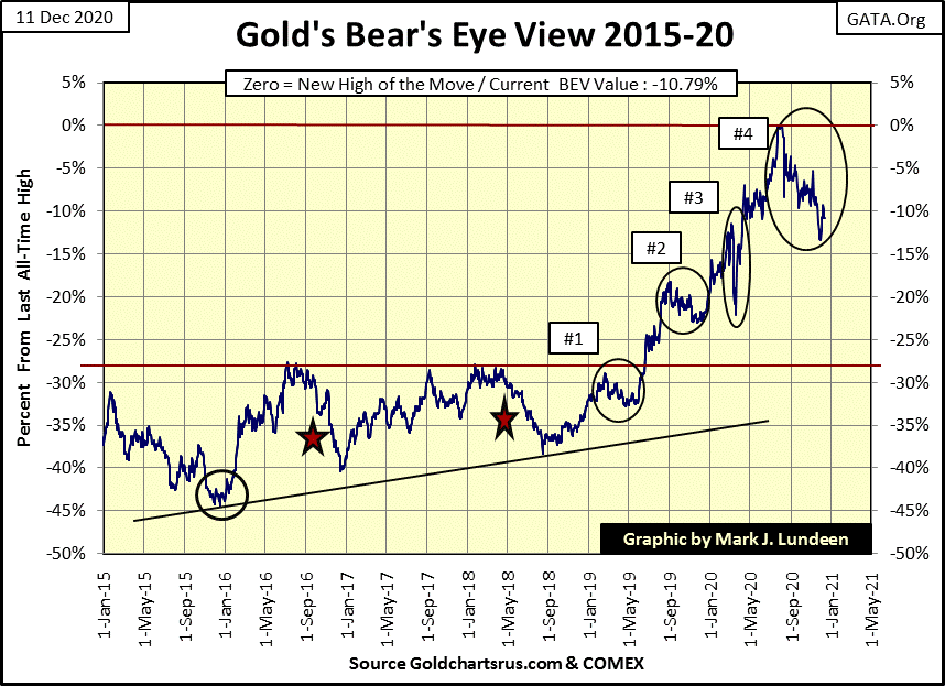
Gold’s current correction from its all-time high of $2061 seen in early August below is developing into its longest and deepest correction since its December 2015 bottom. What does that mean? Not much, but it does test the resolve of the bulls.
I don’t think it will happen, but should gold decline to its BEV -20% line ($1648), I wouldn’t like it but what am I to do about it? Exit my precious metal positions and buy Wall Street glamor shares as the Dow Jones rises above 30,000? Thanks, but I think I’ll pass on that one! In today’s uncertain world, gold and silver are very attractive assets to hold and just leave it at that.
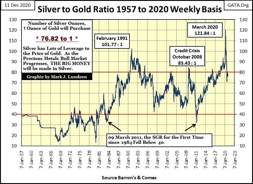
Here’s the silver to gold ratio (SGR) going back to 1957. During precious metals bull markets, the SGR declines to lower levels. During precious metals bear markets the SGR increases to higher levels, but why?
Silver is gold on steroids. During bull markets silver advances more than gold. During bear markets silver deflates more than gold. At bull market tops, an ounce of gold is only worth fifteen ounces of silver, as it was in 1968 and again in 1979.
Though I have to note that in 1968 gold was fixed at $35 an ounce. The decline of the SGR in the 1960s was because the price of silver was rising as the US Government flooded the global economy with paper dollars in excess of the Bretton Woods $35 gold peg. This is why the US Treasury stopped minting coins from silver in 1964; “silver became too expensive.” The Treasury has been minting base metal slugs into dimes, quarters and half dollars ever since.
A SGR of 15 is about the same ratio between gold and silver in the Earth’s crust. At bear market bottoms, an ounce of gold can purchase much more silver, though the record SGR of 121.81 seen last March didn’t occur during a bear market.
About the time you believe that you understand the rules in the market, someone always changes them, like seeing a SGR of 121 last March during our current bull market advance in the old monetary metals. That SGR of 121 from last March didn’t last long. By the end of May it had dropped below 100 and closed the week at 76.82 ounces of silver to one ounce of gold. All and all, the SGR chart below is very supportive of the bull market for precious metals. Next stop a SGR of <40 sometime in 2021? It could happen!
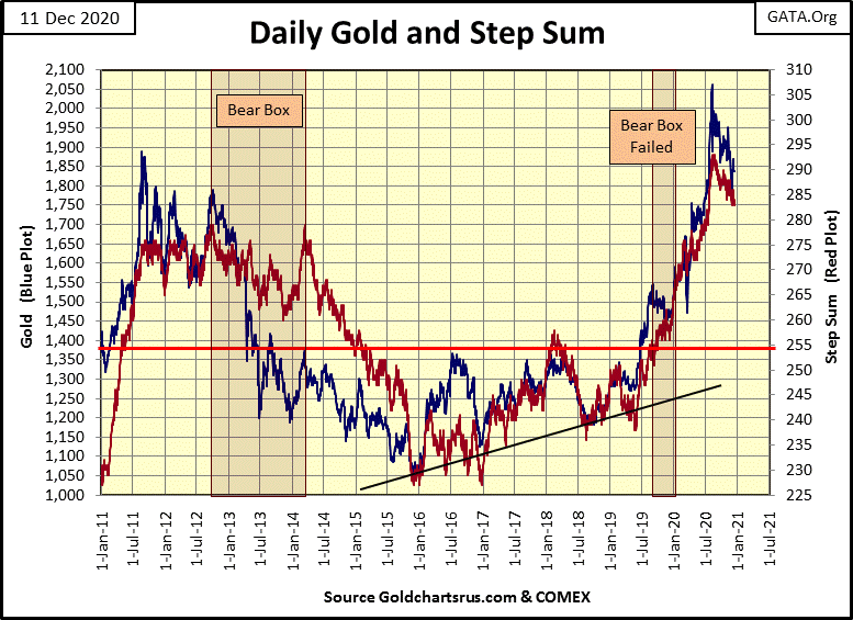
Looking at gold’s step sum chart below, I remain bullish on the gold and silver market. As noted above with gold’s BEV chart, the current correction is the longest and deepest since its December 2015 bottom. But look at what gold and its step sum have done since the summer of 2018 – advanced into record territory. After advancing from $1200 to over $2000, in just two years, a break in the advance is to be expected.
I expect the same will prove to be true for the Dow Jones below after it has advanced 11,600 points (61.61%) in the past ten months. This is not the time to get bullish on the stock market. Anything can happen. Should the FOMC “inject sufficient liquidity” into the market, we could see the Dow Jones above 35,000 before we see any April showers, but I won’t count on that.
So, in anticipation of additional market tops following an amazing 62% advance in the Dow Jones from its March bottom, I’m marking our current top as the second top in a bearish double top chart formation. The Dow Jones may have more to go before this advance sees its ultimate high, but at times such as this one has to be careful of not letting greed cloud your judgement.
In a significant market decline for the Dow Jones, this is exactly the type of market where we should anticipate a big bear box to form in the chart below. Remember a bear box forms because the bulls see every down day as a buying opportunity, and they come back the next day to scoop up the bargains. This is what bulls do during bull markets, and they are rewarded for doing so. But come a market decline, being bullish becomes a very bad habit.
This refusal to exit the market results in the step sum plot (market sentiment) to remain elevated as the Dow Jones valuation plot (market reality) continues to deflate.
At some point, could be months or even years later, the bulls come to their senses and finally accept that it’s a bear market. We can see that exact point in a step sum chart, when the step sum plot finally collapses to recouple with the price plot. This is the point when the former bulls now see every daily advance as an opportunity to SELL.
You can see this exact market phenomenon in gold’s step sum chart above. From 2013 to 2014 the bulls saw each daily decline as an opportunity to buy. Beginning in May 2014 market psychology shifted, where the former bulls saw each daily advance as an opportunity to SELL, resulting in the collapse in gold’s step sum plot. From November to December 2015 selling overwhelmed the gold market, as its step sum plot plunged down to its ultimate bottom.
Is this going to happen with the Dow Jones, my proxy for the broad stock market below? Well, if the bulls now running wild and free on Wall Street believe themselves ten feet tall and bullet proof as Mr Bear comes into the market to claw back market valuations, it sure could.
Gold’s 15 count below saw a -5 on November 30th as it hit the bottom of the move with a BEV -13.44%. Since then, gold has been advancing. Nothing exciting, but I note that after three down days (Dec 8-10), gold refused to break below $1800. I like that. It’s an indication (not the promise) that the bottom of gold’s current correction was made on November 30th.
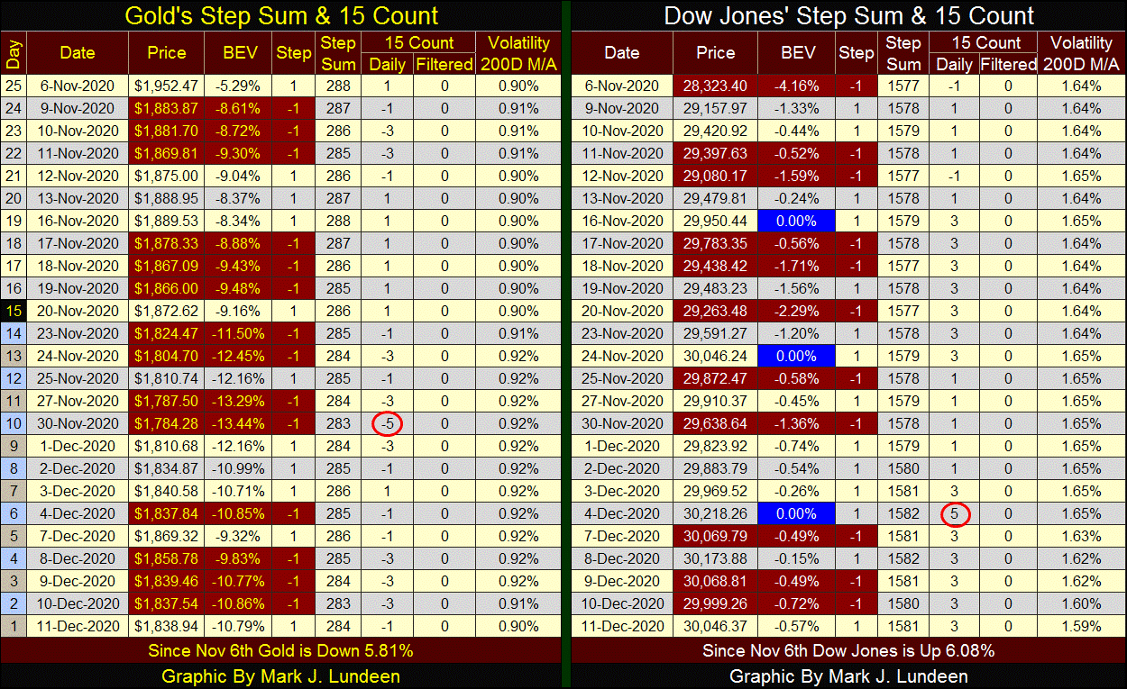
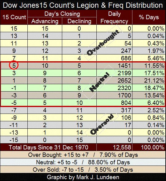
The Dow Jones’ 15 count made a +5 on December 4th as it made its last BEV Zero, and came down a bit since. Here’s the Dow Jones’ 15 Count’s Legion and Frequency Distribution table below, which is very similar to gold’s. A +5 is still considered neutral, but just barely. In a fifteen day sample, seeing only five declining days in the sample means there is a lot of buying happening. Seeing the 15 count come down a bit is not a bad thing to happen in the market.
Note the Dow Jones daily volatility 200 day M/A close the week at 1.59%, down big as all those days of extreme volatility from last February / March are finally exiting the 200 day sample. There were some days last February - April the Dow Jones saw +/-10% daily moves.
Unless the market becomes volatile again, daily volatility for the Dow Jones will continue declining in the weeks and months to come, and that’s good for the bulls.
Is inflation a problem in today’s economy? The answer to that question depends on who you ask. Ask any currently employed economist and most likely they will say no, as they know what the employment prospects are for an economist who would answer yes to that question. The problem with being employed as an economist is that most positions requiring someone with those skills are in banks academia or government; three institutions who benefit greatly from monetary inflation flowing from the Federal Reserve.
Ask that question from a historian, and in most cases I expect they would say that yes; inflation at any time in history has proven to be a problem, a problem that can terminate a civilization.
William Durant commenting on humanity’s first experience with paper money in 10th century China concluded this topic with the following comment:
"Such were the sources of that flood of paper money which, ever since, has alternatively accelerated and threatened the economic life of the world."
-William Durant: Our Oriental Heritage, (1935) pg 780
How should inflation be measured? Modern economics measures inflation by price changes in indexes such as Consumer Prices (CPI) or Producer Price (PPI) Indexes. In effect contemporary economists measure monetary inflation by its effects on prices within the economy. If they were honest, they’d also use the Dow Jones and Standard & Poors 500, as well as rising real estate valuations as inflation indexes too, but they don’t.
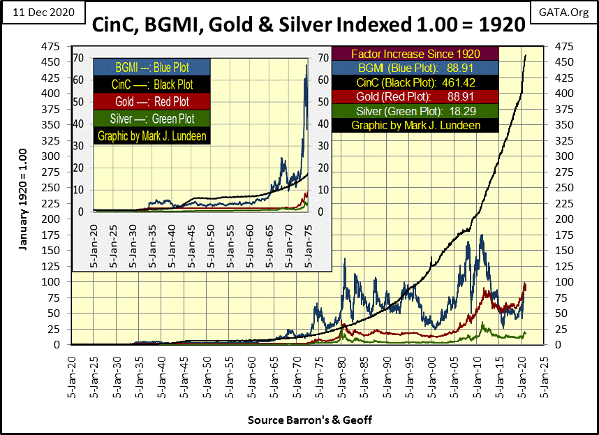
I personally like using Currency-in-Circulation (CinC) as my inflation index as it shows what the “policy makers” are actually doing; inflating the supply of money, instead of the consequences of monetary inflation as seen in CPI, PPI or the Dow Jones.
I have a Collier’s dictionary of the English language from 1924. I looked up the word inflation in it and it wasn’t there. However the word “inflationist” was listed; “one in favor of an increased issue of paper money.” As you’ll see, we’ve had a lot of that in the past ninety-six years.
The chart below plots the indexed values of CinC (paper money), the Barron’s Gold Mining Index, and gold and silver since January 1920. I picked these market series along with CinC as they are known to be inflation hedges. With CinC increasing by a factor of 461 since 1920, they’ve proven to be poor hedges against inflation – so far.
But look at the expansion of CinC since January 2010, its really took off. What’s happening here? Go back and reread my William Durant quote above! This is going to end badly, and as it does at some unknown point in the future; count on gold, silver and the BGMI soaring upward to match the soaring CinC plot.
But keep in mind the “policy makers” don’t inflate the money supply to inflate the value of gold, silver and share prices of their miners. And they control the flow of inflation as they use the banking system as their mechanism to decide where their inflationary dollar, flows to. Do you want to take a margin load to purchase some shares of Amazon, or maybe to buy a house with a mortgage? The banking system is there to help you do exactly that. Tell the banker you want to borrow $250,000 to buy some gold bullion and see where that conversation goes.
So, the banking system increases the money supply to inflate the value of financial market assets and real estate and to generate income for the Federal Government in excess to what its tax revenue allow. But ultimately the banking system does inflate the valuation of precious metal assets, when booming bull markets go bust, and the flow of funds reverse from financial assets towards gold and silver. A significant and prolonged bear market on Wall Street would do wonders for precious metal assets.
Our current bull market in gold and silver began during the 2000-02 NASDAQ High Tech bear market. The old monetary metals once again surged upward during the 2007-09 sub-prime mortgage bear market, and again after last March’s -37% flash crash in the Dow Jones. Gold and silver don’t require a bear market somewhere else in the financial system to see their valuations rise. But a big bear market on Wall Street doesn’t hurt, as historically, flight capital from deflating stocks, bonds and real estate seeks a safe harbor in gold and silver.
But “liquidity” flowing from the Federal Reserve flows into many areas of the economy, including government. In 1924 when dictionaries didn’t feel the need to list “inflation” in their publications, the average American came into contact with few government officials. The only employee from the Federal Government people came into regular contact with was the mailman, with the local police and fire departments involving themselves with citizens.
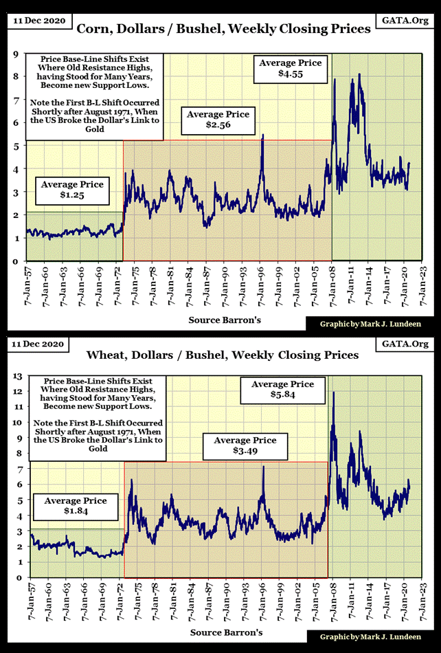
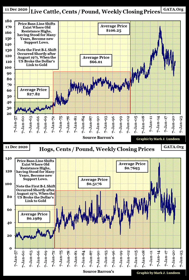
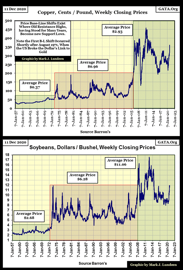
With the vast increase in CinC since 1924, you can be sure many government employees are watching us, as Americans become a “human resource” for government bureaucrats to manage or vaccinate as “policy” requires. But this week I want to look at inflating prices in basic commodities since 1957, to point out something I call Price Base-Line Shifts, where former price ceilings become price floors.
With agricultural commodities, there are many factors fixing their prices; changes in seasonal rain patterns, yield losses due to insect-pest infestations or mold and blight from year to year. But if you look at grain prices going back to 1957, you’ll notice two key years in their price history:
- 1971;
- 2008.
These dates are approximate, but the events that occurred on them have impacted commodity prices.
It’s not hard to imagine why this is so; in August 1971 the US Treasury severed the dollar’s last link to a gold standard, and in 2008 Doctor Bernanke began his quantitative easings (QE #1-3) with Fed Chairman Powell beginning his Not QE #4 in October 2019, a “Not QE” that continues to this day.
As a picture is worth a thousand words, I think it’s best to just publish these charts for my readers to study on their own. But keep this thought in mind; when Mr Bear comes to take Wall Street’s good times away by deflating financial market asset valuations to levels not seen since the depressing 1930s, the deflationary blow back from the stock and bond markets won’t be limited to gold and silver, but also inflate cost of living items such as you see below.
First corn and wheat.
Next cattle and hogs
Here’s copper and soybeans.
Last but not least; gold and silver. Note silver is plotted in cents, as in the 1950s the published price of silver in Barron’s was in cents, but I converted the average prices in the text boxes into dollars.
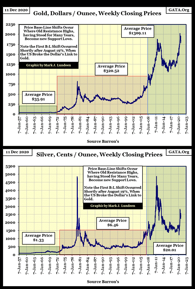
As these chart above make evident, over the decades inflation flowing into the economy has inflated the prices of commodities, but far from the price increases seen in financial asset valuations, or growth in government. But when looking at the lay of the landscape ahead of us; when Mr Bear comes back to clean up the mess currently running riot on Wall Street, the blowback flow of past “liquidity injections” into the stock and bond markets are head straight into commodity prices, which includes gold and silver.
Watch the bond market. When bond yields once again increase towards their pre-2008 levels; all hands brace for heavy rolls to both port and starboard!
No doubt about it, it’s a sad situation we find ourselves in as 2020 draws to a close. But at times like these a little humor goes a long way, so here’s a YouTube video on the shampoo situation at Venice Beach, California, something to cheer everyone up.
https://www.youtube.com/watch?v=oVm7FkQI4BM
Mark J. Lundeen
*********