The Big Three Commodities (Copper, Oil And Gold)
 share
share
 share
share
 share
share
 share
share
 share
share
Today I would like to show you some long-term charts for the big three, Copper, Oil and Gold. There are a lot of similarities between them which is strongly suggesting all three should be in new bull markets. The laggard is gold which has still not confirmed its new bull market but is getting closer as you will see. The key will be what the US dollar has up its sleeves so let’s start with a daily chart for the US dollar.
The US dollar still hasn’t totally broken down yet, but it did have a failed inverse H&S bottom. It was a very beautiful and symmetrical H&S bottom that looked like it was going to reverse the downtrend that is right at a year old now. It had a nice clean breakout above the neckline with a clean backtest from above. All looked good. After a brief rally the US dollar declined once more to the neckline, but this time the neckline failed to hold support, strongly suggesting the H&S bottom was failing.
As we’ve discussed in the past when you see a failed H&S pattern you often times see a strong move in the opposite direction. The rule of thumb is that when the price action breaks below the right shoulder low the failure is complete. The US dollar is still trading slightly above the right shoulder low, but is now getting close to breaking that important low. Note how the neckline reversed its role to what had been resistance during the formation of the H&S bottom, to support once broken to the upside, and then reversed its role one more time to resistance on the last backtest from below.

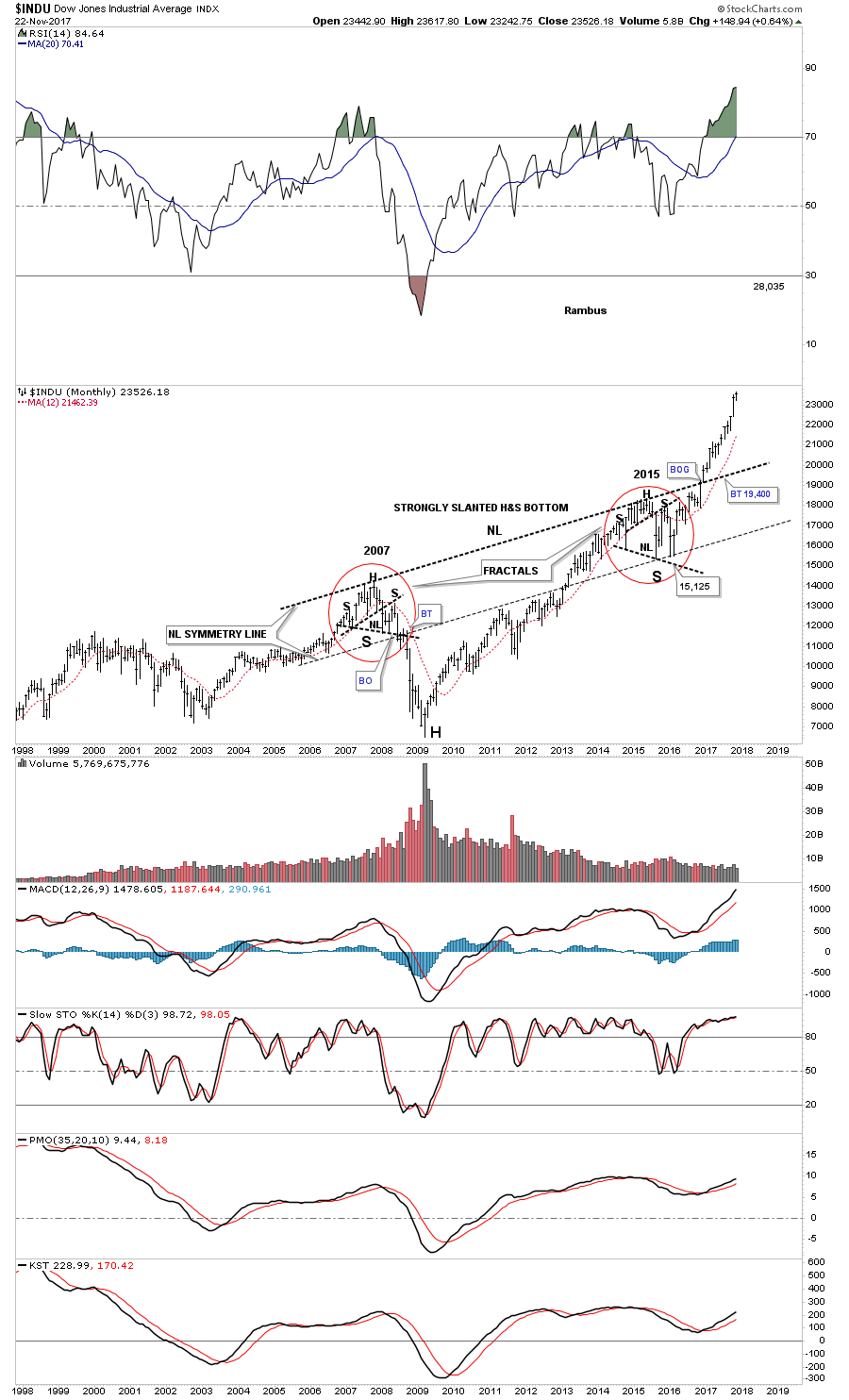
Below is a 20-year monthly chart for the INDU which shows you what can happen when you see a failed H&S pattern. In 2007 that H&S top worked out beautifully, but it was a different story altogether in 2015. The two H&S patterns were about as symmetrical as they could be, but when the price action broke out above the right shoulder high in early 2016, the failure was complete and we have gotten a very strong impulse move in the opposite direction.
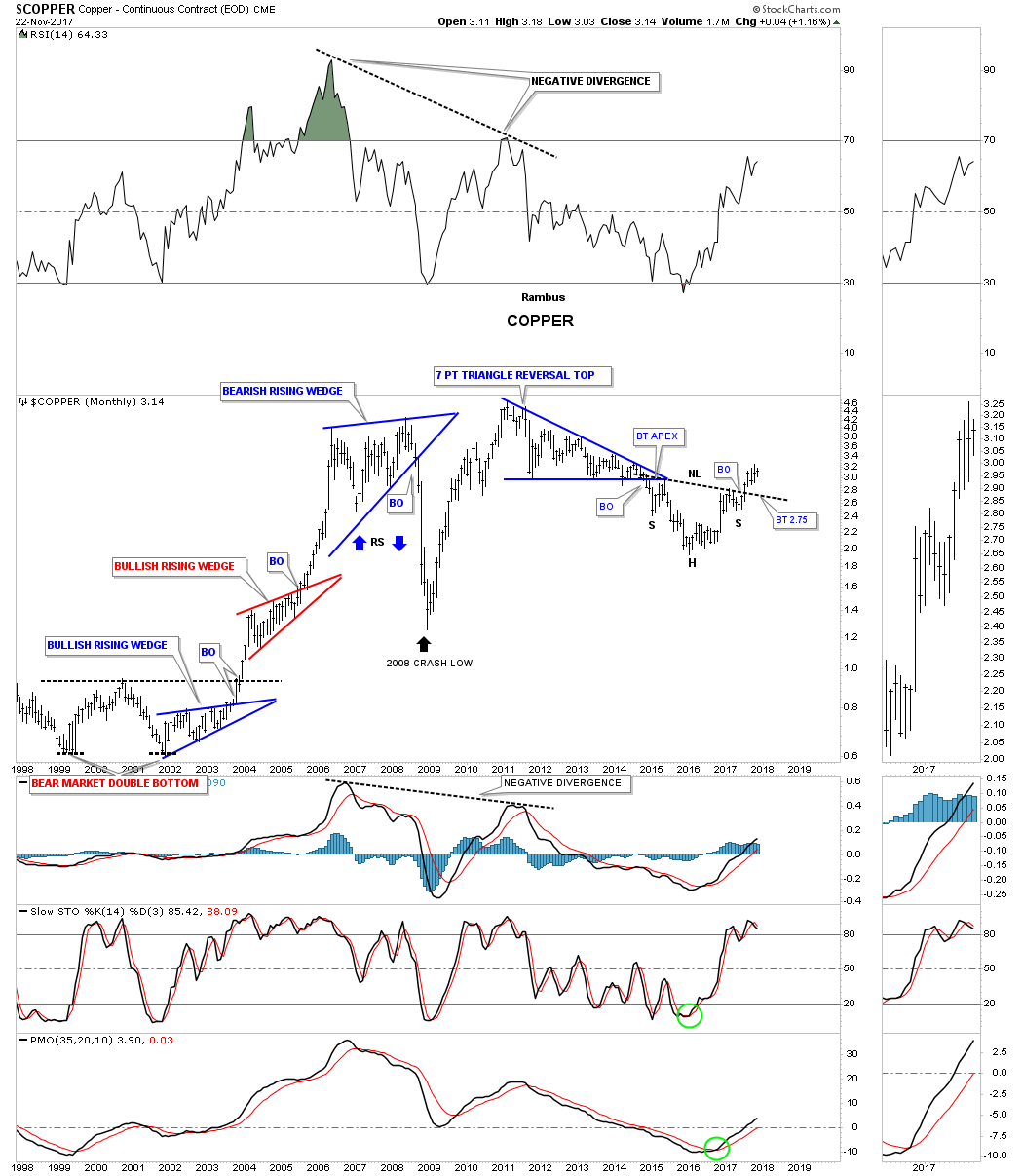
Commodities should enjoy a weaker US dollar as they generally run inverse to each other. About 5 months ago Copper broke out from a very symmetrical H&S bottom on this 20 year monthly chart with no backtest to the neckline so far. There are no rules that says we have to have a backtest, but many time we do.
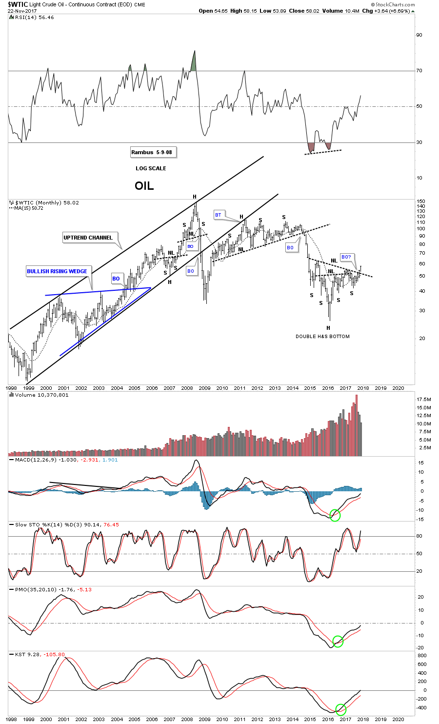
Now let’s take a look at WTIC, Crude Oil, as it has a similar setup to Copper. Copper is a little further along in its breakout move as oil is just now in its second month. For nearly two years oil has built out a double H&S bottom which is reversing the bear market from the 2011 high. This 20 year chart shows you why it’s important to look for H&S patterns at the end of big moves. There was a H&S top in 2008 followed by another one in 2011 and now our current H&S bottom. There was also another important H&S pattern which was a consolidation pattern in 2007 which launched oil on its parabolic ride to 147. When you see a H&S pattern show up on a long term chart you know the move is going to be very large, such as a bull or bear market.
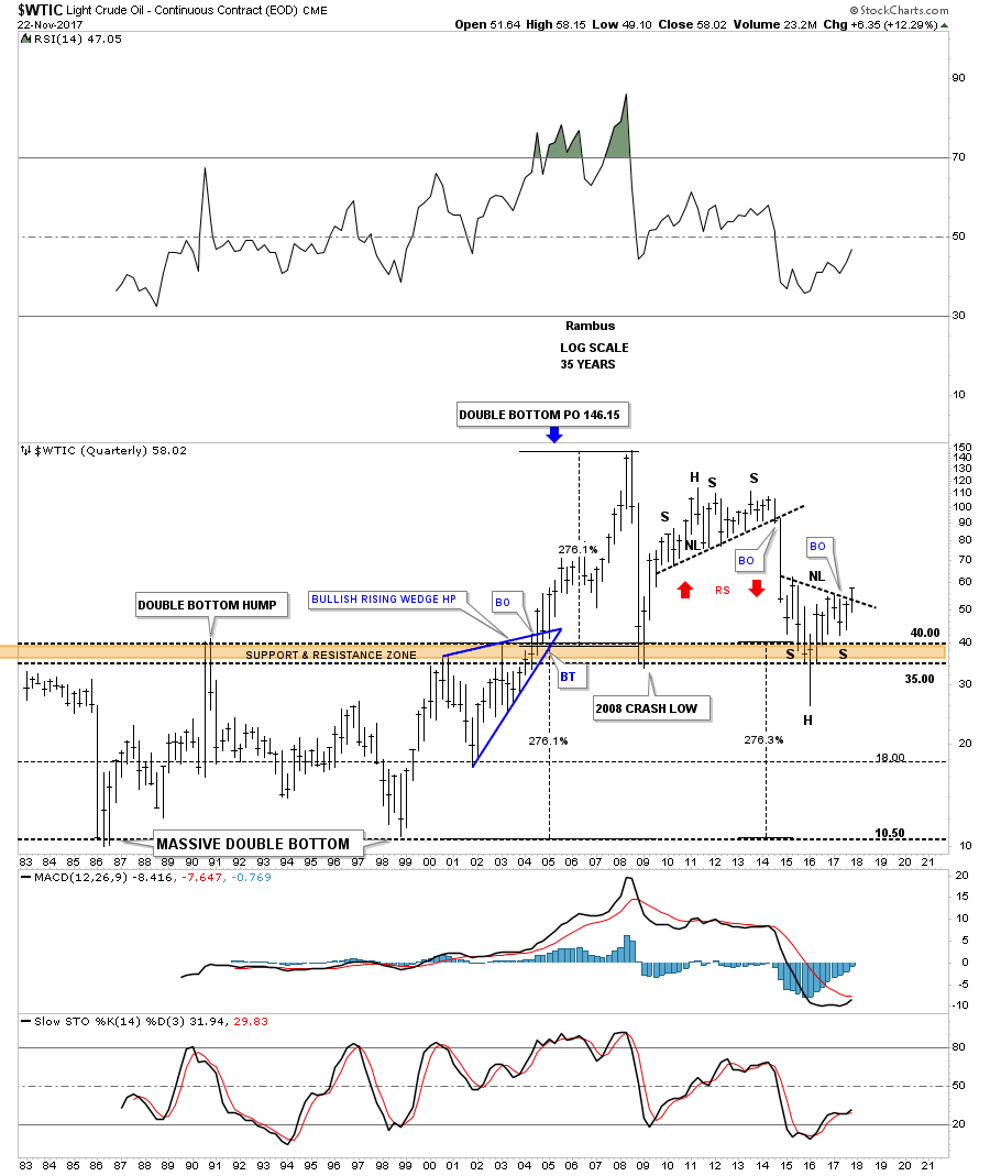
This 35-year quarterly chart for oil shows you how it built out a massive 20 year double bottom. I know it is hard to believe but in 1998 oil was trading down to 10.50 where it put in the second bottom which launched oil to its all-time high at 147. Before oil could breakout of the massive resistance zone between 35 and 40, it built out a bullish rising wedge.
On this log scale chart you can see the double bottom was 276% between the top and bottom. When you add 276% on the breakout it projected a price objective up to 146.
Durning the 2015 crash oil initially fell through the old resistance zone which looked at the time that it could possibly move all the way down to the 10.50 area. Looking back in hindsight now it was just a strong backtest, which left a very long tail on that quarterly bar. Like Copper, this move in oil is just getting started.
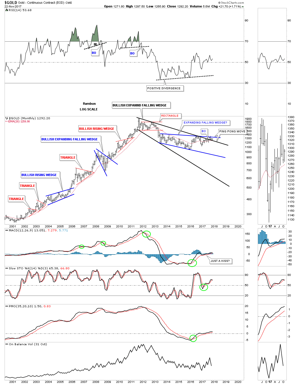
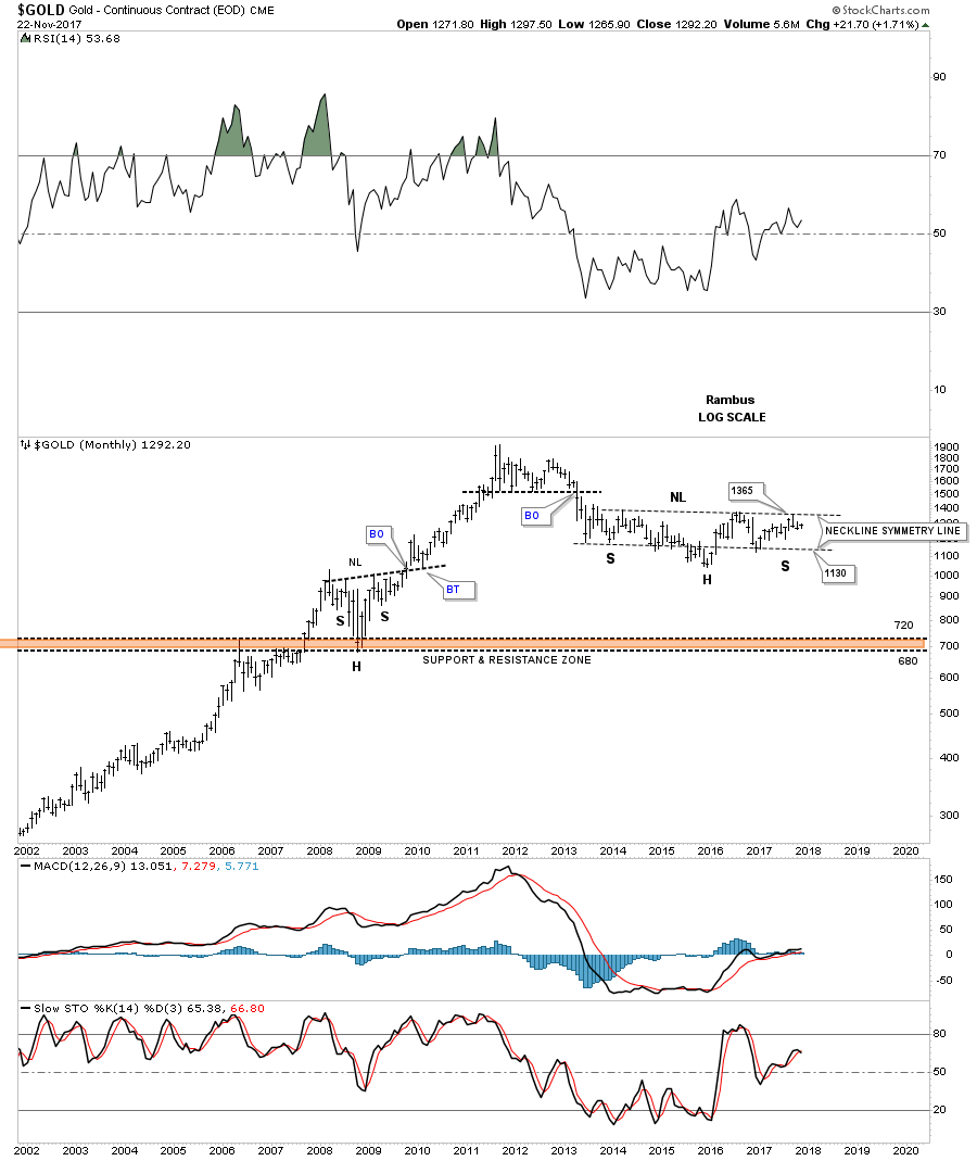
Now let’s take a look at some gold charts we’ve been following. This first chart is a monthly look which shows the beautiful bull market uptrend with one consolidation pattern forming on top of the next. That all ended in 2011 when gold topped out and the bear market began. There are two different long term patterns I’ve been showing for gold. One is the bullish expanding falling wedge which is on this chart, and the other is a parallel downtrend channel. The last time we looked at this particular chart I was showing a possible ping pong move taking place between the top rail of the blue expanding falling wedge, and the top rail of the much bigger black expanding falling wedge. Note the bullish expanding falling wedge which formed during the 2008 crash low.
I’m going to use this weekly chart to show you gold’s 2011 parallel bear market downtrend channel as it’s a little more detailed. This past summer gold finally broke out above the top rail of its bear market downtrend channel. That top rail is the same one as the top rails we looked at on the monthly charts above. It’s only the bottom rail that is angled differently. As you can see gold has been doing a ping pong move between the top rail of the downtrend channel and the old neckline from the H&S top. So far the breakout and backtest is working.
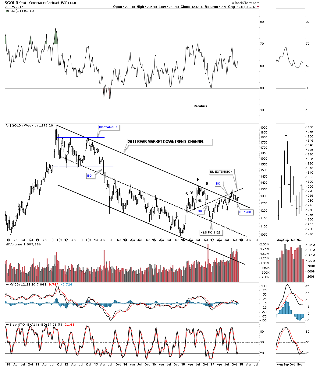
Previously we looked at a big H&S bottom that formed on Copper and Oil which have already broken out. Gold is currently still working on its own H&S bottom if it can breakout above the neckline which would come into play around the 1365 area. It’s pretty symmetrical but I can’t rule out one more move down to the neckline symmetry line at the 1130 area to match the symmetry to the left shoulder a little more closely. The bottom line is that if gold can trade above the neckline it will have a massive base to launch its bull market just like Copper and Oil.
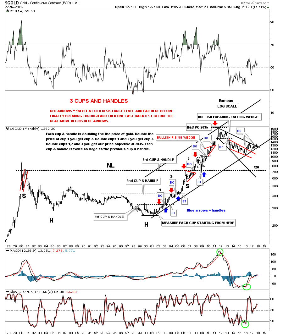
This last chart for tonight is a 40 year look at gold that shows its massive 25-year H&S bottom which launched its bull market. Every time I show this chart I always say it’s a good study in how support and resistance works. The red and blue arrows shows how each cup and handle were broken to the upside with one last backtest before the next move higher, which doubled the previous cup and handle formation.
Also notice how that massive 25 year neckline was initially tested with the red triangle. After the red triangle was complete the breakout finally took place. If you were trading the PM complex back then you know how bad the 2008 crash was which seemed like the end of the world. As you can see the 25 year neckline reversed its role to support during the 2008 crash at the 700 area. That massive H&S bottom had a price objective up to the 2035 area which ended up being about 115 points too high, but for such a massive pattern it was pretty close.
What these big three commodities sectors are strongly suggesting is that the US dollar may be entering into a bear market as commodities are entering into a new bull market. Time will always tell the truth, but that is how it’s looking on this day before Thanksgiving 2017.
*********
share
share
share
share
share
 Meet Rambus, a seasoned trader and technical analyst renowned for his unbiased and insightful chart work. Through his website, Rambus Chartology, and Substack newsletter, Rambus shares his expertise with a global community of subscribers, providing daily updates, commentaries, and hands-on training in the art and science of chartology. With his calm, humble, and down-to-earth approach, Rambus demystifies complex market trends, helping his followers navigate the challenges of today's volatile markets. Join the Rambus Chartology community today and discover a unique blend of technical analysis, trading expertise, and time-tested protocols. Subscribe now at www.rambus1.com or https://rambuschartology.substack.com/
More from Gold-Eagle