Bull Market Or Inflationary Smoke And Mirrors?


This week found the Dow Jones at the same spot as it did last week in the BEV chart below; at a new BEV Zero (new all-time high) as it advanced by 324 points during the week. The bulls must be feeling pretty good, as since November 1st the Dow Jones has made seven new BEV Zeros. And since October 24th the Dow Jones is up by 1,199 points, or 4.5% in less than a month.
* How much longer can this go on? *
I have a new chart below showing the weekly purchases and sales by the Federal Reserve in the Treasury market. A quick look at it shows the Federal Reserve has begun its QE4 since the end of September, though they will not admit it. I’ll save my comments on its effects on the economy and markets until later in this article where I post this chart.
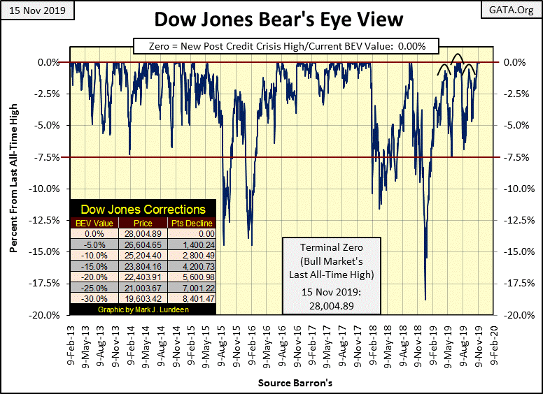
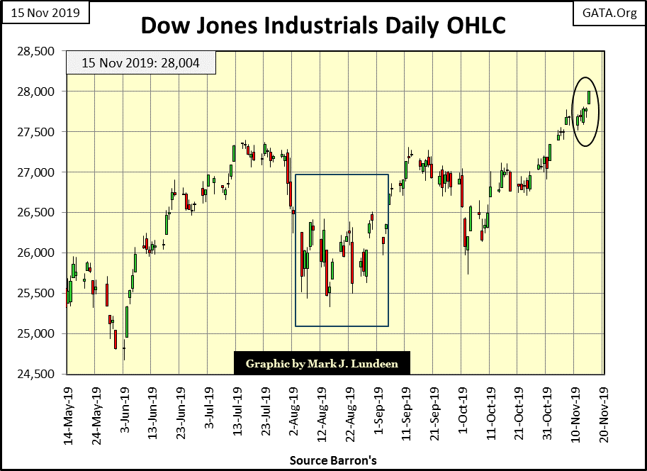
Finally, the Dow Jones is making significant daily gains in its daily bar chart below, closing the week at over 28K, if only by $4.89. I wouldn’t be shocked to see it advance 324 plus next week.
The only thing that could spoil this party for the bulls would be some unexpected market event, for example the failure of Deutsche Bank. Market commentators have been speculating about Deutsche Bank’s failure for years. It has a horrendous OTC derivatives book that should have taken it down long ago, but so far hasn’t. But that doesn’t mean that someday it won’t; possibly someday soon.
Here are some videos on Deutsche Bank, a bank whose liabilities may someday become greater than the GDP of the EU, beginning a train of bank and central banks failures around the world. That would be bad for the bulls in the stock market.
https://duckduckgo.com/?q=deutsche+bank+bankruptcy&atb=v82-1&iax=videos&ia=videos
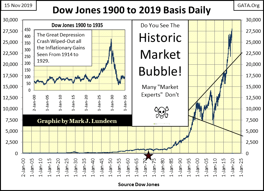
Another view of the current market advance can be seen in the chart below plotting the Dow Jones from January 1900 to the close of this week. The Red Star spots the August 1971 decoupling of the dollar from the Bretton Woods’ $35 gold peg; the world has never been the same since, and not improved for it.
Geeze Louise! Look at what the “policy makers” did to the Dow Jones from its credit-crisis market bottom of March 2009. In the past ten years these monetary maniacs have inflated the valuation of the Dow Jones’ by 21,458 points.
The Dow Jones’ bubble of the 1920s (chart insert) isn’t comparable to what we see below. If in the next year the Dow Jones goes over 30,000, so what? Do you think that would be good? Good Grief! When this bubble begins deflating in earnest, don’t be surprised should gold go over $30,000 an ounce in a very disorderly market.
And don’t think you’re going to just liquidate your stock-market positions one day during a financial panic not seen since the 1930s, and get a position in gold and silver bullion the next. Retail investors will be sidetracked from doing either as Wall Street insiders first take care of themselves.
People forget, but I don’t how as the NASDAQ bubble was deflating in 2000 retail investors called their brokers to sell, only to have their brokers NOT pick up the phone. So what if trading todays is mostly done on computers, what are people going to do when their broker’s computer system is down as sell orders overwhelm it?
Here’s what makes a financial panic a financial panic – in a market meltdown EVERYONE is in a panic to sell, while NO ONE is buying. If the sub-prime mortgage crisis didn’t become a financial panic, it was only because the Federal Reserve itself in 2008-09 was willing to be the buyer of last resort, using its Quantitative Easings #1 to 3 to fund its purchases. Is that possible today? Possibly, but the members of the FOMC would realize that doing so today may be suicidal for the Federal Reserve.
Next is how the major market indexes I follow traded last week; really good. Eleven of them closed the week at a new all-time high, with four more of them in scoring position (within 5% of a new all-time high).
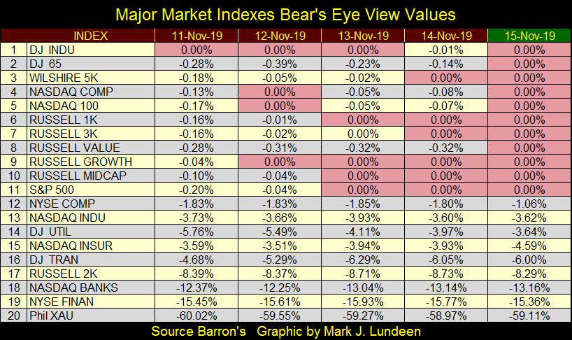
I’m keeping an eye on the NASDAQ Banks (#18) and the NYSE Financial (#19) Indies. If something like a default by Deutsche Bank were pending in the background, yet not reported on by the financial MSM, we should see these Indies come under some selling pressure first.
I also included the XAU, an options index for precious metals mining companies that trades at the Philadelphia Options Exchange. One of these days the gold miners are going to make their move and I want to see exactly when.
I got the XAU data set from Nick Laird of Goldchartsrus.com.
Nick was a shrimp boat captain who shrimped the Coral Sea some decades ago; he then hurt his back on the job and had to find something else to do. Like me, Nick is a data hound, and over the years has compiled an amazing body of market data which he offers for sale to the public at low, low prices. Data that is not only very useful to investors, but is also never offered to the public by Wall Street firms or the MSM. If you like my long-term charts in the markets, that’s the type of data Nick has for sale.
If you’re interested in keeping a data set for this, that or some other market or economic series; give Nick’s site a look.
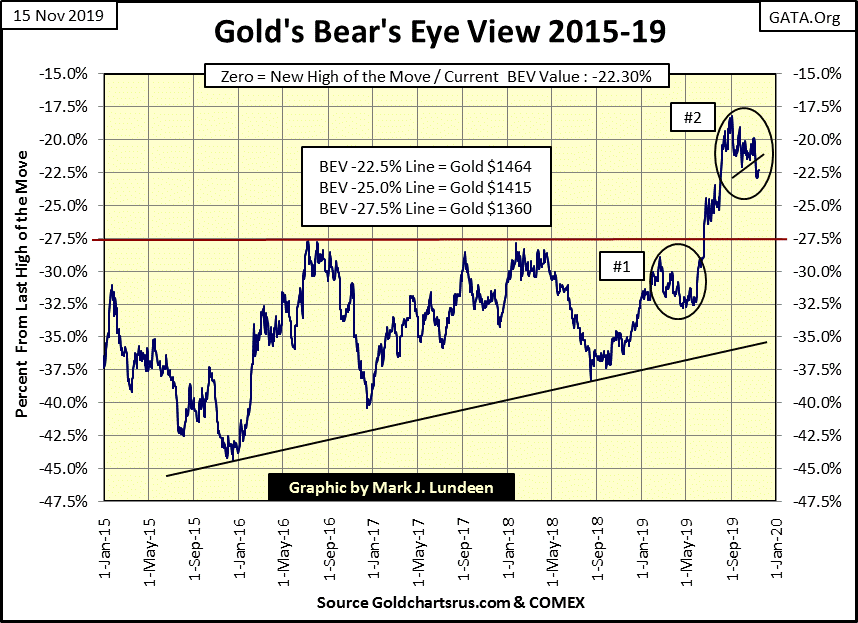
Gold is actually holding up pretty good in its BEV chart below considering the huge COMEX Open Interest now in the market, plus it’s now in a bear box that began in early September.
Here’s the chart of gold with its COMEX open interest. The big banks keep selling paper gold (shorting the gold market by the ton) with gold that they don’t have and will never deliver to the market.
In early September their selling halted the advance in gold that began in early summer, yet three months later the price of gold is still hanging on, preventing the banks from liquidating their short-contracts at a profit. How many more COMEX gold contracts must they sell before they break this advance and push the price of gold down to much lower levels?
Look at the summer of 2016 to see what the big shorts want to happen now in 2019.
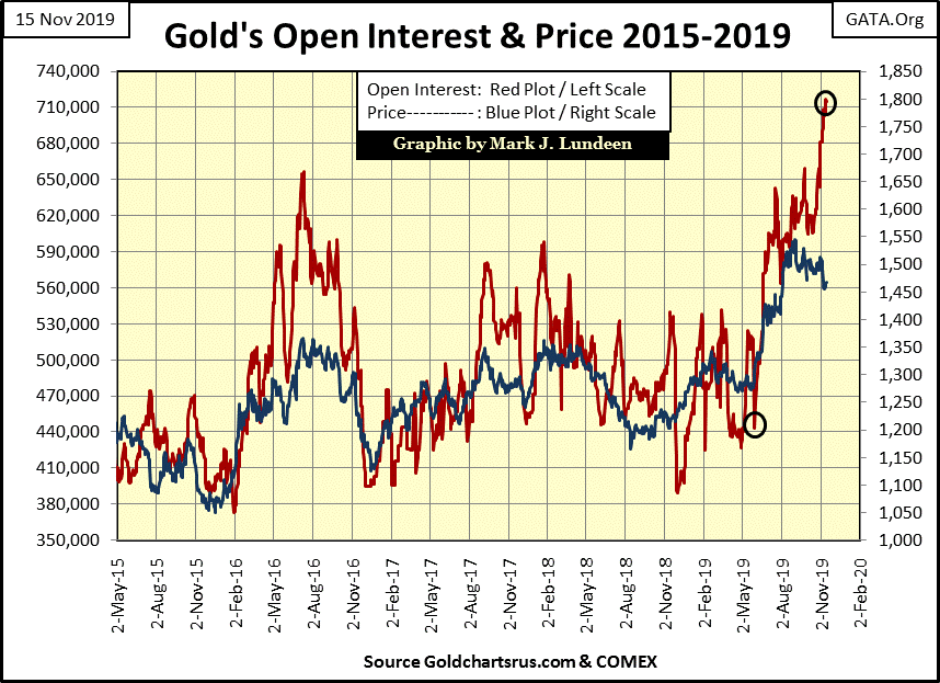
Bill Murphy of GATA had some interesting insights on the COMEX Open Interest situation on Thursday in his Le Metropole Café’s Midas Comments:
“After all these years of tabulating open interest changes, it is only natural to be all over what is going on in gold at the moment, which, as mentioned, is historic. James Mc covers what is happening better than anyone. Curiosity might have killed the cat, but it can’t be helped when it comes to the preliminary open interest numbers. Would the gold OI continue to surge in light of yesterday’s move higher? The early answer from James…
Amazing
Prelim. gold OI +9,250, total OI now 717,713. The 1k of shorts per $1 of gold gain did it again. Just what the hell is going on here? Who are these fearless long players? Why isn’t the CME raising margins on them as well? It must be a BIG Sovereign to take on such massive risk, knowing what the cartel always does to hapless spec longs.”
- Le Metropole Café’s Midas Comments 14 Nov 2019
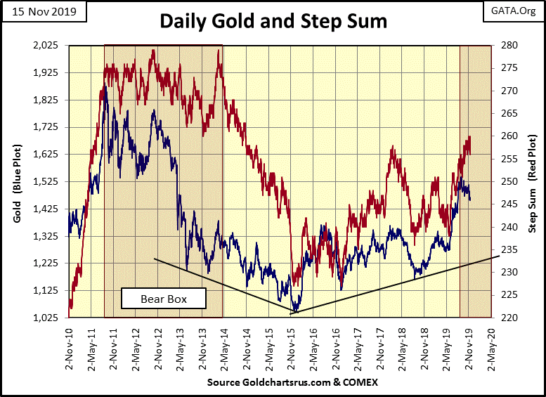
Next is gold’s step sum chart, and in mid-November the bear box gold that has been gestating since early September is now on full display. What does this bear box tell us? That the bulls believe the current decline in the price of gold is only a correction in the market, so daily market declines are seen by the bulls as buying opportunities.
But the thing about bear boxes is that typically it’s the bears that have a better understanding of the market, which in gold’s case are the big banks you see flooding the gold market with tons of phantom gold (Red Plot) in the chart above.
Step sum bull and bear boxes don’t always form at significant market tops and bottoms. When they do these step sum boxes can continue for years, but most don’t.
The thing to watch now is how much more phantom gold these banks flood the market with. If they can overwhelm COMEX demand for gold, the price of gold will begin to collapse, and the bulls will stop seeing down days as buying opportunities (buying on weakness), and begin using advancing days as selling opportunities (sell into strength) causing the step sum to collapse as it did in 2014-15.
Note how during the 2014-15 collapse in the step sum, that most of the market decline in the price of gold had already occurred. That too is very typical of bear boxes.
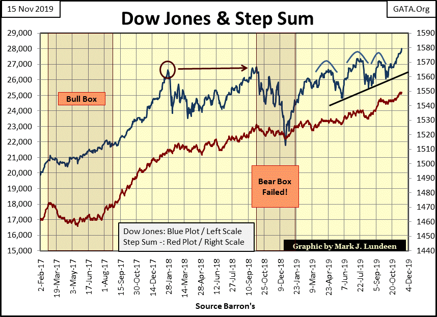
Here’s the step sum chart for the Dow Jones. Both market reality (Blue Price Plot) and market sentiment (Red Step Sum Plot) are now advancing. Since the Dow Jones’ January 2018 market top (Red Circle) it’s been a rocky road for the bulls. But deep down inside they know one eternal-market truth, or a something that’s been true since August 1982 – that the stock market always bounces back.
Look at the 18% market correction of last December and the step sum’s reaction to it. The bulls were never fooled, not for a moment did they even consider that the market was at the edge of disaster. As far as they were concerned, that bear box deserved to die a shameful death. And now a year later it’s – yee ha, off to bigger, better and much higher new all-time highs!
Well I can’t argue with success, especially with a stock market that has now been advancing for thirty-seven years. So to the bulls all I have to say is have fun. Yet no market advance lasts forever, not even this monster of an advance.
In gold’s step sum table below, downward pressure being applied to the price of gold can be seen, as is its stubborn step sum which closed the week at 260, its highest level since 2015. Gold’s 15 count since October 14th has remained between +3 and -1, which tells us that gold is neither over bought or oversold, which suggests the current trends in the price of gold and its step sum should continue for the foreseeable future.
What’s really needed in the gold market is a big jump in its daily volatility. When its volatility’s 200Day M/A increases above 1.00%, the advancing gold and silver markets will be one of the main topics of discussion in the financial MSM. But that isn’t going to happen as long as the current advance in the Dow Jones continues.
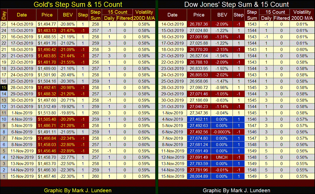
Look at that solid block of blue and red on the Dow Jones’ side of the table. Geezers? Who’d call these bulls anything but animals running wild and free?
The interesting thing about this block are the down days (Red). One of them saw the Dow Jones down by only seven pennies, the next was unchanged from the day before (UNCH) and the latest saw the Dow Jones down by only $1.63. Before 1970 when the Dow Jones traded below 1000, these daily declines would be seen as normal. Today with the Dow Jones valued at over 27,300, these daily claw-backs by Mr Bear are pathetic.
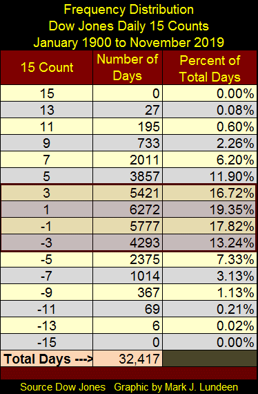
The 15 count for the Dow Jones has been at a +5 for the past six days. Should the Dow Jones only see only daily advances for the next week, its 15 count will increase to a +9 by next Friday. I don’t think that is likely as the higher the 15 count goes, the more pressure for a market series to correct, and a +9 is very high for a 15 count.
Since January 1900 it’s happened only 733 times (see table below), and unless the Dow Jones was ordained to see an even higher 15 count, the market was due for a short-term correction.
What does the Federal Reserve do? One thing it does is to create dollars from nothing with which it purchases other people’s liabilities, usually Uncle Sam’s in the Treasury bond market. However it can also “monetize” mortgages or junk bonds if it wants to. Doing so creates demand in the bond market which raises bond prices and lowers bond yields as it “injects liquidity” (monetary inflation) into the financial system. Flooding the financial system with “liquidity” also “stimulates” the economy and results in bull markets somewhere in the markets. This is how financial booms are created.
The other thing the Federal Reserve can do is to sell the bonds it has in its portfolio, purchased as described above. This creates supply in the bond market which lowers bond prices and increases bond yields. This is how the FOMC withdraws “liquidity” from the financial market, which results in recessions in the economy while pricking any financial bubble it inflated during the above boom time.
So, given two choices of how to operate; boom or bust, why doesn’t the FOMC just purchase bonds which it never sells to fund a permanent boom-time economy and financial market? Because there are consequences having an economy fueled by “liquidity” flowing from the Federal Reserve; today’s homeless living on the streets of our cities is a direct result of “monetary policy” as executed by the FOMC.
Demand in a market is seen as a flow of dollars towards something for sale in a market, say like demand for housing. When the dollar was restrained by the Bretton Woods $35 an ounce gold peg, the supply of dollars flowing into housing was constrained by the limited supply of dollars-in-circulation – limited to the income of prospective home buyers. Price housing higher than demand could afford, and the seller was left without a buyer.
With the Federal Reserve now managing the markets by inflating the money supply, that’s all changed and changed for the worse. Demand; dollars for housing is no longer limited to what prospective home buyers can afford, but how many dollars the Federal Reserve has to “inject” into the mortgage market to “support real-estate market valuations.”
Before August 1971, when the US Dollar was taken off its $35 gold peg, to have seen as many homeless as we see today would have also seen collapse in demand for housing and home prices. That is exactly what happened in the 1930s.
Twenty years ago I went to a private library to gain access to old Barron’s issues for their market data. They had the actual issues of Barron’s on hand bound in annual volumes. An issue from 1941 (as I recall) had an ad for a ten acre plot with a view of Thomas Jefferson’s Monticello in Virginia. It had a multi-bed & bathroom main home, guest house and a stable for ten or so horses; all for around $40,000. What a deal! Then I saw the note at the bottom of the ad; all this was constructed in 1929 for $1,000,000. Twelve years later this fantastic-residential property was selling at a 96% discount in a market with few buyers.
The Federal Reserve is doing everything necessary to insure that doesn’t happen today. And the more the FOMC “supports real-estate valuations”, the greater the supply of citizens whose income can’t compete with the FOMC in the housing market, and so are forced to live on the streets.
Let’s take a look at the Federal Reserve’s balance sheet below. Blue Plot is the Fed’s portfolio of US Treasury debt. The Red Plot is US Treasury Debt + everything else, but everything else is mostly mortgages.
The FOMC’s first dive into the mortgage market occurred in early 2008, where it swapped its US Treasury Debt for Wall Street’s toxic mortgages to save the banks, the same banks that were driving the cost of housing up beyond what wage earners could afford.
Had the Federal Reserve NOT DONE THIS, housing prices during the 2007-09 sub-prime mortgage debacle would have crashed, and so would have the global banking system. The post 2009 world would have been a repeat of the depressing 1930s. We wouldn’t have seen what we have now in San Francisco and elsewhere; billionaires with more money than they know what to do with as the number of homeless increase as the clueless MSM wonders where all the homeless are coming from.
I can tell them; hundreds-of-thousands, and possibly millions of people today are living wretched lives on the street so that decades of inflationary valuations in the real estate market can be preserved.
In the plots below Doctor Bernanke’s QE1-3 are very apparent with the FOMC gorging on Treasury debt and mortgages from 2009-14. From 2014 to 2017 the FOMC limited its purchases, but beginning in January 2018 the Federal Reserve began to sell bonds and mortgages, withdrawing “liquidity” from the financial markets.
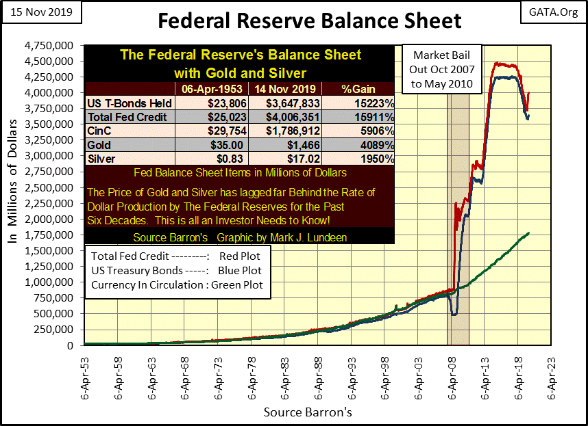
As promised at the start of this article, below I took the weekly changes in the Federal Reserve’s holdings of US Treasury debt going back to January 2016, and it provided a real insight to our current market.
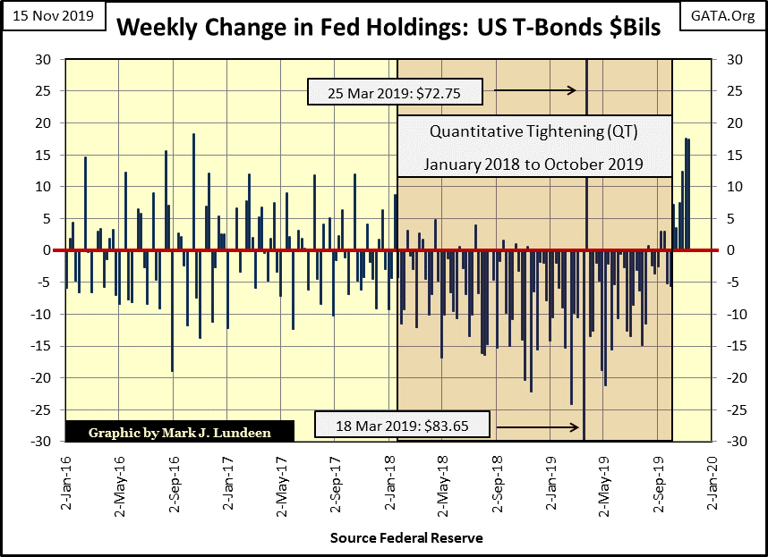
Go back and take a quick review of the Dow Jones and its step sum, note the date when the post 2016 election bull run stopped (Red Circle on that chart), January 2018, exactly when the FOMC began its Quantitative Tightening (QT) above. And when did the Dow Jones once again began to advance? At the end of September, exactly when the FOMC once again began “monetizing” Uncle Sam’s IOUs in the Treasury market. It’s all just inflationary smoke and mirrors, and it will not end well.
I want to see some action. Trump needs to pardon Stone and others caught up in Mueller’s snare and begin prosecuting Bill and Hillary and the host of other establishment criminals who have for too long sold out America for their personal profit.
Mark J. Lundeen
*********


