The Chartology of Deflation


 About a month or so ago I started posting regularly on the possible inflection point I was seeing in regards to the deflationary trend that has been on -going since 2011. As you know stocks move from a reversal or consolidation pattern in an impulse move which is much different than a sideways chopping action of a reversal or consolidation pattern. Impulse moves are the stored up energy that is released once a reversal or consolidation pattern is finished doing its job. About four weeks ago it looked like the most recent consolidation phase was coming to an end which would then leave the door opened to an impulse move.
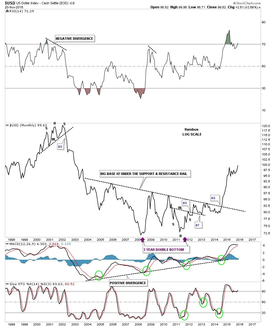
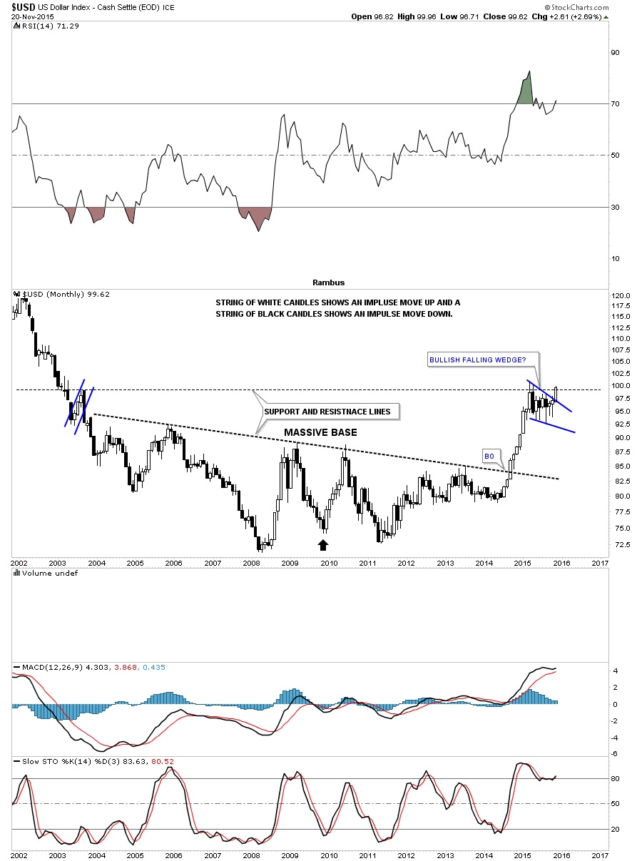
At the first writing of the possible inflection point the US dollar was still trading within the confines of its possible bullish falling wedge which I viewed as a consolidation pattern to the upside. Shortly after that first post on the possible inflection point the US dollar broke out of its bullish falling wedge and is now approaching its previous high just above 100 or so. The US dollar is the key driver for this deflationary spiral that has been in place for over four years now with no light at the end of the tunnel for the commodities complex yet.
You’re probably getting tired of all the post on the US dollar but this is where the truth lies in regards to the falling commodities complex. Without a rising US dollar the deflationary scenario would not have a chance of playing out. Some of the more important commodities have now started their next impulse move lower which could very well be the capitulation phase where the baby is thrown out with the bathwater. If this is the beginning of the capitulation phase it should be relentless in nature whereby investors just throw up their hands in disgust and exit their positions at any price.
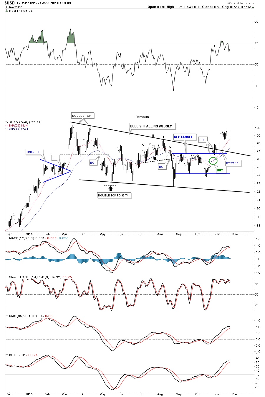
The first chart of many tonight is a short term one year daily chart for the US dollar that shows the bullish falling wedge in detail. The breakout was just a tad on the sloppy side but the top rail of the blue rectangle that formed out toward the apex, held support which has led to the current move higher. As you can see the price action is approaching the high made back in March of this year which the US dollar will need to take out to confirm then next impulse move higher is truly underway. So far so good.
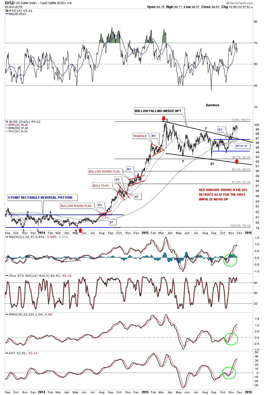
The longer term two year daily chart for the US dollar shows the previous impulse move up out of the five point blue rectangle reversal pattern in 2014. That impulse move created three smaller red consolidation patterns which is what one likes to see during a strong impulse move.
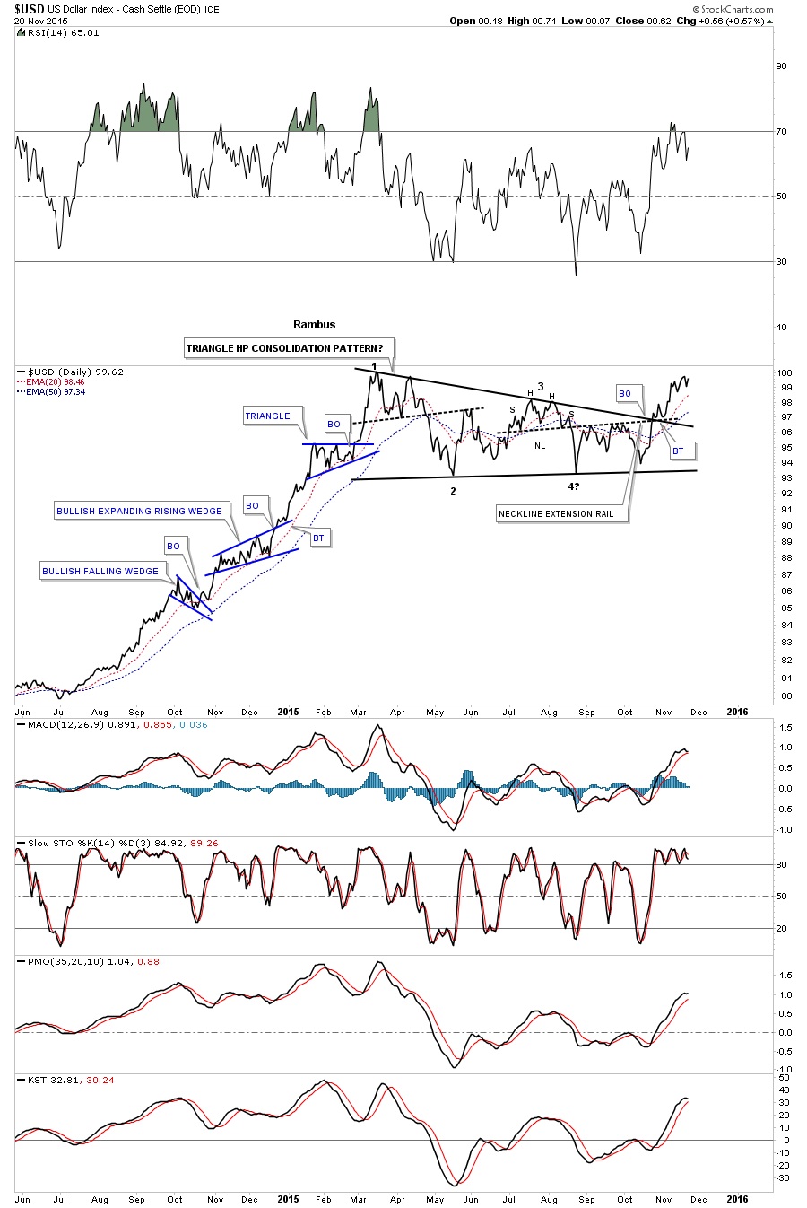
Below is a daily line chart which shows the previous impulse move up with a nice clean breakout and backtest of the bullish falling wedge. Again you can see the three smaller blue consolidation patterns that formed in that strong impulse move up.
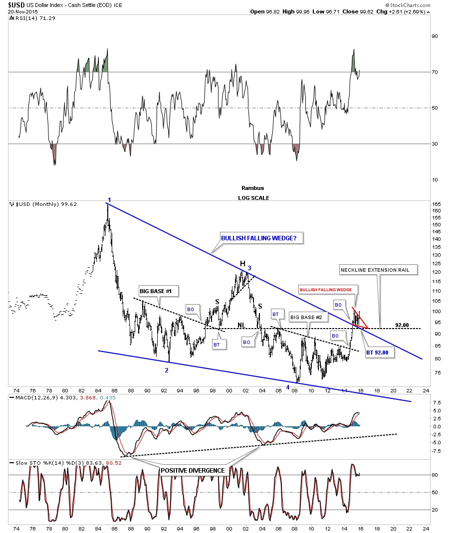
This next chart is a 30 year monthly bar chart I showed you many times once the top rail of the blue bullish falling wedge was broken to the upside. This chart is a very important to understanding the longer time view. Note the breakout and backtest to the top rail of the 30 year bullish falling wedge which shows the small red bullish falling wedge which is the same falling wedge we just looked at on the daily charts above. Pieces of the puzzle.
This next chart is a weekly combo chart which has the US dollar on top and gold on the bottom. Note how close the US dollar is to testing its recent high while gold is testing its recent low. If the US dollar is getting ready to breakout to a new high then it stands to reason that gold will break to new lows as the inverse correlation comes into play.

If the US dollar can close out the month of November right where it’s now it will be at a 13 year high on the long term monthly line chart and a new high for its bull market.
Lets look at one last chart of the US dollar which is the monthly candlestick chart. This chart clearly shows that when the US dollar is in a strong impulse move up it will produce a string of white candlesticks and when it’s in a strong impulse move down it will form a string of black candlesticks. The previous impulse move up created nine white monthly candlesticks in a row.
If the US dollar is breaking out of a bullish falling wedge then there is a good chance that the $XEU is breaking out of a similar pattern only in the opposite direction. The long term monthly chart for the $XEU shows this to be true.
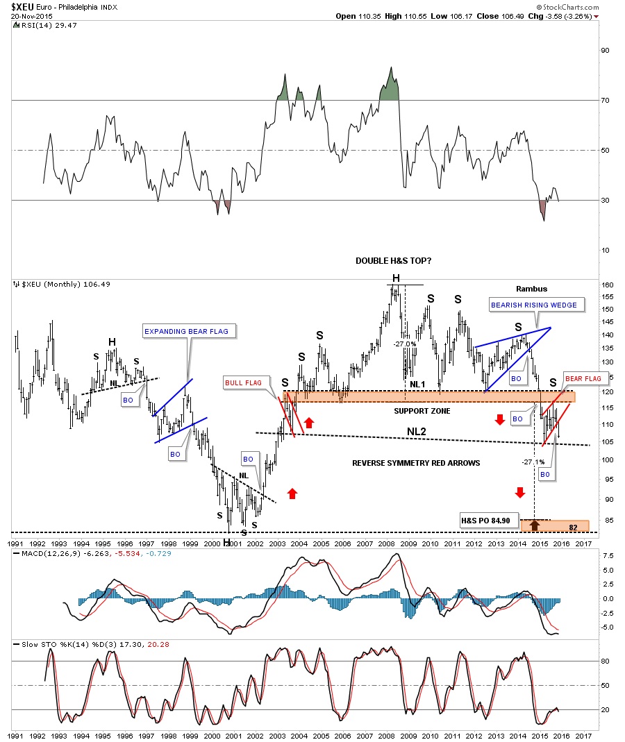
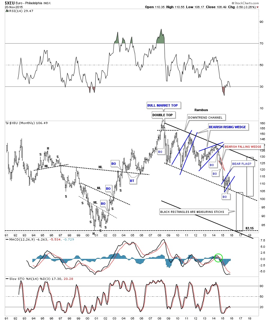
The long term monthly chart for the $XEU shows a different pattern that has the same implications as the chart above if it breaks below the black dashed down slopping trendline which would be showing us this latest impulse move down is just halfway finished.
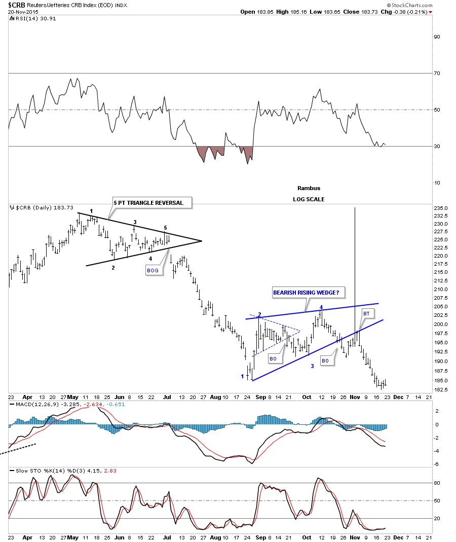
If the US dollar is showing strength in here then we should see some weakness in some of the commodities indexes. The daily chart for the $CRB index shows it has broken down out of the blue bearish rising wedge complete with a backtest.
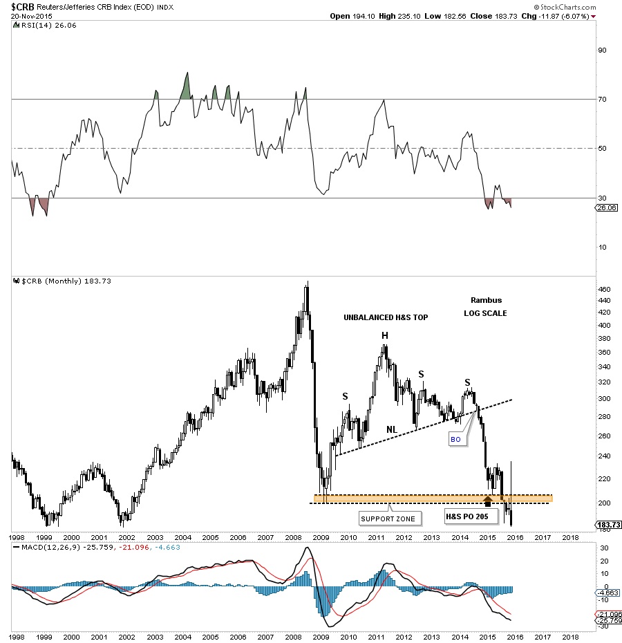
The monthly chart for the $CRB index shows it has broken down below the brown shaded S&R zone with a backtest to the underside currently testing its bear market lows.
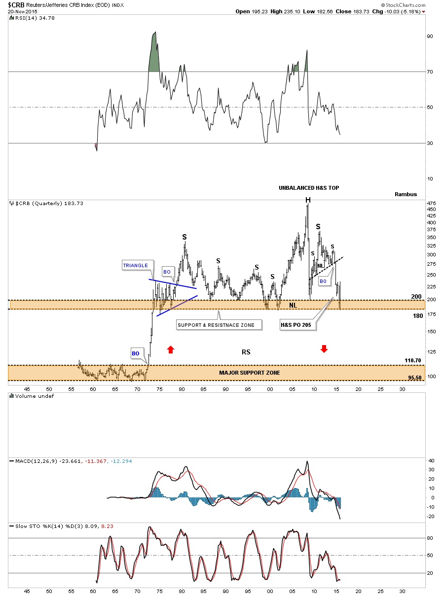
The very long term 60 year quarterly chart for the $CRB index now shows how close it’s to breaking below the brown shaded support and resistance zone going all the way back to the early 1970’s. That’s pretty incredible when put it into perspective.
After breaking out from a five point black triangle reversal pattern as its bear market top the $GNX has created one consolidation pattern below the next showing us its bear market is still intact.
********
 Meet Rambus, a seasoned trader and technical analyst renowned for his unbiased and insightful chart work. Through his website, Rambus Chartology, and Substack newsletter, Rambus shares his expertise with a global community of subscribers, providing daily updates, commentaries, and hands-on training in the art and science of chartology. With his calm, humble, and down-to-earth approach, Rambus demystifies complex market trends, helping his followers navigate the challenges of today's volatile markets. Join the Rambus Chartology community today and discover a unique blend of technical analysis, trading expertise, and time-tested protocols. Subscribe now at www.rambus1.com or https://rambuschartology.substack.com/


