Current Evaluation Of Stock Prices, Gold Price And Oil Price


SPX: Long-term trend - Bull Market
Intermediate trend - Is the 7-yr cycle sketching an intermediate top?
Analysis of the short-term trend is done on a daily basis with the help of hourly charts. They are important adjuncts to the analysis of daily and weekly charts which ultimately indicate the course of longer market trends.
SHORT-TERM DOWNTREND
Market Overview
After finding support at 2040 on 3/11, SPX started a rally and appeared to be on its way to making a new all-time high, but that was not to be. The uptrend fizzled five points short of the former high, and three straight days of selling resulted in a 70-point loss. The fact that the index could not make a new high -- followed by a correction of this magnitude -- could have some significant implications for the longer-term trend, especially if the decline has farther to go which seems likely.
After making a low at 2045 late Wednesday, the index started an oversold bounce of 22 points which took only four hours to complete. After that, it went to sleep and stayed in a narrow trading range for the rest of the week. Even the fact that Janet Yellen was scheduled to speak at 3:45 Friday had no material effect on prices. This has all the earmarks of a consolidation in an incomplete downtrend, and an extension of the decline appears likely. We should not expect a major correction, however. There is no indication that the market is ready for that, but another 50 to 100-points pull-back would not be surprising.
Indicators survey
Weekly and daily momentum indicators are in a sell mode and the hourly oscillators look just about ready to cycle down.
The Summation Index (chart below courtesy of StockChart.com) gives us a good perspective of the weekly breadth. Since its recovery from the October low, it has remained positive, but in a much lower range than previous ones of the past three years. The long-term deceleration process is similar to that exhibited by the weekly price MACD, both representing a weakening long-term trend. Near term weakness is also evidenced by the fact that the last peak in the SPX hardly shows on the NYSI or its indicators. Since neither the RSI nor the MACD are oversold, there is plenty of room for lower readings in the next couple of weeks.
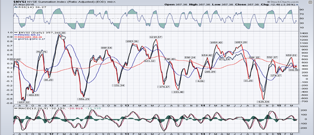
On the P&F chart, it looks as if only the first phase count has been filled. Longer counts which could produce some additional decline are still in place.
Chart Analysis
The daily chart (courtesy of QCharts.com, as well as others below) shows the price action going back to the peak just prior to the October low. The trend line from that low provided support for the former correction, but last Thursday, it was breached by a good margin. Furthermore, Friday’s action looks like a back-test of the trend line. We’ll have to see if, on Monday, there is enough strength in the index to get back above the trend line or if we roll over from Friday’s close.
The decline sliced through the15,30,60 and 90 DMAs in one fell swoop. Next in line is the 120 DMA (purple) and 200 DMA (red). If we keep declining, it is likely that one of these will provide support and arrest the downtrend, at least tempoarily. However, if we break below both, we could easily continue to the bottom of the red channel! In fact, there is a combined Fibonacci and a P&F projection which has the potential of dropping the index down to that level.
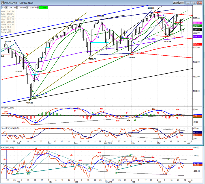
All three oscillators have made bearish crosses and are negative. The two lower ones are also far from being oversold. Until they show a more favorable pattern, the index is not ready to turn higher.
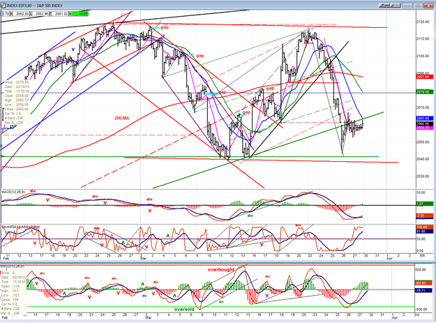
The hourly chart, shows the steepness of the decline, practically all the way down to the previous lows. Starting a decline with such downside momentum is usually the characteristic of longer- lasting weakness. In addition, the move has broken below the trend line and the price’s inability to close back above it during a two-day period suggests that this is only a back-test of the broken trend line.
In spite of the feeble bounce (about a 31% retracement), the two lower oscillators are already showing signs of wanting to roll over, and the MACD has remained essentially flat at its low point.
This could turn into a bottom if the next decline stops one more time at the support line and builds a base (as did the mid-month drop). We’ll soon find out! Considering the positions of the oscillators, it should not take too long for the index to re-test its low.
Another possible scenario would be for price to find support just below the former lows, on the red parallel to the line drawn across the two tops. But if that line is broken, it could turn out to be the mid-point of the wider channel. It’s helpful to know what the most likely possibilities are, and let the market tell us which one it favors.
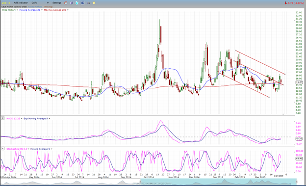
VIX (NYSE Volatility Index) - Leads and confirms market reversals.
For the past few weeks, VIX’s behavior has been pretty much in sync with the SPX and has not given us advance notice of any short-term move in the market. I did point out last week that the long-term pattern of the VIX is tracing out a rounding bottom, which would justify the expectation of a rounding top in the market.
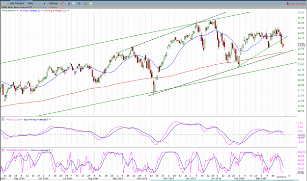
XLF (Financial ETF) normally leads the market at important tops.
The XLF retains its longer-term divergence with the SPX but it is not sending clear signals about the near-term, except perhaps in its oscillators which are bearish and appear to be calling for more weakness ahead. The index has challenged its 200 DMA twice since October. It may be ready to do it again.
UUP (dollar ETF)
UUP is undergoing its most significant correction since emerging from its base. Still, taking the longer view, it is a very minor correction which does not, at this time, suggest anything more than a brief interruption of its upward path.
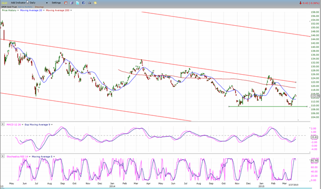
GLD (Gold trust)
The pause in UUP has helped GLD to hold at the level of its previous low and bounce. With the 25-wk cycle expected to bottom in early May, there is no assurance that the gold ETF will be able to hold this level for the next few weeks.
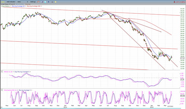
USO (US Oil Fund)
USO made a new low before breaking out of its steep downtrend. This does not look like any significant reversal. At best, it should start to build a base and at worst, it should continue to drift down in some sort of a short to intermediate ending pattern until it reaches its projection target of 13.
Summary
Since the October rally, SPX has been trading in a broad congestion pattern with an upward slant. Any seasoned technical analyst will tell you that this is potentially a bearish formation which, most of the time, signals the end of an uptrend. In this case, it would mark the completion of the prolonged intermediate trend which started in October 2011.
The first indication that this theory may be playing out in the SPX is that last week, after failing to make a new high, it encountered sustained selling for three consecutive days which brought it down to the level where it found support at its last short-term low. The action of the following few days suggests that more weakness lies ahead. Should it turn out to be significant, it would be an additional sign that the intermediate trend is running out of steam.
********
FREE TRIAL SUBSCRIPTON
Market Turning Points is an uncommonly dependable, reasonably priced service providing intra-day market updates, a daily Market Summary, and detailed weekend reports. It is ideally suited to traders, but it can also be valuable to investors since highly accurate longer-term price projections are provided using Point & Figure analysis and Fibonacci projections. Best-time reversal estimates are obtained from cycle analysis.
For a FREE 4-week trial, send an email to: [email protected]
For further subscription options, payment plans, weekly newsletters, and for general information, I encourage you to visit my website at www.marketurningpoints.com . By clicking on "Free Newsletter" you can access the latest newsletter which is normally posted on Sunday afternoon (unless it happens to be a 3-day weekend in which case it could be posted on Monday).
The above comments and those made in the daily updates and the Market Summary about the financial markets are based purely on what I consider to be sound technical analysis principles. They represent my own opinion and are not meant to be construed as trading or investment advice, but are offered as an analytical point of view which might be of interest to those who follow stock market cycles and technical analysis.

When Andre Gratian was a stock broker years ago, a friend introduced him to technical analysis of the market. Consequently, it is not an exaggeration to say that Andre fell in love with this approach! Ever since then, it has become an increasingly important part of his professional life. Gratian has studied the works of Wyckoff, Edwards & Magee, Edward J. Dewey (cycles) and many others. However, one of my most profitable undertaking has probably been to study Point & Figure charting, which he finds invaluable in analyzing stocks and indices. If he were restricted to one methodology, this is the one that he would choose. This well-rounded background has given him what he feels to be a special insight into the stock market, facilitating the recognition of meaningful patterns and the ‘turning points’ in all trends, whether they be short or long term. Andre feels very comfortable discussing the stock market and passing on meaningful information to others. His subscribers include individuals and money managers throughout the world. Moreover, his Newsletters are currently published on several financial sites, here and abroad.


