Debt, Diminishing Returns And Something Else


From the NY Times on Saturday: The package would inject vast amounts of federal resources into the economy, including direct payments of up to $1,400 for hundreds of millions of Americans, jobless aid of $300 a week to last through the summer, money for distributing coronavirus vaccines and relief for states, cities, schools and small businesses struggling during the pandemic. An interesting point for a debate is whether this is a ‘stimulus plan,’ as the NY Times called it, or a ‘survival lifeline’ in the guise of a package to ‘stimulate’ the economy.
The winner of such a debate will be the one better able to distinguish whether the US economy is merely suffering a setback under the COVID regime and therefore it only needs a nudge to get back on the growth track, or whether the economy has been in real decline for a long time and COVID has dealt a near deathblow that now calls for a drastic remedy to survive. In this respect, the following is relevant.
One would think that something as important as the debt to GDP ratio would be specifically defined and accurately known. Three sources on the internet deliver the following ratios for 2020: 107.60%, 132.557% and 127.28%. The first one refers to ‘Gross Federal Debt’, the second to the nominal GDP and the third is only up to date to August 2020. Observe, though, that all three report the ratio to two decimals as an indication of its accuracy! As it happens, such accuracy is not important and not even the wide divergence in the three ratios matters all that much.
No country goes from a relatively low debt/GDP ratio to one where red lights begin to flicker in a year or two. A consistent increase in the debt to GDP ratio is a result of mismanagement of a country at the level of national policy and strategy. Initially, adding new debt has a positive effect on the GDP, but long term mismanagement results in the national debt increasing to where the country sits with a dilapidated economy that no longer is able use debt productively, only to contain crises. It then requires more debt simply to keep the economy from imploding at a faster rate.
An extensive World Bank study of the relationship between national debt and GDP found, “The growth prospects of a nation are stymied by the burden of government debt. This negative effect of increases in national debt across many countries more often sets in when the debt/GDP ratio exceeds 85%.” [My emphasis.]
It has long been commented on that whereas in the early years after WWI a dollar of debt added multiple dollars to the GDP, this had changed over time; smaller GDP gains were being achieved from increases in the national debt. Often, the economic Law of Diminishing Returns gets the blame for the reduced growth per unit increase in national debt. This might well be a wrong explanation; only a convenient excuse not to put the blame where it really belongs.
Whatever the key level where increases in national debt become counterproductive, be it 85% or 100% of GDP or something else, it is unlikely there is one ratio that fits all countries. Since repayment of the debt in principle has to be done from taxes, a better measure of whether the national debt is strangling the economy is what percentage of the total population pays taxes. For example, in the US with debt at more than 100% of GDP – before the additional $1.9T ‘stimulus’ – almost 50% of the population are taxpayers. In South Africa, with its debt/GDP ratio of 75%, the situation is more dire, since fewer than 8% of the population pay taxes.
While South Africa finds itself in a debt death spiral, it is near certain that the US in recent years have also been moving past the point of no return, largely because of the size of mandatory spending relative to the total budget. Most of this spending is in the form of entitlements, including pensions that are being paid by the plundered Social Security fund. However, mumbling about problems of high debt to GDP ratios diverts attention away from what I believe is the underlying cause of the problem.
Society believes households, which operate as individual entities in financial terms, should be managed prudently to ensure their continued existence as free individual entities not beholden to anyone else. A household that habitually spends more than what it earns ends up in financial trouble, typically with the head of the household being declared bankrupt.
Two reasons can bring a household into this condition – it habitually lives beyond its means or the economy as a whole is in a state of decline and opportunities to earn sufficient income for the survival of the household are scarce. Yet, even then the state of bankruptcy results from a decision not to downsize its standard of living to fit within the available income, however traumatic that might be. Whether financial ruin occurs in a pursuit of instant gratification or because of external circumstances, in most instances it is a result of poor or wrong decisions by its management.
Much the same logic applies to individual countries.
Bankruptcy is the result of an ongoing process over a long period of time, typically signposted by the expanding use of debt as measured by an increasing debt to GDP ratio.
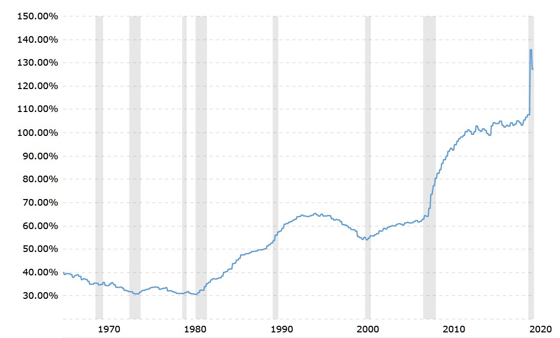
https://www.macrotrends.net/1381/debt-to-gdp-ratio-historical-chart
The chart has March 1966 at 39.16% as the first data point, with the trend declining to a low of 30.80% in November 1974. It then remained sideways during the bad inflation years until a new low at 30.60% in August 1981. Reaganomics became the vogue and the ratio started to climb until it peaked at 65.31% in May 1995.
The decline in the ratio that then followed, to reach a low at 54.04% in July of 2001 gives the impression that the Clinton administration must have been frugal in its spending and successful in its management of the economy. There is reason to believe this decline firstly was due more to the new formula CPI that was introduced in the mid 1990s. The new CPI was lower than the true increase in consumer prices and also boosted the GDP beyond the real increase in economic activity. Secondly, a runaway IT sector did add a great deal to the real economy during these years.
While flattering the Clinton presidency, as the world was repeatedly informed in years to come, the changes to the CPI set a process of middle class impoverishment in motion that is still baffling economists today, based on their analyses of only the effects of a too low CPI that is being used as a cost of living index for salary and wage increases, but neglecting to identify the true cause of the problem.
Post 2001 and the trauma of that year and the collapse of the dot.com bubble, the trend in the debt to GDP ratio steepened. The crisis of 2007/8, which was the result of various changes in house financing, among others made during the Clinton years to artificially stimulate the economy, including the new CPI, started a steep increase in the ratio.
A mostly sideways trend in the ratio from 2013 to 2019 is largely an illusion. The CPI and its close cousin, the GDP deflator, which do not measure the out of pocket increase in the cost of living nor the real increase in the economy, had by then been compounding the decline in the living wage and an artificial increase in the GDP for 20 years – the latter to create the illusion of fiscal discipline. Then COVID-19 hit to lift the covers off the vulnerable state of the US with its employee households that have no reserves to weather the storm and a large indigent population that have to rely on the state for their survival.
However, the rot did not begin with Reagan and his demand side economics. The no-regard-for-the-consequences spending may well have started with the costly war in Vietnam, which had no clear and definite strategic objective of neither a political nor a military nature. Apart from its effect on the Treasury, it caused a major rift in US society that might have provided the impetus for Johnson’s Great Society fiasco that by hindsight achieved rather little compared to its cost. That in turn contributed to Nixon’s decision to take the dollar off the effective gold standard which assisted to make the later profligacy of the government possible.
The same as for a household that spends itself into bankruptcy, when a country has a debt to GDP ratio that in accepted economic theory is viewed as a probable point of no return, it is not happenstance, an accident of bad fortune. It is a condition that was a long time in the making, through decisions based largely on taking the easy way out – printing money – rather than the more unpalatable actions that are really required to address the situation. Doing so became a habit that has been carried forward by all politicians who have re-election as a key objective.
It would appear that the current administration is following that path as if it is the main road to Shangri La. In a broader context, that brings us to another unpalatable truth: a predominantly service economy that imports most of its consumables, but exports little, must in due course become impoverished relative to its neighbouring economies from where it sources its imports. It does not matter whether it requires many years or decades, such an economy is one that lives beyond its means and will travel down the path to effective bankruptcy. It is a shoe that fits and to correct that situation was one of Trump’s main objectives.
Early indications are the new administration might still view reducing dependency on China as a possible solution; however, a solution that is mentioned, transferring the source for manufactured goods from China to nearby countries, will not resolve the basic problem of enriching other countries at the expense of the US.
All this while the suppression of PM prices continues to try and reduce the short positions of the Banks by compelling gold bulls close their positions. The alternative is to trigger hedge fund black boxes into selling by simulating the start of a bear market. This is a tactic that appears to be working, according to Friday’s CoT report; however it is not yet evident whether this will get the Cabal out of a potential short squeeze and if it becomes as successful as the Cabal wishes, it carries other risks.
When the black hedge fund boxes discover their mistake of falling for a bluff, they will switch back out of their short positions into new long positions and they will not be price sensitive when doing so. They will also be urgent buyers in a market with a dearth of sellers. Should that situation develop, the period to the end of April could bring a few pleasant surprises! If the hedge funds fall deeply enough into the trap, it could conceivably mean the end of the price suppression when they start buying.
Finally, the rising trends in the yield of the US 10-year Treasury note and the price of crude oil remain unchecked; even if the weekly changes are not large – as yet! – the trend is consistent and therefore quite steep. Mainstream economists probably can be expected to debate whether these trends are a cause or symptom of inflation – while accepting a future with inflation as a given, despite the opinion of the Fed.
In line with recent issues, this US Markets report is not optimistic about the future of the US. It hurts to write in this vein even from a far off country; the US has for so long been a bulwark of conservative behaviour and a bastion of freedom of free speech, which, alas, is becoming history. It is an unpleasant experience to project current trends a decade or more into the future, probably well beyond my own sell by date, by which time the US will be a different place from a decade or two ago.
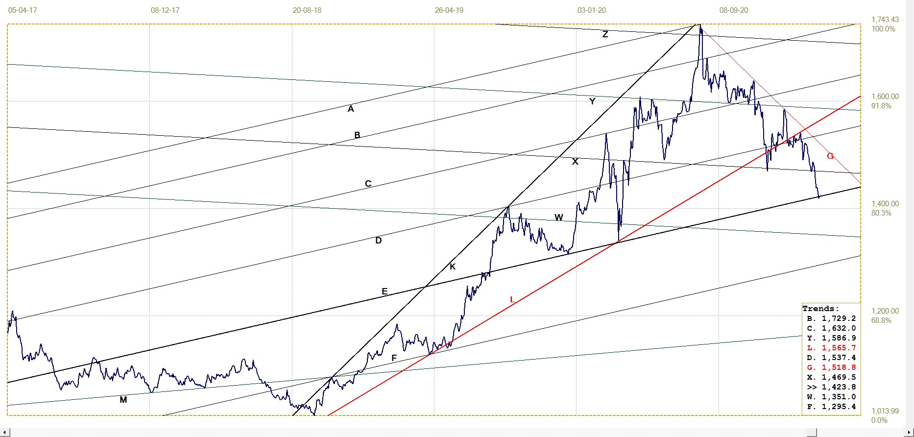
Euro–Dollar
The new analysis presents for channels in which the euro has developed trends. The more relevant are the recent euro bull channel WXYZ, with the reversal off line W as the euro yielded to the resurgent dollar. It is now settled in bear channel UV and has some way to go still to test the bottom of the bull channel at line Z.
Whether it will break below channel YZ in which it already finds itself, should depend on how the markets react to the additional almost $2T that will now be printed. That is, unless the Exchange Stabilisation Fund is the force behind the new strong dollar.
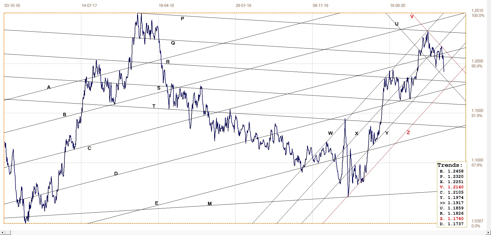
Euro–dollar, last = $1.1917 (www.investing.com)
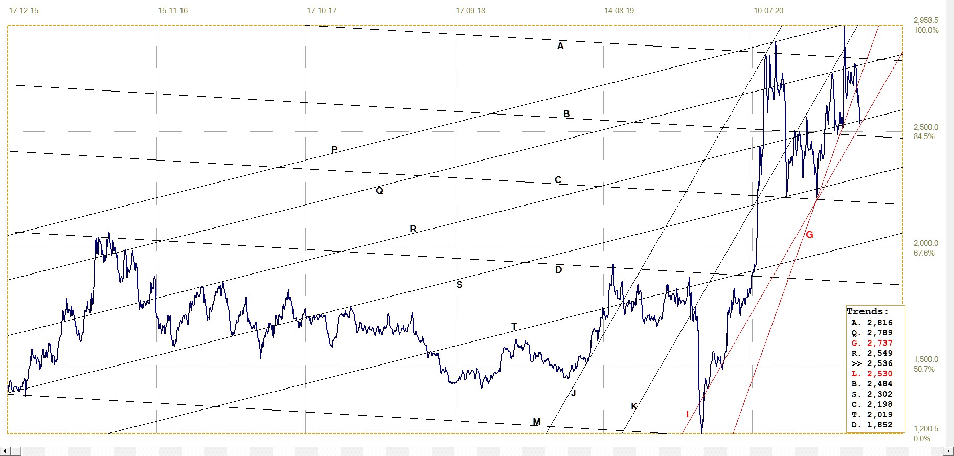
DJIA daily close
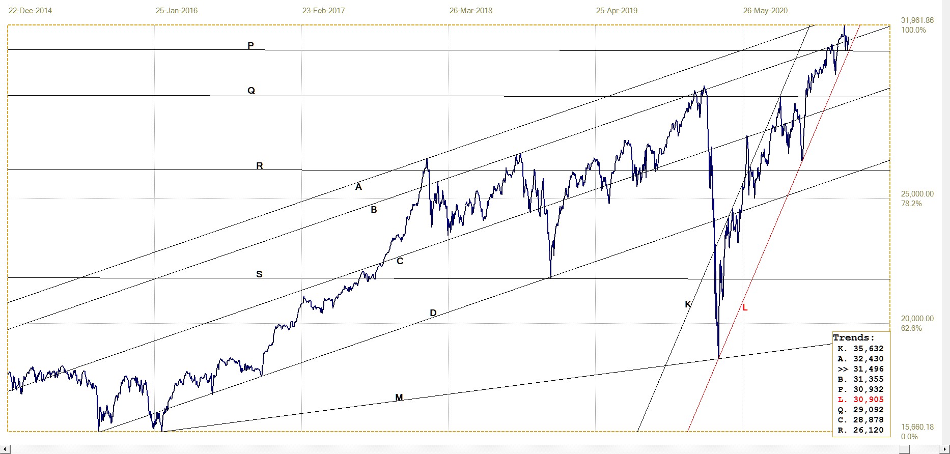
DJIA. last = 31496.30 (money.cnn.com)
Also a new analysis, the DJIA has almost reached the top of its bull channel ABCD, while holding in the steep bull channel KL since the bear spike a year ago. It is now testing support at the bottom of channel KL and will have to rally this week to hold to the channel. A break below channel KL and also below line P – accurately located in a progression of channel ratios from line S to line P – would also be significant in terms of this technical picture.
The large and unexpected jump in the NFP number – thanks to 131k new jobs from the birth/death model – sparked a major counter-trend rally on Friday. It remains to be seen whether it can last.
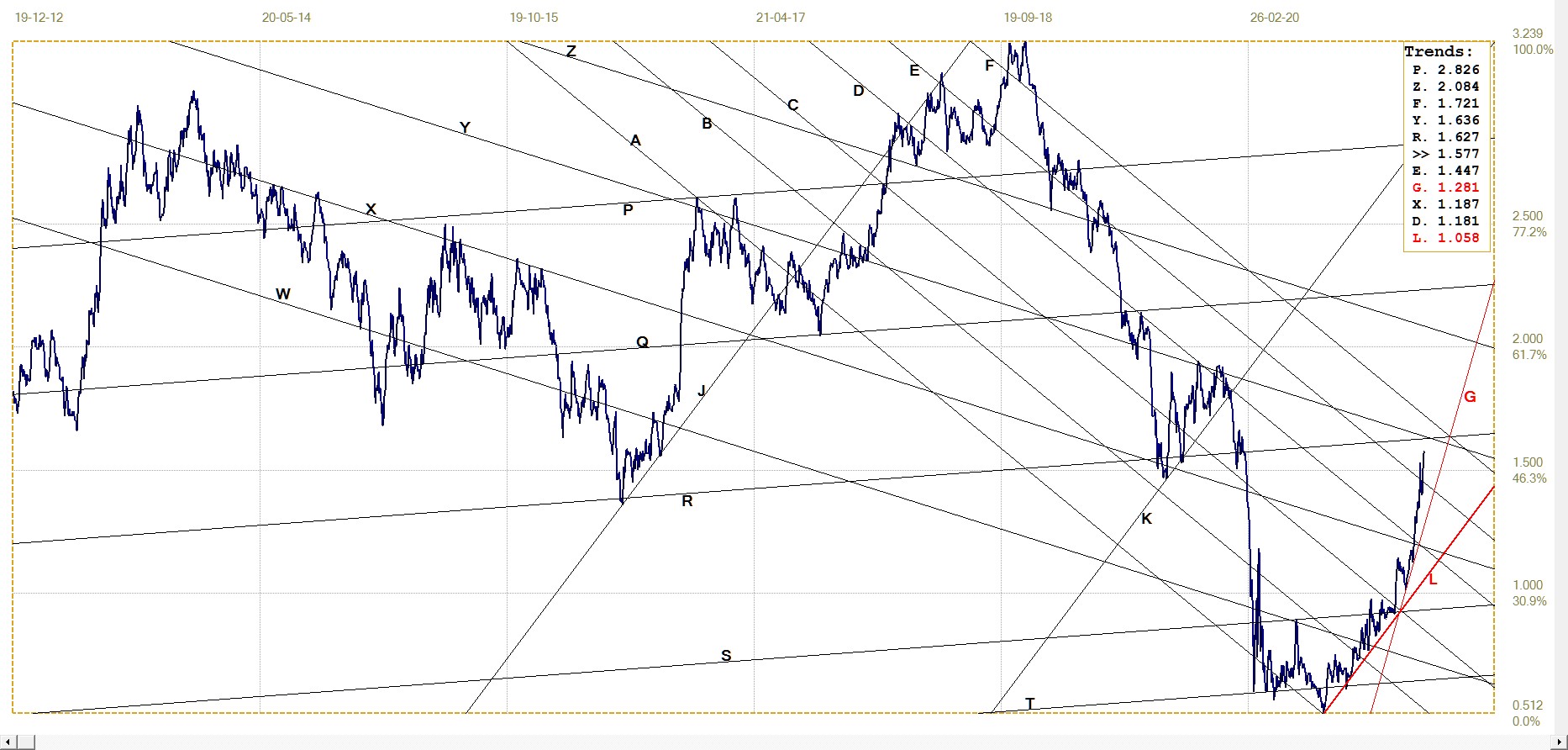
Gold London PM fix – Dollars
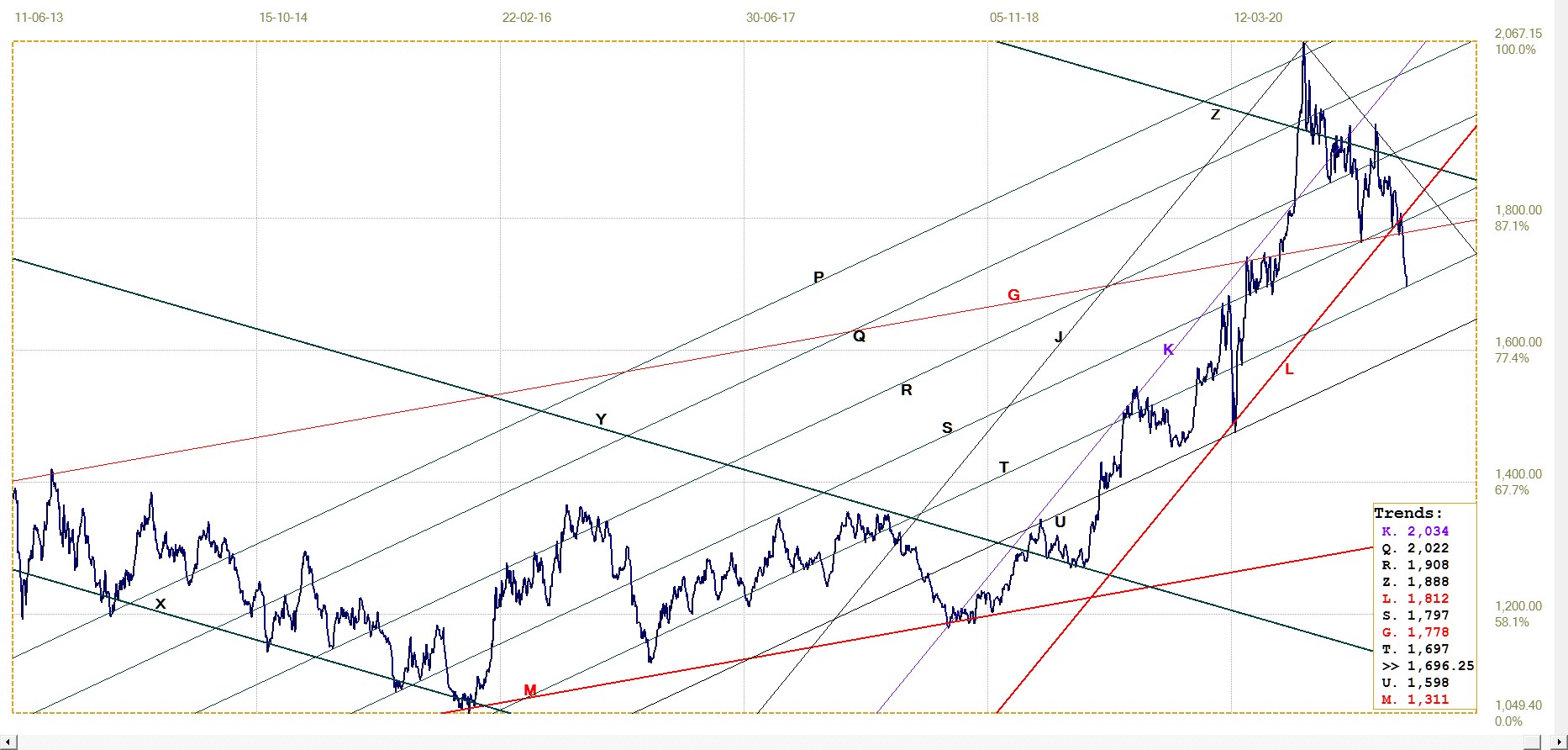
Gold price – London PM fix, last = $1696.25 (www.kitco.com)
During the eight month long price aggressive suppression since early August, the price of gold nevertheless managed to hold in bull channel JKL, until last week. The price broke steeply lower to also break below line G, which had previously offered firm support, to reach line T. That it was fixed in London right at the trend line after such a steep move, hints that the support could hold.
Should the suppression be reduced to allow prices to increase again, it would imply that, as mentioned earlier, selling by hedge funds has reduced the Cabal’s overall short positions (mainly silver?) to where the risk of too many new buyers entering the market at these lower levels outweigh the advantages of further suppression. The question then will be how far do prices have to rise before the hedge funds begin scrambling to cover their new shorts?
Euro–gold PM fix
Interesting that after having failed to hold within the rising megaphone KL, the euro price of gold also went into free fall to end and hold at support of a significant trend line. Note that megaphone KL, so typical of its kind, contains steep and sustained trends. A break higher would also have been steep and sustained.
Now that the price has reached line E, it can be seen that the chart pattern between lines K and E is a larger and less steep megaphone. If the pattern is going to hold, with a reversal higher off line E, there is again the potential for steep and sustained moves, at first perhaps only as high as line L. In that case, a new megaphone could develop over time between lines L and E. These patterns suggest the euro price of gold could become very volatile – which one might expect if a sharply weaker dollar to send the dollar price of gold soaring is not countered by the euro also becoming stronger against the dollar.
Euro gold price – PM fix in Euro. Last = €1423.83 (www.kitco.com)
Silver Daily London Fix
Since the bull market ended in early August last year, the price of silver has had a torrid time. It was slammed down from near $30 to twice find support along line C; once in September near COMEX op.ex and again at the end of November. Then it held up well when the final aggressive attack began in response to the GameSpot-induced silver squeeze attempt that again took the price to near $30. That is, it did hold above the steep support of line G until last week, then plummeted to look for support at trend lines R and L.
This final fall might have happened when the hedge funds changed positions from being long to short, adding more impetus to the selling that was going on. If so, it implies that they too had held onto their long positions until the black boxes simply had to concede that being long of silver was the wrong option. Again, if so, it will mean the hedge funds do not have much of a cushion for their new short positions once the price reverses and begins to increase again – which can be expected to be a rapid move if there are no large sellers to stand in the way of silver bulls looking for bargain purchases.
Silver daily London fix, last = $25.355 (www.kitco.com)6
U.S. 10–year Treasury Note
The rising trend in the yield on the US 10-year Treasury note since the break above channel WX has straightened out, with practically no hesitations. While most of the steps are small, the trend is holding and is moving away from the initial steep trend along line G.
The acceleration might not last beyond a possible key break above the cross-over of lines R and Y and – if that break should happen – beyond a break to above the medium term and quite steep bull channel AF.
U.S. 10–year Treasury note, last = 1.577% (www.investing.com )
The yield on the US 10-year Treasury note is increasing steadily and holding clear of the steep support along line G, which had set the direction of the early trend. The yield does not have too far to go before challenging the top of the broad bull channel AF and has room to maneuver before having to test line G for a possible change in the trend.
A break above the broad bull channel could trigger either a sudden jump higher in the yield or perhaps the beginning of a more sideways consolidation. So far it seems meant to be that line F will be tested; what happens next time will reveal.
West Texas Intermediate crude. Daily close
After initially reversing off line C as it failed to extend the important break above lines R and Z, the price of crude launched a second attempt which last week had success in breaking above line C. This implies that the market has not yet reached a potential top, whether only temporarily so or for the longer term.
Clearly the rising price is an indication of demand exceeding supply, or at least the expectations are this will become so in future. Knowing that, one has to explore further whether the relationship is changing because demand is on the increase or supply is expected to decrease. Given measures implemented or to be enacted by the new administration, it would appear that the market expects the local supply to be reduced, which might result in new imports should the economy react to all the stimulus that might be in the pipeline.
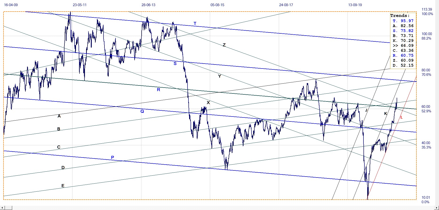
WTI crude – Daily close, last = $66.09 (www.investing.com )
© 2021 daan joubert
*********


