A Deep Dive into the XAU


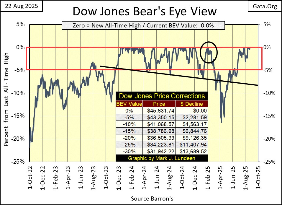
Friday was a big day for the stock market. Many stock indexes closed at, or very near a new all-time high. As for the Dow Jones (my proxy for the broad-stock market), at this week’s close, it saw its 56th BEV Zero, new all-time high in its BEV chart below, since entering into scoring position in November 2023. A new all-time high that pushed the Dow Jones deep into record territory. Since December 4th of last year, the last all-time high for the Dow Jones was 45,014. Today it closed at 45,631, an advance into market history by 631 points.
Okay, so what now? I’m thinking we’ll see additional new all-time highs, but wonder, will we see the Dow Jones at 50,000? That would be a 9.57% gain from today’s close. Let’s call it 10%. If someone is going to be a bull, they should have some idea of what kind of return they are expecting, for assuming the growing risks this market has to offer them. Is the possibility for a 50,000 on the Dow Jones, worth the growing risks this market has to invested funds?
What are the potential risks and rewards the Dow Jones is offering investors from this week’s close? A possible 10% gain to the upside, and there is no guarantee for that to happen, as opposed to a potential loss of what? A loss of something over 40%, a Dow Jones close of 27,378, or lower.
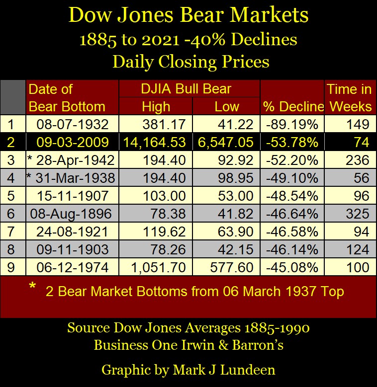
Looking at the Bear’s Eye View of the Dow Jones going back to 1885 below, seeing the Dow Jones decline by 40%, or more from the top of a bull market, is something experienced investors expect, and plan for. Like it or not, 40% declines in the Dow Jones are constantly occurring market events, as seen below. Nothing is going to change that.
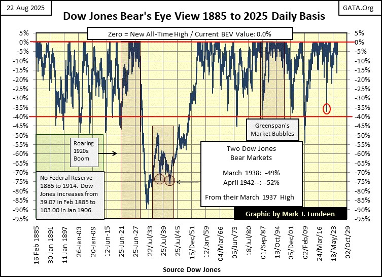
Now mind you, I’m just pulling these numbers out of my hat. As I can’t see into the future, I sometimes speculate about is likely, and unlikely, especially at market tops. But if I were in this market, which I’m not, I’d have trip wires, when crossed, I’d reduce my exposure, and even to totally exit from this market.
How about seeing the Dow Jones below, closing below scoring position, somewhere below its BEV -5% line in its BEV chart below. A BEV of -7% as a trip wire is a good start, to begin reducing one’s exposure to the risks of this market. At a Dow Jones close below 42,437 (BEV -7%), sell 20% to 50%, or maybe 100% of one’s bull-market positions, and not come back until we see yet another of the many Dow Jones’ 40% market declines, seen in the chart above.
But most people aren’t going to do that. It’s just a historical fact that most people never make money in the stock market, as they don’t know when to buy, or sell. And when they finally do have some stocks in their portfolio, the thought of selling never enters their mind.
Here is the Dow Jones daily bar chart. Friday saw a strong advance, and I don’t know if you noticed it, but the Dow Jones’ BEV lines shifted up after Friday’s close.
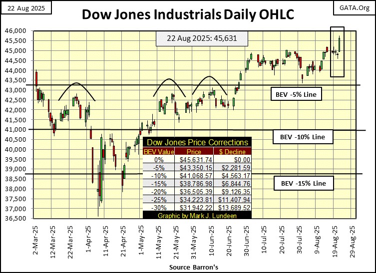
This week, I don’t have much to say about this chart, except to say I wonder how much thrust this advance still has in it? Dow Jones 46,000? Sure, why not?
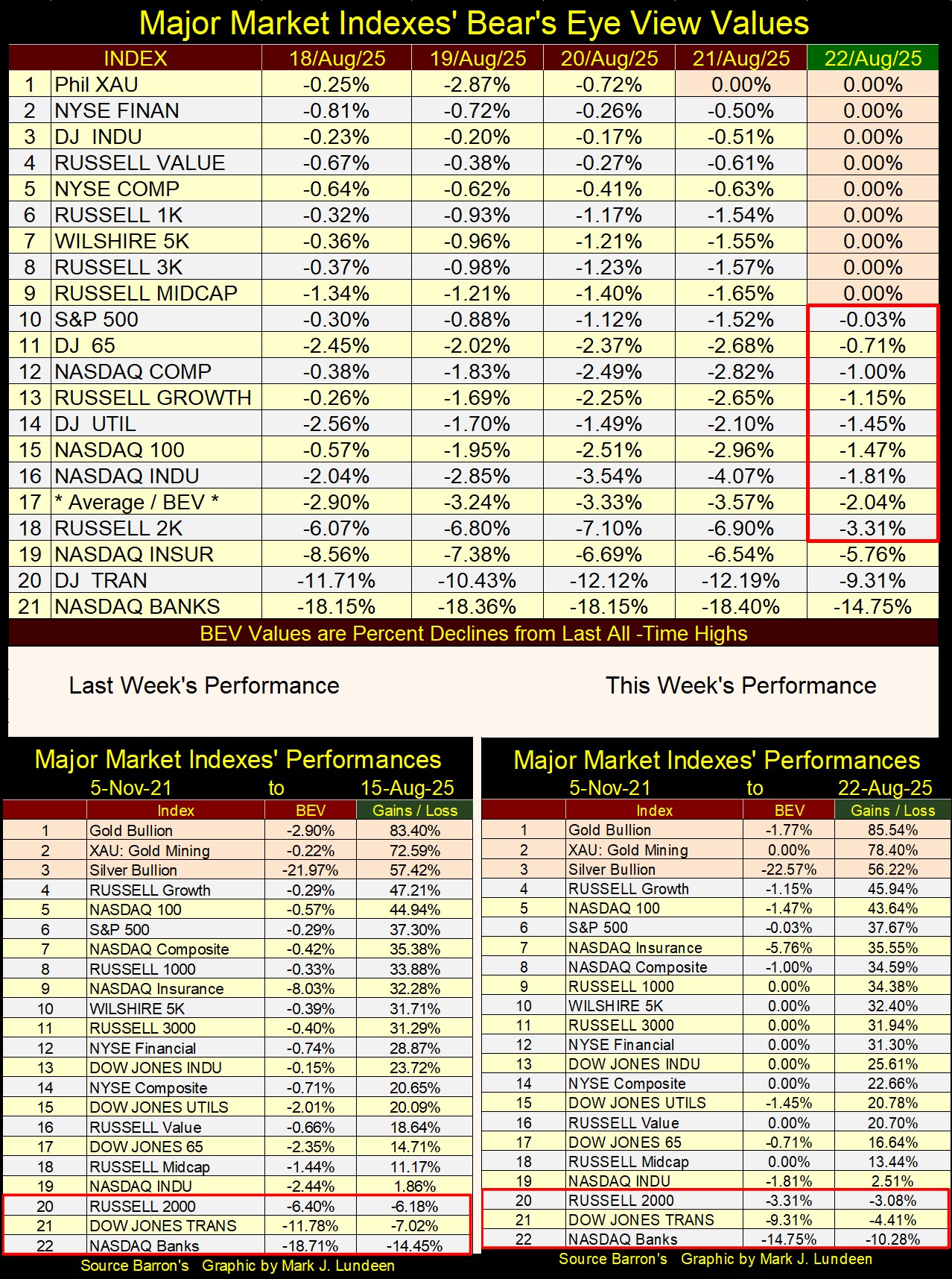
Next is my table listing the BEV values for the major market indexes I follow. On Friday, nine of these indexes closed at a new all-time high, and the next nine of them closed well into scoring position, with BEV values of less than -5%.
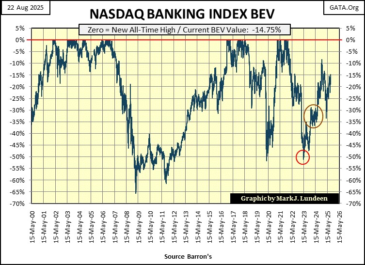
Did you note the one index that saw two BEV Zeros this week? The XAU saw a new all-time high on Thursday, and Friday’s close. Only one of these indexes closed with a double-digit BEV; the NASDAQ Banking index closed the week 14.75% below its last all-time high, seen in November 2021.
Don’t you think it odd, so many of these indexes are behaving like party animals, while these banks aren’t finding any joy in this market, and haven’t for years? (as seen in their BEV chart below)
I’ll tell you how a banking crisis works. The government’s “regulators” and the banks themselves are well aware of it, long before the public reads about it in the financial media. But those in the know, say nothing about it, and actually deny it, until it can’t be denied any longer.
Is there a potential banking crisis in the works? I am someone who would not know. So, my opinion on any difficulty these banks may, or maybe not have, is worth about what you are paying for it – nothing.
But I’m not stupid either. The financial system for decades has allowed consumers, corporations, and government to become deeply indebted. Credit creation by the financial system is what drives bull markets up to the sky. Debt default of this credit, is what drives bear markets down to extremes people think impossible.
Look at the XAU (#2) in the weekly performance tables above. It’s catching up to gold (#1), which is logical as gold mining is a leveraged way to invest in gold. This would be a good time for me to go deeper into the gold, and silver miners in the XAU.
This week, of the major market indexes I follow, only the XAU generated a new all-time high, twice. Since April 2011, this is something that just didn’t happen; the XAU making new all-time highs. And as you can see in the XAU’s BEV chart below, since 1983, when first published by the Philadelphia Options Exchange, new all-time highs (BEV Zeros) for the XAU have been rare market events.
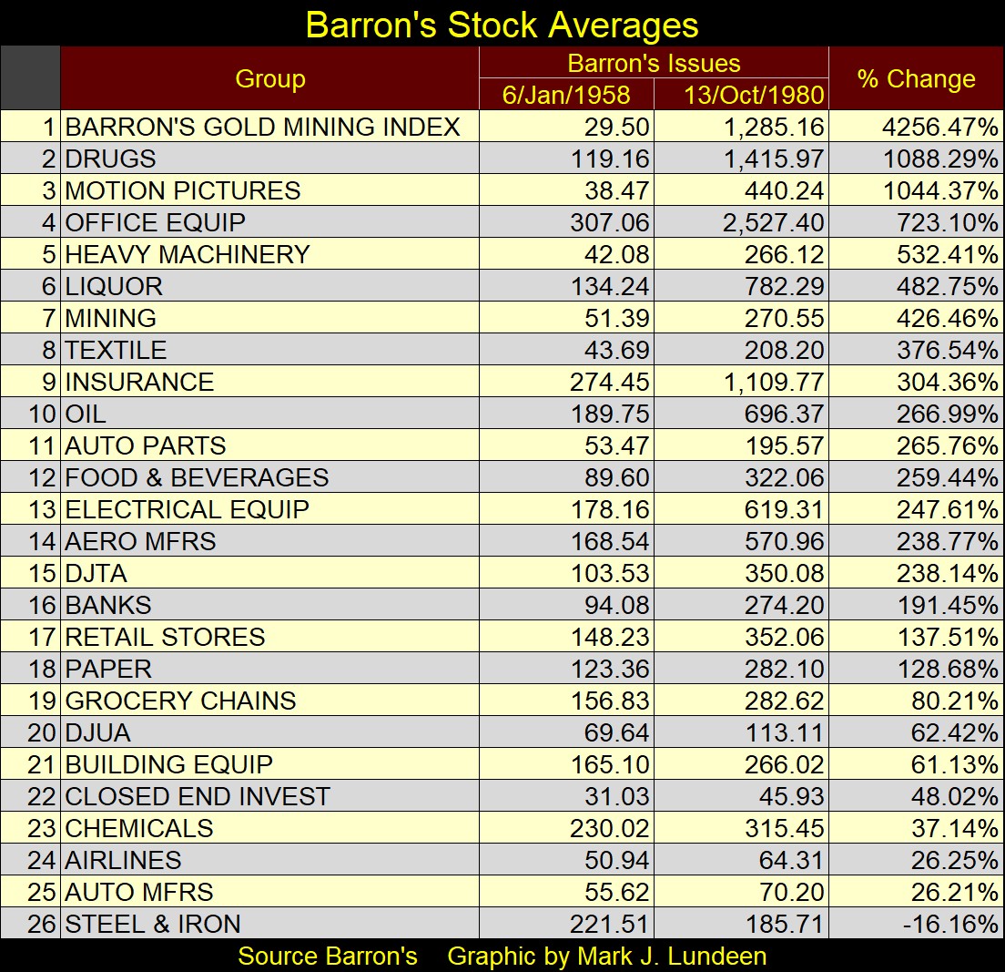
One point to keep in mind; the 1958 to 1980 bull market in gold mining shares (a twenty-two-year bull market), ended in 1980. During this bull market in gold mining, Barron’s Gold Mining Index (BGMI) increased from 29.50 in Barron’s 06 January 1958 issue, to 1,285.16 in Barron’s 13 October 1980 issue, an increase by a factor of 42.56 to 1, during these twenty-two-years.
Nothing else in the Barron’s Stock Averages (twenty-six stock groups) came close to the BGMI, as seen in the table below.
So, for charts of the XAU, as it began in 1983, are best understood as a history of a bear market in gold and silver mining shares. But no trend in the market lasts forever, including a bear market in the gold and silver miners.
A very nice feature when plotting market data via the Bear’s Eye View format, is the ability of directly comparing one market to another, as dollar values for both, are rendered into new all-time highs, and percentage claw-backs from those all-time highs.
Let’s now do that with the XAU, and the Dow Jones below, from 1983 to this week’s close.
Bear’s Eye View (BEV) values are simply the percentage claw-backs from a market index’s last all-time high. All-time highs in a BEV chart are equal to 0.0%, and never more. Something both the XAU and the Dow Jones achieved at this week’s close; BEVs of 0.0%. Below in the XAU’s BEV chart, we see just how rare new all-time highs (0.0%) were since 1983, and how many daily closes the XAU saw 30% below, and much more from a previous all-time high.
What is seen below, is a forty-two-year history of misery for the gold miners. That isn’t to say money couldn’t be made in gold mining. But the bear market seen below, is more attractive to a speculator than to an investor, which is why the XAU is a very popular options contract at the Philly Options Exchange. Look at the huge moves! From all-time highs, to market declines of 50%, 60% and more.
What more could an option’s put buyer desire? And to keep the XAU’s option’s call buyers happy, we see huge advances from those profound bottoms, from Great Depression like bottoms, up to new all-time highs.
I myself don’t speculate in options. As a market enthusiast, it’s best I don’t do that. But if I were thinking of doing so, (which I’m not) these gold miners in the XAU, seem an excellent market to do some research on.
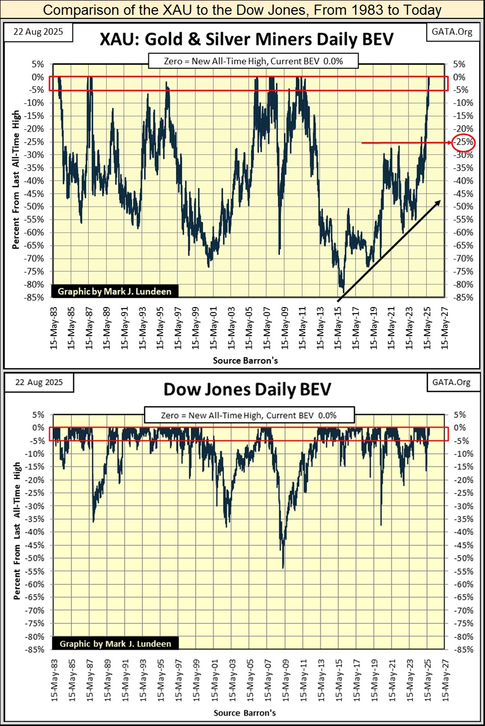
Now compare the XAU’s BEV chart, with the Dow Jones’ (directly above) since 1983. I kept the scaling identical for these two indexes’ BEV charts, to better illustrate the profound differences between these two indexes since 1983.
To properly chart the XAU, I had to include BEV values down to -85%. And since 1983, most daily closings for the XAU were below their BEV -25% line.
For the Dow Jones above, I could have reduced its scaling to a BEV of only -55%. That is because in March 2009, at the bottom of the sub-prime mortgage bear market, that is what it took to chart the second deepest bear market percentage decline since 1885, #2 in the table below.
It is a point of interest, that since 1974, the Dow Jones has only once seen a decline from an all-time high greater than -40%, in 2008-09. While for the XAU, since 1983, over half of its daily closings were over 40% below their last all-time highs. 51.41% of its daily closing to be precise, as seen in its Frequency Distribution Table below.
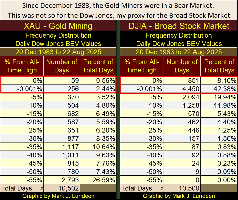
A useful technique when analyzing Bear’s Eye View data in a Distribution Table, is to look at the daily closings in the top two rows, its 0% and -0.001% rows. The 0.0% lists the quantity of new all-time highs (BEV Zeros). The -0.001% row lists the quantity of daily closings in scoring position, daily closings within -0.01% to -4.99% of their last all-time high.
During a bull market advance, an index’s BEV value will typically close daily in these two rows, as have gold and the Dow Jones since November 2023. By adding their Percentage of Total Day’s together, we can determine how frequently an index was in bull market.
For the XAU; 3% of the total daily closings since 1983 were in a bull market, which is no bull market at all.
For the Dow Jones; 50.48% of the total daily closings since 1983 were in a bull market. When considering the massive market declines the Dow Jones has seen since 1983;
- The 1987 Flash Crash,
- The 2000 to 2002 NASDAQ High-Tech bust,
- The 2007 to 2009 Sub-Prime Mortgage Debacle, that almost took down the entire global banking system,
- The March 2020 flash crash,
none of these major market events, had a enduring impact on the bull market that began in August 1982.
This is ridiculous. It would also be total nonsense, if we did not know for a fact that the idiots at the FOMC have been inflating and “stabilizing” market valuations for decades. These makers of “policy” have boasted of doing so for a long time.
Is there a connection between these two market extremes? The bull market for the Dow Jones, and the bear market for the XAU? I believe there is; that the XAU has done so badly, is because the Dow Jones has done so well, as a result of “monetary policy” directing flows of monetary inflation toward the broad stock market, away from the miners of gold and silver.
This is why I’m so interested in seeing the XAU doing so well in 2025. I believe the smart money, those in the know, know the top for the stock market is near. So, they are shifting their wealth from the broad stock market, into an investment that is counter-cyclical to the Dow Jones – the gold and silver miners in the XAU.
When this massive bubble in the stock market finally goes bust, massive flows of dollars will flee from stocks, bonds, and real estate. This tsunami of dollars has to go somewhere, and seeing the XAU doing so well in 2025, before the the pending bust, strongly suggest precious metal assets will be a major draw for this anticipated flight capital from Wall Street. Or so it seems to me.
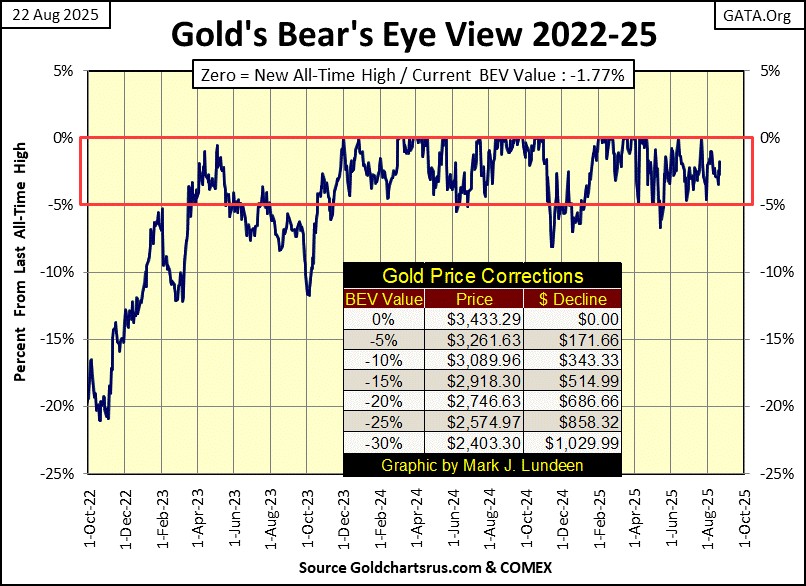
How did gold do this week? Let’s look at gold’s BEV chart below to find out. Gold closed the week with a BEV of -1.77%, or 1.77% below its last all-time high of $3,433.29, seen two months ago on June 13th.
But since November 2023, except on rare occasions, gold has daily closed in scoring position, within 5%, of its 66 new all-time highs (BEV Zeros = 0.0%) seen below.
As a BEV chart only sees market data in percentage terms, with 0.0% equal to a new all-time high, and -100% a total wipeout in market valuation, one gets no sense of how well gold has done in dollar terms in the BEV chart below, since November 2023. So, in dollar terms, how good has gold done since November 2023? November 2023 began with gold closing at $1,985. Gold’s current last all-time high was $3,433, an advance of 73% in the past thirty-three months.
Nothing else I follow has done as well as gold in the past few years, but the gold and silver miners in the XAU are catching up.
Next is a chart plotting the indexed values of gold and silver, where 1.00 = January 1969. Indexing gold and silver enables me to directly compare one to the other. The only time silver outperformed gold, was from 1969 to 1980, where at their January 1980 peak, silver had increased by a factor of 26, while gold only by a factor of 18. But since January 1980, silver has lagged behind gold, as very evident in the chart below.
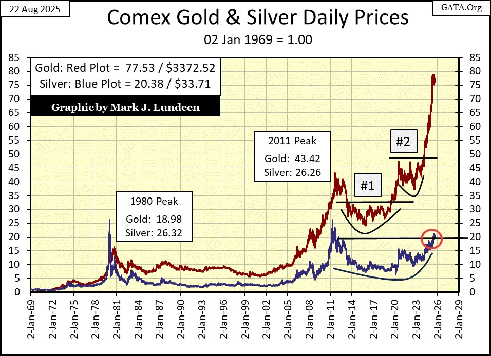
Looking at gold’s amazing advance since the last half of 2023, since the breakout at correction #2 above, one would think it is time for a third correction. Remember, nothing goes straight up forever. But gold and silver for the past few months haven’t done much of anything. They may not be going up, but they aren’t going down either.
Maybe this is their correction. If so, the next big thing to expect from them would be for them to advance into market history. Especially so with silver, to see silver to finally close above its highs of January 1980 ($50 an ounce) would be huge news.
I know it will be with market commentators covering gold and silver investments. What the main-stream financial news would make of silver finally breaking above its highs of January 1980, I don’t know. Silver may have to break above $75 an ounce before they would notice, and $100 an ounce before silver becomes a significant news story.
In gold’s step sum table below, gold is still in a period where daily declines are more numerious than daily advances. Even so, gold remains in scoring position, ready to advance to new all-time highs in the days to come.
Daily volatility for gold is low, only 0.85%, as seen in gold’s Volatility’s 200D M/A column.
What gold really needs in a big increase in daily volatility, some days of extreme volatility; 3% days. A 3% day, is a day where gold moves up or down by 3%, or more, from a previous day’s close. The arrival of 3% days for gold, pushing its daily volatility’s 200D M/A above 1.00%, would strongly suggests money is flowing into the gold market, that things are about to become exciting.
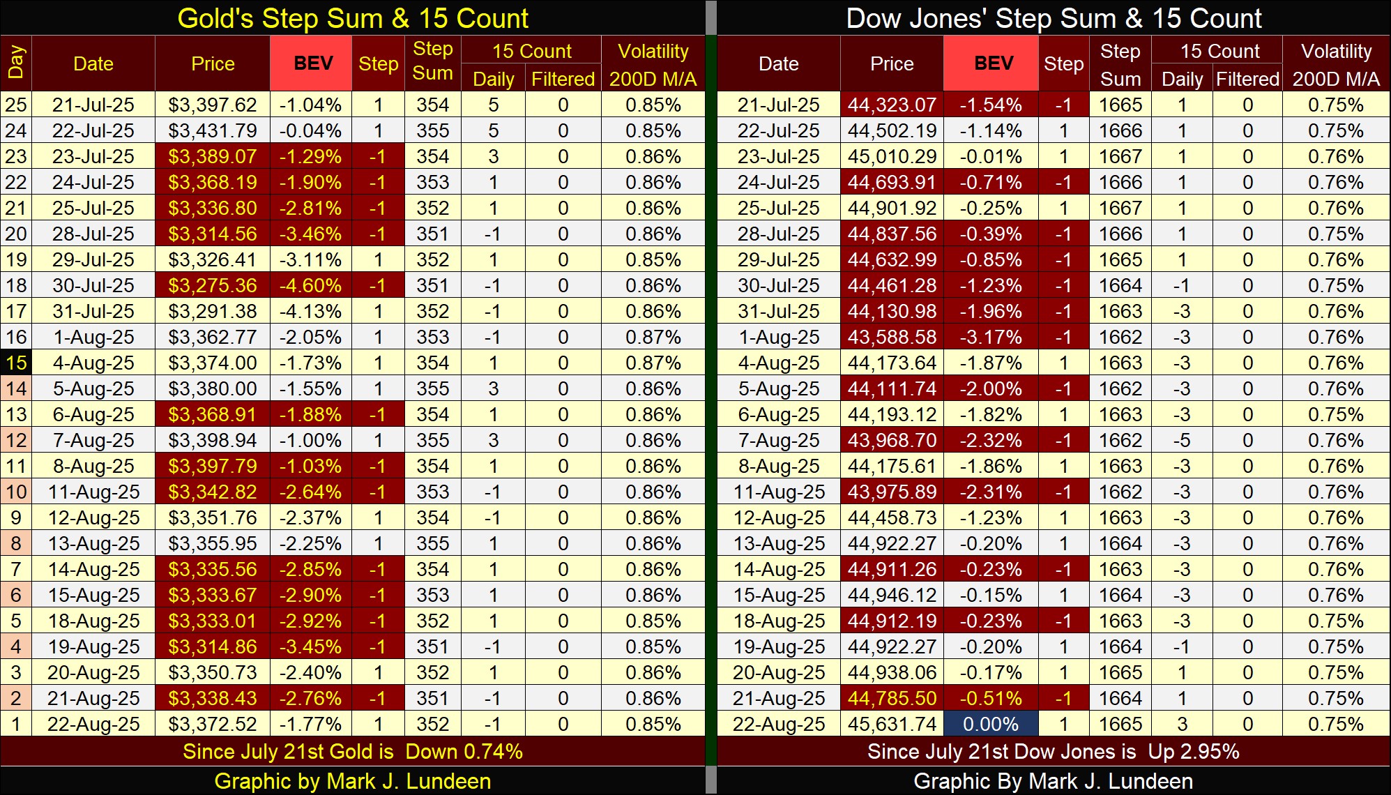
For the Dow Jones in its step sum table, it made a new BEV Zero, new all-time high on Friday’s close. That was to be expected, as the Dow Jones has daily closed in scoring position, BEV values below -5%, for the past twenty-five trading days, as seen in its step sum table.
Don’t be surprised if we see additional new all-time highs in the weeks and months to come, or for as long as the Dow Jones’ BEV values remain in scoring position. Is this a buy recommendation from me? Absolutely not! I’m only stating the obvious; as long as the Dow Jones remains in scoring position, new all-time highs should be expected.
A point of strength for the Dow Jones is its daily volatility’ 200D M/A has remained around 0.75%, which is low. For the Dow Jones, low volatility is good for stock market bulls.
What the Dow Jones doesn’t need, unlike gold, is for it to begin to see days of extreme volatility, which for the Dow Jones are 2% days, days the Dow Jones closes up or down by 2%, or more from a previous day’s closing price. Historically, rising daily volatility, to something above 1.00% for the Dow Jones HAS ALWAYS been a precursor of deflating valuations in the stock market. But that isn’t happening right now.
I remain a big-bad bear when it comes to risking money in the stock market as a long-term investment. But right now, looking at my technical indicators, Wall Street is where unicorns and bulls dance together, as blue birds of happiness sing to them. How long can that go on?
*******


