The Dow Jones Has Done Nothing Since Mid-April


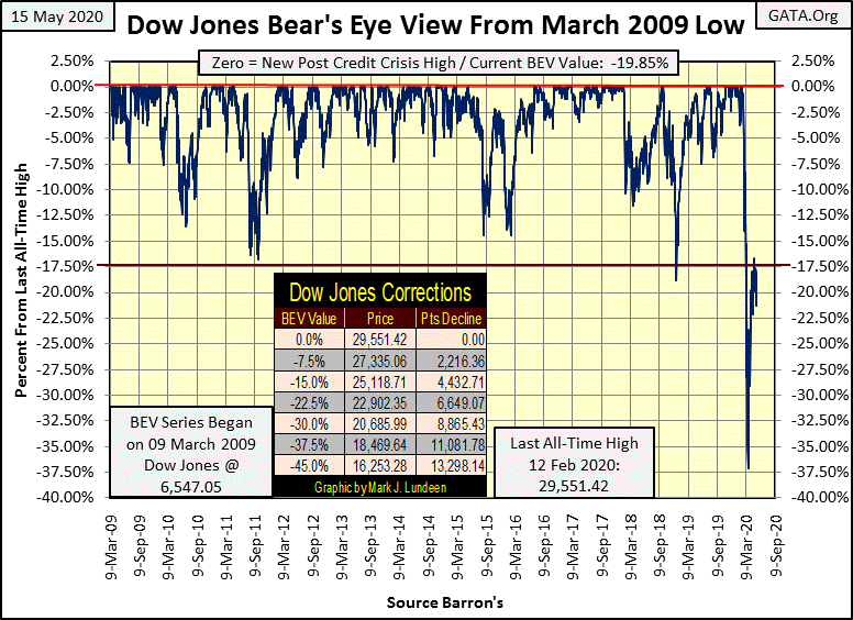
The Dow Jones is on the rebound from its March 23rd BEV -37.5% bottom; the bottom of one, if not the steepest percentage decline in Dow Jones history. So far its BEV 17.5% line in the BEV chart below has been the first line of resistance that has held during this advance. The Dow Jones’ first attempt to break above it was on April 17th, when it closed at a BEV of -17.97%; a full month ago.
I’m not surprised, as a move from its BEV -37.5% line up to its BEV -17.5% line is a big move, and big moves must be corrected for. What is surprising is how the Dow Jones from February 12th (the Dow Jones’s last BEV Zero) to March 23rd dropped 37.5% (only twenty-seven NYSE sessions) with no break in the decline!
The thing to watch for now will be whether the Dow Jones once again attempts to break above this line of resistance in the next month or so, or resume its bear market decline.
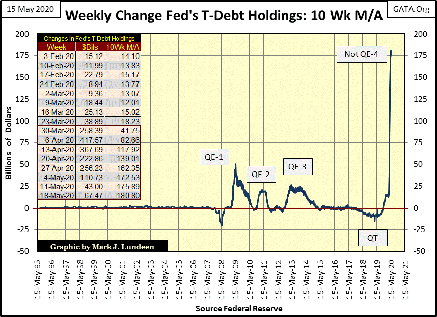
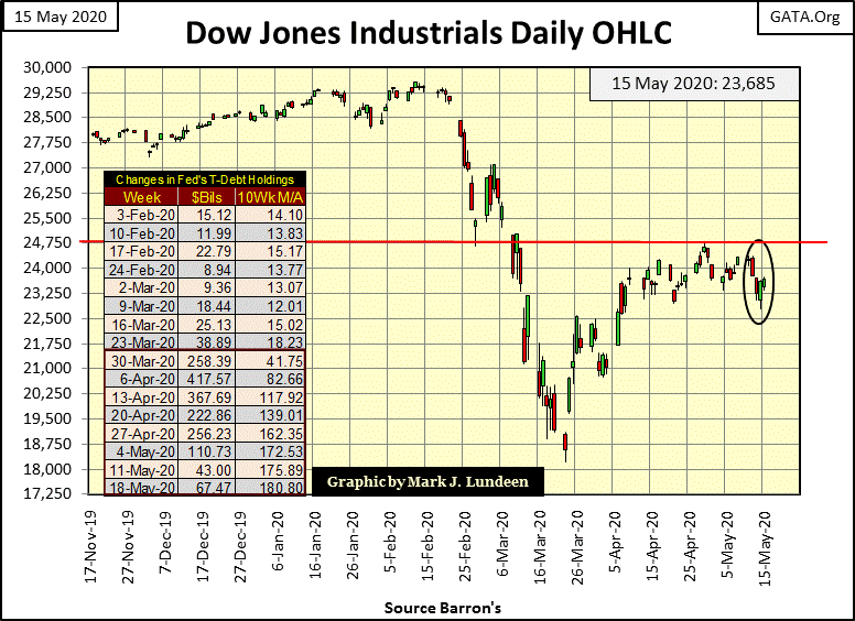
In the bulls favor is the FOMC flooding the financial system with “liquidity”, but not as intensively as they did in April, as seen in table insert for the chart below. This week they “injected” another $67.47 billion into the economy. That’s far from the triple-digit billion dollar “injections” the FOMC did in March and April when the Dow Jones came roaring back from its -37.5% market bottom.
The “policy makers” at the FOMC desire these dollars flow into, and then stay in the financial markets to “support market valuations.” But ultimately the end points of where these dollars flow to isn’t up to the FOMC, but to consumers, employed or otherwise, who at the tail end of these inflationary flows may foolishly use these dollars for their utility bills and groceries.
Driving around the town, I see small businesses such as restaurants and bars closed for business. I’m sure it’s much the same in all fifty states. I wonder how many of them will reopen, and for those that do, how many can remain in business in the months to come?
Sure, the FOMC can “inject” monetary inflation directly into the stock market to “support market valuations.” But they can’t motivate the now impoverished clientele of millions of little businesses to consume as they did before the CCP Virus allowed America’s politicians to shut down huge portions of their economies to save us from a virus that after four months has proven to be no worse than the common flue.
We won’t know the true economic impact of the CCP Virus pandemic until later this summer. I’d be pleasantly surprised if the economy rebounded quickly, but the bear within me is expecting the exact opposite to happen.
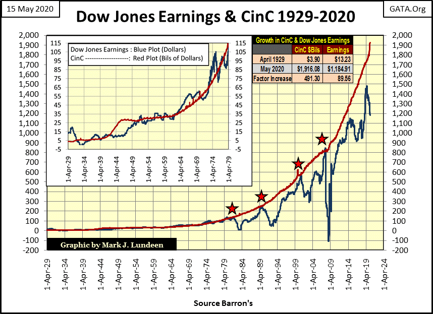
Earnings for the Dow Jones (Blue Plot below) have decoupled from the growth in CinC (Red Plot), and been trending down since April 2019; not good.
From the 1930s to 1980, an increase of one billion dollars in CinC once produced one dollar in Dow Jones earnings. This relationship between inflation and Dow Jones’ earnings was never bolted together, but in the chart inserted in the graphic below, the relationship readily apparent.
Then from 1980 to 2007, when the Dow Jones produced one dollars in earnings for every one billion dollars of CinC (the four red stars), earnings for the Dow Jones saw a dramatic decline. Now, since 2007 growth in CinC has decoupled from earnings, and now far exceeds growth in earnings for the Dow Jones. Will these two plots ever again merge? I expect they won’t.
We’re looking at an evolutionary process, where over time “monetary policy” has less and less impact on corporate earnings.
What’s the next phase in this process? A time when “monetary policy” has zero or perhaps even negative impact on corporate earnings? With the Dow Jones earnings peaking in April 2019 as CinC continued rising; maybe the next phase has already begun.
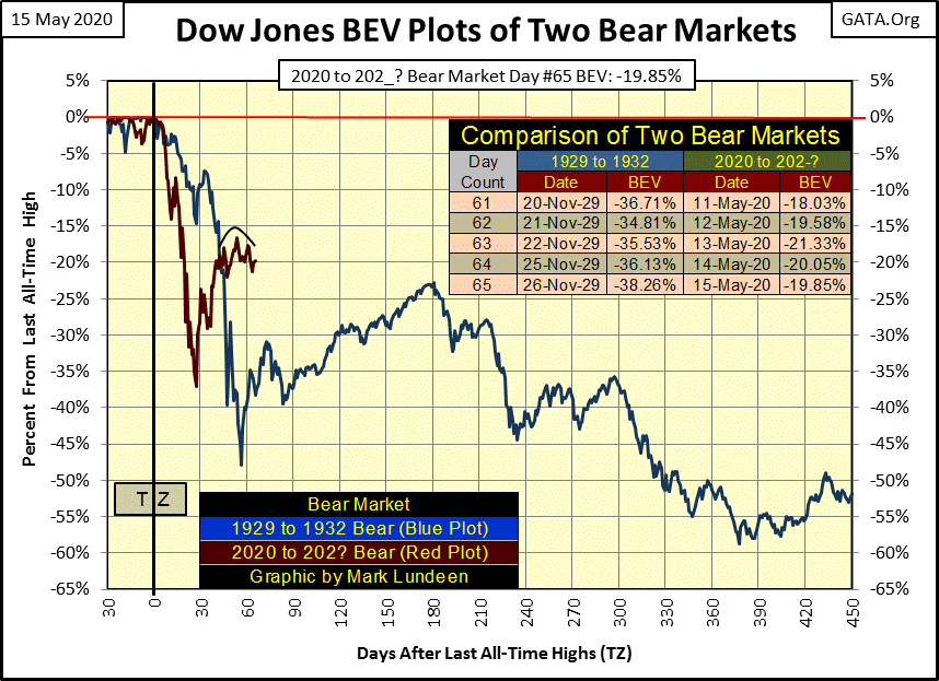
Here’s my chart comparing the 1930s’ market crash with ours. A small head and shoulders top formation now in place for our bear market (Red Plot), a bearish chart formation that began as the FOMC tapered off their Not QE-4 in April (see two charts up).
Should the Dow Jones decisively take out its -17.5% BEV line this head and shoulder formation will mean nothing. But should the Dow Jones fail to do so, and once again begin its bear market decline, this head and shoulders formation will have proven to be a historically important technical formation.
What do I think will happen? Will the Dow Jones break above its BEV -17.5% line or fail to do so? At week’s close I’d say it’s a coin toss whether it’s one or the other; which is to say whether or not the FOMC continues “injecting” massive amounts of “liquidity” into the financial system.
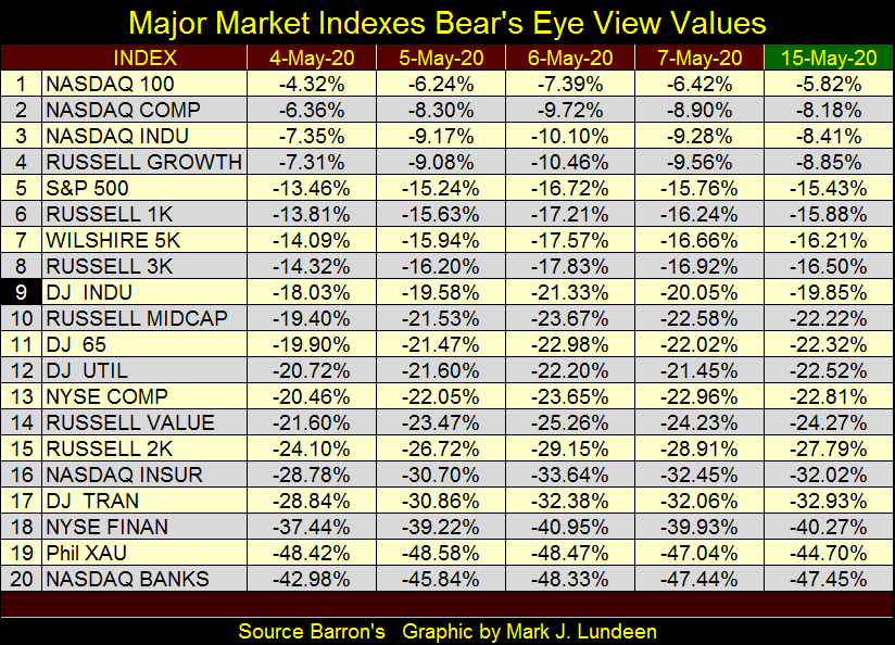
At week’s close four of the major market indexes I follow closed within 10% of their last all-time highs, with the NASDAQ 100 in scoring position (-5%) for a new all-time high, as seen in the table below.
Mr Bear was a bad bear this week (week 12 of the bear market); producing both a day of extreme market volatility (Dow Jones 2% day) and a day of extreme market breadth (NYSE A-D 70% day) on Wednesday.
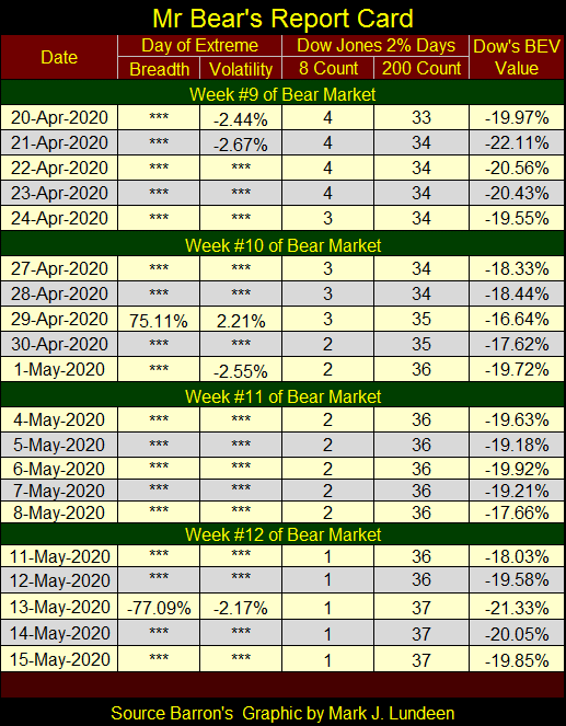
I expect these extreme days are going to calm down for the foreseeable future, until the next episode of market nausea once again strikes. But when will that be? If corporate internals are as bad as I imagine, surely by next autumn.
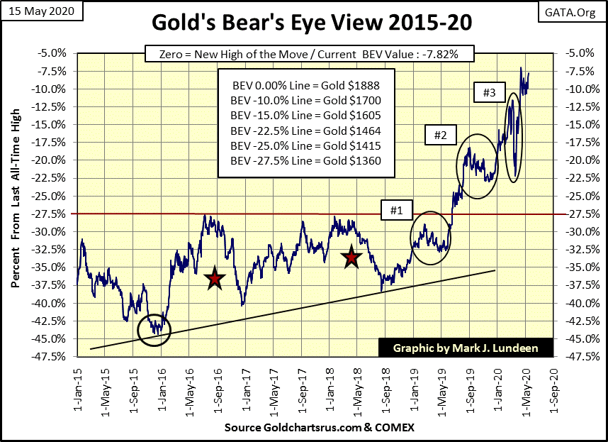
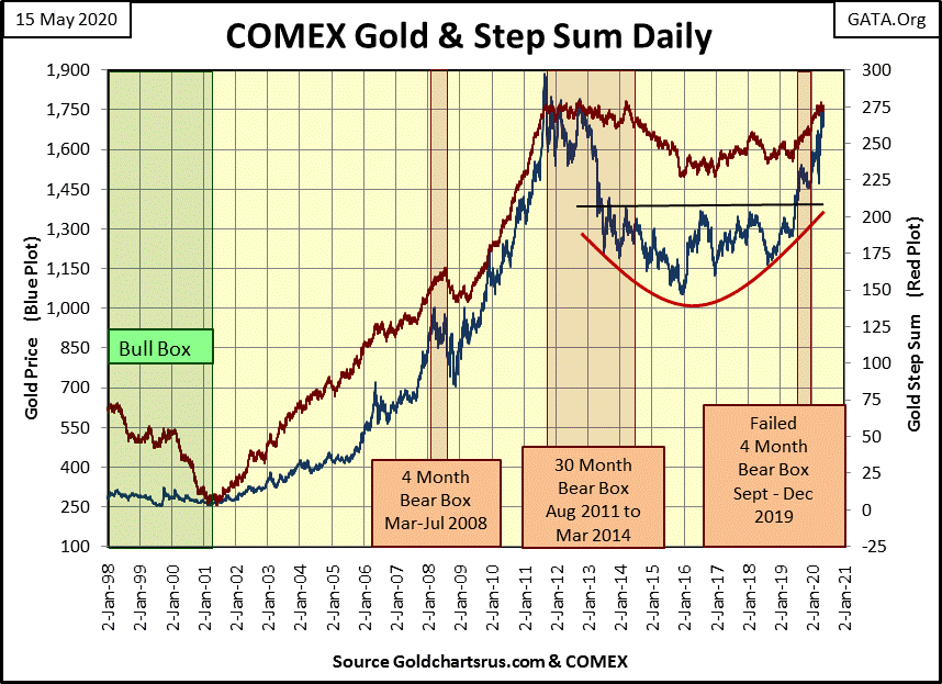
Gold closed the week only 7.82% from a new all-time high in its BEV chart below. But this last 7.82% of the post December 2015 market advance to a new all-time high may prove to be the most difficult. It’s a fact that “policy makers” worldwide see a rising gold price as threat to their social order, a social order currently funded with monetary inflation.
At the King World News link below, Eric King’s interview with Alasdair MacLeod informs us of the big losses sustained by the big bullion banks who for decades have made a fortune by shorting paper gold at the COMEX gold futures markets. If these massive losses are a fact, and I have no doubt they are, maybe having gold and silver breaking above their old all-time highs in a very dramatic fashion is a very real possibility sometime soon.
I’ve plotted below the indexed values of the price of gold (Red Plot) and CinC (Blue Plot) going back 100 years. Why do I use CinC, or currency-in-circulation as a standard for earnings for the Dow Jones above or the price of gold below? Because they’re both given in dollars. One hundred years ago the US dollar was defined in terms of gold; $20.67 dollars for an ounce of gold; no more, no less as prescribed by law.
As is obvious in the chart below, the “policy makers” took the dollar off the gold standard long before President Nixon “closed the gold window” in August 1971.
Why did they do this? For power over you and me. Back in the 1920s when gold was at an honest $20.67, the news media once had people like H.L. Mencken writing stuff like this for the benefit of anyone who cared to read it:
“The government consists of a gang of men exactly like you and me. They have, taking one with another, no special talent for the business of government; they have only a talent for getting and holding office. Their principal device to that end is to search out groups who pant and pine for something they can't get and to promise to give it to them. Nine times out of ten that promise is worth nothing. The tenth time is made good by looting A to satisfy B. In other words, government is a broker in pillage, and every election is sort of an advance auction sale of stolen goods."
- H.L. Mencken
Inflating the supply of dollars, as seen below, has allowed the banking system to provide massive loans to “dependable people” to purchase media companies including Hollywood, people who in 2020 would never allow a H.L. Mencken to say what was really on their minds on their platform. This is why these people hate the internet so much, as they haven’t YET gained complete control over it.
The link below provides a graphic of the BIG 6 media companies that control most of the entertainment and news media of the world. It wasn’t like this when President Nixon “closed the gold window” in August 1971. But since then the banking system, via the expansion of CinC and credit has provided sufficient “liquidity” to allow the purchase of smaller media outlets, by trusted individuals, into the large conglomerates seen below.
Note: This content is exactly what the “policy makers” don’t want you to see, so they make it hard to download. After clicking on the link, you’re going to have to hit the reset button a few times (like 4 or 5) to download it; but the effort is worth it.
https://www.webfx.com/blog/internet/the-6-companies-that-own-almost-all-media-infographic/
The same is true with academia, with their bread and butter program of student loans, and just about everything else with even mundane industries such as electrical utilities. These past few decades has seen a concentration of corporate control into fewer and fewer hands, hands that are loyal to the “policy makers”, not to the American Constitution.
Back to the chart below; these indexed plots are based on data published in dollar terms. So when these two plots merge, one can fairly say the price of gold is in equilibrium to the volume of paper dollars in circulation. This was certainly true in the 1920s, before President Hoover attempted to print his way out of the Great Depression.
After Hoover’s bout of monetary inflation gold was devalued to $35 an ounce in 1934. But as seen in the chart blow, WWII once again decoupled the price of gold from CinC, and so it was until 1980 when gold spiked to over $800 an ounce as these two plots once again merged; but not for long.
In 2011 the price of gold made a feeble attempt to rise up to the CinC plot, but then gold began a very suspicious 45% bear market that ended in December 2015, and now once again gold is advancing upward towards the blue CinC plot
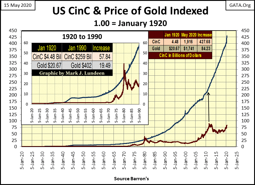
If one thinks of gold as money, as I do, you may be tempted to take the factor increase CinC has seen since January 1920: 427.68, and multiply the 1920 price of gold: $20.67 by it. A gold price of $8,840.15 an ounce results, a price that would once again merge these two plots together for the first time since 1980.
You may think that is an extreme value to peg gold to. However below at Greg Hunter’s USAWatchdog’s interview with Jim Sinclair (aka Mr. Gold), Mr. Sinclair pegs gold at something over $50,000 an ounce using total debt in dollars instead of CinC. The difference between Mr. Sinclair’s and my computations is I’m looking at the expansion of paper money (CinC), while he is looking at the expansion of credit and debt over these many past decades. Of the two views of gold, I think he is correct, but I use CinC as that is what I have data for.
https://usawatchdog.com/simple-math-says-50000-to-87500-gold-price-jim-sinclair/
Whether gold’s ultimate price is $8840 or over $50,000, in its step sum chart below we see the possibility of either valuation in it.
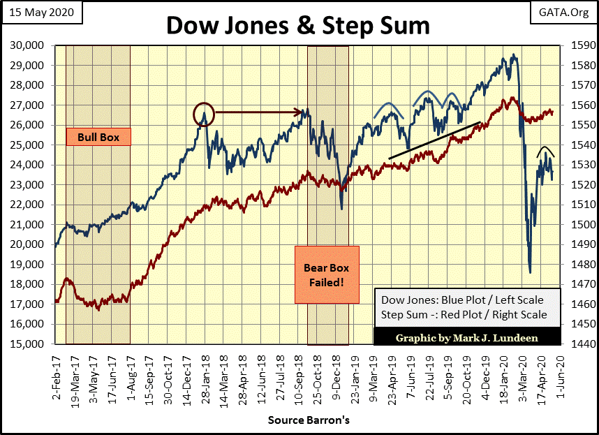
The Dow Jones’ step sum chart below isn’t as positive as is gold’s above. There’s that annoying head & shoulder topping formation to be seen. And even if in the weeks to come should the Dow Jones make a serious break to new all-time highs, I just don’t like this market. It’s betting a “liquidity” junkie will get a sufficient fix of heroin to win the race before his heart stops.
Never fear, there are those who are nimble enough to profitably trade this market come what may – and you know who you are! But I’m not one of those gifted people, so until further notice the stock market is only a spectator sport for me, as I really believe that gold and silver are the places to be in today’s market.
Here’s the Dow Jones in daily bars. The 24,750 line is important. If the Dow Jones can’t break above it, we may see the next phase of the bear market begin sometime soon. Looking at this chart (and the table in it), since early April the Dow Jones hasn’t done much for the bulls. Unless the “policy makers” decide to give the stock market another BIG SHOT of “liquidity” sometime soon, this market could just roll over.
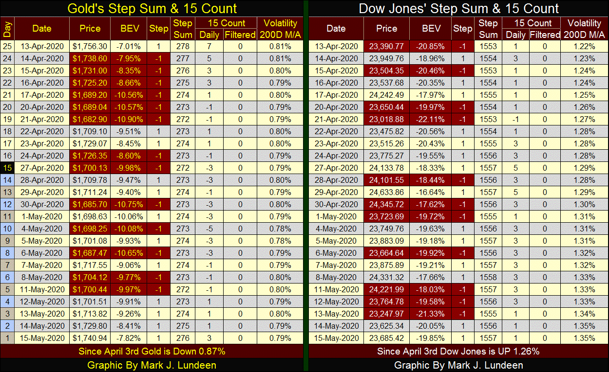
I’m in a hurry this week. Unfortunately I have other things to do besides commentating on the markets, so I’m going to close this week’s commentary with my step sum table for gold and the Dow Jones and leave it at that.
Mark J. Lundeen
More from Gold-Eagle


