Dow Jones Index at All-Time Highs…And I Don’t Care


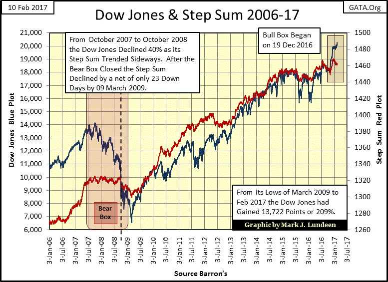
This week ended with the Dow Jones once again closing a new all-time high. Moreover as we see below, the Dow Jones and its step sum are forming a bull box. I don’t take divergences in an index to its step sum seriously until they’ve aged for two months or so. But this divergence between the rising Dow Jones (market reality) and its declining step sum (market sentiment) began around December 19th, so it’s time to begin following the bull box’s progress.
As always, the price trend in a step-sum box is the better predictor of future price trends than is the trend in its step sum. In this case the price trend is advancing; that’s what makes this a bull box.
This bull box can work out in several ways.
One way is for the Dow Jones to continue advancing as its step sum continues lagging behind, until one day the Dow Jones once again sees more up days than down. This would reverse the down trend in the step sum, and hopefully give the Dow Jones a nice little boost upward in price.
But closing the box (seeing the two trends once again agreeing with each other) wouldn’t necessarily result in a big advance in the Dow Jones. This is especially true as this box is forming so late in a major market advance in the stock market. I’d feel more positive about this bull box had it formed in 2009-10 when the wounds inflicted on investors by Mr Bear during the credit crisis were still fresh in everyone’s mind, and market values much lower than they are today.
The other way this bull box could resolve itself would be for it to fail; where the declining step sum trend, not the rising price trend, proved to be correct in predicting a market decline.
I’ll continue following this bull box in the coming weeks, but it doesn’t change my bearish opinion on the stock market. Look at the chart below. To be bullish on the stock market one has to expect the potential gains the Dow Jones (the stock market) may make are worthwhile, while assuming the current risks, which are considerable.
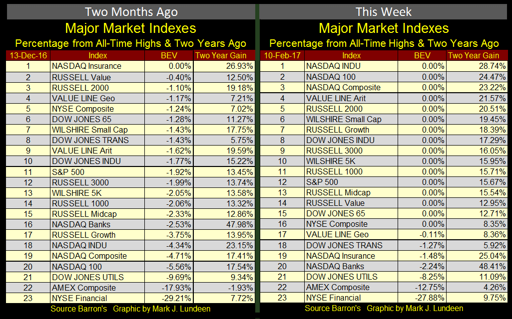
Next is a table showing the two year gains in the major market indexes from the middle of December, and at the end of this week. Seeing a 0.00% in the BEV column indicates a new all-time high. On 13 December 2016, the Dow Jones was at #10. This week the Dow found itself at #8.
From two years ago, the Dow Jones was up 15.22% last December, and now in February it’s up 17.29%. But if you actually look at the percentage gains the Dow Jones has made since December 13th, it’s up only 1.80%.
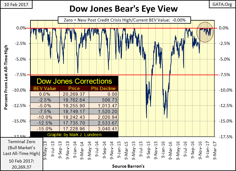
This bull is advancing like a tired old man. But as we see in its Bear’s Eye View (BEV) chart below, since November 10th (Red Circle) when it made it’s first of many new daily all-time highs (20 of the past 63 trading days) in the wake of the November elections, it hasn’t given much to the downside either.
This is a strange market. In the past three months the Dow Jones has either made a new all-time high at a rate of one for every three days, or been within 1.21% of making one. Take a moment to study the chart below. There hasn’t been a similar period of ultra-low volatility since January 2013. I believe that would also be true for the past few decades.
And what has the Dow Jones given investors for all those new all-time highs since November 10th? An advance of only 7.77%. I admit that’s more than what the Bank would give you in a savings account over three months. However, a savings account doesn’t have the risk to principal the stock market has.
But while the Dow Jones and the major market indexes I follow saw many new all-time highs at the close of the week, the same couldn’t be said for the Dow Jones Total Market Groups (DJTMG). At the end of the week, only 10 of 74 groups saw new all-time highs. On an all-time high basis, the DJTMG hasn’t seen any excitement since early 2015; two years ago.
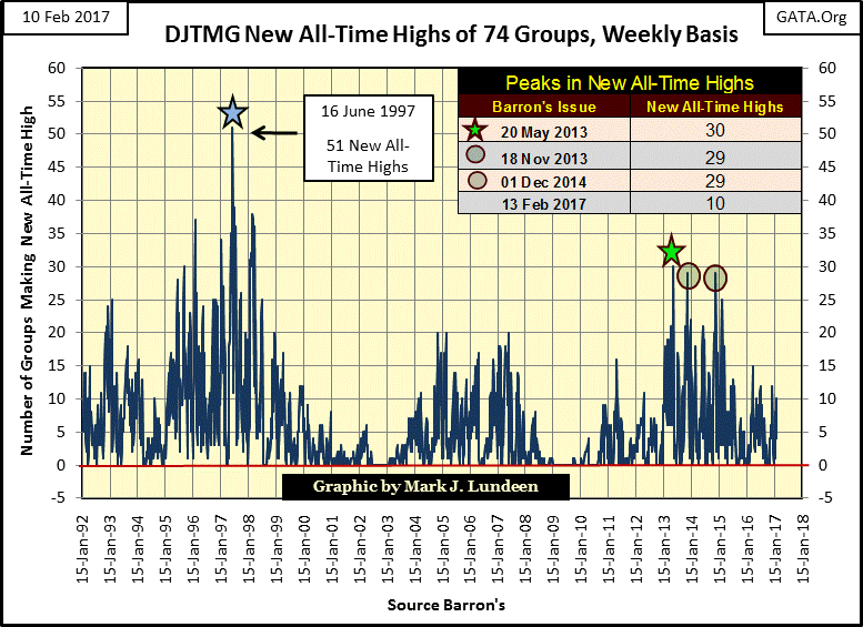
Same goes for the DJTMG’s top 20, or the number of groups within 20% of their last all-time high. For the past year, the top 20 has been stuck in the 40s, not going up, but then not going down either.
If you look at the top 20 plot below, typically since 1992 it’s either advancing upward or going down, though that isn’t always true. Last January the top 20 was heading down. From 52 groups in July 2014, it declined to only 26, from where it quickly recovered. Since then the top 20 has been stagnating in the 40s.
Looking at the plot below, we see how the top 20 peaked for the high-tech and mortgage bubbles; highs that once reached saw the DJTMG begin decaying into a bear market. The current peak (52 in July 2014), is not similar to the two previous peaks, and I have to wonder why.
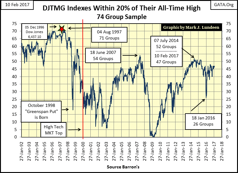
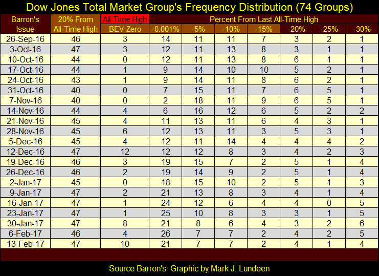
Here’s the frequency distribution table for the DJTMG showing those groups 35% or less from their last all-time high. There are more groups, but they are located further than 35% from their BEV Zeros. The top 20 data plotted above is found in the column next to the Barron’s Issue dates, and it’s simply the sum of all the columns highlighted in light brown; Bev-Zero to -15%. The numbers of groups making new all-time highs are found in the BEV-Zero column.
Examining the NYSE Advancing – Declining Ratio below yet again shows the current era in the stock market; the post high-tech bubble (2000-2017) is unique in the ninety one years plotted.
Note on the NYSE A-D Ratio; I use A-D data as a ratio instead of an A-D Line as the number of companies trading at the NYSE has changed greatly since the 1920s. Using the data as a ratio normalizes the data over the decades.
The chart has tables for the three post Great Depression bull markets so we can gauge how the A-D Ratio impacts market advances.
The 1942 – 1966 bull market saw the A-D Ratio peak in 1956. The Dow Jones itself would see an additional advance of about 100% in the following ten years as the A-D Ratio trended sideways.
The 1982 – 2000 bull market saw the Dow Jones increase by 1408% during its eighteen year timespan. The Red Star marks the begging of this bull market. For the largest percentage advance in the Dow Jones since 1926, the NYSE A-D Ratio didn’t advance much.
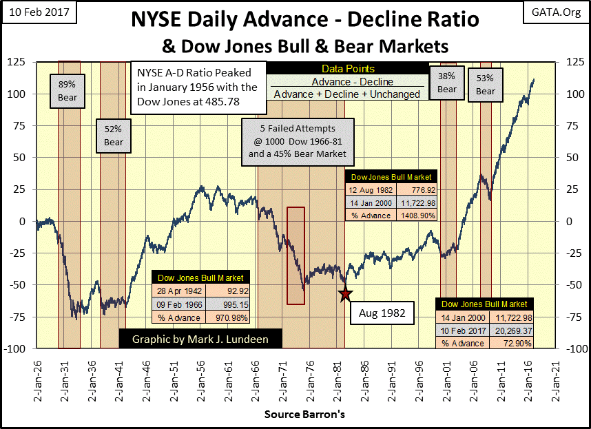
I took some liberty with the next bull market by dating its start in 2000. I did so because first Alan Greenspan, then Dr. Bernanke and now Janet Yellen, have practiced bear-market interruptus with great vigor during this entire period of market history. By starting this bull at 2000, we can see the success these “policy makers” have had in thwarting Mr Bear’s effort in deflating the stock market.
To date, the 2000 – 2017 bull market has seen the Dow Jones advance by only 72.90% in the past seventeen years. This is only a year short of the eighteen years the 1982-2000 bull market enjoyed, even as the NYSE A-D Ratio has surged upward as it has never done since the 1920s! If through the wonders of time travel, someone who saw this chart in January 2000 might believe the Dow Jones would be somewhere over 60,000 in 2017.
We today know the truth; for all the “liquidity injected” into the stock market by the “policy makers” since January 2000; the Dow Jones hasn’t even seen a double. But the Dow has seen two massive bear markets since 2000, and I expect a third is coming that will overwhelm the best efforts of the Washington and Wall Street to contain it.
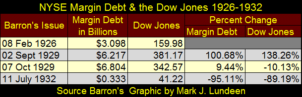
The following chart and table plotting NYSE Margin Debt and the Dow Jones from 1926 to 1933 are beautiful illustrations of the impact inflationary flows from the Federal Reserve have on the stock market.
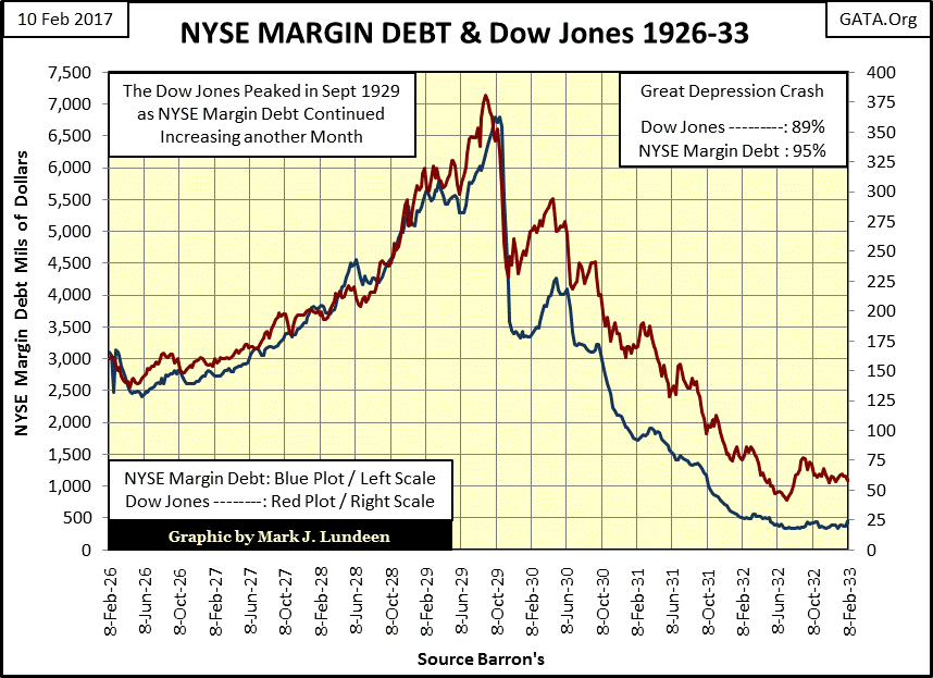
The data used in these graphics come from the dusty old pages of Barron’s of the 1920s and 1930s. So, we’re looking at the actual data seen by the markets at that time. The table below gives the specifics. From Feb 1926 to Sept 1929, the Dow Jones peaked, increasing by 138% as NYSE Margin Debt doubled. Would one have advanced without the other?
I don’t think so. The stock market was going up because people were using margin debt to leverage their profits. And people were taking on margin debt because the stock market was going up.
NYSE Margin Debt maxed out a month later in Barron’s 07 Oct 1929 issue. Margin Debt saw a one month increase of 9.44% as the Dow Jones declined 10%, in spite of the additional “liquidity” flowing from the Federal Reserve.
When people begin leveraging their capital losses with margin debt, you know the end of a bull market is near. This is why, unlike diamonds, inflationary bubbles aren’t forever. The Dow Jones bottomed in Barron’s 11 July 1932 issue, having crashed by 89% from its 1929 peak, Margin Debt by 95%.
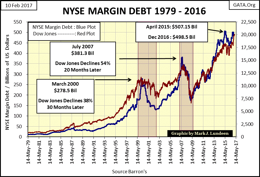
Next is a chart plotting NYSE Margin Debt (Blue Plot) with the Dow Jones (Red Plot) from 1979 to 2016. December 2016 is the latest data available for NYSE Margin Debt.
The pattern seen during the 1920s & 30s is also evident below. Market advances see investors leverage their capital gains with margin debt. Investors deleverage as a matter of personal survival during market declines.
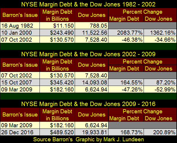
Here’s a table giving the specifics on NYSE margin debt and the Dow Jones for the three bull, and two bear markets seen above.
Going back to the chart directly above, the current bull market is markedly different from the previous bull markets seen since the 1920s. All previous bull markets saw NYSE margin debt peak, which marked the start of a bear market. But our bull market is different. It saw margin debt peak in April 2015, and then like the Dow Jones, it just refused to go down.
Well, you know what I think of that; we’re seeing the finger prints of the “policy makers” practicing bear-market interruptus. I don’t know how long they can get away with supporting the market’s current overvaluations with inflationary “injections of liquidity.” But when they stumble, or decide to use deflation in the financial markets as a weapon against President Trump to punish him for dismantling their precious new world order, with a half of a trillion dollars in margin debt currently in the market needing liquidation in a market panic; there’s a lot of reasons to fear a historic market decline ahead of us.
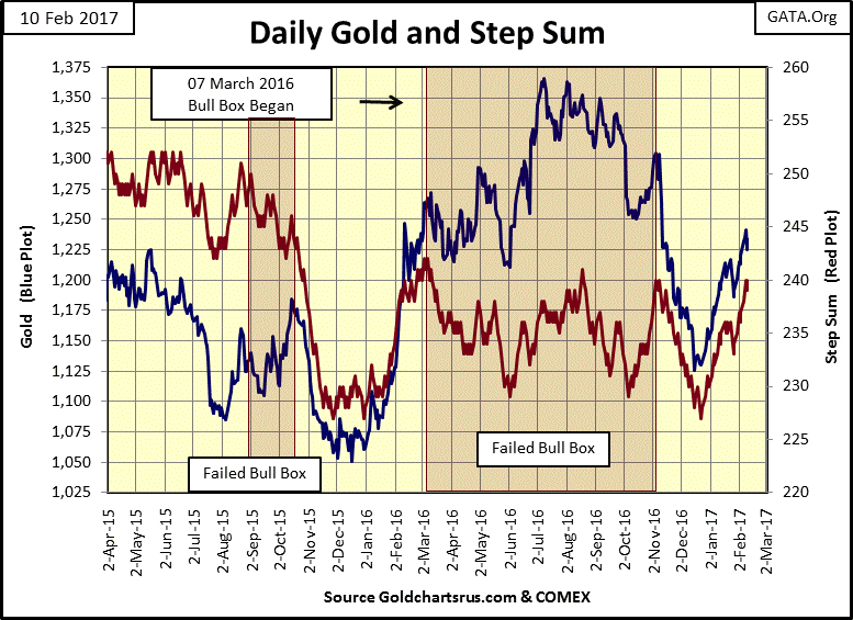
How did gold do this week? Good, if not spectacular. It’s now evident the lows of last December are an important low in the chart below, and for the first time in a year, gold’s price and step sum trends are in agreement. What we watch for now is whether or not the highs of last summer will be taken out in the months to come.
Can gold do that? I think it will. But I’m not a futures trader using leverage at the COMEX. For most people, they should just buy the old monetary metals in full and take them home. After that, take a position in the precious metal miners, with a small position in the gold and silver exploration sector.
And be patient. We’re in the early stages of a historic bull market in precious metal assets. Seeing the global central-banking cartel inflating their currencies to worthlessness as they manipulate interest rates and bond yields far below where a free market would have them guarantees that! Time and compound interest are your friends, as people who purchased, and held on to high-tech shares from 1982 to 2000 discovered.
Here is the step sum and 15 count table for gold and the Dow Jones. Gold’s price and step sum values are advancing nicely. And you can see the bull box building in for the Dow Jones. On January 6th, its step sum was 445. A month later it declined by net of six down days (February 8th: 439), yet the Dow Jones itself was making new all-time highs.

How does that happen? Simple; the Dow Jones goes up more on its fewer advancing days than it goes down on its more numerous down days. It’s actually very bullish for a market to do that. It will be interesting following this development.
As the current bull market for the Dow Jones is now eight years old, and growing older, I don’t expect much to come of its bull box. Even if the Dow Jones is destined to rise up to 25,000; that’s only 25% from where it finds itself today. Considering the potential for a serious market declines from here, I don’t think it’s worth the risk for anyone but a nimble trader who knows how to hedge and has the discipline to cut their losses should the situation demand it.
The best investment strategy for retail investors is to just take a position in the early stages of a massive bull market, and simply stick to it knowing the road ahead of them will have its ups and downs. In February 2017 I believe that place is in the precious metals and their miners.
Over at Live Trading News; Paul Ebeling (Editor of LTN) penned an excellent piece on George Soros; that he’s a threat to national security.
George Soros has been around for a long time. In the early 1970s he was a regular at Barron’s Round Table. Only movers and shakers on Wall Street are invited to sit in on that.
But Mr. Soros has a dark side. On a CBS’s 60 Minutes interview he admitted how during World War II, he was a Jewish collaborator with the Nazis’ liquidation of Hungary’s Jewish population, and that he took some satisfaction from it.
As there’s another major market crisis pending, it would be a good thing to have these two links on Soros given a wide circulation in cyberspace. Many of the same players in Congress and the financial system during the 2007-09 sub-prime mortgage crises are still there. No doubt these people are planning on yet another corrupt bail out from Congress.
What the financial system really needs isn’t another bail out, but to finally see these people have their day in court for fraud and malfeasance. That’s what should have happened in 2009, but Obama’s Attorney General; Eric Holder refused to prosecute. The list of people who should appear before the bar needs to include members of the FOMC – after a complete and independent audit of the US Gold Reserves.
Mark J. Lundeen
[email protected]


