The Dow Jones Index To Gold Ratio Gives A Sell To Stocks And A Buy For Gold And Silver


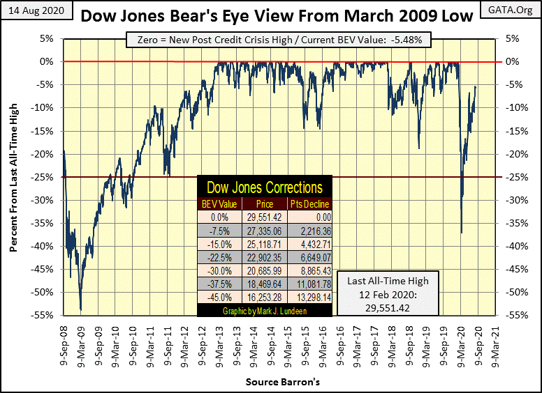
This week the Dow Jones closed at a new high for the move, from its -38% bottom of last March. At week’s end, it has fallen short of breaking above its BEV -5% line. So, the Dow Jones isn’t in scoring position just yet, but maybe that’s what next week is all about. I’ll say this, if after five months of climbing out of the hole the Dow Jones found itself in last March. And if after coming this close to finding itself in scoring position, (< 5% in a BEV chart) should the Dow Jones fail to make a BEV Zero in the Bear’s Eye View chart below sometime before September, or even October, well it wouldn’t be good for the market.
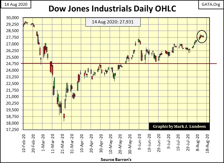
In the Dow Jones’ daily bar chart below, we see how the venerable Dow isn’t in much of a hurry to make market history. For it to rise up to the occasion and break into record territory, it would have to advance another 1,620 points from today’s close. That’s not much of a move when today’s closing price is 27,931.
Let’s look at the major market indexes’ BEV values below, or how far each is from making a new all-time high, aka a BEV Zero (0.00%). Last week four of these indexes made BEV Zeros every day until last Friday. This week there were none, but the top eight closed the week in scoring position so I’m expecting we’ll see more market history made next week.
In the Major Market Indexes BEV table, I note the XAU is at #20 once again, below the NYSE Financial Index and the NASDAQ Banks (#18 & #19). It’s just a temporary setback. By Christmas I wouldn’t be surprised should the XAU be the top performing index in the table below.
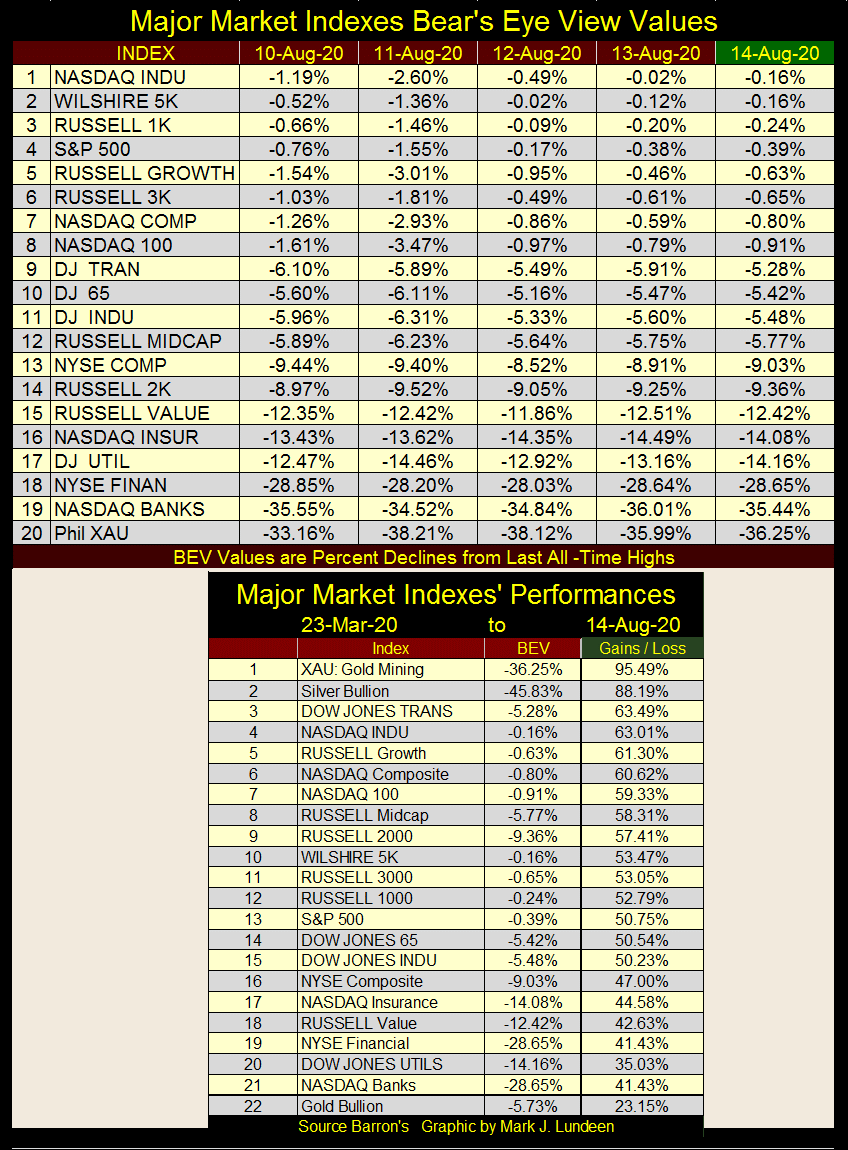
The Dow Jones Transportation Average (#3) has been a top performer since the market’s March lows, even though its earnings have collapsed by 88% since December 2018. Earnings for the S&P500 (#13) have collapsed by 38% since December 2018 too. But none of that matters in a market whose valuations are “supported” by the FOMC.
Below we see the weekly “liquidity injections” the FOMC has administered to the market since January 2016. This week they “injected” another $15 billion into the market. But what does that mean? Well, before 2007 the FOMC typically “injected” only $2.5 billion A MONTH into the market. It’s pretty clear that without this massive “support of market valuations” by the “policy makers”, this is a market that would have seen its valuations crash long ago.
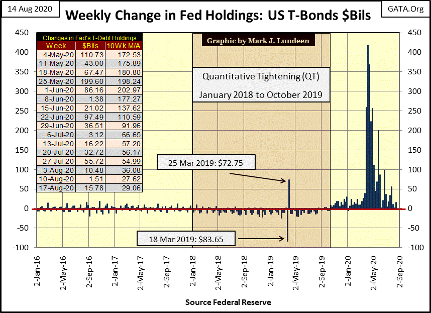
If the Federal Reserve hadn’t “injected” $2.5 trillion dollars into the financial system since last December, all of the indexes above would now be far below their March lows, which for the Dow Jones was a -38% BEV.
Just how far Mr Bear could have clawed back market valuation for the Dow Jones and the other indexes seen above can only be a speculation now in August, but I believe the market would have entered into another Great Depression type of market decline.
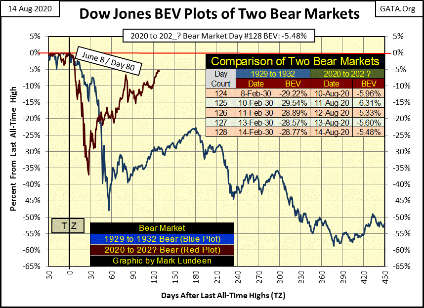
In other words, our bear market (Red Plot below) wouldn’t now be approaching its BEV 0.00% line, but more closely tracking along with the Great Depression bear market decline (Blue Plot).
Look at the red plot’s decline, our decline below. It took less than thirty NYSE trading sessions for it to drop 38% from an all-time high. That’s the fastest 38% market decline in the history of the Dow Jones. I believe Mr Bear had big plans for the stock market in 2020, until the FOMC turned a fire hose of “liquidity” on Mr Bear’s crash below.
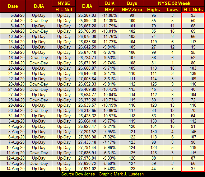
The S&P 500 is an index of the 500 largest companies (by market capitalization) in the US stock market. At week’s end, it was only 0.39% from making a new all-time high. But what’s odd about that is how few of the over 3,000 issues trading daily on the NYSE have seen new 52Wk highs in the past month, see table below.
For all the “liquidity” the FOMC has “injected” into the financial system in 2020; $2.5 trillion, 52Wk Highs at the NYSE remain surprisingly low. Usually with the Dow Jones and the S&P 500 so close to making new all-time highs, I’d expect a few H-L Nets of over +300 to be seen in the table below. The largest 52Wk H-L Net so far in this market advance off of last March’s bottom was on August 5th: 146.
Yves wrote this week asking about the Dow Jones to Gold Ratio (DJ / G Ratio). I hadn’t thought about that ratio for years, so I made the effort to plot it in the chart below. Market volatility introduced by the Federal Reserve System since 1913 is very evident.
Most noticeably the DJ / G Ratio has advanced four times since 1913; I placed a red circle on the peaks in these advances. During these advances in the DJ / G Ratio, in terms of gold, it made sense to be out of gold and silver and in the stock market.
The DJ / G Ratio declined three times since 1913, and again I placed red circles on the bottoms of these declines. The ratio is currently in its fourth decline, whose bottom we have yet to see. During these declines, the stock market should be avoided and investors do best when they invest in gold, silver and precious metal mining shares.
Let’s take a look at how to read this data using the plunge in the plot from August 1999 to August 2011. In August 1999 you could have exchanged one Dow Jones for 45 ounces-of-gold at the plot’s peak. In August 2011 you could have repurchased one Dow Jones for only five of those forty-five ounces-of-gold, keeping forty ounces as pure profit. Or in August 2011 you could have also chosen to purchase nine Dow Jones with the entire forty-five ounces-of-gold from August 1999.
It’s the opposite when this plot increases. In July 1980, it took about one ounce-of-gold to purchase one Dow Jones. Nineteen years later one Dow Jones was worth about 45 ounces of gold, so it made good sense to be in stocks, and out of gold from 1980 to 1999.
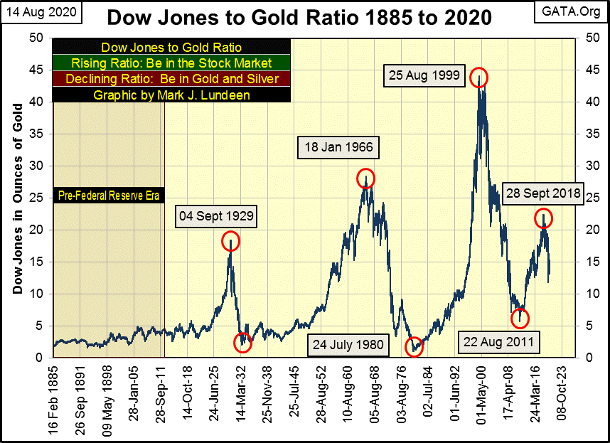
Currently, the Dow Jones to Gold Ratio peaked in September 2018, and has declined ever since. This is speculation on my part, but I’m expecting this current downtrend to continue until this ratio bottoms in record territory, where a mere fraction of an ounce-of-gold can purchase one Dow Jones. If so, it’s best if investors avoid the stock market, choosing instead to maintain a healthy exposure to gold, silver and precious metals mining shares.
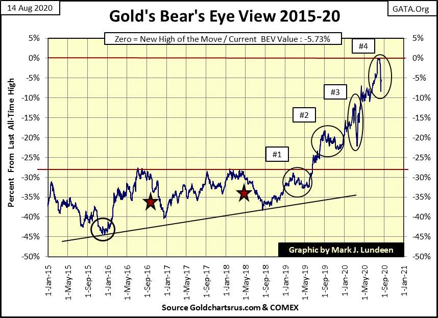
Moving on to gold’s BEV chart below, gold is currently in a little correction, closing the week 5.73% from its last all-time high. I’m not smart enough to know where gold will trend in the coming weeks, but I expect it will soon be making new BEV Zeros in the chart below.
But even should it continue trending down, I’m not going to sell. Not in an economy where the Federal Reserve just “injected” $2.5 trillion into the financial system since the first of the year.
Here’s another remarkable achievement in “monetary policy” for the FOMC; this week Currency in Circulation (CinC), or paper money in circulation in the economy exceeded $2 trillion. That’s double since March 2011 when CinC first exceeded $1 trillion dollars.
Don’t get me wrong; I’m hoping and expecting gold and silver will do really well for the remainder of 2020, and into 2021. But should they begin to go down in the coming months, ultimately it won’t matter as our central bank’s “monetary policy” is guaranteed to result in the termination of the US dollar’s global reserve status. It’s going to happen, and you’ll be glad you own gold and silver when it does.
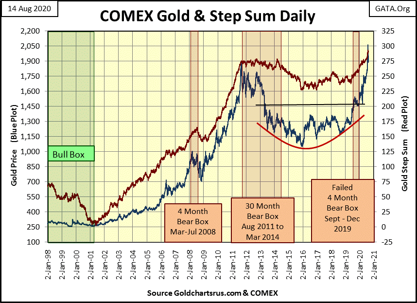
Not much has changed in gold and its step sum chart below. It remains a promising chart pointing to better things to come for gold and silver in the months and years to come. Just note that in the 2001 to 2011 advance, gold had corrections, as all bull market advances do.
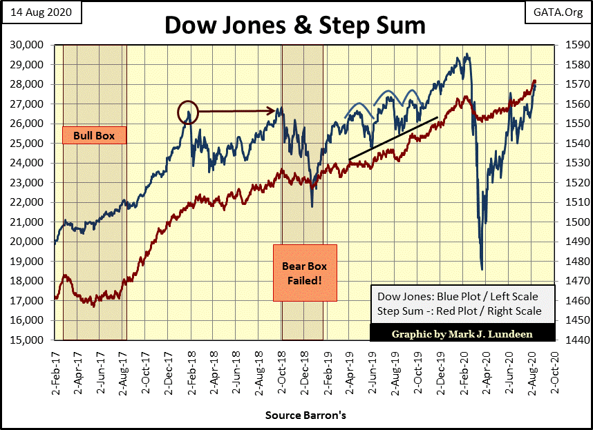
I’m going to cut out the Dow Jones step sum chart and the Gold and Dow Jones Step sum Table commentary below, as last night I had a power failure in my neighborhood. The lights didn’t come back on until late Saturday morning. I just don’t have the time to do these graphics justice, so I’m just going to publish them and let my readers fill in the blanks.

The following commentary was written on Thursday night.
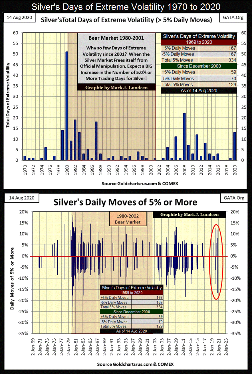
The old monetary metals are seeing an increase in the frequency of their days of extreme volatility, which for gold are day to day closing moves of (+/-) 3% and (+/-) 5% for silver. In 2020 gold has so far seen seven extreme days while silver has seen thirteen. One has to go back almost a decade to see similar volatility in gold and silver, and we’re only in August.
In the first two weeks of August gold has seen one extreme day; -7.09% on Tuesday this week. On Tuesday this week, silver saw a whopping -16.45% decline. I hope my readers weren’t surprised as I warned them about increasing daily volatility as the precious-metals bull market developed. Silver with its volatility threshold of (+/-) 5% is worse. Since August 3rd (last two weeks) silver has seen four (4) positive days of extreme volatility, with two of those this week following Tuesday’s big plunge in the silver market.
That’s how real cowboys and cowgirls ride their bulls; they hold on for dear life and don’t’ let go!
At this point, I’d caution against trading actual gold and silver bullion. You would have no problem selling them; in fact you would most likely sell them at a premium to the prices seen on the internet and financial media. The problem is getting back in, as you may have to wait in line to do so. If someone wanted to do something adventurous in this precious metals’ bull market (which I don’t recommend, but lots of people do), buy some put or call options for the XAU. With options, if you’re right you take home many more dollars than you put in. If you’re wrong you only risk the amount of dollars you staked.
The graphics below plots days of extreme volatility for gold and silver going back to 1970. Volatility in the gold market has calmed down significantly since the early 1980s, but picked up a bit from 2006 to 2013. Gold saw not one day of extreme volatility from 2017 to 2019 (three years), but so far in 2020 has seen seven extreme days.
Seems to me with this pickup in daily volatility, something has changed in the gold market, something in favor of the bulls. So, if we saw a big down day on Tuesday, don’t worry as there is good reason to expect a big up day sometime in the next month or so.
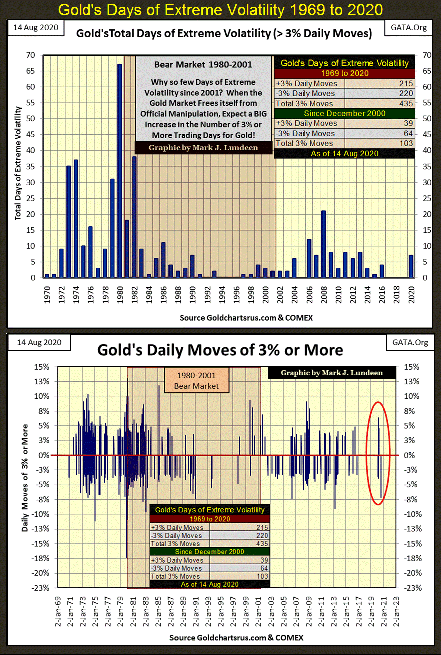
Looking at the bottom chart of the graphic above, the famine in daily volatility gold has seen these past few years can’t be missed. Note all of those big -3% down days in the 1970s as gold trended up to its ultimate bull market high in January 1980. And then note all the big +3% days in the early 1980s as gold began a two decade long bear market.
This is what gold and silver do whenever they are making a big move up or down; they become volatile markets. That the old monetary metals are now trending upward, these extreme days of volatility, both up and down, tells us the metals are making a big bull market move.
Before this bull market in gold is over, I’m expecting an extreme volatility cluster formation similar to what we see in the 1970s, quite possibly a denser and more prolonged cluster.
Silver’s days of extreme volatility are shown below. Since 1970, gold has seen more days of extreme volatility than has silver. But keep in mind these thresholds for daily volatility,( 3% for gold and 5% for silver) are completely arbitrary values chosen as they work. Originally I used a 3% threshold for silver. However silver’s days of extreme volatility then overwhelmed those of gold. So, I upped silver’s threshold to 5% which works fine in the charts below.
My apology to the webmasters who have to insert my next table into their work; it’s a big table but I don’t know how to condense it. This table breaks down daily volatility by year since 1970, which in 2020 is fifty years. It lists annual volatility as follows:
- 1st: First Closing Price of the Year / First Day of Trading in January;
- % Range: Percentage Spread between the Yearly High and Low Price;
- Plus: Quantity of Positive Days of Volatility;
- Negative: Quantity of Negative Days of Volatility
- Total: Total Days of Extreme Volatility.
I think the information in this table is very insightful. I’m going to assume in the next four and a half months left in 2020, gold and silver are going to see many more days of extreme volatility. If so, 2020 may prove to be the most volatile market for the old monetary metals since 1982, the year the Dow Jones began a bull market advance that continues to this day.
I anticipate 2020 will be a year of change, where precious metals valuations are going to be inflated by flight capital fleeing deflation in the financial markets.
The big problem for the “policy makers” will be the “liquidity” they’ve “injected” into the financial system since 1982, will find it increasingly easy to change channels; to no longer flowing into financial assets but now into precious metals investments. The more stocks, bonds and real estate deflate, the more gold, silver and their miners will inflate.
If someone wanted to understand my core concept for the market trends for the next few years, this is it; deflation in the stocks, bonds and real estate = inflation in precious metals assets.
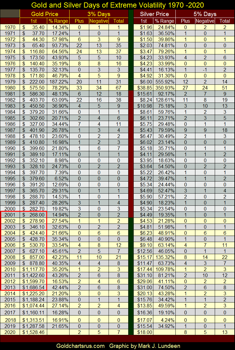
I placed a red box around the years 2001 to 2013 for gold, as for these twelve years (2002 to 2013) gold closed higher than the previous year. Of course this is based on the closing price for the first day of each year. This is something the Dow Jones, or anything else I’m aware of has ever done, so it’s a historical achievement for gold to have done this.
Here’s a well-researched, and detailed article by the Hedgeless Horseman on my favorite precious-metals exploration speculation: Eskay Mining (ESKYF / NASDAQ). I’m not going into detail of what it says about Eskay Mining, as it’s best for those interested in a fabulous exploration speculation to just take the time to read the article below. And it’s a long a read, but worth the time.
https://www.thehedgelesshorseman.com/eskay-mining/eskay-mining/
Last March ESKYF on the NASDAQ (aka Eskay Mining) was going for less than $0.10. This week it closed at $0.58. These little exploration companies are illiquid, so it’s not surprising to see it jump by a factor of 5 in only five months. It could be back down to below $0.10 in a few weeks. But I don’t think that will happen.
Currently Eskay Mining is placing drill pads down to drill some three kilometers of core material from identified areas of interest. Assays of these cores most likely won’t be out until October or November. I’m hoping Eskay Mining shareholders finally get to see a very Merry Christmas for 2020.
Keep in mind Eskay Mining is a speculation, no guarantees can be made on future performance. But $500 will get you about 1,000 shares at today’s price. If Eskay strikes it big, you’ll make the big bucks. If they don’t, the most you lose is $500.
Mark J. Lundeen
*********


