The End Is Nigh? (Part 1)


This Weekend Report will probably be one of the most important posts I’ve made in quite some time. It will require 3 parts to fully present this scenario.
I’m going to try and lay out a game plan on how this possible last impulse move down may play out in time and price. One thing I can guarantee you is that there will be no bell going off at the bottom when it finally materializes. The volatility will most likely be very extreme with huge swings back and fourth as the last of the bears sell out to the new bulls. How long that process will play out is anyone’s guess. It may take several months or longer until we see some type of reversal pattern form.
Normally after a hard move down the first bounce off of initial support will be the strongest. It’s like dropping a super ball, the first bounce will be the highest with the subsequent bounces losing steam until it finally comes to rest. These bounces will produce some type of reversal pattern that we should be able to recognize which most likely will be a double bottom or inverse H&S bottom.
Today, in part one, I would like to look at the HUI, the precious metals stock index, for clues on how this last impulse move may play out in time and price. I’m saying last impulse move down but there in no way to know 100% for sure if that is true. This next impulse move down is based on what the chart patterns are suggesting today along with some of the individual precious metals stocks. When you add everything up it becomes clear that at a minimum we’ve been in the next impulse move down since the May high at the 185 area. I’m going to use the HUI as a proxy for the rest of the PM stock indexes as it’s leading the way lower.
First I want to look at the short term two hour charts and move out to the longer term charts to try and put everything in perspective and paint a picture of how I think things may play out based on the Chartology at this time. We’ll definitely need to keep an open mind and adapt to changes that the market may throw at us.
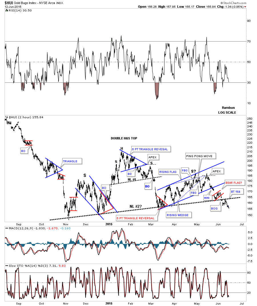
When looking at these short term charts the November low from last year was a most important low as many of the individual precious metals stocks and precious metals stock indexes show that low as being the first reversal point in a bigger consolidation pattern. This consolidation phase has gone on now for 7 1/2 months. When the last impulse declined into that November low there was no way to know how or which type of consolidation pattern may build out. All we could do is watch the price action for clues on what may develop. This first 2 hour chart for the HUI shows most of the smaller consolidation patterns that formed since the November low. It’s easy now to look back in hindsight to see how things unfolded but it’s much harder in real time to know 100% for sure what you’re seeing is correct as chart patterns can morph into bigger patterns.
Some of you may remember the 5 point blue triangle reversal pattern that ended up being the head of, at that time, a small H&S top labeled #1. There was a nice reverse symmetry decline into the March low which now is the armpit of a much bigger H&S pattern #2. You can see how laborious the right shoulder was during its formation as the original blue dashed rising wedge morphed into the bigger rising wedge which eventually built out the right shoulder. I showed you how the HUI may do a ping pong move in the apex of the blue dashed rising wedge and also how the apex may hold resistance. Looking back in hindsight that’s is what happened and why we started to get short the Kamikaze Stocks. The first big clue we got is when the price action gapped below the bottom rail of the blue rising wedge. From there you can see the little red rising bear flag that formed right on top of the neckline. Then the price action gapped below the neckline with one clean backtest so far. I wish I could rule out no more backtests to the 164 area but it’s still possible at this point in time. The main thing is we have a clean line in the sand at the 164 area to keep a close eye on.
This next 2 hour chart for the HUI I’m going to use for illustration purposes and call it a four point triangle consolidation pattern. They’re basically both consolidation patterns with the same outcome.
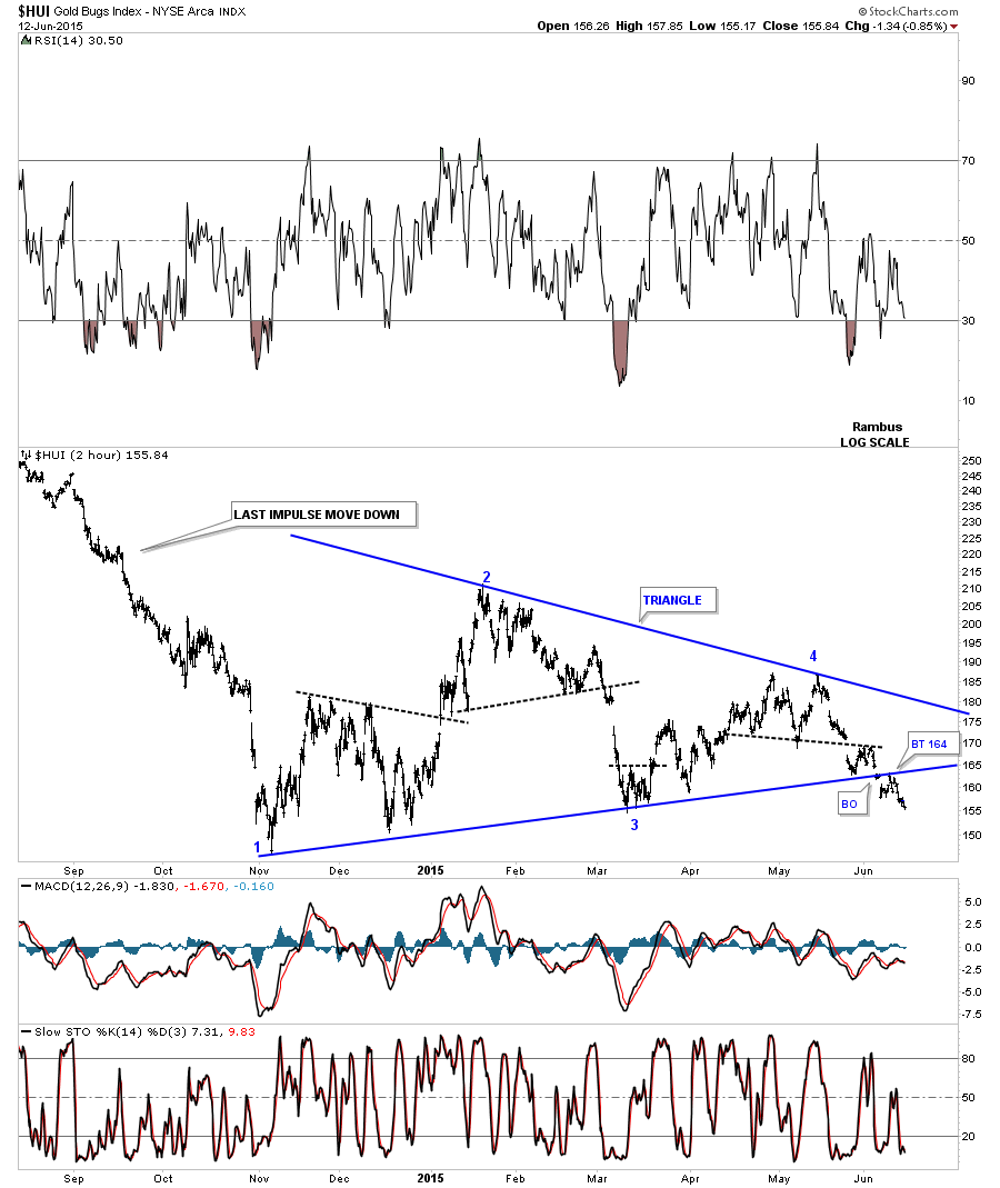
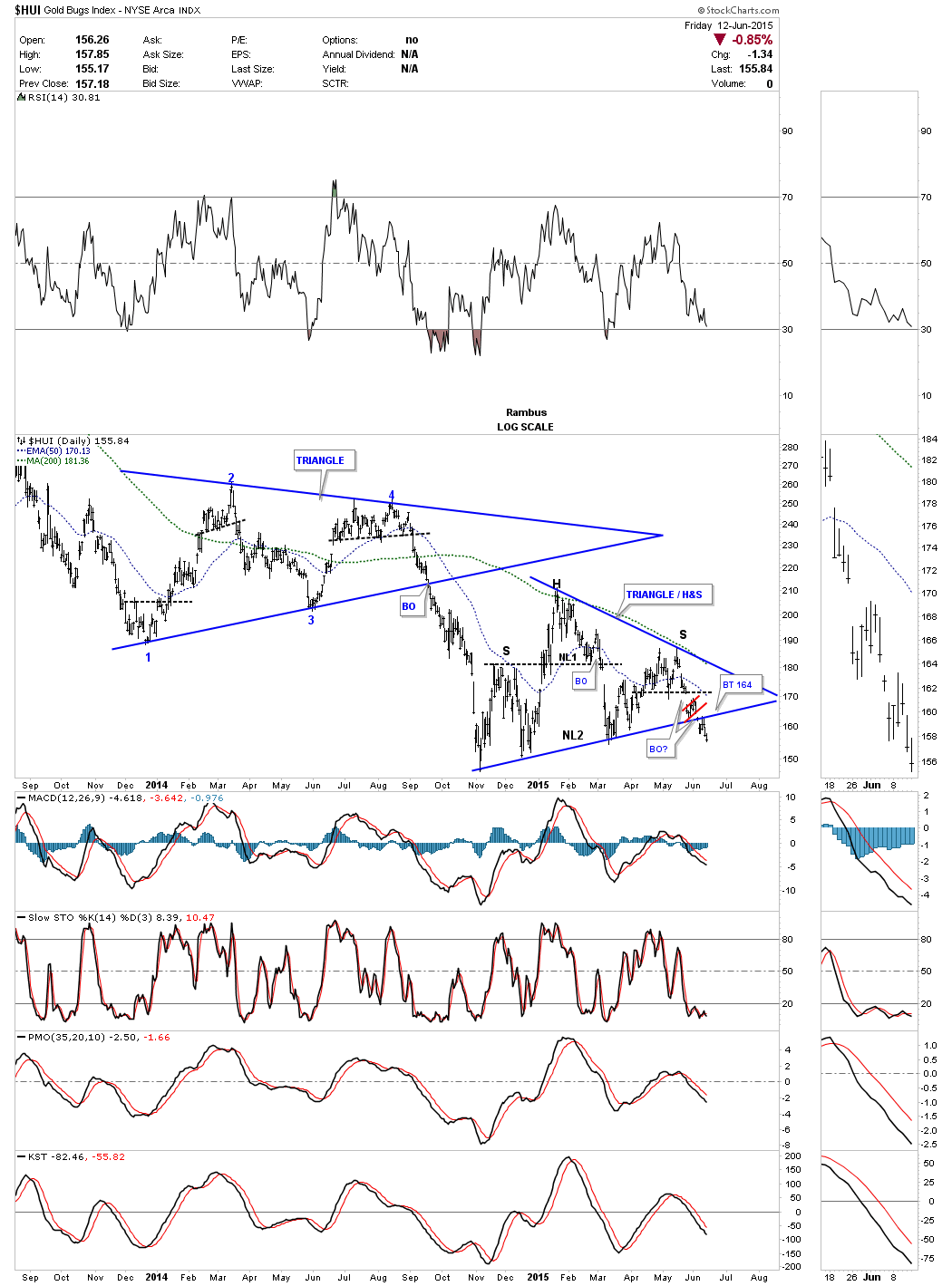
This next chart is a 2 year daily look at the HUI which shows the combo H&S / triangle pattern we just looked at above with the blue triangle consolidation pattern that led to the last impulse move down once the bottom rail was broken to the downside. Since the November low from last year the HUI has built out this blue triangle/H&S consolidation pattern.
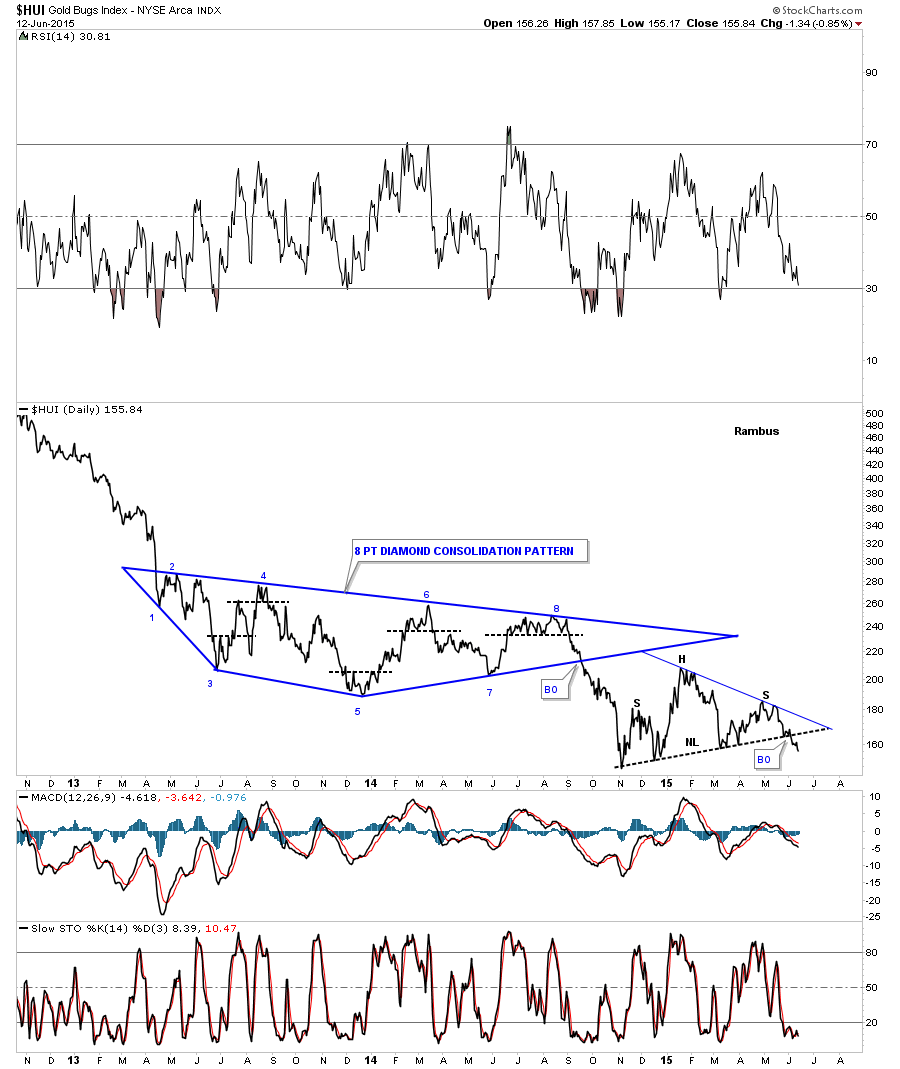
To say the last two years in the PM complex has been tough would be an understatement as traditional chart patterns have morphed into bigger patterns. Longer term members may remember this blue 8 point Diamond consolidation pattern that chopped around for almost a year and a half before it finally broke to the downside in the last impulse move down. Starting at the 5th reversal point you can see the blue triangle, that I showed on the chart above, which finally ended the Diamond. The last impulse move down started at reversal point #8 and ended at the all important November low last year. Hear I have the H&S consolidation pattern in place but it could also be a triangle consolidation pattern that is just now starting to break down. Note how many times the bottom rail or NL has been touched over the last seven months or so. This is an important breaking taking place right here and now.
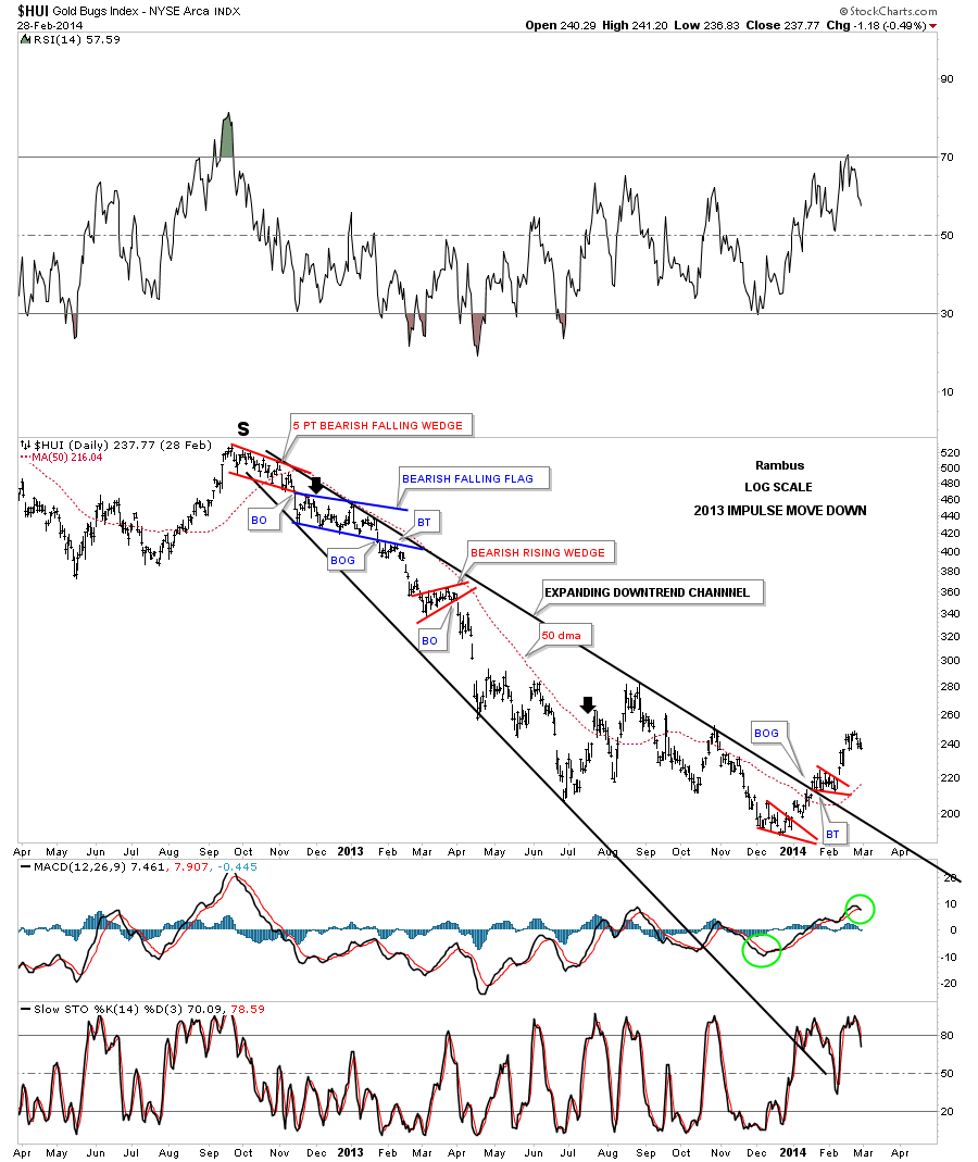
Before we move on the the longer term charts I would like to show you the first impulse move down we caught back in December of 2012. The big S at the top of the chart represents the top of the right shoulder for the massive H&S top. That right shoulder high was an unconventional 5 point red bearish falling wedge which is a reversal pattern. When the pattern broke down we took our first short position on the backtest to the underside of the red falling wedge as shown by the black arrow. That short trade started out very slowly as shown by another unconventional blue falling flag which took a good three months to build out.
At the time I was using the 50 dma as our sell/stop. You can see how well it worked in holding resistance which the HUI couldn’t break. Finally the blue falling flag broke to the downside with a nice clean backtest to the underside of the bottom rail. The HUI declined sharply until the start of the conventional red bearish rising wedge which took about a month to complete. The black arrow in late July of 2013 shows where the HUI gapped above the 50 dma where we finally exited our Kamikaze position. The reason I’m showing you this trade is to show you that it will not be a cake walk during this next impulse move down. There are going to be some small consolidation patterns that form along the way with some very wide swings in the price action that will scare the pants off of you. They call it short covering rallies. They will only last for a few days but be prepared for them.
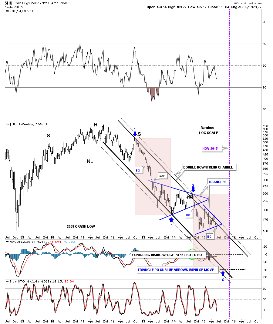
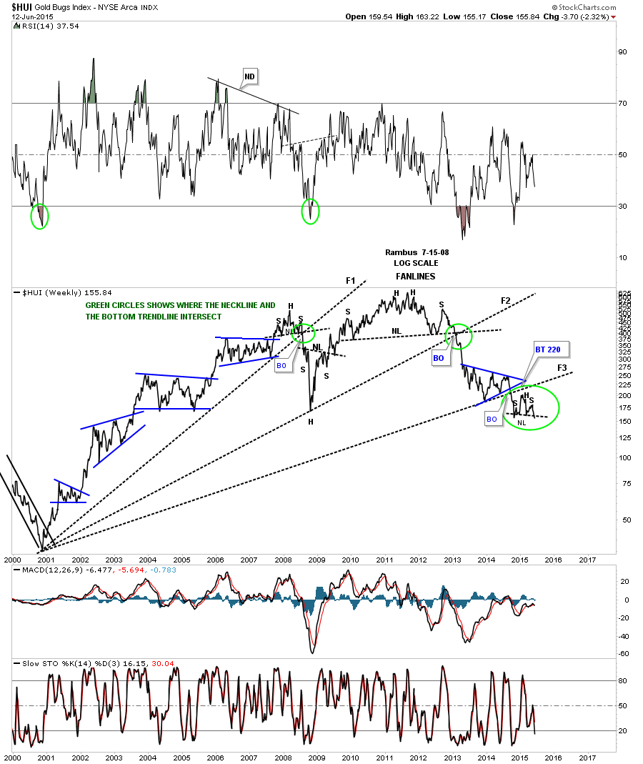
This next weekly chart for the HUI is one we’ve been following very closely that shows the double trendline downtrend channel. The outer dashed trendline has held resistance three times now so we know it’s hot. You can see the lower rail of the bottom triangle cracked this week to the downside. This is the point where we could see a backtest to the underside of the lower triangle before the move lower takes off. Note the impulse move down from the upper blue triangle. There was no backtest when that bottom rail was broken. The pink shaded areas measures time and price based on the first big impulse move down as shown by the blue arrows.
When I first built this chart I was using the last reversal point in the upper blue triangle as the starting point for the second impulse move down. At the time the smaller lower blue triangle hadn’t formed yet which may change the price objective as shown by the blue arrows. I’ll show you what I mean in a moment.
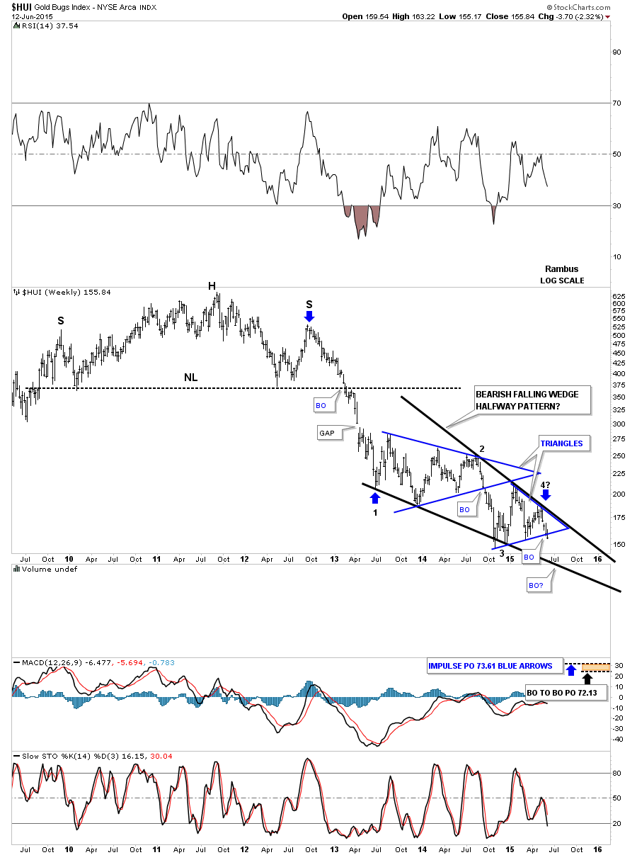
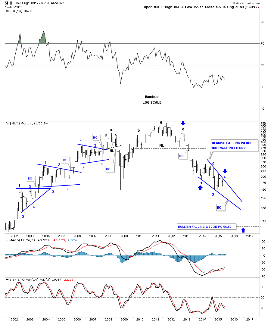
As I’ve shown you on the charts above this has been a rather unconventional trading range, for a lack of better words. This next weekly chart for the HUI I’ve never posted before until today. I’ve been looking at this next possibility for some time trying to explain this big trading range which I would view as very complex. I have shown you in the past how two smaller chart patterns can build out a bigger pattern which is not at all uncommon. If we fuse the two blue triangles together we get, what most chartists would call, an unconventional bearish falling wedge.
The weekly chart below shows how the falling wedge fits into the big picture. I’ve made two price objectives based on the impulse method as shown by the blue arrows and the breakout to breakout method. The breakout to breakout method starts with the breakout from the massive H&S top to the first reversal point in the black falling wedge. Take that measurement and add it to the breakout from the black falling wedge to get your price objective. If the black bearish falling wedge plays out then we’ve only completed four weeks of this next impulse move down as shown by the blue arrow at reversal point #4.
Before you write off this possibility I will show you another bearish falling wedge that played out during the 2008 crash.
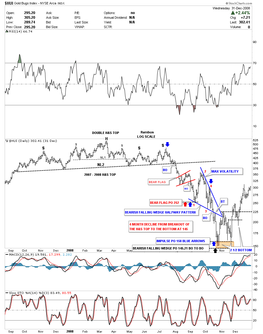
This next weekly chart for the HUI takes in the H&S top that built out in 2007 and the 2008 crash that ensued when the breakout from the neckline took place. Like our most recent massive multi year H&S top, which is a double H&S top, the 2007/2008 H&S was also a double H&S top. The first leg down the HUI formed a little red bear flag halfway pattern which when it completed marked the first reversal point in the big blue bearish falling wedge.
If you’re an adrenalin junkie, as Sir Parabolic Chuck ,at the Chartology Forum says he is, you would have been in 7th heaven. Note how many points were in the first reversal point within the blue bearish falling wedge in about two weeks time. Then the second reversal point to the downside that was bigger than the first reversal point which again took about two weeks. The 3rd reversal point took less that a week to complete and then the fourth reversal point signaled the blue falling wedge was complete when the price action broke below the bottom blue rail. Note the clean breakout and backtest of the bottom rail of the blue bearish falling wedge. It was perfect Chartology. After the backtest was completed it only took four days for the HUI to reach its ultimate low around the 150 area.
The initial bounce off of the bottom was roughly 75 points from about 150 to 225 in about two weeks time. Just think about that for a minute. All I can say is be careful of what you wish for. The HUI then decline back down to the 160 area in just over a weeks time forming the second low. From the second low the HUI rallied almost 100 points in less than two weeks time where it finally ran out of gas and fell back. At the time I was looking for the double bottom hump to hold support but as you can see the price action traded below that area for about a week before the HUI left, what I’m calling a 2 1/2 point double, bottom for good. The HUI basically doubled in about 2 months time from 150 to 300 before you could blink and eye. Previews of coming attractions?
Below is a monthly chart that shows how the current bearish falling wedge would look as a stand alone pattern.
Next I would like to show you a few long term charts looking for clues on what is happening from a different angle. This monthly chart for the HUI shows three fanlines that start at the bear market low in 2000. Note how fanline #2 splits the two triangles with the blue one on top and the red one below. Perfect Chartology. What is also apparent on this very long term chart that shows the entire history for the HUI is the bull market that started in 2000 built out a massive blue bearish rising wedge. Note the big breakout in April of 2013 that so many were calling manipulation at the time. I viewed that big move down as a breakout from two important trendlines. The first was the breakout from that massive H&S top that few believed was possible at the time. The second breakout broke below the bottom rail of the massive rising wedge pattern. From a Chartology perspective that’s exactly what you want to see when two important trendlines give way.
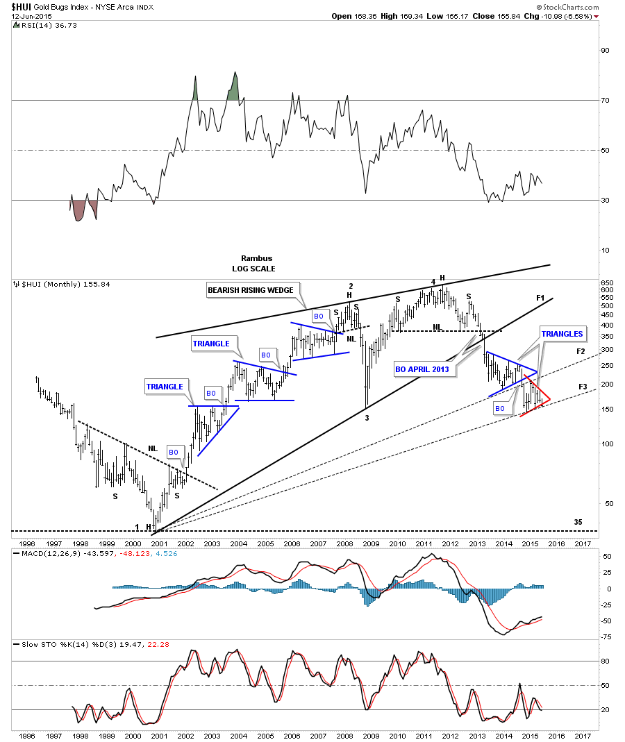
This next chart is a weekly line chart for the HUI which helped confirm for me when the HUI was breaking out from that massive H&S top in 2013. Note how fan line #1 formed when the HUI broke below the neckline and the dashed uptrend rail which had been in place at the time in 2008, green circle. The exact same thing happened when the massive H&S top broke down in 2013 again at the neckline and fan line #2. You can see the small H&S top that has been forming since fan line #3 gave way late last year. If you changed this chart to a bar chart you would see the head backtested the underside of fan line #2 right on the money.
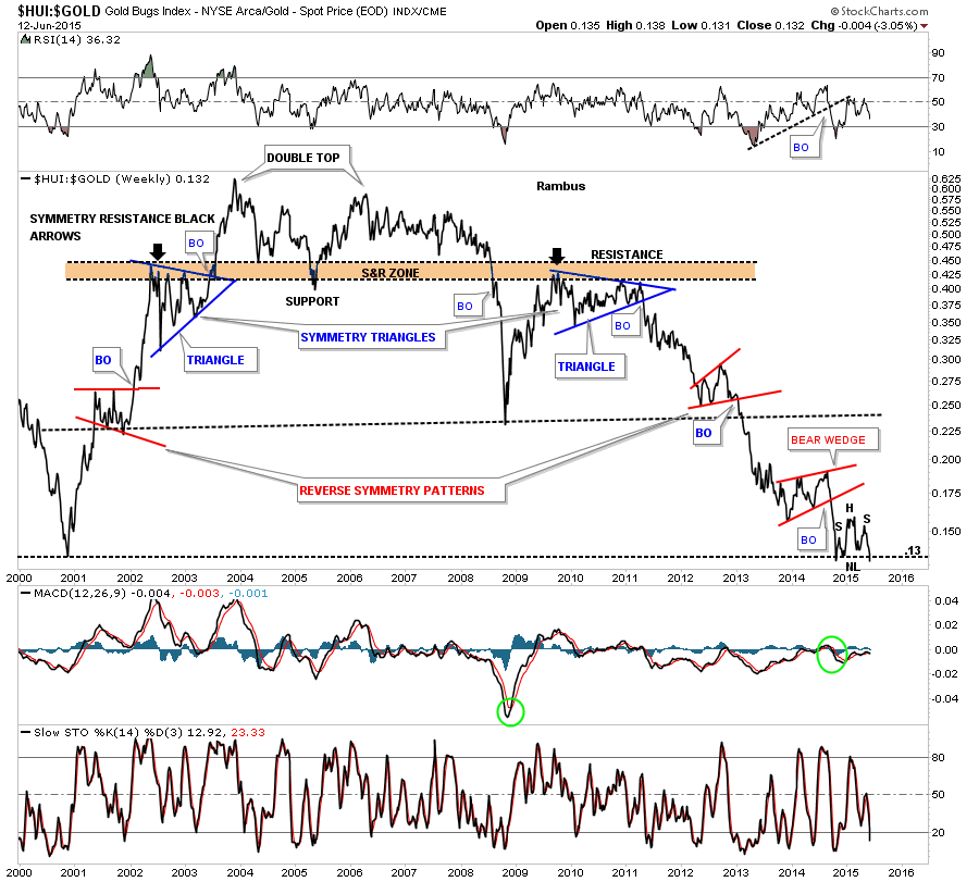
Next I would like to show you a couple of ratio charts. The first ratio chart compares the HUI to GLD. Here you can see the H&S top that has formed since the November low from last year.
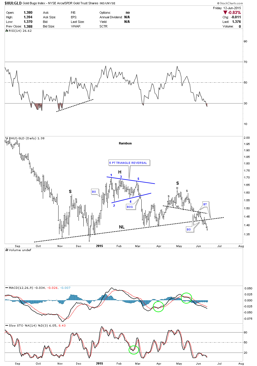
This very long term weekly chart for the HUI:GLD ratio shows the H&S top, on the chart above, is sitting right on a very important support line that goes all the way back to the 2000 bear market low at .13 or so.
This last chart for tonight shows the HUI:SPX ratio that shows the HUI under performing the SPX and has now broken the neckline to the downside.
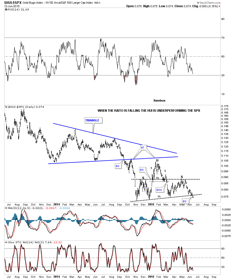
From a Charology perspective the HUI is not looking very healthy in here. We could see a little backing and filling over the next week or so but nothing of significance. In part 2 (for subscribers) we’ll look at the precious metals themselves and look for more clues on a time and price objective. In part 3 I’ll show you many precious metals stocks that should also give us a big heads up on when to look for a possible important bottom to start building out. I really believe we’ve started this next important impulse move down that may take up to four more months to play out so we still have some time left to get our shopping list together on which precious metals stocks we’ll want to own once this Grueling Bear Market comes to an end. Mercy !
We will be calling on the Good Knights and Ladies at the Chartology Forum Round Table to prepare the list based on their wide array of knowledge in the Precious Metals Stocks.
All the best…Rambus
 Meet Rambus, a seasoned trader and technical analyst renowned for his unbiased and insightful chart work. Through his website, Rambus Chartology, and Substack newsletter, Rambus shares his expertise with a global community of subscribers, providing daily updates, commentaries, and hands-on training in the art and science of chartology. With his calm, humble, and down-to-earth approach, Rambus demystifies complex market trends, helping his followers navigate the challenges of today's volatile markets. Join the Rambus Chartology community today and discover a unique blend of technical analysis, trading expertise, and time-tested protocols. Subscribe now at www.rambus1.com or https://rambuschartology.substack.com/


