Gold Price Forecast: The Critical Breakdown That Most Investors Missed


With rising bond yields crushing gold, and the yellow metal touching yearly lows, there is one detail that has not received attention.
I recently wrote that I would provide the details for the analogy to 2008 in the mining stocks, and that’s exactly what I’m going to do today. But first, let’s take a look at what happened on the 16th, because we’re seeing a major breakdown that I think almost nobody noticed.
This breakdown is not in gold.
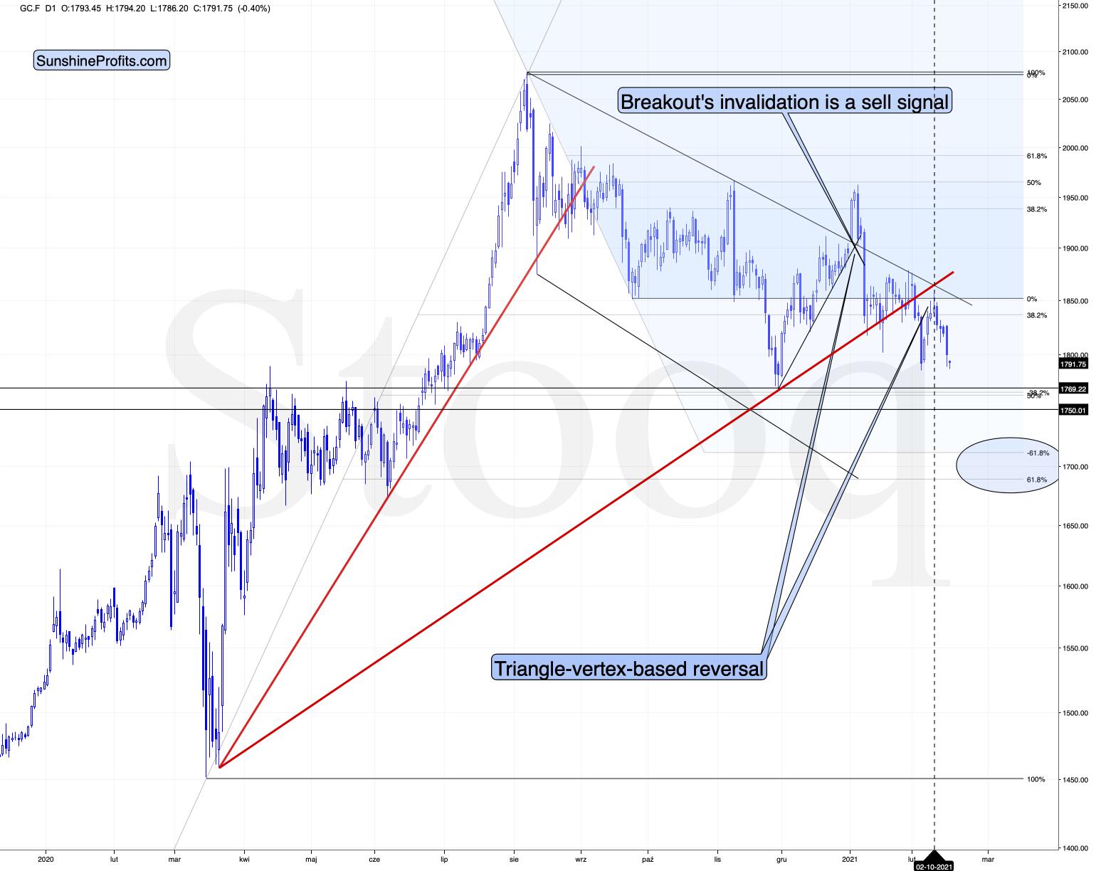
Figure 1 - COMEX Gold Futures
At least not at the moment of writing these words.
Gold is testing its previous lows after reversing almost right at the triangle-vertex-based reversal. Please take a moment to appreciate this technique, as without it, one could have gotten prematurely excited by the early-Feb upswing, which actually turned out to be nothing more than a verification of the breakdown below the rising red support line. The outlook here remains strongly bearish for the following weeks.
The above-mentioned “hidden” breakdown is not visible in silver either.
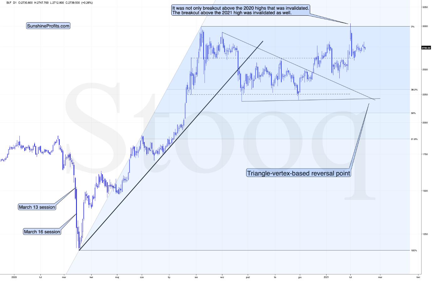
Figure 2 - COMEX Silver Futures
The white metal is relatively strong compared to gold, which is perfectly normal given the current situation on the market:
-
The precious metals market is just before a big price decline.
-
The general stock market is still moving higher.
Given the proximity of the triangle-vertex-based reversal in silver, it could even be the case that silver moves higher one more (final) time before the slide starts. Then again, it could be the case that it declines sharply and bottoms shortly – just like it did in September 2020.
The above-mentioned “hidden” breakdown is not visible in the GDX ETF chart either, but we’re getting closer to the true answer.

Figure 3 - VanEck Vectors Gold Miners ETF (GDX)
The GDX declined by 2% yesterday, and just like gold it’s trading close to its 2021 and late-2020 lows. There was no major breakdown here… yet.
The 50-day moving average seems to have stopped the preceding upswing and miners are now ready to move lower.
The slide to about $31, then a comeback to $33 - $34 and then another – much bigger – slide continue to be the most likely outcome from here. The least certain part, in my opinion, is the existence or the size of the corrective upswing after the initial decline to about $31.
Ok, having said that, let’s see where the “hidden” breakdown happened.
It was in the HUI Index to S&P 500 ratio.
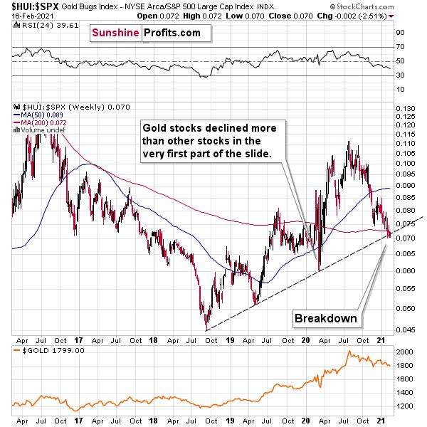
Figure 4 - $HUI, $SPX
This ratio shows how well gold stocks perform relative to other stocks. In other words, this ratio replies to the following question:
How would gold stocks perform if it wasn’t for the movement of the general stock market?
In a way, the above ratio is more “true” than the HUI Index itself, because it focuses much more on the “precious metals” aspect of the index.
What is important is that we are witnessing a breakdown below the rising support line that started in 2018, that was created based on also the 2019 bottom and that served as support at the 2020 bottom. The fact that this ratio managed to stop the decline is remarkable.
Let’s go through this again: gold stocks are doing something more bearish that they weren’t able to do even at the end of the 2020 slide.
The breakdown is not yet confirmed and it’s not yet significant, but it is a small crack in a very important dam. The implications are already bearish.
And this is especially the case given the analogy to 2008 that I will talk more about below.
Let’s start with a quote from my previous analyses:
I wrote on Feb. 5:
The three of the biggest declines in the mining stocks (I’m using the HUI Index as a proxy here), all started with broad, multi-month head-and-shoulders patterns. And now we’re seeing this pattern all over again.
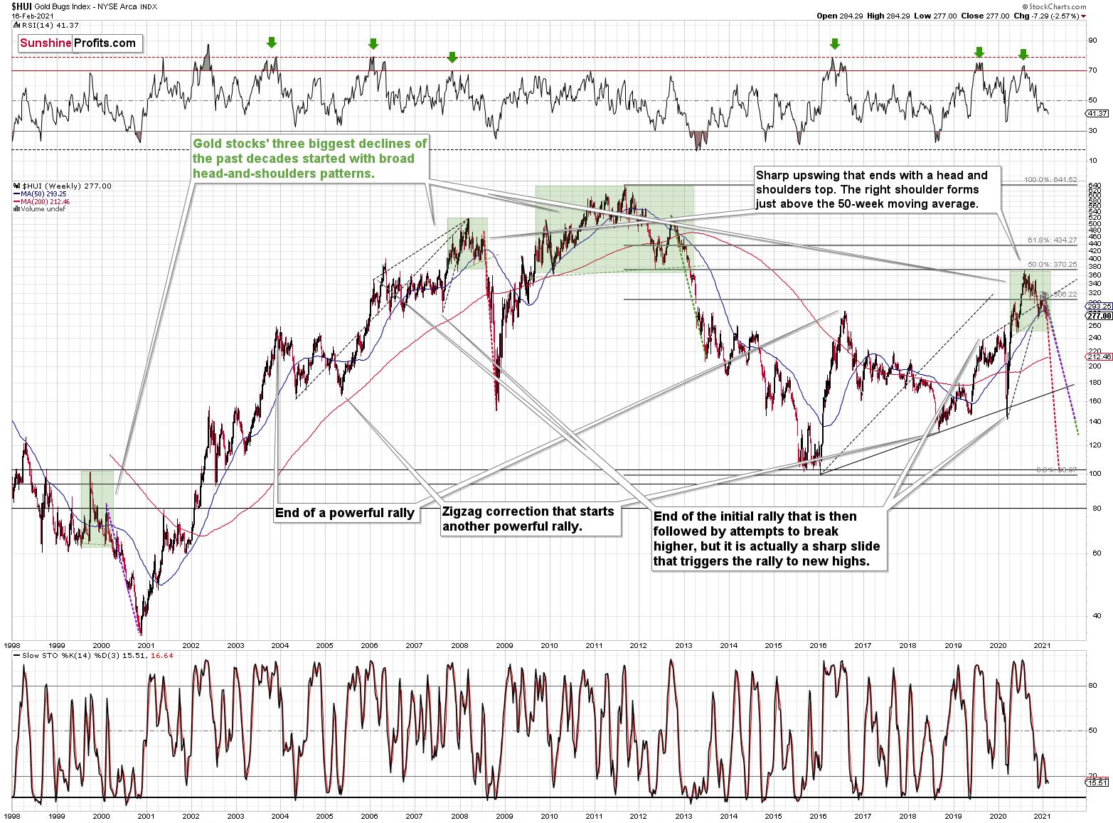
Figure 5 - NYSE Arca Gold BUGS Index (HUI) and Slow Stochastic Oscillator Chart Comparison
The above picture should make it clear why I was putting “at least” in bold, when describing the targets based on the head-and-shoulders patterns.
In all three cases, the size of the decline exceeded the size of the head of the pattern. This means that the $24 target on the GDX ETF chart is likely conservative.
Can we see gold stocks as low as we saw them last year? Yes.
Can we see gold stocks even lower than at their 2020 lows? Again, yes.
Of course, it’s far from being a sure bet, but the above chart shows that it’s not irrational to expect these kind of price levels before the final bottom is reached.
The dashed lines starting at the 2020 top are copies of sizes of the declines that started from the right shoulder of the previous patterns. If things develop as they did in 2000 and 2012-2013, gold stocks are likely to bottom close to their 2020 high. However, if they develop like in 2008 (which might be the case, given the extremely high participation of the investment public in the stock market and other markets), gold stocks could re-test (or break slightly below) their 2016 low.
I know, I know, this seems too unreal to be true… But wasn’t the same said about silver moving below its 2015 bottom in 2020? And yet, it happened.
While describing gold’s very long-term chart (Figure 5 - above), I wrote that based on gold’s MACD indicator, the situation is also similar to what happened in 2008. The above chart shows some additional similarities. Let’s consider the sizes of moves between the 2004 bottom (one could argue that this is when the several-year-long rally started) and the 2008 top, between the initial 2006 top and the 2008 top, and between the very beginning of the final rally – at the end of the fake sharp downswing and the 2008 top.
I marked all of them with dashed lines and I copied them to the current situation. By “current” I mean what happened recently and in the previous years – to the situations that seemed analogous to the ones described above. For instance, the near-vertical 2020 downswing that was followed by a big rally that ended with a big head-and-shoulders top seems similar to what happened in mid-2007.
As one might expect, these dashed lines don’t point to the same price top. No wonder – the history doesn’t repeat itself to the letter, as the circumstances are not identical.
But…
What is remarkable is that, on average, these dashed lines did a great job in approximately (!) pinpointing the end of the entire rally and the start of the next massive move lower. One of these three dashed lines is several months too early, one is several months too late, and one is almost exactly pointing to the 2020 top.
This makes the current situation even more similar to what happened in 2008, which has profoundly bearish implications for the entire precious metals sector. I will provide more details of this analogy in the following Gold & Silver Trading Alerts – stay tuned.
Keep in mind though: a move of this magnitude most likely requires equities to participate. In 2008 and 2020, the sharp drawdowns in the HUI Index coincided with significant drawdowns of the S&P 500. However, with the words ‘all-time high’ becoming commonplace across U.S. equities, the likelihood of a three-peat remains relatively high.
Let’s zoom in. Here’s how the situation looked like in 2008.
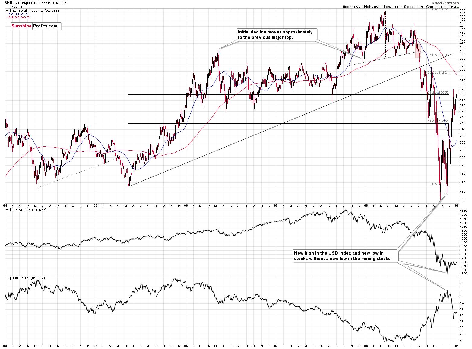
Figure 6
And here’s how it looks today (I’m using the GDX ETF, so that we get the direct implications for tradeable targets):
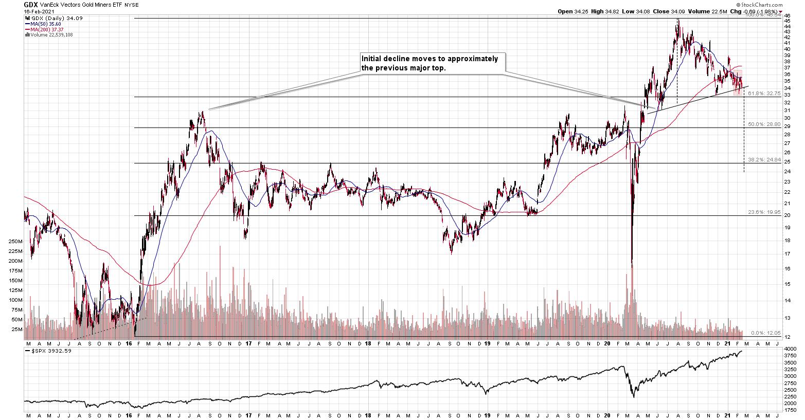
Figure 7
In both cases, the entire pattern started with a breakdown below the head-and-shoulders that triggered a decline that wasn’t as big as one might expect it to be.
The rally that followed has more or less doubled the size of the decline that preceded the above-mentioned bottom, but the rally itself had three distinct parts.
-
The first part was the rally back to the previous highs (the mid-2005 highs and mid-2015 highs).
-
Then, after a consolidation, we saw another rally and a correction below the 50-day moving average (marked with blue).
-
And finally, we saw a top that took the form of a double top where the second top was slightly higher than the previous (mid-2006 and mid-2016) one.
Afterwards, we saw a sizable decline. After that decline, mining stocks entered a consolidation, which was either long (mid-2006 – mid-2007) or very long (late-2016 – early-2020). During the consolidation, mining stocks moved back and forth between the initial high and then the initial post-top low.
The consolidation ended when we saw a sharp decline that by itself triggered a powerful comeback – like a slingshot. The decline in 2020 is crystal-clear, and it is also visible in 2007. I remember how people reacted back to the near-vertical slide in mining stocks back in 2007 – the emotionality was sky-high even though miners didn’t decline as much as they did in 2020. If it wasn’t for the pandemic, it’s probable that the decline that we saw last year wouldn’t be as severe. Since the pandemic was a one-time (hopefully…), non-market-based event, it’s a piece of information that we should “discount” here. In other words, in my view, it’s justified to say that both sharp declines (2007 and 2020 ones) were similar.
What followed then was a sharp rally that had three major stages:
-
The rally above the previous (2006 and 2016) high and formation of the initial top.
-
The correction to approximately the previous (2006 and 2016) high.
-
The rally to new highs and the final top there.
In both cases, the initial top from point 1 was the left shoulder of the broad head and shoulders pattern, while the final top (point 3) was its head.
In both cases, this head-and-shoulders formation had the right shoulder a bit higher than the left one (both, lows and highs), which caused the neckline to ascend in both cases.
In both cases, the middle of the right shoulder was indicated by the death cross (the 50-day moving average breaking below the 200-day moving average).
Then, at the very end of the head-and-shoulders pattern, we saw a quick (when viewed from the long-term point of view) back-and-forth movement around the neck level, when miners tried to get back above their 50-day moving average, but failed to do so.
I marked the above back-and-forth movement with red rectangles. This is where we’re currently at – most likely right before the massive plunge.
This might seem like an implication that’s too far-fetched, but if this analogy is to be upheld and the general stock market decline is needed to trigger the biggest part of the decline, then perhaps the above analogy is telling us that the general stock market’s rally is about to end. Bitcoin just reached an important psychological milestone ($50k), so it would be quite natural for it to decline now. This could be one of the triggers for the “big unwinding” of various bubbles that formed in the previous months (and years).
This could be exactly how the Kondratiev winter starts. And – as a reminder – based on how gold stocks performed under similar circumstances (in 1929 and 2008) they would be quite likely to keep declining for about three months after stocks top. The final bottom could therefore take place in May (or June, if stocks manage to delay their decline for longer). Naturally, the above might happen differently and – in particular – at different times, and these time predictions are not enough to enter risky option trades, but it does seem a quite possible scenario.
Now, what does the above analogy give us in terms of price targets? After spending a long time analyzing the above charts, I came to the conclusion that the 1-to-1 analogy won’t be reliable, but the indirect implications might. Just as the shape of the consolidation and size of the slide that triggered the rally were somewhat similar but not identical, the shape of the upcoming decline doesn’t have to be identical.
However, there are certain factors that would have been important anyway, and the link to 2008 only makes them stronger. Actually, there is no major surprise here. The key take-away is that the Fibonacci retracement levels as well as the previous lows and previous highs are likely targets for rebounds and their ends. This fits with what I’ve been featuring on the GDX ETF chart, so it only makes those points more valid.
There is one extra take-away, though. It’s not visible on the above chart, but the interesting observation was that the HUI Index corrected whenever it declined more than 29% of its nominal price, with the exception being the very first consolidation. In other words, when things get wild, and the miners decline more than 25%-30% of their nominal value, it means that they are almost ripe for a corrective upswing. This is a very important observation, because it tells us when we should be paying extra attention to nearby support levels and when we might consider temporarily exiting or even reversing our short positions.
Summary
Everywhere one looks, the signs are bearish. Rising bond yields? Check; Bets on an economic recovery? Check; Similarities to 2008? Check; EUR/USD currency pair? Check; The USD poised to rise? Check (although gold declined even on the USD’s recent dips – no help needed).
It’s all pointing in one direction.
The medium-term top in the precious metals is in and the following weeks are not likely to be pleasant times for anyone who jumps on the bullish bandwagon just because prices moved higher in the previous months or based on some forum posts. Tread carefully.
What’s profitable is rarely the thing that feels good initially. As silver often moves in close relation to the yellow metal, forecasting gold’s rally without a bigger decline first is thus likely to be misleading. Silver is likely to slide as well. The times when gold is continuously trading well above the 2011 highs will come, but they are unlikely to be seen without being preceded by a sharp drop first.
Thank you for reading our free analysis today. Please note that it is just a small fraction of today’s all-encompassing Gold & Silver Trading Alert. The latter includes multiple premium details such as the outline of our trading strategy as gold moves lower.
If you’d like to read those premium details, we have good news for you. As soon as you sign up for our free gold newsletter, you’ll get a free 7-day no-obligation trial access to our premium Gold & Silver Trading Alerts. It’s really free – sign up today.
Przemyslaw Radomski, CFA
Founder, Editor-in-chief
Sunshine Profits - Effective Investments through Diligence and Care
* * * * *
All essays, research and information found above represent analyses and opinions of Przemyslaw Radomski, CFA and Sunshine Profits' associates only. As such, it may prove wrong and be subject to change without notice. Opinions and analyses are based on data available to authors of respective essays at the time of writing. Although the information provided above is based on careful research and sources that are deemed to be accurate, Przemyslaw Radomski, CFA and his associates do not guarantee the accuracy or thoroughness of the data or information reported. The opinions published above are neither an offer nor a recommendation to purchase or sell any securities. Mr. Radomski is not a Registered Securities Advisor. By reading Przemyslaw Radomski's, CFA reports you fully agree that he will not be held responsible or liable for any decisions you make regarding any information provided in these reports. Investing, trading and speculation in any financial markets may involve high risk of loss. Przemyslaw Radomski, CFA, Sunshine Profits' employees and affiliates as well as members of their families may have a short or long position in any securities, including those mentioned in any of the reports or essays, and may make additional purchases and/or sales of those securities without notice.
********
 Przemyslaw Radomski, CFA, is the founder, owner and the main editor of SunshineProfits.com. You can reach Przemyslaw at: http://www.sunshineprofits.com/help/contact-us/.
More from Gold-Eagle


