Gold Ratio Charts Revisited


 As the consolidation phase continues to build out from this first impulse move up in the precious metals sector, let’s review some of the charts we’ve looked at previously that suggested the bear market might be over. Most of these charts will be ratio charts which compare different sectors to one another. These rather complex charts give us some hidden clues that an important reversal may have taken place.
The consolidation process takes its toll on both the bulls and the bears alike. As you know there are never any guarantees of anything when it comes to the markets so it’s always important to try and get the big picture right to get the odds in your favor.
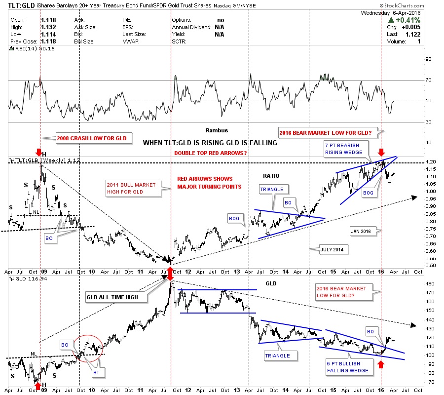
Let’s start with one of the more important combo ratio charts we’ve been following which has the TLT:GLD ratio on top and GLD on the bottom. When the ratio chart on top is falling (Gold is Outperforming Bonds ), GLD is generally rising and vice versa. On the left side of the chart, you can see the ratio chart topped out in 2008 while GLD bottomed with both forming H&S patterns. Next, in 2011, the ratio chart bottomed out while GLD topped out and started its bear market. Now looking to the right-hand side of the chart you can see where the ratio chart on top, topped out on January 16th of this year while GLD on the bottom also put in its bear market low. The ratio chart on top has been rising over the last three weeks while gld has been consolidating, which is to be expected as no market goes straight up or down. So far there is nothing concerning with this combo ratio chart except for a mild correction. As long as the ratio chart trades below the top black dashed horizontal rail the new bull market lives on.
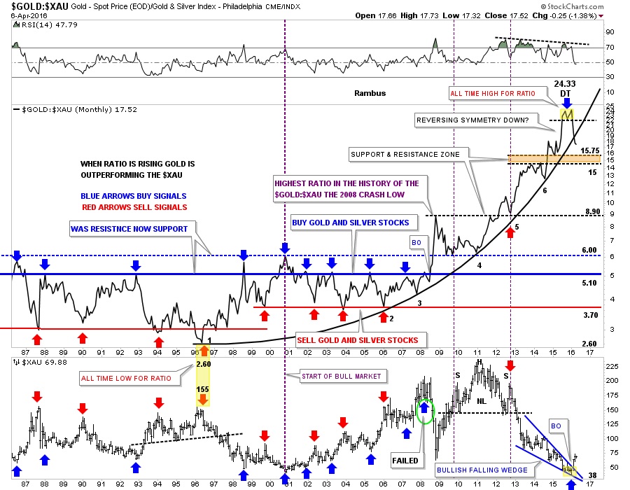
Below is another very important combo ratio chart we’ve been following which shows the GOLD:XAU ratio chart on top and the XAU ( large cap Gold Stocks) on the bottom. This combo chart does a very good job of showing just how undervalued the XAU is to the price of gold. Back in 1996, the ratio chart on top bottomed out at 2.60 while the XAU on the bottom topped at 155, which wasn’t too far out of whack. The parabolic arc shows from that low in 1996, even with the bull market years from 2000 to 2011 gold continued to beat up on the XAU until just recently when the ratio chart on top put in that small double top at 24.33 yellow shaded area. To say the XAU is under-valued to the price of gold is an understatement. Think about this for a moment. It has to be one of the most amazing bear markets in history. The price of large cap Gold Miners has been falling relative to Gold for 20 years, even during the most incredible bull market the yellow metal has ever seen! Ask any Gold Enthusiast and they will tell you, Gold stocks have been a brutal investment choice.
The ratio chart on top is a monthly line chart so we won’t know until the end of April if the crack below the parabolic arc is truly broken to the downside. Note how the XAU on the bottom chart bottomed out at the same time the ratio chart was putting that double top. The XAU is now in its third month of a breakout move out of the seven-point bullish falling wedge reversal pattern. There is nothing broken on this chart and still looks positive for the XAU outperforming gold.
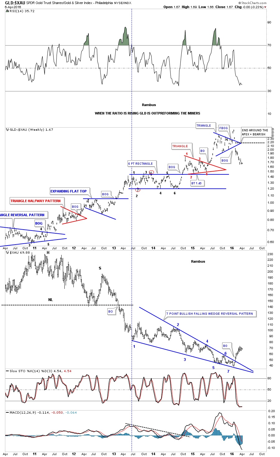
This next chart is a weekly bar chart for the GLD:XAU ratio on top and the XAU chart on the bottom which gives us a close-up view of the price action. Note the GLD:XAU ratio chart on top shows a failed breakout above the top rail of the blue triangle which shows up as a double top on the monthly line chart. The bearish setup here is when the price action gaped below the apex of the blue triangle which is never a good sign if one is bullish. Also, we’ve discussed many times in the past that when you see a false breakout in one direction you tend to see a big move in the opposite direction, which we have. The XAU chart on the bottom shows it has broken out of a seven-point falling wedge reversal pattern. So far nothing is broken on this combo chart.
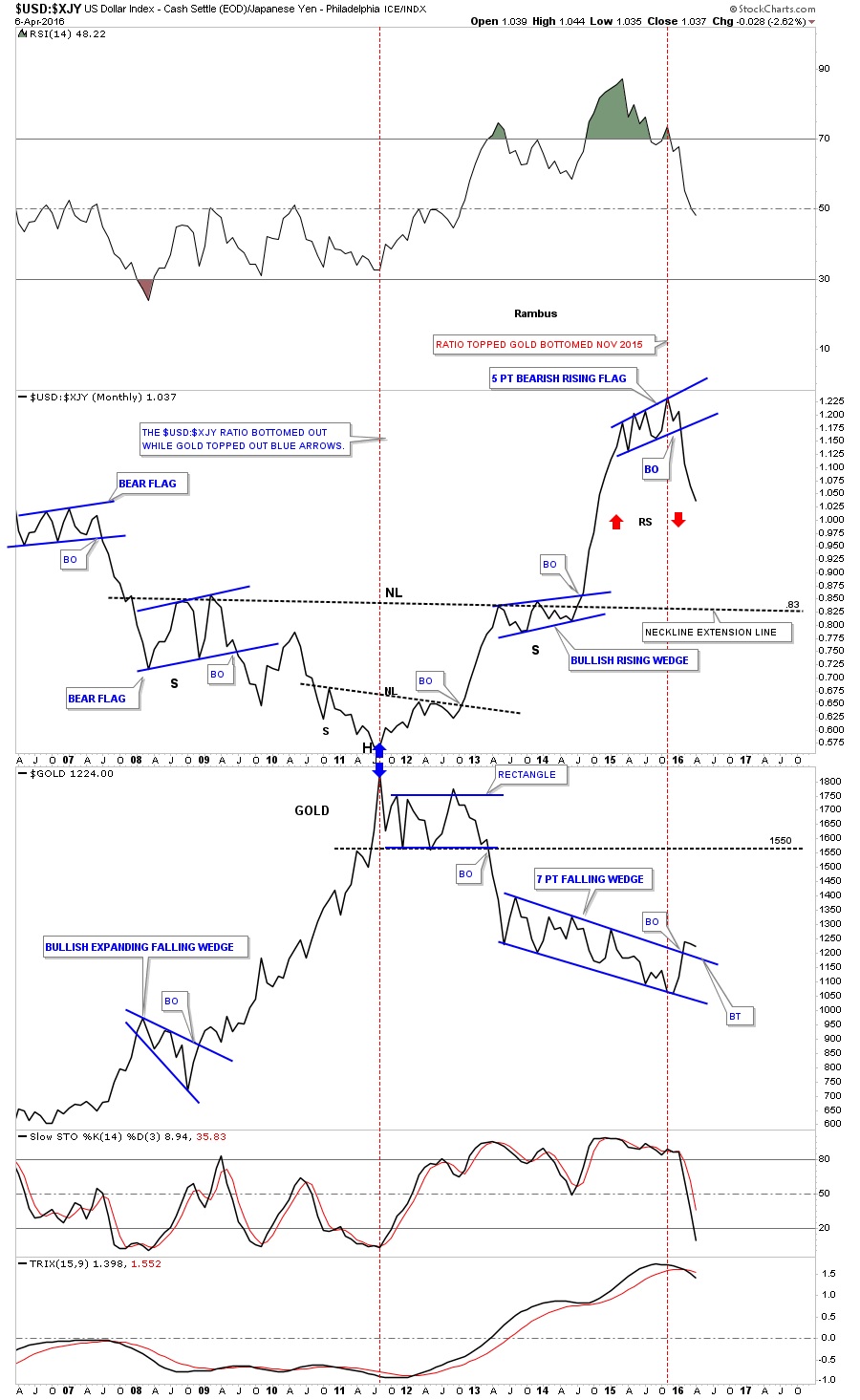
This next ratio combo chart shows the very important USD:XJY on top and gold on the bottom that we’ve been following very closely. You can see how they are generally inversely correlated, not always but in a general sense. You can see in 2011 when gold put in its bull market peak the ratio chart on top built out an inverse H&S bottom, blue arrows. From that 2011 low, the ratio chart on top went on a tear to the upside while gold built out its bear market downtrend. For most of 2015 while gold was generally falling lower the ratio chart was building out a five-point bearish rising flag. Before that five point blue bearish rising flag broke to the downside I thought it might breakout through the top side which would signal the capitulation move for the PM complex. Once it broke to the downside I wasn’t going to argue with what the chart had just said, that the five point rising flag was a reversal pattern to be respected. The other important aspect of the ratio chart on top is the possible setup for some reverse symmetry to the downside, as shown by the red arrows. We’ve been following the breakout from that five point bearish rising flag reversal pattern since day one, looking for a near vertical drop which so far has been taking place. The reason being is that there are no consolidation patterns to stem the decline which could offer some support. How the ratio chart went up is most likely how it will come back down.
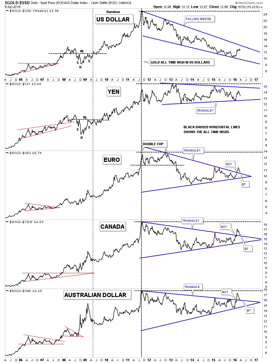
This next chart is a combo chart which compares gold to many of the important currencies of the world. As you would expect the gold vs the US dollar would show the weakest chart as the US dollar had been so strong. Gold vs the Australian dollar has been the strongest of these currencies charts with the Canadian dollar being pretty strong as these are commodity based currencies. They all have formed blue consolidation patterns with Gold in Euro, Canadian Dollar, and the Australian Dollar all breaking out above the respective top rails.
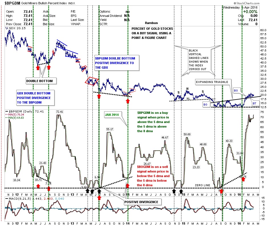
This next combo chart shows the GDX on top and the $BPGDM on the bottom. I like to use the $BPGDM chart on the bottom to look for a divergence with the GDX chart on top. After the initial move up in January of this year, there was a divergence where the $BPGDM had a much higher low vs the GDX. The $BPGDM just recently went on another buy signal when the price went above the above the 5-day moving average and the 5-day moving average traded above the 8-day moving average which is now properly aligned to the upside.
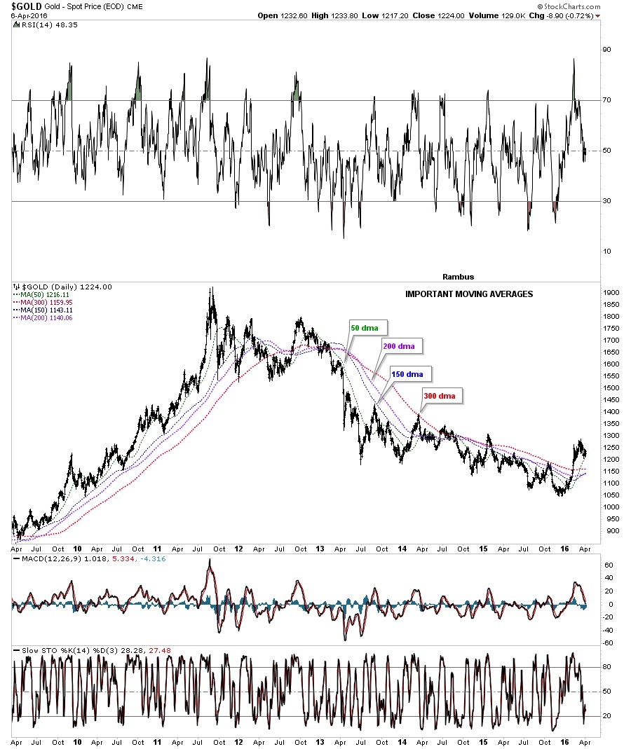
Let’s look at one last chart which shows the most important moving averages for gold on the long term daily chart. It wasn’t very long ago and the price of gold was trading below all four moving averages. I said at that time that gold would have to show its hand if it started to trade above any of the moving averages. There is no getting around that fact. As you can see gold is now trading above all four of the moving averages which have all started to turn up. At some point, I expect to see them all properly aligned in a similar fashion to the left side of the chart. When they all get aligned properly, in a bull market or bear market, they show you the major trend and which direction one should be trading.
Without actually analyzing the PM complex in isolation, the inter-market relationship with the different sectors we looked at on the charts above paint a picture of a reversal of the bear market that has been in place for 4 1/2 years. As long as the relationships keep playing out as they have since the beginning of this year I have to remain a bull until proven otherwise. It won’t be easy but with a game plan in place to follow it makes taking a position and holding on to it during the inevitable pull backs less challenging.
 Meet Rambus, a seasoned trader and technical analyst renowned for his unbiased and insightful chart work. Through his website, Rambus Chartology, and Substack newsletter, Rambus shares his expertise with a global community of subscribers, providing daily updates, commentaries, and hands-on training in the art and science of chartology. With his calm, humble, and down-to-earth approach, Rambus demystifies complex market trends, helping his followers navigate the challenges of today's volatile markets. Join the Rambus Chartology community today and discover a unique blend of technical analysis, trading expertise, and time-tested protocols. Subscribe now at www.rambus1.com or https://rambuschartology.substack.com/


