The Great Deflation Round 2
In tonight’s report I would like to show you some charts that could be telling us that the second shoe maybe getting close to dropping in the on-going deflation scenario that really started to take hold last year at this time. If you recall the US dollar broke out of a massive base and with most commodities following lower. Commodities have been consolidating for most of 2015 chopping out some decent sideways trading ranges. In order to really get this second leg going to the downside, for commodities, the US dollar is the key component that needs to breakout topside.
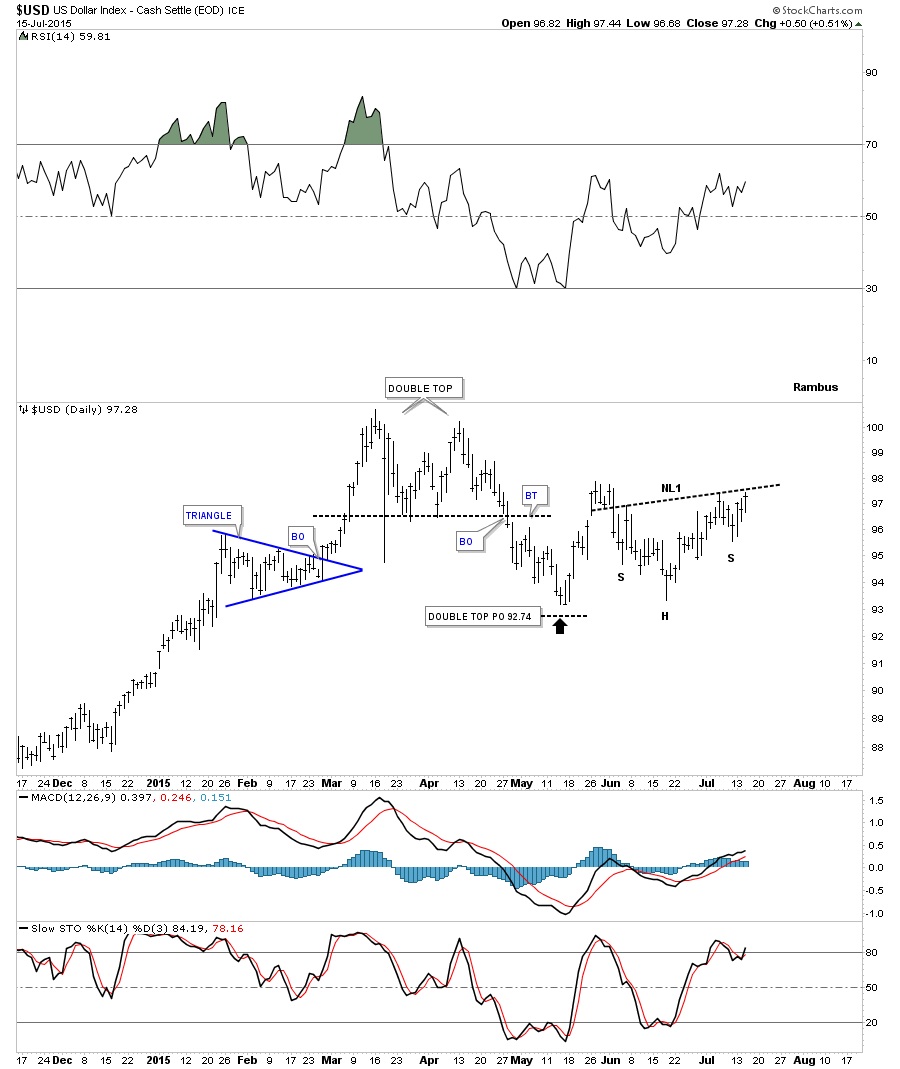
The first chart tonight will be of the US dollar which topped out in March of this year creating a double top reversal pattern. After nearly reaching the price objective in May the dollar had a good bounce only to come back down to the previous low around the 93 area in the middle of June which I could make a case for a double bottom. The low on the right side of the potential double bottom has been carving out an inverse H&S bottom with today’s price action touching the possible neckline. Needless to say this is a critically important point right here and now for the US dollar.
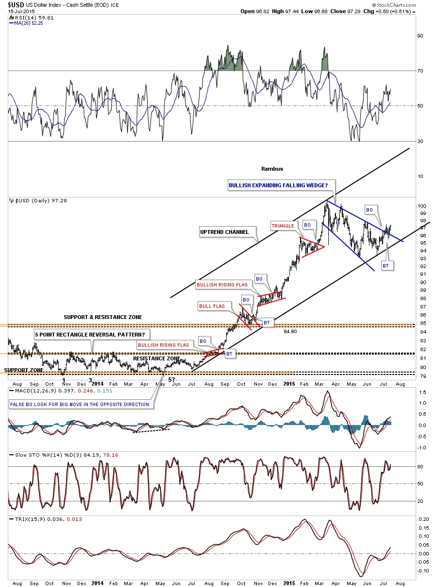
Below is another longer term daily chart for the US dollar that shows the big impulse move up that started in July of last year that we followed right from the beginning. Note the smaller red consolidation patterns that made up that strong impulse move up. Also note how much bigger the blue expanding falling wedge is compared to any of the smaller red consolidation patterns. This tells us that the potential blue expanding falling wedge will most likely be a halfway pattern that will separate the first impulse move up from the second impulse move up that maybe is just now getting started. This is the pattern I’ve been showing you on the UUP chart. We’ll know in the next day or two if the breakout and backtest to the top blue rail of the expanding falling wedge is valid. So far so good.
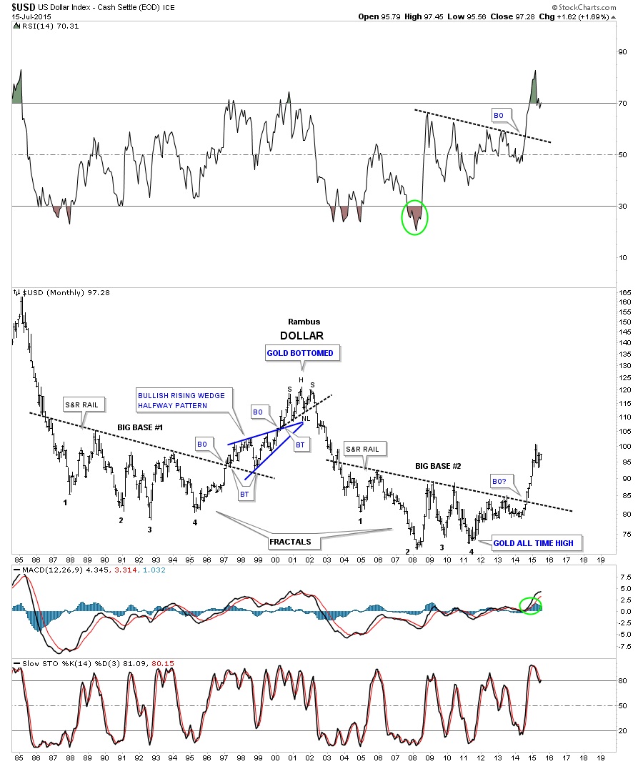
This next chart is a very long term monthly look that shows the two fractal bases that are uncanny in their appearance to each other. You can see the massive rally that the US dollar had once all the pressure was released from the big base #2 last year.
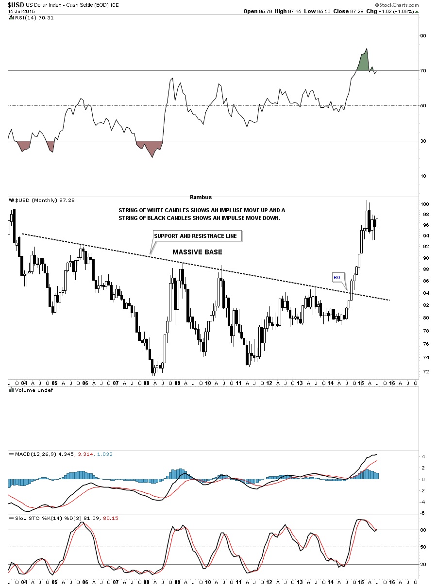
This next monthly chart for the US dollar zeros in on the big base #2 using candlesticks. When you see a string of white candlesticks all in a row, especially on a monthly chart, you know you’re in an impulse move up and when you see a string of black candlesticks all in a row you know you’re in an impulse move down. If the US dollar can close out the month of July in a strong move we’ll see our first white candle which is needed to start an impulse move higher.
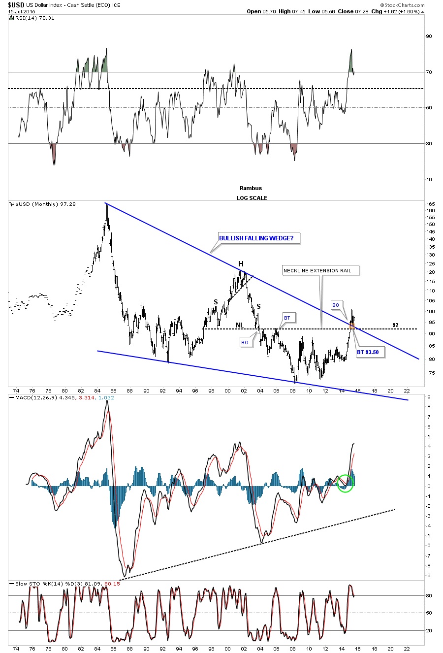
Let’s look at one last long term chart for the US dollar that shows the massive bullish falling wedge pattern. If you recall I said to look for support on the backtest to the top blue rail as shown by the little brown box. Worst case scenario would be a test of the neckline extension rail just slightly lower at 92 or so. The top blue rail has done it job so far holding support.
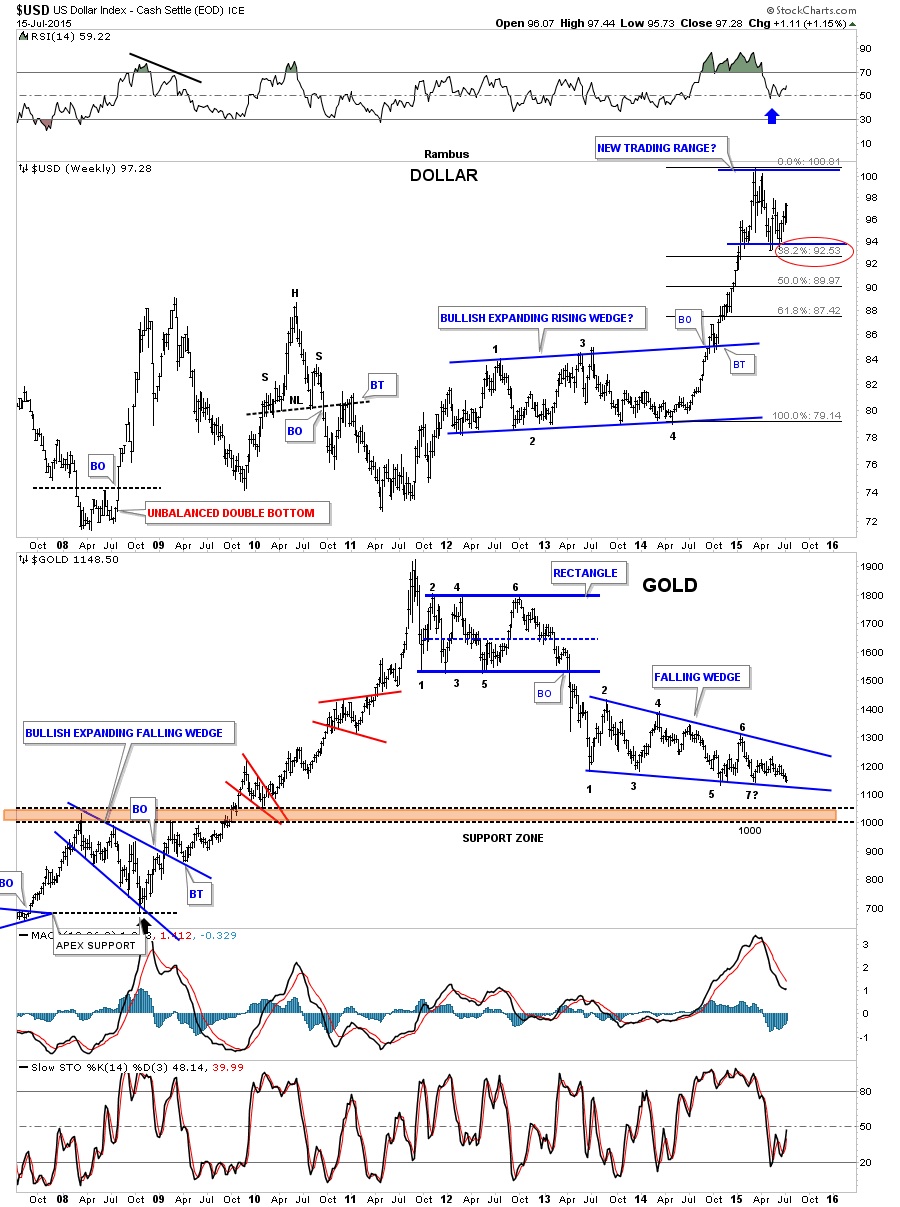
Below is a combo chart that has the US dollar on top and gold on the bottom. The US dollar had about a 38% correction off of its most recent high while gold has just kept plugging along forming the two year falling wedge consolidation pattern. One thing that should stand out for you is how gold has made a series of lower lows and lower highs since it’s bear market began almost four year ago. Note just the opposite price action on the left side of the chart during the bull market years where gold made a series of higher highs and higher lows.
The XEU is the biggest component for the US dollar so it should give us some clues to help us understand what is going on with the US dollar. The daily chart below shows a six point Diamond consolidation pattern that has been forming since the low in March of this year. After a strong backtest that left behind an island reversal pattern it looks like the breakout is starting to gain some traction.
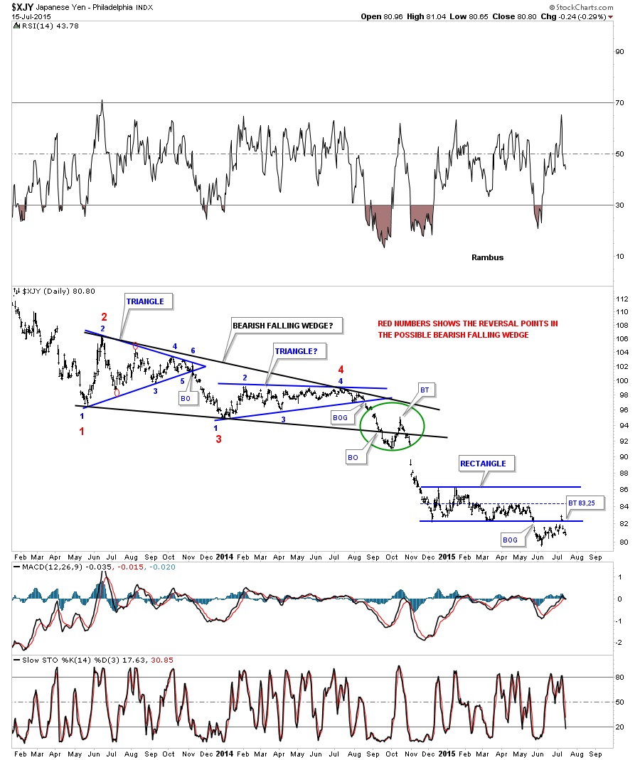
The XJY is another important currency which shows it broke down from a rectangle consolidation pattern several weeks ago with a strong backtest that also left behind an island reversal pattern.
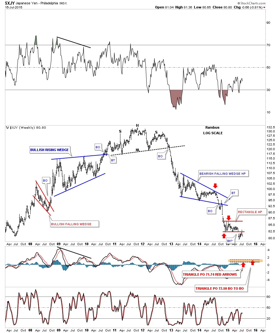
The long term weekly chart for the XJY shows its bear market decline and the little red rectangle consolidation pattern that has formed as just, Another Brick in the Wall.
By looking at the different currencies we can see that they have been consolidating since the March low of this year and have broken out from those consolidation patterns within the last two weeks or so with a backtest in most cases. Keep in mind these consolidation patterns formed after a very strong decline which is what you want to see in a strong impulse moves down that can be made up of several small consolidation patterns. After you see the third small consolidation pattern form in a strong impulse move you know you’re getting close to the end.
During the last impulse move down the commodities also matched the currencies in weakness almost tic for tic. Let’s look at a few different commodities and see if they’re showing a similar setup to some of the currencies we just looked at above.
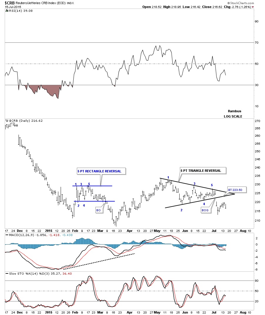
Below is a daily chart for the CRB index which is showing us a five point triangle reversal pattern after a very small rally off of the initial February low. The breakout was accompanied by a big breakout gap but the backtest failed to reach the bottom rail of the black triangle reversal pattern. It’s a reversal pattern pattern because it formed within the uptrend. Had the CRB broken out above the top black rail it would have been a four point consolidation pattern. Reversal patterns have an odd number of reversal point and consolidation patterns have an even number of reversal points.
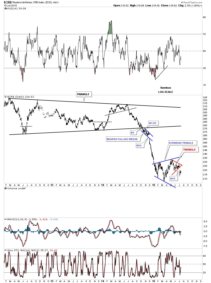
This long term daily chart for the CRB index shows its first impulse leg down when it broke out of the huge triangle reversal pattern. It has been consolidating in the blue expanding triangle which shows a lot of volatility.
The bottom line is that I’m seeing some of the same setups that marked the beginning of the last major impulse move down that started last year about this time. Most of all the currencies are breaking down from five month consolidation patterns while the commodities are breaking down from slightly bigger consolidation patterns along with the precious metals stocks. If this is true we’re on the cusp of another deflationary move down of similar magnitude of the one from last year. Stay tuned as things are really starting to get interesting.


