Greece And Gold Suffer…While Yellen “Stabilizes” The Dow Index


I use CNN Money for after hour stock index futures and get an occasional chuckle reading their market commentary.
Market rally: Dow zooms back to 18,000
“Jun 10 4:13pm: One of the biggest threats to the stock market is finally looking a bit less scary.“
The above mentioned threat to the stock market that’s “finally looking a bit less scary” is Greece’s possible exit from the EU. Apparently Bloomberg reported that Germany (Greece’s largest creditor) “blinked” resulting in a Dow Jones surge of 236 points on Wednesday. The problem with this blink is that at best it’s only a short term political maneuver to delay addressing the structural problem of hundreds of billions of euros in unpayable debt owed to Greece’s creditors. As we see in the table below, the bond market’s concern isn’t just Greece’s debt problem. Yields all across Europe are rising.
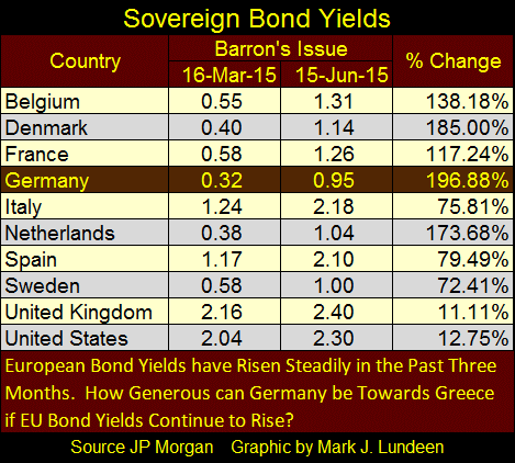
Any time a “blink” in Europe can send the Dow Jones up 236 points, we are living on borrowed time. By Friday the Dow Jones was back below 18,000.
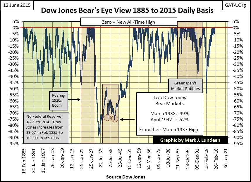
It’s been awhile since I’ve commented on the long term history of the Dow Jones. Even before Charles Dow created his stock averages in 1885 the stock market sometimes went up and sometimes went down. However it wasn’t until Mr. Dow actually began to publish his stock average in 1885 that it was possible to quantify the direction the market was moving. So let’s take a quick look at the history of the Dow Jones movements from 1885 through present day. Using the Bear’s Eye View (BEV) format to compress 130 years of market history into a range of 100 percentage points:
- 0% = New All-Time High
- -100% = Total Wipeout in Valuation
The chart below displays the stock market exactly as Mr Bear sees it. Each new all-time high is a big-fat-zero to Mr Bear as he’s only interested in how large a percentage he can claw back from the last all-time high. And that’s exactly what we see below; new all – time highs and percentage declines from each all-time high since 1885.
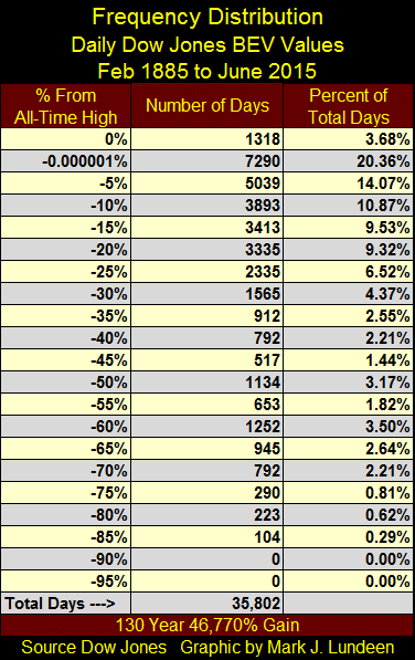
Below we see the frequency distribution break down of all 35,802 Dow Jones daily closes since February 1885 using the same data seen in the chart above, or how many days the Dow Jones has closed at a new all-time highs and how many days it closed within a given range of percentages from an all-time high.
A note on the -0.000001% row in the frequency table; it’s included to isolate actual new all-time highs (BEV Zeros) from daily closes nearly, but not quite making a new all-time. Each row lists a single percentage decline, but in effect contains a 5% range of percentages. For example, the -5% row includes the 5,039 daily closings between -5% and -9.999%. By including the -0.000001% row, actual new all-time highs (BEV Zeros) are kicked up to the 0% row, while closes nearly making a new all-time high are grouped with all daily closes down to -4.999%.
If you look closely at the BEV chart above, you’ll note that from 1885 to present, no Dow Jones bear market ever declined more than 50% from a BEV Zero except during the Great Depression’s valuation crater (Sept 1929 – Nov 1954). That was until we saw eight daily closes greater than -50%, (but none not more than -54.999%) below the October 2007 BEV Zero during the credit crisis bear market. So the majority of all 5393 daily closings more than 50% below the previous all-time high were Great Depression events.
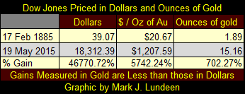
It’s interesting to look at the Dow Jones over the past 130 years from Mr Bear’s point of view. Each of the past 1,318 all-time highs appears as a zero to him, so he has no idea how much the Dow has gained in dollar terms.
However back in 1885 the dollar’s value was fixed at $20.67 dollars per ounce of gold while today the dollar’s value is undefined. Doctor Bernanke in testimony before Ron Paul, Chairman of the House Financial Services Subcommittee on Domestic Monetary Policy, was asked by Mr. Paul to define what a dollar was. As you can see in the below Youtube video (2:16 minutes into the video) the Chairman of the Federal Reserve either couldn’t or wouldn’t.
https://www.youtube.com/watch?v=EL20eX1v9XA
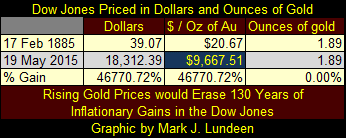
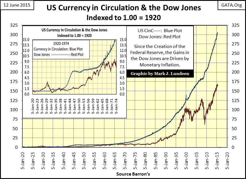
Since 1885 the Dow Jones has appreciated by 46,770% in dollar terms, or in other words, a dollar invested in the Dow in 1885 is now worth $467.70 undefined and unredeemable dollars of indeterminate purchasing power. Still that might seem impressive until one realizes that in terms of gold the Dow has only appreciated by 702% compared to 5,742% for gold itself (the amount that gold has appreciated in terms of dollars). The dollar in 1885 bought about fifty-seven times more gold than it does today.
When we consider all the monetary inflation that the dollar has suffered since 1885 the gains the Dow Jones has realized in terms of gold seem generous, meaning that current gold prices are too low. I have currency in circulation data (CinC: paper dollars and coins in circulation) going back to 1920, and the number of dollars in circulation has increased by a factor of 305 over the past ninety-five years. But increases in CinC fail to tell the entire dollar inflation story as most of the dollars now in circulation were created by commercial banks issuing new credit (loans). Also the Federal Reserve’s portfolio of US Treasury Debt (credit creation by the Federal Reserve) has increased by a factor of 1,645 since 1938 and continues to increase each week. The dollar as an economic unit can’t survive this, so we should be preparing ourselves for much higher dollar gold prices in the future.
For years there has been talk at the highest levels of finance about replacing the dollar as the global reserve currency, usually by the same people responsible for the ever expanding supply of dollars. President Obama’s first Treasury Secretary: Tim Geithner comes to mind. Rising gold prices to astronomic levels should be expected. As seen below, gold reaching $9,667 would completely wipe out 130 years of inflationary gains in the Dow Jones, assuming that the Dow Jones could survive $9,667 gold and maintain its dollar value at 18,000 – but that’s not likely.
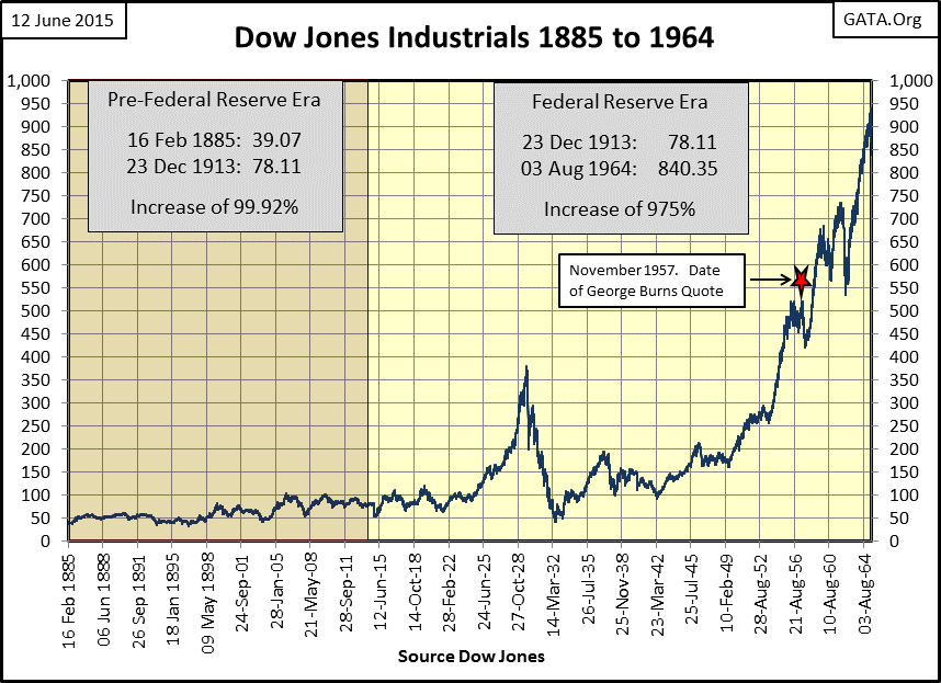
Why couldn’t it? Let’s return to the Dow Jones’ BEV chart above and study how the stock market has evolved over the past 130 years. From Feb 1885 to Dec 1913 the American stock market operated without central bank interference. In other words the volume of money and credit was determined by the amount of gold coin in circulation and gold bars in bank vaults. All that changed with the creation of the Federal Reserve in December 1913, and we can see the Fed’s inflationary impact on the Dow Jones in the Dow’s BEV chart above and its dollar plot below.
Today “economic growth” is defined in dollars that apparently have no economic definition, a virtual zero in the denominator. So it’s excusable for people to look at these charts and mistakenly conclude that economic growth prior to 1914 was slower than it was in the years that followed. However America actually experienced phenomenal economic growth from the end of the Civil War up until the creation of the Federal Reserve under the gold standard. This period saw the development of mass produced consumer goods, and the birth of the oil, electric power, and steel industries that transformed global commerce. What markets didn’t see under the gold standard were inflated share prices at the New York Stock Exchange and rising consumer prices. The quote and chart below makes my point.
“The real problem with retiring is money. Most people save their whole lives to retire in the same style they enjoyed when they were working, only to realize that they can’t live like they used to even while they’re still working. You see these ADs for retirement and they always have fishing boats in the background. That’s because for * $120 a month *, fishing is the only way retired people can feed themselves. --- George Burns: Burns and Allen Television Show / Season 8 Episode 9, * 1957 *
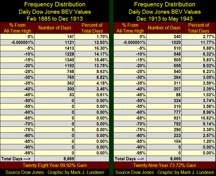
The frequency distribution table below provides another view of the effect of the Federal Reserve on the stock market, a comparison of the volatility of the Dow Jones from February 1885 to December 1913 (8,669 trading days before the Fed’s creation) with December 1913 to May 1943 (the first 8,669 NYSE Trading sessions after the Fed’s creation). The newly created central bank had clearly failed to live up to the promises made before 1913 that it would contain market volatility.
The next table compares the Dow Jones market gains over the two periods shown above priced both in dollars and in ounces of gold. With the creation of the Federal Reserve increases in market volatility went hand in hand with a decrease in profitability for blue chip stocks.
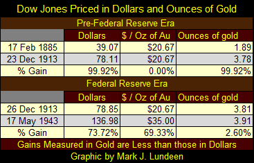
Note also that the price of gold was changed in January 1934 and pegged at $35.00 after over a century at $20.67. This was an outrageous 70% overnight devaluation of the currency and a huge transfer of wealth from the private citizens who were owners of gold bullion to the federal government that seized it.
“Monetary policy” has changed little since, as is evident below. The valuation of the Dow Jones (Red Plot) may have increased after decades of monetary inflation (Blue Plot) flowing from the FOMC, but since the Dow’s 2000 top it has clearly failed to keep up with dollar production at the Federal Reserve. Obviously the supply of dollars is not directly connected to the level of the Dow Jones Industrials Average. And while the supply of dollars and base metal coins that make up CinC is never reduced, the Dow Jones can deflate as well as inflate, as it has done twice since January 2000.
The chart below is an interesting study of the Fed’s first inflation / deflation boom-bust debacle of the 1920s and 30s contrasted with the modern day Dow Jones in the era of quantitative easing (QE) and zero interest rate policy (ZIRP). Even without the current blatant government manipulations, in the 1920s the Dow Jones increased to levels that astounded market experts. But in the following crash Mr Bear still managed to claw back all of the gains of the Roaring 20s and then some. The Great Depression bottom of 08 July 1932 (41.22) wiped out 89% of the Dow Jones value, dropping it to a level not seen since June 1897!
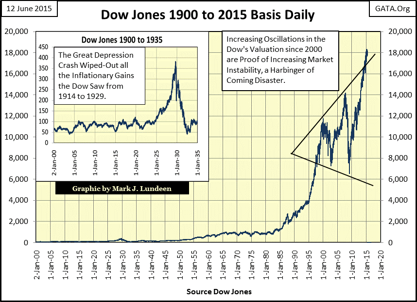
Our current boom took off as if it were a three stage rocket to the moon, with two significant bear markets since its first peak in January 2000. Absolutely nothing like this ever happened in the 1920s, but then ten decades ago the Federal Reserve’s “monetary policy” wasn’t managed by a monetary maniac like Doctor Bernanke.
“Policies have contributed to a stronger stock market just as they did in March 2009 when we did the last iteration of this. The S&P 500 is up 20% plus and the Russell 2000, which is about small cap stocks, is up 30% plus.”
------ Doctor Benjamin Bernanke, CNBC Interview with Steve Liesman 13 Jan 2011 (1:40 PM)
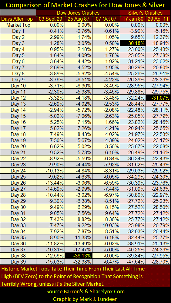
I hope I’m wrong, but I fear the Federal Reserve has created the perfect conditions for an uncontrollable and devastating collapse in the stock and bond markets. But how can we know when the collapse begins? Well for one thing the Dow Jones will experience its “Terminal Zero” (TZ) or last bull market all-time high and begin its bear market decline. The path from top to bottom can vary greatly, as we see below.
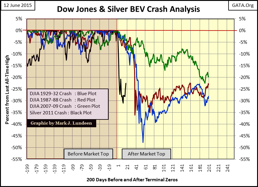
The Roaring 1920s (Blue Plot above) saw the Dow Jones reach its last all-time high (TZ) on 03 September 1929. Fifty-four trading days later it broke below its BEV -40% line; an incredibly rapid drop! The October 1987 flash crash (Red Plot) was actually a derivative event; or “portfolio insurance” as they called the derivative trade at the time. The Stock market declined through a threshold that pushed every computer on Wall Street into its sell-only mode. Still back in autumn 1987 it took the Dow Jones thirty-four trading day after its terminal zero before it dropped more than 10%. More typical is the 2007-09 mortgage crises’ 54% bear market (Green Plot). It finally managed to decline by 20%, but only after 184 trading days passed since its 07 Oct 2007 terminal zero.
The Dow Jones’ last all-time high was set on May 19th, seventeen trading days ago. On Friday the Dow Jones closed just 2.26% below its last all-time high. The question is whether the May 19th BEV Zero is the current bull market’s terminal zero? Only time can tell, unless we’re talking about silver (Black Plot above), whose declines are best described as a bushwhacking. Look at the silver crashes in the table below. Just three days into the 22 year long 1980-2002 precious metals bear market silver had dropped over 30%! The bushwhacking the “policy makers” gave silver in April – May of 2011 saw a 31% drop just twelve days after its terminal zero.
As Chris Powell of GATA said many years ago; “there are no longer markets, only interventions.” But those days will soon be coming to an end, and those assets the “policy makers” attempt to levitate (stocks and bonds) will come crashing down; the assets they actively suppress (gold and silver) will explode to the upside.


