The Guns Of August, The Trade Set-Up And Removing Your Rose Colored Glasses


Today I am going to lay out the case of a major market top and how it fits into the geopolitical backdrop of today. We then profile the trade set-up to look for and finally I will forcefully remove your Rose Colored Glasses you have been wearing since January 2017.
In Barbara Tuchman’s “The Guns of August” she argues that August 1914 was when the Gilded Age died and the modern era actually began. The book opens with the famous depiction of Edward VII’s funeral in 1910 attended peacefully by all the kings of Europe. Never again would the body of world leaders be unified and cut from a similar cloth. The war ushered in a new world, not recognizable from the past. Not since that time have we witnessed such diplomatic folly as in the month of August 1914. Today we wonder are we witnessing a similar conflict between a super power and the client state of China which is an emerging super-power? Could it unfold in a similar fashion?
Since May I have chronicled the topping process associated with a post bubble contraction. We have witnessed the following sequence:
1 The Gold-Silver ratio initially warning of an upcoming credit contraction in the future.
2. European stocks putting in a top in the traditional time window of May-June
3. USA stocks embarking on a final run for the roses, one last hurrah over the summer.
4. The Gold-Silver ratio signaling a confirmation of its original signal.
5. Yield curve flattening and credit spreads widening
6. Investor psychology embracing market top behaviors.
7. An initial crack in the US indexes in the time window of August or September.
The Topping Process
Over the summer we have watched the indexes relentlessly rise despite narrower breath. The FAANGs drove the NASDAQ and Boeing drove the Dow over the past 6 weeks. The DOW being a price weighted index, was inordinately influenced by Boeing, now a $240 stock. Boeing’s rise accounted for 75% of the DOW’s gain since the beginning of July. Strip Boeing out of the DOW and the index barely even rose… Same with the FAANG’s effect on the NASDAQ.
This of course is classic topping action. It masks the underlying exhaustion which has been occurring in individual issues. The exhaustion expressed itself in a lack of volatility. On August 8th the S&P 500 had gone 13 days in a row with less than a 0.3% fluctuation. This has never occurred since records have been kept since 1927. This compression then expressed itself with the VIX exploding over 80% in a raucous 3 day move.
Bearish market signals have been evident to the few who cared to interpret the charts. Let’s take a look at some of the flashing red flags available to all who care to see:
S&P500 Orthodox Broadening Top
Pull out your copy of the bible of technical analysis: Edwards and Magee. Look under the index for “The Orthodox Broadening Top”. The example they use is Air Reduction Co. from 1929. I will scan and post below:
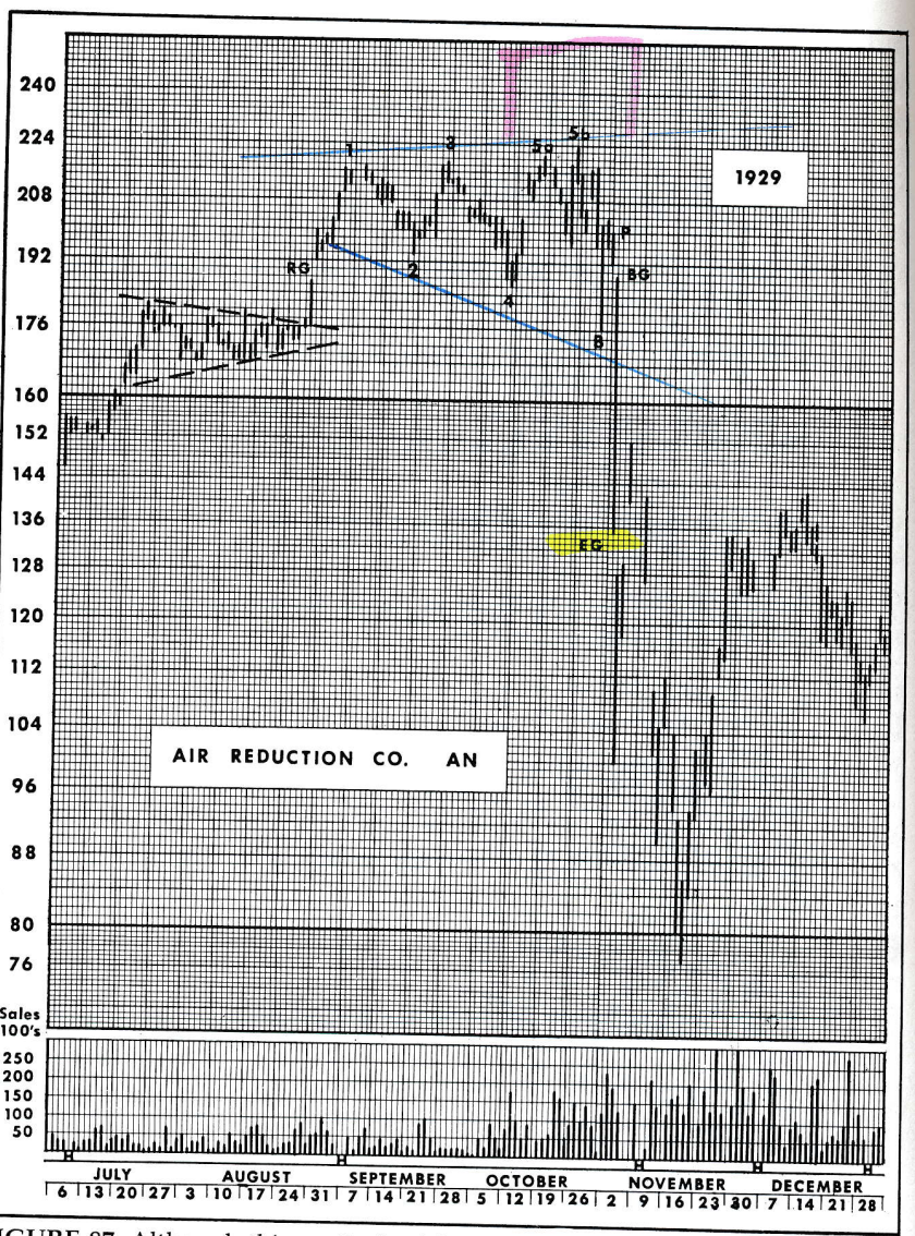
E&M remind us this type of top comes from low volume markets (check) and it is precisely defined on the chart (check). It’s definition is:
“It has three peaks at successfully higher levels and, between them, two bottoms with the second bottom lower than the first. The assumption has been that it has been completed and an in effect as an important reversal indication just as soon as the reaction from its third peak carries below the level of its second bottom”
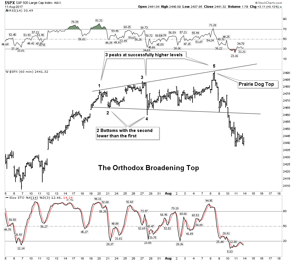
Knights, I believe in making charts as simple and uncluttered as possible. Clean charts deliver the most powerful messages. This chart above should make you sit up and take notice. It is classic, right out of the pages of the Edwards and Magee reference book.
My analysis of this chart actually shows weak exhausted action. E&M state that 4 out of 5 examples of this pattern have a re-test of high #3 (point #5). This re-test often exceeds the high by up to 3%. We see this re-test in the above example in Air Reduction Co labeled as 5b. In our present day case we see the S&P spike high in a prairie dog top with no ability to rally for a re-test. This is a case of exhaustion and in my analysis is quite foreboding.
I emphasize that E&M characterize this pattern as “extremely bearish” and it depicts the last stages of a Primary Uptrend. That’s right,- PRIMARY. This was the principle pattern that exhibited itself in numerous individual issues in the 2 months leading into the crash of 1929.
Within this current broadening top formation we can also see two loosely formed H&S tops as well. Bottom line: This is a treacherous reversal pattern.
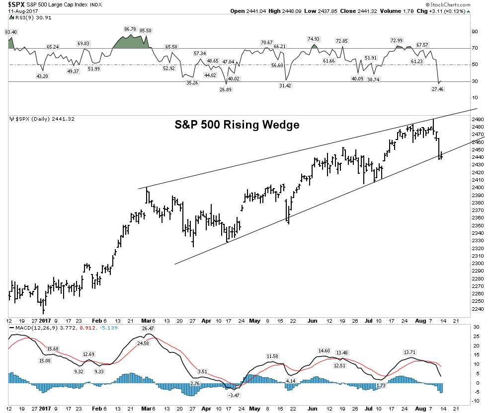
S&P500 Bearish Rising Wedge
If we step further away and look at a daily chart over the past 8 months we see the S&P 500 forming a presumably bearish rising wedge. I will cover the investment set-up later on at the end of this section.
Red Flags Everywhere
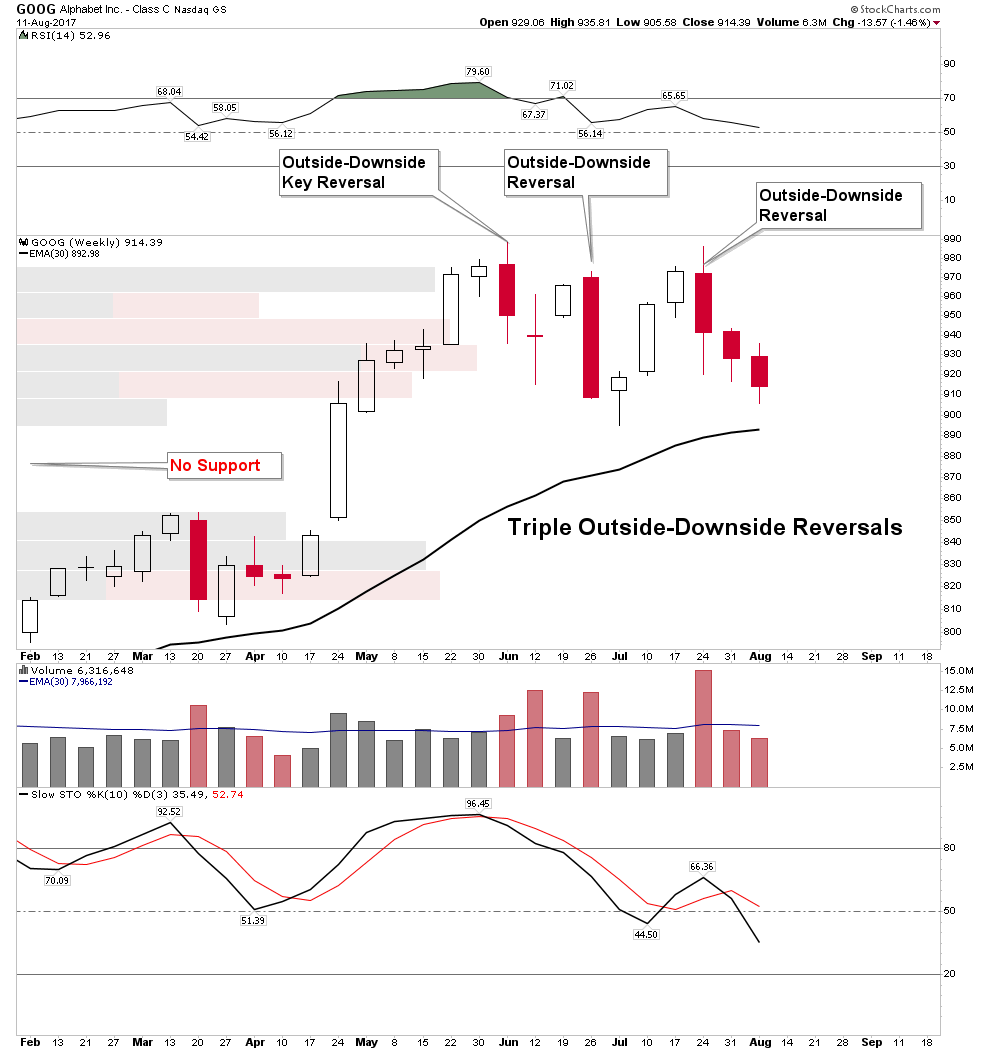
The FAANG stocks have risen relentlessly all year long, however recently have been broadcasting major trouble ahead. Let’s take a look at some of the red flags:
Google of course is widely owned and at $900 can no longer generate much upside volume as it’s hard for the little guy to move the needle with his low order size. Therefore, it is very significant when we see 3 Outside-Downside reversals with one being a KEY reversal (reversing new highs) all within an 8 week span! If Google breaks $900 on a weekly closing basis it has the potential to trigger a trap door as one can see there is no support until it reaches $855.
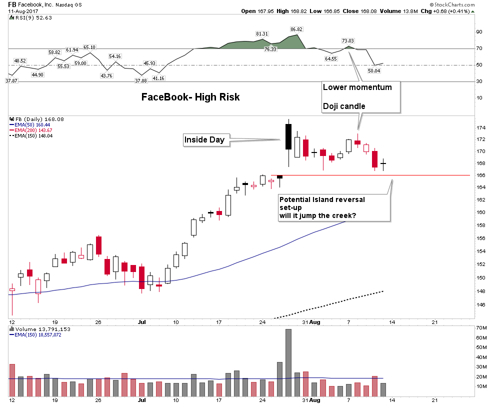
Here we have a very high risk stock. If you own this do you feel lucky? It opened July 27 with great fan-fare and put in a black candle inside day. This is a sign of exhaustion. Note the following attempt to rally failed with a red doji, change of trend, candle. Since the black candle top, down days have exhibited more volume than up days. This stock is at high risk of triggering a very bearish Island Reversal if it jumps the creek below the red line.
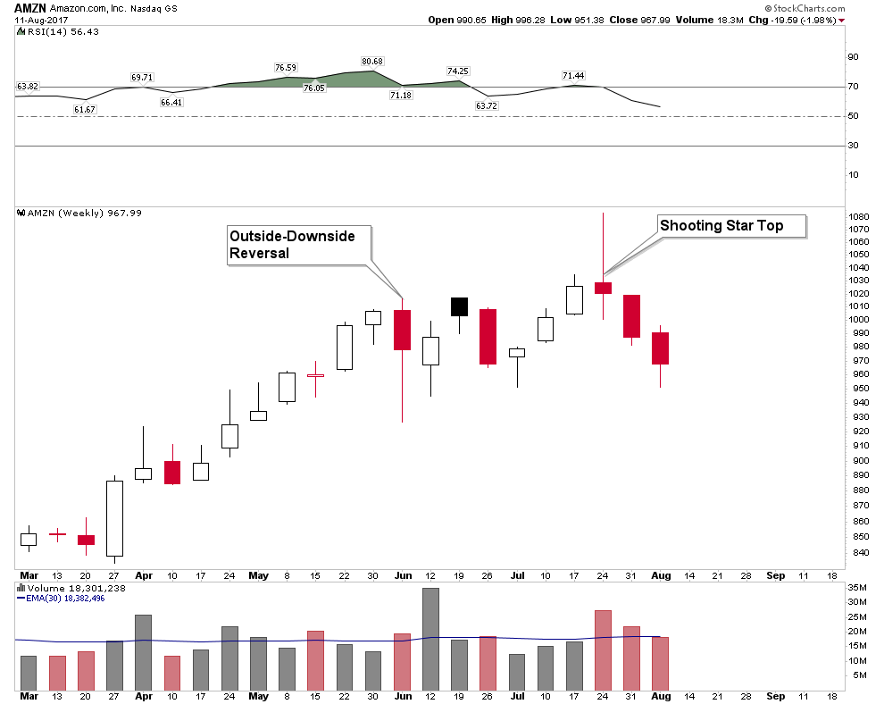
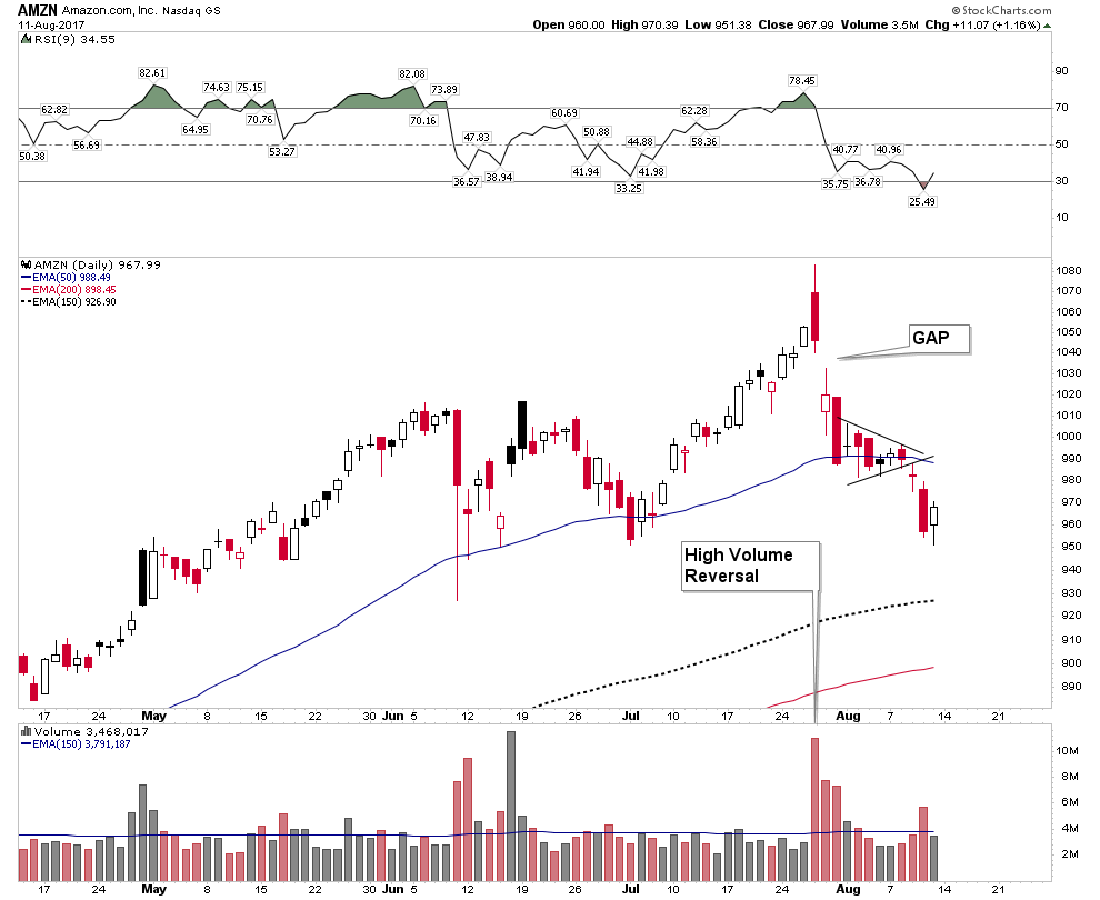
Amazon
Weekly: Outside Reversal with a high volume weekly shooting star top. What else do you want folks.
Daily: High Volume Key reversal off the top with a gap down the next day. Checkmate!
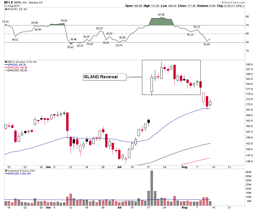
Netflix
Standard Island Reversal off the top. This is high risk.
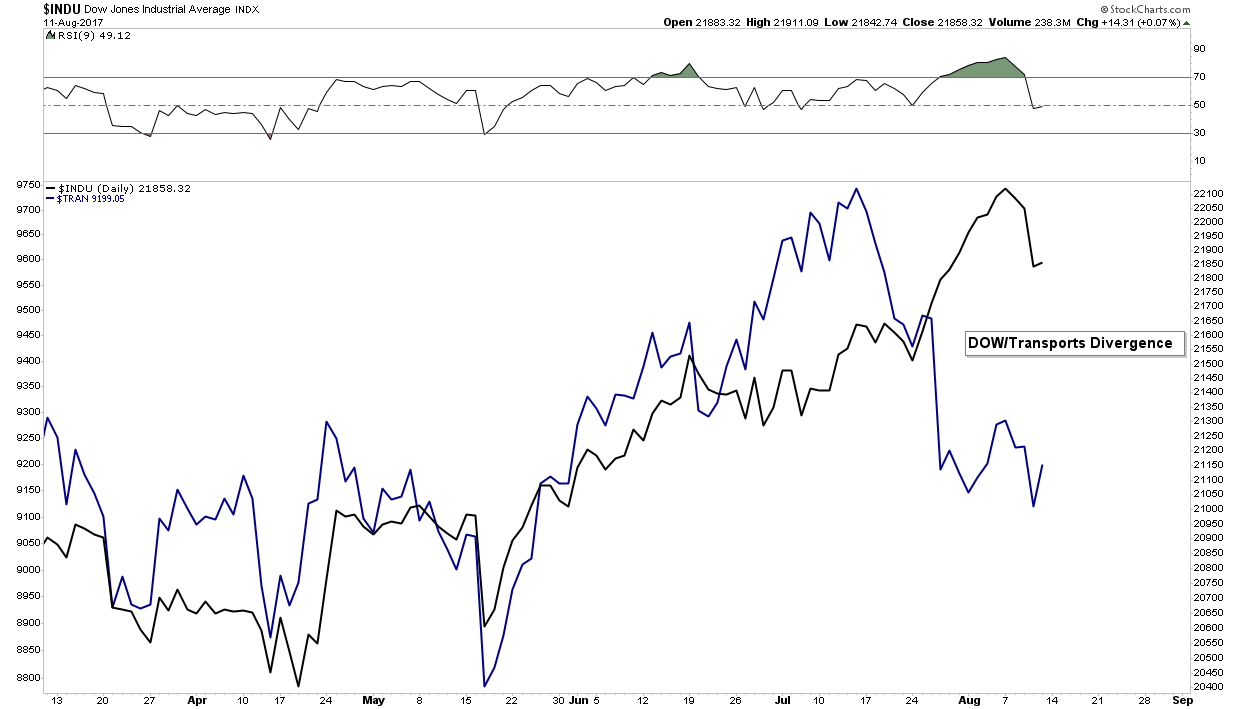
There are many other examples of technical failures right off their tops, but these are the highest profile. The point is there are many charts showing profound technical signs of failed tops. The DOW Transports have also been displaying a divergence with the Dow for the past month which occurs typically at market tops:
Bull Markets Don’t Die Of Old Age
Really? Well that’s the Wall Street narrative at least, however all rules have limits. This bull market began in March of 2009 making it one of the longest in history. In a recent study of the 32 longest bull markets throughout the world over the past 100 years to include Europe and Asia the current NASDAQ bull market is the second longest bull market over the past 100 years of all markets!
The Dow has now eclipsed all previous bull market durations in the DJIA in all of its history. The second longest was the bull of the 1920’s which lasted 419 weeks. Today our bull is at 440 weeks. One of the indisputable facts in the study of bull markets is that the longer a bull market lasts the higher the probability the ensuing bear market develops into a deeper bear market.
Years which end in 7 have historically had a tough go of it during the 3rd and 4th quarters. 1907, 1937, 1987 had major crashes in the 4th quarter. Other years had strong sell offs as well, such as 1917,1957 and 1977. 2007 was the precursor to the financial crisis of 2008. There clearly is a 10 year cycle in the markets and it often bottoms in the later part of the 7th year.
We have all seen numerous measures of extreme valuation of today’s market, but we also know that markets can’t be timed using valuation. Excessive valuation however, will always be corrected. Many would say this cycle wont end until the little guy comes back into the market. Guess what, he already has! Here is a quote from Charles Schwab Brokerage:
“In Q2 after years of avoiding equities, Schwab clients opened the highest number of brokerage accounts in the first half of 2017 since 2000. This was the biggest first half increase in 17 years. Total client assets rose 16% to $3.04 Trillion.”
In summary: The little guy is in.
Again, there are so many anecdotal signs of an imminent top I cannot begin to chronicle them all here. Recently Warren Buffet passed the $100 million mark in cash. You of course know he does not sit on cash at market bottoms.
Thursday afternoon I was watching Bloomberg financial TV with the Dow trading down almost 250 points when a market strategist from a Wall Street brokerage house was confidently stating this was a buy the dip opportunity. He seemed so sure of himself and smug, having been conditioned to do so over the past 8 years. So if you think the market can’t drop because so many people are looking for it to drop, you are just not thinking…it can, and conditions are ripe.
The Trade Set-up
Of course anything can happen. If North Korea announces this weekend they are going to suspend future missile tests I am sure the S&P would rip upward through the entire Broadening Top formation to new highs. There are no guarantees about anything and a myriad of different outcomes are possible, but this is what I would look for in rough fashion: I expect an aggressive backtest up to at least the bottom S&R line of the broadening top formation around the S&P 2460 level. Why? Because the ingrained buy the dip mentality has programed Wall Street to buy it. They simply can’t help themselves. Any hint of good news should spark a rally. I think the only reason it didn’t occur on Friday was because of weekend uncertainty.
Also from a technical perspective we are set up to rally right now. Look at the NDX Down vs Up Volume. It has been a great indicator of past bottoms. It shows when the market is washed out at the lows. Thursday’s big down day shows the market is now washed out and ready to rally. Any positive news should cause a bounce. But I am not playing it. My trade is to find an entry point for the short side.
I prefer to sit and watch and stalk the market. I want to see how the SPX chart at the beginning of this report and the QQQ chart below resolve themselves and to look for a short entry.
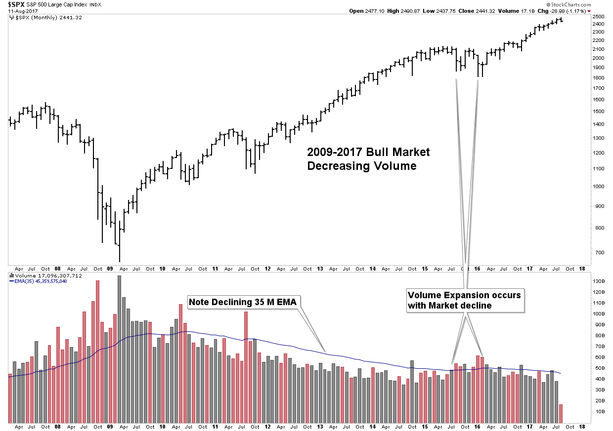
S&P500 Big Picture
The message of the below chart to me is this entire bull market, since 2009 has been engineered and is phony. I understand that goes against the grain for many. But I ask where is the volume? Real bull markets ride along a tide of increasing volume. This “bull market” has had progressively decreasing volume. If I had to guess…and we are allowed to, I would think that when the inevitable bear market comes along it will be fast and furious as illiquidity will lock up the market.
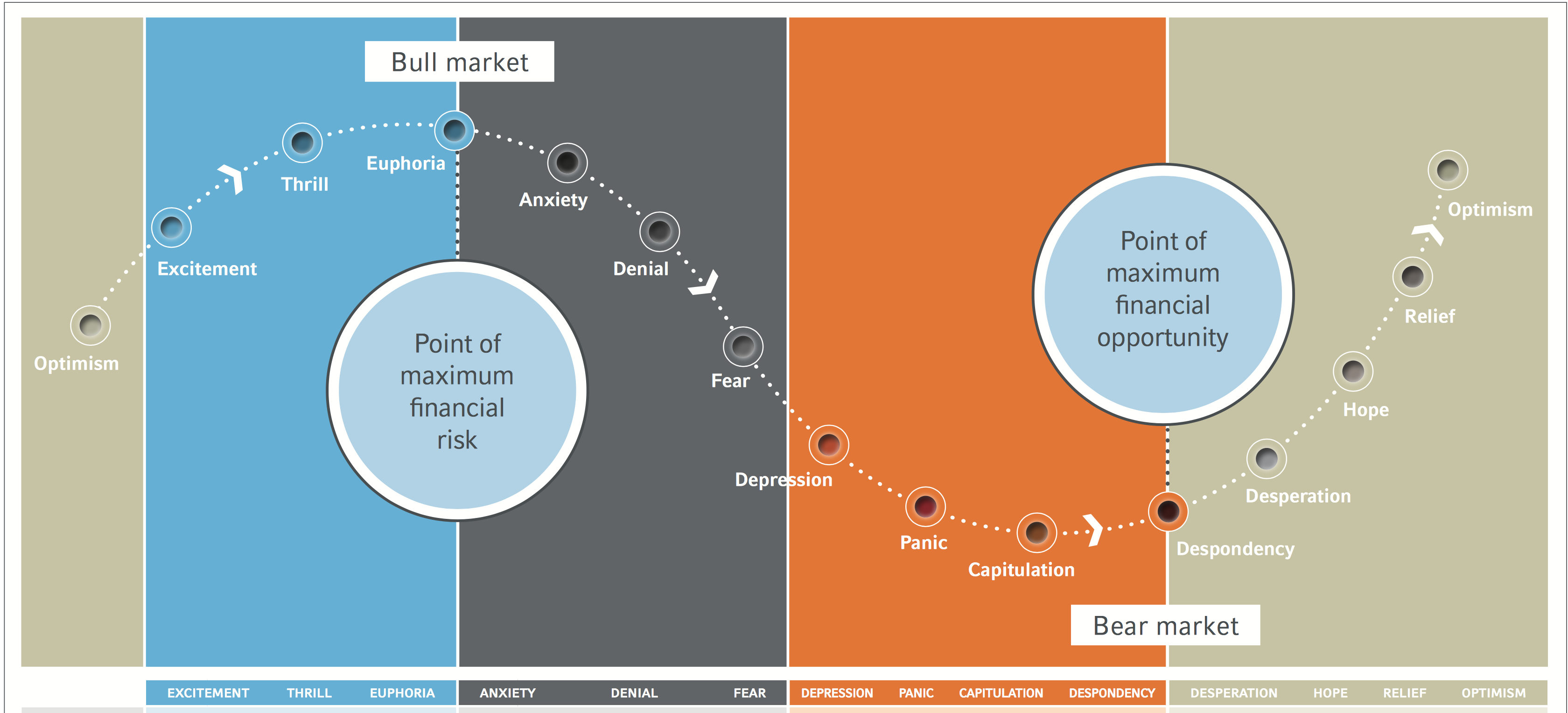
The Market’s Cycle of Emotions
The below chart shows where we are in the emotional market cycle. We are just now leaving the euphoria stage and approaching the anxiety stage. It was only a week ago where mass Trump rallies celebrated how great everyones 401Ks were and the Dow’s string of advances seemed to never cease. How fast things change. By late October we may already be to the fear stage.
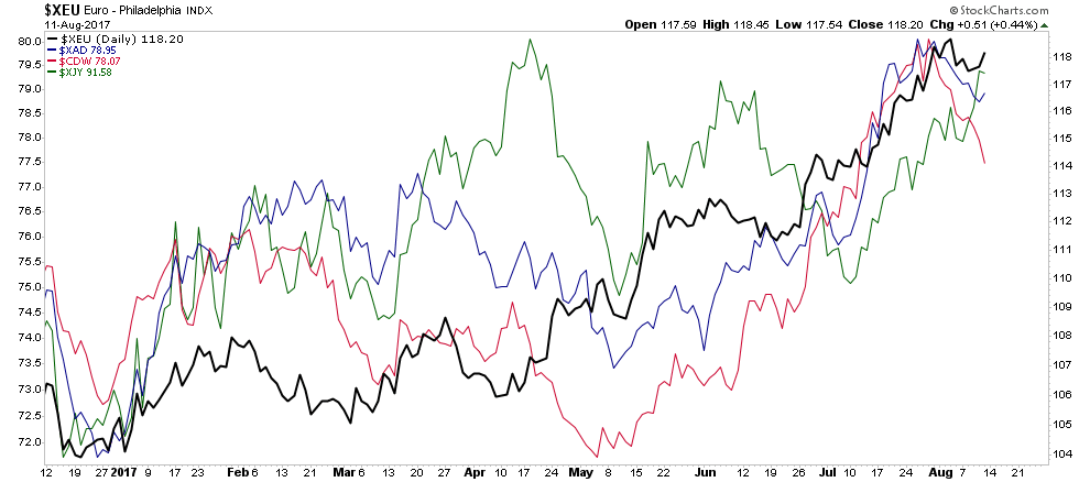
It’s Time to Remove Your Rose Colored Glasses- The Currency Deflator.
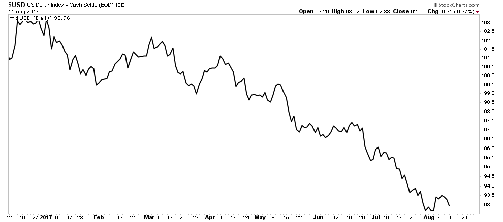
Since Jan 3, 2017 the USD has been in a decline with plenty of debate as to its future path. The overriding question: Is the USD now in a Primary Bear market? I do not believe it is, instead I interpret its move as a secondary reaction in an ongoing Primary Bull market. That said, since Jan of this year the USD has been in a downtrend. Therefore if you are a Dollar centric person everything we buy or sell has been affected by the decline of the USD.
The weaker USD has assisted commodity and gold prices. Simply stated a weak USD has elevated the price of financial and real assets. If the USD is your currency you have been viewing the markets through Rose Colored glasses. Well I am now going to remove those glasses so you can see how the world really looks. I warn you it’s not pretty.
I received this inspiration while sipping on a scotch in Edinburgh Scotland two weeks ago. It was one of those Ah-Ha moments. As USD people we see everything through the USD lens, and I wondered what would it look like if we were to see it from a different, yet equally valid perspective.
Below is a chart of the Yen, Euro, Canadian & Aussie Dollar. Since January they have squiggled around a lot, but have ended up pretty close relative to each other. So I am going to use the Euro as a proxy for all currencies to correct asset prices for the weakness in the USD we have seen this year. This is called a currency deflater. We correct the effects of a declining currency by dividing assets by the Euro.
Here is a view of the USD since January. Above we have currencies going from bottom left to top right and below we have the USD going from top left to bottom right. Significant indeed!
********
 Meet Rambus, a seasoned trader and technical analyst renowned for his unbiased and insightful chart work. Through his website, Rambus Chartology, and Substack newsletter, Rambus shares his expertise with a global community of subscribers, providing daily updates, commentaries, and hands-on training in the art and science of chartology. With his calm, humble, and down-to-earth approach, Rambus demystifies complex market trends, helping his followers navigate the challenges of today's volatile markets. Join the Rambus Chartology community today and discover a unique blend of technical analysis, trading expertise, and time-tested protocols. Subscribe now at www.rambus1.com or https://rambuschartology.substack.com/