HUI:GOLD Ratio Chart…Another Grizzly Year!


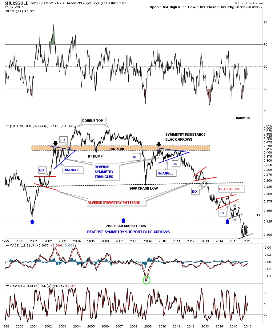
 I was just going over some old charts and came across this one, which is a ratio chart that compares the HUI to gold going all the way back to the bear market low that was made back in 2000. I use to show this chart quite a bit when the blue triangle on the right side of the chart broke down. This chart shows you a good example of how weak the HUI has been vs gold. The initial impulse move out of the 2000 bear market low shows the HUI really kicking gold’s butt until late 2003. The ratio then declined into the 2005 low which ended creating a double top hump. There was no way to know back then that the 2005 low would be a double top hump until much later. From the 2005 double top hump the ratio rallied up to the previous highs made back in 2005 around the .60 area. As hard as the HUI wanted to it couldn’t break through the double top highs and traded sideways until the infamous 2008 crash. From there the HUI rallied back up to the double top hump but could go no further even tho the HUI was making a new bull market high back in 2011. It then formed a blue triangle consolidation pattern just below the double top hump which matched the one that formed during the bull market back in 2002. At the time I labeled them symmetry triangles, one going up and one now coming down in the same place.
You don’t have to be a rocket scientist to see how badly the HUI has under-performed gold since the 2011 high.
This ratio built out a second reverse symmetry pattern at the 2008 crash low. Note the red flat top expanding triangle on the left side of the chart and then coming down the equally small red bearish rising wedge on the right side of the chart. Long term members may remember that I was always looking for ratio to hit .13 to see what would happen there. It was a place where the HUI may start to outperform gold again and the ratio could start to rally but that wasn’t the case. As you can see the ratio built out a small H&S consolidation pattern right on top of the 2000 bear market low and then broke below that all important 0.13 on the ratio. Now this ratio is building out another possible H&S consolidation pattern just below the 2000 bear market low at .13 or so. Who could have ever imagined back in 2011 or even going all the way back to the late 2003 ratio high that the HUI would underperform gold in such a massive way for such a long period of time? As a matter of fact this chart has had 4 major impulses down, one every year for the last 5 years . There is still no end in sight yet that this ratio is bottoming out or reversing this grizzly bear market that really took off in 2011 IMHO.
********
Courtesy of http://rambus1.com/
 Meet Rambus, a seasoned trader and technical analyst renowned for his unbiased and insightful chart work. Through his website, Rambus Chartology, and Substack newsletter, Rambus shares his expertise with a global community of subscribers, providing daily updates, commentaries, and hands-on training in the art and science of chartology. With his calm, humble, and down-to-earth approach, Rambus demystifies complex market trends, helping his followers navigate the challenges of today's volatile markets. Join the Rambus Chartology community today and discover a unique blend of technical analysis, trading expertise, and time-tested protocols. Subscribe now at www.rambus1.com or https://rambuschartology.substack.com/


