A Long-Term Look At The Stock Market And Precious Metals


I’ll be taking a break from writing until after the holiday season, but before I take my leave, I’d like to leave my readers with a few long term charts on the market. Let’s start with the Dow Jones, Barron’s Gold Mining Index (BGMI) and US Currency in Circulation (CinC) going back to 1920.
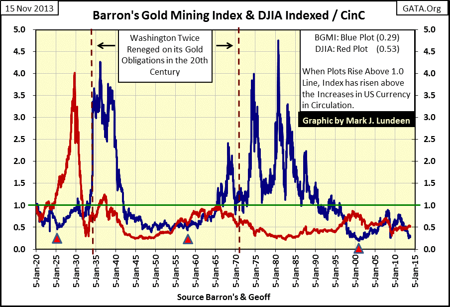
Without a doubt, monetary inflation (Blue Plot / Rising CinC) has outperformed both blue chip and gold mining shares since 1920. Unfortunately, benefitting from rising CinC is the preserve of Washington and Wall Street, not people like you or me. To my mind, to be a successful investor one needs only to exceed the gains in CinC. Both the Dow Jones and the BGMI have done so at various times since 1920, but neither has done so since 1997. The Dow Jones (Green Plot) has seen only one bull market that exceeded the inflationary gains of CinC, and that was ninety years ago during the Roaring 20s as seen in the chart’s insert.
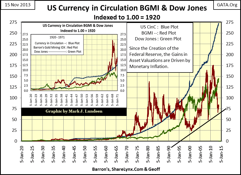
Since 1920, the BGMI (Red Plot) has exceeded the inflation adjusted returns of the Dow Jones. But one must be psychologically prepared for volatility in the gold mining shares and be willing to purchase them when they are out of favor as an asset class; (like they are currently).
But without a doubt, since 1920 the BGMI’s red plot has frequently found itself above the blue CinC plot in the chart. This has not been true since the mid-1990s when gold mining concluded a bear market that began in 1980. Since coming off its bear market bottom of April 2000, twice the BGMI has seen powerful upward thrusts toward the CinC plot. Unfortunately, on both occasions, intervention by the “policy makers” interrupted the bull market in gold mining shares.
Their reasons for doing so are quite logical. Since August 1971, financial asset valuations have been inflated far beyond reason. And as bull markets in gold, silver and mining shares don’t directly benefit from monetary inflation, but instead as a reaction to deflation of financial assets whose valuations have been previously inflated. The “policy makers” are attempting to prevent trillions of dollars from fleeing deflating financial assets, and from flowing into precious metals investments.
One can see this effect in the chart above, or maybe even more clearly in the chart below, where the Dow Jones (Red Plot) first inflates with little benefit to the BGMI (Blue Plot). But after the Dow Jones begins to deflate in a bear market, the BGMI clearly benefits from the declining Dow Jones. The Dow Jones and the BGMI have been countercyclical to one another over the past 93 year period for which I have data.
The BGMI didn’t really begin its bull market in the 1930s and in the 1960s until after the Dow Jones began to deflate. This has happened twice since 1920, and I believe this will happen for a third time in the years to come. Due to the Federal Reserve’s enormous “injections of liquidity” into today’s financial markets , the potential gains in gold mining are huge, as trillions of dollars flee from deflating stocks and bonds and seek safety in what is today still a tiny sector in the stock market. When will this happen? I haven’t a clue. Am I recommending that my readers buy mining stocks today? Well, I wouldn’t try to talk them out of it, but we may see gold mining shares decline further during for unknown length of time before they hit bottom. Which gold miners should you look at? I’m not the guy to make that recommendation.
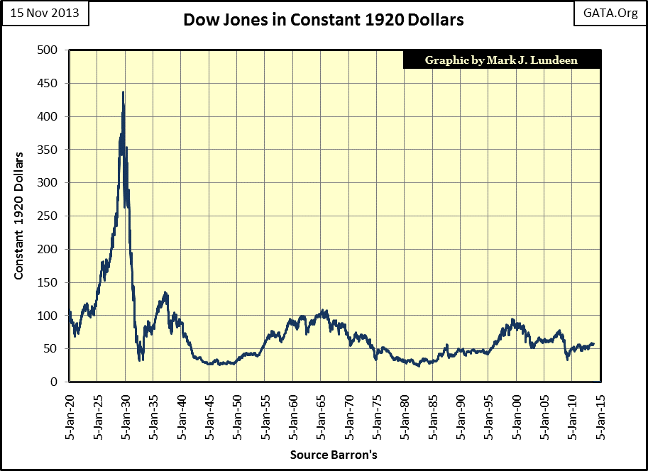
Let’s take a quick look at the Dow Jones in constant 1920 dollars (next chart), which is very similar, but not identical to the Dow Jones red plot above. The plot’s points are constructed by using a ratio of the published value of the Dow Jones Industrials to the indexed value of CinC since 1920. As we see in the first chart in this article, that would make the current denominator 272, as for every paper dollar (and coin) in circulation in 1920, there are now 272 dollars in circulation. If we included all the dollars sitting in checking accounts, savings accounts, and Treasury Bonds (then and now), the ratio would be much, much larger than 272. However, as in 1920 anyone could take a $20 paper bill and exchange it for a $20 gold coin at a bank, I prefer using CinC which doesn’t included any instruments of credit.
Does correcting the inflated value of the Dow Jones in this manner provide an accurate picture of the Dow Jones since the creation of the Federal Reserve in 1913? I think it provides a more accurate view of the Dow Jones as it takes into account monetary inflation. But admittedly, seeing the Dow Jones making new all-time highs in nominal dollars (but still valued at just $50 in constant, inflation adjusted 1920 dollars) after one hundred years of continual money printing inflation by the Federal Reserve, does seem a little excessive to me. In other words, I find it easy to accept that $448 in 1929 could purchase multiples more than $15,900 does today, even if not quite nine times more, as suggested in the chart above.
Also, seeing the Dow Jones’ nominal dollar all-time highs in 2007 (and again now in 2013) actually lower than the all-time highs of 2000 (in inflation adjusted terms) is no surprise. Go back to my first chart and look at the growth in CinC since 2000; it has more than doubled in the past thirteen years.
Next up is the price of gold in constant 1920 dollars. Remember, just as with the Dow Jones above, today’s price of gold below is being divided by 272, the increase in CinC since 1920. It’s interesting to note that the 1968-80 gold bull market terminated with the price of gold at $30 in constant 1920 dollars, although in nominal dollar terms gold had increased to $840.
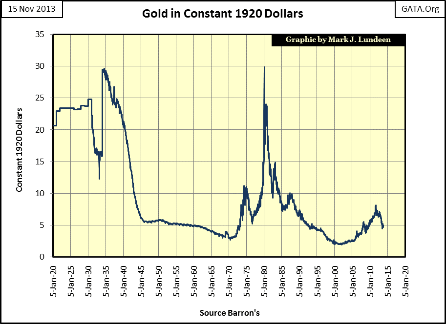
To see gold once again reach $30 in 1920 dollar terms, it would have to increase to $8,300 in 2013 dollars. Could gold really increase to $8,300? I believe that and more is already baked into the inflationary cake. In the past I’ve predicted that gold will see $30,000 because of Federal Reserve’s “monetary policy.” I see no reason to lower my prediction now as the Federal Reserve continues doing the exact same thing it has done ever since it was created by Congress in 1913, (when an ounce of gold was $20.67): inflate the American money supply for the benefit of Washington and Wall Street.
Next we see the price of silver priced in constant 1920 dollars. Like gold, silver’s 1980 bull market top (when priced in 1920 dollar terms) ended when it finally found itself very near its 1920 price. Currently, silver is going for 8 cents an ounce in 1920 dollars. For it to return to $1.50 in 1920 dollars, it would have to increase to $450 an ounce in 2013 dollars.
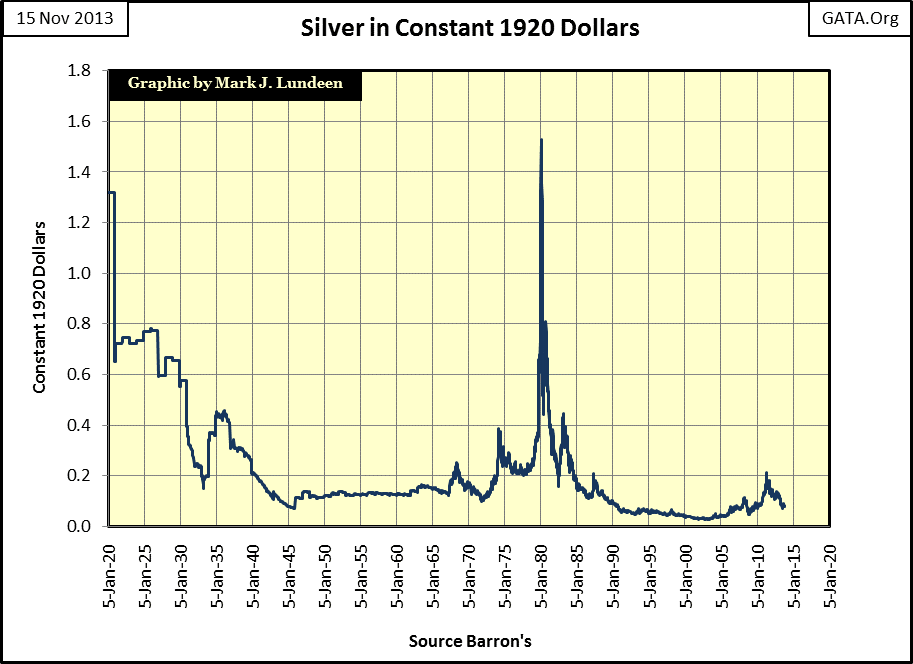
Could silver do this? Well it’s not really a question of what silver will do, but what the college professors controlling “monetary policy” have been, and continue doing with the quantity of dollars in circulation: increasing them with absolutely no limit. Looking at the price of silver this way, I expect that $450 will prove to be only a stepping stone on its way much higher prices.
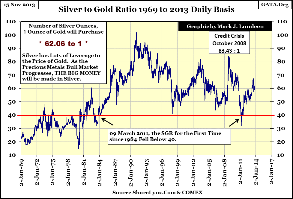
Looking at the ratio of the price of silver to the price of gold, $450 silver and $8300 gold would give us a ratio of 18.4, a ratio not seen on the chart below since a brief dip in 1980. That is a long way from the current 62.06, which I believe makes today’s silver price a historic bargain. Remember, since antiquity gold has been hoarded. This was also once true of silver, but is no longer so. In the first half of the 20th century, the US Treasury warehoused billions of ounces of silver. But during the 20th century, industry began consuming silver with no attempt made to recycle the silver used in manufactured goods. The implication being that where once there were 15 to 20 ounces of silver available for every ounce of gold hoarded, this is no longer the case so. The billions of ounces of silver once hoarded by the US Treasury are now all gone, tossed onto the trash heap, as is the case for the silver hoards of many other nations. This makes an ounce of above ground, investment grade silver much rarer today than an ounce of gold.
However, silver’s current rarity is not yet priced into the market price of an ounce of silver, but I believe one day it will be. Little facts like this hold no interest to investors who now mistakenly believe that precious metals are in a bear market. But when gold and silver once again begin making new all-time highs in a dramatic fashion, you can be sure that the relative rarity of silver over gold will become a major factor in pricing silver. Also, considering that a large portion of the silver market is industrial demand, (companies willing to stockpile silver at any price for future use if the price starts rising), speculation that an ounce of silver could one day be more valuable than an ounce of gold is not unreasonable.
What kind of silver should you buy? Well, don’t buy paper silver on the COMEX or a silver ETF managed by a large Wall Street bank! I like junk silver (pre-1965 US dimes, quarters and half dollars, also called “90” by industry insiders due to its 90% silver content), especially half dollars and mercury dimes. 1964 Kennedy half dollars are particularly nice because they are generally in mint condition since most left circulation immediately in the late 1960’s, or immediately entered private collections still in mint rolls. The 1965 to 1970 Kennedy halves are only 40% silver. But American Silver Eagles (ASE’s) and other one ounce 99.9% silver rounds and bars minted by private mints are good too.
Here’s a chart of the National disgrace. It only keeps increasing and that won’t change until Treasury bonds and the US dollar become worthless. And keep in mind that $17 Trillion shown below is only the tip of the iceberg. The chart does not accurately represent the true indebtedness of the United States, since it does not contain off balance sheet items such as the liabilities for Social Security, Medicare, Medicaid, Fannie Mae (FNMA), Freddie Mac (FHLMC), FHA loan guarantees, etc, etc. I have heard estimates of between $100 Trillion and $200 Trillion for the true total debt obligations of the United States from various organizations including the Congressional Budget Office.
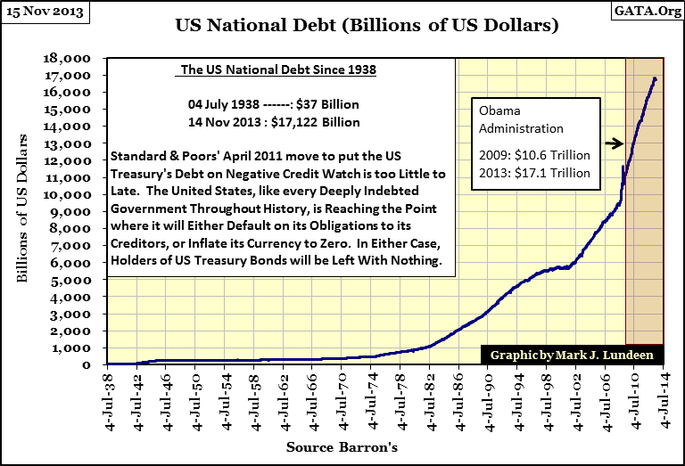
Do you disagree with me on this? Just remember that the same elected officials who voted for the “Affordable Health Care” legislation, an act of Congress that doubled the cost of health care for millions, also don’t believe there’s a downside to our ever expanding levels of debt and CinC. Well, Obamacare was sponsored by a pair of leftist liars, (President Obama, and Nancy Pelosi). Of the two of them, I’m scared more by Pelosi, who has to be the most ignorant member of Congress. Here’s a link to some Youtube videos of the Representative from the city of San Francisco.
https://www.google.com/webhp?sourceid=navclient&ie=UTF-8#q=Youtube+Nancy+Pelosi+
NYSE margin debt is best understood as a measurement of speculative excesses in the stock market. I’ve seen reports that NYSE margin debt is at record highs. Well, with the Dow Jones closing the week only forty points away from 16,000, this is not true as seen in the chart below.
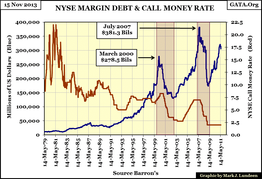
If the history of NYSE margin debt is any guide, (and it usually is), the Dow Jones may still have a good way to climb before it comes tumbling back down to reality. After all, margin debt is greatly influenced by the Federal Reserve. It sets the Call Money rate, which has been fixed at 2% for years. And as people are once again sucked into the market by rising share prices, (which is something the Baby-Boomer generation has a bad habit of doing), we just might see a new high in NYSE margin debt as retail investors decide to leverage their investments via margin debt.
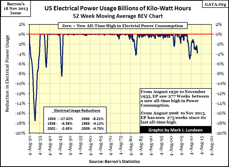
But I don’t like my prospects in the stock market because I believe its rising prices are the result of a long running “liquidity” driven fraud. How can anyone justify these lofty market valuations when electrical power consumption (EP) by the American economy is languishing? This is data of good predictive value; every significant pre-2008 decline in EP seen below corresponds to economic difficulty and an ailing stock market. Our current decline in EP is the most significant since World War 2, yet the Dow Jones closed this week at a new all-time high? This dichotomy of rising share prices during a major decrease in economic activity is something never seen before, and that should give us all pause for thought of exactly what in the hell is going on here.
We may yet see much higher prices in the stock market, but only because bubbles, once started, must inflate until they rupture. Typically, the public enters into the stock market after the bubble is nearing its terminal stage. Because of low trading volume and NYSE margin debt, I don’t believe the public has yet become fully invested in the stock market. So unless something surprising happens, for instance a mass exit from the US Treasury market by central banks, I expect gains coming from the stock market. But it will go up without me.
The real estate market is heating up again, or so we are told by “experts” in the field. But look at the DJTMG’s Home Construction group from Barron’s 20 May 2013 issue; back then it was at a 52Wk high, and a full 79.35% above its 52Wk low, as the home builders found themselves #3 in the table below.
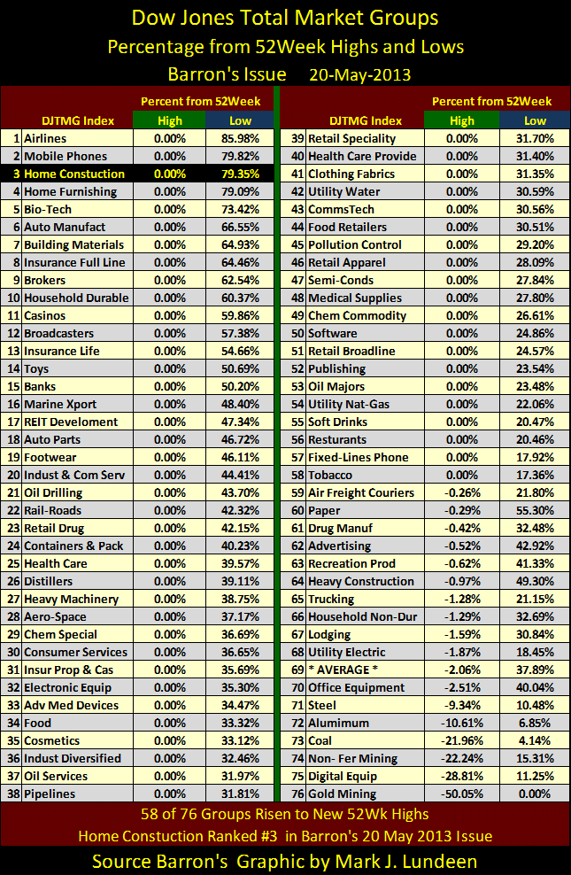
But what a difference six months can make. In Barron’s latest issue (below), the Home Construction group has fallen to #75 on the list, and is one of only three DJTMG groups that are down by double digits from their 52Wk highs. The only group worse off than the home builders is gold mining.
This collapse in the DJTMG’s Home Construction index makes me very suspicious whether we are experiencing an actual recovery in the housing market, and seeing 72 of 76 DJTMG groups less than 10% away from making a new 52Wk high is a strong indication the stock market is fully valued at current prices. But does that even matter when the market’s valuation is set by “policy decisions” made by the Fed? For the time being, I guess not.
But if you’re someone who likes to buy at the bottom and sell at the top, now seems like a perfect time to reduce your exposure to the stock market; that is, if you entered in September 2011 (see below) when share prices were far below their 52Wk highs.
Did you enter the market in September 2011 when the stock market was in a slump from Washington’s last debt-limit crisis, with 25 of 76 DJTMG groups at 52Wk lows, having fallen more than 30% below their 52Wk highs? Most likely not as everyone else in the stock market was selling, as is usual at the bottom. Unfortunately, they don’t ring a bell to tell you to sell into a strong market. And unfortunately, there is never anyone to hold your hand when you ought to be buying because asset valuations are down big. With that in mind, now seems to be the time to take some profits off the table (if you have any) from the current rising stock market, and maybe buy some gold, silver and depressed precious metals mining and exploration shares.
See you next year, Happy Holidays!


