Market Commentary for the Week


This week the Dow Jones closed with a BEV of -15.50%, not yet breaking below its BEV -20% line in this market decline. Who knows, maybe it won’t. Maybe it will now turn around and go on to new BEV Zeros below, taking the rest of the major market indexes up with it. That would not be very likely in my opinion, but it could.
Considering the following factors arguing against that happening in the summer of 2022;
- FOMC is Raising Interest Rates,
- Bond Yields and Mortgage Rates continue rising,
- CPI Inflation is the Highest in Four Decades,
- Since November 2021, Commodities have been in a Bull Market,
exactly how the stock market could now turn around, resuming its previous bullish ways is a mystery to me. So, I’m going to continue assuming the bullish “market experts” seen on TV are wrong, meaning I still believe we are in a bear market.
The Dow Jones BEV chart below spanning 1996 to 2022 records some remarkable bear-market market history. The 2007-2009, sub-prime mortgage bear market’s 54% market decline is the Dow Jones’ second deepest percentage decline since 1885, exceeded only by the Great Depression’s 89% market decline.
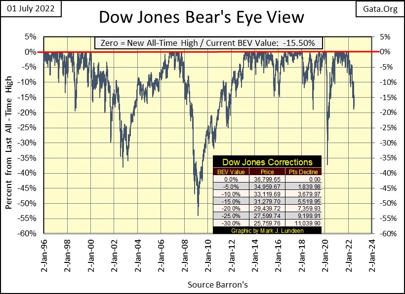
Excluding the Depressing 1930s crash, before March 2009, the Dow Jones had deflated more than 50% from an all-time high only once before; in April 1942 making March 2009 a significant market event. There is also the March 2020 flash crash. Yes, that was a market decline of only 37%. But that 37% market decline happened on only twenty-eight NYSE trading sessions, of which seventeen were days of extreme market volatility (Dow Jones 2% Days).
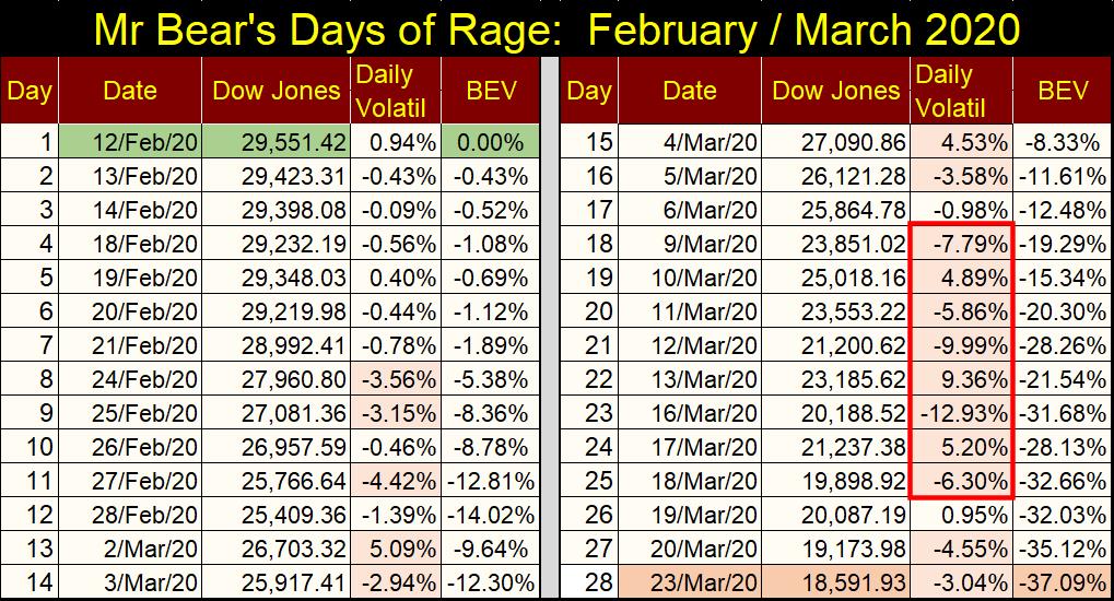
In the table below, I’ve noted the violence of Mr Bear’s days-of-rage during February / March 2020. The “market experts” at the time blamed it on the covid pandemic, totally ignoring the fact that the FOMC was forced to abort its QT only six months earlier as panic ran riot in the overnight Repo market, as overnight rates spiked to double digits for lack of “liquidity.” By March 2020, the “liquidity” crisis hit the NYSE.
Look at the red box on the right side; an 8-count of 8, eight consecutive Dow Jones 2% days, the first since the Great Depression Crash.
I call these days of extreme volatility “Dow Jones 2% days”, but the 2% is just a threshold value. Note in March 2020, few of those 2% days were anywhere near 2% daily moves. The Dow Jones’ 2% day on March 16th took the Dow Jones BEV value from -21% down to -31%; the Dow Jones deflated 3,000 points in a single NYSE trading session!
If “market experts” weren’t taking Mr Bear seriously before March 16th, they certainly were after it!
Below I’ve posted my chart of the FOMC’s weekly “injections-of-liquidity.” If you ever wondered why in March 2020, the idiots decided to begin “injecting” trillions-of-dollars of monetary inflation into the financial system, you need look no farther than Mr Bear’s Days-of-Rage above to understand their motivation.
The idiots feared without those trillion-dollar “injections”, the market would have collapsed into another Great Depression market event. And I believe they were correct to fear this. What do you think?
In the Navy, we’d always drilled for causality control; what to do when things go wrong. What is feared far out at sea, is that a series of cascading casualties develops due to the improper operation of the ship’s engineering equipment. Most of my ships were powered by boilers, but in today’s Navy ships, they are now powered by gas turbines (Jet Engines) diesel engines, or nuclear reactors. I don’t believe a single ship currently serving in the US Navy uses boilers for propulsion. Which is good, as boilers are a demanding mistress to those who serve them.
But boilers will serve my purpose in the following.
The steam used to drive the ship’s screws and electrical generators is dry-superheated steam. No droplets of water can enter the steam turbines for the main-engines or electrical generators. For should they, the turbines will shatter, resulting in the ship going dark and dead at the sea, as well as possible deaths for those on watch in the engineering spaces.
So, if the water levels in the boiler are allowed to rise above a certain level (event A), this leads to a ship dead-in-the-water with no electrical power (event B), moving then on to cascading failure of just about everything else. Something that should never, ever happen IF the ship is properly operated.
Now let’s look at the markets and financial system of the 21st century in the table below, where things were allowed to run amuck in the markets by a bunch of idiots. This is only a visual graphic, not a detailed explanation of booms and busts of the past quarter century, but it tells the story.
And the idiots knew better; none of the following had to happen. Still, they did it, as corrupt politicians stood idly by as a thankful Wall Street shared the wealth with influential insiders in the government, and academia that flowed its way.
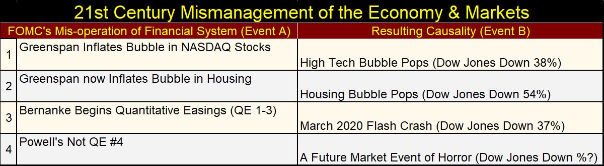
Note each of the resulting casualties above was in some way of greater magnitude than the ones before it. But, is #4 really going to be a market event of horror? That’s what I, and I believe the idiots at the FOMC fear it will be.
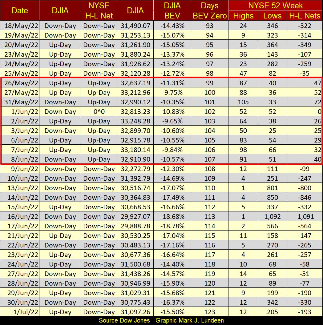
As bad as that sounds, it didn’t happen this week, as seen in the table of major market indexes’ BEV values below. No major market index below deflated by over 10% in a single day.
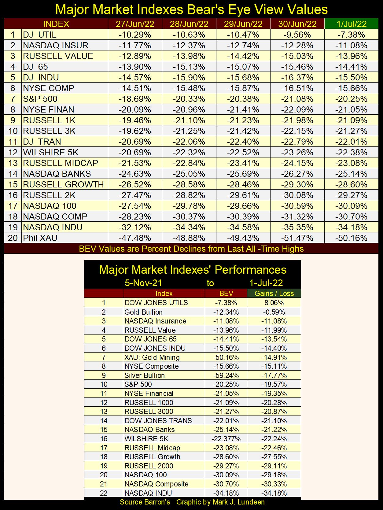
I note in the table above that gold closed the week at #2, the XAU at #7, and silver at #9. They could have all done better, but then they could have all done worse.
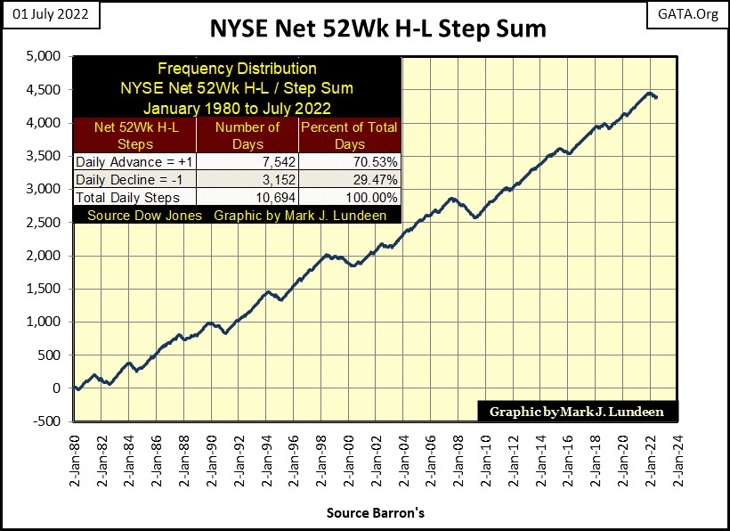
Once again, 52Wk Lows are dominating the trading at the NYSE. For a short while 52Wk Highs lead the market (Red Box), but that didn’t last long. And following these shallow incursions into positive NYSE 52Wk H-L nets (all were below 100), the NYSE saw a negative 52Wk H-L net of 1,091 only six trading sessions later.
In the battle between the bulls and the bears on display below, it’s the bears who are demonstrating power.
Seeing 52Wk Lows dominate trading at the NYSE isn’t normal, as seen below where I plotted a step sum for the NYSE 52Wk H-L nets. Any day with a positive 52Wk Net (more 52Wk highs than lows) is equal to +1. Any day with a negative 52Wk Net (more 52Wk lows than highs) is equal to a -1. The step sum plotted below is the running sum total of all these +1 & -1 since January 1980.
In the table, since January 1980, 70.53% of all daily closes at the NYSE closed with a positive 52Wk H-L net.
So, why are there so many negative 52Wk H-L nets in the table above? This is what happens when stock market valuations come under pressure, resulting in the step sum current dip down in the chart below. Our dip began in early January 2022, and I expect it will continue taking this step sum down until this bear market hits a bottom. Possibly only the first a several bottoms before Mr Bear is satisfied with his work, and departs from Wall Street.
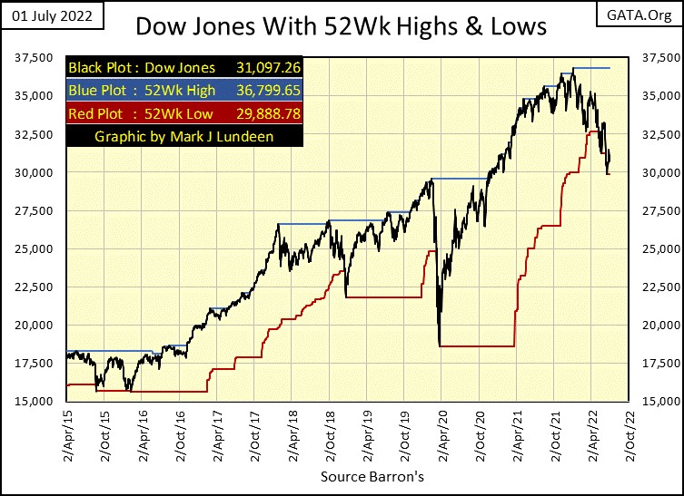
For the Dow Jones itself, it saw a few 52Wk Lows in the past month, but has rebounded since then. How long before it begins pushing down on its 52Wk Low line (Red Plot) again? I don’t know; but before September? Maybe.
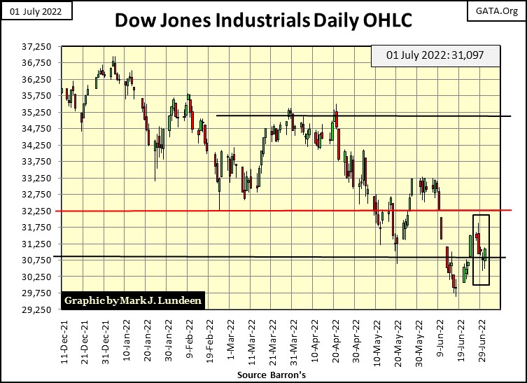
One more Dow Jones chart; the Dow Jones in daily bars. The stock market, as seen by my market proxy (the Dow Jones) didn’t have a great week. But, since the Dow Jones last all-time high seen below on January 4th, the power seen in the chart below has all been to the down side, with any bullish corrections in the market little-wimpy advances that didn’t last long.
What the bulls need in this market is a BIG SHOT OF “LIQUIDITY”, which if you believe the idiot savants at the FOMC, is the one thing they aren’t going to give the bulls. Heck, they are trying to drain “liquidity” from this market.
What is there to take away from this chart? As I read it, further declines in the Dow Jones in the weeks and months to come. But don’t be shocked should we see a positive week or month in the market as this bear market progresses towards its ultimate bear-market bottom.
The stock market’s valuation has been inflated with monetary inflation, by the FOMC, since August 1982. That is forty years of inflated market valuations, and many tens-of-trillions of dollars of consumptive debt generated by the Federal Reserve and its captive banking system that Mr Bear must write down, or write off completely from the global balance sheet. What it took the Federal Reserve forty years to accomplish, will take Mr Bear a few years to take apart.
This is a bear market that has a long way to go before it hits bottom. Speaking for myself; I’m out, and don’t plan to come back anytime soon!
How goes the FOMC’s QT? So far, not as planned.
Originally, the plan was to deflate the Federal Reserve’s balance sheet by $50 billion a month, month after month, starting in May. That was altered to beginning in June, and now we wait until July (now) to see what the idiot savants at the FOMC have planned for the financial system.
Will they actually begin deflating their balance sheet by $50 billion dollars a month, month after month? Or do they just stop talking about it, as the idiots and their minions in the main-stream financial media forget about the whole thing. They (the idiots and their media minions) will pretend there never was any plan to “deliquefy” the FOMC’s balance sheet. The entire QT thing will be flushed down the memory hole, where it will never again see the light of day.
The remarkable thing about the members of the FOMC, is that each of them are brilliant people, and I mean that. I would have flunked out in the first month of their many years of education. So, who am I to call them idiot savants? Because that is what they are.
The “savant” is a term from the 18th century Enlightenment era. Voltaire referred to his intellectual peers as savants, making this term one of high praise. During the American Revolutionary War, when Benjamin Franklin wasn’t negotiating with the French Crown for assistance against the British, he usually spent his spare time with beautiful women, or savants. In 18th century France, many savants were not only influential with the government bureaucracy, but were quite lovely too.
So, what makes the gifted individuals sitting at the Federal Reserve Open Market Committee (FOMC) idiot savants? Oh, that’s easy. Because only an idiot would be capable of deceiving themselves into believing they could drain $50 billion dollars a month, month after month, from their Not QE #4 below. While also promising they would raise their Fed Funds Rate in fifty-basis points increments, multiple times during 2022 and not cause a crash in the stock market of a magnitude not seen since the Depressing 1930s.
That they announced this idiocy many months, and many times in advance, with much acclaim from the know-nothings in the financial media only confirms FOMC members’ status as “idiot savant.”
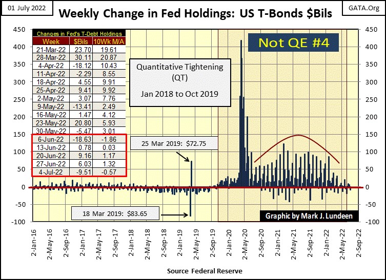
To see exactly how much “liquidity” the idiots have drained from their balance sheet, we go to the table above. The dates given in the table are Barron’s issue dates, but the dates given by the Fed’s Board of Governors are different, with the latest dated June 30th, not July 4th.
Back to the topic at hand; the “liquidity” drained from the Fed’s balance sheet in June 2022. The idiots managed to drain only $12.17 billion dollars in June. Most likely for the reasons seen in the table below – valuations in the stock market are deflating. Had the idiots actually drained all $50 billion dollars promised in May and June ($100 billion total as originally announced), where would these major market indexes be today?
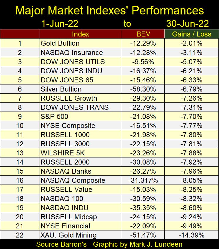
Note gold is #1 in the table above, while the gold miners finished at dead last at #22. This makes gold the top performing investment in the list above for the month of June, as it lost its owners less money than did investments in the stock market. Sorry to say, this same thing cannot be said about owning shares in the gold and silver miners.
But considering the mission-statement of Mr Bear; that following any significant bull market advance, that he will pop any, and all bubbles inflated into the market by the FOMC.
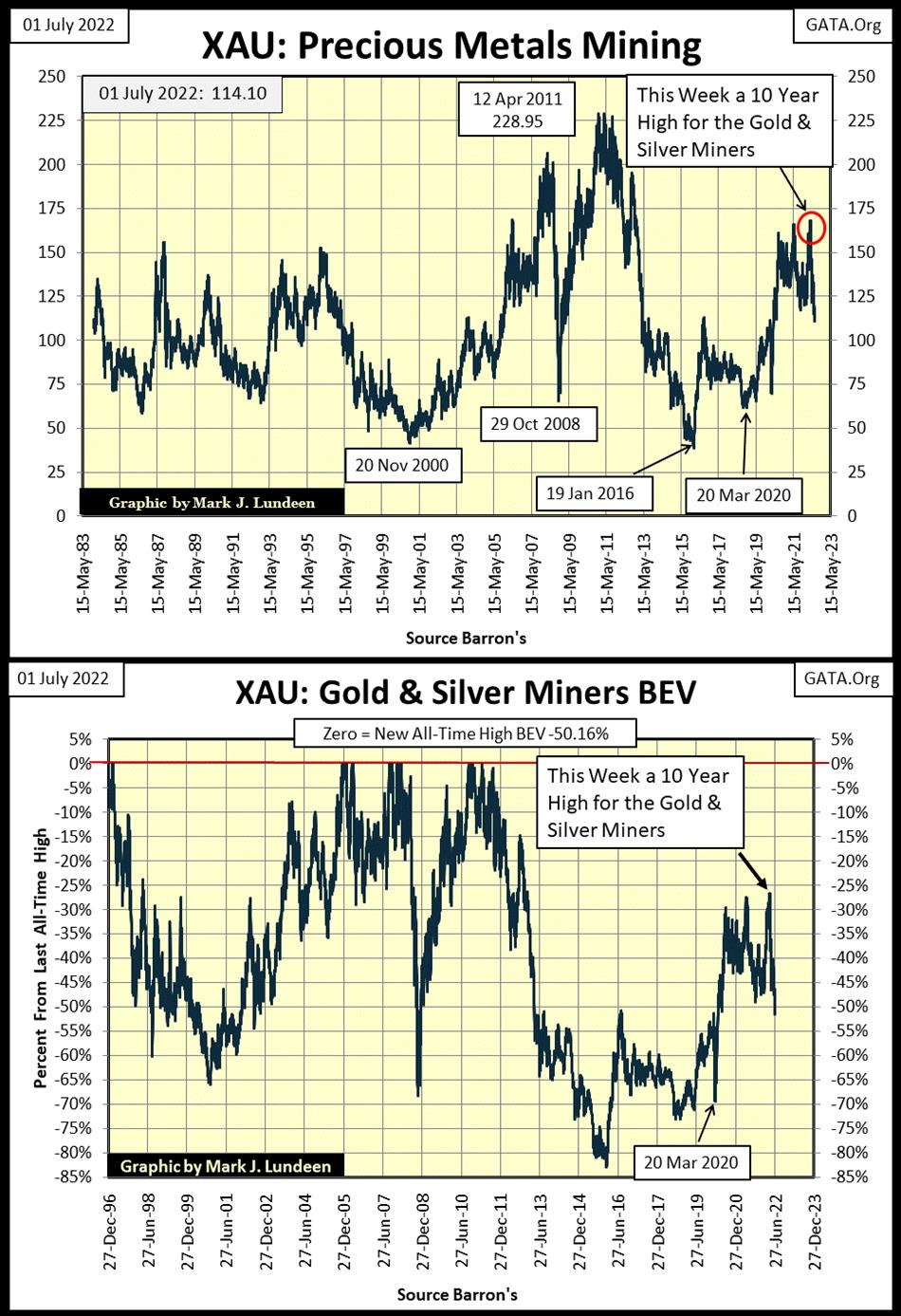
Since Washington decoupled its dollar from the Bretton Woods’ $35 gold peg in August 1971, there have been many valuation bubbles inflated in the market. But one area of the market that has NOT seen its valuations inflated are the gold and silver mining sectors of the stock market. So, exactly what are Mr Bear’s plans with the gold and silver miners seen below in the XAU?
Incredibly, at this week’s close, the XAU closed only $7.04 above where it first closed on its first day of trading in December 1983. That tells me that whatever is ailing the gold and silver miners, it isn’t that its valuations are overinflated. That it isn’t Mr Bear deflating its valuations, but the “policy makers” who love to do what they do best; manipulate market valuations to their selfish ends.
In a world of deflating stocks and bonds, the last thing the “policy makers” need is a wild bull market to begin in gold, silver and their miners. So how long can this go on, this phony bear market in precious metals assets?
I don’t know. But what I do know is in a bear market, it is Mr Bear who will eventually dominate all. Even the “policy makers” will ultimately learn their day is past. We’ll all know when that day comes; as precious metal asset valuations begin to rise up towards levels not believable today. In July 2022, patience is a virtue of great value.
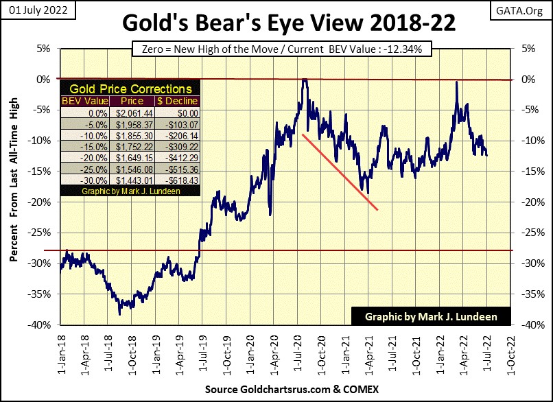
Let’s look at gold’s BEV chart. The COMEX goons keep huffing and puffing, but so far, they’ve failed to blow gold’s house down; failed to drive gold’s BEV below its BEV -15% line. If the goons can’t do that, and so far, they haven’t, I’m going to remain positive on the gold and silver markets. Actually, should the goons drive gold down under its BEV -25% ($1546), I’d still stay positive on precious metal assets, as in this bear market, I believe Mr Bear is on my side.
I think we may be coming to a bottom in the precious metals’ current time of troubles. Case in point is that the Silver to Gold Ratio went above 90 at this week’s close, actually 91.03 ounces of silver for 1 ounce of gold. That’s 5.69 POUNDS OF SILVER for one ounce of gold.
Too many investors see extremes, such as this, as a reason to give up hope; that thing will never change, and so they give up. Thinking like this will lead investors to buy at the top because the market has been rising for years, and then sell at the bottom because they now believe the market only goes down.
But the correct way to understand such extremes, as an SGR of 91.03, is that quite possibly a current market trend is about to play itself out, that a change in the market may be at hand.
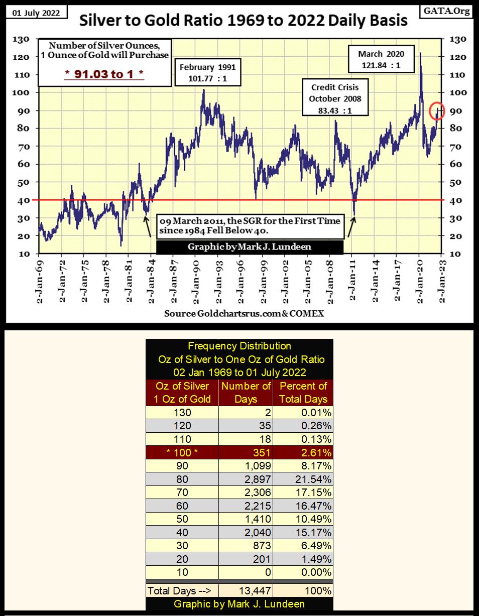
An SGR of over 90 is a market extreme, as seen in the frequency distribution table above. Since January 1969 the SGR has closed within the range of 90.01 to 100 (Red Row Above) on only 351 days of the past 13,447 COMEX trading sessions. That’s not many.
Does this promise a return to gold and silver’s bullish ways? I don’t want to go that far. But it seems to me this extreme in the SGR, while it may become even more extreme in the weeks ahead, signals a coming change somewhere ahead of us.
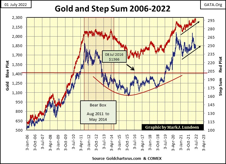
And what could that change be? Looking at gold’s step sum chart below, the change may be a pleasant one for the precious metal bulls out there. Gold, and its step sum have for the past eighteen months refused to break below their black rising trend lines.
As I see this market, that is a big positive. Especially following that massive 2011 to 2014 Bear Box, and the bottoming formation (red bowl) and the breakout for gold in July 2019. Gold is a market that now wants to do something big, but something, or pack-of-goons are sitting on it. This too shall pass.
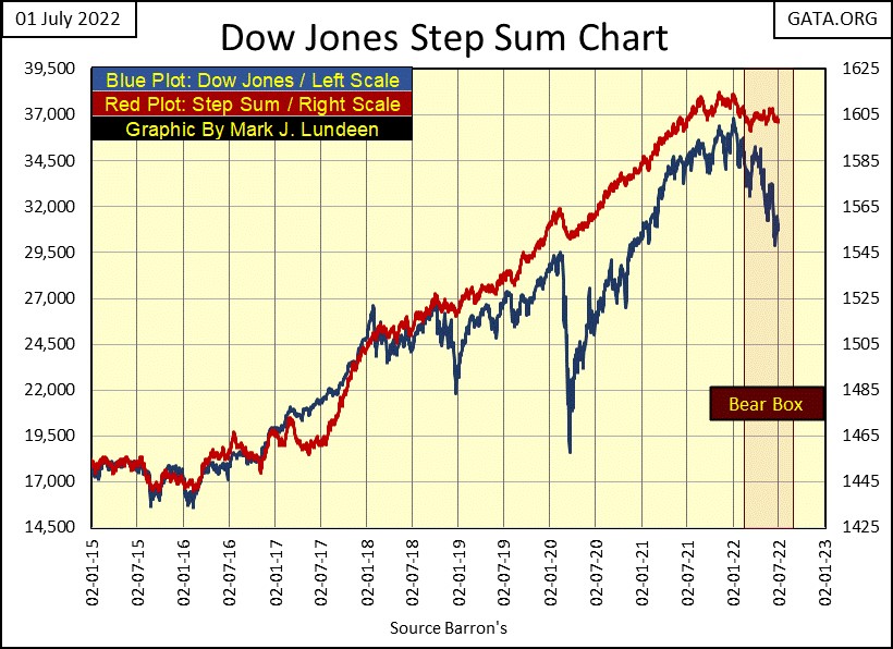
The step sum chart for the Dow Jones continues telling a tale of denial. Bullish market sentiment (Red Step Sum Plot) refuses to recouple with the deflating Dow Jones (Blue Dow Jones Price Plot).
As the big bulls in this market must be the idiots of the FOMC, who aren’t in this market for profit, nor do they fear market losses, but to “execute monetary policy”, this bear box may go on for a long time, becoming a bear box of legend. That is just me thinking of one of many possibilities in the market, but who can tell?
Moving on to gold and the Dow Jones’ step sum tables below, both of these markets have seen a lot of selling pressure since the end of May. Gold’s 15-count closed the week at a -5, the Dow Jones at -3. There may be more selling to come in the weeks ahead of us, but at some point, the selling will exhaust itself, and these markets will then see more advancing daily closes than decliners.
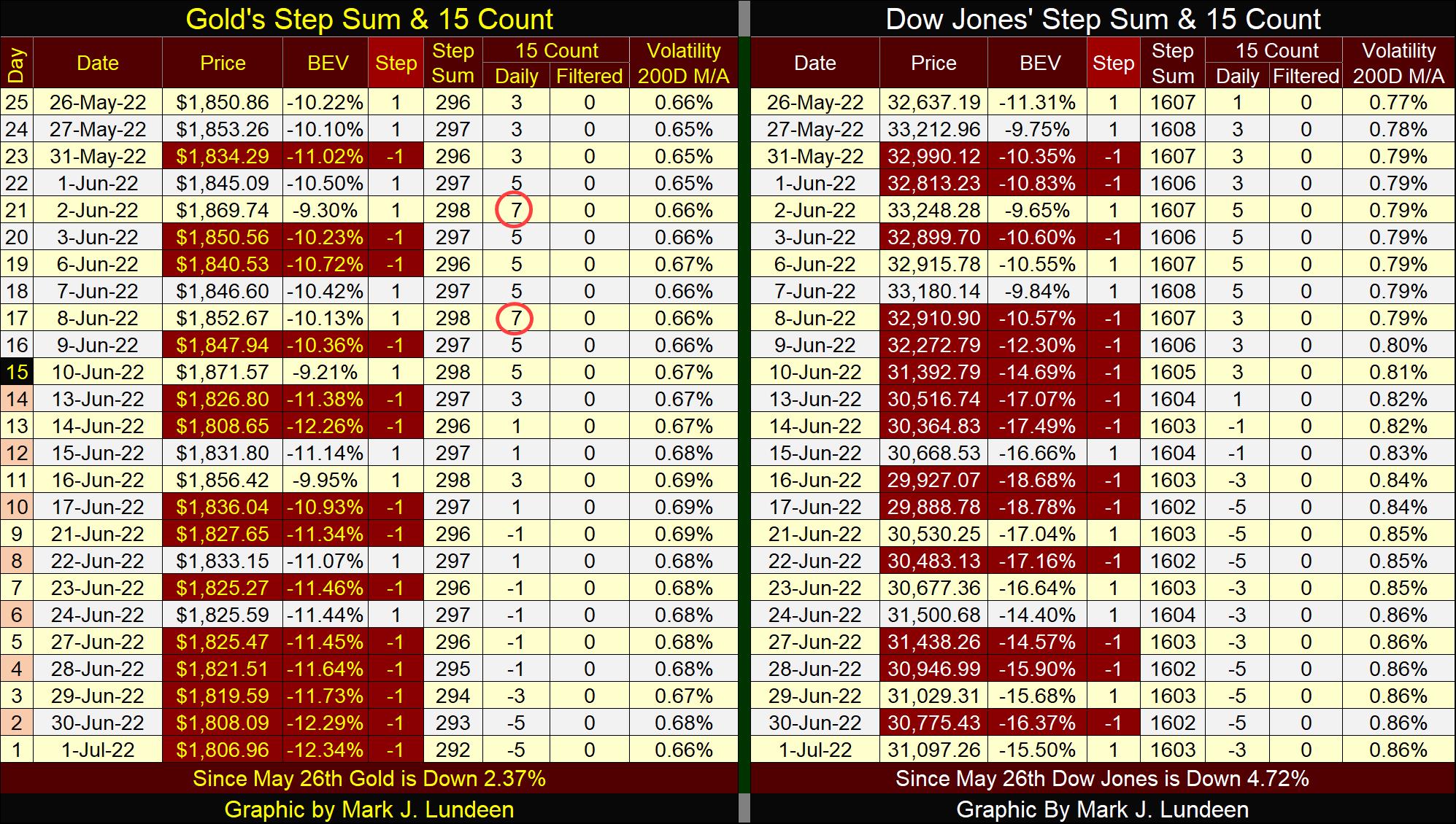
At that point, we’ll then see how effective the overwhelming daily advances are in driving valuations upward. The Dow Jones is in a bear box, a market condition where more daily advances actually result in declining market valuations.
How is that possible? Simple; market valuations go down more on the fewer down days than it advances during the numerically superior daily advances.
That’s it for this week. I’ll be back next week.
Mark J. Lundeen
01 July 2022
********


