Now You See It, Now You Don’t!


When a stage magician draws a rabbit out of a top hat, you KNOW that it had been there all the time. When he closes his pretty assistant in a large box sitting on a table and then, when he pulls the sides down she is no longer there, you KNOW that somehow she was moved elsewhere. To be fascinated by how he can mislead the eyes is why you have paid to see his show. The Bureau of Labour Statistics (BLS) has been doing much the same disappearing trick on most US consumers ever since the mid 1990s. Now you have money to spend, now you don’t.
The official view of the widely used and closely watched Consumer Price Index (CPI) is that ‘The goal of the CPI is to measure how much the consumer needs to spend each week to consider herself just as well off as she was before the price increase.’ The key point to note is the use of the word ‘consider’; the CPI is intended and designed to play mental games with the consumer, much like the stage magician does when confusing the eyes. Another similarity is that it costs you money in both cases.
One of the key assumptions in the BLS Magic Show is the sleight of hand known as ‘substitution’: ‘The index is based on a fixed market basket of goods and services. But, for example, if the price of an item like steak gets too expensive, consumers may switch to hamburger.’
The effect of these two core elements of the new CPI, introduced during the Clinton administrations, can be compared to the tale about the frog in the pan of water on the hot plate of the stove. The gradual rise in temperature is hardly noticed until, as it gets uncomfortable, the frog is no longer able to climb out. Clipping away at one’s historical standard of living at a percent now and two percent next year is supposed to lull consumers into accepting a rising cost of living as ‘normal.’
Before the 1990s there was a ‘Cost of Living’ index which measured how large one’s wage or salary increases have to be to maintain the same standard of living. Since the new CPI and its use to set wage and salary increases, the objective is to bluff all employee households into ‘thinking’ they are enjoying a constant standard of living – a bluff that was called by the academics when there was the recent concern about the worsening finances of middle and working class America.
This concern soon became muted when the social academics and reporting media added 2 and 2 to find 4; an answer that pitted them against the might of the BLS and the economists and also the US government which had benefitted greatly since 1995 from a CPIT that reported increases in price smaller than they actually were.
The primary effect of a now no longer new CPI is that employee households become impoverished over time. Perhaps the best evidence of the effect of inflation, be it officially recognised or an insidious effect of the CPI, is that up to the middle 1970s the average US household enjoyed a very good life with only one wage earner. Such a household could aspire to owning a house and going away on vacation as a family and providing a good education for the children – all this without other debt than a mortgage on the house and usually at most 2 years to pay off the motor car. Too few people who remember growing up in such a household are still alive today.
Teachers are salaried employees and the graph below shows how their incomes have been affected by the CPI.
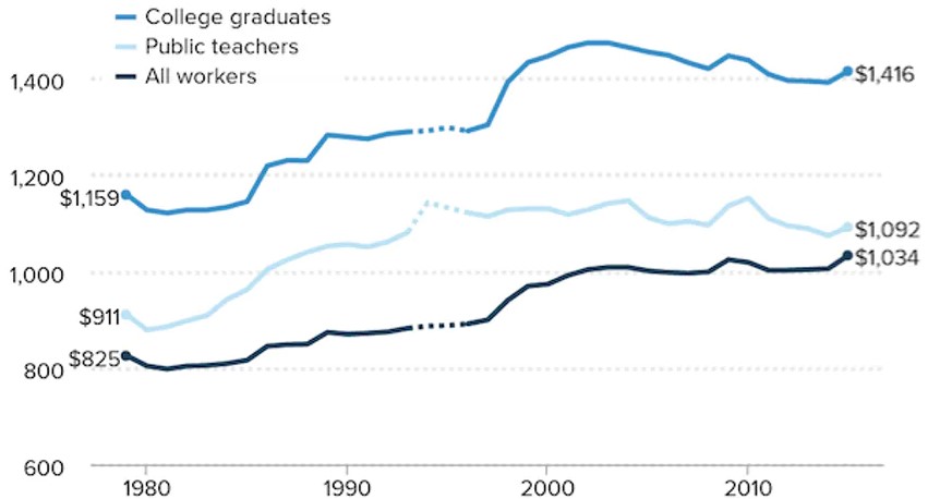
Teachers are college graduates, but they work for salaries with regular CPI adjusted increases. Other college graduates become lawyers, doctors, engineers and so on who are generally able to enjoy more freedom to negotiate their incomes based on demand for their specific expertise, or are self-employed and can set their own fees.
Observe the change in the gradients of the two blue lines and in particular the gap between them before and after the mid 1990s and also the gap between the light blue line and the black line. Teachers have been short-changed since the time when the new CPI was introduced. Irrespective whether they ‘consider themselves equally well off’ today compared to before 1995, they clearly are in fact not as ‘well off’ as other graduates. And teachers probably have fared much better than many people in all kinds of working or admin occupations.
Other than the impoverishment of employee households, the wave of the economic magicians’ wands does more than lower our standard of living. Their sleight of hand also creates an illusion of growth in the economy as reflected in the increase of real material wealth compared to how we perceived that the actual increase. A simple, exaggerated example will suffice.
In an economy with 1000 households every household in year 1 can purchase a new car at $10 000. The manufacture and sale of the 1000 cars contribute $10 million to the GDP. 10 years later, with a new CPI in effect, only 750 households could afford to purchase a new car which then had a price of $16 500. According to the CPI the new car is worth the increase of $6500 in the price because of all the improvements that have been implemented. This means that the full $12.375 million is boosting the GDP by 23.75% compared to 10 years before. In another 10 years only half of all households can afford a car, but the GDP has received another large boost.
Is that the kind of economy where one would choose to live so that one can boast about the ‘strong economy’ and how wonderful that is? The effect of this situation is illustrated by three charts from the well-known Shadowstats site of John Williams.
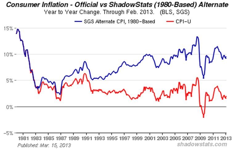
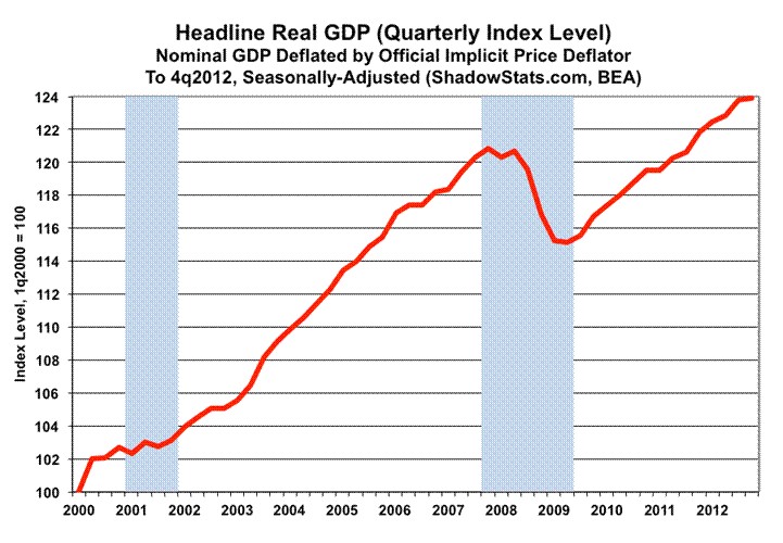
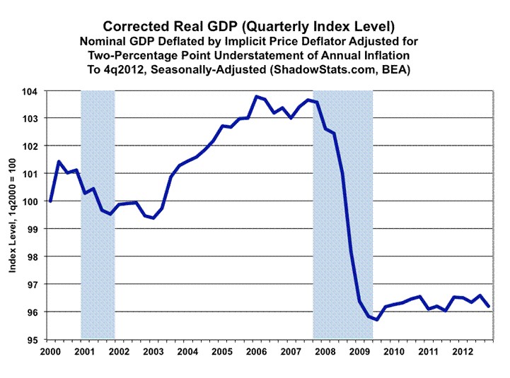
Publicly available charts only extend to 2013, but they illustrate what is happening. Since 1985 there has been a growing gap between the official CPI and the real increases in prices as measured by the red line. Given that the method used to calculate the CPI has not been radically changed since 2013, that gap still exists and still reflects the decreased purchasing power of incomes that receive CPI related annual increases.
American households are still being impoverished, with the lower and middle income households doing so at a faster rate than households in the upper ranges of salaried incomes. The example of being able to afford a car probably applies to the whole range of consumer goods – the mean standard of living has been scaled down.
The trends reflected in the charts have extended for another almost 8 years and are set to continue while the CPI remains unchanged and while wage/salary increases remain pegged to the CPI.
At the magician’s show you know that the rabbit being drawn from the top hat is an illusion the magician wants you to see. In the consumer economy, the BLS and the government want you to accept the illusion that you are sustaining your standard of living. To convince you of the truth of this, the government has set the example that ‘taking on more debt is a good thing’ and by keeping interest rates low helps to give substance to this illusion.
No wonder the Fed has promised to keep rates as low as they are well into 2023 – whatever the real rate of price increases is. Official inflation will be low, because they will wave their magic wands and make it disappear. Serial stimulus packages and other means will be used to ‘boost growth in the economy’, but with a primary objective of retaining the illusion that the economy is healthy, but COVID (or any other suitable reason) requires that a ‘stimulus’ is needed to get it into top gear.
Another long running illusion is the belief that the sell-by date for gold and silver is history. This illusion is maintained by the tactic of subverting the century old London Gold fix as the official price of gold to conform to metal prices as quoted on COMEX.
I do not know exactly how or when this was done, but early in the new century the leasing of gold to the bullion banks and selling of central bank gold to suppress the price of gold could no longer keep it below $300. COMEX then became the place where the price of gold was determined, to be rubber-stamped by the London Bullion Market Association (LBMA). This also happened to silver when it too became an embarrassment to ‘the-dollar-is-so-strong-because-there-is-no-inflation’ camp.
France and Russia are two examples where popular uprisings have unseated ruling governments – a method that was also employed successfully in Libya and in Egypt, among other countries. Now it looks as if there might be a similar event unseating the Cartel with their hegemony over the PM market. It is trite that the COMEX scam can only continue while there is enough gold and silver to meet delivery requests.
For a long time it seemed few deliveries were really taking metal out of circulation, other than changing ownership of the metals in the COMEX vaults. Now two things have happened: firstly, the message that there is too little metal available, predominantly silver, was brought home by the REDDIT groups who had ignited a buying frenzy by small investors that emptied the shelves of retailers and scared the Cabal into panic mode; secondly, in order to shift a large volume of material one either needs a few large trucks or, which appears to be happening, an army of Apes – as the REDDIT silver buyers are called – each willing to carry away a few ounces.
If enough silver can be taken out of the market supply just about ounce by ounce, any contracts standing for delivery no longer are the primary drain of silver from the market, but only a bonus. While this movement lasts and grows, time is definitely on the side of the metal bulls. And the time is now running out fast!
Meanwhile the whispers of inflation that were mentioned here recently continue to get louder in the yield on the US 10-year Treasury and the price of crude oil. These and similar trends will get right in the face of the Fed with its promise of extra low rates for two more years. An interesting economic battle looms given that these trends do continue, as could be expected from the amounts of ‘stimulus’ of all kinds. We really do live in interesting times when illusions that have been constructed during the past three to four decades are revealed for what they are.
Euro–Dollar
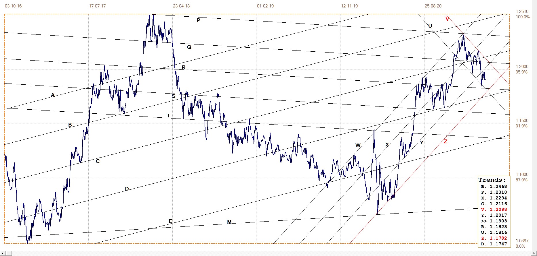
Euro–dollar, last = $1.1903 (www.investing.com)
The euro is still holding within bear channel UV, with the rebound off the lower boundary at line U holding just below the top of the euro bull channel YZ. The near term trend has been sideways, and could continue so for some time. The US dollar index has been firm, now holding well above 90 and even 91. Yet the effect on the euro has been minimal during the past two weeks. This implies a break higher into channel XY and above channel UV should the dollar drift lower as the new ‘stimulus’ gains ground. With more to come?
DJIA daily close
Both the DJIA and S&P500 hit new all time highs last week, but the Nasdaq failed to confirm, with its all time high way back in February. Perhaps this combination can serve as a modified major Dow Theory top where non-confirmation of major indices signals the end of a long term market trend.
The DJIA only lost a little more than 1% off the high on Wednesday and two days do not make a trend, but two down days in a row are not a common occurrence in the kind of stock market behaviour we have had during the past year. This week should see the DJIA trending a bit lower if the long term top is already in. Although a sideways drift for some time before the Bear can really take over is possible. The Bull will not let go easily.
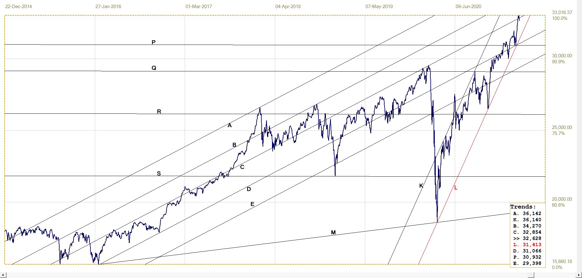
DJIA. last = 32627.97 (money.cnn.com)
Gold London PM fix – Dollars
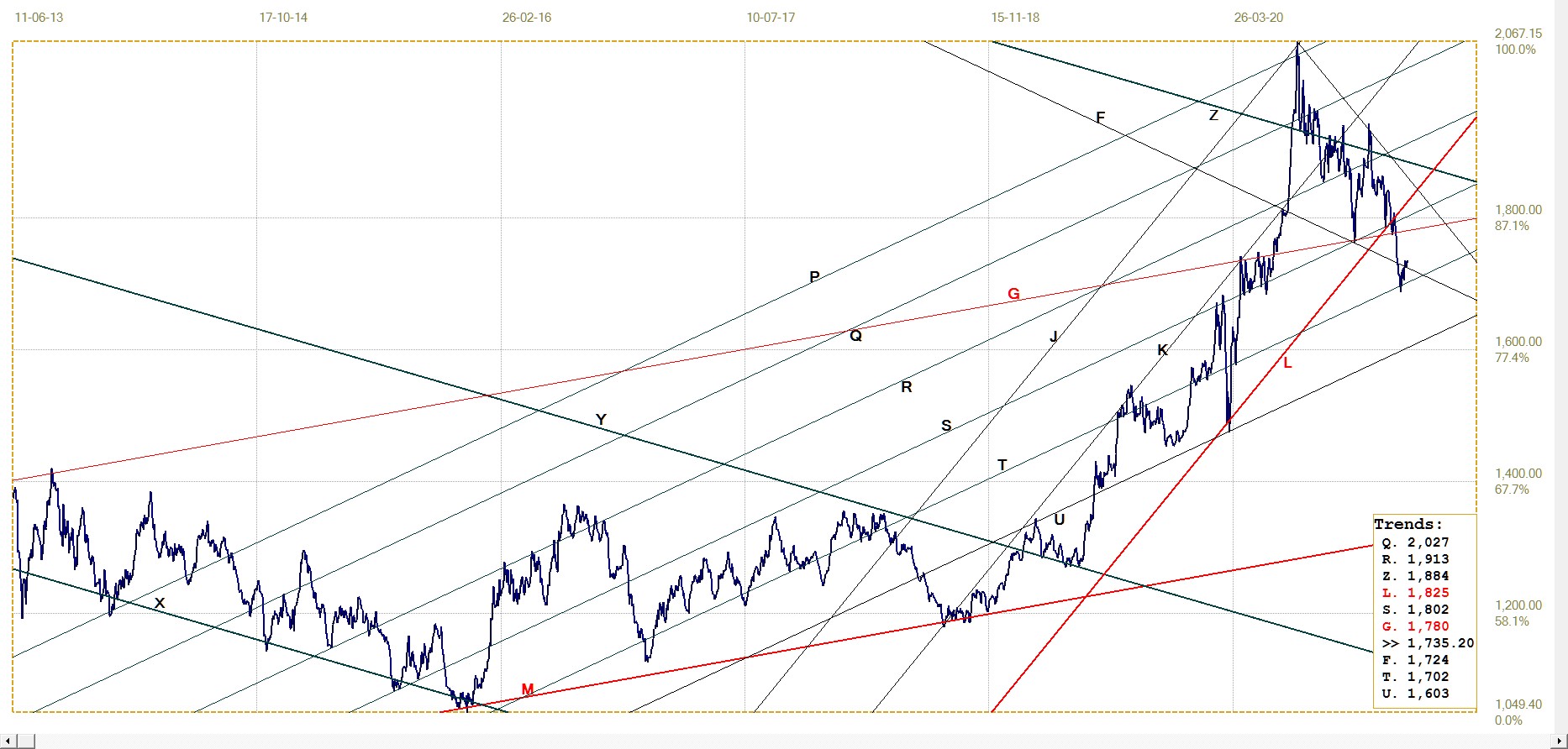
Gold price – London PM fix, last = $1735.20 (www.kitco.com)
The London PM fix was below $1700 on two occasions recently, with the low fix at $1687.05 on the 8th of March, two weeks ago. Since then the price has struggled to regain the rising trend, managing to break back above line F which acted as key support not too long ago.
The new-found attention that is focused on silver is bound to stimulate (that word again!) similar interest in gold, probably from more conventional and conservative investors who want to stick to the yellow metal. The REDDIT movement in silver and the increased focus on inflation in the various media are bound to arouse some desire among that crowd to add some more gold to their existing hoards – more so while the price appears cheap.
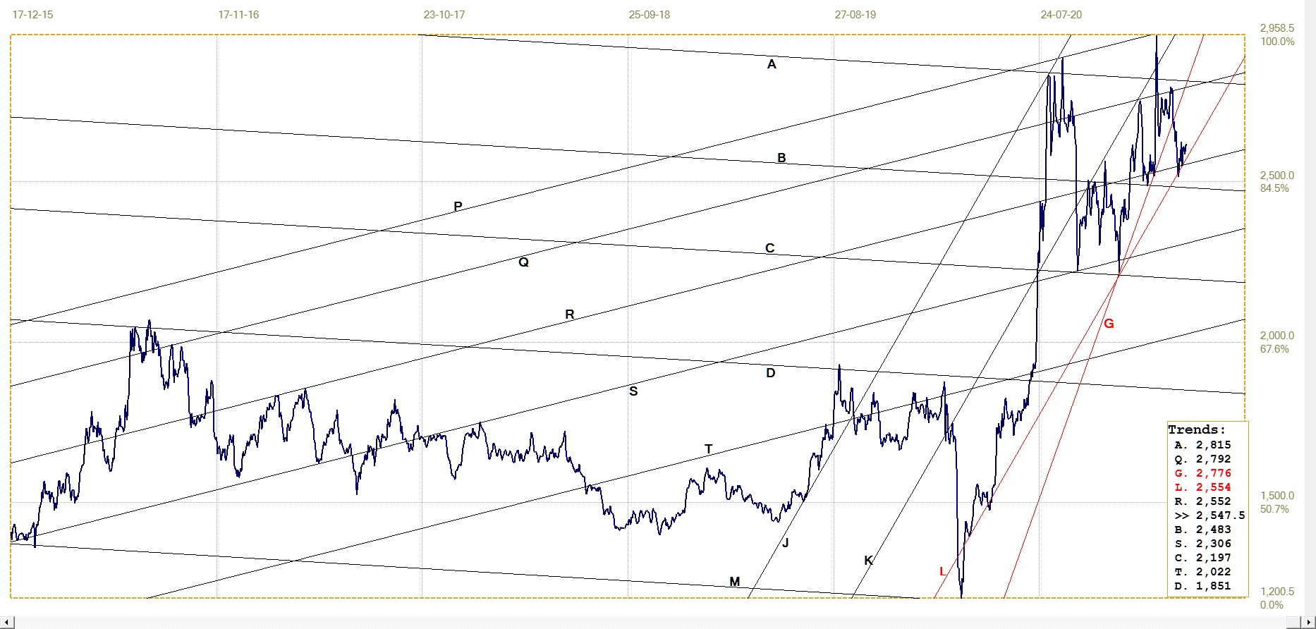
Euro–gold PM fix

Euro gold price – PM fix in Euro. Last = €1459.82 (www.kitco.com)
The euro price of gold also rebounded off significant support two weeks ago. The trend since then has been consistent if limited to small gains. The euro price of the metal illustrates that the bullish effect is real in dollar trems; it could be maintained even while the euro firmed against the dollar, which acts as a drag on the price in euro of the metal.
The trend is quite steep and if it can be maintained, line X – another significant trend line – could be tested as early as this week. A break higher would be bullish, the more so if the dollar is to lose ground against the euro in the meantime to act as a brake on the rally.
Silver Daily London Fix
Silver daily London fix, last = $26.175 (www.kitco.com)
Technically silver has done very well indeed during the ongoing assault to try and get Bulls to discard their long positions. Except for the brief and steep spike when the REDDIT squeeze failed to hold, the price held within range of the recent highs and also held within the steep channel JKL – although it was/is a tight call.
Whether the price can recover back above the previous steep gradient along line G is rather doubtful – not impossible, should all the silver buying begin to affect prices on COMEX, but not a realistic expectation at the moment. Holding in the steep bull channel JKL will however be good enough to keep buyer interest alive.
U.S. 10–year Treasury Note
The rising trend in the yield on the US 10-year Treasury note has now accomplished three important breaks above resistance in the past few weeks; the steady trend has broken above RA, XY and the important broad bull channel AF. So far it has held onto the breaks and the longer it does so, the smaller become the odds of a new rally.
Should the dollar also begin to weaken again, as most commentators expect, the combined losses foreigners suffer from the currency and the increasing yield could unleash a flood of selling. It will then be up to the Fed to close its eyes for the state of its balance sheet and do all it could to protect the stability of the markets.
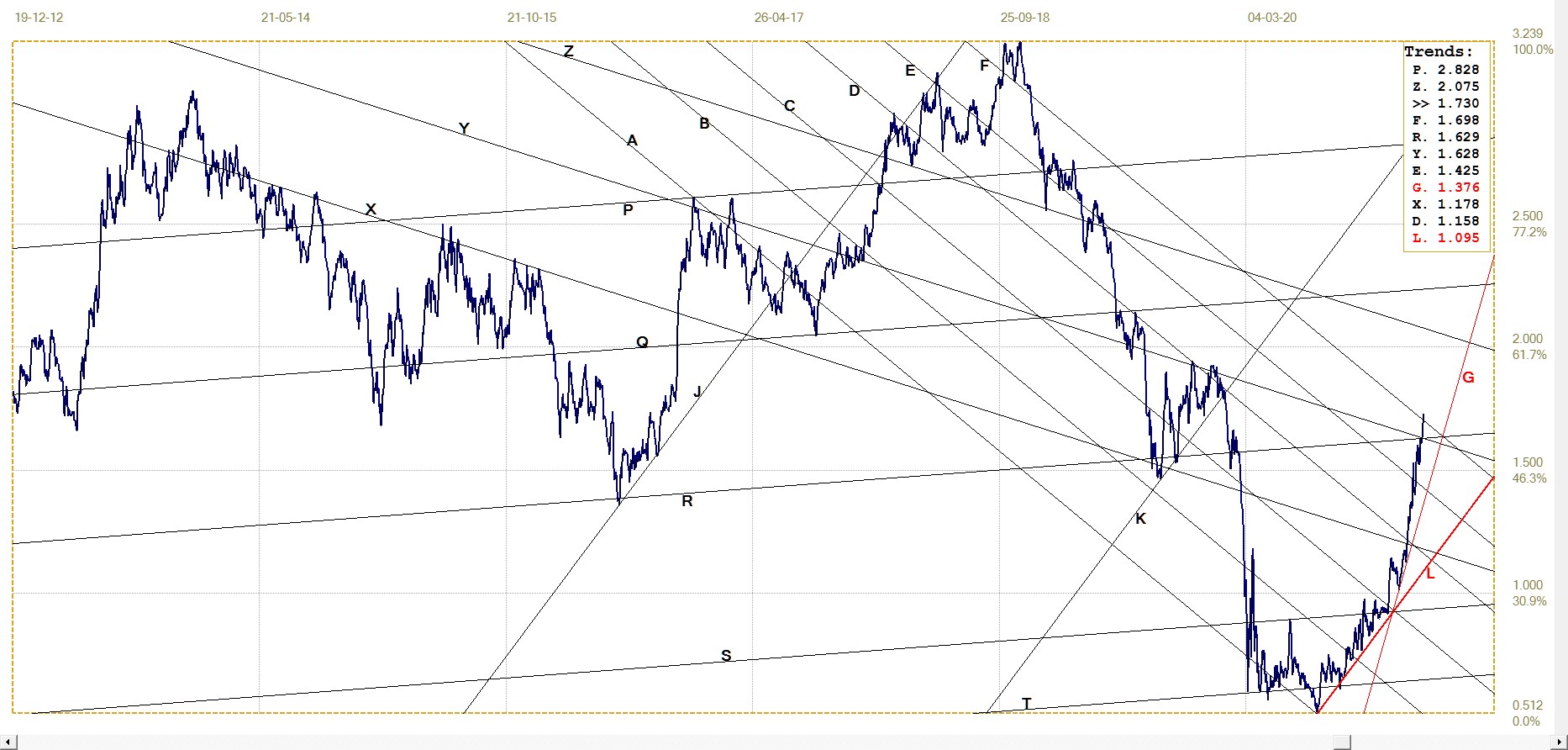
U.S. 10–year Treasury note, last = 1.730% (www.investing.com )
West Texas Intermediate crude. Daily close
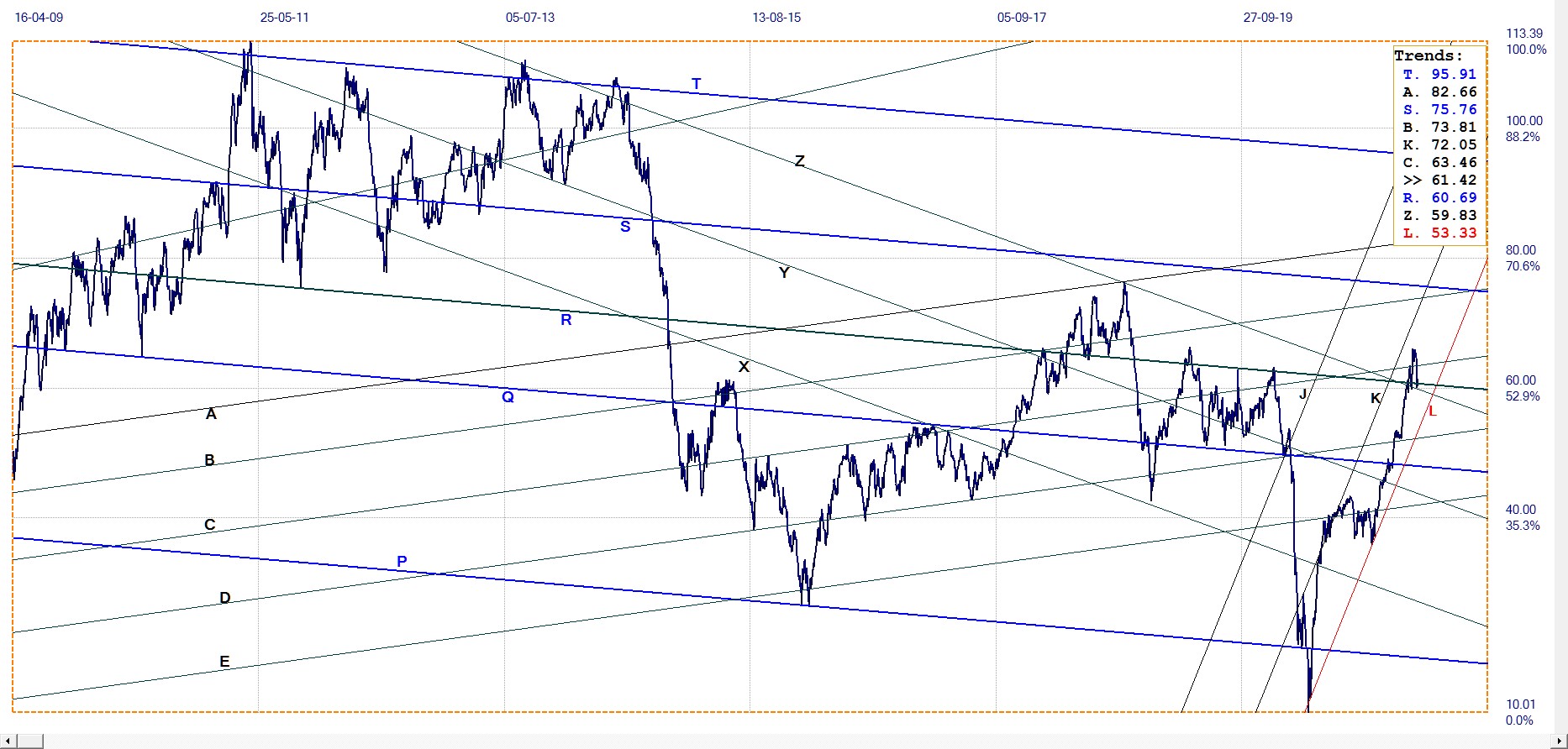
WTI crude – Daily close, last = $61.42 (www.investing.com )
After breaking to a new high above channel PQR and also above line C, the price corrected lower to return for a test of support at the top of channel QR and also at line Z. For the time being and until the picture clears on what longer term effect the new drilling regulations and pipe line deconstruction will have on the supply of oil, it has to be assumed – given limited market knowledge – that the drop in price is the result of uncertainty in the market and not a definite new trend based on expected lower demand as the economy is to remain sluggish.
Nevertheless, the near 50% increase in the price of crude since the price drifted sideways in October last year will have a ripple effect right through the economy and cause inflation to inch up by a significant cumulative amount. The price has been in a steeply lower and then broadly sideways trend since mid 2013 and has not yet set a new intermediate high. Should the recent trend be resumed, it would not take very long to move into a new higher range not seen for some 8 years.
©2021 daan joubert.
********