Perhaps A Reason For A Bearish Wall Street


During the run-up to the 2016 US presidential elections, there was speculation that if Trump were to be elected it would prove beneficial to gold and silver. Their reasons were not very specific and might have been merely hope that any regime change in the US must be good for the precious metals. During the first year and a bit of Trump’s term of office, the prices of the metals improved some, but perhaps did not do as well as many people had hoped. Now we see some life in gold and silver both; while Trump certainly had a role to play, emotions and expectations might be mixed depending on what might be various reasons for this firmer trend.
It is not clear exactly what Trump was supposed to do to boost prices of gold and silver, but the way he is implementing policies to make America great again, as he has promised, are having some positive effects. Two of these stand out. The tax cuts for corporations, while asking for commitments from them to improve wages of employees, also ensure that the budget deficits are expected to remain high and even increasing over what was ‘achieved’ during Obama’s 8 years.
Growing deficits place the dollar under pressure, which is beneficial to the precious metals in two ways. A weaker dollar has the effect of increasing prices, including those of the precious metals, while loss of faith in the dollar prompts investors to seek a safe haven that holds value – more so if demand for the safe haven should also increase thus to add momentum to an increase in the price. Secondly, Trump’s position with respect to the imposition of higher trade levies and his actions in Syria has caused international tensions to spike higher, which results in a flight to safety by concerned international investors, not only in countries that are directly affected. Gold in particular features high on the list of popular safe havens.
Last week, Wall Street continued its earlier wild roller coaster ride, but introduced a new twist that has been absent before. Just as gold and silver are never allowed to have two consecutive bullish days – not for a long time, since it’s all time high and even from before that time – Wall Street for quite some time now was not allowed to have two down days in succession. Whenever such an event threatened, one could see the amount of effort put in, particularly in the period shortly before the close, to ensure a positive end to the trading day, generally doing so with success.
Last week the DJIA ended the week with the third down day in a row, to suffer a total loss of 323 points. Even if the loss had not been very large, three consecutive days in the red surely must be a shock to the psyche of the financial system. It is therefore with both interest and trepidation that one looks ahead to Monday. Also with memories of that Monday in 1987 for those who lived through it.
As discussed previously, in charting terms the DJIA has a new all-time high already in place and we are in the early days of what should be a quite long and deep bear market after all the euphoria and misallocations of a near unbroken 10 year long steep bull market. Add a fundamental reason for being bearish on equities as set out in the chart below, which appeared in a recent Midas letter. it may not have caught the eye of all that many people, but it displays the reason why Trump really faces a major uphill battle to pull America back into greatness.

Dave from Denver – Northman Trader
It has been a recurring theme in my writing that employee households in the US, all of them, but excluding the more lofty levels of management, have become more and more impoverished since the switch to the hedonic CPI in the mid-1990s. Wage and salary increases are linked to an official CPI that lags increases in consumers’ out of pocket cost of living by a substantial margin. Yet this attracts little attention.
The chart above is excellent proof of this effect of the ‘new’ CPI, even if it covers only the 10 post crisis years, from 2007 to 2016. The median change in the net worth of US households during this period of recovery after the financial crisis, which includes a major bull market on Wall Street and in the housing market, is negative except for the top 10% of households. Look at the percentage changes in the lower groups and compare with the top 10% and there can be little doubt about what has been happening since at least 2000 and still continues! And why.
The incomes of the top 10% of households include those people – professionals, top management and other rather elite people who have the power to ensure that their incomes exceed the rate of increase in the actual cost of living by a good margin. The next 10% are almost in that privileged position, but they are at least able to match their incomes to increases in the real cost of living. The remaining 80% of all households are increasingly impoverished – of which many of the lower echelon are part time workers at best or on government’s assistance. If it were not for ease of debt, even more of them would be on full government assistance. When more debt is no longer easy to obtain, their dependence on the state will increase the deficit.
Yes, if Trump is successful, jobs will come back to America. But the old jobs are gone forever; what will come back will be new jobs in new working environments – jobs that will require different and challenging fresh skills; and an eagerness to get stuck in to learn those new skills and also the willingness to put these to work.
If Trump is successful and all those of the disheartened 80% who lack a permanent job can be enticed away from the lazy life on state assistance or temporary work, a change for the better can be achieved. But it won’t be months before improvement is really obvious, but many years. And perhaps even decades to get back to where the vast majority of Americans were during the heydays of the 1970s. Not an easy way home, but can be done and Trump might just be the person to do so. In time.
A final note on the data presented in the above chart; the use of median values. means half of the lower 80% of US households – two out of every five households – have had their net wealth decrease by more than 20% from 2007 to 2016, while half of the lowest 20% of households had their already little net wealth decrease by more than 29% in just 10 years. This is not just an Obama legacy, as the dates of the above chart might suggest, but a legacy of three 8 year long administrations during which much effort went into creating the right image and appearance, but with little that is of real substance to show for their respective contributions to the rapidly mounting Federal debt.
The economy cannot be sustained much longer by adding more debt at household, corporate, state and Federal levels. Sooner or later this decline will be reflected in declining corporate earnings and with a trailing PE of 26 that implies the market has more than just 20% to give back. The ripple effect of that happening – even over a year or two, or longer – will topple other dominoes, such as state and other pension funds and all the index following EFTs. Sad news, but as the saying goes, “There is no such thing as a free lunch”, which is what living on attempts tries to achieve
Euro-Dollar
Normally, when a triangle develops on a price chart while within a strong trend, the price will, after completing the triangle, break in the direction of the original trend. For the euro, as had happened to gold in 1996, a quite large triangle developed in a bullish trend between 2005 and 2013. This time, also like for gold earlier, the break when the triangle ended prematurely was in the wrong direction. Between 2013 and 2015, the period of the collapse in the euro, the dollar index went up by 25% from 80 to 100.
Then, in late 216, when the dollar index was at 103, the dollar Bear took over again and the euro started its rally of the past 18 months to keep it in its bull channel KL ($1.1725). On breaking back above the horizontal base of the old triangle, the rally ended in a tight sideways consolidation that with one brief exception is holding just above line H ($1.2253) – a support level that is now close to being tested. The long term outlook for the euro is technically bullish as long as the horizontal support at line H can hold.
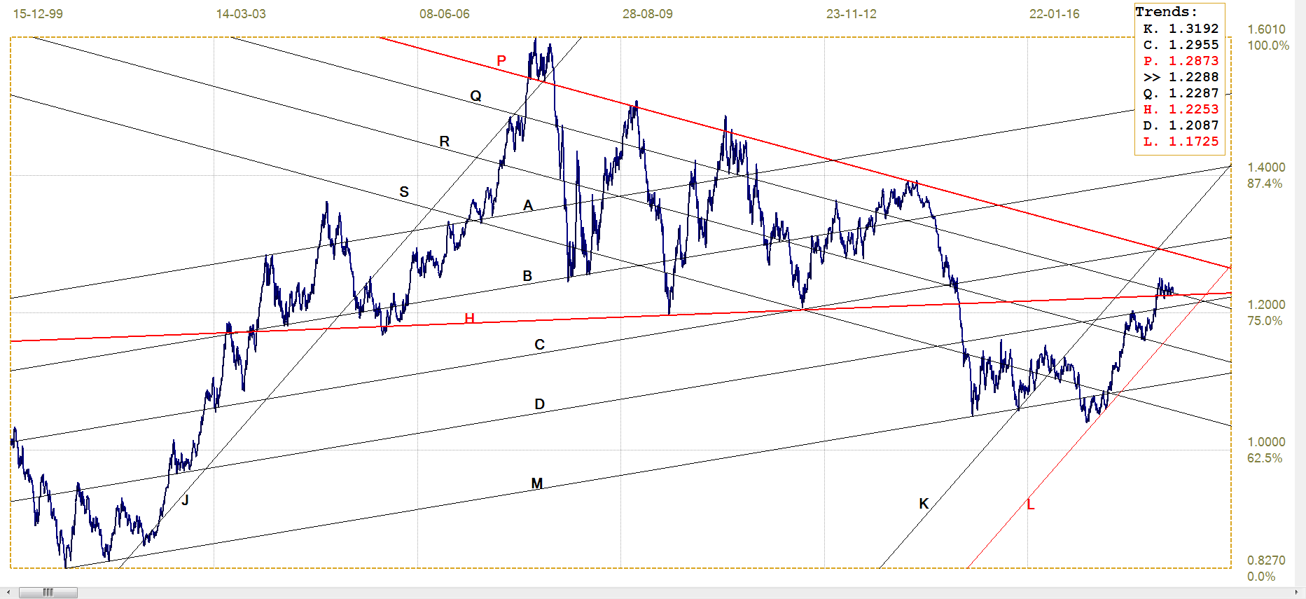
Euro-dollar, last = $1.2288 (www.investing.com)
DJIA
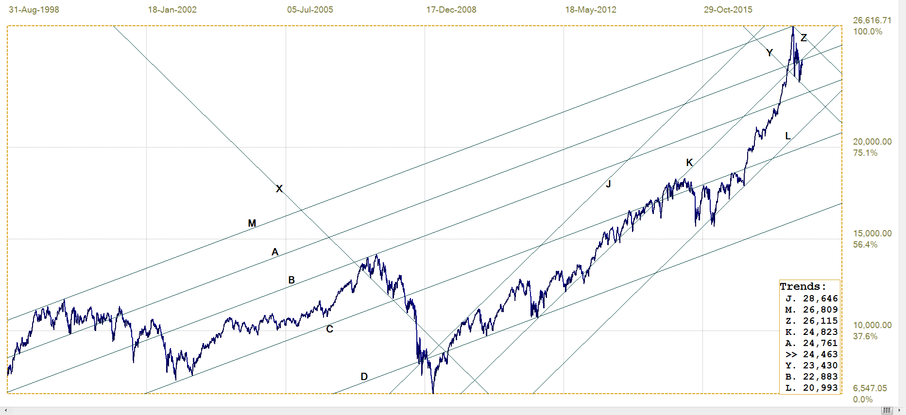
DJIA, last = 24462.94 (money.cnn.com)
The post 2009 bull market on Wall Street consists of two distinct parts. Until early in 2016, the trend was quite volatile, with significant corrections early and again at the later stage of this time frame, which includes a brief break below bull channel JKL (20 993). Following the recovery of that correction, the DJIA turned bullish and then took off near vertically and practically unbroken after the 2016 presidential election, until the all-time high early in 2018.
As discussed last week at the hand of a monthly chart of the DJIA, there are good technical reasons to consider January the end of the long lasting and very strong bull market since 2009. The current very high volatility on Wall Street clearly is a battle for superiority between the Bulls and the Bears. The winner will be decided in time by the answer to the question whether the growing wealth of the top 10% of US households can continue to grow – or at least ensure stability in – the economy if the other 80% is not really able to increase the wealth of the US consumer.
From the evidence of the chart shown in the introduction, the answer is clear; the American worker and middle classes are tapped out. They, to the extent possible in their respective circumstances, have been spending on the strength of their ability to make new debt – which is a process that cannot continue indefinitely, and more so in a climate of rising interest rates. When more of them have to cut spending back to essentials only, as already applies to a good fraction of these two classes of the population, the economy will falter to a degree no longer able to be concealed by statistical shenanigans and political rhetoric.
Technically, that would imply that bear channel YZ (23 430 – 26 115) could well be the avenue of choice to be followed by the Bear as it takes control of Wall Street – probably when it does, and not ‘if’.
Gold PM fix - Dollars
The chart of the price of gold since the 2011 high can be divided into 3 segments; the first and third of these occupied the bear channel ABCD ($1274). The middle segment lies below that channel and above the master trend line, M. The new rising trend off line M that started in late 2015 soon had the price in the third segment, a recovery into bear channel ABCD.
The difference from before is that channel ABCD is no longer dominant, because the bull channel PQRST has taken over since the low. More recently, after the gold price tumbled during the second half of 2016 while the dollar staged its steep and final rally, the price of gold has been holding to the steeper bull channel KL ($1327) and had broken clear of bear channel ABCD.
Line H ($1349) on the gold chart is not as near horizontal as its equivalent on the chart of the euro, but it has acted as long term resistance to any attempt by the price of gold to resume its bull trend. Now the time of a final test is approaching – will the price of gold hold to either of bull channels KL or ST to challenge resistance at line H with complete success, or will the stagnant sideways market continue?

Gold price – London PM fix, last = $1342,10 (www.kitco.com )
Euro-gold PM fix
Euro gold price – PM fix in Euro, last = €1089.7 (www.kitco.com)
With the euro holding to its tight recent range above support and with the price of gold bumping against resistance and, so far, failing to break higher, the euro price of gold has not done much. After the slight improvement off support along line C (€1065) some weeks ago, the price also has held in a tight range. The bull channel KL (€1089) has been modified to employ line L as a watchdog to warn if the slightly rising trend in the euro price of gold falters and turns sideways to lower.
The dollar, in terms of the dollar index, is holding sideways within its medium term bear channel, with quite low volatility. So far, the technical view is the dollar bear trend will resume and – if that were to happen – a stronger euro will place the euro price of gold under pressure, unless the dollar price of gold can break decisively to above the longer term $1350 ceiling.
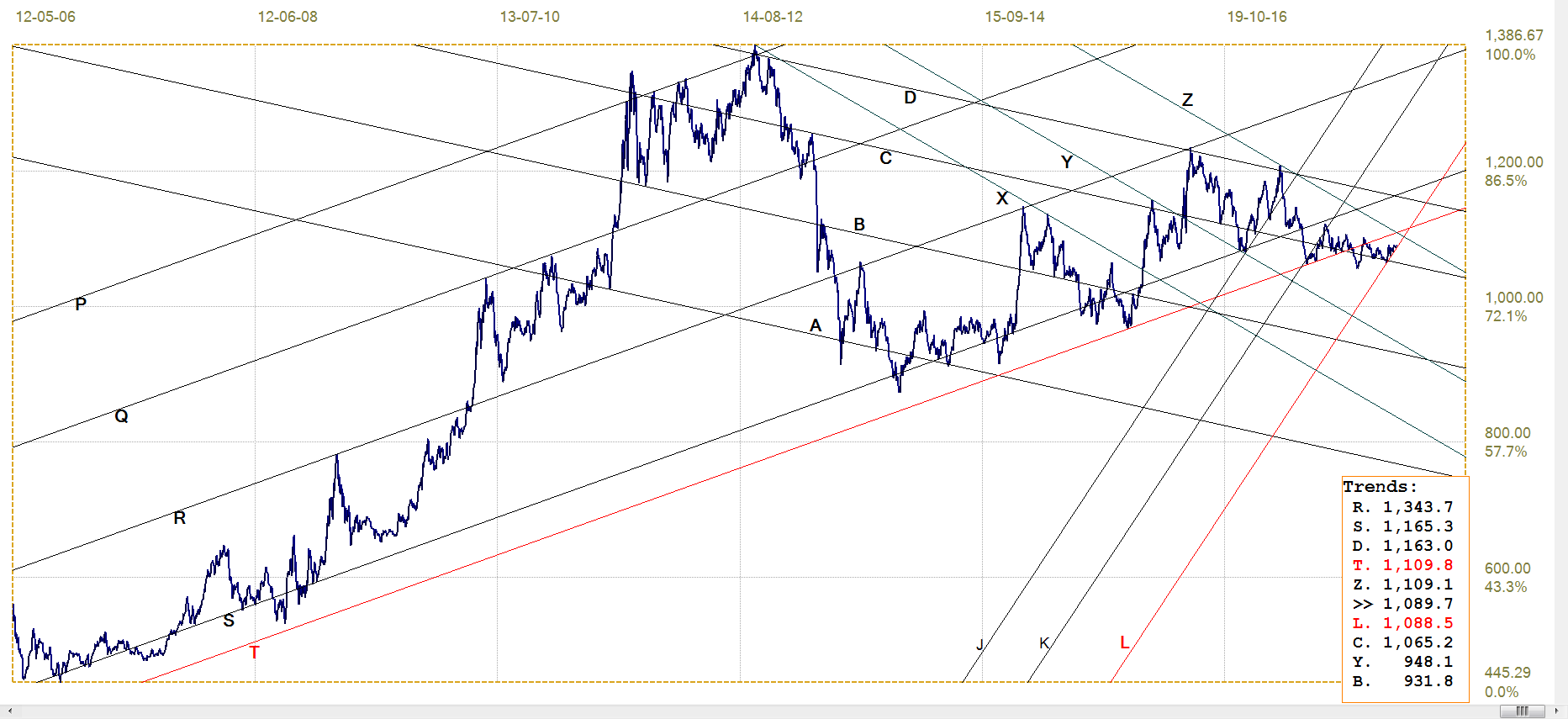
Silver Daily London Fix

Silver daily London fix, last = $17.11 (www.kitco.com)
Another modified analysis has the price of silver, similar to that of gold, changing in time from the initial post 2011 bear market ABCD (C-$16.99) to extending the bear trend in channel MD ($13.13) and in early 2016 changing to bull channel JK.
This channel turned out to be too steep for comfort – of the shorts! – and the price was suppressed to keep to the shallow bull channel ST. It now depends on whether line L is really part of bull channel JK and strong enough support to carry the price further, at a steeper inclination, to hold within channel KL and break above line S ($18.89) – as it has just done last week as an indication of what could happen next.
US 10-year Treasury Note
Another modified analysis has the yield on the 10-year Treasury spending almost 3 years in bear channel PQRST despite beginning its time in the channel with a major bond market rally that took the yield down to 1.36%, before the bear market took over. A steep sell off found support at the top of the bear market, followed by the volatile rally that reached all the way across the broad channel.
The new sell-off is keeping to the quite narrow and steep bear channel KL (2.865%) and broke above the longer term shallower bull market trend at line X after only a brief hesitation there. The very steep trend resumed to reach the top of channel KL (3.184%) and line Q (3.048%) before rallying back for the goodbye kiss on line D (2.741%). The next move depends on how strong line C (2.962%) is going to prove itself to be to bring the current new bear trend to an end. Even a reversal lower will still have bearish potential as long as the yield remain in channel KL.
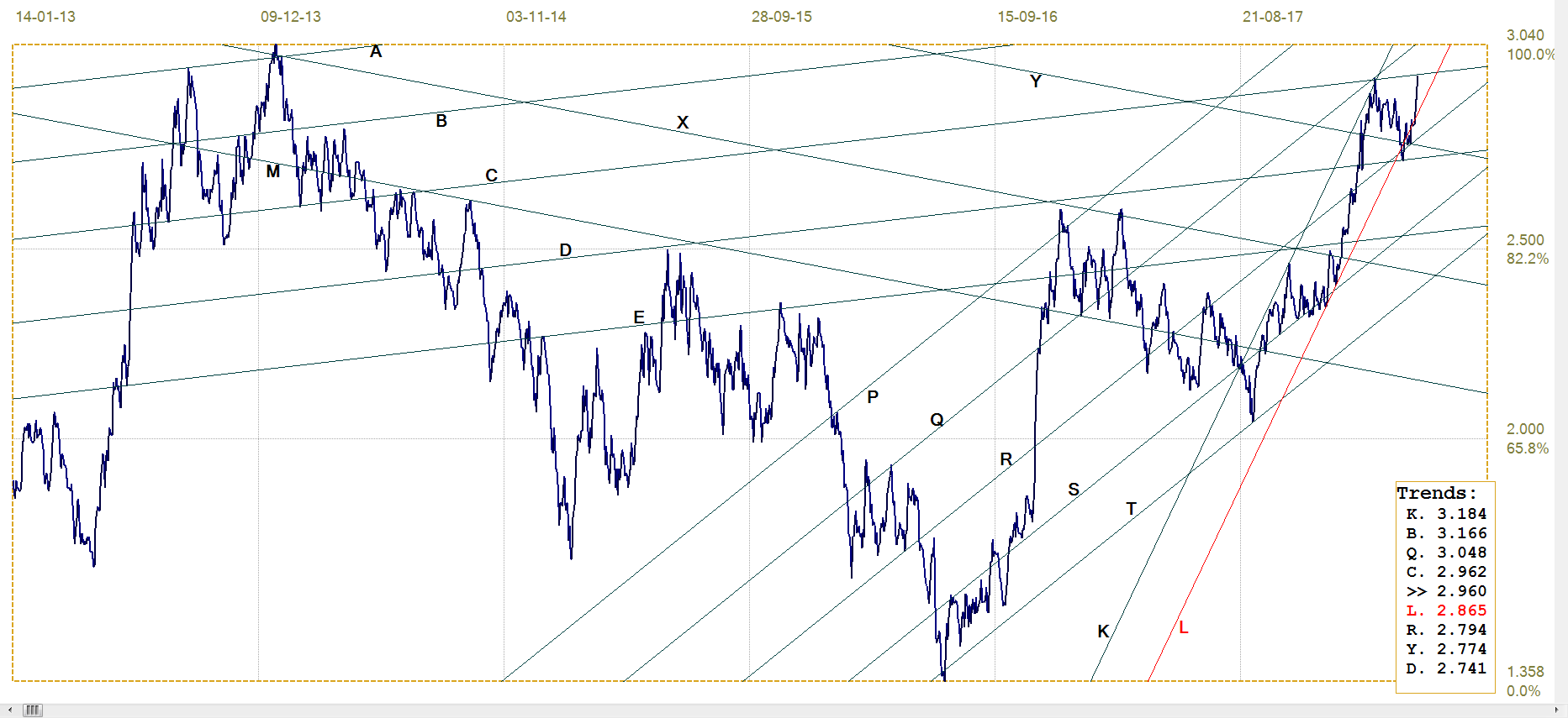
US 10-year Treasury note, last = 2.960% (www.investing.com )
West Texas Intermediate crude. Daily close
Similar to the chart of the 10-year treasury, that of the price of crude showed a steep decline, this time in 2013, to reach a low of $26.21. The new rally off the low at first settled sideways in channel XY, before resuming the steep rally to hold close along line L ($61.66). The price is now approaching previous longer term horizontal resistance at line W ($69.05) that has to be broken to add confidence in the new rising trend.
It would seem from the headlines that this new trend is not finding favour with the Trump administration who is blaming OPEC for what, to me, appears to be finally a period where the fracker producers can breathe a sigh of relief that they no longer have the banks breathing down their necks. Perhaps the feeling is that higher gas prices at the pump affect more Americans badly than when a relatively few people in the fracking industry have to battle to survive.
Makes sense in one way, if one is intent on really re-awakening the economy, but I know too little about the industry to know whether OPEC is to blame. I still inhabit a world where OPEC was keeping prices low to try and starve the frackers and get rid of their competition.
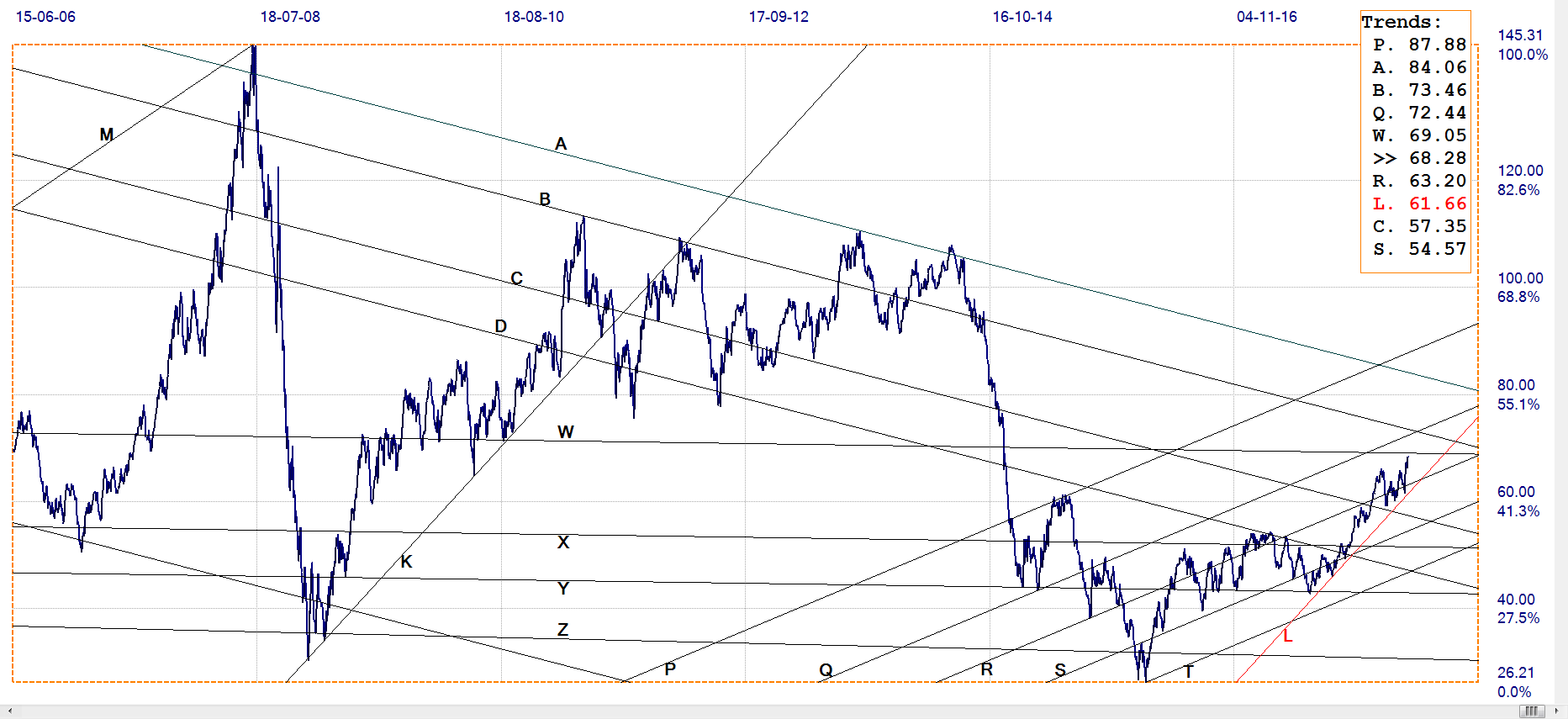
WTI crude – Daily close, last = $68.28 (www.investing.com )
© 2018 daan joubert, Rights Reserved chartsym (at) gmail(dot)com
********


