Precious Metals Bull Update


Tonight I would like to update some of the precious metals stock indexes as they have been basically consolidating for the last couple of months. This has been healthy for this sector which has been on fire since the middle of January of this year.
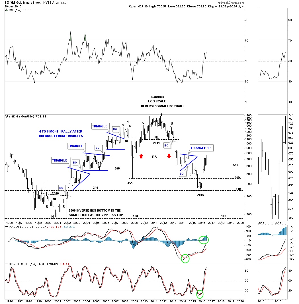
This next chart is a monthly chart at the $GDM which shows the bull market years and the consolidation patterns it made. At some point we’ll see some type of consolidation pattern form that will take months to build out but for now the impulse move up remains in place. When that massive H&S top finished building out I called this chart, the reverse symmetry chart, as the rally out of the 2008 crash low was so steep. It’s not a perfect correlation but it gives you a feel on how the move may play out.
There is one other bit of interesting information on this chart as shown by the black rectangles. The inverse H&S bottom in 2000 is the same height as the 2011 H&S top. I put the same black rectangle on our 2016 bottom for comparison. Unlike the 2000 and 2011 rectangles our 2016 rectangle has run much further. The other two formed their right shoulders which took over six months while our current rally hasn’t begun to correct yet.
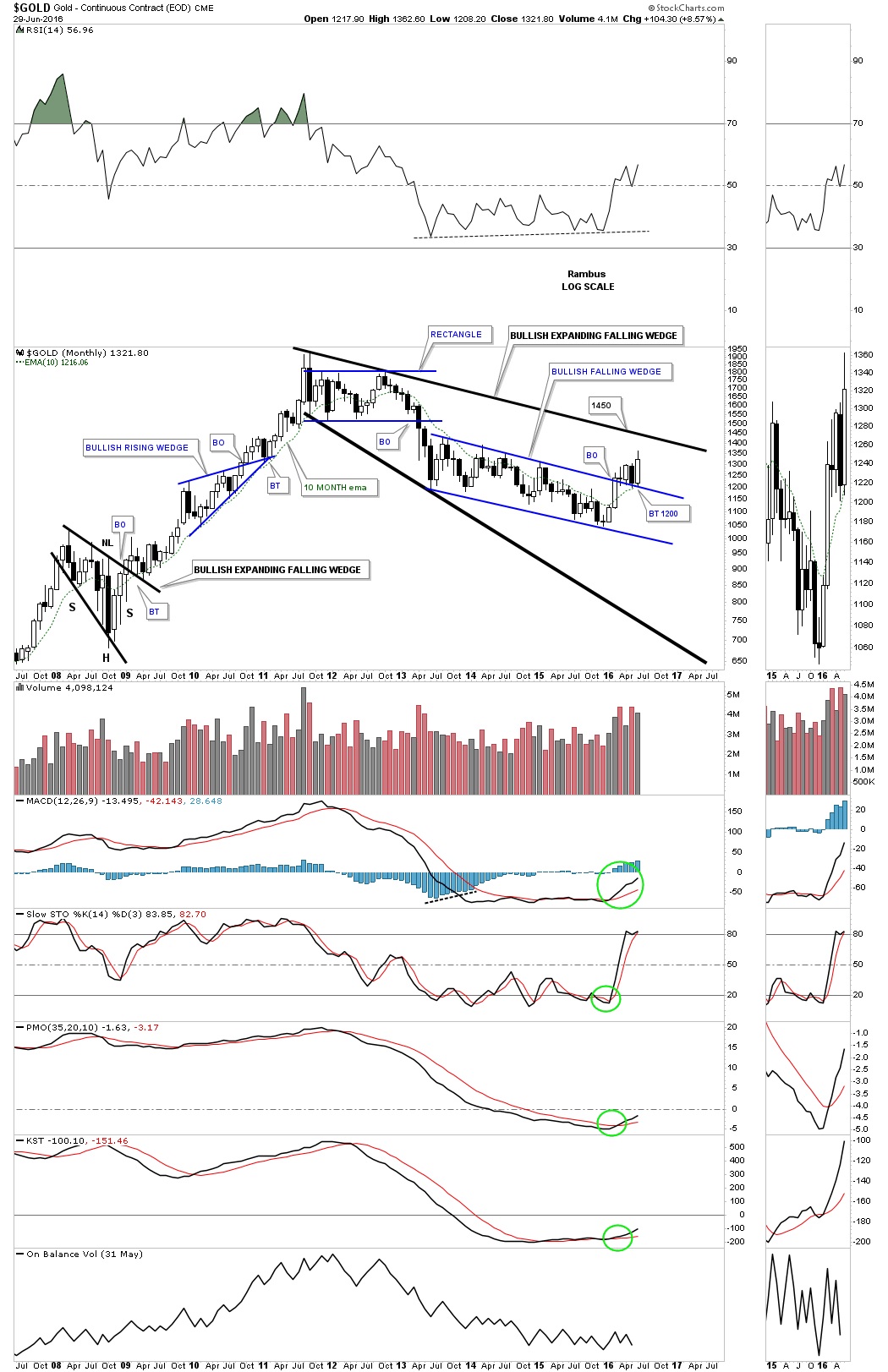
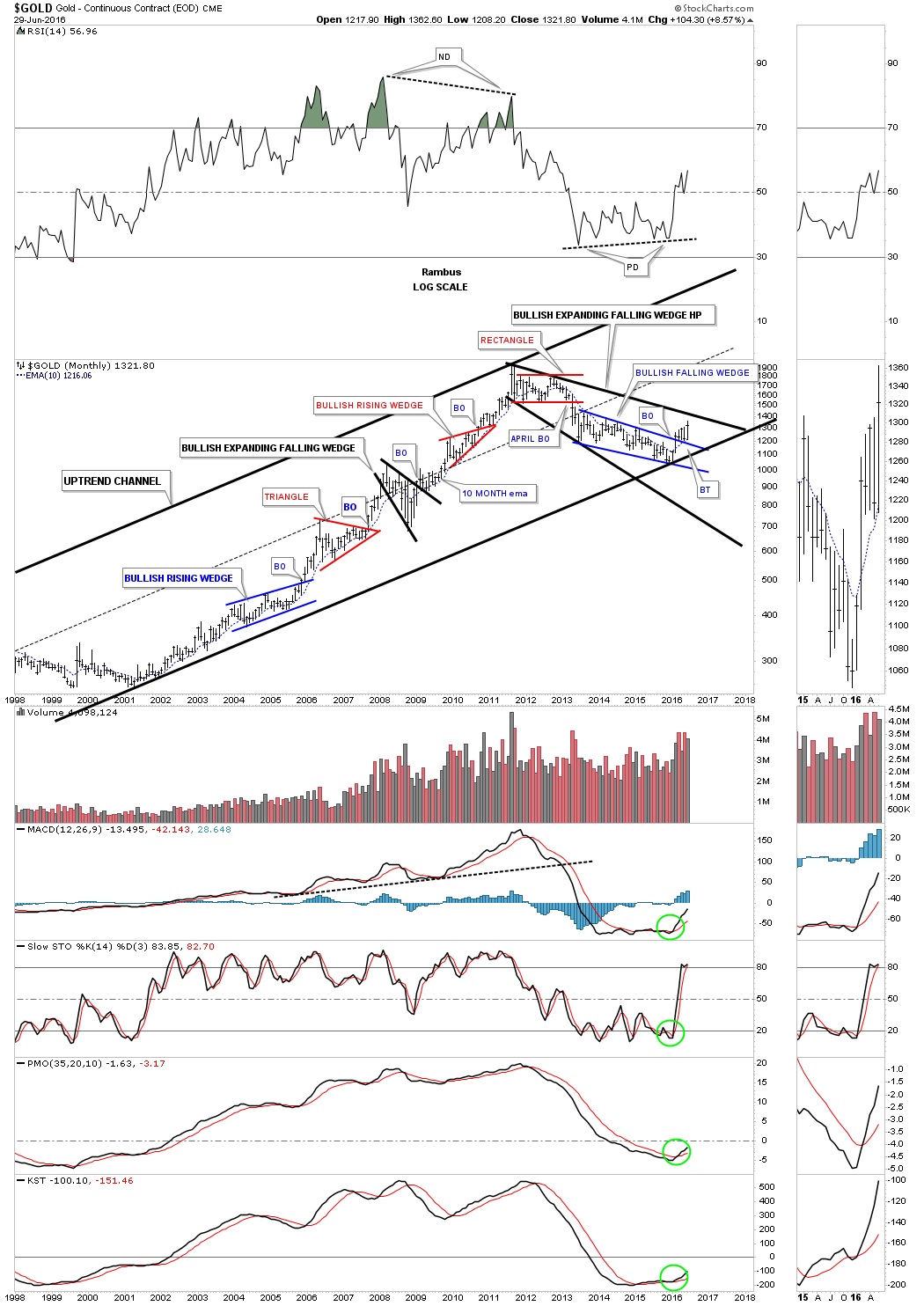
This next chart is a monthly look at gold and shows the rally to the bull market peak at 1920, out of the 2008 crash low. From that September high in 2011 gold has formed a series of lower lows and lower highs until five months ago. Note how the top rail of the bullish falling wedge has reversed its role to what had been resistance to now support. Also gold has made a new monthly high this month which is something it hasn’t been able to do since the 2011 high. The 10 month ema has also helped out in the support department during the backtesting phase.
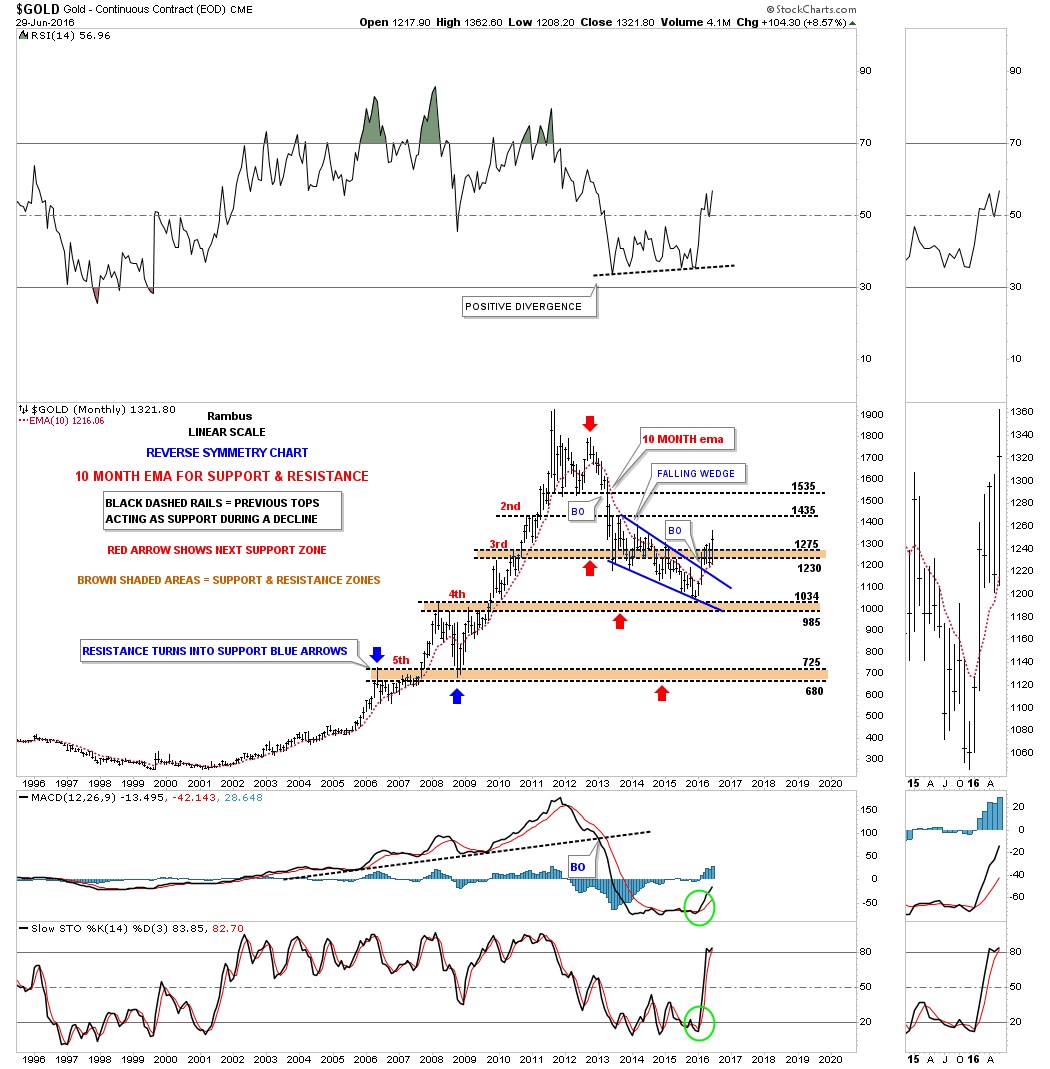
I built out this next 20-year monthly chart right after the top was put in at 1920. I was looking for some reverse symmetry to the downside and built out the brown shaded support and resistance zones. The reverse symmetry down didn’t work out as well as I had hoped on the front end but the brown shaded S&R zone labeled #4, prove to be the bottom of the bear market. When gold was testing the 4th S&R zone I was looking for one last capitulation move down to the 5th S&R zone to complete the bear market. As you can see that didn’t happen. Now with gold making a higher high and a higher low, with the breakout from the blue falling wedge and support on the 10 month ema, gold found its bear market low at the fourth S&R zone.
I call this next chart for gold, just another brick in the wall, as it shows every consolidation pattern that was made during the bull market years. I know this doesn’t sit well with a lot of gold bugs, but when I look at all the beautiful consolidation patterns that formed during the bull market it looks like the work of a free market and not manipulation. If this market was manipulated we wouldn’t see such nice symmetrical chart patterns.
That was one magnificent looking rally out of the 2000 low, one consolidation pattern forming on top of the next. Note the breakouts and backetsts when each consolidation pattern finished building out. They’re hard to see but there are little green triangles that formed at the halfway point in each impulse move up. Note how similar our current breakout and backtest has been vs those during the bull market. Not every consolidation pattern had a backtest but the majority did. Is our current black expanding falling wedge a bigger clone to the one that was made at the 2008 crash low?
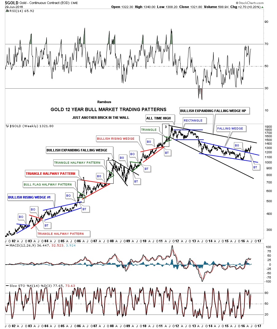
This next monthly chart shows just the bigger consolidation patterns that were made during the bull market years. Note how each consolidation pattern formed at roughly the halfway point in each impulse move up. It may not feel like it but gold is up over 100 points with one day of trading to go for this month of June. From a Chartology perspective this is a pretty as it gets.
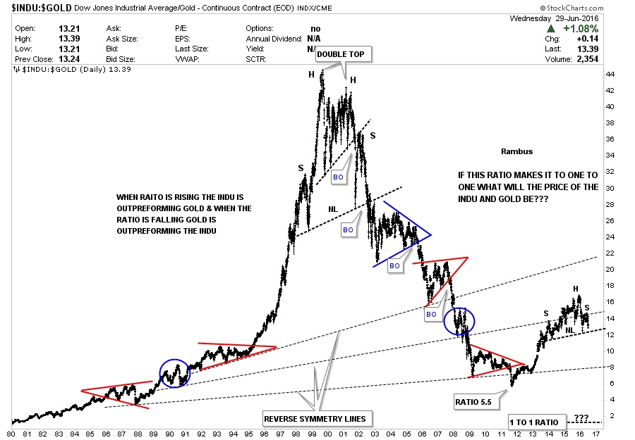
This next chart is a ratio chart which compares the INDU:GOLD going all the way back to 1980. When this ratio is rising the INDU is outperforming gold and when it’s falling gold is outperforming the INDU. This chart shows a good example of the old expression, The Trend is Your Friend. During the bull market in the stock markets that began in 1980 or so, that was the place to be invested as the ratio was rising. Then in 2000 the bull market in the stock markets came to an end and a new bull market in gold began. Again, from the 2000 high the place to be invested was the gold complex until 2011.
As you can see the INDU outperformed gold starting at the 2011 low when the ratio was a 5.5 or so meaning, it took five ounces of gold to buy one share of the INDU. The rally out of the 2011 low looks like it may be running out of gas it the H&S top plays out to the downside. If that happens will the ratio make it all the way down to the infamous 1:1 ratio where the INDU and GOLD are the same price? That has happened several times in the past with the last one being in 1980 when the INDU and GOLD were price around the 850 area. If we see the 1:1 ratio come to fruition down the road, it may signal a shift out of the PM complex. Just another piece of the puzzle to keep an eye on.
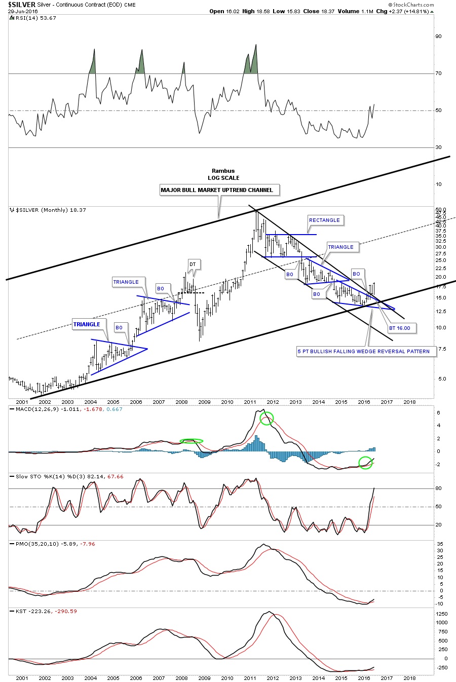
Let’s switch gears and look at a monthly chart for silver which also shows some nice Chartolgoy. Silver topped out in April of 2011 a full five months ahead of gold. The bear market consisted of two consolidation patterns and one reversal pattern at the bottom of the chart. This chart should also give you some perspective of where silver is in its bull market.
I have time for just one more chart for tonight which will be the long term monthly look at the $XAU which goes back 20 years. Because this index is made up of both gold and silver stocks it actually made a new all-time low in January of this year. That low didn’t last very long as the XAU built out a 5 point bullish falling wedge reversal pattern.
I have many more charts to show you but they’ll have to wait for this weekend. I hope these few charts show you the difference between a bull market and a bear market and how the trend is your friend until it isn’t. These trends can last a very long time before they exhaust themselves. Remember the first real correction will come at some point. It won’t be the end of the new bull market but it may feel like it.
 Meet Rambus, a seasoned trader and technical analyst renowned for his unbiased and insightful chart work. Through his website, Rambus Chartology, and Substack newsletter, Rambus shares his expertise with a global community of subscribers, providing daily updates, commentaries, and hands-on training in the art and science of chartology. With his calm, humble, and down-to-earth approach, Rambus demystifies complex market trends, helping his followers navigate the challenges of today's volatile markets. Join the Rambus Chartology community today and discover a unique blend of technical analysis, trading expertise, and time-tested protocols. Subscribe now at www.rambus1.com or https://rambuschartology.substack.com/
More from Gold-Eagle


