Precious Metals: Who’s In Charge?


In this Weekend Report I’m going to update some charts I posted back in November of last year before the PM complex bottomed in late December. What I was showing back in November were many of the H&S tops that were breaking down in an impulse leg to the downside. The lows in December of last year is where they bottomed and began a counter trend rally that took prices back up to the February 2017 highs. From a Chartology perspective all we’ve had so far was a backtest to some of the necklines at this point in time. Maybe it will end up being more, but for now the backtests are holding resistance.
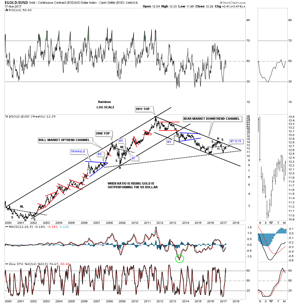
I would like to start with one of the more important ratio charts which compares Gold to the US dollar. During the bull market years this ratio chart built out a parallel uptrend channel that was a thing of beauty. In 2000 this ratio started to build out an inverse H&S bottom which reversed the bear market to a bull market. For the next 11 years this ratio built out one consolidation pattern on top of the next, which is bull market action. Even the crash in 2008 built out a H&S consolidation pattern which launched the rest of the bull market into the 2011 high.
The bottom rail of the major uptrend channel was broken to the downside in April of 2013 which was the defining point on the chart, which reversed the bull market to a bear market. Note the H&S top that formed just below the top rail of the downtrend line in 2016. That is the same H&S top I showed you back in November that had already broken down. You can see the backtest to the underside of the neckline which so far has been the counter trend rally out of the December 2016 low. So from a Chartology perspective nothing has broken yet in regards to the bear market downtrend channel and the backtest to the neckline.
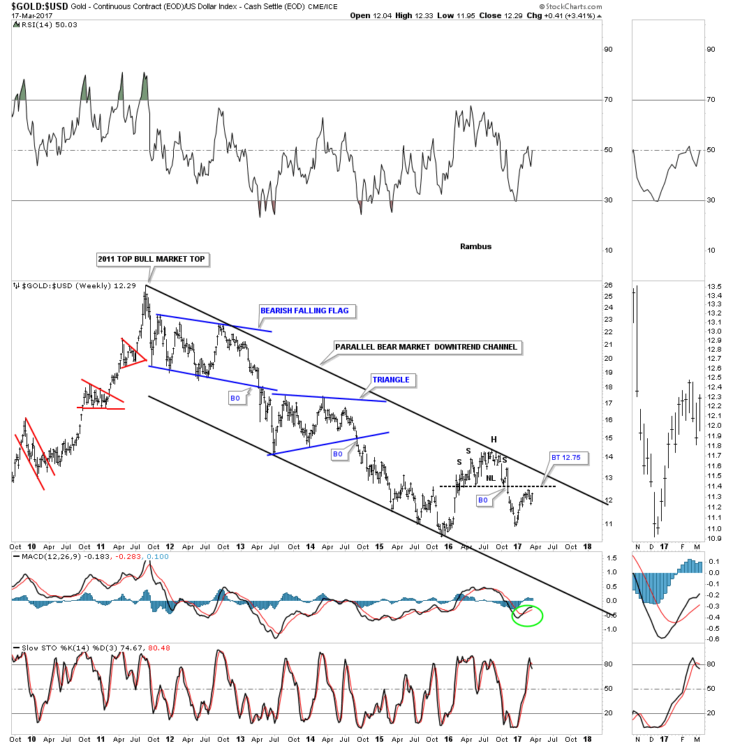
This next chart focuses in on the parallel bear market downtrend channel that began to build out in 2011 and the consolidation patterns that have formed. If the bulls can take out the top rail of the bear market downtrend channel they will be speaking to us loud and clear and I will pay attention to what they’re saying. Until then the bears are in charge.
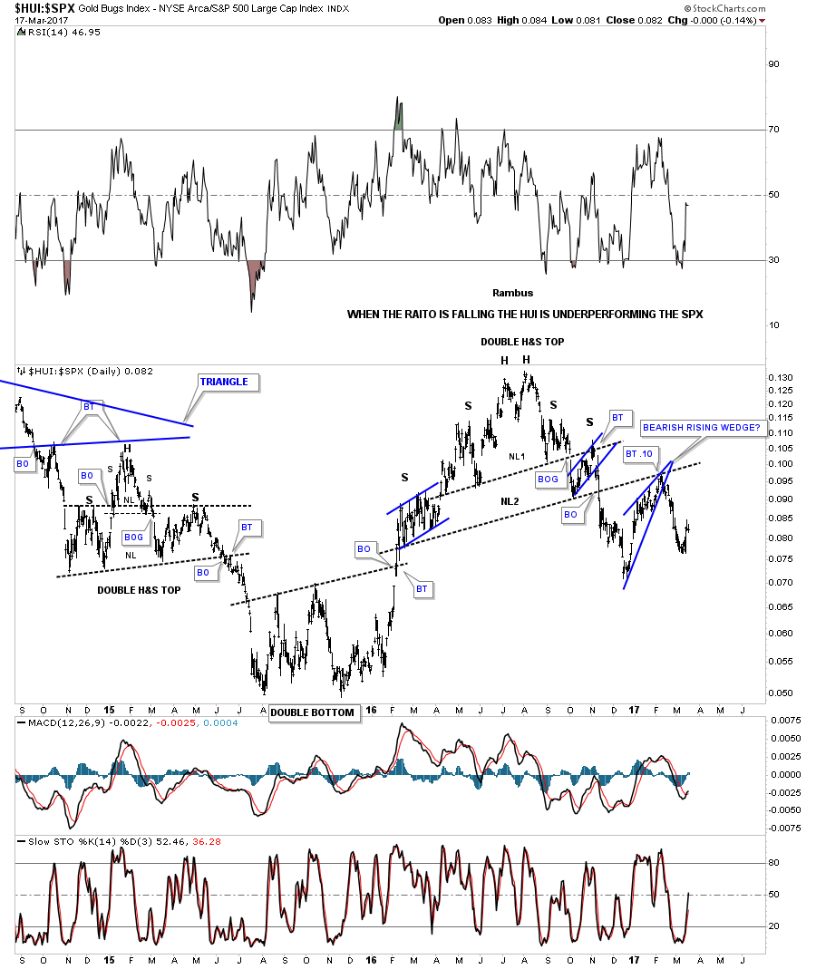
This next ratio chart I compared the HUI to the SPX to see which one was stronger. After breaking down below neckline #2 this ratio found support at the late December 2016 low and built out the blue bearish rising wedge as the backtest to neckline #2. Note the double H&S top that formed back in 2015 which led to the double bottom low. A stock does one of three things. First, it’s either building out a consolidation pattern, a reversal pattern or is in an impulse move. The double bottom in 2016 reversed the downtrend up to that point. The H&S top in 2016 reversed that impulse leg up. What we don’t have yet is a reversal pattern in place to reverse this current leg down in this ratio.
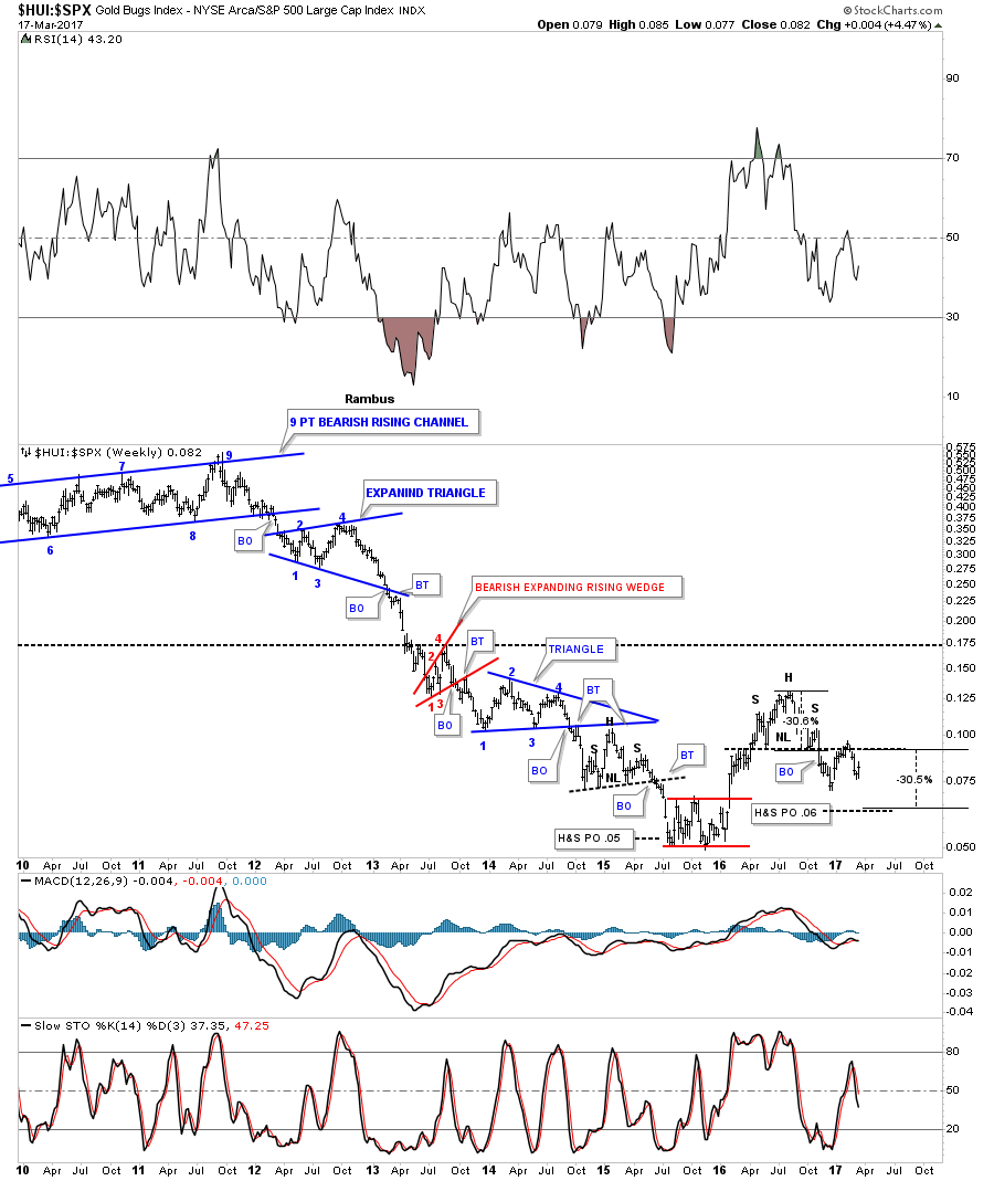
Below is a long term weekly look at the HUI:SPX ratio which puts the H&S top we just looked at on the chart above in perspective. This long term chart also shows you which index would have been a better place to have invested over the last five years or so. When this ratio is falling the HUI is under preforming the SPX.
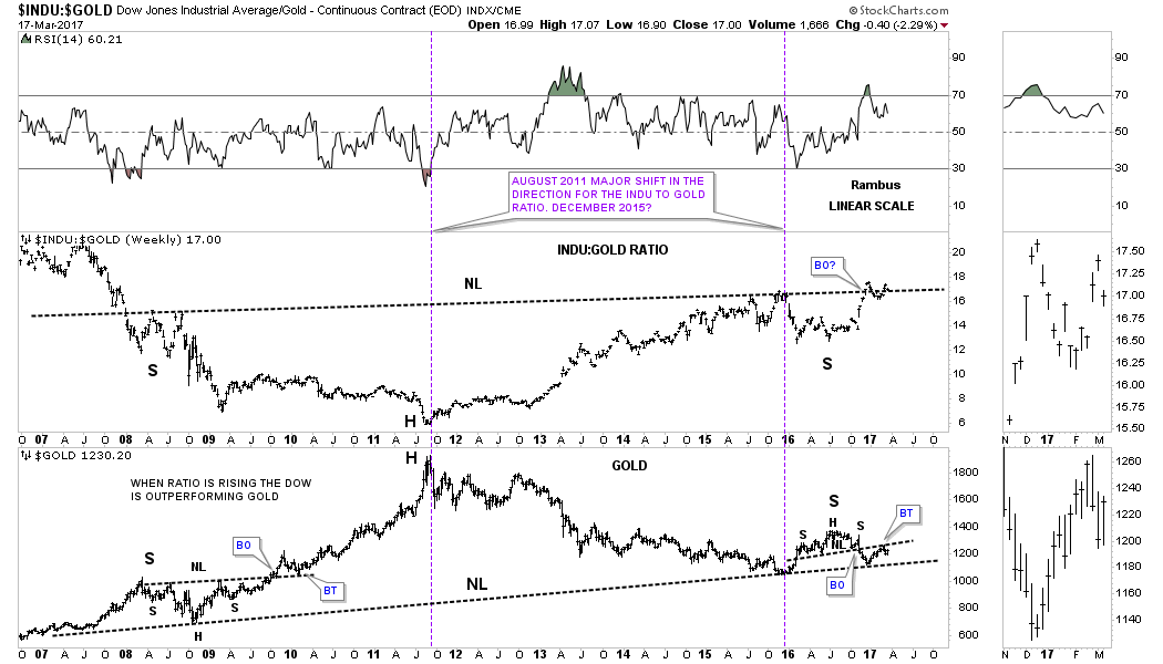
This next ratio chart we looked at is a very long term chart which compares the INDU to Gold going back almost 40 years. As you can see the place to have been invested was in the INDU from 1980 to 2000. Then for the next 11 years or so the place to have been invested was in gold. Since the low in 2011 the place to have been invested was the INDU. One doesn’t have to be a rocket scientist to understand what this chart is strongly suggesting. What I’m looking for is to see the price action making a new high just above the previous one.
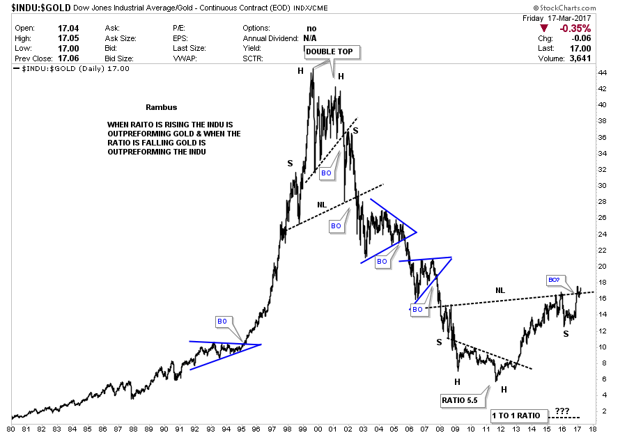
Below is a 10 year weekly chart for the INDU:Gold ratio which is showing two massive H&S patterns. The INDU:Gold ratio chart on top is showing a potential very large H&S bottom, meaning the INDU will outperform gold. The lower chart shows a potential very large H&S top on gold which will lead to a protracted bear market decline. Again, note the smaller H&S top on the Gold chart we’ve been following since shortly after the US elections in November. The bulls will have to rally gold above that neckline to negate this potentially very bearish setup.
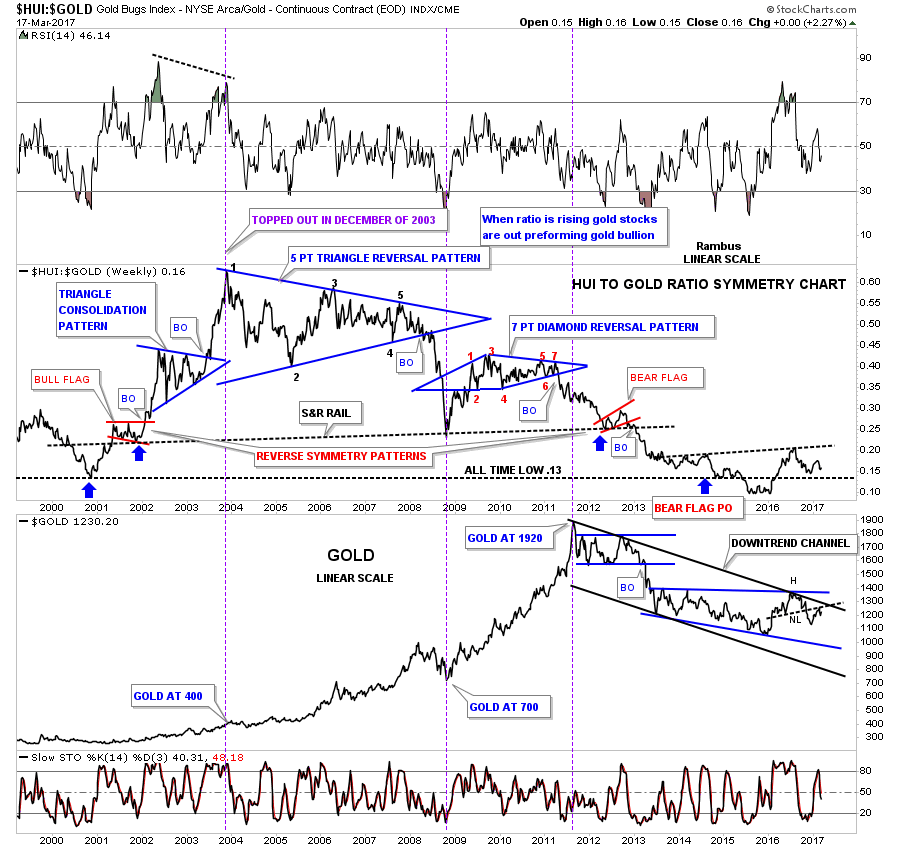
This next chart is a ratio combo chart which compares the HUI to gold on top with gold on the bottom. I won’t go into detail on the ratio chart, as we’ve been following this chart for many years which shows just how badly the HUI has under preformed gold. Looking at the gold chart on the bottom, notice the H&S top again that has formed just below the top rail of the downtrend channel, and the top rail of the potential blue expanding falling wedge. It’s up to the bulls to negate this potential bearish setup on gold.
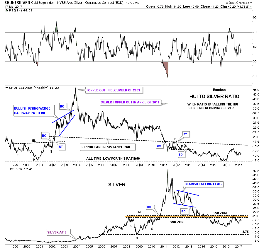
This next ratio combo chart I compare the HUI:Silver on top and silver on the bottom. Just like the HUI:Gold ratio chart the HUI has under performed silver in a very big way going all the way back to top in the ratio in 2003. In order for silver to start going to the upside it will need to take out the brown shades support and resistance zone which has capped silver’s rally since 2014. If silver can trade above the S&R zone that would be a very bullish development.
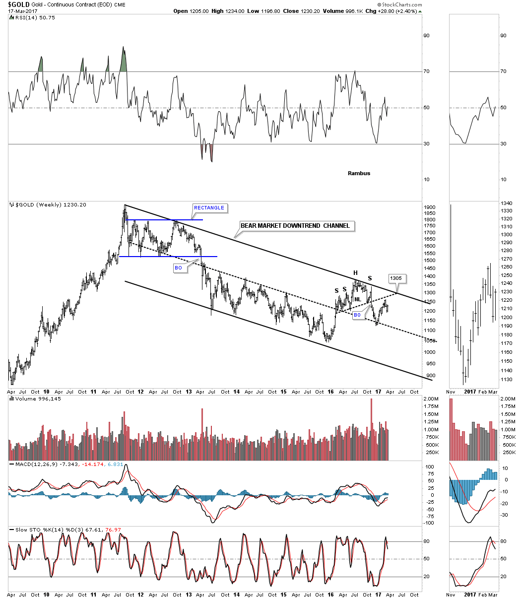
This next chart is for the bulls. So far the bottom rail of the bull market uptrend channel, that began in 2000 still remains intact. There is a possible inverse H&S bottom trying to build out. The head is the December 2015 low and the possible right shoulder is the December 2016 low. Right now the price action is testing the 10 month ema which has done a good job of showing support and resistance going back to the 2000 low. The top rail of the expanding downtrend comes in at 1305. If gold can breakout above 1305 then the potential neckline will come into play next. If gold can take out the neckline to the upside then the bull market is alive and well with a very large H&S base to ensure a big move up.
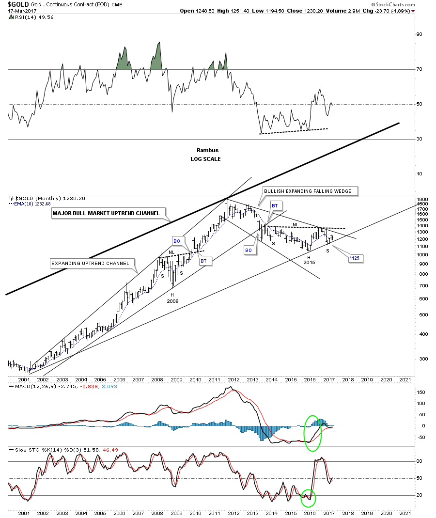
These last few charts will get me very bullish on the PM complex if they can breakout above the top rail of their bear market downtrend channel that began in 2011. Until that happens I have to remain cautious regardless of all the reasons the PM complex has to go higher.
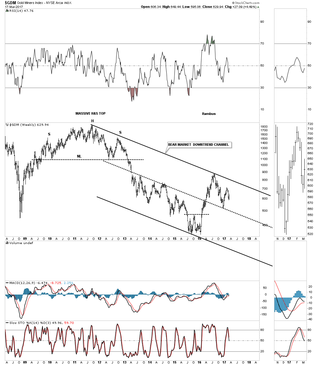
GDM weekly bear market downtrend channel.
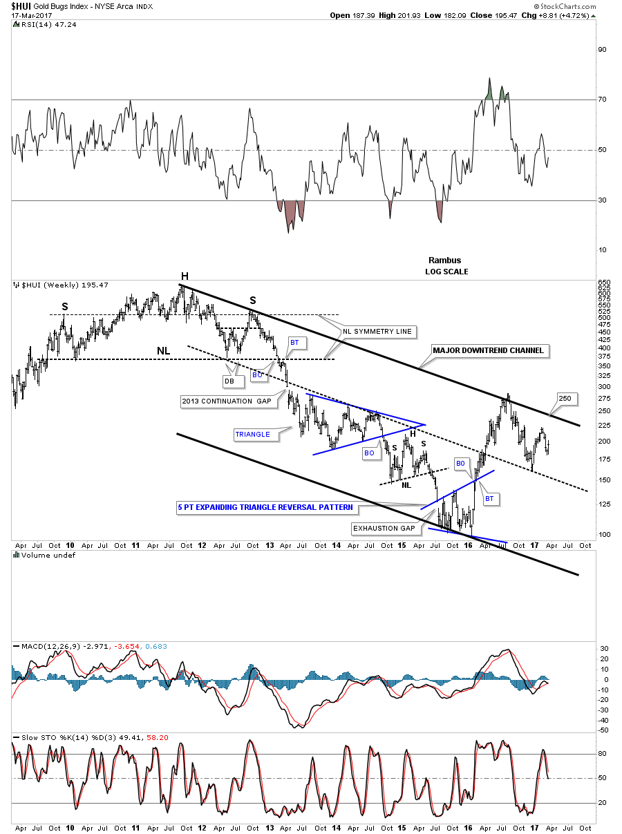
HUI weekly bear market downtrend channel.
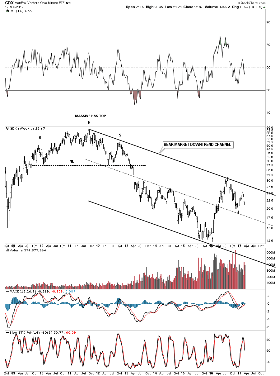
GDX weekly bear market downtrend channel.
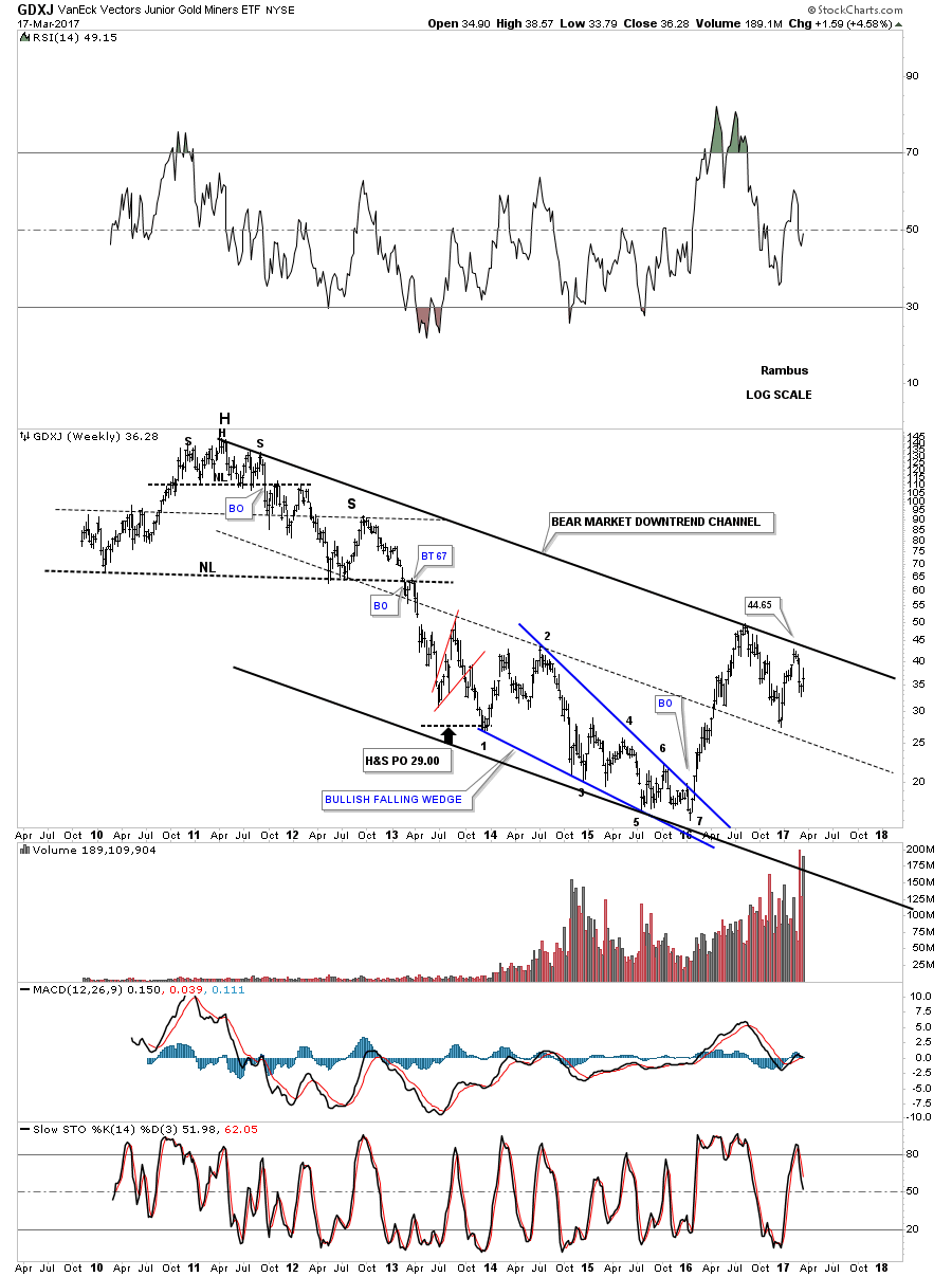
GDXJ weekly bear market downtrend channel. The GDXJ will be the one to watch as it’s the closest to the top rail.
This last chart for tonight shows the weekly bear market downtrend channel for gold. There is nothing I would like more than to be able to trade the PM stocks again especially the juniors. If I’m wrong about the direction of the PM complex then I will have to pay up to get involved again. On the other hand if I’m right that the PM complex is still in a bear market then I will be able to buy the PM stocks much cheaper. What I do know is that the stock markets are in a bull market as they’re making new all time highs unlike the PM complex which is way below their all time highs. Maybe this is the bottom, and if it is, there will still be plenty of time to catch the bull market train before it gets too far down the tracks. All the best…Rambus
********
 Meet Rambus, a seasoned trader and technical analyst renowned for his unbiased and insightful chart work. Through his website, Rambus Chartology, and Substack newsletter, Rambus shares his expertise with a global community of subscribers, providing daily updates, commentaries, and hands-on training in the art and science of chartology. With his calm, humble, and down-to-earth approach, Rambus demystifies complex market trends, helping his followers navigate the challenges of today's volatile markets. Join the Rambus Chartology community today and discover a unique blend of technical analysis, trading expertise, and time-tested protocols. Subscribe now at www.rambus1.com or https://rambuschartology.substack.com/


