Technical Analysis Of The Markets
 share
share
 share
share
 share
share
 share
share
 share
share
Current Position of the Market
SPX: Long-term trend – The bull market is continuing with a top expected in the low 3000s.
Intermediate trend – A new surge of buying has moved ahead the forecast for an intermediate term top.
Analysis of the short-term trend is done on a daily basis with the help of hourly charts. It is an important adjunct to the analysis of daily and weekly charts which discusses the course of longer market trends.
Still Strong!
Market Overview
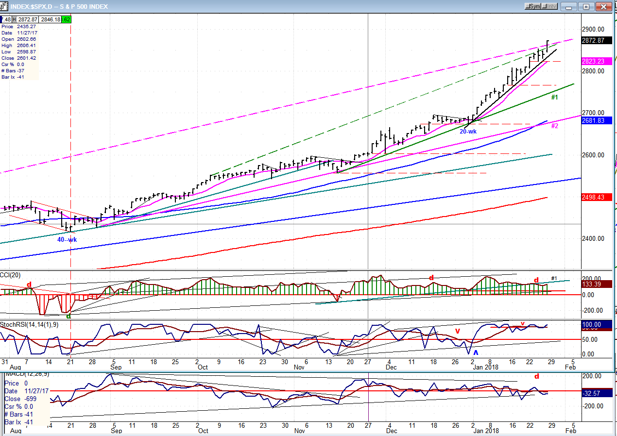
I have seriously underestimated the extent of the uptrend which started with the low of the 7-year cycle at 1810. I was looking for a phase count to take us to a 2660 top, but that turned out to be a short-term stop with SPX only pausing briefly at the end of 2017 and, re-invigorated by the tax bill, it shot up another 200 points in less than a month. An eventual move to the low 3000s had been anticipated and posted under “Long-term trend”, (above), but I did not expect it to be approximated this quickly. In spite of its near exponential trajectory, SPX appears to be building the normal staircase pattern to its next significant projection target. This means that driven by minor cycles, the index forms a re-accumulation pattern which gives us a good idea of what level will be reached at the next minor cycle high, and this process is repeated until it nears the next important price projection, begins to break uptrend lines and eventually reverses its trend.
Currently, we are coming to the end of such a process. Last Wednesday, SPX started to build a new base after the minor cycle made its low, and it rapidly formed an impressive re-accumulation pattern which ended late Thursday with the start of a new short-term uptrend that has quickly reached the vicinity of the new price target (given in Thursday’s Market Summary). Friday’s close fell a little shy of the stated projection but it is expected to be filled on Monday Morning. A minor reversal should then take us to the next cycle low ideally due on Tuesday. This is expected to be a very short correction following the partial completion of the total base count. The next upside target will be included in Monday morning’s update.
Chart Analysis (These charts and subsequent ones courtesy of QCharts)
SPX Daily Chart
About two months ago, expecting SPX to top at about 2700, I mentioned that we would have a confirmed reversal when trend line #1 was broken. At the end of December, the trend line was tested, held, and instead of giving a sell signal, the index started an accelerated rally away from the trend line. This has brought the price above several top channel lines which should have contained prices – and there are higher projections directly ahead! It’s clear that SPX has a definite objective in mind for this intermediate top . After doing a thorough review of the 1810 base on the long-term P&F chart, I have a better idea of what it should be. Only minor cycles lie ahead for the immediate future, and SPX is taking advantage of this favorable cyclic condition to reach its objective before a more important cycle threatens to reverse it course.
If you look at the chart below, you will see that a new trend line has formed which is much steeper than trend line #1. This is obviously the one on which we must focus for an indication that we are near the top. But a break of this trend line will probably not yet signal the beginning of the expected intermediate correction. After it is broken, another will form at a less steep angle, and this process may have to be repeated once or twice more before we are in a position to break trend line #1 and to – finally – start an intermediate downtrend.
One thing that I have found misleading has been the behavior of the breadth index. I have never seen it show such a lack of support for prices for this length of time! If you look at the lowest oscillator, you will understand why I say this. It has been showing relative weakness to the price chart for a long period of time; once again proving the old adage that “Price is King”!
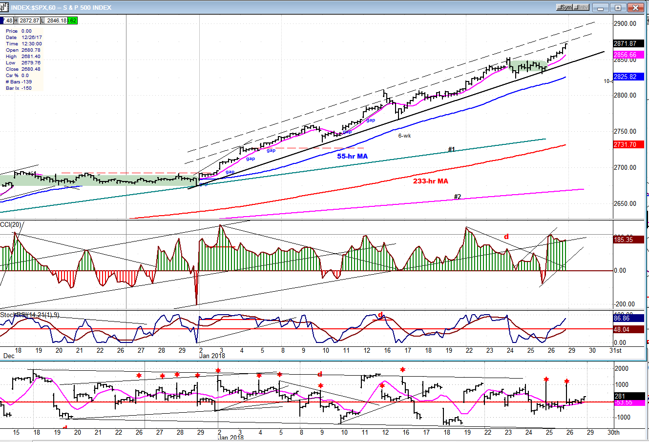
SPX Hourly Chart:
I have often mentioned some of the advantages of the P&F charts over bar charts. Here we have a good example of this! I have highlighted in green two consolidation patterns. The one on the left took two weeks to form. The one on the right, a day and a half. And yet, when converted into P&F charts, they are almost equal in length; which means that they have nearly the same projection count. One could not realize this simply by looking at the bar chart. We will compare the length of the two uptrends next week after the one on the right has been fully extended.
On the hourly chart, we can see that the newly formed, steeper trendline has five contact points, making it a very valid trend line, and warning us to pay attention when it is broken. It also has five touch points on its top channel line; plus one which went above it about half way through the trend. This gives us some good parameters to follow for each short-term move. The one currently underway is close to the preferred top channel line. If we did not know that the next minor cycle low is due on Tuesday and that the move has almost reached its initial target, we could still expect some resistance to occur slightly above Friday’s close which has the potential of turning the price back down.
On Thursday, the CCI dipped slightly into the red, but since it reversed immediately and had a good thrust into the green instead of giving a sell signal, it told us that the correction ended. The bottom indicator (A-D plot) shows that the pattern of selling into first hour strength (which has been taking place for over a month) continues. I thought that it was an indication that large holders were selling into the opening strength in expectation of having reached the proximity of an important top, but the market action has nullified this hypothesis.
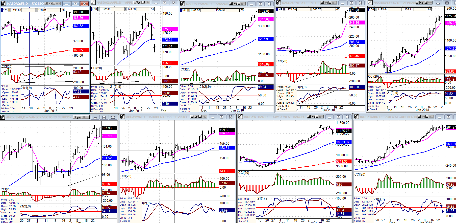
An Overview Of Some Important Indexes (Daily Charts)
Last week, Apple was out of sync with the rest of the FAANGs, but until they all stop making new highs and show a propensity for correcting, it‘s likely that we are not yet ready for a significant market correction.
There was a little more uniformity in the lower tier with all four indexes failing to make new highs, but with the market expected to push higher next week, this may be only a head fake.
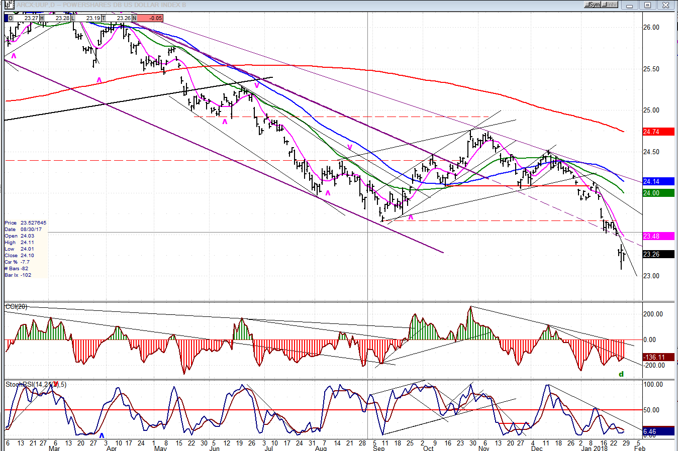
UUP (Dollar ETF)
Last week, UUP was buffeted by comments from the treasury secretary -- who prefers a weak dollar -- and the president -- who now likes a strong dollar. The net result was that the dollar ended significantly lower probably on its way to eventually re-test the 2011 low.
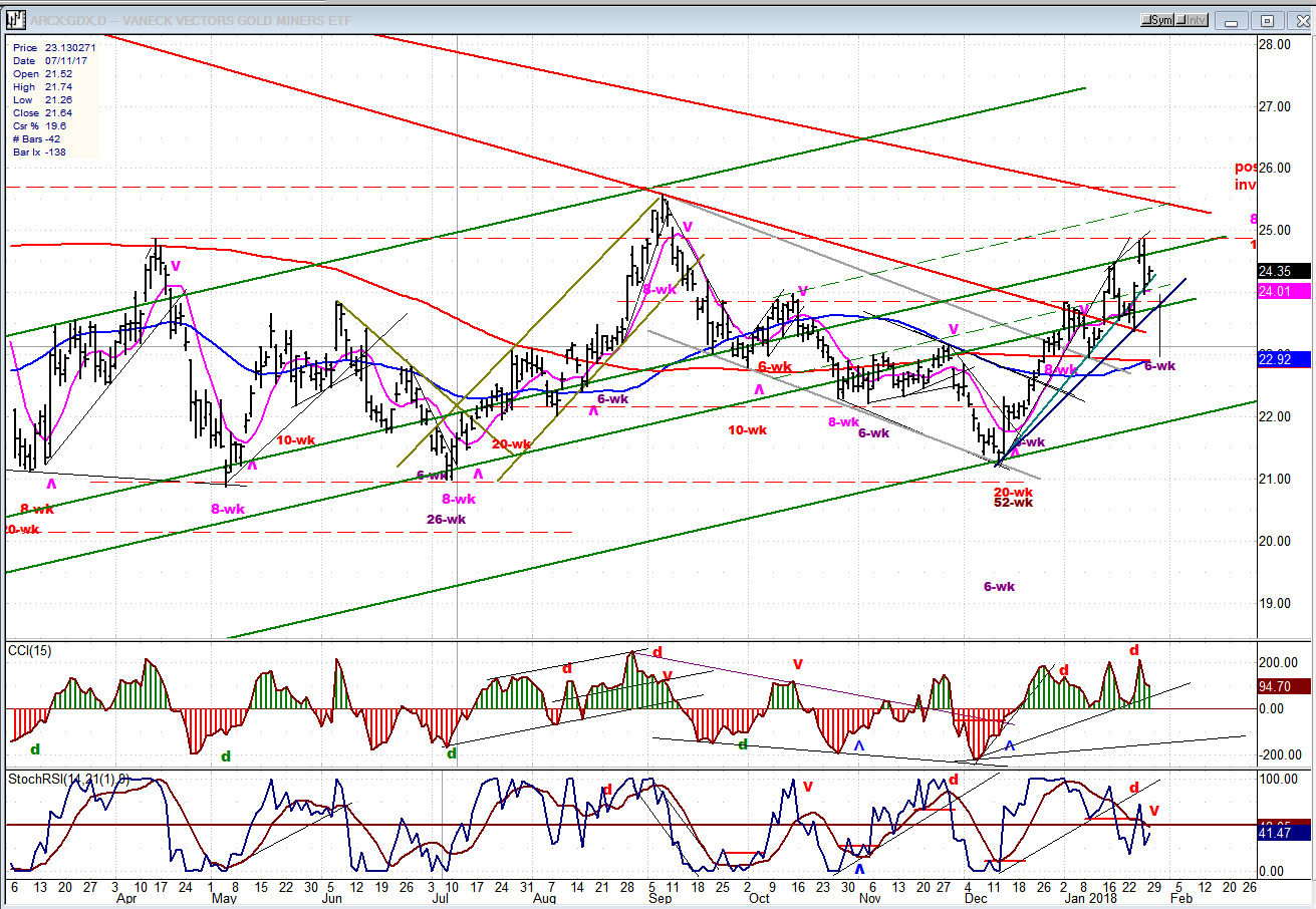
GDX (Gold Miners ETF)
With the dollar taking a plunge, GDX made a new high but obediently stopped at a former resistance level. With its 6-wk cycle low due in just a few more days, it is likely that the current pull-back will continue until then.
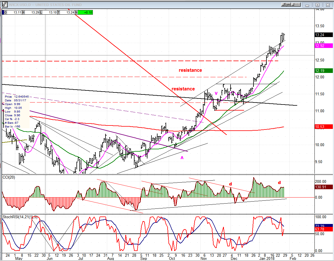
USO (United States Oil Fund)
USO is most likely ready for a minor pull-back, after which it should push at least to 14.50-15 before undertaking a more protracted consolidation. Longer-term, 18-21 is not unconceivable and probably likely.
Summary
A new pattern of re-accumulation has formed which projects higher prices over the near-term.
FREE TRIAL SUBSCRIPTON
With a trial subscription, you will have access to the same information that is given to paid subscribers, but for a limited time period. I think you will find that knowing how far a move can carry is one of the most useful benefits of this service, whether you are a trader or an investor -- especially when this price target is confirmed by reliable indicators which give advance warning of a market top or bottom. Furthermore, cycle analysis adds the all- important time element to the above price projections.
For a FREE 4-week trial, further subscription options, payment plans, and for general information, I encourage you to visit my website at www.marketurningpoints.com.
The above comments about the financial markets are based purely on what I consider to be sound technical analysis principles. They represent my own opinion and are not meant to be construed as trading or investment advice, but are offered as an analytical point of view which might be of interest to those who follow stock market cycles and technical analysis.
share
share
share
share
share

When Andre Gratian was a stock broker years ago, a friend introduced him to technical analysis of the market. Consequently, it is not an exaggeration to say that Andre fell in love with this approach! Ever since then, it has become an increasingly important part of his professional life. Gratian has studied the works of Wyckoff, Edwards & Magee, Edward J. Dewey (cycles) and many others. However, one of my most profitable undertaking has probably been to study Point & Figure charting, which he finds invaluable in analyzing stocks and indices. If he were restricted to one methodology, this is the one that he would choose. This well-rounded background has given him what he feels to be a special insight into the stock market, facilitating the recognition of meaningful patterns and the ‘turning points’ in all trends, whether they be short or long term. Andre feels very comfortable discussing the stock market and passing on meaningful information to others. His subscribers include individuals and money managers throughout the world. Moreover, his Newsletters are currently published on several financial sites, here and abroad.