Technical Analysis Of The Markets


Current Position of the Market
SPX: Long-Term Trend – The bull market is continuing with a top expected in the low 3000s.
Intermediate Trend – The intermediate correction from 2873 is likely to continue until about early June.
Analysis of the short-term trend is done on a daily basis with the help of hourly charts. It is an important adjunct to the analysis of daily and weekly charts which discusses the course of longer market trends.
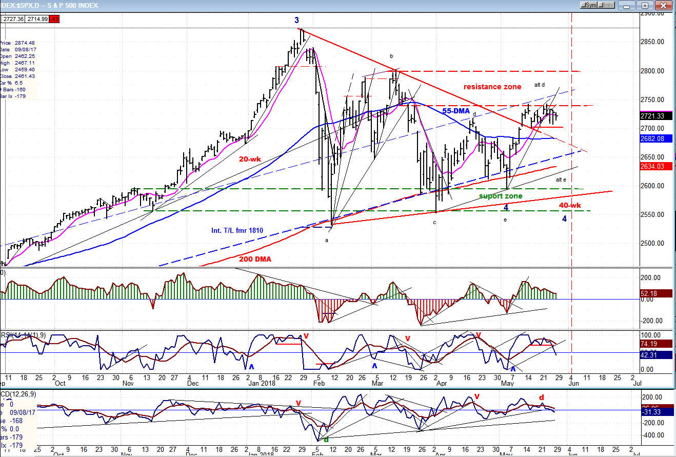
2700 Key Level
Market Overview
What I am saying is that the 2700 level must hold if we are not to witness another spell of weakness before the correction is over. If the congestion pattern which has been created between that level and 2740+ (the 10X P&F chart is built on 10-point increments and ignores partial moves) is distribution, and if the SPX falls below that level, it has the potential of declining down to 2620 before reversing. On the other hand, if it is simply a large consolidation pattern and it rises above 2750, it could keep going until it reaches 2820 before the next reversal. Of course, these are only potentials which, in either case, would have to be confirmed by market action. As I have stated before, P&F projections are not guaranteed, but it’s amazing how often they turn out to be valid, which is the reason why it is such a valuable methodology for analyzing the market.
There is still time for the 40-wk cycle to prove that its low is ahead of us and not back at the beginning of May, but it we go past the middle of June without a significant decline in the index, it will become obvious that it bottomed early, or was superseded by a larger cycle
Chart Analysis (These charts and subsequent ones courtesy of QCharts)
SPX Daily Chart
It is easy to observe that a congestion pattern formed after SPX reached 2742 for the first time. The index has now moved in a 40-point range for two weeks, with the red horizontal line represents the 2700 level. Overall, the chart looks bullish! The price has moved above the red declining trend line and, after back-testing it, it started to trade sideways and has not even retraced .382 of its advance from 2595. It also remains well above its blue 55-DMA which lies just below a normal Fibonacci retracement. But prices do not remain locked in congestion patterns forever. Sooner or later, they move out of it in one direction or another and we want to anticipate that move correctly.
If you look at the congestion phase, you will notice that it consists of two sections, and if we take a count across the second one (from the right) we arrive, in the case of a pull-back, at a conservative projection of about 2770-2780. A mild drop into the 40-wk cycle low would satisfy this partial count, back-test the red downtrend line again, and find support in the area of the 55-DMA. Naturally, I am looking for the kind of scenario which will develop if the 40-wk cycle low is still ahead of us. If none of this comes to pass and the index takes off on the upside instead, so be it! The market is never wrong! Such action would pretty much certify that the correction has ended and that we are most likely on our way to challenge the former high. EWT analysts pretty much agree that this correction is only a wave 4, and that a new high -- which could reach above 3000+ -- will eventually occur to complete wave 5 before we see the end of this bull market.
With the recent market action, the oscillators at the bottom of the chart have gotten just a little more bearish, with the two lowest ones – usually the early birds – going negative. This could be a preliminary sign that we are about to go below 2700, but we need to see more weakness into the CCI before this is confirmed.
SPX Hourly Chart
On the hourly chart, we can also see that if SPX broke below 2700, it would make perfect sense for it to retrace to about 2680. The band of resistance which stopped the index twice before it moved higher, has now turned into support and would certainly halt a decline to that level, as least temporarily. It is also the level of the 200-hr MA which often acts as support or resistance, depending on the direction in which price is traveling.
Considering all these market conditions, a pull-back to this level as the intermediate cycle bottoms would be the perfect scenario – probably too perfect for it to be realized. The market has a tendency to ignore the obvious; just as the pattern of the hourly chart is unlikely to be another H&S top pattern, which is the reason why I did not even bother labeling it. Nevertheless, let’s keep it in mind, just in case.

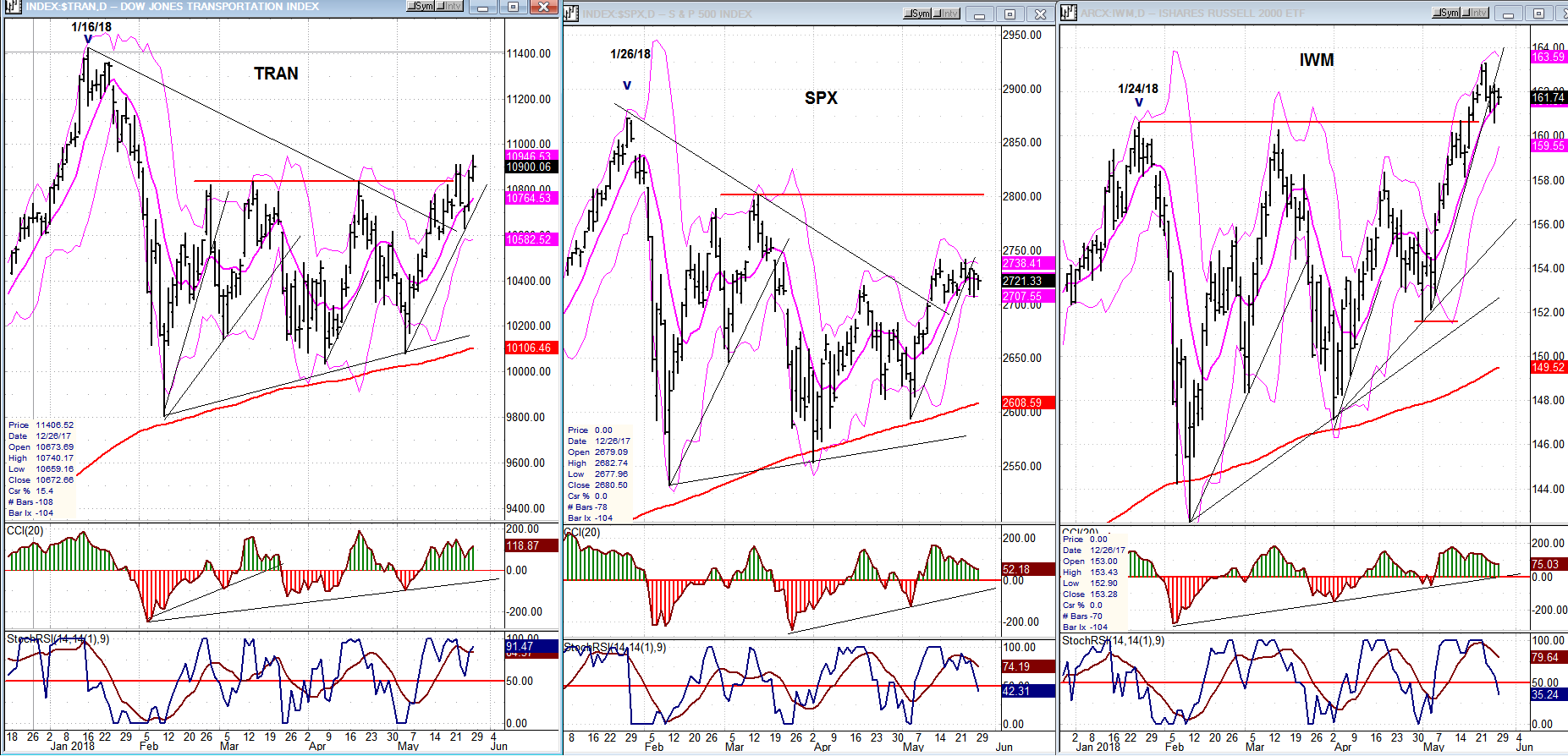
SPX, IWM, TRAN (daily charts)
The contrast between the charts of the two leading indicators and that of SPX is becoming more pronounced and more positive. TRAN and IWM have already gone beyond their former short-term highs while SPX is the laggard. This would imply that the next market move of substance will be on the upside; but perhaps not before one more pull-back, which would be ideal if it materializes. All the oscillators are at their highs and overbought, are showing negative divergence, and are starting to turn down. Also, as suggested last week, IWM appears to have reached a short-term projection and to be starting a correction.
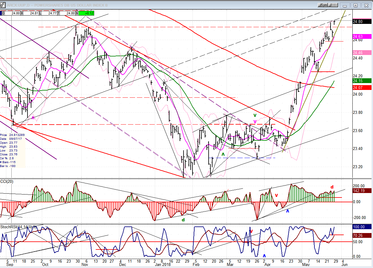
UUP (Dollar ETF) Weekly
UUP continues its uptrend among increasing signs that it is on a short leash. This move has all the characteristics of a 5th wave which is in the process of completing. Negative divergence has been showing at the daily level for some time and it is increasing at the hourly level, suggesting that a reversal is near. But it will not be confirmed until the uptrend line is broken and the indicators have gone negative.
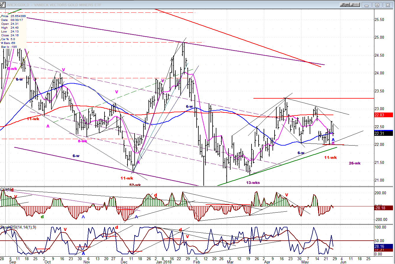
GDX (Gold Miners ETF)
The dollar’s refusal to reverse its uptrend has been a thorn in the side of gold. As suggested above, this should not last much longer. GDX reacted to the bottoming of the 15-wk cycle with an up-thrust, but pulled back when UUP showed that it was not quite ready to turn down. It’s a good bet that GDX will soon be free to move higher as UUP starts to reverse its trend, but initially, the extent of GDX’s move will be somewhat limited until after the 26-wk cycle has made its low around the middle of June.
USO (United States Oil Fund)
USO is not a high beta stock, but it may be one of the most predictable to chart, especially when it comes to P&F projections. In my last weekly update, I stated: “USO has now met its near-term target of 14.50-15.00...” making it susceptible to a price reversal, which is what took place last week – decisively!
The uptrend started in February 2016 from about 8.00, a price level which had also been predicted as a good potential for an important low based on the the previous P&F chart pattern.
USO is now due for a consolidation, perhaps back to about 12:00 and, upon completion of this consolidation, should continue its uptrend to about 17.50-18.00 before a more permanent reversal takes place.

Summary
I am still holding out (against decreasing odds) for a potential final spell of weakness to end the correction which started at 2872. Its occurrence will depend on whether the 40-wk cycle (due ideally in the first week of June) is still ahead of us, and if it still has the power to move the market. Trading below the 2700 level would confirm that this move is underway; while a decisive move above 2750 would suggest that the cyclical low was made earlier, and that we might be on our way to new all-time highs which, in any case, appears inevitable before we put an end to the current bull market.
*********
FREE TRIAL SUBSCRIPTON
With a trial subscription, you will have access to the same information that is given to paid subscribers, but for a limited time period. I think you will find that knowing how far a move can carry is one of the most useful benefits of this service, whether you are a trader or an investor -- especially when this price target is confirmed by reliable indicators which give advance warning of a market top or bottom. Furthermore, cycle analysis adds the all- important time element to the above price projections.
For a FREE 4-week trial, further subscription options, payment plans, and for general information, I encourage you to visit my website at www.marketurningpoints.com.
The above comments about the financial markets are based purely on what I consider to be sound technical analysis principles. They represent my own opinion and are not meant to be construed as trading or investment advice, but are offered as an analytical point of view which might be of interest to those who follow stock market cycles and technical analysis.

When Andre Gratian was a stock broker years ago, a friend introduced him to technical analysis of the market. Consequently, it is not an exaggeration to say that Andre fell in love with this approach! Ever since then, it has become an increasingly important part of his professional life. Gratian has studied the works of Wyckoff, Edwards & Magee, Edward J. Dewey (cycles) and many others. However, one of my most profitable undertaking has probably been to study Point & Figure charting, which he finds invaluable in analyzing stocks and indices. If he were restricted to one methodology, this is the one that he would choose. This well-rounded background has given him what he feels to be a special insight into the stock market, facilitating the recognition of meaningful patterns and the ‘turning points’ in all trends, whether they be short or long term. Andre feels very comfortable discussing the stock market and passing on meaningful information to others. His subscribers include individuals and money managers throughout the world. Moreover, his Newsletters are currently published on several financial sites, here and abroad.


