Weakening Stock Market Internals


Two weeks ago (October 3rd) I noted the bearish NYSE 52Wk High & Low data that began just days before the Dow Jones reached it latest all-time high on September 19th. I included the table below (with data updated to October 3rd), along with the following comments:
“Looking at the action in the 52Wk Highs and Lows in the table below, I’m not predicting the Dow Jones all-time highs of September 17-19 will prove to be a historic high, such as the ones seen in January 2000 and October 2007. However, when the ultimate top of this bull cycle does come and pass by, it will look like this.”
At the close of this past week, downward pressure on share prices has eased off a bit but over the past month the NYSE’s 52Wk Lows continue to overwhelm its 52Wk Highs. It’s obvious the problem the market is having here; the “policy makers” have grossly over-inflated the stock market valuations which now want to deflate. It’s that simple, except the “policy makers” like the inflated market valuations and will oppose deflation with as much “liquidity” as they dare to “inject.” Anyway I’m sure that’s their plan and their main concern.
If they are successful we’ll again see NYSE 52Wk Highs outnumber 52Wk Lows and more new all-time highs on the Dow Jones. If they’re not successful, we’ll continue seeing NYSE 52Wk Lows overwhelm 52Wk Highs in ever greater numbers for the rest of 2014, continuing into 2015 as the Dow Jones resumes the bear market interrupted by the “policy makers” in March 2009. That said, as bad as it may get we’ll still see some days like today (Friday Oct 17th) when 52Wk Highs outnumber Lows, but one good day does not a bull market make. Personally I think the “policy makers” are approaching their Waterloo here, because there are limits to what currency debauchery can achieve in the financial markets.
Let’s review the table below. From left to right it lists the date, whether or not the Dow Jones and the NYSE H-L Net saw an up or down day, the value of the Dow Jones, then the Dow’s Bears Eye View (BEV) value (the percentage the Dow Jones is from its last all-time high), then how many trading days have passed since the Dow Jones made its last all-time high. Then in the last three columns we see the NYSE 52-Week High Low Data, the most important being the 52Wk H-L Nets.
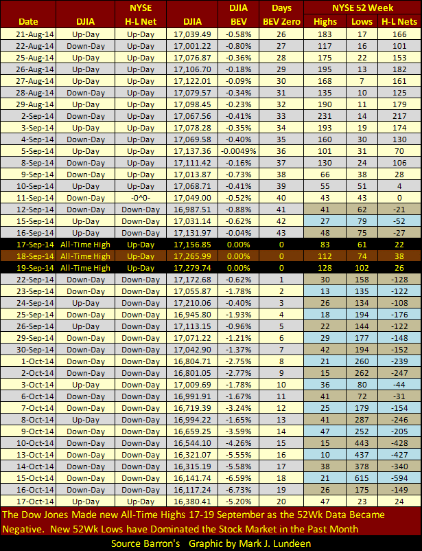
What I find most interesting in the table above is that the Dow Jones may have reached new all-time highs (BEV 0.00%) on September 17-19, but NYSE 52Wk Lows began to outnumber 52Wk Highs three-trading days prior on September 12. Except for those three days that the Dow Jones made new all-time highs, and a month later today, the NYSE has continued to see more 52Wk Lows than Highs. There had been only seventeen days since the first of the year with more 52Wk Lows than Highs up to September 10th. Then, just as the Dow Jones made three consecutive new all-time highs, the NYSE 52Wk H-L Net began its most significant negative cluster of down days since late summer of 2011. And just like most other stocks trading on the NYSE, the Dow Jones wasn’t making any new all-time highs in the late summer of 2011.
But exactly what are 52Wk Highs and Lows? To better understand this data let’s look at the Dow Jones plotted along with its 52Wk Highs (Green Plot) and 52Wk Lows (Red Plot) in the chart below. A similar chart could be made of any single company’s share price trading on the NYSE. The Dow Jones’ 52Wk prices move up and down with the changing valuation of the Dow Jones (Blue Plot). During extended bullish market periods its 52Wk highs are continually pushed higher along with the rising Dow Jones while its lows from 52Wks ago continually drop off. During extended bearish market periods its 52Wk lows are continually pushed lower along with the declining Dow Jones while its 52Wk Highs from a year ago continually expire. It’s important to know that from week to week or month to month, 52Wk highs and lows change, sometimes greatly.
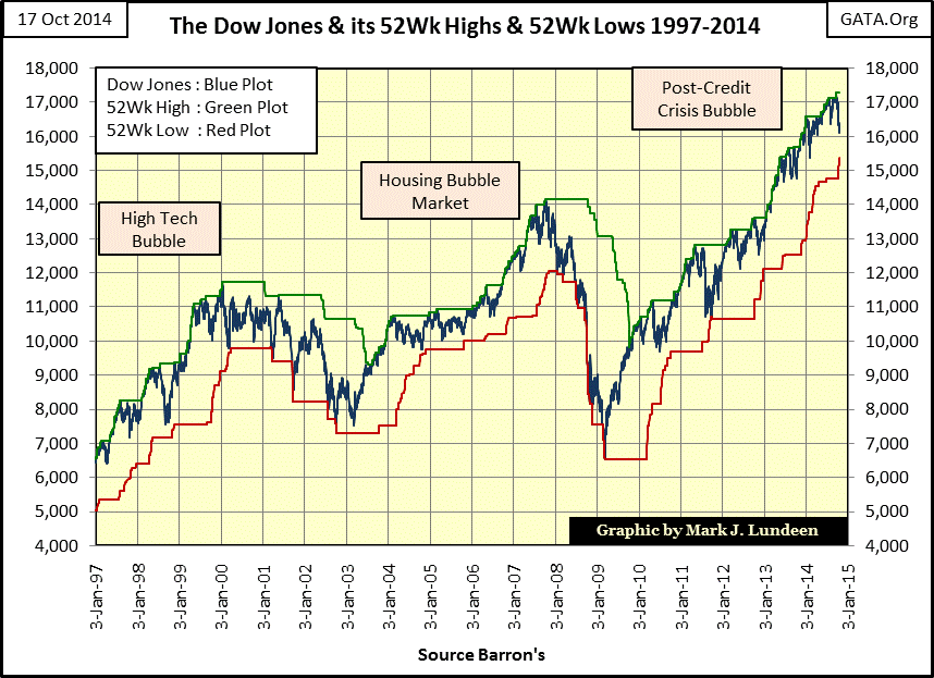
Let’s look back at the High-Tech Bubble bear market when the Dow Jones declined 38%. The Dow Peaked in January 2000, but it wasn’t until a year later that it really began pushing down on its 52Wk Lows. Looking at the Dow Jones (Blue Plot) with its 52Wk Lows from 2000 to 2003 (Red Plot), the deflating High-Tech Bubble has the appearance of a ball bouncing down a set of stairs. Compare this pussy cat of a bear market with the deflating Housing Bubble Market. Nine months after the Dow Jones’ last all-time high in October 2007, the Dow Jones plunged making new 52Wk Lows almost daily. The decline in the mortgage market, mirrored by the Dow Jones above, was brutal enough to cause Congress to convene on live TV in October 2008 to reassure the public that the “policy makers” had everything under control.
Since March 2009, the Dow Jones has made a nice advance during its Post-Credit Crisis Bubble continually pushing its 52Wk Highs up as its 52Wk Lows expired over the past five years. Well as you can see above, this is a long time for the Dow Jones to go on making new 52Wk Highs without a proper correction generating a new 52Wk Low. In August / September 2011 the Dow Jones came close, but failed to make a new 52Wk Low. It really is time for the Dow Jones, and most other stocks trading on the NYSE to begin a market decline severe enough to push down their 52Wk Lows, and in fact if you go back to the table above you’ll see that is exactly what is happening on the NYSE; can the Dow Jones and other major indexes be far behind?
I don’t think so, and if the stock market begins to deflate from its current lofty valuations it could become dreadful very quickly. To see how potentially dreadful a market decline can be, let’s look at the NYSE 52Wk data during the credit crisis in the table below. On September 11th, 2008 the Dow Jones was down 19.28% from its last all-time high as only 499 companies on the NYSE reached a new 52Wk Low. A month later on October 10th the Dow Jones had declined 40% from its last all-time high for the first time since 1974 while the NYSE saw 2901 of the 3306 companies trading plunge to new 52Wk Lows – 88% of the NYSE. That was shock and awe from Mr Bear.
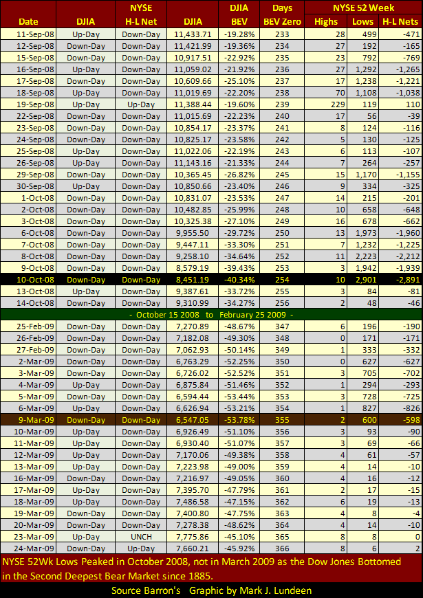
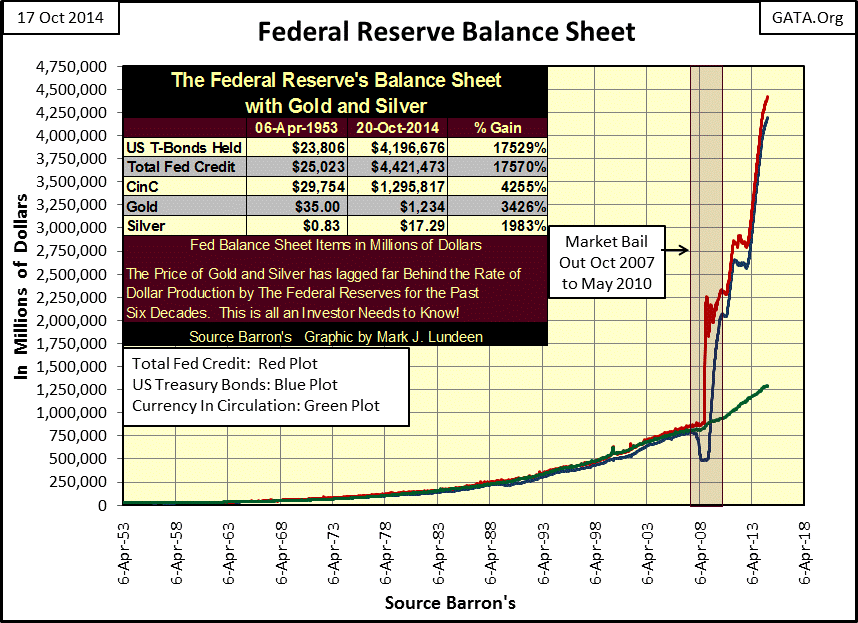
The table above skips a few months and then picks up again in late February 2009 beneath the Green Bar. Notice that the Dow Jones may have bottomed on March 9th, but did so as only 600 companies trading at the NYSE made new 52Wk Lows. The NYSE would not see 52Wk Lows in the triple digits again (173) until 06 May 2010 when the Dow Jones advanced to 10,520; a fourteen month gain of 3973 points. No doubt about it, this was some serious “policy making”, as is evident in the chart below. However the Federal Reserve had to trash its balance sheet in order to achieve these results, and has continued trashing it in the years since. We have to wonder if the Federal Reserve could possibly repeat this trick in the crisis to come? I don’t believe that global finance would allow it without abandoning the dollar as the world’s reserve currency, but who knows what will, or can happen?
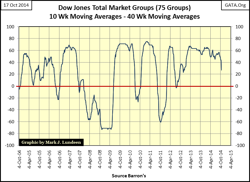
We can see the stock market’s fundamentals deteriorating not just in the growing number of NYSE 52Wk Lows, but in how many Dow Jones Total Market Groups’ (DJTMG) 10Wk Moving Averages are above their 40Wk Moving Averages (chart below). In mid-September there were 57 net of the 75 indexes with 10Wk M/A above their 40Wk M/A. This week the number plunged to only 27 net averages. Like a single stock moving from a 52Wk High to a 52Wk Low, it takes a lot of downward pressure to drive a market group’s 10Wk M/A below its 40Wk M/A. But in truth that isn’t actually so. History proves it takes a lot of buying to make the stock market go up, while it will go down, and even crash with no help at all. Janet Yellen knows this very well as her Federal Reserve terminates it program of quantitative easing purchases. If this trend continues, the market, and the “policy makers” will have problems.
Here’s a chart I haven’t posted for a few years: the NYSE Financial index’s BEV plot with its step sum from its absolute credit crisis bottom (09 March 2009) to present. The financial companies in this index were ground zero in the credit crisis; from July 2007 when rumblings in the mortgage market first began to be heard in the media through March 2009, they had crashed by 79%. Even after untold trillions of dollars had been “injected” into these companies, and accounting rules changed to give these zombies the appearance of solvency they only managed to recover to about 65% of their previous all-time high of July 2007. There is a lot of weight bearing down on these companies’ share prices.
Currently, these financial companies (and their step sum) are experiencing their largest decline since early 2012. If this is just a simple correction within a bull market, there is no need to fear what we are seeing above. But the current era in financial history is in no way normal. The global economy is choking on unserviceable debt that has to be written off before any true recovery can commence, and doing so would wipe most of the “assets” off these companies’ balance sheets. But the biggest problem these financial companies have is that they’re counter-parties to unknown hundreds of trillions of dollars of derivatives, particularly interest rate swaps. Currently this is not a problem as these “instruments of financial destruction” (as Warren Buffet once described them), have yet to come into the money, so they are not currently a liability to these companies. But should the financial markets resume what began in 2008, (and they will), specific performance demands on their derivative obligations will leverage their losses to a point far beyond central bank redemption. All things considered, owning assets with no counter-party risk seems the most prudent strategy. Gold and silver are looking darned attractive.


